In previous posts I have been looking at asset classes, sectors, countries etc. In this post I am going to throw the 30 constituents of the Dow Jones Industrials index ($INDU) at a Relative Rotation Graph and also look for confirmation between weekly and daily time-frames.
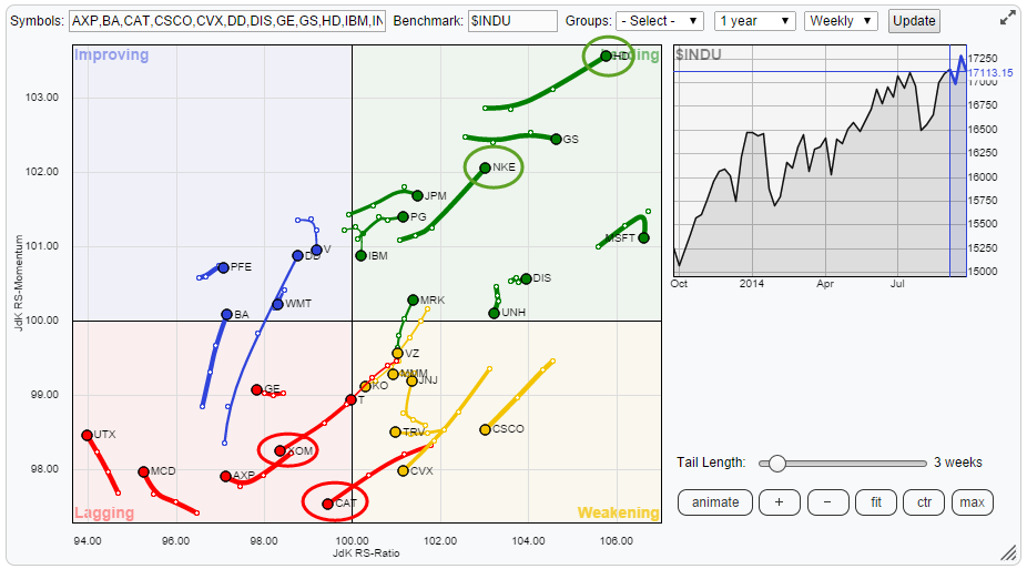
When you open up the RRG-chart page you will find that the members of the Dow Industrials index are present as a predefined group in the <groups> drop-down box. If we bring up that RRG we will be confronted with a bit of a messy picture. This is because of the default 10 period trail in combination with 30 names on the canvas. The combination of more securities and longer trails creates spaghetti charts.
Prepare readable Relative Rotation Graphs
Luckily enough there's an easy solution to that problem. First of all, as of close Friday 9/26, INTC is a big outlier on the chart. The stock has been performing phenomenally well over the past few weeks, outperforming the Dow by a mile, this has pushed the trail of INTC way out to the right which compresses all other tickers on the plot. As INTC looks to have run its course for the time being I tick off the check-box to remove the trail from the RRG and then click <fit> on the controls to make maximum use of my screen real-estate. This improves the picture but we can do better. Setting up an RRG for analysis is a bit of a balancing act, playing around with trail-length and number of tickers on the screen. As I want to analyse all the members of the Industrials index I have only one option left which is the trail length. I moved that back to three weeks which gives me a readable RRG with four observations (roughly one month) per security on the weekly RRG. This results in the picture above.
Looking at that picture there are a few stocks that catch my attention. In the leading quadrant these are Home Depot (HD) and Nike (NKE). Over in the lagging quadrant these are Exxon Mobile (XOM) and Caterpillar (CAT).
Now that I have identified which stocks I potentially like and dislike I want to check what their relative rotation looks like on the daily time-frame. As I want to be be able to flip back and forth between the two time frames I simply duplicate the RRG we just created to another tab in my browser and switch the time-frame to <daily> on the new tab. This will render the same RRG but now using daily data. Once this is done, immediately, the rotation and the trail of Dupont (DD) stands out. Definitely worth exploring further but for now I am going to focus and work my way through the names we identified earlier. In order to do that I check off all the trails on the daily RRG except for HD, NKE, XOM and CAT. Doing this enables me to lengthen the trail for these securities on the plot, I have set it to 15 days to roughly match the three week period on the weekly RRG.
The resulting picture is shown below
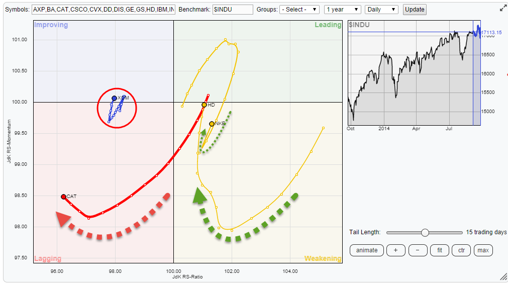
Strong rotation on right hand side.
HD and NKE are moving in the leading quadrant, and heading deeper into it, on the weekly RRG. On the daily RRG they show up in the weakening quadrant BUT they have turned around and started to move back up towards the leading quadrant again. On a regular price chart this translates into a strong relative up-trend that went through a temporary setback and regained momentum and started to move higher again.
Home Depot
The first one is Home Depot, the chart below is the weekly chart in combination with the RRG lines.
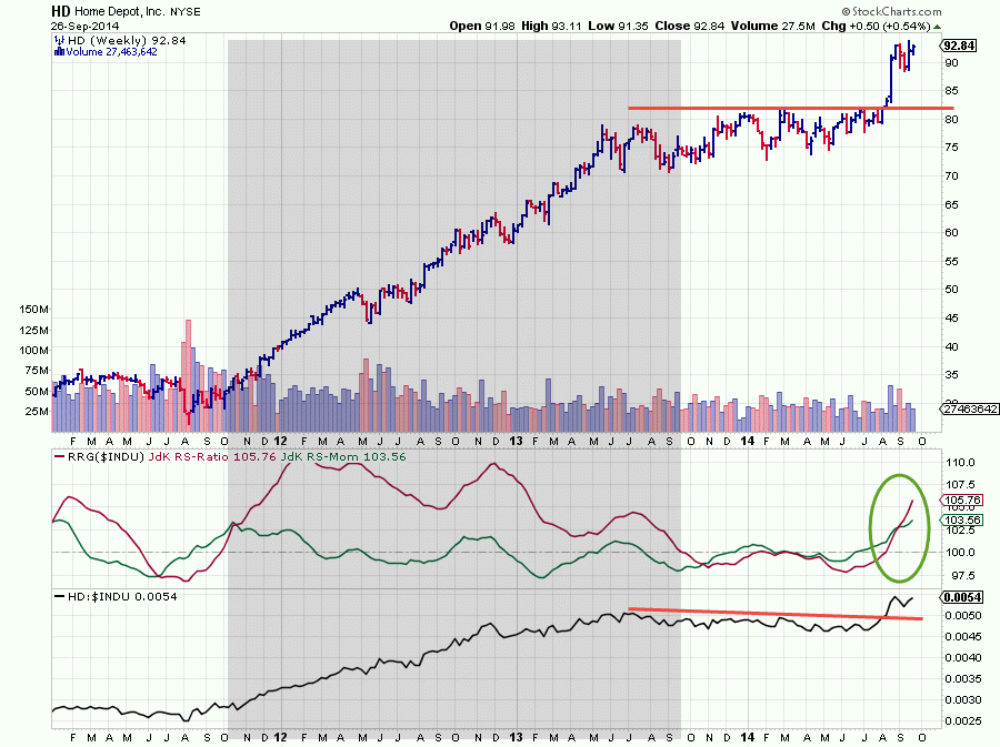
The improvement in relative strength started weeks before the final breakout on both the price and the relative charts. The confirmation with HD crossing into the leading quadrant on the weekly RRG co-incided with the breakout and was just before the price jump.
Note: The shaded area in the chart above is a very good example of a very strong relative trend, indicated by the JdK RS-Ratio remaining above 100 all the time and the JdK RS-Momentum line rotating back and forth around the 100-level a few times causing a rotation to take place completely on the right hand side of an RRG chart.
The next chart zooms in on the daily price and relative action over the past few weeks.
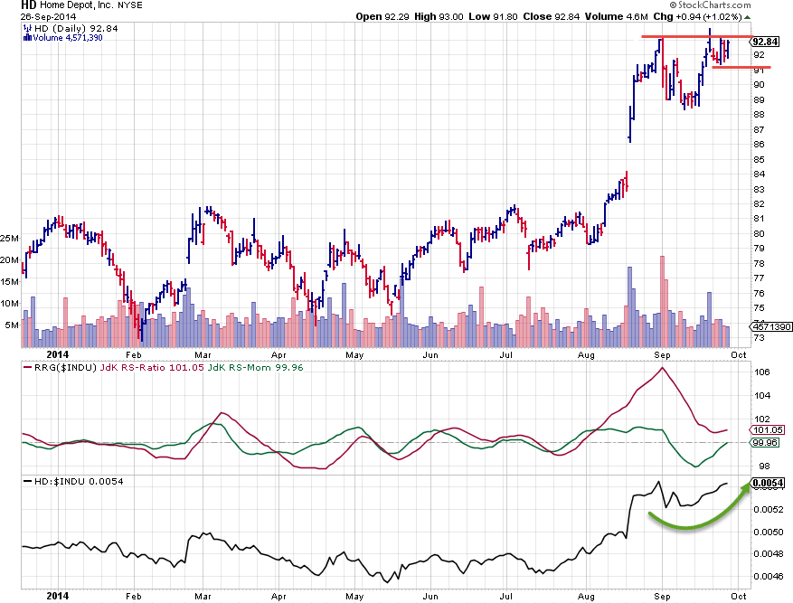
The daily RRG lines picked up the relative improvement early August when both the JdK RS-Ratio and the JdK RS-Momentum lines crossed above 100 and pushed the stock into the leading quadrant. After the breakaway gap and the subsequent rally the price move stalled and has been building up resistance around $ 92. The corresponding drop back in relative strength is clearly visible and this is what caused the setback and the rotation into the weakening quadrant on the daily Relative Rotation Graph. At the moment we see that the loss of relative strength on the daily time frame is stalling again. The JdK RS-Momentum is about to cross back above the 100-level again while the JdK RS-Ratio is putting in a low above the 100-level. This brings the daily picture in sync with the weekly with both time frames showing positive relative strength backed by positive momentum. A break above resistance near $ 92 is now needed to provide the additional fuel for a further rally.
Nike
The weekly picture of NIKE is showing a nice up-trend on the price chart from mid-2012 onwards until the beginning of this year when price began to stall and move sideways with resistance building up around $ 80. The corresponding relative strength against the Dow Jones Industrials index dropped which pushed the RRG-Lines below 100 (stock in lagging quadrant). In April-May the JdK RS-Momentum crossed back above the 100-mark indicating improvement. This was confirmed early in August when the JdK RS-Ratio line also crossed above 100, comfortably putting NIKE in the leading quadrant and out-performing the market.
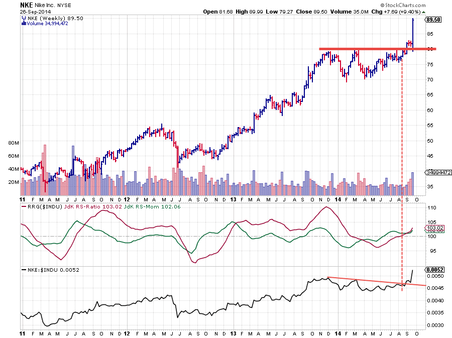
In the first week of September this was followed by a break above the horizontal barrier which opened up the way for more upside price movement. And that is exactly what happened after a test of the former resistance level as support which can be seen on the daily chart below.
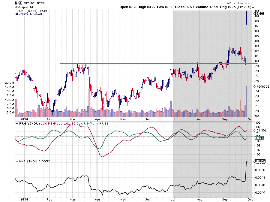
The shaded area shows when the daily RRG Lines crossed above the 100-mark signalling the new up-trend in the relative strength line (lower pane). The intermittent drops of the JdK RS-Momentum line below 100 and back up cause the rotations to take place on the right hand side of the Relative Rotation Graph indicating a strong trend in relative strength. If not invested in this stock yet then it is now, from a trading perspective, probably wiser to wait for another set-back as we do not want to chase such a move and buy at the highs to see the stock go into a corrective move. The longer term relative picture is definitely still strong on both the weekly and the daily charts.
Exxon Mobile
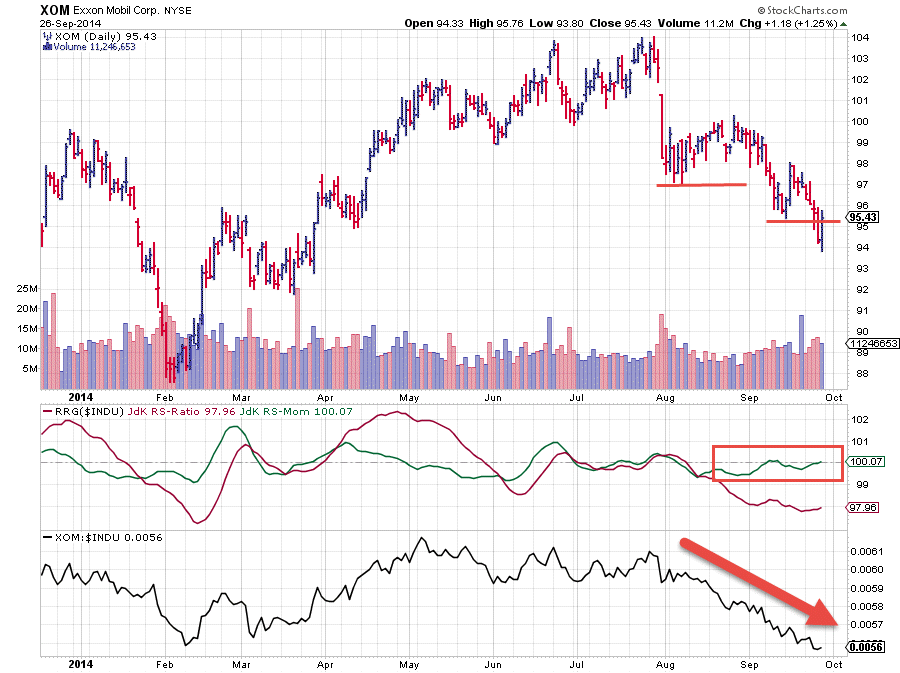
In the lagging quadrant we spotted Exxon Mobile. The weekly price chart of XOM, in combination with the RRG Lines and relative strength shows a 'not so nice' picture.
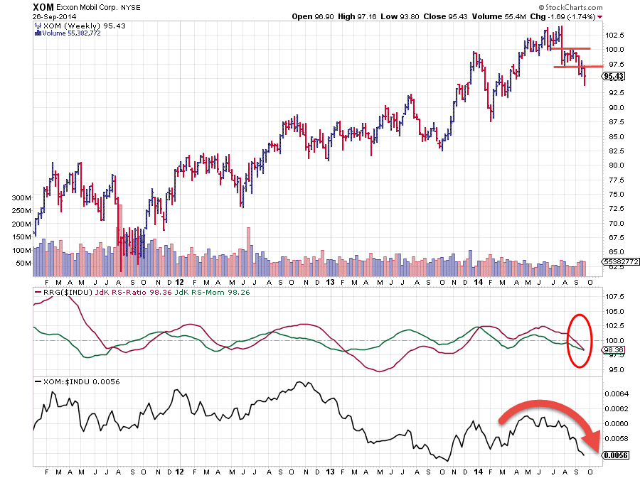
The relative trend was positive since late 2013 when the JdK RS-Ratio crossed above 100, backed by strong relative momentum. This came to an end a few weeks ago. The JdK RS-Ratio had been moving below 100 since June and the relative weakness started to become more clearly visible in the RS-line (lower pane) followed by the JdK RS-Ratio crossing below 100, putting the stock in the lagging quadrant of the weekly RRG. The recent breaks to lower levels on the price chart are not helping here.... to say the least.
If you go back up to the daily RRG you can see the position of XOM, inside the red circle. This stock has been moving around the 100-level on the RS-Momentum axis while staying steady around 98 on the RS-Ratio axis. This means that the relative down-trend is steadily pointing down but not accelerating nor decelerating, hence the small distances between the observations. With that in mind check the daily chart of XOM below.
Caterpillar
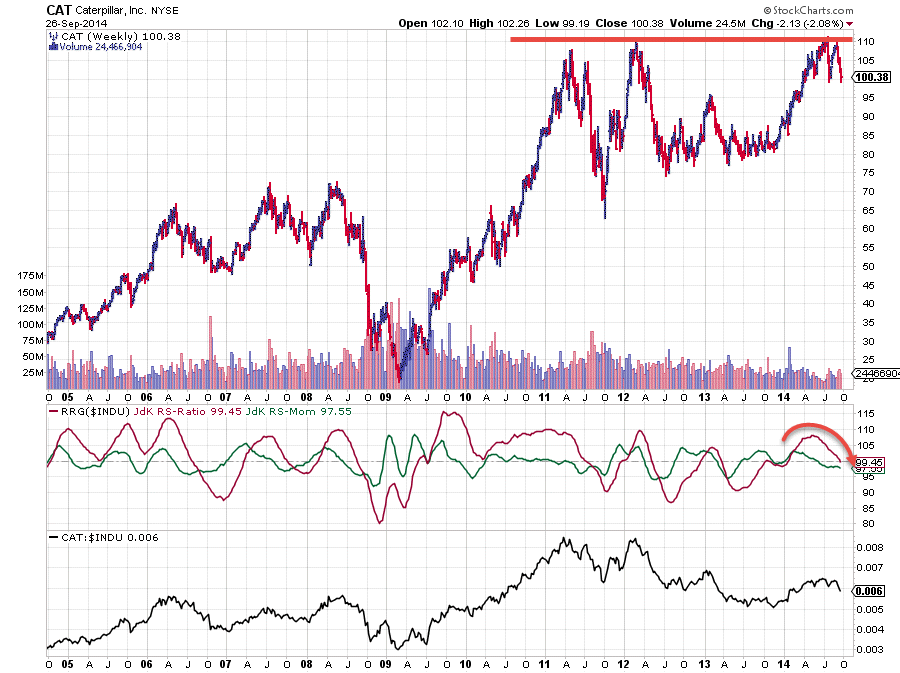
The second name that we spotted inside the lagging quadrant was Caterpillar (CAT). The stock has been showing great relative strength and a great up-trend on the price chart since the beginning of this year but it has tested the $ 110 resistance area for the second time in the past few months now but to put things in perspective I have printed a longer-term chart of CAT below which shows that it is actually the fourth time that this area has been tested as resistance. $ 100 in CAT is starting to look like a steel barrier which is very unlikely to broken upward any time soon. With the JdK RS-Ratio on the verge of crossing below 100 (more) under-performance seems to lie ahead.
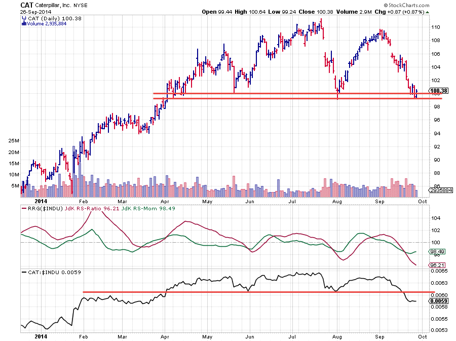
The daily chart of CAT, below, shows that price has hit support near $100 which could cause a temporary hickup given the weakness of the longer-term charts. Expect resistance to kick in around the recent consolidation area near $ 104-106. Obviously a break lower will trigger an acceleration of the decline.
Conclusion
- HD and NKE looking good from relative point of view
- Better not chase NKE after the gap up, look for corrective move back to breakout levels
- XOM and CAT expected to under-perform.
- CAT might be in for a short-term rally as it is currently testing support.
This post ended up being a little longer than I anticipated .... I guess I got carried away a little :) Hope you make it through to the end ! I'll try to stick to more manageable chunks of text next time.
Julius


