The Relative Rotation Graph of the nine sector ETFs against the S&P 500 (SPY) is showing some clear and distinct rotations at the moment. Especially the right hand side of the plot where we find the sectors that are (still) in relative up-trends against the broader S&P 500 is fairly outspoken.
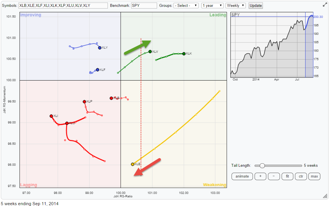
Technology now leading Health care
If we kick-off in the top right-hand corner, the leading quadrant, we find XLV (Health Care) and XLK (Technology) both still heading higher on the JdK RS-Ratio axis and still at decent relative momentum values (JdK RS-Momentum). This means they are still in a relative up-trend against, and thus in general out-performing, the S&P 500. These two sectors can now be classified as the strongest two in this universe, using the JdK RS-Ratio as a measure, with XLK taking the lead over XLV.
An interesting chart to study therefore is the price and relative action of XLV vs XLK (or the other way around).
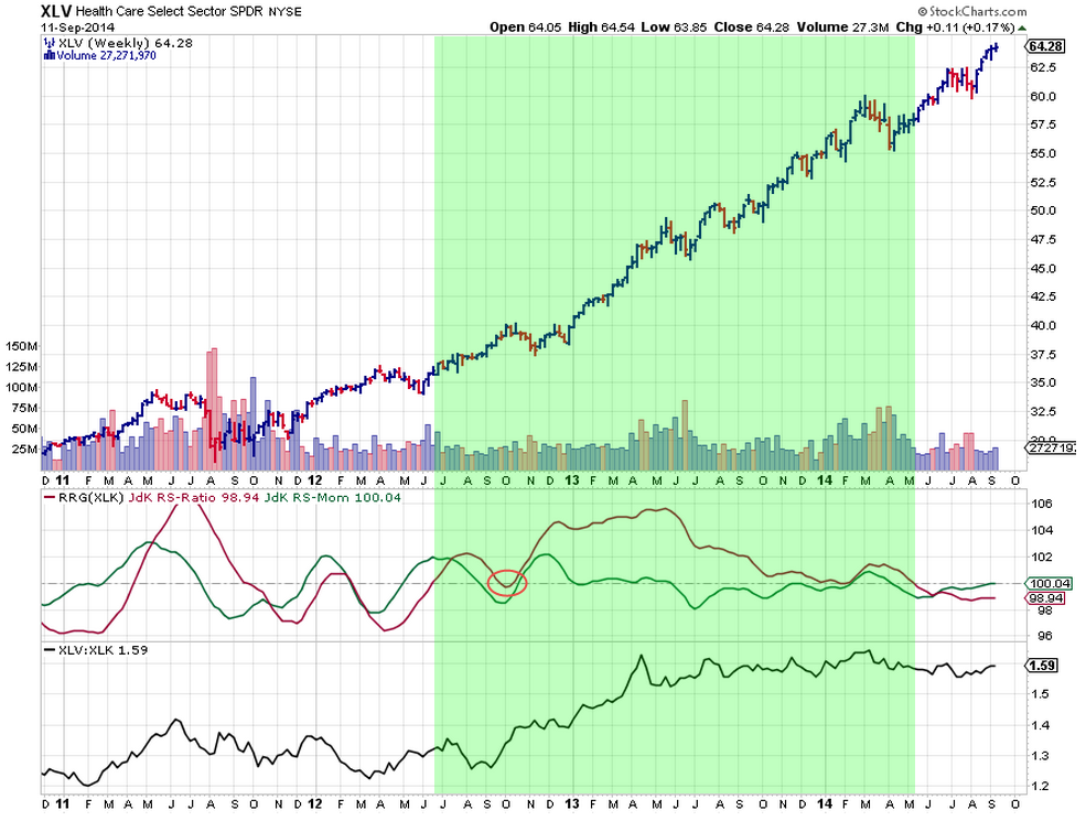
The chart above shows the price action of XLV with the RRG lines and the comparative relative strength line against XLK plotted below. What we see here is a very strong price chart all the way back to late 2011. The XLK price chart will reveal a pretty similar picture with only a slightly less pronounced up-trend in the beginning. The RRG lines pick up this difference in relative strength somewhere mid-2012 when the JdK RS-Ratio crossed above 100 and, with the exception of a short period in October 2012, moved above the 100-level continuously until a few months ago when the JdK RS-Ratio line dropped below the 100-level. This drop signaled a change of leadership which then went to XLK (Technology).
With both sectors strong in relative strength as well as relative momentum, the differences are only marginal but relative strength studies like the RRG-lines will enable you to distinguish between both if necessary and for the time being they show that XLK is in the lead.
Energy sector losing power
The other eye-catching move on the right hand side of the RRG is that of the Energy sector (XLE). This is the sector with by far the longest tail over the past five weeks and it is NOT pointing in the right direction. The sector went through a positive relative rotation during the past few months but the longer-term picture reveals that this looks to be yet another temporary move.
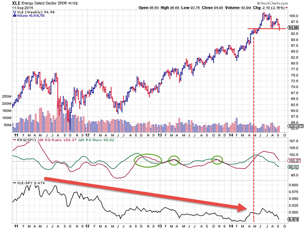
The chart above shows the Energy sector in combination with the RRG-lines and the raw relative strength line against the S&P 500 (SPY). Glancing at the slope of the raw RS line it can be seen that the general trend since mid-2011 has been down all the way. There have been a few hick-ups late 2012 and at two occasions in 2013 but the trend never really turned around. Back in May of this year the situation finally seemed to change when the JdK RS-Ratio line pushed above 100, convincingly backed by decent relative momentum. The move carried through for a few months but then started to turn around again recently. And it is doing that fairly aggressively when judged by the length of the recent tail.
Given the negative momentum and the position close to the 100 level, it is only a matter of time before the RS-Ratio line breaks below 100 again. The raw RS-line has dropped back to the low levels where it used to be in the beginning of this year. A break below these levels will likely spark a renewed decline in relative strength. The pattern in the price chart does not predict a lot of good either. A first lower high has already been set and the market is pushing against support offered by the recent low. Once this gives way an acceleration of the decline may be expected.
For now the rotation is clearly out of Energy into Health Care and/or Technology.
Finding pairs
If you peek back at the RRG at the top of this article you will see that I have drawn a vertical red dashed line between the XLV and XLE positions on the JdK RS-Ratio axis. When we draw a chart showing XLV in combination with RRG-lines against XLE this is where the RS-Ratio line will cross the 100-level as you can see on the chart below.
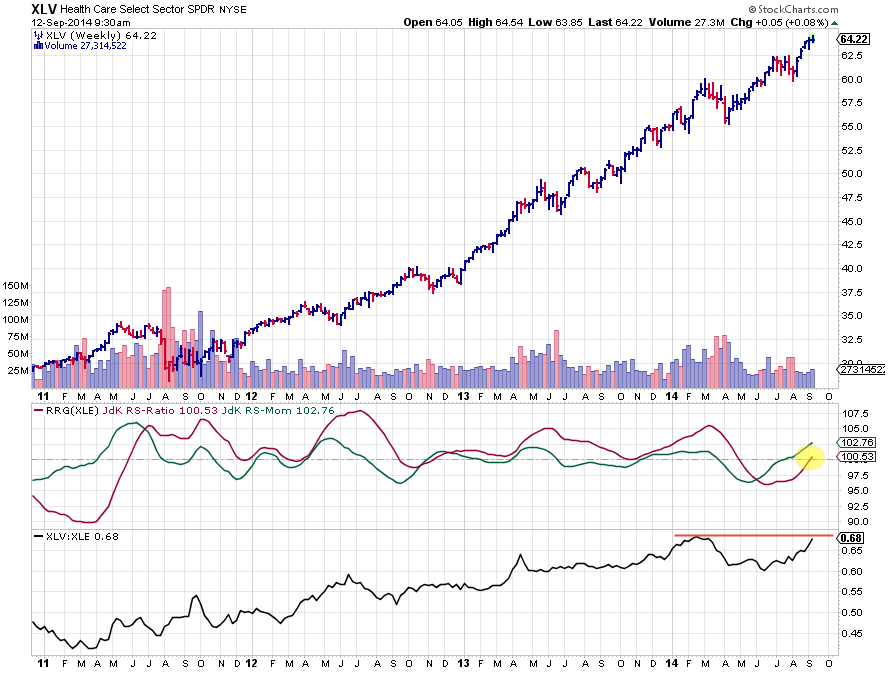
The relative trend comparing XLV with XLE has therefore just turned in favor of XLV again.
The point that I am trying to make here is that monitoring the direction of the move and the position on the JdK RS-Ratio scale of two securities on an RRG chart, enables you to quickly find (pair) trading ideas by sliding this (imaginary) vertical line from left to right looking for two securities that line up as that level on the RS-Ratio axis represents the 100-level in case of a 1-1 comparison plotted on a regular chart.
Conclusion
- XLV and XLK strongest sectors within S&P 500 at the moment
- XLK leading the way
- XLE losing power
Julius


