One of the comments on my last article (daily data now available for RRG charts) mentioned using RRG charts in relation to monitoring different asset classes, which just happened to be the subject of this article that I was already working on when the comment came in.
"Can RRG charts be used for monitoring / analyzing asset allocation?" The answer to this question is a full blown YES!
However, one thing that you have to keep in mind setting them up!
Apples and apples, oranges and oranges
By far the most important issue to tackle when setting up an RRG for asset allocation purposes is to make sure that all the elements in the universe, i.e. all the securities or indices that we are going to compare, are actually comparable. Probably THE most important comparison when it comes to asset allocation is the Equity / Bond comparison. Especially the bond / fixed income side of things is where we can go wrong. As you know (i hope) the StockCharts.com database contains numerous ticker symbols representing fixed income instruments including indices, investment funds, ETFs and yields..... and these are definitely not all comparable. What you want to look for in terms of fixed income instruments to include in your asset allocation RRG are "Total Return indices or funds". In other words, something that properly represents the return on a possible investment. This means that YIELDS ARE NOT SUITABLE!! Just as a reminder the chart of the 10-year treasury note price and the corresponding yield are each others inverse. This is illustrated in the chart below.
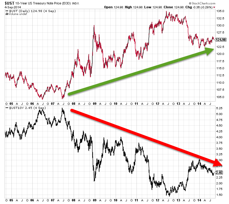
This chart shows the PRICE of the 10-year Treasury Note in the upper pane and the corresponding YIELD in the lower pane. The inverse relationship is clearly visible. Putting those two ticker symbols into a Relative Rotation Graph makes it even more clear.
The Relative Rotation Graph below holds the same two ticker symbols as in the chart above ($UST and $UST10Y). For the benchmark I have picked $CASHUS (Barclays Capital Cash Composite) which represents the return on cash held in USD, a benchmark that will never go down.
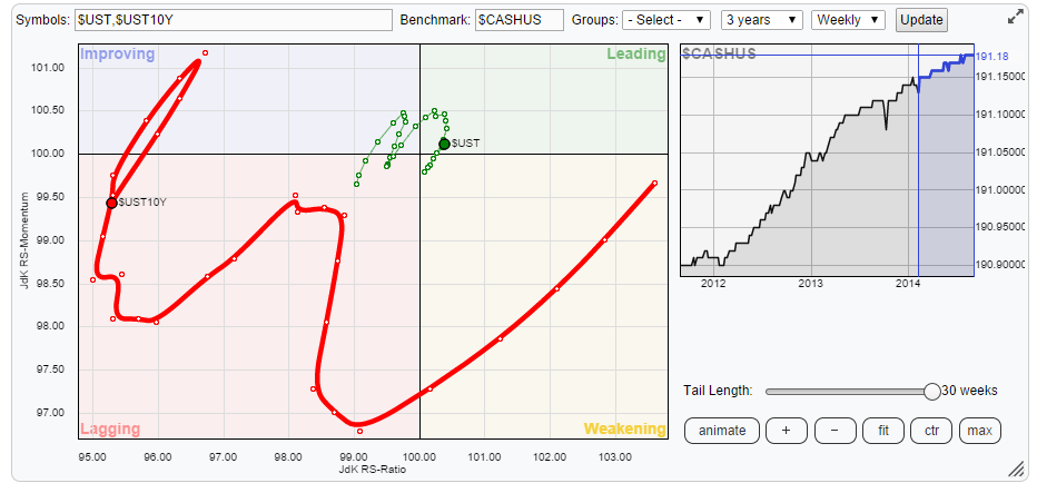
The inverse relationship between the two is well visible as is the much wider move of the yield in relation to the price. This has to do with the fact that bond prices are pretty high at the moment and therefore yields are low, so it takes quite a big move in price to cause a small move in yield or the other way around, a small move in yield causes a big move in price.
Note: If you are a subscriber to StockCharts.com you can click the RRG and it will open up the live RRG where you can use the chart-controls. Select <ctr> and click <animate> and remember that these two ticker symbols represent the same instrument!
All in all the basic point here is that you want the apples on one RRG and the oranges on another one.
Asset Allocation
Back to the asset allocation setup. In my Asset Allocation approach I prefer to keep a limited number of asset classes. Starting at a too wide array of 'asset classes' in the top of the pyramid does not make sense. So for this purpose I have setup a RRG-chart using 6 (US) Asset Classes.
- Equities : SPY
- Government Bonds : IEF
- Corporate Bonds (investment grade) : LQD
- Corporate Bonds (high yield) : HYG
- Real Estate : VNQ
- Commodities : DJP
For a proper comparison I will be using a 'balanced' benchmark. The ticker symbol for that is VBINX which is the Vanguard Balanced Index fund. It tracks the performance of a portfolio consisting of 60% US equities and 40% US bonds (broad market cap weighted). Plotting all these on a weekly RRG gives the picture below.
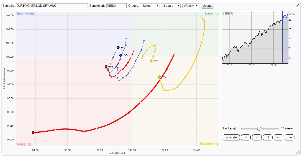
The one thing that immediately catches the attention is the position of commodities (DJP) in the far-left-bottom corner, deep inside the lagging quadrant. There is no doubt that that is an asset class which is better avoided.
Further inspection of the plot learns that we have two asset classes on the right hand (in relative up-trends) side and the remaining three others are on the left hand (in relative down-trends) side.
The chart below shows the relation between equities (SPY) and Government Bonds (IEF) in combination with the RRG lines and the basic relative strength line. The JdK RS-Ratio is above the 100-level, indicating a relative up-trend for equities over bonds since September 2012 and this move is still underway. The oscillation of the green JdK RS-Momentum line around the 100-level illustrates the (small) high-low rotations that occurred during this move of higher highs and higher lows in the relative strength line. All in all the trend has been picked up very well and it is still in play. Over the past few months a little loss of strength of this trend is visible bringing the JdK RS-Ratio closer to the 100-level and recently a declining JdK RS-Momentum line. Worth to keep an eye on but no alarm bells yet.
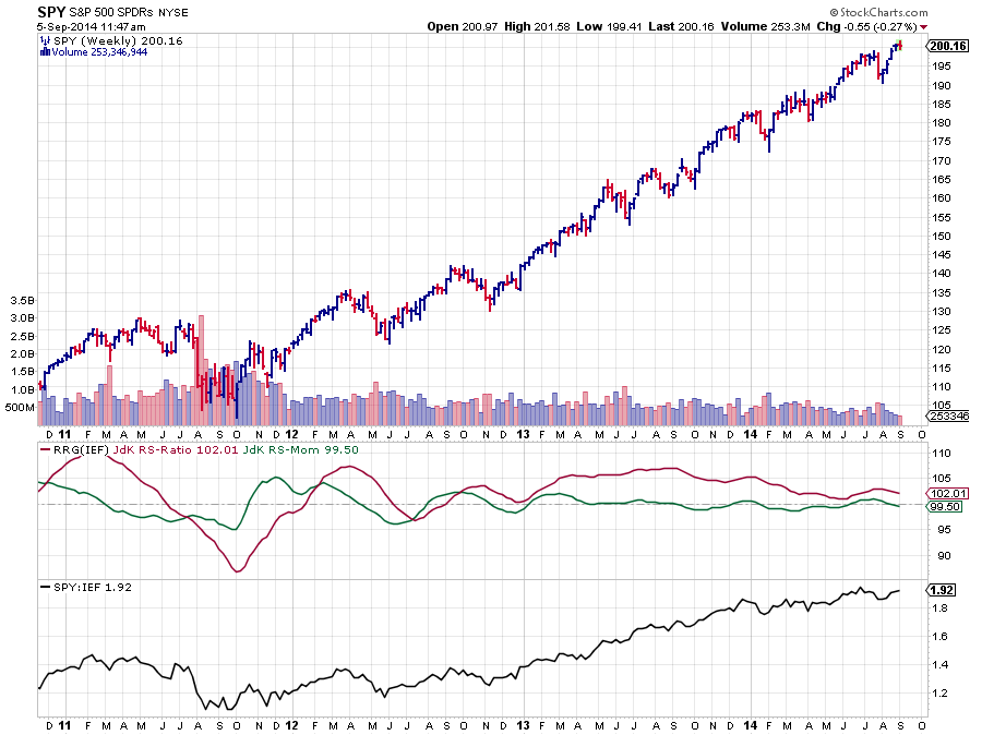
Opposite to the rotation of SPY, the fixed income instruments are all three recently showing some upward momentum but for the time being this is all still 'recovery in a longer-term down-trend'. All these instruments have neared the center of the plot (the benchmark), which undeniably brings a crossover to either side closer but we're not there yet. Because of the fact that everything is taking place very close to the benchmark it is better to wait for some sort of confirmation than to jump ahead, rotation can still take place completely on the right (for SPY and VNQ) or on the left (for IEF, LQD and HYG) hand side of the RRG.
Equities or Real-Estate
If we really want to find out which asset class is the strongest at the moment, and why wouldn't we?, we need to put SPY against VNQ which I have done in the chart below.
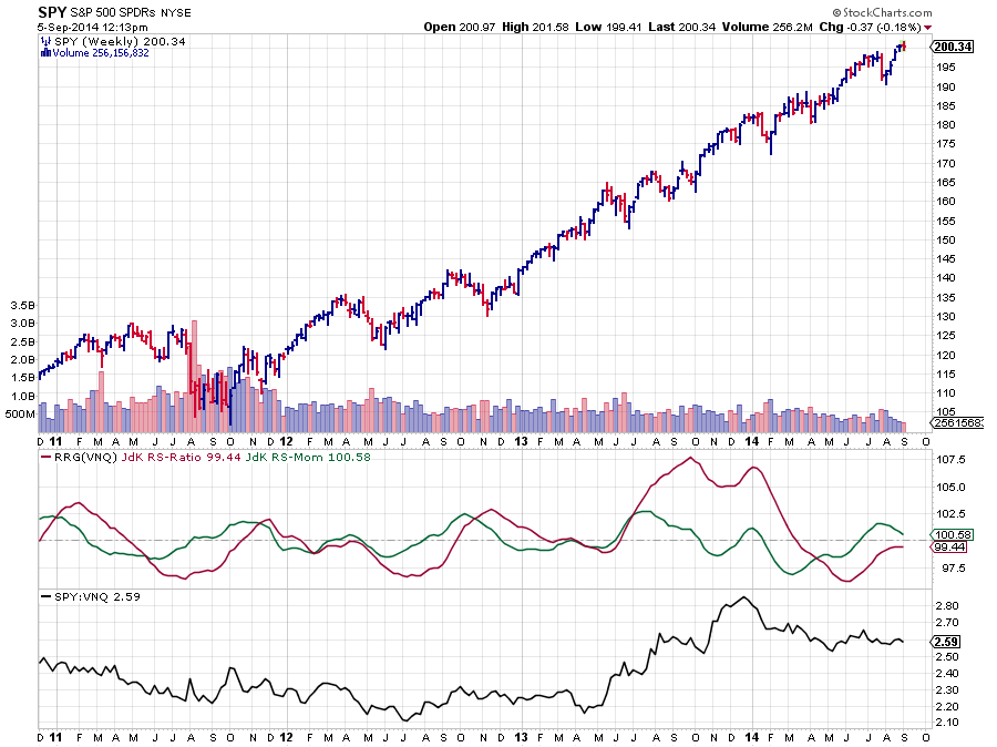
The fact that the JdK RS-Ratio line is moving below the 100-level indicates that SPY is trading in a relative down-trend compared to VNQ. This makes VNQ the strongest asset class for the moment. As you can see over the past few weeks the green JdK RS-Momentum line has started to move lower again, indicating a loss of momentum, while the RS-Ratio is still below 100. Assuming that this loss of momentum will continue a little longer leads to the conclusion that VNQ will remain the strongest at least for a few weeks longer.
Conclusion
- Risk assets (equities & real estate) are still preferred.
- Commodities are not even close to becoming relatively attractive
- Real Estate is stronger than Equities
- For the time being the relative trends are intact but they need to be watched as rotations are nearing crossover levels.
Julius
