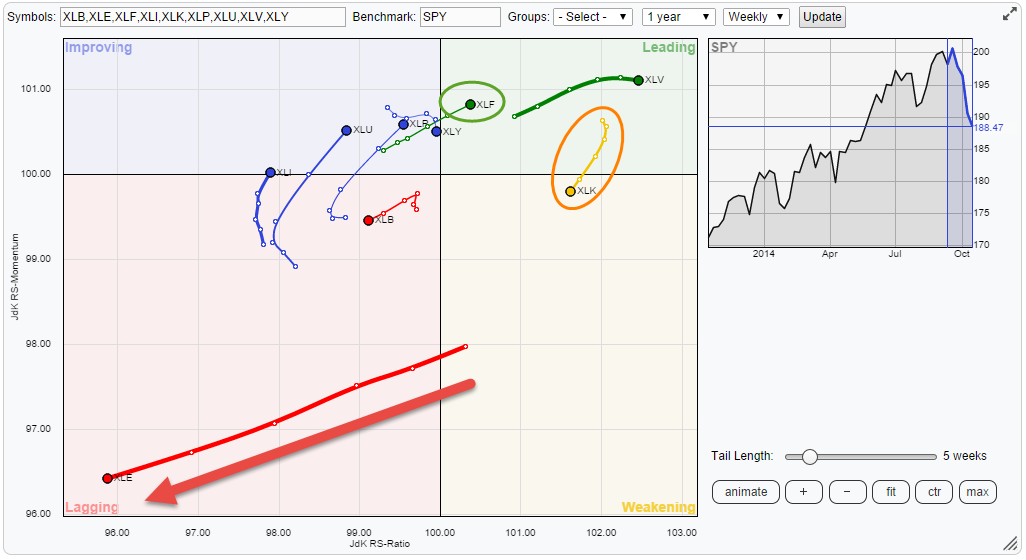
Printed below is the weekly Relative Rotation Graph(tm) of the nine S&P sector ETFs against SPY. The clear eye-catcher on this picture is the move of XLE (Energy) deep inside the lagging quadrant and still heading deeper into it. The second observation is that the strong relative trend for XLK (technology) got damaged in the recent market decline and the sector moved into the weakening quadrant. On a more positive note we see that XLF (Financials) has been able to keep up its improving relative strength over the past few weeks and is now entering the leading quadrant.
Energy (XLE) continues weak rotation
The strongest move on the Relative Rotation Graph with sector ETFs is undoubtely XLE. The weak rotation for this sector has been visible for a while already and the the length of the trail pointed to a strong (downward) move over the past few weeks. That move is now panning out and the downward relative trend in XLE is getting more mature. Be careful this is by no means a sign that it is about to end or reverse.
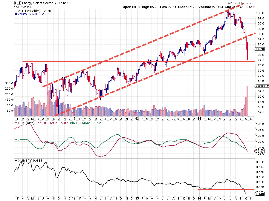
The picture above can clarify this. If we start on the price chart it is very clear that the upward sloping channel, that originated in late 2011 has been broken, downward.....violently!! The subsequent price-drop was caught by a horizontal support level coming off the 2011 and early 2013 highs and the sector is currently bouncing up off that level. This sector will need some time to digest all this selling pressure. I am looking at the lower boundary of the previous rising channel as resistance to cap any upward moves for the time being.
The relative pattern was leading the price move back in August. Late July the JdK RS-Momentum dropped below the 100-level indicating that the relative up-trend was losing power. This initial weakening was then rapidly followed by the JdK RS-Ratio breaking below the 100-mark confirming the relative down-trend.
On the Relative Rotation Graph the sector moved into the lagging quadrant at that moment. Shortly thereafter the RS-line itself broke below its previous low, opening up new downside potential on a relative basis. It's the the angle of decent on both the RRG-Lines that is causing the long powerful trail on the RRG to keep pointing deeper into the lagging quadrant.
With such a strong down-move under its belt there are clearly chances for more or less powerful recovery rallies but for the time being that's how they should be judged... recovery rallies within a relative down-trend.
Technology got hurt but is not 'out' .... yet.
On the RRG above this sector is still clearly on the right hand side of the plot indicating that it is in a relative up-trend. As a matter of fact when we use the JdK RS-Ratio to 'rank' this sector universe XLK is the second strongest sector at the moment but going through a, temporary?, loss of momentum. A closer inspection of this sector on a price chart in combination with its RRG Lines reveals that things are not all that bad so far.
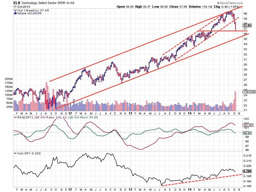
On the price chart we can see that XLK got hurt during the recent market decline but, unlike the XLE chart we saw earlier, XLK is still well within the boundaries of its longer-term rising channel and still has some room to manouevre before leaving it.
This picture seems to get repeated in the pane holding the RRG Lines as well as on the RS-Line itself. On the latter chart (lower pane) we can still see a rhythm of higher highs and higher lows indicating that the relative up-trend is still intact. This is confirmed on the middle pane, holding the RRG-Lines, where the JdK RS-Ratio line is still, well, above the 100-level, indicating an up-trend in relative strength.
An interesting comparison to make is between the wo trails of XLK on the one hand and XLE on the other. Where we saw XLE drawing a very long trail on the RRG, XLK is doing much less of that. As a matter of fact the trail on XLK is confined in a rather small area on the Relative Rotation Graph which indicates slow movements from week to week. This type of behaviour leaves the possibility for a rotation on the right-hand side of the RRG wide open which would confirm the strong relative trend for XLK at the moment.
Financials entering leading quadrant
Within all the negative price power in markets over the past few weeks the Financials (XLF) sector has been holding up remarkably well. XLF has been heading towards the leading quadrant for a few weeks already and has now definitely crossed over confirming its relative strength.
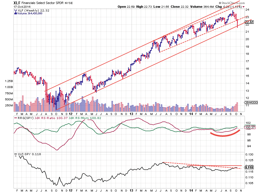
Reading from the chart above the up-trend in price is still intact with XLF bouncing off the lower boundary of the longer-term rising channel. From a relative point of view things are looking good and as said the sector just entered into the leading quadrant on the Relative Rotation Graph but it could use a bit more 'juice' so to say.
The RRG-Lines both crossed above the 100-level indicating an upward turn in the RS-line but just like the long-trails on XLE supported the negative view for this sector, the relatively short trail for XLF casts a little doubt about the power of this move at the moment.
A closer inspection of the RS-Line in the lower pane on the chart above learns that relative strength has only just started to break a falling trend-line running over the highs since mid-2013 while there's also still some overhead resistance coming off the two RS highs earlier this year. All in all I would say that financials are starting to look good from a relative perspective but I would love to see a bit more confirmation in the RS-line, preferably a break above the horizontal resistance level. It's an early call so some caution should be exercised.
Conclusion
- Energy (XLE) confirming strong relative down-trend
- Technology (XLK) got hurt but is still in a relative up-trend
- Financials (XLF) are improving but could use a bit more 'juice'
Julius


