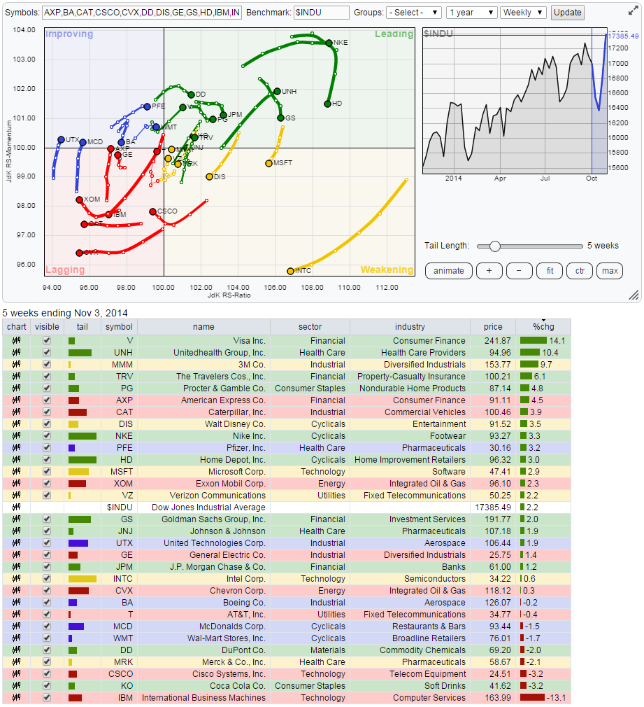
The Relative Rotation Graph below shows the members of the Dow Jones Industrials index with that same index acting as the benchmark. As all members of the benchmark universe are present on the plot we call this a "closed universe".
Open and Closed RRG-charts
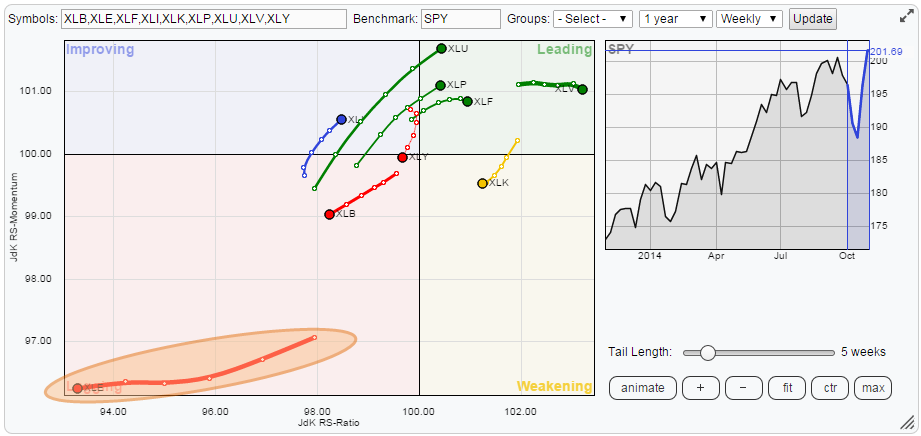
On a RRG holding a closed universe we can expect to see the members more or less evenly spread out over the canvas. On a Relative Rotation Graph holding an open universe this is not necessarily the case.
Let's use the S&P 500 Energy sector as an example. This sector has been a huge under-performer over the past weeks/months and the sector index or ETF itself is moving deep inside the lagging quadrant on the Relative Rotation Graph with the S&P 500 as the benchmark (see chart below).
If we now want to take a closer look at what's going on inside the Energy sector we should plot a Relative Rotation Graph of the members of the Energy sector index against the S&P 500 Energy sector index as the benchmark. This is done in the RRG below.
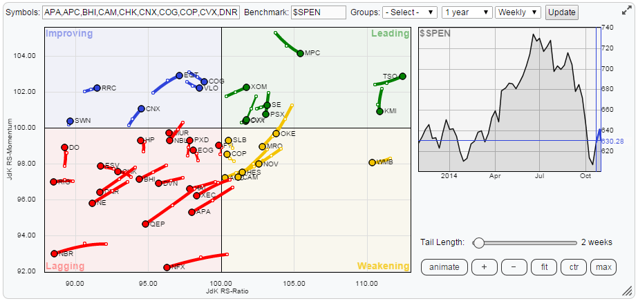
What we see here is again, just like the RRG of the sectors against the S&P 500 itself a more or less evenly spread out universe. On the plot of the energy sector there are a bit more individual stocks in the lagging quadrant when compared to the number of stocks in the leading quadrant but don't be fooled! Inside the leading quadrant you will find both XOM and CVX who, together, make up almost 35% of the Energy sector so mathematically we need more weight, in this case more smaller weight stocks, opposite of XOM and CVX.
Bear in mind these two RRGs, sectors against S&P 500 and Energy stocks against S&P 500 Energy index, are both closed universes.
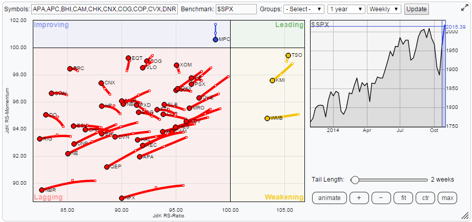
An open universe is when we would plot the members of the S&P 500 Energy index against the S&P 500 index itself (not the S&P 500 Energy sector index). In that case the 43 members of the Energy index are compared with the much larger universe of the 500 stocks that make up the S&P 500. And as we already know where the Energy sector is positioned on the Relative Rotation Graph we can, and should, expect the majority of the individual members, when plotted against the S&P 500 index, to show up in the lower left-hand, lagging, quadrant of the RRG. And this is exactly what happens as can be seen on the RRG below.
The Dow Jones Industrials universe
Back to our closed universe of the Dow Jones Industrials index. On the RRG below I have toggled off (by un-checking the boxes in the table below the chart) most of the names in order to high-light the four that are drawing my attention.
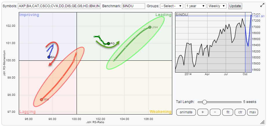
In the leading quadrant i am looking at PG and UNH where UNH is characterized by a very long tail indicating a strong move, heading further into the leading quadrant and PG by a short tail, indicating a more stable pattern but also turning upward again after a few weeks of declining relative momentum. In the lagging and the improving quadrant we find BA and IBM where IBM has a very long tail, clearly heading down deeper into lagging territory and BA a short tail but turning back down towards the lagging quadrant again.
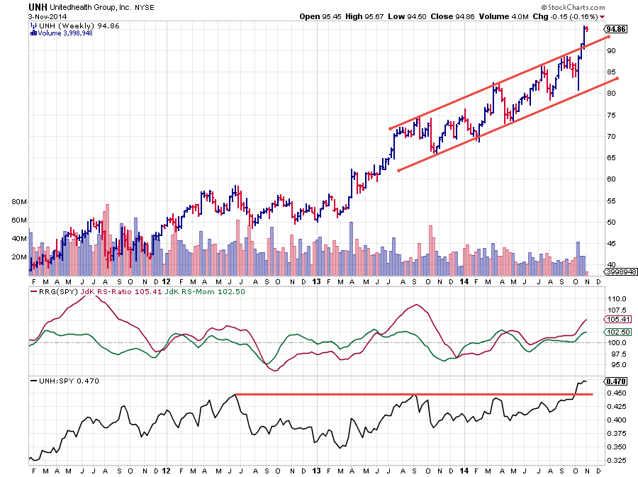
Unitedhealth Group
On the Relative Rotation Graph the tail of UNH stands out in a positive way. Over the past five weeks the stock gained on both the JdK RS-Ratio- as well as the JdK RS-Momentum axis, both at a steady rate.
A look at the price chart reveals that the stock has powered to the upside and broke above the rising trend line that was capping the upward channel since mid 2013.
If we combine this with a clear break above previous highs in the Relative Strength line, causing both RRG-Lines to move well above the 100-level, we have to conclude that more relative strength may be expected going forward. Especially dips back towards the breakout level should offer good opportunities.
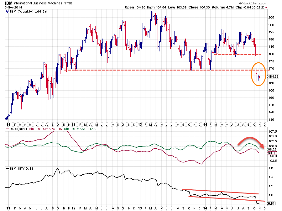
International Business Machines
The chart of IBM is showing pretty much the opposite picture. The stock moved lower on both axes over the past few weeks, causing the tail to point clearly lower into the lagging area.
The pattern on the price chart was not very strong to begin with moving more or less sideways for almost three years already and in a more pronounced range since the beginning of this year. This caused the JdK RS-Ratio to move below the 100-level for almost three years with only a small hickup in May of this year so the big drop of a few weeks ago was a confirmation of the already weak relative outlook.
This sharp decline caused IBM to break below a horizontal support level around 170 which will now start to act as resistance and very likely will cap any attempt of this stock to rally again. Risk/Reward is here clearly not in favor of long or overweight positions.
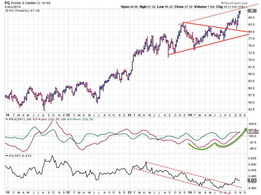
Proctor & Gamble Co.
The chart of PG shows a gradually up-sloping price pattern which broke out of a large symmetrical triangle back in August. The subsequent rally took PG up to the upper boundary of the rising channel that started to emerge. This potentially limits the upward potential for now but it gives ample opportunity to buy dips inside the channel.
The Relative picture is more interesting. As you can see on the middle pane with the RRG-Lines, PG has been an under-performer for a very long time (roughly since Q2-2013). But the improvement on the price chart has caused the down-trend in relative strength to turn around.
Both RRG-Lines are now back above 100 and moving higher while the raw Relative Strength line has left the falling channel and looks to be starting a new series of higher highs and higher lows.
It looks like there is more in the "relative" store here!
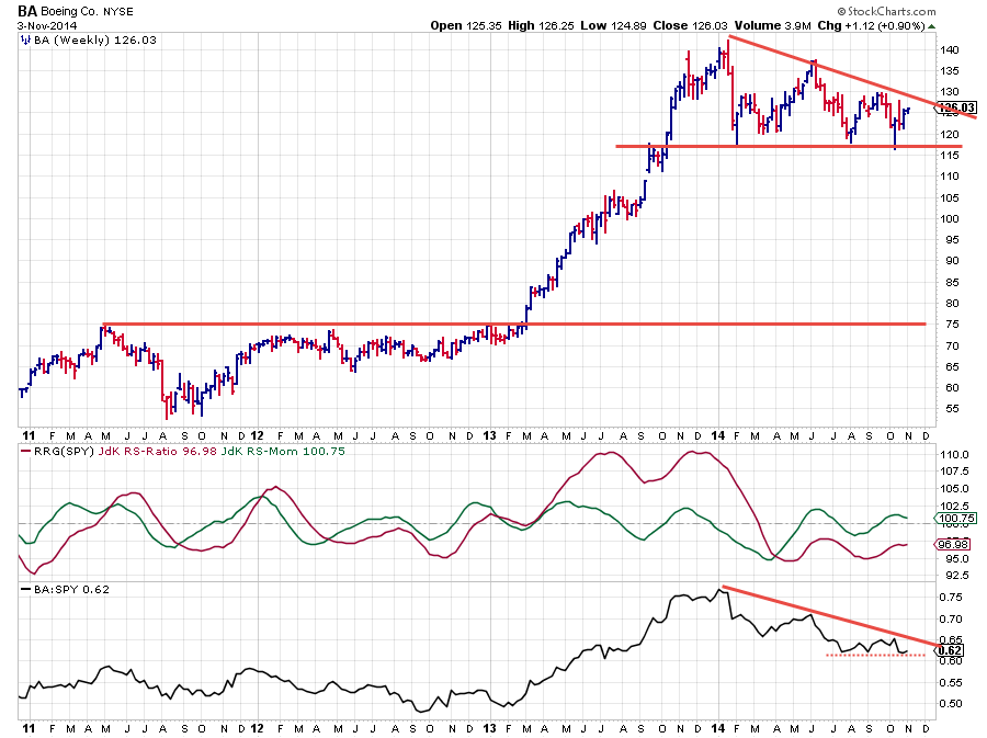
Boeing Co.
As the title of this article stated, BA looks to be on finals for a landing inside the lagging quadrant and if we keep the analogy we can add that it is doing so after a "touch and go" on the same runway back in the second half of July. A strong relative down-trend therefore.
The price pattern is showing clearly lower highs since the beginning of this year while support has been built up between 115-120. A break of this level is expected to have major (negative) implications in price terms.
The relative line is holding up at horizontal support for the time being but a break lower here is also expected to spark a new leg down in relative terms.
The JdK RS-Ratio well below 100, signals that a relative down-trend is still in full force. Further under-performance seems to be in the cards for the next few weeks.
Conclusion
- UNH powering ahead
- PG in steady relative up-trend
- IBM continuing its relative down-trend at full force
- BA turning down towards the lagging quadrant again
Julius de Kempenaer | RRG Research


