In the previous article on US sectors I mentioned Energy (XLE) and Consumer Discretionary (XLY) as sectors to watch for sector-rotation. XLE as being suspect and at risk for more or renewed under-performance and XLY as pushing further into the leading quadrant and thus expanding its out-performance. Looking at the current Relative Rotation Graphs for US sector-rotation below it looks like we have a third sector that is under-going a strong rotation.
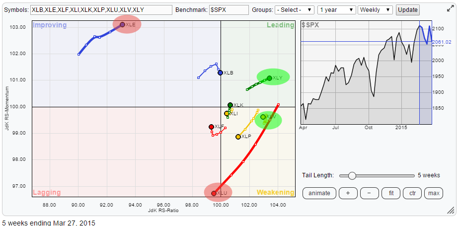
This third sector is XLU (Utilities). Over the past 5 weeks XLU showed a strong downward acceleration which just recently pushed the sector into the lagging quadrant.
XLE, measured by JdK RS-Ratio, is still clearly the weakest sector in this universe while the opposite goes for Consumer Discretionary (XLY) which remains firmly inside the leading quadrant and is still, gradually, moving higher on both axes.
The fourth sector worth inspecting further is Health Care. XLV is currently inside the weakening quadrant but it is the second strongest sector AND it is 'hooking' back up towards the leading quadrant, usually a sign for a strong relative trend.
Utilities nose-diving into lagging quadrant (XLU)
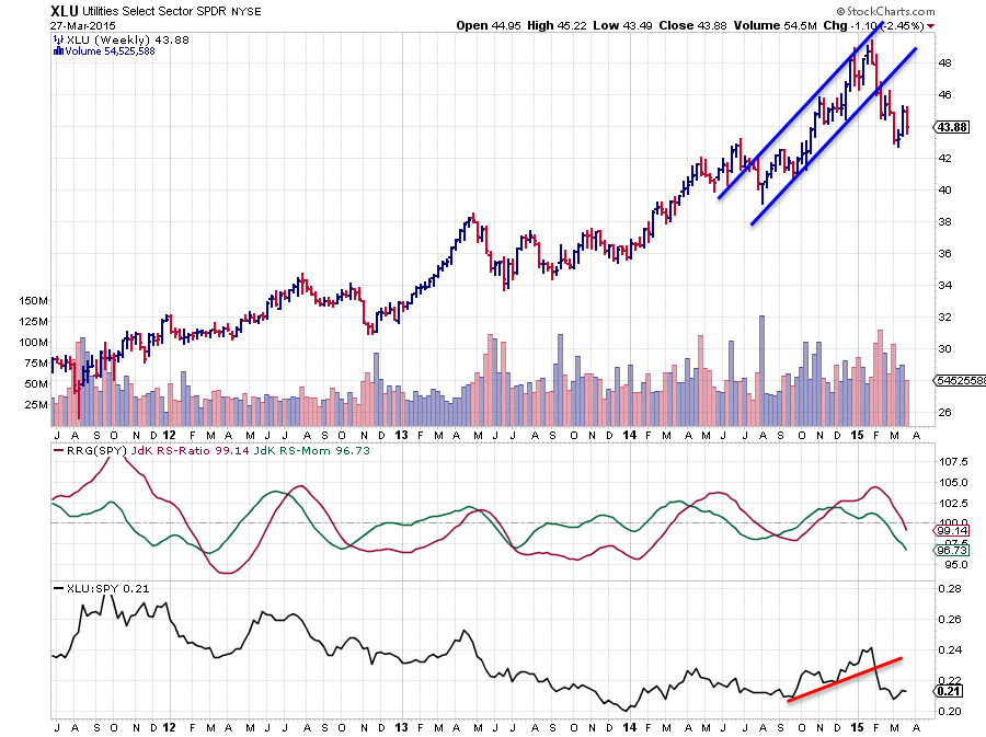
A look at the Relative Rotation Graph shows that the sector Utilities (XLU) is the sector with the longest trail,over the last 5 weeks, in the universe. This means that it is a strong move and in this case the move stretches out on both axes. XLU is heading lower on the JdK RS-Ratio axis which means that the relative up-trend in which it had been moving rapidly lost strength and actually turned down into a relative down-trend. The decline on the JdK RS-Momentum axis indicates that this weakening of the relative strength is backed by further weakening of the relative momentum.
An inspection of the price chart in combination with the RRG-Lines (above) shows this in more detail.
The up-trend in price had already been broken a few weeks, almost two months, ago. A series of lower highs and lower lows is now clearly visible here. On the relative charts, the raw RS-line in the third pane and the RRG-Lines in the second pane above also started to deteriorate. The raw RS-line dropped below a short-term rising support line at the end of January. At that time the RS-Ratio line was still above 100 but RS-Momentum was heading towards the 100-level. The change of direction in the raw RS-line was picked up by the RRG-Lines over the past 2-3 weeks pushing the Utilities sector clearly into the lagging quadrant now.
Given the speed of the move, reference the long trail, the clear break of support in the raw RS-line and the down-trend that is already visible on the price chart, a turn for the better is unlikely in coming weeks. It looks like more (relative) down-side price and relative action lies ahead for this sector.
Energy (XLE) move still questionable
I discussed the Energy sector more in depth in the previous blog on US sector rotation.
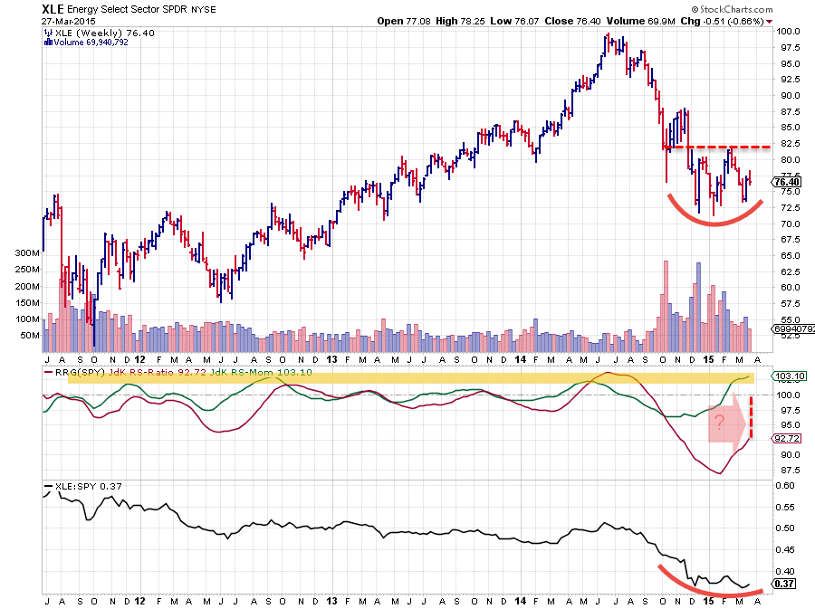
Compared to the position of XLE on the Relative Rotation Graphs about a month ago and now we can see that the sector started to move right more than up over the past weeks. This indicates that the trend in Relative Strength started to improve but that relative momentum started fading at the same time. With the sector still positioned at "low" RS-Ratio levels this still makes the move suspect.
The price chart of XLE in combination with the RRG-Lines above should clarify a bit more. The raw RS-Line seems to have found some sort of a support level and started moving sideways. This definitely is a sign of improvement from a relative perspective. This also started to show up in the RRG-Lines where the RS-Ratio line moved higher since January.
The problem is that the move started at such low levels, and still is at relatively low levels that it is very questionable whether the current RS-Momentum levels will be sustainable and able to pull the RS-Ratio line above 100 in this move.
If you look at the historical values for the RS-Momentum line in the graph above you will notice that current levels can be qualified as "high" in comparison with the history over the past 3-4 years. At the same time you can see that the RS-Ratio line, even despite the recent rise, is at very "low" levels in comparison with the past 3-4 years.
All in all this sort of rotation remains very questionable and can easily result in a turn down again soon and thus a rotation on the left hand (negative) side of the RRG. The best thing to do now is to monitor the relative (rotational) move closely in coming weeks.
Consumer Discretionary (XLY) firmly in the lead
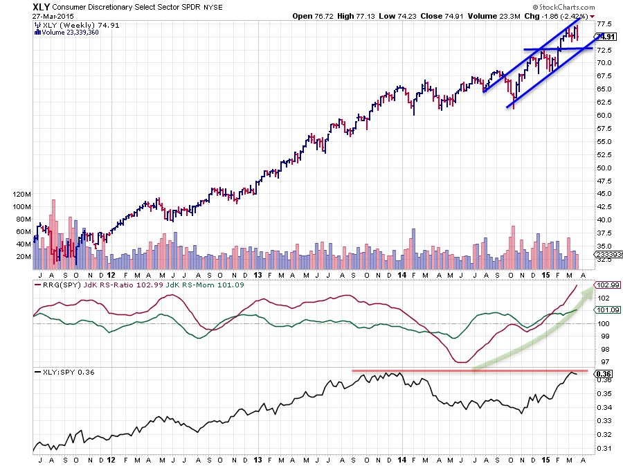
Consumer Discretionary is the other sector I discussed in the previous US sector rotation article.
This sector continues to push higher on both axes and thus deeper into the leading quadrant and it does so at a very stable rate. Compare the trails of XLE and XLY on the Relative Rotation Graph. The first one hard down with a long, slightly curved, trail, and the second one almost a straight line with a much shorter trail. A clear difference in stability!
The only one thing that needs to be monitored for the time being is the fact that XLY is pushing against horizontal support in the raw RS-line. Given the strong price chart and the strong relative move as depicted by the level of the JdK RS-Ratio there is not too much to worry about for now. As a matter of fact if the underlying power of XLY happens to be strong enough to break beyond this horizontal barrier, another acceleration in relative strength is likely.
XLV still a very "healthy" sector
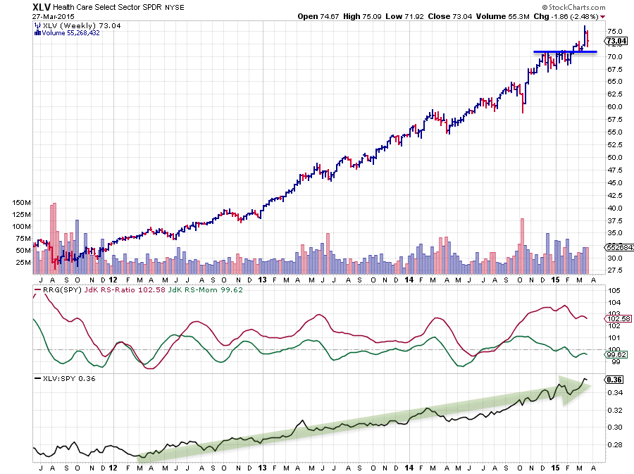
The Health Care sector (XLV) has been camping inside the weakening quadrant for the past few weeks but it does that with a minimal trail. Just look at the RRG at the top of this post. XLV is the only one that fits inside the shaded oval INCLUDING its trail, all others are using a lot more space on the RRG. The fact that this is happening on the right hand side of the plot indicates that the relative strength is still up and at a very stable momentum level.
The (relative) trend in XLV is such a text-book example of how RRG and relative strength moves can get you ahead of the game that I used it in my presentation at the MTA symposium in New York last week. A lot of people often ask what the typical duration of a relative trend is. My answer always is that I use a minimum of 3 months as a rule of thumb (based on a weekly RRG chart) but that my experience is that these relative trends often last much longer than 3 months. The current move in the Health Care sector makes a perfect example for that.
Conclusions
- Utilities nose-diving into lagging quadrant
- Energy move remains questionable
- Consumer Discretionary silently pushing deeper into leading quadrant
- Health Care still very healthy
Julius de Kempenaer | RRG Research
RRG, Relative Rotation Graphs, JdK RS-Ratio and JdK RS_Momentum are registered TradeMarks by RRG Research


