The Relative Rotation Graph holding a number of ETFs tracking various asset classes continues to be dominated, or distorted if you wish, by the two asset classes that are moving far away from the center for quite some time already.
Regular readers of this blog will recognize VNQ (Vanguard REIT Vipers) on the right-hand side and DJP (iPath Bloomberg Commodity Index Total Return ETN) on the left-hand side.
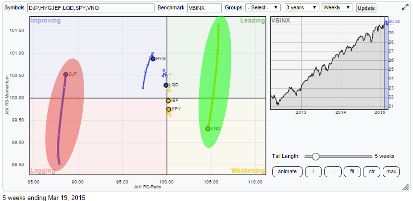
A very quick and dirty conclusion could be to remain Long, or overweight, Real-Estate and Short, or underweight, Commodities. but let's look a bit more in-depth to what's going on in terms of asset class rotation.
Vanguard REIT Vipers (VNQ)
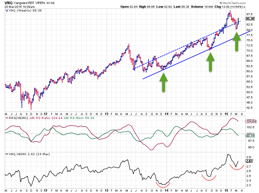
The weekly price chart of VNQ is characterized by three major lows since the start 0f 2014 that each came in at a higher level. Hence it is pretty safe to conclude that an up-trend is still in play here.
In the period from December 2014 - January 2015 VNQ rallied higher and even broke above a rising resistance line connecting a few recent highs. I agree that that rising resistance line can be drawn in more than one way so I eye-balled it and put it somewhere in the middle to get the picture, which for me is more important than trying to pin-point some exact numbers.
After a high just shy of $90, VNQ went through a correction of nearly two months which ended near $80. This corrective move is clearly visible on the price chart but it did not harm the long-term up-trend.
On the relative charts (RRG-Lines and raw RS-Line) the picture is not much different. In the RS-line a similar sequence of higher lows is visible confirming the up-trend in relative strength against the benchmark*. In the RRG-Lines, the red JdK RS-Ratio line is still well above 100 indicating an up-trend in relative strength. The green JdK RS-Momentum line just dipped below 100 indicating some loss of relative momentum but given the distance of the RS-Ratio line above 100, which measures the intensity/strength of the trend, it is unlikely that the trend in relative strength is turning negative from here on.
The recent decline in both price and relative strength are therefore judged as a correction within the longer-term up-trend which is likely to pick up again soon.
* The benchmark used in this RRG and the accompanying price charts is VBINX (Vanguard Balanced Index Fund)
iPath Bloomberg Commodity index Total Return ETN (DJP)
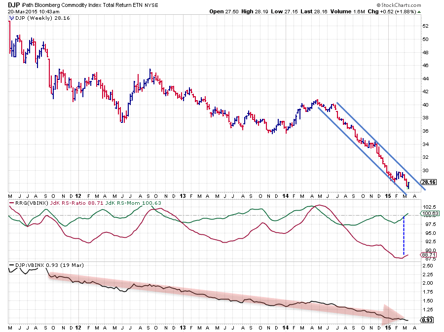
The picture for commodities is almost the exact opposite of that of real-estate. The raw RS-line is in a very, very solid down-trend for well over three years now. prices of this basket more or less halved. The JdK RS-Ratio has caught almost all of this relative down-trend against the VBINX benchmark.
At the moment the RS-Ratio line is being dragged up somewhat by a rising RS-Momentum line which is just peeking above the 100-mark. However, just like in VNQ, the RS-ratio here is far away, in this case lower, from the 100-mark and this makes an immediate turn up in relative strength very difficult. A lot of up-side price and relative power will be needed to make that happen.
So for the time being the existing down-trend in relative strength is expected to continue its path lower.
VNQ <--> DJP
An even better of this relationship can be seen when the price charts of VNQ and DJP are plotted on one graph, in combination with the RRG-Lines and raw RS-line of VNQ against DJP. This picture is plotted below.
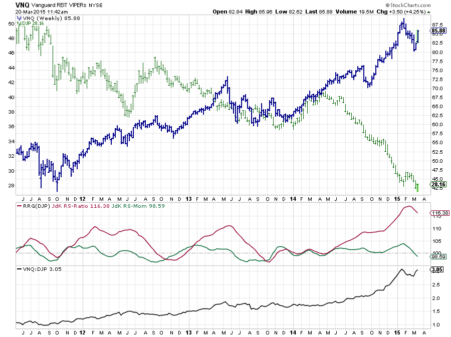
Needless to say that the blue bars are VNQ and the green bars are DJP. Together they form an almost perfect "scissor-chart" (don't google this, I just made it up ). On a more serious note look at the slope of the RS-line in the lower pane, up-up-up and away!
With two exceptions in Q4-2012 and Q3-2013 (followed by a flat period Q4-13 / Q2-14) the RS-Ratio line has moved well above 100, indicating that a (strong) relative up-trend was and still is in play.
For sure this ratio is over stretched and risk is increasing but as we like to follow trends and not 'predict' turns I'll stick with it for the time being.
RRG scribbles
When I start to prepare for writing a blog-article I usually print off one or two RRGs covering the universe(s) that I want to write about. With the print in front of me I then start to make up my mind and make small notes and remarks on the print to line up my thought process and remind myself of the charts I need to investigate and potential areas of interest.
You can see my scribbles for this article in the picture below.
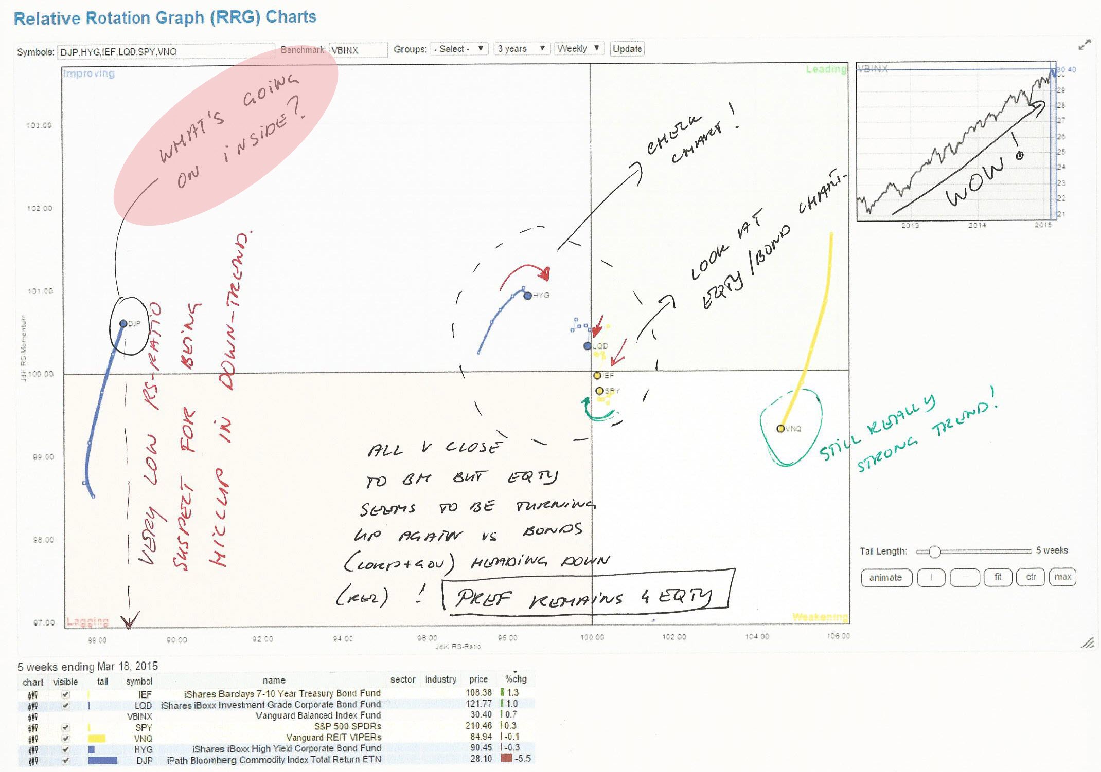
One of the remarks I put on that chart was for DJP to "check what's going on inside". And so I did.
Inside commodities.
The way to dive into the commodities asset class is to set-up a Relative Rotation Graph holding the various sub-groups that make up the general commodity index.
For this purpose i have used the Dow Jones UBS index family of commodity groups (which has recently been taken over by Bloomberg so technically they are now Bloomberg commodity indices). At the moment this RRG looks like this:
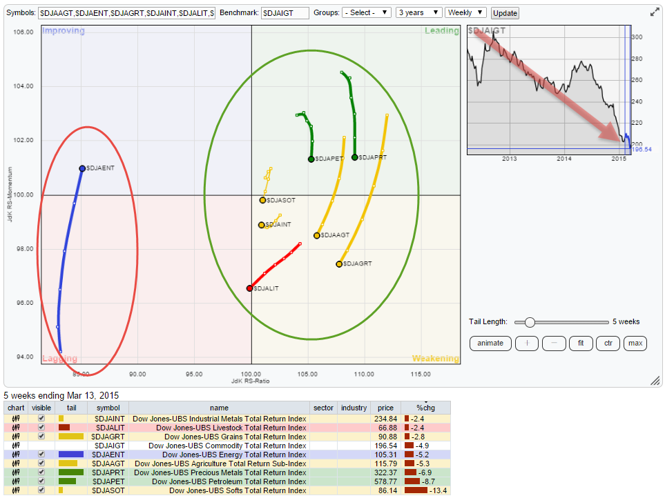
First of all the price-trend of the group as a whole, mimicked by the DJ-UBS Commodity TR index ($DJAIGT), is clearly down. The positions of the various sub-groups on the RRG will tell you more about the inner forces at work in this general move.
In this case you see $DJAENT on the left (negative) and ALL other groups on the right-hand (positive) side. This means that Energy is the biggest culprit of all this commodity misery. Almost all individual charts for these groups show declining price trends but Energy is that one that is clearly the worst within this universe.
What i wondered is: "Has this always been the case during this multi-year down-trend in commodities" so I played back the rotation using the slider on the RRG graph (the one overlaying the benchmark chart). The RRG below shows the RRG of the same universe but now back-dated to early 2014.
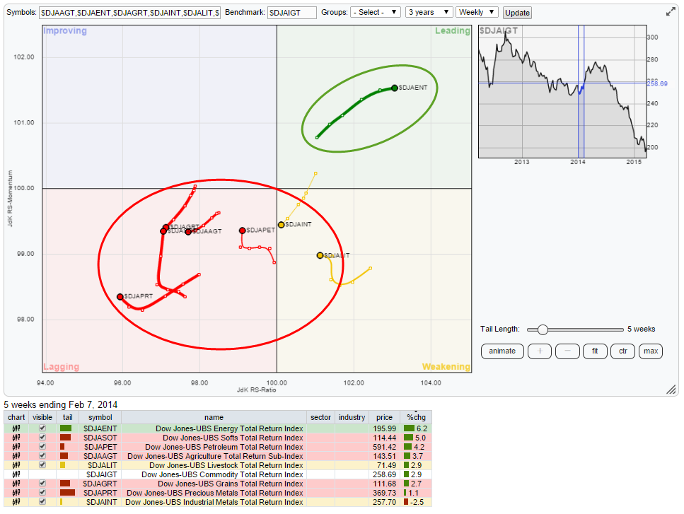
As you can see the situation at that time was almost opposite. The Energy group as a lone ranger in the leading quadrant and, almost, ALL other groups in the lagging quadrant. Compare that to the situation on the benchmark chart ($DJAIGT) and you see that commodities as a whole at that time started a temporary up-move. The move in Energy dragged the benchmark up and left the other groups behind.
If you want to play back and forth the history on the RRG for this universe you can do so with this linkable version. What you will see is that Energy has more or less been swapping positions with the rest of the universe, speeding up and slowing down the general down-move in commodities.
With Energy being such an important sub-group it's almost sure that we will need to see a turn-around and improvement on the price chart for Energy (related groups) before a turnaround of the relative strength of commodities as a whole will become a serious possibility. For the time being commodities remain in trouble.
Conclusions
- VNQ / DJP relationship continues in favor of VNQ
- Inside the commodities universe, Energy is dragging the universe lower
Julius de Kempenaer | RRG research
RRG, Relative Rotation Graphs, JdK RS-Ratio and JdK RS-Momentum are registered TradeMarks by RRG research.


