It is time for a look at the relative rotation of the Dow 30 industrial stocks again. The Relative Rotation Graph below shows the 30 stocks that make up this index.
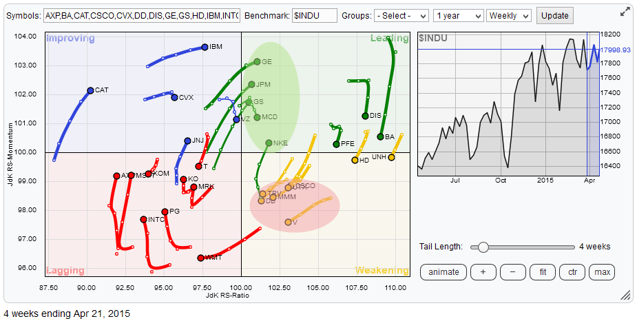
When I look at that RRG there are two things that immediately catch my eye.
The first thing is the 'cluster' of stocks that just started heading into the leading quadrant from improving, in combination with one that is 'returning' to the leading quadrant from weakening. The second is the cluster of stock that are inside the weakening quadrant but heading towards the lagging quadrant at different angles.
Weakening
Let' start with the 'not-so-nice' rotation and zoom in on that area for better visibilty.
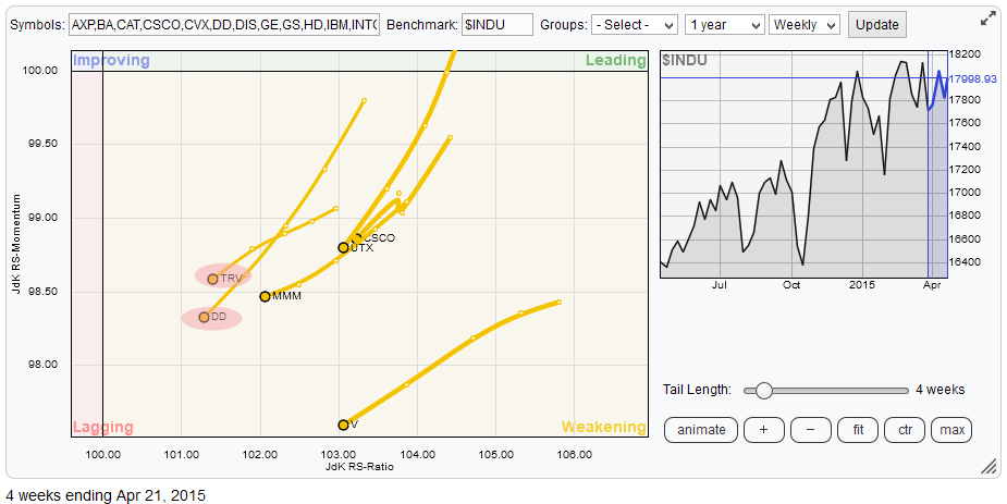
Within this group of stocks there are, to me, two that stand out in a negative way compared to the others. Not surprisingly these are the two stocks with the lowest Jdk RS-Ratio; TRV and DD. At this point in my analysis I like to inspect the price charts of those ticker symbols to make up my mind. For that I use the layout that I always use in my blogs as well, which is simply a price chart (weekly), the two RRG-Lines and a raw relative strength line.
I hope that you agree with me that when you look at the charts of these individual names it can be concluded that the relative trends for all but TRV and DD are still up which makes them candidates for returning back up towards the leading quadrant again in order to resume their relative up-trend against $INDU.
The Traveler Cos (TRV)
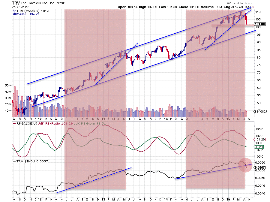
The (weekly) chart of TRV above shows that the price is still within the boundaries of the rising trend channel which is visible over the past three years. When using a thick marker probably the same can be said about the (raw) relative strength line in the lowest pane of the chart. However there are some similarities with a past period that make me cautious with regard to the coming (relative) performance of this stock.
When I compare the price and relative developments in the period May-2012 to May-2013 with the period May-2014 until now I see a somewhat similar setup. In both periods price is clearly in an up-trend but breaks a short-term rising support line (at a steeper angle). Also in both cases the relative strength line is in a longer-term up-trend but breaks a steeper angled support-line. In both cases the JdK RS-Ratio line has spent a considerable amount of time above the 100-level, indicating a relative up-trend and in both cases we have seen the JdK RS-Momentum line oscillating around 100 on two occasions (rotating on the right hand side of the RRG plot).
While I am writing this blog I see the price of TRV dropping like a stone and nearing the horizontal support level around 100 on the price chart. This confirms the signs of weakness as described above and seems to suggest that a period of weak(er) (relative) performance lies ahead.
DuPont Co. (DD)
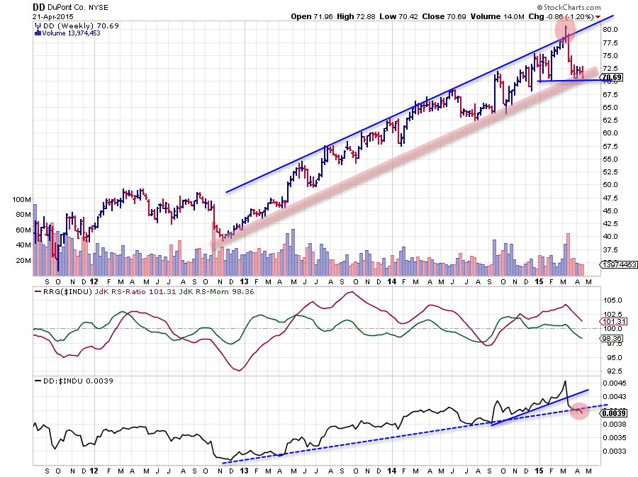
The weekly chart of DD shows a strong up-trend in price that emerged out of the late 2012 low and worked its way higher within the boundaries of a rising channel. This trend resulted in a break above the rising resistance line in the first week of March but that break was reversed very quickly resulting in a blow-off.
The expected behaviour when a price returns back into its rising trend-channel after an upward break is to go for, at least a test of, the lower boundary of that channel. in this case levels near 70. This happened in the weeks following the drop back into the channel and price has been resting at support around 70 for three to four weeks now.
A break lower means that the short-term horizontal support around 70 will be broken while at the same time the rising support 'zone' will be taken out. Such a move will very likely trigger a downward acceleration in price.
From a relative point of view the situation is not much better. A short term rising support line in the RS-line has already been broken downward and the longer-term (dashed blue) support line is under attack at the moment and seems on the verge of being broken downward. Remember that it is not the end of the week yet so there is still a chance that the RS-line will close the week at or above support but chances seem to be diminishing every hour now. The JdK RS-Ratio line is still above 100 but the RS-Momentum line, already below 100, is dragging relative strength down quickly.
All in all not a very strong chart with enough warning signs to be cautious about (relative) performance in coming weeks.
Leading
The second cluster of stocks as mentioned above are highlighted in the (zoomed in) RRG below.
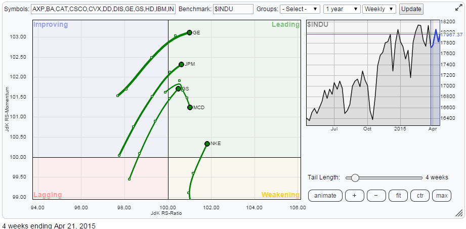
The odd one out in this group is MCD and if you look at the chart you will be able to notice why that is.
This stock is trading in a very broad trading range (~90 - ~100) for roughly two years now resulting in a relative strength line showing a shallow angle of descent. The JdK RS-Ratio picked up a small relative up-trend but it seems that JdK RS-Momentum is almost immediately negating that new move. As all this is happening very close to the benchmark; it is difficult to make a call, so better play safe and not jump on the train yet.
Another stock that stands out in this small group is NKE. Unlike the others NKE headed back into the leading quadrant after a stint through the weakening quadrant but it rotated back up on the right hand side of the RRG plot, confirming its strong (relative) up-trend. If you inspect the charts you will find that both up-trends, price and relative, are still fully intact for NKE.
Goldman Sachs Group (GS) & J.P. Morgan Chase & Co. (JPM)
The moves in JPM and GS are almost identical, both on the RRG chart as well as on their price charts. The picture below shows JPM as it looks, only, slightly better than GS based on a higher JdK RS-Momentum value.
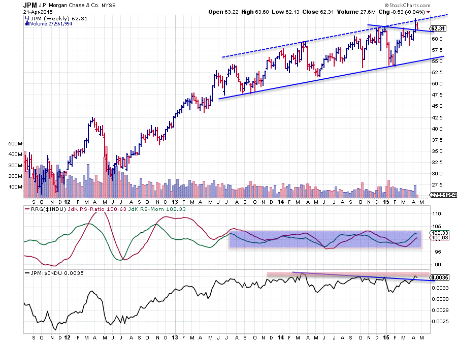
It's not the best chart you've ever seen but it is one of the charts within the Dow that is attempting to break out to the upside and challenging its recent highs in that process. JPM has broken a slightly downward sloping resistance line last week and at the moment this former resistance level seems to hold up as support which is a positive sign.
Levels around 62 are to be watched for support now and potentially a jumping board for a next move higher.
On the RS-line a somewhat similar pattern exists. The slightly downward sloping resistance line that connects the high in the RS-line since early 2014 seems to be broken upwardly. However, a resistance zone (red shaded area) can still be seen as a hurdle. The JdK RS-Ratio and RS-Momentum lines are starting to push above the 100-level suggesting that a new relative up-trend is in the making. As said the picture for GS looks almost identical.
General Electric Co. (GE)
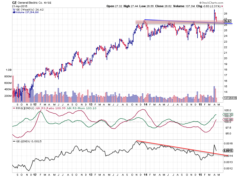
Three weeks ago GE blasted through the slightly downward sloping resistance line that kept the stock under pressure for almost a year. This also resulted in a sharp up-move in the RS-line which had already started to rise slowly a few weeks prior.
Before the break higher on both the RS- and the price- charts the JdK RS-Momentum line had already crossed above 100. The additional (relative) momentum created by the sharp move higher is now pulling the relative performance up and dragged the JdK RS-Ratio line above 100, suggesting that a new relative up-trend has started.
After the break on the price chart GE set a new high near 28.70 and then started correcting back. At the moment the stock is finding support at the former resistance and breakout level which is now acting as support.
Provided that this support level in the 26 - 26.50 area holds up this could be a good (re-) entry point to participate in a new (relative) up-move.
Conclusion
- In the Dow universe two clusters of stocks are visible rotating in opposite directions
- TRV and DD are on the verge of starting new (relative) down-trends, caution with those
- NKE rotated back towards the leading quadrant from weakening, underscoring its strong relative trend
- JPM and GS are showing almost identical patterns and have potential for an upcoming period of out-performance
- GE looks to be offering good re-entry point after strong upward break
Julius de Kempenaer | RRG research
RRG, Relative Rotation Graphs, JdK RS-Ratio and JdK RS-Momentum are registered TradeMarks by RRG research.


