The Relative Rotation Graph below shows the rotation of various asset classes (ETFs) around a balanced portfolio as represented by VBINX (Vanguard Balanced Index Fund).
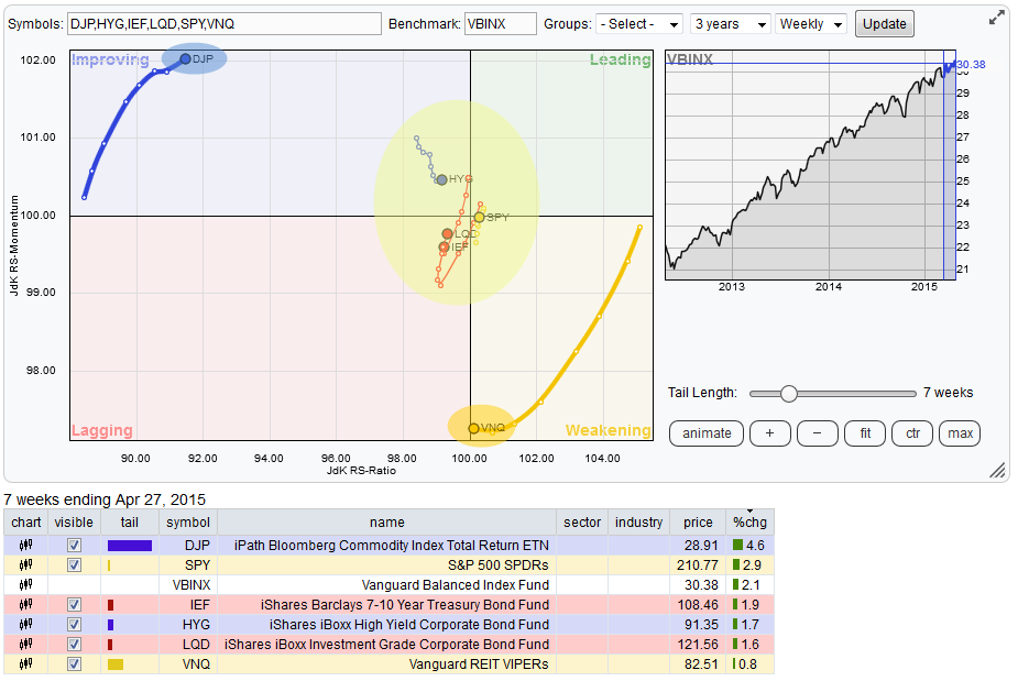
While reading this RRG the two asset classes that remain on the outskirts of the plot are commodities (DJP) and Real Estate (VNQ). All other securities on this Relative Rotation Graph are getting closer and closer to the center of the chart i.e. closer to the benchmark.
A rotation close to the center of the chart means that the performance of these securities lies in line with the performance of the benchmark. Hence it will be difficult to generate excess return or alpha from these markets.
On the RRG at hand this suggests that the only two asset classes where one can look for a performance away from the benchmark are Commodities and Real Estate. Clearly Real Estate is positioned to the right of Commodities which means that the relative trend between Commodities and Real Estate is still in favor of the latter. But rotation over the past 7-10 weeks shows relative momentum moving in opposite directions (in favor of commodities).
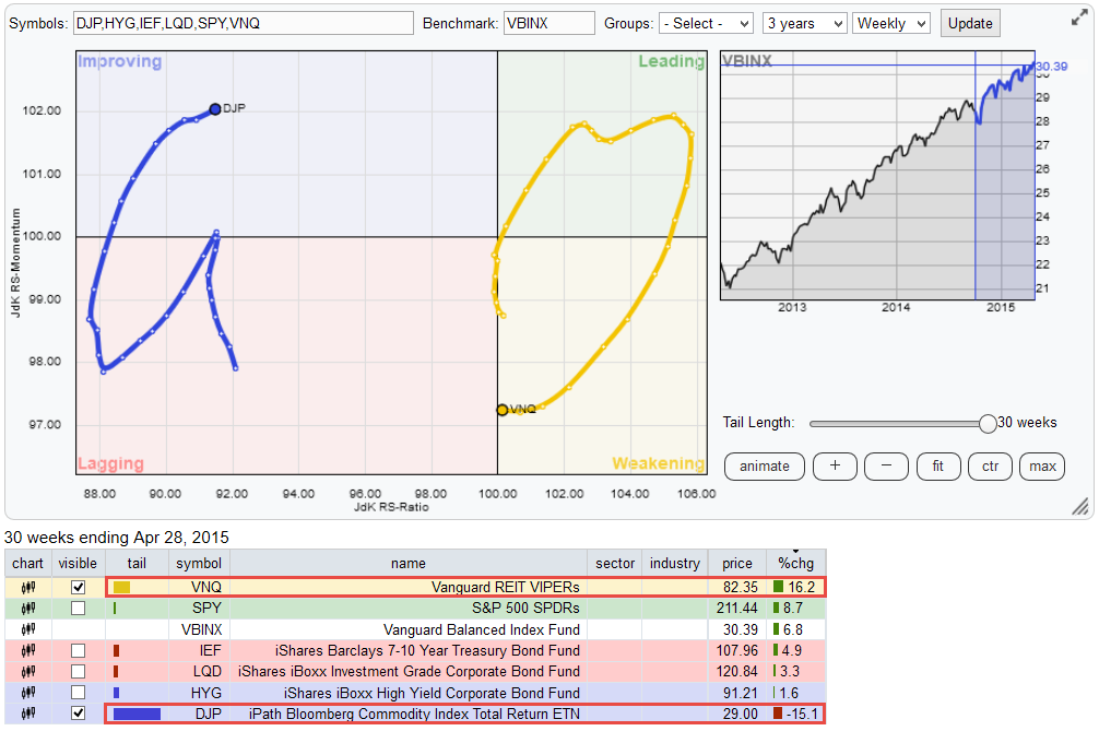
Be careful here, the fact that VNQ on the RRG is about to enter the lagging quadrant only means that the relative trend against VBINX is turning down. In comparison with DJP, VNQ is still far to the right i.e. in a relative up-trend. Putting an imaginary cross-hair between DJP and VNQ on the Relative Rotation Graph may help you grasp that concept.
Reading from the performance table below the RRG chart it can be seen that, the momentum driven move, over the past 7 weeks DJP has out-performed VNQ slightly less than 4%. When the trail is extended to 30 weeks (maximum trail length) the strength of this relative trend becomes clear(er).
Commodities (DJP) <--> Real-Estate (VNQ)
The best way to analyze this relationship is to run a direct comparison between DJP and VNQ
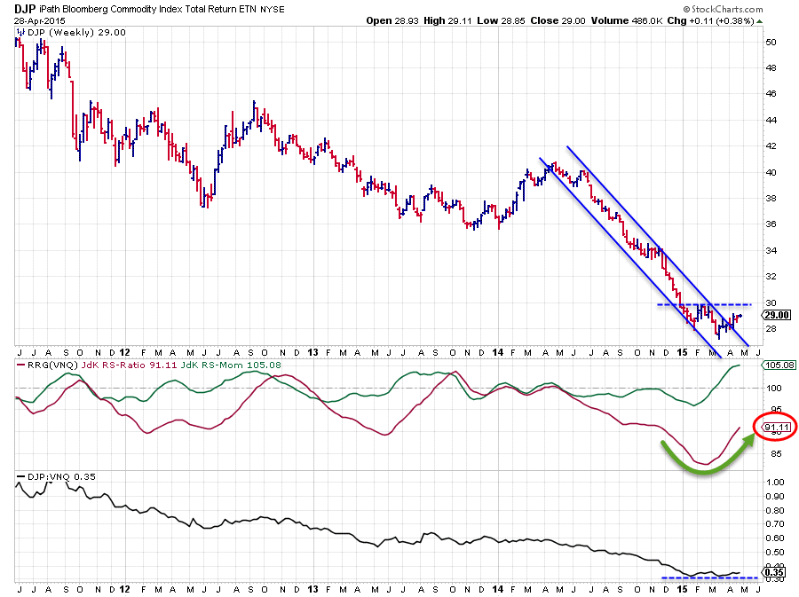
It looks as if DJP has left its steep down trending channel that was visible from June 2014 onward. The falling resistance line has been broken upward which is a positive, but the rhythm of lower highs and lower lows is still intact. $ 30 is the first important horizontal resistance level to watch. A break beyond that previous high will be another positive sign as it will stop the sequence of lower highs and subsequent lower lows. We are not there YET !!
From a relative point of view the big trend in the raw RS-line (lower pane) is still down, only the last two lows have formed around the same level which could point to some changes going on beneath the surface. This slight improvement since the beginning of this year has led to a rise of the JdK RS-Momentum line above 100 and a turn up in the JdK RS-Ratio line. The problem is that the level of the RS-Ratio line is still very very low while RS-Momentum has reached a relatively high level already.
It is usually very difficult for securities to maintain such a high level of relative momentum for a prolonged period of time and thus drag the relative trend (RS-Ratio) around to the upside without interruption. Given the very low RS-Ratio values and the fact that RS-Momentum has already started to level off again over the past few weeks indicates that it is still very well possible for the relative down-trend to pick up again and push the relationship lower once again.
Real-Estate (VNQ) <--> Commodities (DJP)
The relationship described above is not very "easy" to read. A good "trick" to potentially get a better handle in situations like this is to turn the chart upside down. Which in this case means running the relationship the other way around. This results in the chart below.
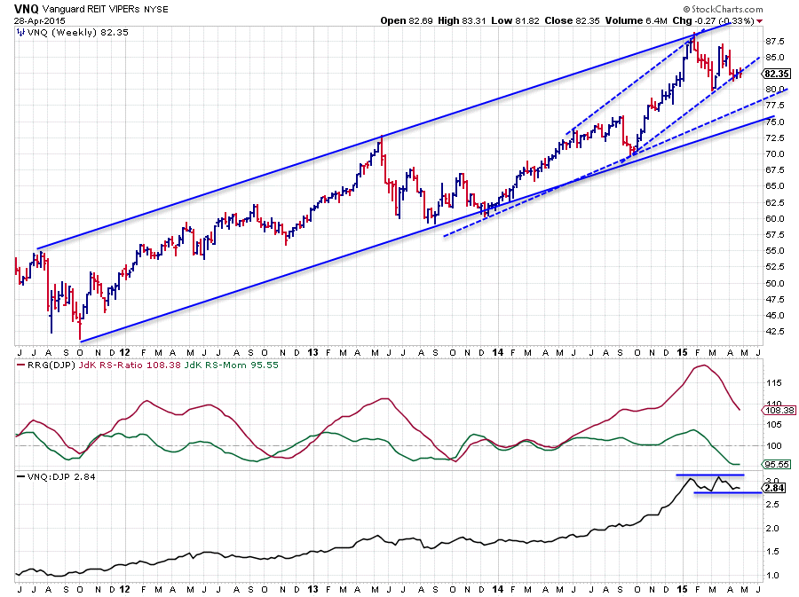
The VNQ price chart has some different characteristics when compared to the DJP chart earlier. Most obviously its trend is (still) up albeit at a less steep angle than the down-trend in DJP. Where DJP broke above its falling resistance line, VNQ is now testing the first rising support line. And as you can see there are a number of support levels found between the current price and the lower boundary of the long term rising channel. In other words; VNQ has quite a bit of room to maneuver before a material change in trend will occur
As to be expected the relative picture is the exact opposite of the reverse relationship. However due to the fact that the numerical value of the raw RS line is now around 2.8 instead of around 0.35 as on the first chart makes the highs and lows stand out a little better (the moves are more pronounced). This reveals that the most recent low in the RS line is actually higher than the previous one and also shows that the RS-line is still holding above its recent low.
The RRG-lines, which pick up the trends in the RS-line, are not impacted by its numerical level as a result of the normalization algorithm and they are sending the same (reverse) message. The relative trend is still clearly in favor of VNQ over DJP but recently this trend has lost some of its relative momentum. Price and relative development in coming weeks will very likely tell us if the recent pause is the prelude to a change in that trend or if it is 'just' a pause and that the trend will continue higher. The first thing I will keep an eye on is a possible completion of a double top (or bottom, depends on which chart you prefer to watch) in the RS-line. That would be a first sign for an upcoming reversal.
The remaining asset classes
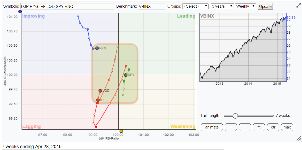
Hopefully when I zoom the Relative Rotation Graph in on the remaining asset classes it will become clear what I am aiming at with the heading of this article. All other securities on this RRG are cramped into a very small area around the mean of the chart (=benchmark). On the JdK RS-Ratio axis the area spans from roughly 99.25 to 100.75 or less and on the JdK RS-Momentum axis all is captured between 99.50 and 100.50. A very condensed area if you recall that DJP is way out around (92,102) and VNQ is found near (100, 97).
Also compare the length of the trails of DJP and VNQ with the other trail-lengths. The short trails and the closeness to the benchmark indicates an almost flat (=in line with benchmark) performance for these asset classes. One of the reasons why DJP and VNQ can move, so far, away from the benchmark is the fact that these asset classes are not included in this benchmark.
Hugging the benchmark
So all in all, from an investment point of view there is little to gain by choosing particular equity or fixed income instruments (ETFs) over simply getting them all together within VBINX. With DJP also heading higher on the RS-Ratio scale, albeit very slowly with still a long way to go, and VNQ virtually at 100 on the RS-Ratio axis it looks as if all asset classes are moving back in line with a balanced benchmark performance.
Probably the best chance to generate some excess return compared to VBINX and the situation to look for is when VNQ will start to curl back up and start gaining on the RS-Momentum axis and DJP doing the reverse.
Conclusion
- Commodities and Real-Estate continue to stand out on the RRG
- Relative up-trend of VNQ vis-a-vis DJP still intact despite loss of momentum
- All asset classes moving close or heading towards benchmark performance
- Hard to find opportunities for out-performance at asset class level
Julius de Kempenaer | RRG research
RRG, Relative Rotation Graphs, JdK RS-Ratio and JdK RS-Momentum are registered TradeMarks by RRG research.


