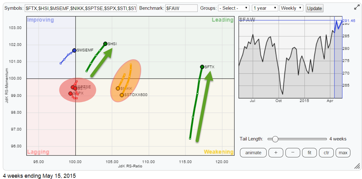
The Relative Rotation Graph below holds a number of world equity indices and shows their relative rotation versus the FTSE all world index ($FAW).
click the chart to open the live RRG
Initial observations
A couple of quick observations from the RRG before we move into more detail of the individual charts.
First of all China ($FTX) continues to stand out even despite the weak performance over the past few weeks. The relative trend versus the 'world index' as well as the other indices plotted on the chart continues to be extremely strong and there seem to be no signs of weakness ahead.
Working our way from China to the left of the plot we find the Japanese Nikkei index ($NIKK) and the European STOXX600 index ($STOXX600) clustered together and heading South into the weakening quadrant. Based on the JdK RS-Ratio value both are still in a relative up-trend but losing relative momentum. Given the relatively high values on the JdK RS-Ratio axis, this loss of momentum could well be temporary before the relative trend will resume. It is way too early to call a reversal.
The one index / country that stands out on this Relative Rotation Graph is Hong Kong ($HSI); it has the highest JdK RS-Momentum value and is heading deeper into the leading quadrant at an almost 45 degree angle which means that $HSI is gaining on both axes. Definitely worth a further look.
The MSCI Emerging Markets index ($MSEMF) is about to cross over into the leading quadrant from improving.
And finally we find Canada ($SPTSE), Singapore ($STI) and the US ($SPX) clustered close to the benchmark and just inside the lagging quadrant. The combination of being very close to the benchmark (cross hair in the middle) and the very short tails suggests that these indices are moving more or less in line with the FTSE all world index.
China ($FTX)
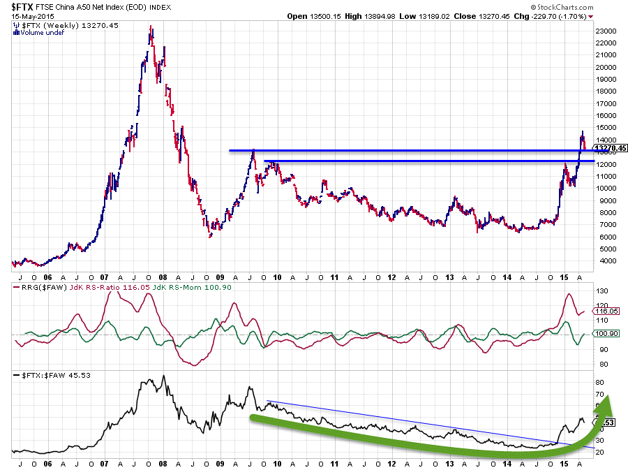
The $FTX chart remains very much of interest and the only way to properly analyse its developments is by looking at a long-term chart.
The chart above stretches out over ten years and that is needed to be able to see the interaction of current price development with the major peaks that were set back in mid and late 2009. The levels we are talking about are roughly 12 and 13.000.
In the beginning of this year the Chinese market peaked against 12.000, the level of the late 2009 top which acted as resistance. After a short setback this 12.000 level was taken out upwardly and the market started attacking the next resistance level near 13.000, coming off the mid-2009 peak.
As you can see on the chart not much defence was offered by that 13.000 level as the market blasted right through it in order to finally peak near 14.500. Not a new all-time-high (not by far) but a new 7-year high nevertheless and just shy of an intermediate top that was formed during the market slide in 2008.
This means that yet another resistance level (13.000) has been taken out which will now most likely start to act as support. The other thing is that the series of higher highs and higher lows which is visible in this chart is once again confirmed and based on that recent series; the previous peak near 12.000 will be a second support level to watch in case the current decline will extend further. This seems unlikely.
Finally the up-trend in relative strength has also been confirmed by the recent rise on the price chart as it broke above its recent peak. The JdK RS-Ratio line is moving very comfortably above the 100-level and JdK RS-Momentum is picking up again, suggesting we will see a further rise in relative strength going forward.
Emerging Markets ($MSEMF)
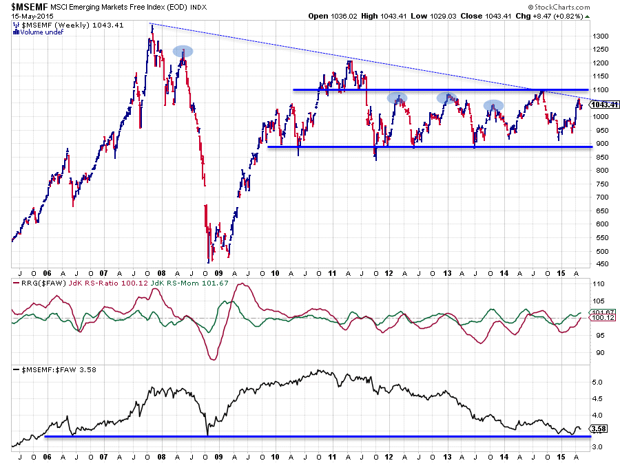
The Emerging Markets index catches the eye on the Relative Rotation Graph as it is on the verge of crossing into the leading quadrant from improving. Enough reason to have a closer look at the (price) chart of this index.
For this market I have also pulled a long term chart. The main reason for doing this is the fact that over the past 3+ years this index has been moving in a wide trading range between roughly 900 at the lower boundary and 1100 on the top of that range. Looking at a longer-term chart can put such ranges in much better perspective.
The first thing that I see on this long-term chart is a falling trend-line (thin dashed blue line) coming off the 2007 peak which connects with the 2011 and 2014 peaks and the recent rally seems to have bounced off this resistance level for the time being. As I have always learned that properly drawn trend-lines should connect SUBSEQUENT highs or lows of the same magnitude, the line described above and drawn on the chart is not the best one as it misses a number of highs (blue shaded peaks). Nevertheless it seems to have at least some sort of validity as it does line up a number of them and the recent rally seems to respect it as resistance.
Much more important, at least I think, is the horizontal barrier near 1100. So even if the market would be able to take out the falling resistance line, shortly thereafter the horizontal barrier at 1200 is very likely to cap the rally.
This means that upside potential from current levels is judged to be limited while at the same time the downward risk within the trading range is as low as 900. Not a very favourable ratio.
The analysis of the (raw) RS-Line is a different thing. What we see there is actually very interesting as the raw RS-Line seems to be in the process of forming a (double) bottom against a horizontal support level that comes off two major lows dating as far back as 2006 and 2008. Certainly something to pay attention to as these previous two relative lows led to a very strong (relative) trend.
Hence the situation we have at hand here is a promising outlook from a relative point of view, which is being picked up by the RRG-Lines heading higher and (almost) above the 100 level. The price chart however is still signalling some concerns.
Betting on an upward break in price and getting into (relative) long positions would be the aggressive approach. More conservative would be to wait for a break above 1100 on the price chart which will definitely push relative strength higher.
Hong Kong ($HSI)
On the Relative Rotation Graph for this universe Hong Kong is without a doubt the most promising market. Moving higher on both axes at a steady pace is causing a trial that points straight into the leading quadrant, a strong picture. But how does that look on a regular (price) chart?
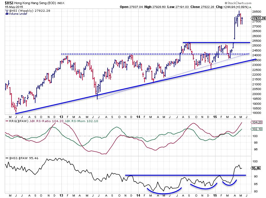
The picture above shows the Hang Seng index over the last 3.5 years. Scanning the chart quickly reveals that all major highs over this period are at subsequent higher levels. This indicates that buyers are willing to come back to the market at higher levels after each market correction. The important highs on the other hand have formed pretty much at the same level every time. Initially the 24.000 level seemed to be the horizontal resistance level to watch and the break beyond this level in 2014 looked good but was not able to deliver more upside. After that the 25.000 level started to come into play and the 24-25.000 range popped up as the barrier to overcome.
Underneath the price action the relative strength of this market against the FTSE All World Index slowly but steadily continued to improve, resulting in a move of the JdK RS-Ratio line above 100 in the middle of 2014. Even during the sideways move in the secnd half of 2014 the RS-Ratio managed to stay above 100 indicating a relative up-trend.
The recent break above resistance near 25.000 with a break away gap triggered the acceleration and caused the RS-Line to take out a horizontal resistance level as well. All clear for a further rise!
However, the real impact of the recent break only becomes, once again, visible on a longer-term chart!
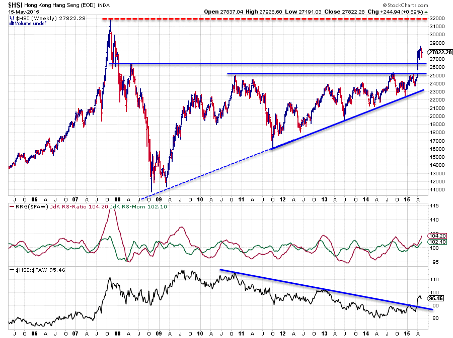
The chart above shows the price and relative performance of the HSI over the past ten years and as you can see the 25.000 resistance level did not just show up out of the blue ... It was a major high dating back to late 2010 that started to put pressure on the market. What also becomes visible on this longer-term picture is that the break higher not only positioned the HSI above the aforementioned 25.000 resistance level but also above the 26.500 resistance level based on a high and low back in 2007 (low) and 2008 (high).
All in all this means that the current move looks to be all set to target the all-time-high (~32.000) in the Hong Kong stock market while the down side is well protected by support in the 25-26.000 area. Any dips into that support area look to be good buying opportunities going forward.
On the relative strength chart the down-trend that has been in play since late 2010 has now clearly turned up, suggesting a further rising relative strength against the rest of the world.
Conclusion
- China ($FTX) remains in very strong relative up-trend
- Japan ($NIKK) and Europe ($STOXX600) going through relative correction but trends remain intact
- Emerging markets ($MSEMF) improving but needs a break above resistance near 1100
- Hong Kong ($HSI) on track towards all-time-high-levels
Julius de Kempenaer | RRG Research
RRG, Relative Rotation Graphs, JdK RS-Ratio and JdK RS-Momentum are registered TradeMarks by RRG Research


