On the Relative Rotation Graph holding a number of Asset Class ETFs in comparison to the Vanguard Balanced Index fund, the opposite moves of commodities and REITs continue to attract attention.
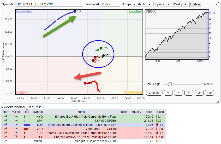
Initial observations
The opposite moves in Commodities (DJP), heading higher on the JdK RS-Ratio axis at positive relative momentum, and REITs (VNQ), heading lower on the RS-Ratio axis at negative momentum, are coming close to crossing over and turning their relative relationship in favor of commodities.
The remaining asset classes are clustered inside the blue circle on the graph above but it looks as if Equities (SPY) and High Yield bonds (HYG) have turned for the better again while Government bonds (IEF) and Corporate bonds (LQD) started to head lower and into the lagging quadrant again.
Vanguard REITS VIPERs - VNQ
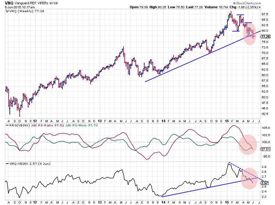
The VNQ chart is now seriously starting to give way to the downside on both the price and the relative graphs. Starting on the price graph we can see that a series of lower highs followed by lower lows is emerging. This newly formed down-trend is now challenging the rising support line coming off the late 2013 low and looks to be on the verge of breaking this support to the downside.
When I draw a similar trend line on the raw RS-chart connecting the lows from December 2013 and September 2014 that line is now clearly broken, while also in this raw RS-Line a pattern of lower highs followed by lower lows can be seen. The result is that both the RRG-Lines are now below 100, putting VNQ inside the lagging quadrant against VBINX. The length of the trail and the steady move lower on the RS-Ratio axis suggests that there is more relative down-side expected in coming weeks.
iPath Bloomberg Commodity Index Total Return ETN - DJP
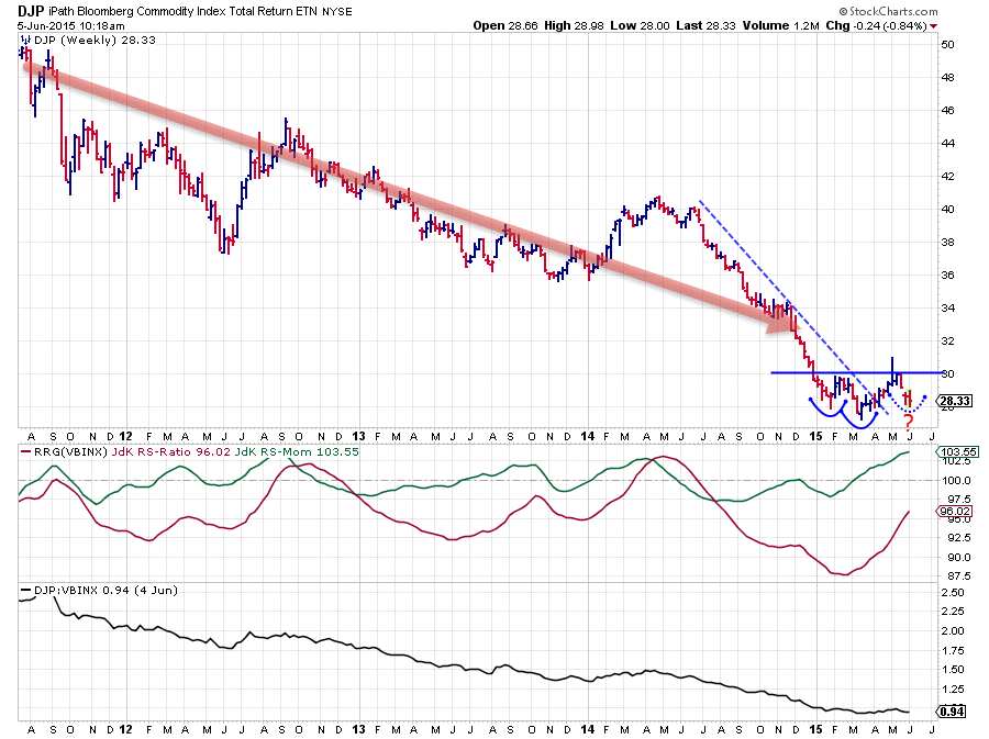
Eye balling the DJP chart one can argue that the big trend in commodities is still clearly down. However the price action since the beginning of this year suggests that a change might be around the corner. Especially the combination with the DJP move on the Relative Rotation Graph makes me interested to investigate what's going on here.
From a relative point of view, improvement is visible in the RRG-Lines. The JdK RS-Momentum has moved above the 100-level already a few months ago while the JdK RS-Ratio line is moving up steadily. This constellation puts DJP comfortably within the boundaries of the improving quadrant, rapidly moving higher on the RS-Ratio axis.
On the raw RS-chart we need to zoom in on the movement over the past few months (beginning of this year) to see this improvement as it basically is the strong relative down-trend flattening.
The down-move over the past three years can be broken down into two big legs moving lower. One starting in September 2012 ending late 2013. And the next one starting April 2014 and possibly coming to an end now.
For the first time in a year DJP was able to push the formation of a high back up to the level of a previous high (near $30). The market briefly peaked above that resistance level but then decided that it was not ready yet to move higher. Currently we are digesting supply coming off that $30 resistance level.
Obviously the big question is where this move will find support and turn around again. The level of the low before the last one, near $28, makes a good candidate. If that happens we could very well see a H&S reversal pattern taking shape. The left shoulder formed in January near $28, the Head in March near $27 and if my view is correct we should see the second shoulder to be put into place any week now near $28. The neck line connects the two in-between highs near $30.
It's an early call but it has all the elements for a proper H&S reversal to occur, especially the fact that the pattern is forming at the end of a very, long down-trend. There is definitely a previous trend that can be reversed. Be on the lookout for a break above $30 to complete this pattern for an initial move higher of some $3, which equals around 10%.
Equities and Fixed Income Rotation
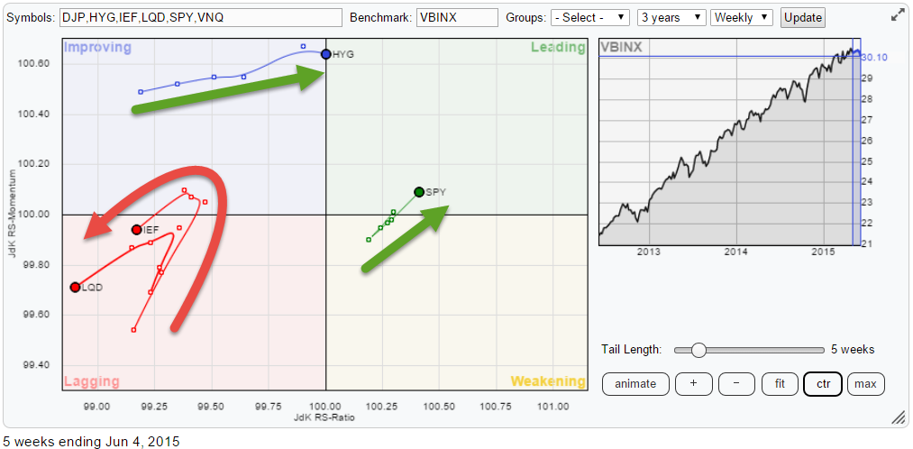
The rotation of Equities and some fixed income asset classes is taking place a bit closer to home (=benchmark). On this RRG we can see very well that Relative Rotation Graphs are a RELATIVE visualization tool.
Just looking at the price chart, the S&P 500 (SPX) has not been all that strong recently. But from a relative perspective within this universe it is the strongest asset class and it is moving deeper into the leading quadrant. So bear in mind that when a security moves (deeper) into the leading quadrant it does not necessarily have to have an up-trend in price as well!!
The RRG above shows the universe of asset classes zoomed in on the moves of Equities and three fixed income related ETFs. The split is visible between Equities (SPY) and High Yield (HYG) on the one hand and Government Bonds (IEF) and Corporate Bonds (LQD) on the other hand.
iShares Barclays 7-10 Year Treasury Bond Fund - IEF
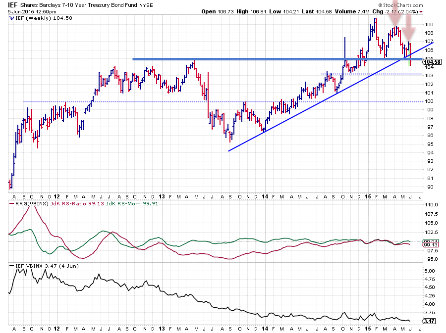
The IEF and LQD charts look fairly similar and they both cause concern. As seen on the RRG, IEF and LQD are heading (back) into the lagging quadrant.
On the IEF chart the rising support-line running under the lows of 2014 has definitely been broken downward while two lower highs have been set since the peak in January. Until last week support was still holding up near 105 which was an important level as it not only represents the two most recent lows but also the peak of April 2013. This 105 level has now given way to the downside and that move opened up the way for further downside in IEF, where 103 looks like an intermediate support level but more serious support is only seen around 100!
The corresponding levels for LQD are 114 and 104. All in all both these markets are facing serious downward risk while the recent breaks of support levels will likely limit any upside attempts for the time being.
Equities / Bonds - SPY / IEF
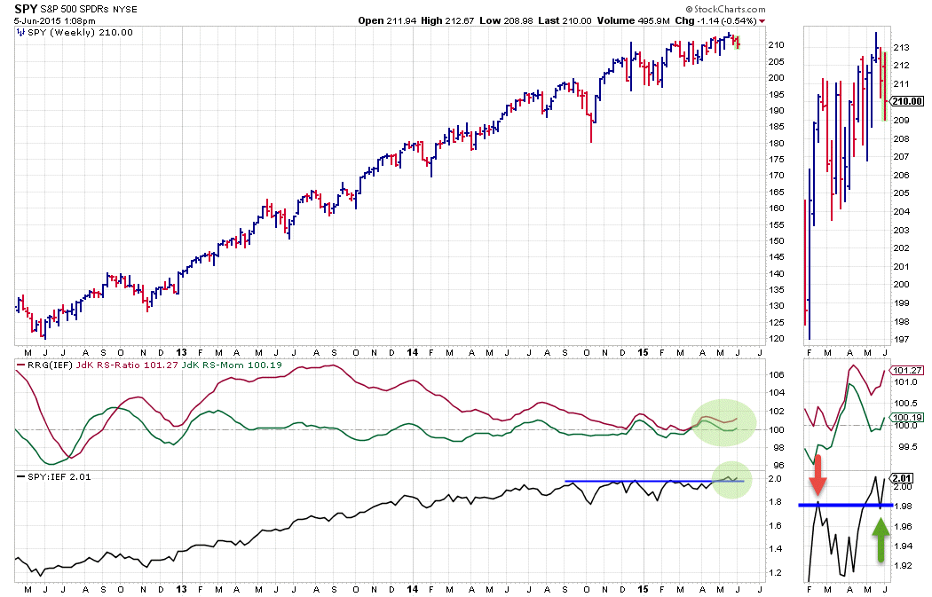
With all this rotation going on between various asset classes the comparison Equities / Bonds makes interesting material to study.
The chart shows the weekly price graph of SPY with the RRG-Lines and the raw RS-Line against IEF, and what we see here is that the raw RS-Line is breaking above its recent peaks! And this move is dragging both of the RRG-Lines higher and away from the 100-level where they were hovering for a few months already. This confirms that the relative trend between equities and bonds, at the moment, is still in favor of equities.
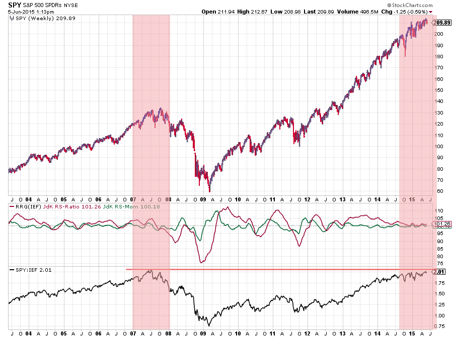
Despite the upward break there is one concern and that is the fact that the current ratio is very close to the level where it was during the market peak back in 2007. For now signals are pointing to higher levels for this ratio but close monitoring is a wise thing to do. And although the chart below shows you the long-term picture for this ratio I can tell you it is not the highest level of the Equity / Bond ratio ever seen in history, that occurred in early 2000 at the peak of the dot-com bubble.
So, despite all the negativity, equities actually look good for the time being! From a relative perspective that is .... Be warned this is not saying that equities will not go down, it only suggests that equities are likely to outperform (government) bonds.
Let's see what the markets have in store for us in coming weeks and how things will unfold going forward.
Conclusion
- More downside expected in VNQ
- Commodities could be forming H&S bottom
- Well defined split between Equities and High Yield Bonds and Government- and Corporate Bonds
- Equities and High Yield out-performing VBINX
- Government Bonds and Corporate Bonds under-performing VBINX
- Equity / Bond ratio at very high levels near 2007 peak but still pointing higher
- Hence favoring equities over (government) bonds
Julius de Kempenaer | RRG research
RRG, Relative Rotation Graphs, JdK RS-Ratio and JdK RS-Momentum are registered TradeMarks by RRG research.


