The Relative Rotation Graph of US sectors (10 ETFs) is showing some interesting sector rotation going on at the moment.
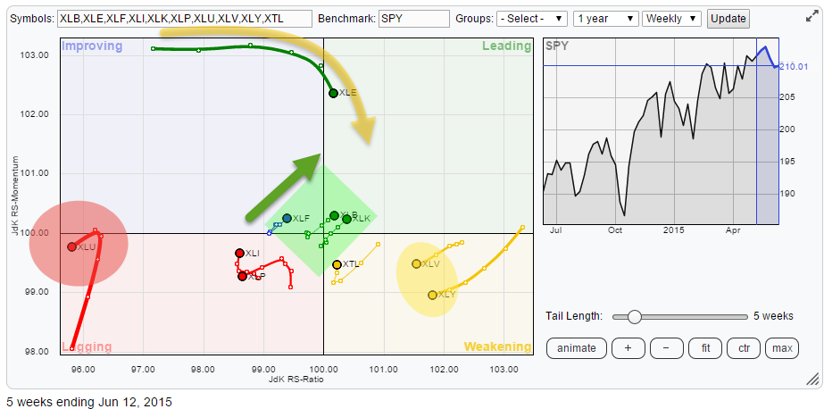
Initial observations
Glancing over the RRG above continues to show Energy (XLE) and Utilities (XLU) "standing out", as in "far away from the mean", like they have been doing for quite a while now. Both sectors were covered in-depth in the previous RRG-blog on US sector-rotation so I will only do a quick update on those two today. XLU aside there are two more sectors showing up in the lagging quadrant. These are Industrials (XLI) and Consumer Staples (XLP).
On the right-hand side of the Relative Rotation Graph we find the strongest sectors, measured on JdK RS-Ratio, inside the weakening quadrant. These are Health Care (XLV) and Consumer Discretionary (XLY). For the time being I judge these rotational patterns as strong relative up-trends vis-a-vis the S&P 500.
For (relative) upside potential I have my eyes on the sectors inside the green box near the middle (benchmark) of the chart. The fact that they have been close to the benchmark over the past weeks means that they have been trading more or less "in line" with the general market. It's the heading of the trail over the past two to three weeks that makes me curious to what's going on there and have a closer look at their regular price and relative charts.
Energy - XLE
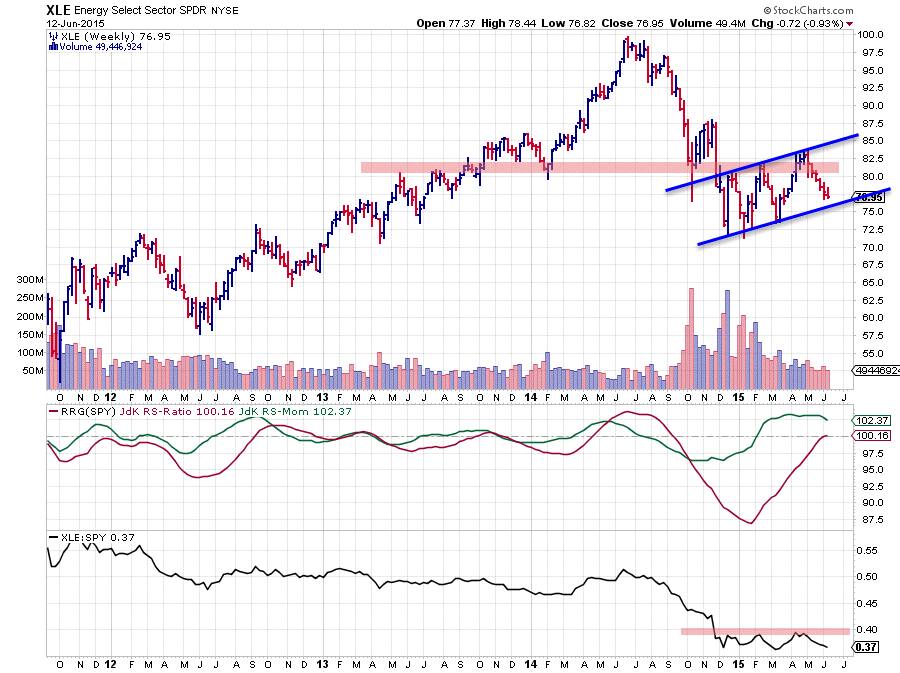
The rotational pattern of XLE against the S&P 500 has been showing an interesting pattern. The RRG chart above is a linkable version. If you click it a live RRG holding the S&P sector ETFs will open up.
When you position that RRG back to 30 January 2015 you will find XLE inside the lagging quadrant far away to the left. Meaning that this sector was in a strong relative down-trend at that time but it started to move up on the JdK RS-Momentum axis. Then after 30 January XLE moves almost straight up until 6 March following the very strong (relative) momentum during that period.
From 6 March onward this strong momentum disappeared just as fast as it showed up and on the back of that momentum move the relative trend managed to move higher on the JdK RS-Ratio axis and just crossed over into the leading quadrant but the fact that RS-Momentum already is starting to roll over now makes me very cautious calling a relative up-trend for XLE. The raw RS-Line did not manage to take out its previous high and is falling back to previous lows. A break to new lows will call for further under-performance.
The pattern on the price chart is not encouraging either. The $80-82.50 resistance zone was too strong to be taken out during the recent rally. Although there is a series of higher highs and higher lows visible, the highs are only marginally higher than their predecessors and so are the lows. This does not suggest very strong demand. When the short-term rising support line, connecting the recent lows, would be broken one could even see a big flag-like pattern being completed which would call for a further decline in price.
All in all still a sector to approach with caution.
Utilities (XLU)
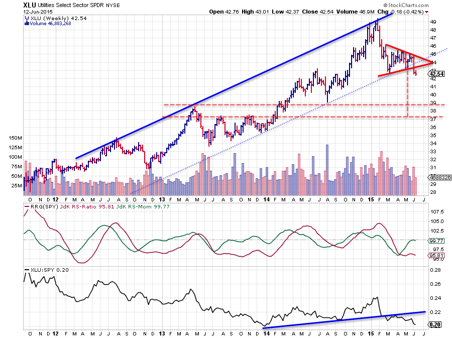
Above is the updated XLU chart. Previously we had a situation where the up-trend in the raw RS-Line (lower pane) was already clearly broken downward but on the price chart the up-trend was still intact, with price hovering just above the rising support line (the now dotted line running under the last major lows). This has now changed.
On the RS chart the down-trend is taking out (minor) previous lows and relative strength is on its way for the lows that were set late 2013. Taking out this level to the downside will very likely add more fuel to the move lower.
On the price chart a breakout of a triangle-like continuation pattern is now visible which suggests that a further decline in price is ahead. Applying the general measuring rule for such chart patterns gives a target between $37-39.
This is done by measuring the distance from the preceding peak to the lowest level inside the pattern. This distance is then projected down from the breakout level which gives the 'aggressive' price target, in this case near $37. A more conservative target is measured by dropping the distance from the most recent peak within the pattern, in this case $39. Extending these levels backwards on the chart shows that both $37 and $39 were fairly major peaks and troughs in the past and that they have acted as support and resistance levels previously.
All in all this confirms the weak (relative) trend for the Utilities sector. It suggests a further decline towards the mentioned support-zone between $37-39, while upward potential is limited towards the recent breakout level ($43), while all of this is expected to happen in a relative down-trend against the broader market.
Zooming in
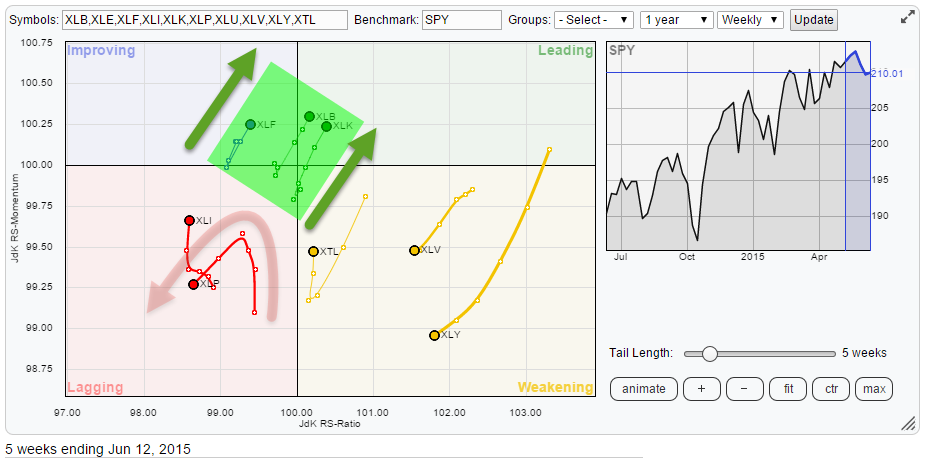
The zoomed in Relative Rotation Graph above shows the remaining sector rotation in more detail. It is clear that XLY (Consumer Discretionary) and XLV (Health Care) are still strongest on the JdK RS-Ratio scale but going through a (temporary) loss of relative momentum.
When you click the links on the ticker symbols a live chart for these sectors will open up. On XLY you will see a still very decent up-trend in price and on the relative strength against the S&P 500 you can see that this sector is very close to breaking above a major relative peak that was set late 2013. Such a break will very likely confirm the current relative strength and cause a rotation back up to the leading quadrant without travelling through the left side of the RRG chart.
On XLV you will see one of the strongest (price) up-trends in existence. The RS line is showing a similar up-trend which is also pushing towards new highs in relative strength. WIth the JdK RS-Ratio still well above the 100-level a continuation of the current relative up-trend is expected in the weeks ahead.
Consumer Staples - XLP
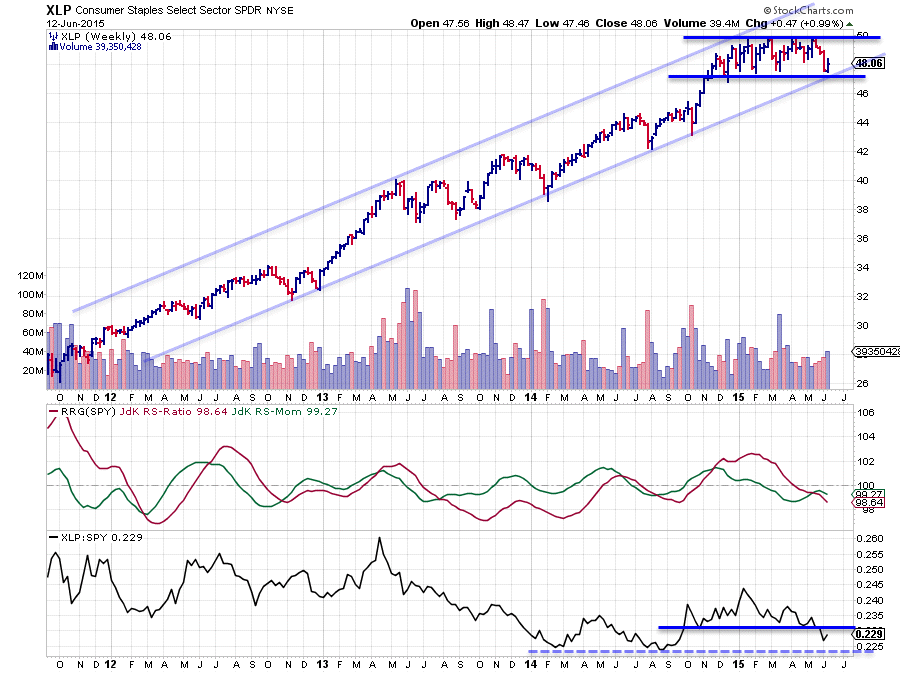
XLP and XLI are the two other sectors inside the lagging quadrant. The chart above is XLP which, I believe, shows the clearest (negative) picture of the two at the moment.
On the price chart the long-term up-trend is still intact. However, since forming the last peak against the rising support line in the beginning of this year just below $50, the sector started to trade sideways in a range between roughly $47 - 50. This trading range is now hitting the levels of the rising support line that connects the major lows of recent years.
Combined with a strong(er) performance of the S&P 500 this has been causing a declining RS line since the start of the year which just dropped below its previous lows confirming that a relative down-trend is under way. This has been picked up by the RRG-lines showing both the JdK RS-Ratio and the JdK RS-Momentum lines below 100, positioning XLP inside the lagging quadrant.
The curling down of the RS-Momentum line over the past 2-3 weeks suggests that a new (relative) down-leg is around the corner. The trigger to really fuel such a move will very likely have to come from a downward break of the double support level near $47.
"Double support" because it is the level where the lower boundary of the recent trading range and the rising long-term support line are meeting each other. Therefore Consumer Staples remain a sector to avoid.
Inside the green box
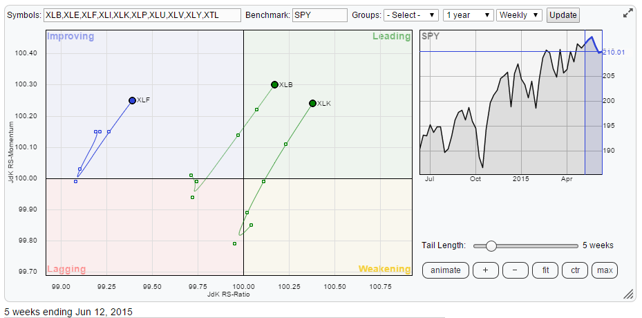
Three sectors are positioned inside the green boxed area on the RRG; they are Financials (XLF), Materials (XLB) and Technology (XLK). Why are they so interesting at the moment while they are still so close to the benchmark, which normally means a relative trend in line with the market?
Don't worry, close to the benchmark still means a trend in performance similar to the S&P 500 in this case. On the live RRG just scroll back three weeks in time and you will notice the difference. Three weeks back the trails of these three sectors were very short, their heading was unclear, and they were (even) close(r) to the centre of the chart.
What is triggering my attention is the fact that for all three sectors the trail all of a sudden came to life and they are all heading at a near 45 degree angle meaning that they are gaining on both axes of the Relative Rotation Graph.
Let's work from left to right.
Financials - XLF
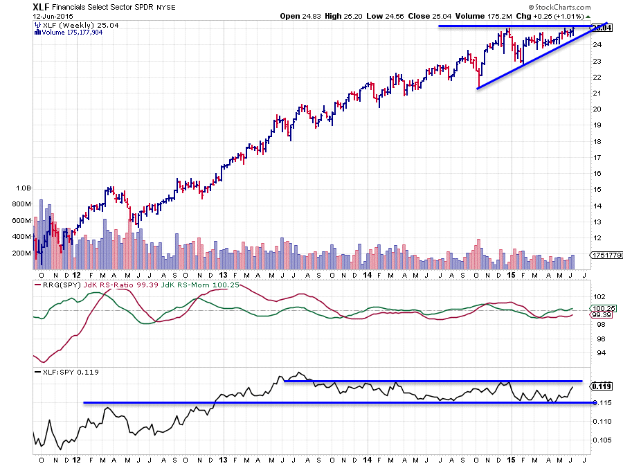
Inside the improving quadrant we find the Financials sector (XLF). Looking at the price chart not much has happened since the beginning of the year. The sector is trading pretty much at the same level as it was at the end of December and XLF is pushing against that previous peak which is now acting as resistance.
What I find more interesting is what has been happening to the lows (the troughs) over the past months. They all came in at a higher level! Translated into English this means that buyers have been willing to pay a higher price each time during a market correction, causing a low to come in at a higher level than previously. This happened while the peaks were formed near $25. Apparently the level at which sellers were happy to lose stock.
This sort of price action can be compared to a spring which is put under more and more pressure, the more pressure there is the more explosive the ensuing move will be upon release. In technical terms this will be an ascending triangle. The break is expected to the upside and when it happens, a fairly explosive move higher is expected.
Now for the relative strength charts (RRG lines and raw RS-Line). Not much has happened there lately. The RS-line has been moving sideways in a tight range since roughly late 2013. As the RRG Lines are trying to track relative "trends", which clearly were not present during this period, they oscillated around the 100-level with very little margin.
We all know that, in case of a trading range, the direction of the breakout will call the direction of the move that is likely to follow. Here also the analogy with the spring being put under pressure holds up. Based on the RS-chart and the RRG-lines it's difficult to call for a direction. But, combining the pattern on the price chart, where the direction of the breakout is expected be to the upside, with the rotational pattern on the Relative Rotation Graph, there's a very good chance that we will see financials as one of the leading sectors once the break is a fact.
Materials - XLB
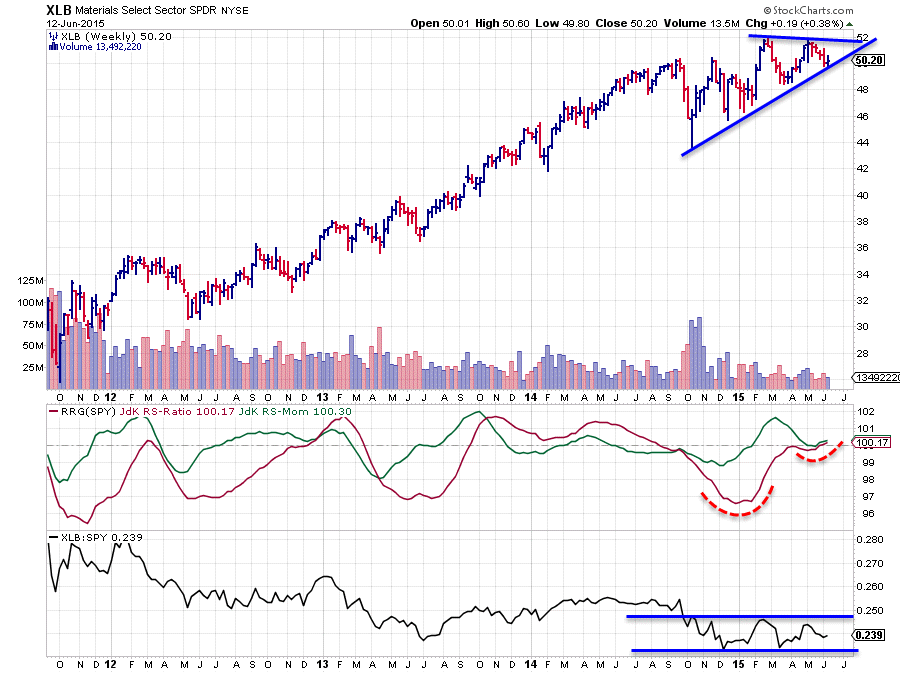
The materials sector ended a few months of down-trending relative strength towards the end of 2014 and moved in a range since then. Not as tight and not as long as the range we have seen in Financials but nevertheless.
On the price chart there are also some similarities visible. Two peaks near $52 are acting as resistance and have been preventing a further advance since February. The lows, however, are all at higher levels since November. Once again a situation where buyers are willing to buy the market at a higher level each time, while sellers are satisfied at the same level as previously.
The RRG lines seem to be picking up the start of a new relative up-trend in its very early stages. Just recently the RS-Ratio and the RS-Momentum lines have started to both move higher above the 100-level. Once we see price break above the $25 resistance level, an acceleration of that premature relative up-trend seems likely.
Technology - XLK
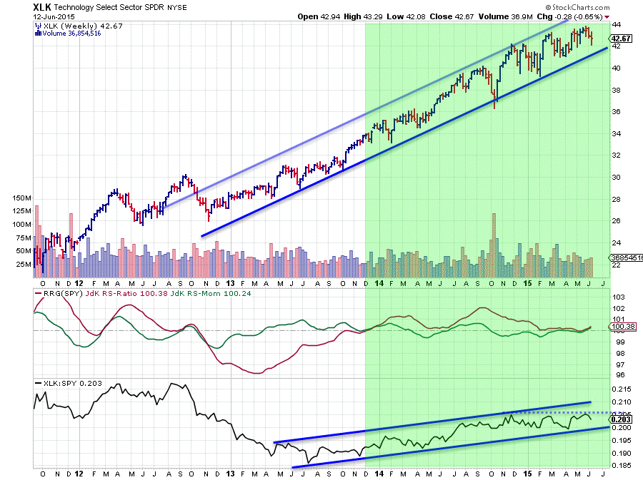
The third and last sector inside the green box and the one furthest to the right is Technology. Being furthest to the right on a RRG chart means that it is the one with the strongest relative trend. The chart above shows you why.
On the price chart the up-trend is visible since somewhere late 2012 and the move is fairly well contained between the parallel sloping support and resistance lines. Peaks are coming in at higher levels while troughs are made at subsequent higher levels, albeit only marginally since the beginning of this year.
On the relative chart a similar pattern can be seen. Only here the up-trend started not until late 2013. Just like Financials and Materials the RS-Line of Technology moved sideways since the beginning of the year and a break out of this range is needed to provide the relative trend with new fuel. On the RRG-Lines the up-trend in relative strength is still present with the RS-Ratio line moving above 100 since December 2013, although it was a little tricky when the RS-Ratio line shaved the 100 level 3-4 weeks ago.
Assuming a continuation of the up-trend in price in the weeks to come, a further improvement in relative strength seems logical, which will cause the Technology sector to rotate deeper into the leading quadrant.
Conclusion
- XLE recent relative momentum fading, be cautious
- XLU confirming relative weakness / down-trend, expected to continue further down in price and relative strength
- XLP rolling over on the price chart and rotating deeper into the lagging quadrant
- XLF, XLB and XLK expected to accelerate when overhead resistance levels can be taken out
Julius de Kempenaer | RRG Research
RRG, Relative Rotation Graphs, JdK RS-Ratio and JdK RS_Momentum are registered TradeMarks by RRG Research


