In last Tuesday’s (6/15) webinar with Arthur Hill I presented a Relative Rotation Graph based on size indices and how this can be used to focus attention to a specific part of the broader market. You can re-play the recording of this webinar here.
One of the most standard uses of RRG is plotting the S&P economic sectors (based on indices or ETFs) in comparison with the S&P 500 index. This is limiting our view to large-cap stocks only. And although large actually means LARGE, the S&P 500 which represents US large cap stocks makes up roughly 88% of the total market (S&P composite 1500 index), there is still 12% left for small- and mid-cap stocks whose (relative) performance from time to time can differ significantly from the S&P 500.
For the record, mid-caps make up 8% of the Composite index while small-caps are at 4% .
Plotting this on a Relative Rotation Graph is easily done and will give you immediate insight into how the relative trends of large-, mid- and small-caps versus the broad market Composite and versus each other are moving.
Creating a Relative Rotation Graph for size indices
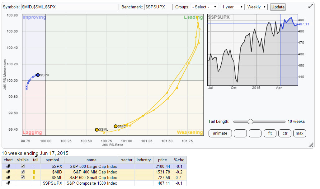
Just open up the standard RRG from the link on the home page and replace the ticker symbols with the symbols for the three size indices: $SPX, $MID and $SML. Next replace the Benchmark ticker with: $SPSUPX and then hit ‘update’. Your picture should now look like this:
Btw: The picture is linked to a live RRG-chart. When you open it and click “Show Linkable Version” you will be able to create a bookmark for this link so you can call this RRG any time without having to re-create it.
Mid- and small-cap segments out-performing S&P composite and large caps
As you can see the mid- and small-cap indices are inside the weakening quadrant on the RRG, still pretty far away from the center, while the S&P 500 (large-cap) is inside the improving quadrant rotating closer to the center.
On a Relative Rotation Graph like this you will almost always find the $SPX rotating very close to the center as it makes up almost 90% of that benchmark. Mid- and Small-caps will rotate further away meaning that that is where opportunities for Alpha, out-performance versus the benchmark can be found.
The current positioning of the mid- and small-cap indices still indicates that they are in a relative up-trend against the composite index (and against Large-caps). This can be seen on the regular chart below.
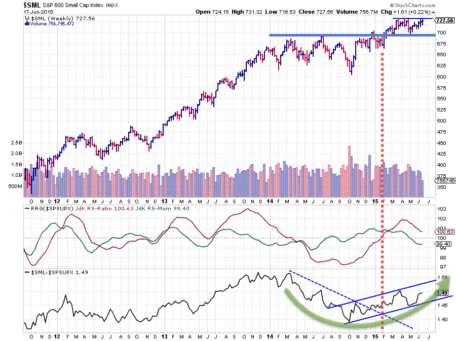
Pretty much all of 2014 small-caps have been under-performing the S&P Composite index, as you can see in the lower pane which holds the raw Relative Strength line. This RS-line was clearly trending lower in that period and followed a rhythm of lower highs and lower lows.
This situation started to change (come to an end) in November / December last year. At first a higher low was formed and a bit later the falling resistance line (blue dashed) was broken upwardly. At that stage the green JdK RS-Momentum line had already turned above 100 indicating that the JdK RS-Ratio had formed a low and had started to move up, while still below 100. In other words: ‘the relative down-trend against $SPSUPX was still there but getting less severe and leveling off’. This positioning of the RRG-Lines put the Small Cap index inside the improving quadrant on the RRG.
The continuing improvement of the raw RS-line, indicated by RS-Momentum holding up above 100, eventually dragged the RS-Ratio line above 100 as well towards the end of January. At that point $SML moved into the leading quadrant. Since then Small-Caps are generally trending higher against the S&P Composite index.
The March-April dip in relative strength is now being reflected in the (red) JdK RS-Ratio line and dragged the RS-Momentum below 100, which caused a rotation into the weakening quadrant.
Daily RRG confirms strong trend for mid- and small-caps
A good way to judge the move through the weakening quadrant in more detail is to switch to a daily version of the Relative Rotation Graph. Simply change the time frame in the controls above the benchmark chart and click update.
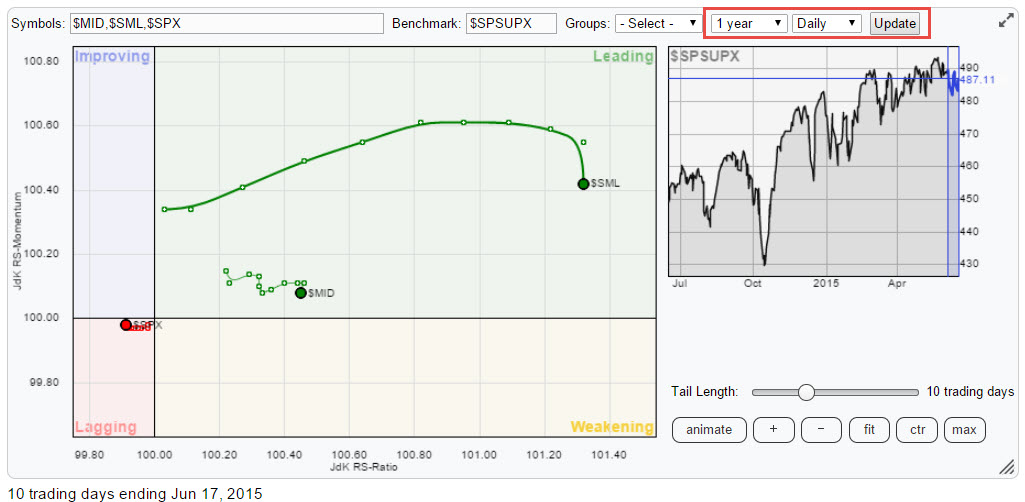
As you can see on this daily version of the RRG above, small- and mid-cap indices are inside the leading quadrant and generally moving right (=higher on the RS-Ratio axis) signaling a, still continuing, relative up-trend against the composite index on a daily basis. The position of $SML further away to the right compared to $MID indicates that the move is led by the small-cap segment of the market.
Here is the price chart below.
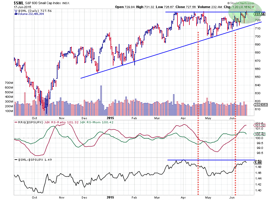
The ‘dip in relative strength’ that showed up on the weekly RRG actually was a complete rotation of $SML through weakening, lagging, improving and finally back into leading on the daily RRG. On the weekly RRG this ‘only’ caused (or is causing) a move into weakening so far.
Conclusion
On the price chart $SML is pushing against horizontal resistance around 730 while the most recent lows have all been formed at subsequent higher levels which indicates aggressive buyers. If the market will be able to take out this horizontal barrier an acceleration of the rally is expected which will be very beneficial for the relative trend as well.
Combining the strong weekly picture for $SML vs $SPSUPX, and the fact that the rotation on the weekly RRG is already leveling off, with the strong relative picture on the daily RRG as well as on the daily price chart, leads me to the believe that there is a good chance that rotation on the weekly RRG will turn back up towards the leading quadrant again without crossing over to the left hand side of the plot.
A bit simpler; “it looks as if the relative up-trend for Small Caps will last a little longer.”
Julius de Kempenaer | RRG research
RRG, Relative Rotation Graphs, JdK RS-Ratio and JdK RS-Momentum are registered TradeMarks by RRG research.

