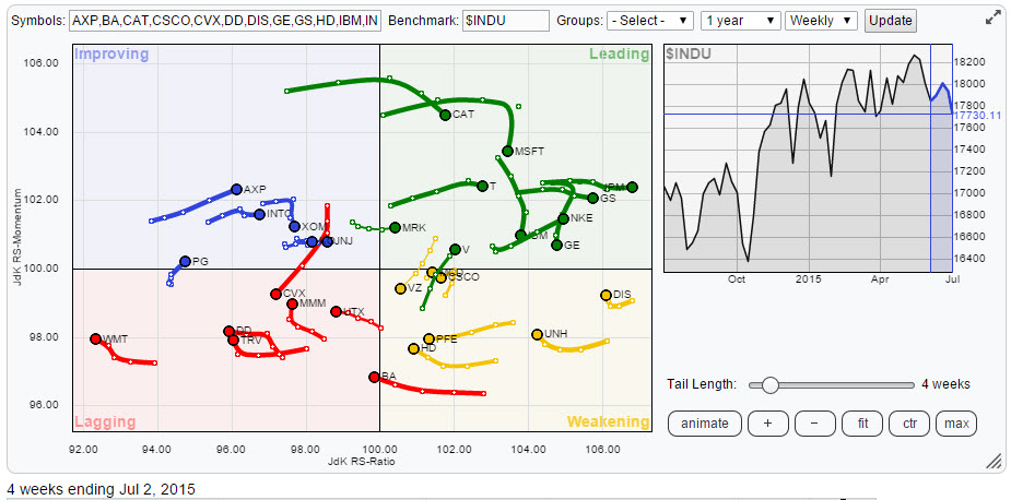
As usual the 30 members of the Dow Industrials index are fairly evenly spread out over the Relative Rotation Graph, highlighting the good, the bad and the ugly ! Before moving into further detail I'll give you a bit of a head start saying that some technology stocks are starting to look 'ugly' which usually happens before they end up being bad!
Initial observations
Starting in the top-right quadrant (leading) there are a few easy calls to make with regard to JPM, GS and NKE. These stocks continue to push higher and a quick look at their charts confirms that the up-trends in both price and relative strength are still very strong. In the same quadrant a bit more to the left (closer to the 100-level on the JdK RS-Ratio axis) I see three stocks, MSFT, IBM and GE, that are bending their trails South and started heading towards the weakening quadrant. In itself this does not have to be a problem as the trend in relative strength is still up but I'd like to look at the price chart to see what's going on in more detail.
In the weakening quadrant DIS and UNH are still far to the right and they start to slowly turn back up again. This is in line with a strong relative trend that just went through a corrective phase within the longer-term relative move higher. The short trails, especially on DIS, confirm this.
While looking at this RRG I continuously zoom in and zoom out to see or pick up rotational patterns. In this process I see CSCO bouncing off the 100-level on the JdK RS-Momentum axis and starting to head further left on the Ratio axis again. In the back of my mind is the observation that within the leading quadrant I have seen MSFT and IBM turning down on the Momentum axis as well.
Moving to the bottom-left, lagging, quadrant things are getting a bit clearer again in relative trend terms. Almost all the reds are confirming their relative weakness and continue to head West on the RS-Ratio scale. One ticker in particular catches my attention and that is CVX. As you can see this stock moved into the improving quadrant but then started to turn back down again. This is the type of rotation you will find in strong downward relative trends and it suggests that another leg down is under way.
In the improving quadrant we find predominantly short trails without a lot of relative momentum. There are two stocks that intrigue me. The first is XOM because I just saw CVX nose-diving back into the lagging quadrant again. The second one is INTC as I noted rotations in three tech stocks already that I wanted to inspect further.
So all in all it looks like I'm stumbling upon two bigger "themes" within this universe, these being technology stocks and energy stocks, unfortunately both seem to be set for a negative rotational pattern. Because I want to double check these rotations on both the weekly and the daily time-frames I ran another RRG plotting only the names that I picked out and do that on a daily time-frame.
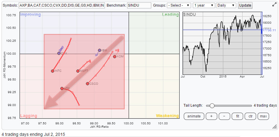
Wow ..... they are all on the left hand side of the plot,meaning that all relative trends for these stocks on this time-frame are down and pretty much only IBM is showing a little bit of positive relative momentum but judging by the short trail it is very questionable if big blue can keep this up or has to surrender together with the other tech stocks on the plot.
Tim to look at some individual charts.
Energy
Chevron - CVX
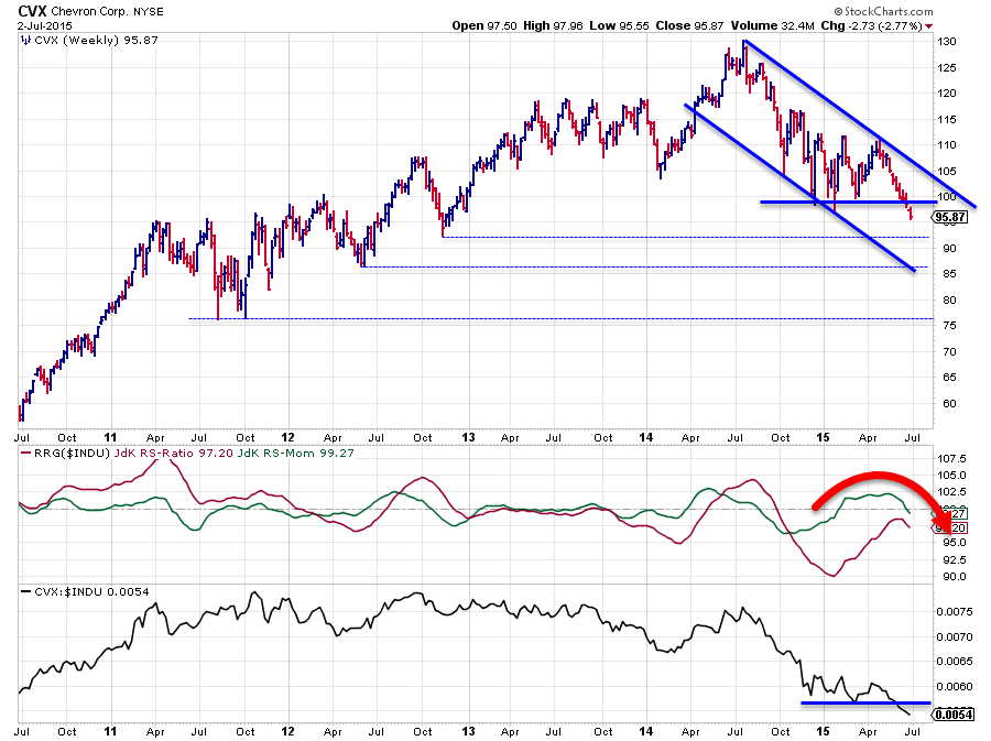
CVX is inside the lagging quadrant on the weekly Relative Rotation Graph and on the verge of rotating back into the lagging quadrant on the daily RRG. It can't get much weaker than this! The longer-term relative trend is down and the shorter-term trend is turning down again after a temporary recovery.
The price chart does not look much better. On a long-term chart you will find a solid up-trend in price emerging out of the 2009 lows which was broken sometime in 2014 during the first decline of CVX from $130 to $105. After that break a series of lower highs and lower lows started to become visible until support in the $100 area was met. This level was tested three times but every rally, out of the lows that were set, stranded around $110, each one marginally lower (112.20 / 111.80 / 111.08). Selling pressure at work.
The last move lower which started from the last peak ($111) has a lot of power behind it, look at all the red bars in a row, and has now just pushed CVX below this $100 support level which opens up the way for even more down-side. The relative picture which improved shortly during the testing of support has now also broken below its most recent low (raw RS line) and the RRG-Lines are both turning lower again.
All in all a very weak picture which will continue further down in both relative and price terms. At the minimum upside potential has to be judged as very limited.
Exxon Mobil - XOM
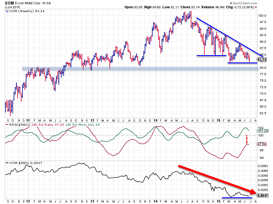
XOM shows a similar pattern as CVX but has not broken down as clearly (yet). The pattern of lower highs followed by lower lows is undeniably there, just like it is in the graph of the raw RS-line. There was some horizontal support near $85 late last year which got broken downward only to find a new support level a bit lower at $82.
The weak sign was that the rally out of the newly set lower low (at $82) once again put in a lower high near $90. At the moment price is resting at that $82 support level and a downward break would again be a negative sign for XOM.
More importantly however, I think, is the broader support area which is visible around $80. That area holds a number of peaks and troughs going all the way back to 2007-2008. Check the chart here.
The relative outlook is still weak as the JdK RS-Ratio line is still well below the 100-mark and the JdK RS-Momentum line has started to turn down again, this setup causes XOM to turn down inside the improving and head down to the lagging quadrant again on the RRG chart. A break below the $80 support zone will defintely speed up that process and make XOM, just like CVX, into one of the weaker Dow stocks.
Technology
United Technologies - UTX
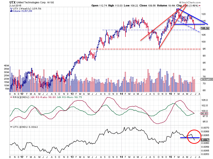
UTX makes an interesting chart. First of all it shows two clear breaks of support. One in the price chart where the most recent support level, connecting two lows at $112.50, was convincingly taken out. The second clear break is visible in the raw RS-line where the April low was broken downward.
This combination alone would be enough to urge caution for UTX. A new series of lower highs and lower lows is emerging and the upside potential for the stock is limited to the former breakout level at $112.50 or at the most the top of the falling channel which is starting to come in around $115. If the intermediate support level near $108 (horizontal blue dashed line) has any strength left in it we could see a small recovery pull-back to the breakout level but that's likely to be about it.
What could have a bigger impact on the price of UTX is the potential rising wedge pattern that can be detected, indicated by the red converging trend lines on the chart. The pattern was clearly left to the down-side and, some but not all, text books suggest that a break out of a falling wedge will bring price back to its base. Which in this case would mean a price target near $95. Whether or not that is true or will happen at all, it will not negate the negative outlook for this stock.
Cisco - CSCO
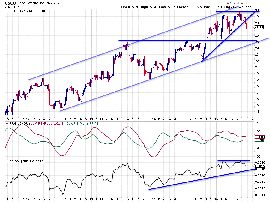
The Cisco chart is a lot less pronounced. The rising channel on the price chart is still intact, let there be no doubt about that. However, the failure of the last rally to break beyond its previous high was a weak thing as well as the break below the short-term rising support line. This suggests that CSCO is in for a move lower within the boundaries of the LT rising channel, possibly testing its long-term support which is pegged near $25, where the rising trend-line as well as a horizontal support level are converging.
The relative picture is not, completely, negative yet but it is definitely not as strong as it used to be any more. Here also the RS-line failed to take out its previous high which is stalling the up-trend and at the same time pushing the RRG-Lines closer to their 100 levels.
The rotation on the RRG chart suggests a further weakening but I will be watching the price chart for confirmation. Upside is limited for the time being.
Microsoft - MSFT
Microsoft is playing around with a few horizontal price levels. The most important characteristic is the rising channel which is visible on the price chart as well as the relative chart during 2013 and 2014. Both channels were left on the down-side early this year.
After that break MSFT started to bounce around between $40-49. Both levels are clearly defined on the chart now and marking the boundaries of a broad trading range. In the middle of that range, around $44-45 another horizontal level shows up which seems to be respected by the market.
With regard to the outlook for this stock, the initial break of the rising channel will be leading in my view, this was a negative as it marked the end of the up-trend. The pull-back which followed has not been able to get MSFT back into the up-trend and failed at the previous high (both price and relative). $49 has therefore now become a major resistance level where more supply is likely to be waiting.
On the RRG chart Microsoft is inside the leading quadrant but starting to hook down. With a clear lower high set in the RS-line and the weakening price chart this is reason for caution.
Intel - INTC
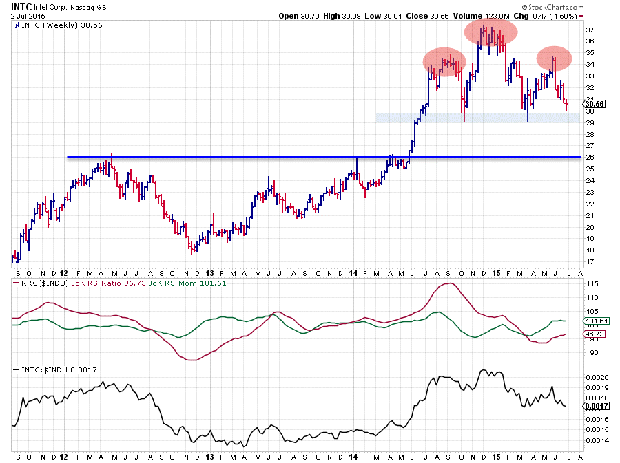
I picked up the Intel chart because it was inside the improving quadrant on the weekly RRG and I had already found a number of tech stocks that seemed to be losing a bit of their attractiveness.
The one thing that immediately struck me when I opened up the chart was the big potential Head & Shoulders reversal pattern in the making. The shoulders and the head are fairly well defined and the neck-line, or maybe I should say "neck-area" is exactly horizontal between $29-30.
Now, IF that is indeed a H&S in the making and IF that "neck-area" is going to be taken out to the down-side... THEN there is a lot of down-side price movement to be expected for Intel. We are not there yet but the picture does not look very good to me.
On the relative strength chart the most recent highs and lows are all lower than their predecessors and the RS-line is currently resting at a previous low. The JdK RS-Ratio line is moving below 100 for a while already indicating a relative down-trend against the Dow Jones Industrials index. Relative Momentum is only marginally above 100 and ready to turn back down again.
The big event to watch for Intel will be the break below $29. If that convincingly happens, i.e. on a Friday close (as we're watching a weekly chart here) we may conclude that the H&S pattern has been completed and lower prices are expected. Based on the height of the pattern a price target for such a move can then be pegged in the $22-23 range.
On its way down Intel will meet a major support level near $26 which could be strong enough to protect the move all the way down to the target area or at least provide a pause, or a period of short relief during the move, but a 10-12% decline is very well possible after completion of the pattern.
Conclusions
- The good remain good, i.e. GS, JPM, DIS, NKE, UNH
- The bad remain bad, i.e. WMT, DD, TRV
- Energy and Tech are starting to look ugly
- CVX broke support levels already and is heading down
- XOM is in a relative down-trend already and seems ready to break support on the price chart
- UTX broke support on price and relative charts and is trending lower
- CSCO is heading towards lower boundary of LT rising channel but losing (relative) strength
- MSFT is moving in a broad range after breaking its up-trend which makes upside movement increasingly difficult
- INTC seems to be building a major H&S reversal pattern offering 10-12% downside at the minimum when completed
Julius de Kempenaer | RRG Research
RRG, Relative Rotation Graphs, JdK RS-Ratio and JdK RS_Momentum are registered TradeMarks by RRG Research


