As I am writing this I am on holiday in Greece and overlooking the Ionian sea. A good time to clear the head and get some fresh thoughts. As it's also almost a year since I started writing my RRG-Blog here on StockCharts.com, and I still enjoy doing every single article, it's also a good time to look back at what has been written and evaluate the routine.
 Regular readers will know that I am trying to maintain a more or less fixed sequence in the subjects for my articles. One on asset allocation, then one on US equity sectors followed by international equity markets and finally an article looking at the constituents of the Dow Jones Industrials index. Then rotate back to start at asset allocation again etc.
There are a few reasons why I have chosen this approach. One is that I believe that proper technical analysis involves a continuous evaluation of a "view". To me it does not make a lot of sense to make a call on a market or a security and then "forget" about it. The markets we are dealing with are continuously changing and any analysis of that market should evaluate and move with it from time to time. A second reason is that I wanted to reach and appeal to as many users / visitors of StockCharts.com as possible, to expose them to Relative Rotation Graphs, educate and build market views based on relative strength analysis.
There are a few ways in which I get feedback on the blog. The first obviously being the comments that you can post on individual articles. For me these are really valuable as they give a direct insight on what you like, what questions you may have, things that are unclear, or simply a nudge of approval which confirms that pieces are appreciated. So keep those coming and I will make an effort to answer every one of them. The second bit of feedback are the comments which you have left after the webinars that I did together with Chip and Arthur Hill; overall these have also been very positive, confirming that we are on the right track. The third bit is coming from the number of "hits" on the individual articles. Once again, no complaints here!
However, looking at these three sources of feedback, using my analytical genes and keeping an open mind it is my observation that articles and views on equity sectors and / or individual equities seem to attract more attention from StockCharts readers and you seem to appreciate them better, please correct me if I'm wrong?
During the the early nineties I worked in the research department of one of the large Dutch banks. One of the things we, as technical analysts, had to do was write a contribution to a "weekly report" on the technical condition of the Dutch stock market index ($AEX index). Given the profile of the average client of the bank our views should be medium to long-term, say 6-12 months. This meant that we would be using weekly charts and looking for longer-term trends to develop on these weekly charts. But the problem with a weekly chart is that it only gives you one new observation every week.... So you can imagine that having to write a weekly piece on a chart that had only one new observation added to it since the last comment became a drag very fast and we ended up writing "because of writing" continuously updating the same view just using other words. Something I have promised myself not to do any more.
After a year of following my subject cycle as mentioned above I noticed that the Asset Class articles and the International equities articles provided less "writeable" opportunities, as their universes are a bit smaller than those used in the articles covering the other subjects and also their relative rotations tend to be longer in duration. Combining that with my initial observation of more appetite for equity (sector) related content made me think that it might be a good idea to merge the asset allocation and international equity articles into one and add a new subject to the cycle. The new subject being an in-depth look at the individual equities that make up one of the major (10) sectors of the S&P 500. Unless you tell me to stay put and don't change a thing of course ....
Let's go!
Asset Allocation
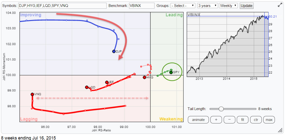
The Relative Rotation Graph above holds a number of ETFs representing asset classes and compares them to VBINX, a Vanguard Balanced Index fund. What immediately stands out is the fact that equities (SPY) is the only asset class on the right hand side of the plot. This translates into equities being the only asset class that is (still) in a relative up-trend against a balanced benchmark. All other asset classes are on the left hand side of the plot and almost all of them are moving lower on the JdK RS-Ratio scale. Hence the initial conclusion remains that equities are still the preferred asset class in the current environment.
The fixed income related asset classes, High Yield (HYG), Government Bonds (IEF) and Corporate Bonds (LQD) have all cycled back down into the lagging quadrant and seem to be out of the picture for the time being. The two other asset classes on the plot, Commodities (DJP) and Real Estate (VNQ) are worth a closer look.
Vanguard REITs VIPERs - (VNQ)
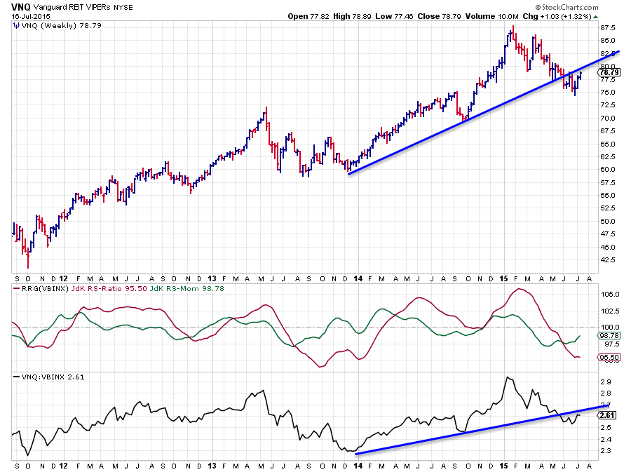
Despite the recent, small, rally in VNQ the relative trend is still clearly down. This is best seen in the raw RS chart (lower pane) where relative strength is trending lower since the beginning of this year. In the previous blog I highlighted the break of the rising trend-line (blue). The small hiccup that we see now in relative strength so far has to be qualified as a pull-back to the former break out level. This translates to a JdK RS-Ratio line that is still moving lower, indicating a relative down-trend. The move slightly higher in JdK RS-Momentum reflects the recent pull-back in relative strength but it certainly does not look like a turnaround yet.
A somewhat similar pattern shows up on the price chart where the blue rising support line was broken downwardly and the recent rally is taking place below the break out level. The area around $80 seems to show up as combined resistance now, offered by the former rising support line, now resistance, and a previous low.
All in all, especially within the scope of this universe, REITs remain the weakest asset class for the moment.
iPath Bloomberg Commodity Index Total Return ETN - DJP
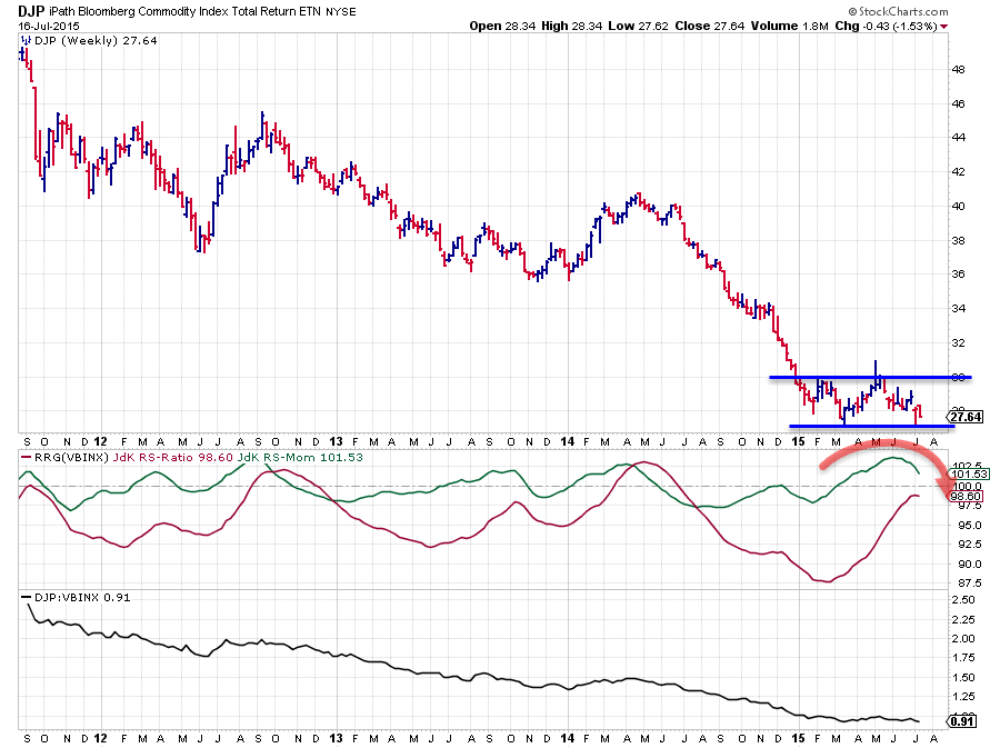
In the previous article on asset class rotation i was building a case for a Head & Shoulders reversal pattern being in the making with a break above $30 (neck-line) needed as the trigger/signal for completion of that formation... Well, with the price action following in the past few weeks, that possibility has just flown out of the window.
Instead of challenging the resistance area near $30 DJP dropped back and the decline got caught by support offered by the previous low just above $27. This means at best we now have a trading range between $27-$30 developing. This could still turn out to be(come) a bottoming formation but it will very likely need a bit more time to develop. Hence, sideways price movement is the best we can expect for now which means that with other asset classes and especially the balanced benchmark going (slightly) higher, commodities will continue to under-perform. The movement of the RRG-Lines is starting to suggest that already with both lines turning down again now. A break below recent lows in the relative strength chart will accelerate the relative down-trend again.
See this movement in more detail on the daily chart here.
International Equities
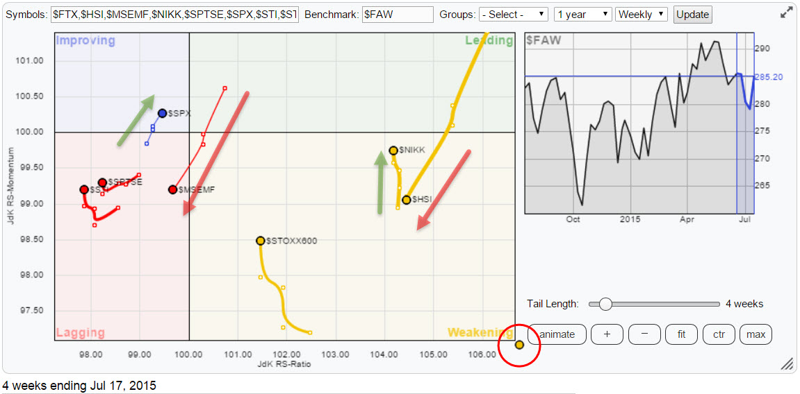
On the above RRG holding a number of international equity market tickers in comparison with the FTSE all world index ($FAW) there are two relationships that are standing out. The first one is Japan ($NIKK) vs. Hong-Kong ($HSI) and the second one is the US ($SPX) vs Emerging Markets ($MSEMF). The RRG above is zoomed in to put more emphasis on the above mentioned relationships. This causes one market to end up in the "gutter" (red circle in the bottom right corner) and you have one guess to figure out which one that is .... yes indeed, that is China ($FTX). My previous analysis on that market still stands.
Japan - Hong Kong
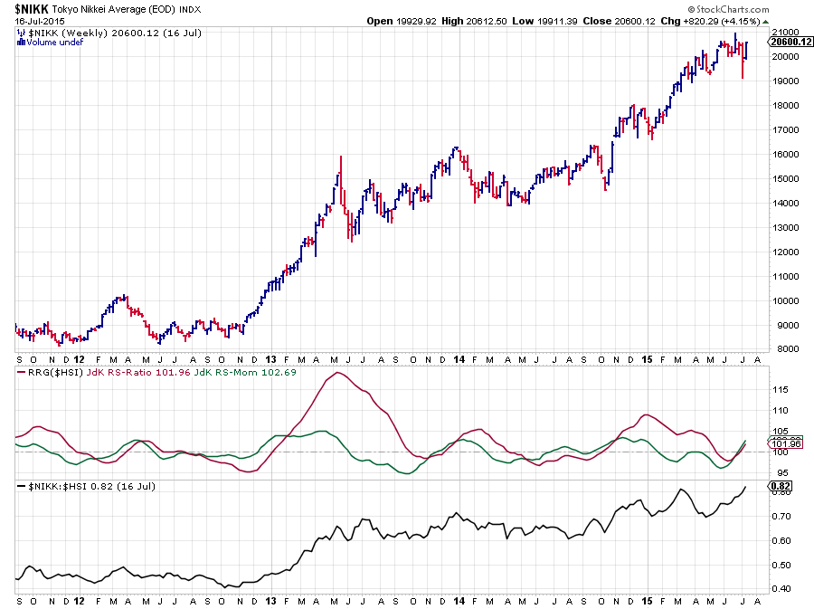
On the Relative Rotation Graph of international equities the Hang Seng index (Hong Kong) can be seen moving lower on both axes into the weakening quadrant with a pretty long trail, indicating there is a bit of power behind this move. However as it is still way to the right of the plot the relative trend vis-a-vis the $FAW benchmark is still up. This is not the case when the Hang Seng is compared to the Japanese Nikkei index. $NIKK is also on the right hand side of the Relative Rotation Graph, hence also in a relative up-trend vs $FAW but it is moving vertically higher opposite $HSI. This makes $NIKK/$HSI an interesting combination to watch as these are two markets that are out-performing $FAW. So which one would you pick?
The price chart above shows the bar-chart of the Nikkei index ($NIKK) and the RRG-Lines and relative strength against $HSI. This picture gives a pretty clear answer as to which market of these two we should prefer.... The relative strength of $NIKK/$HSI is moving higher and ready to break to new highs which caused both RRG-Lines to simultaneously start moving higher suggesting a period of out-performance of $NIKK over $HSI lies ahead. Remember that BOTH markets are in a relative up-trend vs $FAW !
US - Emerging Markets
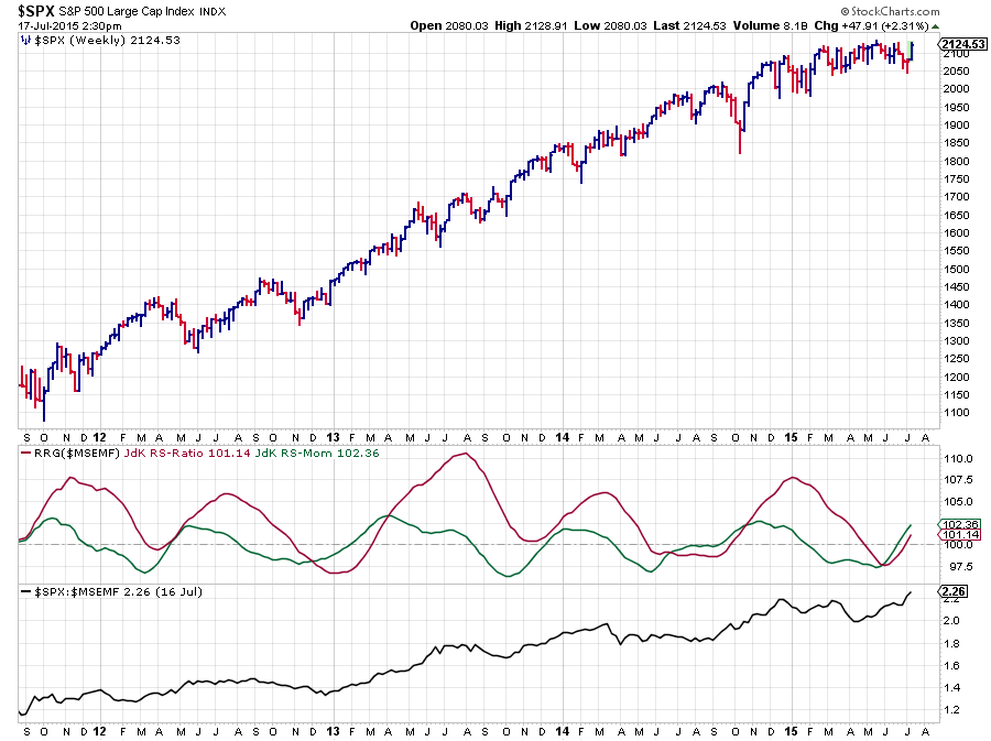
$SPX and $MSEMF are both moving a lot closer to the centre of the chart. For the S&P 500 that is to be expected as the US market makes up a big chunk of the global market. For emerging markets usually a wider rotation can be expected. If you click on the RRG above (international equities) and drag the slider on the benchmark chart to the left and back you will see this effect in play.
With the Emerging Markets index now heading into the lagging quadrant backed by a long trail, a period of under-performance vs $FAW is likely. The S&P 500 on the other hand is moving exactly opposite and on the verge of crossing over into the leading quadrant which means strength for US equities.
The price chart above shows the weekly bar-chart of $SPX in combination with RRG-Lines and relative strength against $MSEMF. The answer to the question which one of these two to prefer is pretty clear. The relative strength line of $SPX/$MSEMF just broke to new highs and looks set to move higher. This pushed both the JdK RS-Ratio and the JdK RS-Momentum lines above 100 and they are both accelerating higher. For coming weeks US equities are therefore expected to move ahead of Emerging Markets.
Conclusion
- Asset Allocation
- Equities remain preferred asset class
- Fixed income related ACs cycled back into lagging (under-performance)
- Real-Estate pulling back but still in relative down-trend
- Commodities negated potential H&S reversal and continue relative down-trend
- International Equities
- Japan ($NIKK) and Hong Kong ($HSI) still in relative uptrend vs $FAW
- $NIKK in relative up-trend vs $HSI, expect continued out-performance of $NIKK over $HSI
- $MSEMF crossing into lagging quadrant, starting relative down-trend against $FAW
- $SPX starting new relative up-trend vs $MSEMF, and very likely against $FAW as well.
Julius de Kempenaer | RRG Research
RRG, Relative Rotation Graphs, JdK RS-Ratio and JdK RS_Momentum are registered TradeMarks by RRG Research


