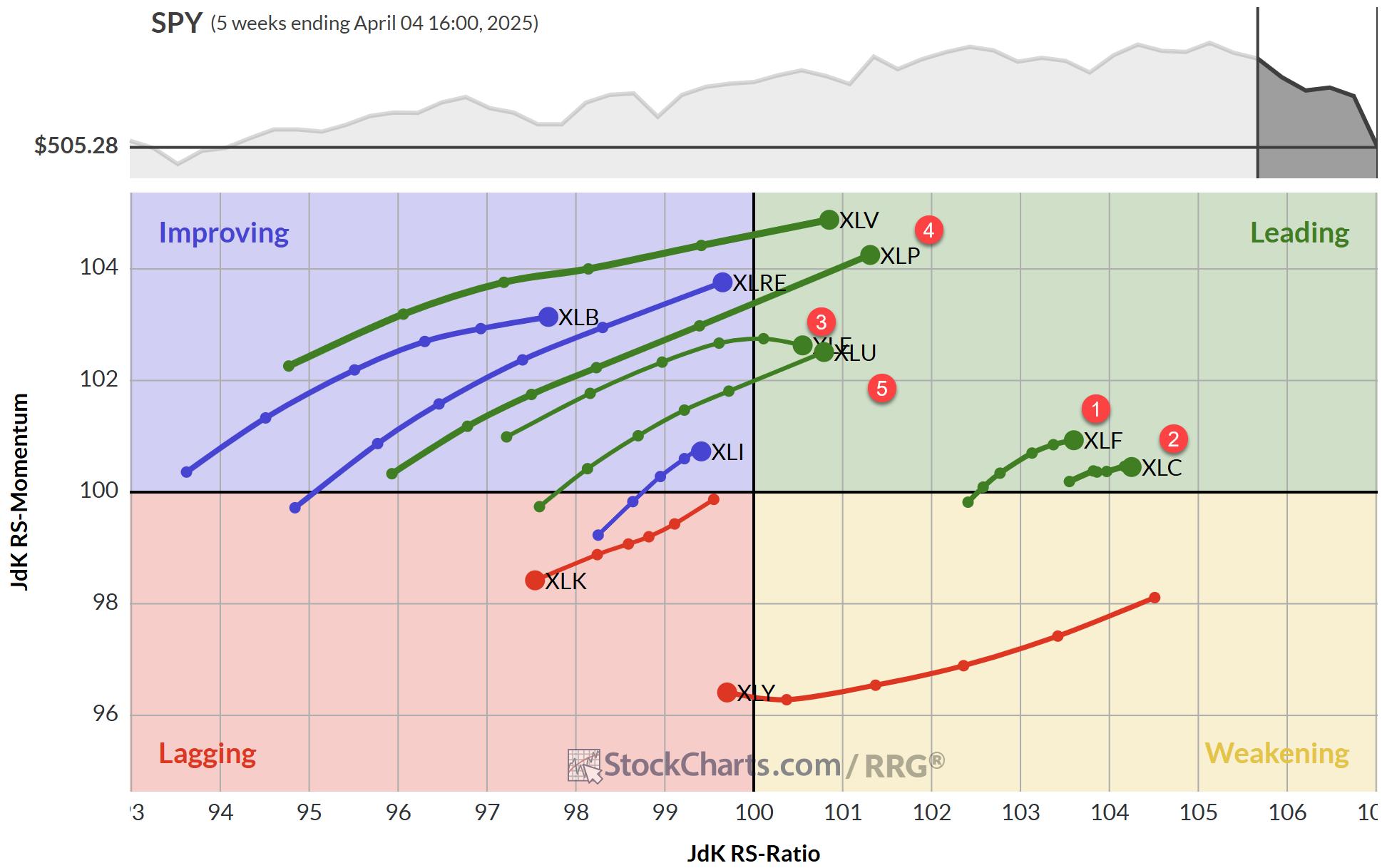
Wow, there's a lot going on in the markets and some big shifts seem to be under way in asset class rotation as well as in (international) equity markets rotation. Relative Rotation Graphs may help you get a handle to put all this movement into (relative) perspective. Let's start with a look at the rotation of various asset classes against a balanced portfolio (VBINX, Vanguard Balanced Index Fund)
So you thought equities made a big move ...?
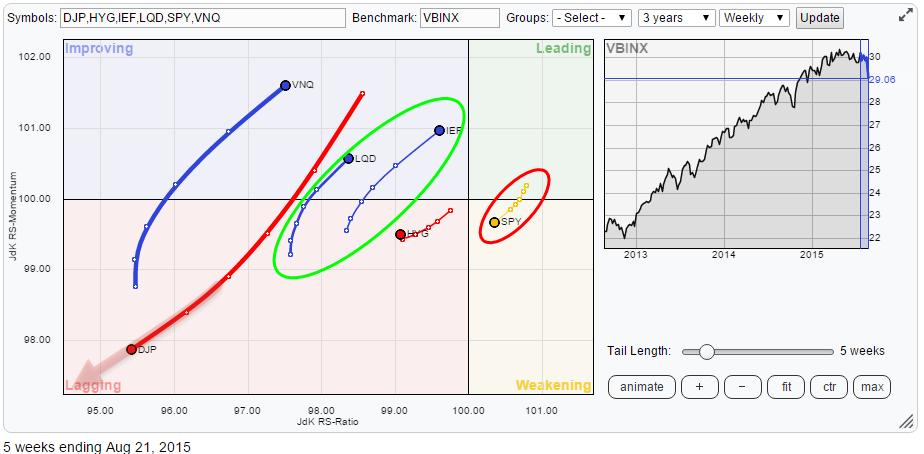
In order to put things into perspective check out the length of the trails for SPY and DJP for example. Yes equities (SPY) dropped like a stone but commodities (DJP) dropped even harder. This is where Relative Rotation Graphs can help you to put things into (a better) perspective.
On the same picture above we can see the the almost perfect opposite moves for SPY on the one hand and IEF, LQD and VNQ on the other hand. Where equities are both losing relative strength and relative momentum, these other three asset classes have been picking up on both axes.
Commodities - DJP
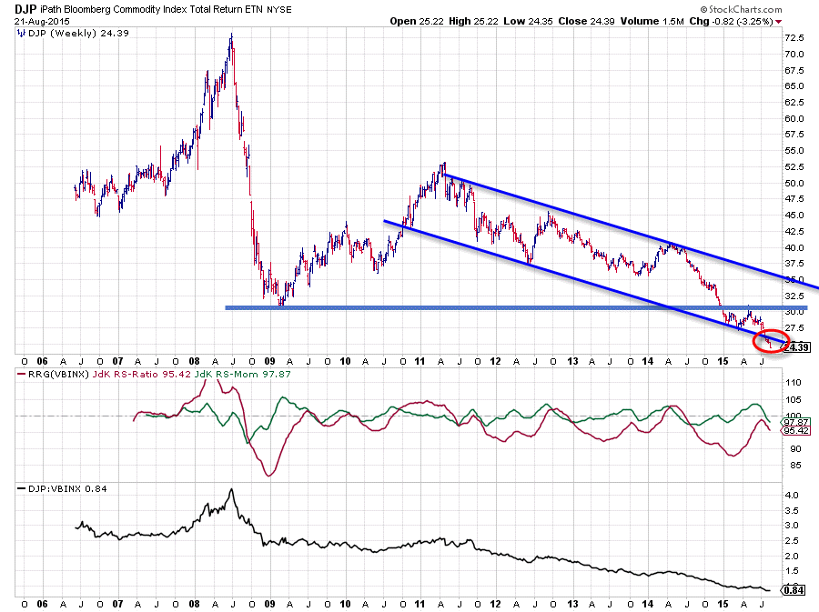
You have seen the chart of DJP in my blogs on asset allocation before and I don't think that I have ever, since I started to write on the site here, been able to find anything positive for this asset class. And quite frankly the picture which is thrown at us by the market at this moment is not going to change that.
Above I created a long(er) term chart for DJP (data since its inception back in 2006). Two things are important here in my opinion. First the falling channel that captured the high-low rotations of DJP since 2011 and secondly the horizontal support level offered by the early 2009 low.
The latter plays an important role in my judgement of the current situation. It should have caught the decline late in 2014. The fact that it did not was a clear sign of weakness and basically triggered further weakness for this asset class. Just after this break of support the lower boundary started to offer support but on a sliding scale, not good. Then a small recovery rally emerged which was subsequently capped by the former horizontal support level which now started to act as resistance, another sign of weakness. After that supply took over again and pushed DJP further down and during last week was even strong enough to push DJP below its already falling support line. Usually dropping below an already falling support level triggers another acceleration in the prevailing down-trend.
All in all this chart looks (still) very weak and there are no signs to see that could call for any improvement at short notice. The downside is wide open and on the upside there is a lot of overhead resistance awaiting for DJP.
Equities - SPY
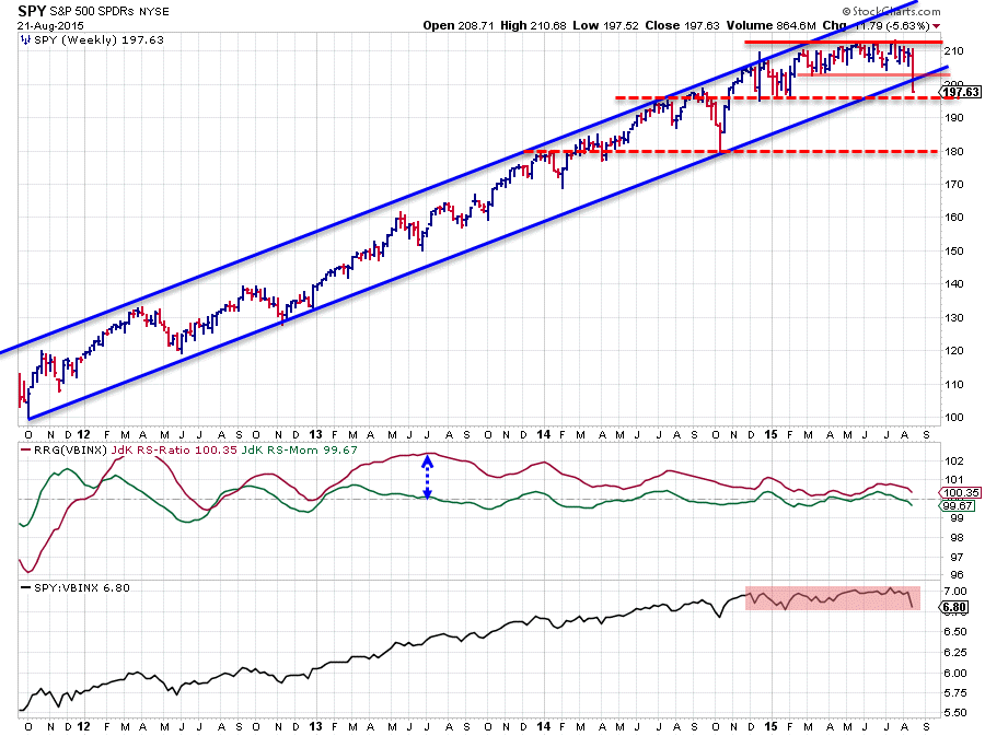
Equities are getting hammered at the moment but despite that beating they are still the only asset class on the right hand side of the weekly relative rotation graph. But the direction of the trail, especially when compared with the direction of the trails on other asset classes shows that rotation among asset classes is under way.
Above is the weekly chart of SPY in combination with the RRG-lines against VBINX. The weakness caused by the breaks of various support levels on the price chart is clearly visible. First the break of the lower boundary of the trading range around 203 followed by the break below the rising support-line which has been capturing all declines since late 2011. The break of this double support area is not a strong sign.
The next area of support can be seen around 195 where a number of highs and lows were clustered in the second half of 2014 and early 2015. When the current surplus of supply is strong enough to also push SPY below that level we will probably have to face a further decline towards the 180 area where more support is visible. Thus not a very rosy outlook in the near-term but more importantly the upside seems heavily capped by the previously mentioned, old, support levels which can be expected to come back as resistance levels now in case of market rallies. A risk / reward ratio tilted to risk !!
In comparison with other asset classes SPY is still on the right side of the equation (on weekly charts) but assuming the continuation of the current rotation that is not expected to last much longer.
The RRG-lines on the SPY chart above show the slowly diminishing strength of the relative trend of SPY against VBINX. Compare the level of the JdK RS-Ratio mid-2013 with the levels since the beginning of this year. High levels are good and above 100 indicates a relative up-trend and this is still the case at the moment, but the loss of momentum is visible and expected to drag the JdK RS-Ratio below 100 as well.
Things are seen in more detail on the daily RRG below.
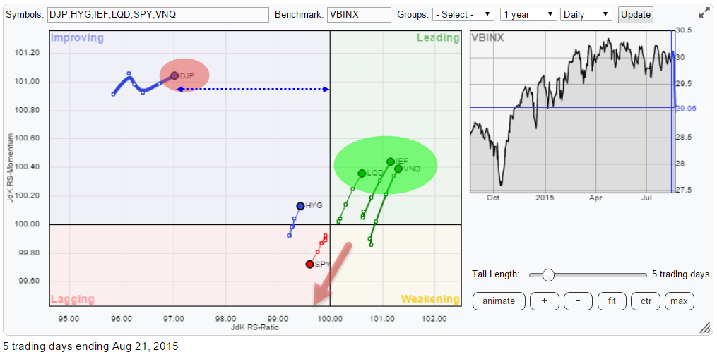
On this picture SPY has already moved into the lagging quadrant and is heading lower on both axes while the asset classes which were moving opposite SPY, inside the improving quadrant, on the weekly RRG are now showing up in the leading quadrant and heading deeper into it.
When you click on the link of the daily RRG above the live chart will open positioned on the 8th of July. What you will note is that at that time all asset classes were clustered very close to the centre of the chart. Then click "animate" to see the markets choosing direction against each other with DJP shooting off to the left and the other asset classes separating themselves over the past few weeks.
DJP, despite being in the improving quadrant, is way too far to the left and therefore still negative. The improvement of LQD, IEF and VNQ over SPY is now starting to take shape which means that we now have a situation where the relative direction for these markets is now confirming the developments that we have seen taking shape on the weekly. The conclusion being that fixed income and real-estate asset classes are taking over from equities on the daily charts and are expected to do that as well on the weekly soon !
Government bonds - IEF
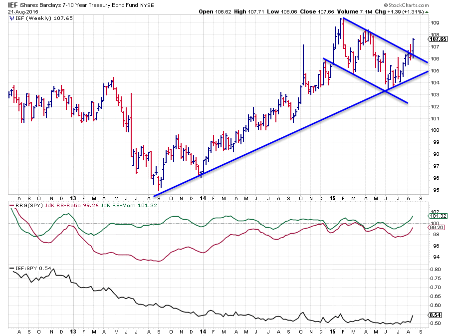
The direct comparison between equities (SPY) and Government bonds (IEF) is shown above. On the price chart the improvement of the bond market translates into an upward break above the short-term falling resistance line which opened up the way for a further rise. There are some horizontal resistance levels overhead but the down-side seems well protected at the moment which makes IEF an attractive alternative for equities at the moment.
This view is confirmed by the relative strength charts. The JdK RS-Momentum line has jumped above the 100 level already and the RS-Ratio line is following rapidly behind. On the raw RS-line the upward break is hard to distinguish on the chart above but when you click the (linked) chart a live version will open. Switch back and forth between weekly and daily and you will clearly see the break in relative strength.
Hence the answer to the question in the title of this article is, very likely, US Government bonds !
US equities against the rest of the world
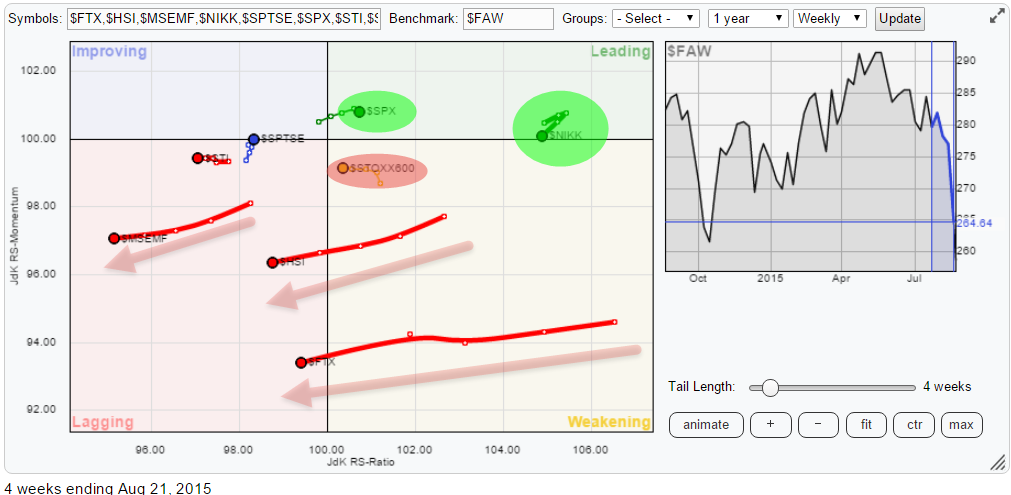
Us equities (SPY) is not the only equity market dropping in value over the past few weeks, as a matter of fact US equities are actually quite strong in comparison with other markets around the world. Check the Relative Rotation Graph below to see the rotation that is unfolding across the various equity markets in the world.
As you know the markets that are furthest to the right are in relative up-trends against the benchmark, in this case the FTSE all world index. Reading from right to left we find the Japanese Nikkei index as the strongest market at the moment from a relative perspective. Despite the fact that here also a serious setback seems to be under way. The Nikkei has managed to hold up above support for the time being.
The second market is the S&P 500 index which is only a touch better than the European STOXX 600 index. The big difference between these two is the direction in which they are heading. The US is heading East while Europe is travelling West which suggests an out-performance for US equities over European.
Often when I do presentations I try to explain to people that it is (far) more important to know where you should NOT invest. The RRG above makes this crystal clear! If you can't stand the heat, get out of the Asian kitchen. Look at the moves of Hong-Kong, China, Emerging Markets but also Singapore. In comparison with these markets the trails that we see on US, European and Japanese markets are child-play. The really big moves and shifts in rotation are taking place in Asia and despite the fact that equities are getting hammered all over the place, the US and especially Japan seem the place to be for any equity allocations in a portfolio.
Conclusion
- Commodities remain out of favour
- Fixed Income and Real-Estate are overtaking equities
- Within equities the US and Japan are holding up well
- Very weak rotation for China, Hong-Kong, Emerging Markets and Singapore.
Julius de Kempenaer | RRG Research
RRG, Relative Rotation Graphs, JdK RS-Ratio and JdK RS_Momentum are registered TradeMarks by RRG Research

