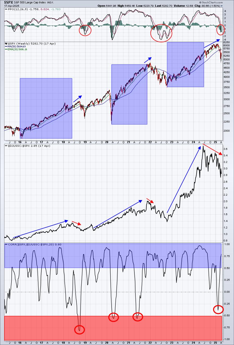
The chart of the S&P 500 index ($SPX) or its ETF equivalent (SPY) has popped up in almost every blog article on the site over the past few weeks/months and the vote has been almost unanimous : It's not looking good! From an absolute point of view that is...
When watched through an international lens the US is actually improving versus other stock markets around the world. The Relative Rotation Graph below shows the relative rotation of the sectors of the S&P 500 index ($SPX). In this article I will take a more in-depth look at the Utilities sector, including some individual stocks, as it looks to be one of the better sectors inside the S&P 500 index universe with some more out-performance up its sleeve as well as have a look at the relative position of the US market vis-a-vis the rest of the world.
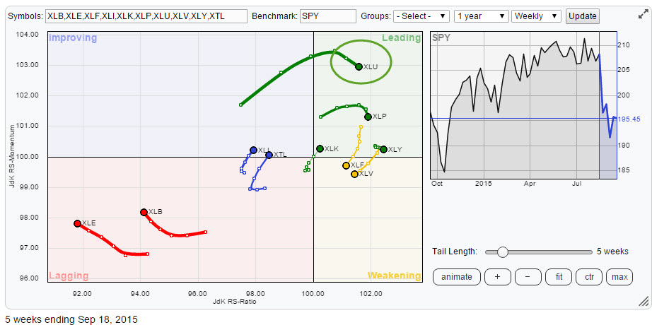
Strong rotation for Utilities (XLU)
The RRG above is a familiar picture for regular readers of this blog. In my previous article I already highlighted the Utilities sector as one that is benefiting from the sector rotation out of, especially, Energy and Materials. The reason for XLU to stand out on the graph is the fact that it is showing the highest relative momentum of all sectors in the universe at this point in time. Although it has dipped slightly over the past two weeks the JdK RS-Momentum reading is still much higher than the other sectors displayed on the RRG.
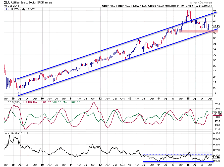
Below is an updated chart of XLU which shows that the rising support line is doing its job and was able to prevent a further decline below $40. I take this as a sign of strength for this sector, especially given the weakness of the market as a whole. An in-depth analysis of XLU is found in the previous article (link above) and that analysis still stands as of today. Adding to that analysis we can now see that the raw RS-line seems to have formed a higher high and is trying to pick up again towards the levels of the previous (2) peak(s). A break above those two previous highs in relative strength will certainly help Utilities to get further ahead versus the other sectors.
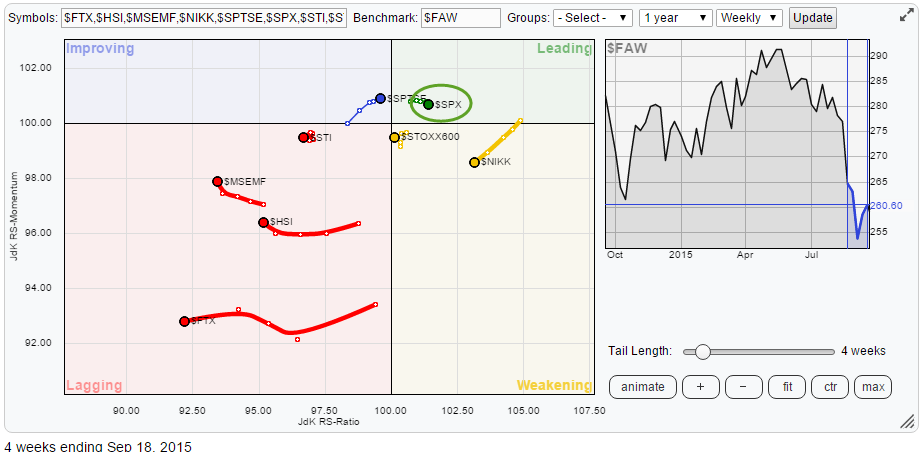
SPY vs the rest of the world
Although the general take on the S&P 500 index ($SPX) is negative and I am in that camp as well for the time being, the US market actually looks fairly good on a relative basis. When the S&P is positioned on a Relative Rotation Graph together with a number of other international equity markets and compared with the FTSE All world index, $SPX is showing up in the top-right, leading, quadrant and it is the only index, together with the Canadian TSX, that is moving higher on the JdK RS-Ratio scale. So, despite the fact that equity markets around the world are having a hard time, the US (and Canada) seem to get hurt the least.
Matching RRG quadrants with styled sector rotation cycle chart
As mentioned above the Utilities sector (XLU) is standing out on the Relative Rotation Graph as potentially interesting, as it is inside the leading quadrant and showing the highest level on the JdK RS-Momentum scale. The picture below shows the modeled "sector-rotation" chart from the ChartSchool article on this subject. I have tried to align the positioning of the various sectors on the RRG by colour coding the sectors according to their position on the Relative Rotation Graph.
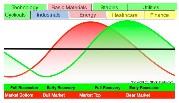
The way I read this information is that given the current relative trends the general market is definitely past its peak with Basic Materials and Energy deep inside the lagging quadrant now. Whether we are in a bear market or already forming a market bottom can be debated as Staples, Utilities, Technology and Cyclicals (Consumer Discretionary) are all inside the leading quadrant and thus in relative uptrends against SPY, but we're not in a bull market and we're past the top, that's for sure.
With utilities strongest on the RS-Momentum scale, they make an interesting sector to have a better look at.
Dissecting the Utilities sector via XLU
The Relative Rotation Graph below shows the constituents of XLU compared to XLU itself:
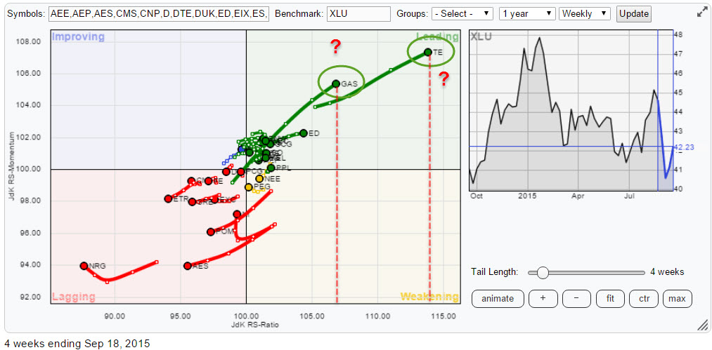
When I bring up this RRG on StockCharts.com, immediately two names stand out, GAS and TE. However when I hover the mouse over the graph icon to the left of their names in the table below the chart, I can see why that is. Both stocks jumped big time not too long ago which distorts the relative picture. A quick investigation shows that both are take-over candidates which makes a further move unlikely, so I am going to remove them from the Relative Rotation Graph to improve the readability. I have done the same for a number of stocks which either showed a jump up or down in price (like POM), are moving close to the benchmark or are in prolonged relative trends with no signs for an imminent change visible (like NRG).
This leaves me with the RRG chart below.
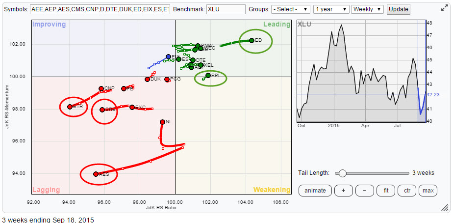
In the lagging quadrant I have circled three names, ETR, SRE and AES. All of these charts are showing (very) weak price charts but above all, very weak relative rotation against XLU. The chart of SRE is printed below as, for me, it shows an almost perfect roll-over from one trend to another.
Sempra Energy - SRE
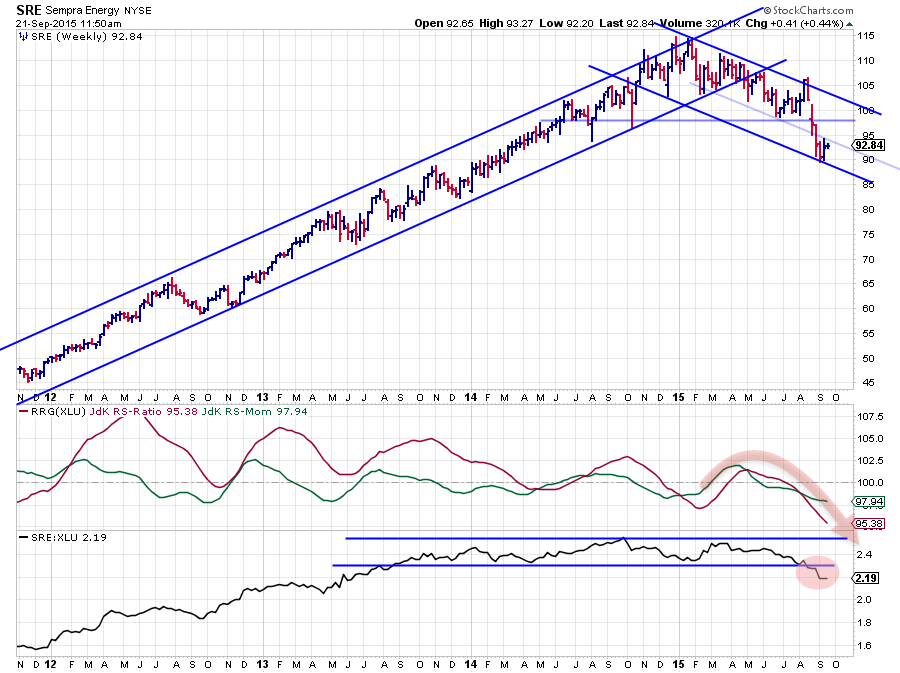
On the price chart the uptrend was broken late April after which a new series of lower highs and lower lows started to form. Relative momentum started to drop mid-May and the RS-Ratio line dropped below 100 mid-July while SRE was still trading above $ 100. Subsequently both price and the raw RS-line broke below their respective horizontal support levels thus triggering an acceleration in the decline. Clearly a stock to avoid within the Utilities sector.
Similar charts can be found for ETR and SRE although not as smooth.
As XLU as a sector is already rated as an out-performer vs SPY, we can use the RRG chart above to do some cherry-picking inside the leading quadrant. There are two stocks I am particularly interested in, ED and PPL.
PPL Corp. - PPL
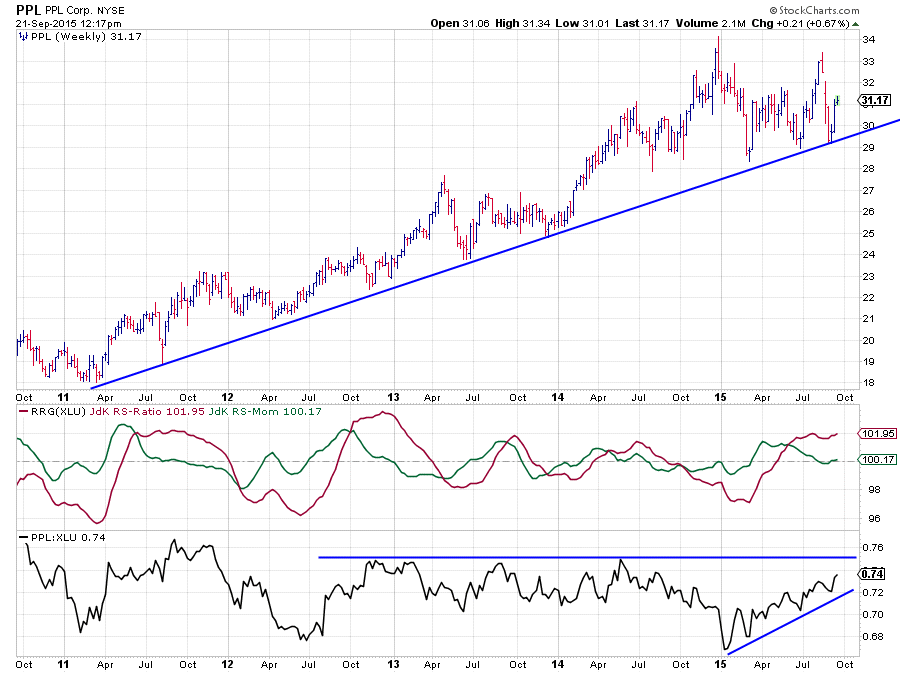
The PPL price chart above largely follows the development of XLU itself which is a positive. It's the development in the relative strength graphs that make PPL worth the extra look. From the relative low in the beginning of the year the stock has started its way higher at a solid pace, outperforming XLU (and thus SPY). This has pushed the JdK RS-Ratio well above the 100-mark where it is now stable around 101. The JdK RS-Momentum line dropped back a bit over the past weeks but seems to be turning around now near 100, which causes PPL to rotate back up into the leading quadrant from weakening where it was for a very short period of time.
This means that a strong relative trend is in play here which has just ended a temporary setback but is now likely to continue its way higher versus XLU.
Consolidated Edison Inc. - ED
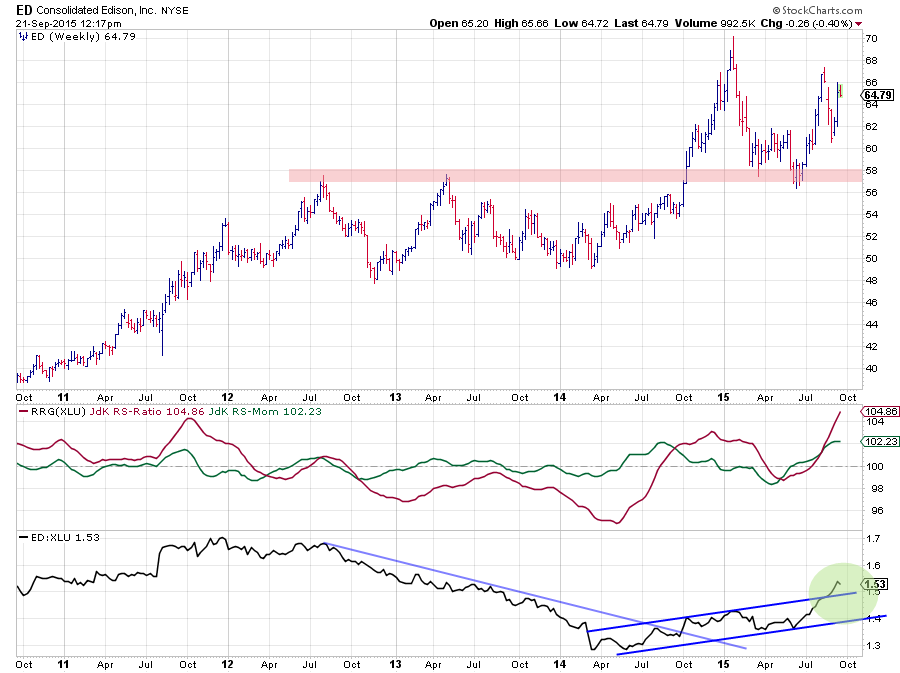
On the above chart of ED we see a very strong support level around $ 58. This level capped a further rise back in 2012 and 2013 but was broken upwardly late in 2014. Price accelerated higher after the break to form a new high near $ 70. The drop back from that peak has now tested that former resistance level as support, twice.
Before price broke above that resistance level near $ 58 the relative strength graphs (RRG lines and raw RS-Line) already broke above the 100-mark (RRG-Lines), indicating that a relative uptrend was underway, and above the falling resistance line on the raw RS-line. The recent break of the raw RS-line out of the already rising channel is causing an acceleration in relative strength which makes ED one of the strongest stocks, if not THE strongest, in the utilities sector for now.
Conclusion
- Utilities (XLU) showing strong sector rotation in S&P universe
- US markets showing relative strength from international perspective
- Positioning of sectors on Relative Rotation Graph corresponds with bear-market / market bottom on styled sector-rotation chart
- ETR, AES and SRE expected to continue their underperformance within the Utilities sector
- PPL and ED are leading utilities higher at the moment
Julius de Kempenaer | RRG research
RRG, Relative Rotation Graphs, JdK RS-Ratio and JdK RS-Momentum are registered TradeMarks by RRG research.