Summary
- Health Care (XLV) catching a cold as it is rolling over
- Financials (XLF) at crossroads, needing to unlock one of two scenarios in coming weeks
- Energy and Materials gaining relative momentum inside the improving quadrant, but follow-through is questionable
- Utilities, Staples and Discretionary stable inside the leading quadrant
- Information Technology the sector to watch for further improvement in coming weeks.
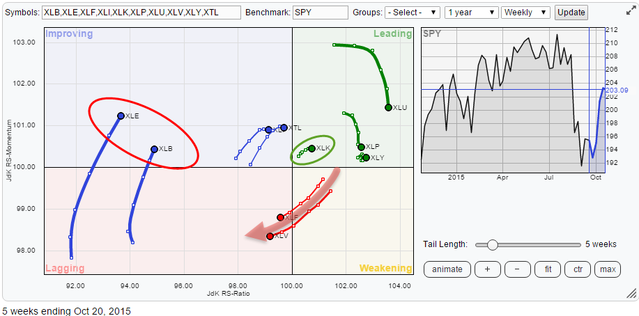
Initial observations
The Relative Rotation Graph showing the sector rotation for US equities (S&P sectors) tells us that the Health Care sector seems to have had its run and is now starting to roll over into a relative downtrend. If it is not getting sick, this sector is definitely catching a cold.
But XLV is not the only sector showing a weak(er) rotation pattern. Right alongside XLV we find XLF, the financials sector following almost the same rotation path as XLV.
On the left hand, weak, side of the RRG there are two sectors standing out. These are XLE, Energy, and XLB, Materials. Given the low level on the RS-Ratio axis for both of these sectors, it is doubtful if they will be strong enough to make it all the way to the leading quadrant. A rotational pattern through the improving quadrant and then back down into lagging seems very well possible and will underscore the current weak relative trends for both sectors.
In the leading quadrant, we find three sectors which are still showing a positive rotation, continuing their relative uptrends versus SPY. These are XLU, Utilities, XLP, Consumer Staples and XLY, Consumer Discretionary. The one sector in the leading quadrant that really deserves a closer look, however, is Information Technology (XLK).
Health Care - XLV
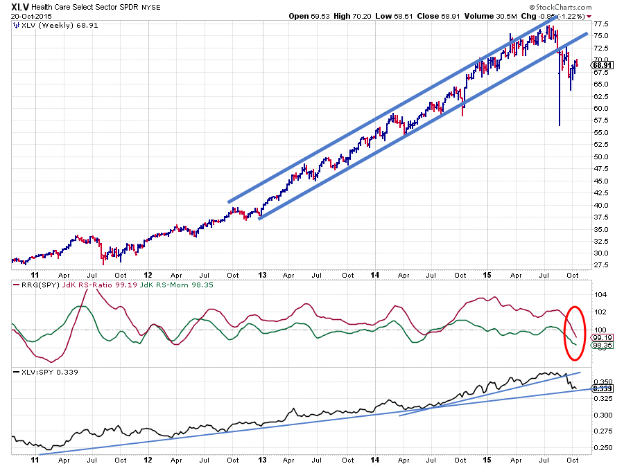
If we look at the price chart above we can see that the health care sector (XLV) basically has been moving in an uptrend all of the time. As a matter of fact, this uptrend in price already started back in 2009.
However, it wasn’t until 2012 before also the relative strength of XLV against the broader market (SPY) started to pick up. Sometime mid-2012 the JdK RS-Ratio crossed above the 100-level signaling that an uptrend in relative strength had started. Pretty much all of the time since 2012 the RS-Ratio line remained above this 100 level with the exception of a short period in the middle of 2014.
The green JdK RS-Momentum line oscillated above and below the 100-level indicating periods of stronger and weaker relative momentum during the whole period. This has been causing rotations which took place completely on the right-hand side of the Relative Rotation Graph. The sign for a very strong relative trend.
Just recently the JdK RS-Ratio dropped below 100 as it was dragged down by a falling JdK RS-Momentum line for a few weeks already. This move suggests that a new relative downtrend for XLV is starting to get underway.
A double-check on the price chart is supporting such a view as for the first time in a very long period price has started to form lower highs followed by lower lows and the rising support line which was marking the lower boundary of the rising channel was broken downward in August.
It looks as if one of the strongest sectors in the S&P has started to roll over on both the price and the relative charts which urges caution for the next few weeks/months. Relative strength is now resting at a longer-term support line. When this manages to hold, it is possible that the current weakness is indeed "just" a cold. If RS breaks below this long-term rising support line the current cold could turn into a more serious illness very rapidly.
Financials – XLF

The financials sector (XLF) is one of the major sectors within the S&P universe and, therefore, a big driver for the market as a whole.
On the Relative Rotation Graph are showing an almost identical rotation/trail. But are they really the same?
This is where the animated rotation feature of the RRG chart comes to the rescue as it will show you how both of these sectors arrived at their current position on the RRG and you will notice that they did not take the same path to arrive at their current position.
Where XLV had been very strong for a very long period of time, XLF has been going through various full rotations (travelling through all four quadrants on the RRG) over the same period of time.
And if you look at the relative charts (bottom two panes) on XLF the picture above you can see that these rotations have not been overly strong. The raw relative strength line in the lower pane has more or less been moving sideways since the middle of 2013 forming a trading range, causing the swings in the JdK RS-Ratio line to be moderate and not move far away from the 100-level. This indicates that the trends that became visible were not very strong as strong trends tend to pull the RS-Ratio line far away from the 100-level.
A look at the rice chart of XLF reveals that:
- The uptrend visible from the low in 2011 has definitely been broken
but also that - The “new” trend is not as decisive as we see in XLV.
As a matter of fact, it looks as if some new support is building up around $ 22.
So what could happen from here? To me, it looks as if both the relative and the price performance are more or less in synch at the moment.
Price dropped but came to a rest at support and is trying to work its way higher again, at the same time relative strength dropped to the lower boundary of its trading range and can be expected to move higher, back to the upper boundary of this range, assuming that it will stay intact.
This scenario would imply further improvement of price from here which would then very likely cause a quick rotation on the RRG not far from the benchmark. And given the importance of this sector in the S&P this would then likely coincide with a further strengthening of the market as a whole.
The other, more negative scenario, would be for the next drop in price to take out the freshly formed support level at $22 followed by an acceleration of the move lower, which, in its turn, would then cause the raw RS-line to break below the lower boundary of its trading range and thus starting a new (real) downtrend in relative strength causing a much wider rotation and further push of XLF into the lagging quadrant.
Price action in the next few weeks will hold the key and unlock one of these scenarios.
Energy – XLE
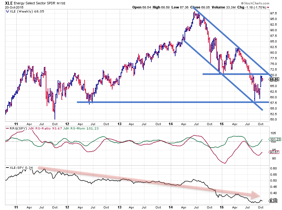
A completely different picture, not only by its rotation on the Relative Rotation Graph, is shown by the energy sector (XLE).
On the price chart, this sector already saw its peak back in July 2014 and started a big move down from that time onwards. The attempt to turn this move around at the beginning of 2015 failed miserably as the market fell roughly 30% afterwards.
From a relative point of view, the picture is even worse. As can be seen on the raw relative strength chart the sector has been more or less in a relative downtrend all the time since 2011. The JdK RS-Ratio line shows a few attempts for a new relative up-move, but they have been very weak and not successful.
The recent drop of the RS-Ratio line, which started in September 2014, marked the strongest relative downtrend in a period of more than 10 years followed by a recovery but as you can see that recovery was not strong enough to pull the RS-Ratio back above 100, i.e. turn the relative downtrend around. At the moment, again an attempt for a move higher seems to be underway. But given the position of this sector on the RRG, weakest sector measured by RS-Ratio it remains doubtful whether this attempt will be successful.
This thought is also fueled by an analysis of the price chart. It does look like some support is being built up between $57.50 - $60, which coincides with a low set in 2013. However, the rally out of this young support level already seems to be hitting a double resistance area coming off the falling resistance line as well as the former horizontal support level around $70 making a further rise questionable. Before this happens it looks as if we need at least one more leg down and possibly a new low being formed above $60. Such a setup would prepare the energy sector for an improvement which would at least stall the current downtrend in price and potentially in relative strength as well.
Until this happens remain cautious with energy stocks as the relative downtrend is still in full swing.
Materials – XLB
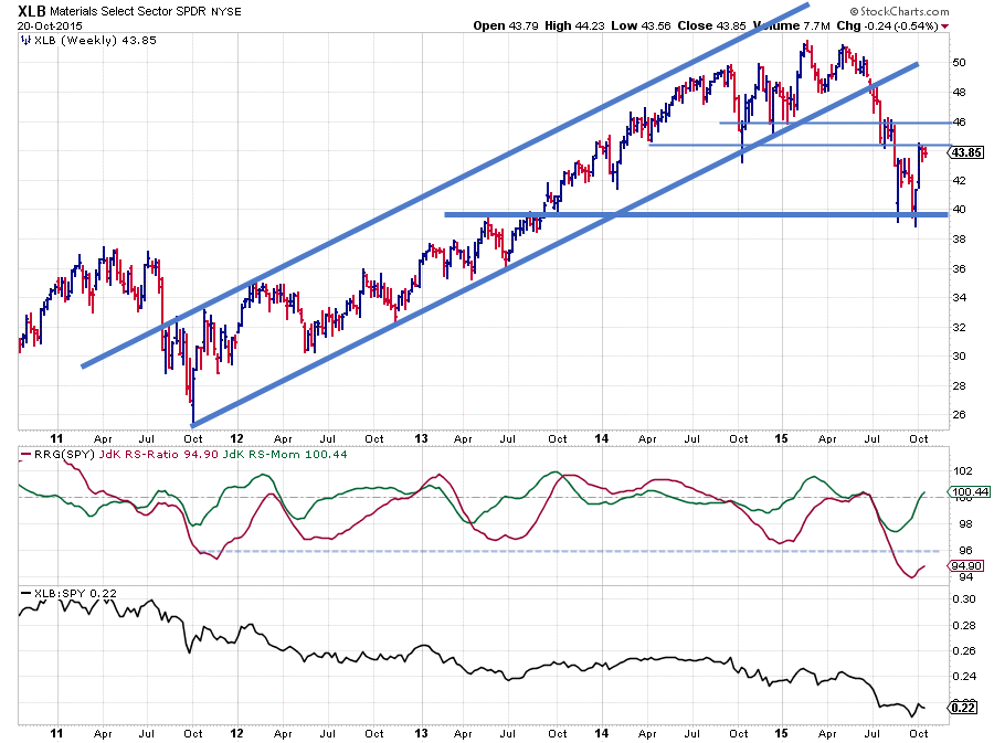
The Materials sector set its peak early in 2015. The drop from this peak down broke the rising support line, running under the lows since 2011, which definitely weakened this sector. Just recently price seems to have found support around $38-40 which corresponds with the level of two major peaks dating back to 2008 and 2011.
But the rally out of this support level already seems to be bouncing its head against a former horizontal support level near $45 which is now acting as resistance making a rapid further rise at least questionable.
The relative line shows a similar pattern as the one for XLE. Pretty much heading lower all the time since 2011. Here also the RS-Ratio line has reached fairly extreme reading in comparison with the rest of the universe. Hence here also it is doubtful whether the current pickup in relative momentum will be strong enough to pull the RS-Ratio all the way back up able the 100-mark without another leg lower forming a better base to jump from.
The relative downtrend is still intact.
Inside the leading quadrant
We find four sectors inside the upper-right, leading, quadrant. They are Utilities, Consumer Staples, Consumer Discretionary and Information Technology.
Utilities and Consumer Staples are clearly losing relative momentum at the moment, judged by their relatively long trails that are pointing lower. Consumer Discretionary (XLY) has a very short trail, indicating a very stable and steady move/performance over the past five weeks. All these three sectors are still clearly in a relative uptrend vis-à-vis SPY.
The one sector inside the leading quadrant that is showing a really promising rotation is Information Technology (XLK) as it is still relatively low on the JdK RS-Ratio scale but nicely heading higher on both axes at the same time indicating an improvement of relative strength that is still powered higher by rising relative momentum.
Information Technology – XLK
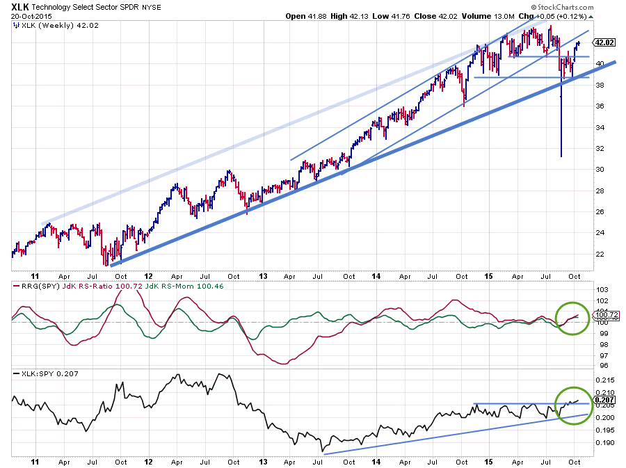
On the XLK chart above one can draw two rising support lines. One running under the lows since mid-2013, which was recently broken followed by a (sharp) drop in price. If we see the wide swing as an outlier (run the same graph based on closing prices to get a better view) new support has formed around $30.
The second trendline originates from the lows in 2011 and as the recent lows have formed against this longer term trendline it looks as if this trend is still intact and a new move higher off of this support is now underway.
The relative trend was very strong during 2014 but started to move more or less flat since the beginning of 2015 resulting in a drop of the RS-Ratio line back to the 100 level where it stayed almost all of this year.
The recent rise off the rising support line is now starting to cause improvement in relative strength as well and the raw RS-line is on the verge of breaking upwardly out of the sideways range of the past months. The JdK RS-Ratio line has already picked up on this improvement and has started to rise above the 100-level in tandem with the JdK RS-Momentum These synced moves of RS-Ratio and RS-Momentum are now causing a rotation into the leading quadrant on the Relative Rotation Graph at an almost 45-degree angle. And as this is all occurring at a relatively low level on the RS-Ratio scale there should be enough potential left to continue in coming weeks, making Information Technology the sector to watch for further improvement.
Julius de Kempenaer | RRG Research
RRG, Relative Rotation Graphs, JdK RS-Ratio and JdK RS_Momentum are registered TradeMarks by RRG Research


