In my recurring cycle of blog subjects, it is time to take a look at the components of the Dow Jones Industrials index again.
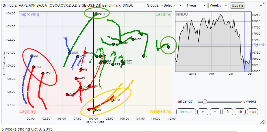
Once again there is a lot to see on the Relative Rotation Graph for this universe. We have GS, JPM and DIS nose-diving into the lagging quadrant on the bottom of the chart. Opposite of that, we find INTC racing into the leading quadrant with a long tail and at very high JdK RS-Momentum levels. On the (far) left side of the chart we find three stocks moving almost vertically into or nearing the improving quadrant but these moves are suspect to me and I'll explain to get deeper into that further down in this article. And finally we find a number of stable outperformers on the right-hand side and inside the leading quadrant. Names like NKE, HD, MCD and AXP are catching my eye.
A new commenting system!
Before I dive into the charts I would like to point your attention to the new commenting system that we have here at StockCharts.com. DISQUS is a universal commenting system that is used by a lot of websites and which makes it very easy to participate in discussions on various subjects. In order to be able to put in your comments with questions or show your appreciation for an article, you need to log in to DISQUS. You can create a new account at DISQUS or connect DISQUS to either Facebook, Twitter or Google or all three. After you have done that logging in is just a one or two click action.
If you stop reading this article here then please put in a comment telling me why and what you think should be different and what would make you read on until the end of the article? :)
Dead cat bounce(s)
On the left-hand side of the Relative Rotation Graph, there are three stocks that are showing almost vertical movement (improvement on the JdK RS-Momentum scale) but very little or no sideways (left to right) movement. Given the fact that these three stocks, DD, CVX, and UTX are the weakest stocks on the JdK RS-Ratio scale and far out to the left-hand side of the plot, this makes these moves suspect as there is a very good chance that the current rise in relative momentum is only a recovery rally within the longer term declining relative trend.
DuPont Co. - DD
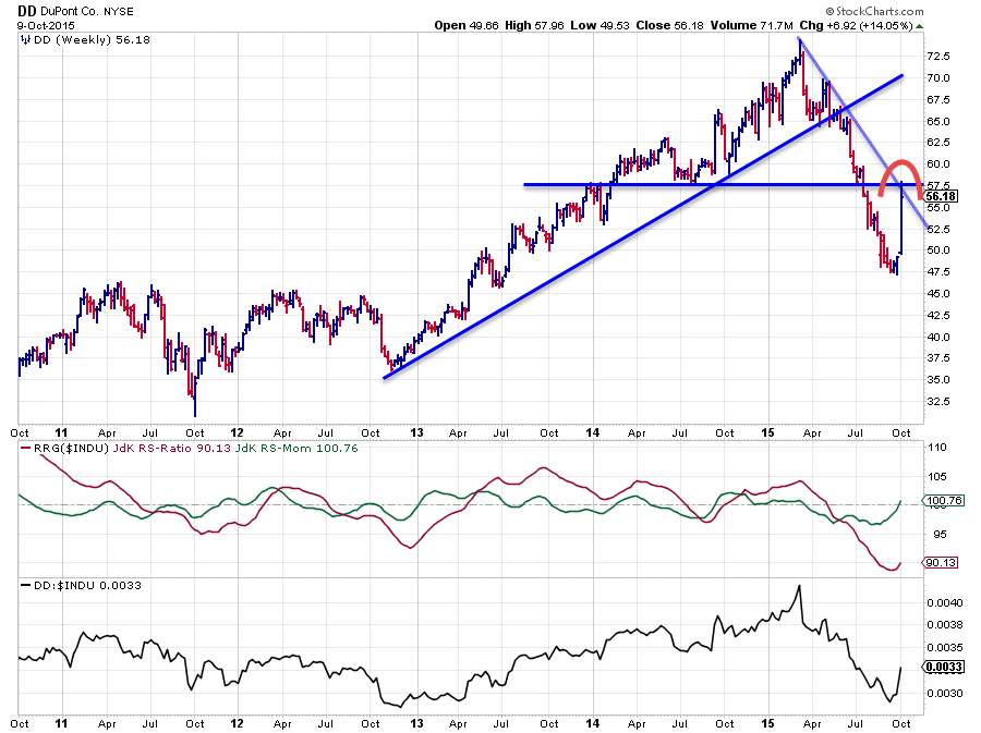
In the previous version of my blog on the Dow Industrials stocks, DD was already featured as one of the weaker names in this universe. And although price continued to decline in the weeks after that post last week showed a completely different picture for DD.The stock jumped in price and literally bounced back all the way to the previous breakout level near $ 57.50. As you can see on the chart above this 2-day jump caused some improvement in the JdK RS-Ratio line on the weekly chart and it is also dragging the RS-Ratio a little higher but in the bigger scheme of things the RS-Ratio is still at the lowest level since 2009. So from a relative point of view DD is still in a downtrend.
One of the characteristics that is observed often on a Relative Rotation Graph is that stocks that are showing very strong relative downtrends can rotate, completely on the left-hand side of the RRG. This type of rotation simply visualizes the high-low rotation of the RS-Line inside its longer-term falling trend.
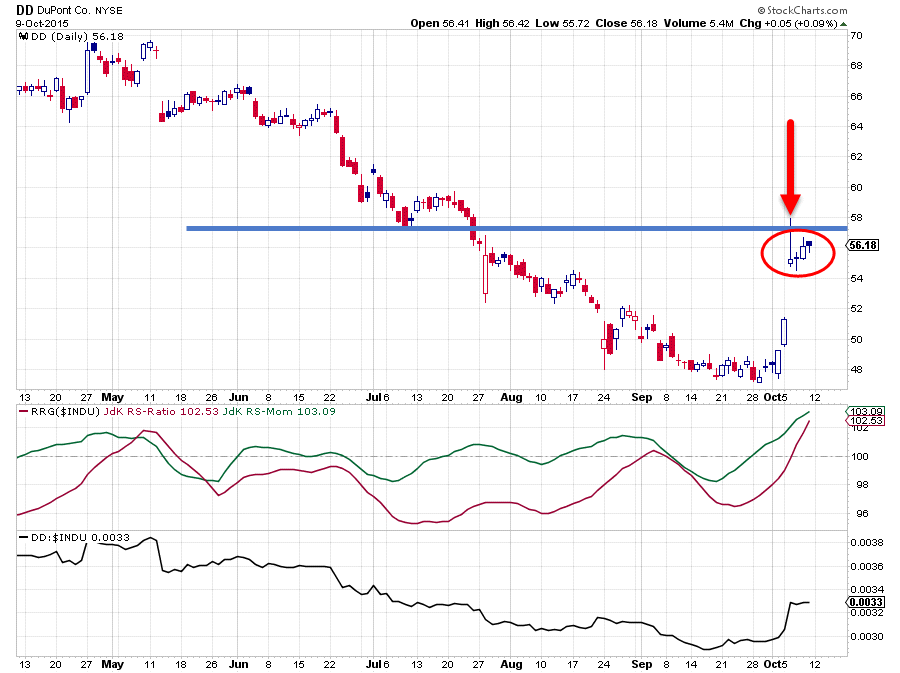 Another thing that I observe on the shorter term DD chart and more specifically on the candlestick chart is the occurrence of a so-called shooting-star. Read more about it in the chart school article here. It is labeled as a bearish pattern!
This shooting star occurred just below the aforementioned horizontal resistance barrier and the follow through in subsequent days has not been able to push the stock any higher, let alone, beyond its resistance level. There is a serious chance ere that the resistance level will be too much to break and that new selling will come in to push DD lower again. Such a new wave of selling will surely take its toll on the relative performance as well and most likely cause the relative strength line to top out and start moving lower again.
All in all this makes DD a dangerous play at the moment from both a relative and a price point of view. Remain cautious.
Chevron Corp. - CVX
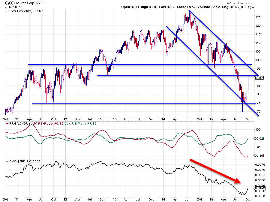
The relative trend for CVX already turned down back in October 2014 (JdK RS-Ratio < 100) and is still very much in that relative downtrend today. The JdK RS-Ratio is at very low levels, similar to those at the beginning of this year. This positions CVX far out on the left (negative) side of the Relative Rotation Graph. The turn up in RS-Momentum over the past few weeks is very likely a recovery move within this longer-term downtrend. A lot of improvement is needed in relative strength to bring the RS-Ratio line back above the 100-mark again nd it is unlikely that this will happen in one straight move.
When looking at the price chart, a falling channel started to become visible since the beginning of this year. After breaking support near $ 97the decline started to accelerate and this acceleration continued when the next support level near $ 90 also gave way. Only at support, coming off the 2011 lows, the drop in price could be stopped. What we now see, in my opinion, is a recovery after the steep drop in price since April, but it is taking place within the boundaries of the falling channel and this pattern looks nowhere near some sort of a reversal. A lot more upward movement in both price and relative charts is needed to establish that and this makes CVX a stock to be careful with.
United Technologies Corp - UTX
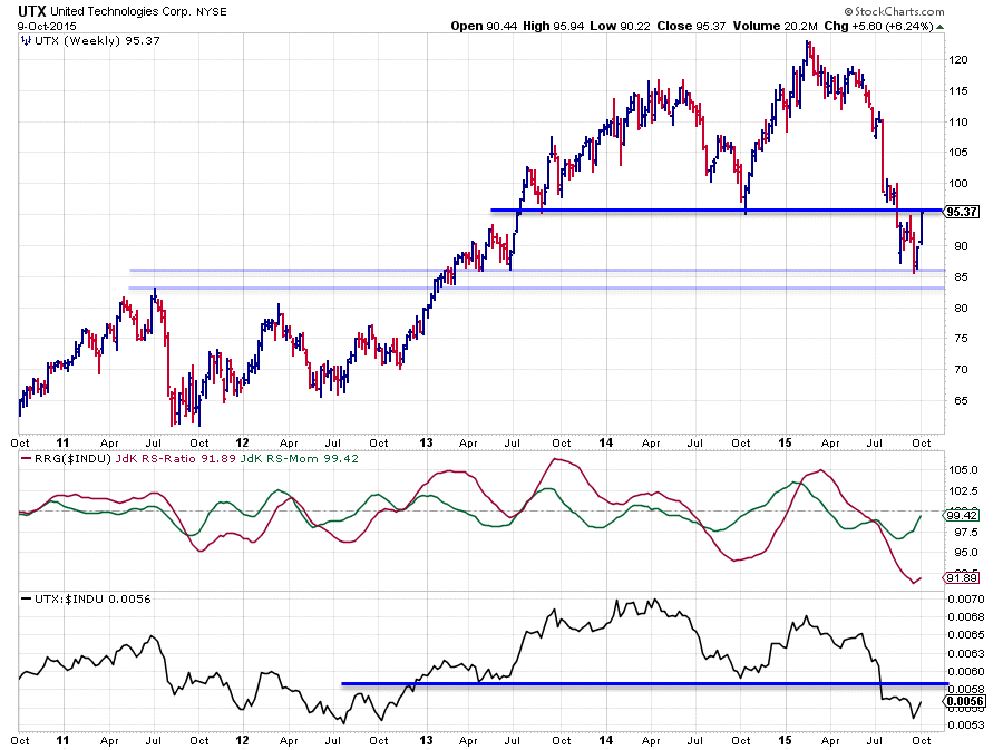
A similar analysis can be done on the chart of UTX above. The short version is that here also a lot more upside movement in both relative and price charts is needed to turn the current downtrend around into something more meaningful. For the time being the recent rally much more looks like a recovery within a longer term down move.
In the danger zone
On the Relative Rotation Graph at the top of this post, there are three stocks highlighted that are moving from the weakening quadrant towards, or already into, the lagging quadrant. They are GS, DIS, and JPM. Of these three GS has already entered the lagging quadrant while DIS is following the trail of GS closely, JPM is slightly behind.
Walt Disney Co. - DIS
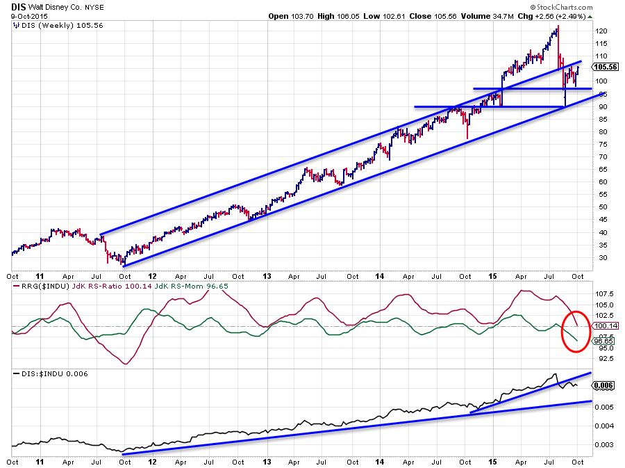
Walt Disney's stock price has been in one tremendous uptrend since its low on the price chart in 2011 and so was the relative strength of DIS against the Dow Jones Industrials index. On both charts a very regular and stable rising trend that accelerated upward in the beginning of this year when price took out resistance near $ 97.50 resulting in a rally to a (blow-off) top just above $ 120. The big drop from that high and subsequently back into the boundaries of the former trend channel certainly put a dent into the good looking price pattern but it is now also starting to take its toll on the relative picture.
The trend in the raw relative strength line steepened during the first nine months of this year but that trend is starting to show signs of weakness now. This is confirmed by the RS-Ratio line being on the verge of breaking below the 100-level which will put DIS inside the lagging quadrant for the first time since 2011. It looks like the (relative) show is over for Walt Disney, at least for the time being.
Goldman Sachs Group Inc. - GS
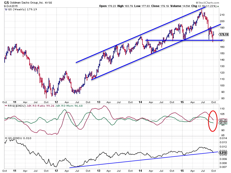
GS has just entered the lagging quadrant on the weekly Relative Rotation Graph suggesting that the stock hast started a relative downtrend against the Dow Jones Industrials index. Looking at the price chart above in combination with the RRG-Lines and the raw relative strength makes, at least, a case to be cautious. On the price chart the rising channel, visible since 2012, was broken a few months ago. The drop in price after breaking the trendline came to a halt at horizontal support near $ 170. Any rallies off of that level are now seen as recovery attempts and expected to meet overhead resistance in the $ 190 area. A break below support at $ 170 will very likely cause an acceleration of the decline.
From a relative perspective, it is a bit more tricky to make a clear call. The RRG-lines position GS inside the lagging quadrant, that is for sure, but we need a bit more negative momentum to make it a convincing move. A confirmation of the indicated relative weakness by the RRG-Lines will certainly come if the raw RS line clearly breaks below the rising trendline as can be seen on the RS-graph in the bottom pane. Keep a close eye on developments in the next few weeks. A break below $ 170 in price combined with a break below the rising support line in relative strength will make a clear case for (further) underperformance of GS
The Solid trends
In the top left quadrant of the RRG, we find a number of stocks that, still, show solid relative uptrends against the Dow Industrials index. A few names that continue to stand out are NKE which remains the strongest stock in this universe measured on the RS-Ratio scale. But also HD, MCD (highlighted in the previous article on the Dow 30 universe) and AXP for example. Double check the chart of MCD since this last post as the stock is now breaking above an important resistance level which should give it an extra boost. Given the weak picture for GS which we saw in the chart above, the AXP/GS chart should be interesting to watch.
Nike Inc. - NKE
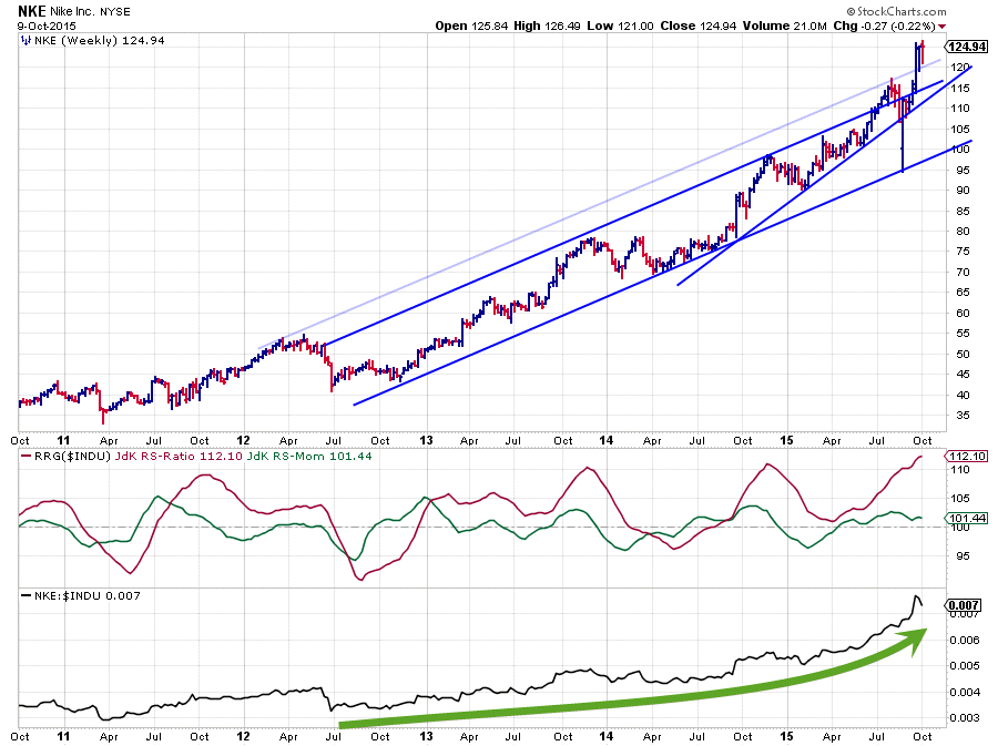
The NKE chart still shows an amazing trend, especially given the weakness of the general market over the past few weeks. No wonder relative strength has been surging lately. The price chart shows a very solid rising channel since the lows of 2012. More recently the stock price is breaking out of that channel on the UPside where, generally speaking, we have been observing downward breaks. This in itself is already a very strong sign pointing to a continuation of the move. From a relative perspective, this upward break only made the relative chart look better and once again confirmed the strength of NKE against INDU.
Both the relative and the price charts are at high levels in and after a very long uptrend. On the one hand this makes the stock vulnerable but until the first signs of these trends weakening are starting to show up I would rather remain positioned WITH this trend than against it as it could well continue for quite a while.
American Express Co. - AXP (vs GS)
While GS is positioned, just, inside the lagging quadrant, AXP is well inside the leading quadrant and clearly pushing deeper into it and confirming its relative strength, not only versus the Dow but also versus the other financial stocks in this universe. This situated is seen even more clear when these financials are isolated on a separate RRG and put against XLF as the benchmark.
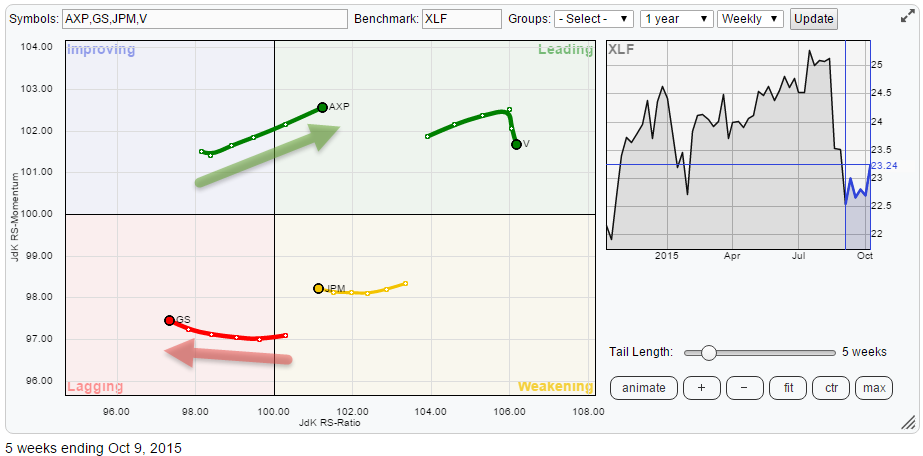
A solid and maturing uptrend for V, AXP strongly improving and JPM and GS weakening. This provides some great information and opportunities to implement. For long only portfolios, preference would be clearly to overweight or only hold AXP and V and be underweight or no position at all in JPM and GS. People who like pair-trades should look for longs in AXP and / or V while at the same time short GFS and / or JPM.
The picture of AXP against GS is plotted below and underscores the view above.
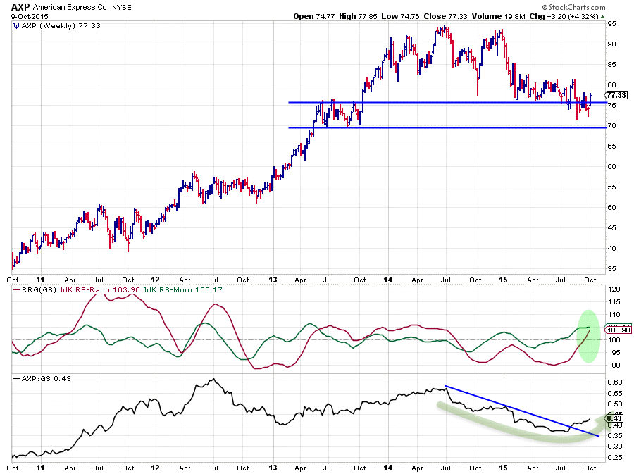
The AXP chart in itself is not all that strong, but it is the relative picture against GS that makes it an interesting picture. The downtrend in relative strength coming out of the mid-2014 peak seems to have come to an end and is turning around in favor of AXP vs GS. The rise of the JdK RS-Ratio above the 100-mark for this combination also suggests that a new uptrend is underway and that AXP should be preferred over GS for the time being.
Intel Corp - INTC --> The power inside
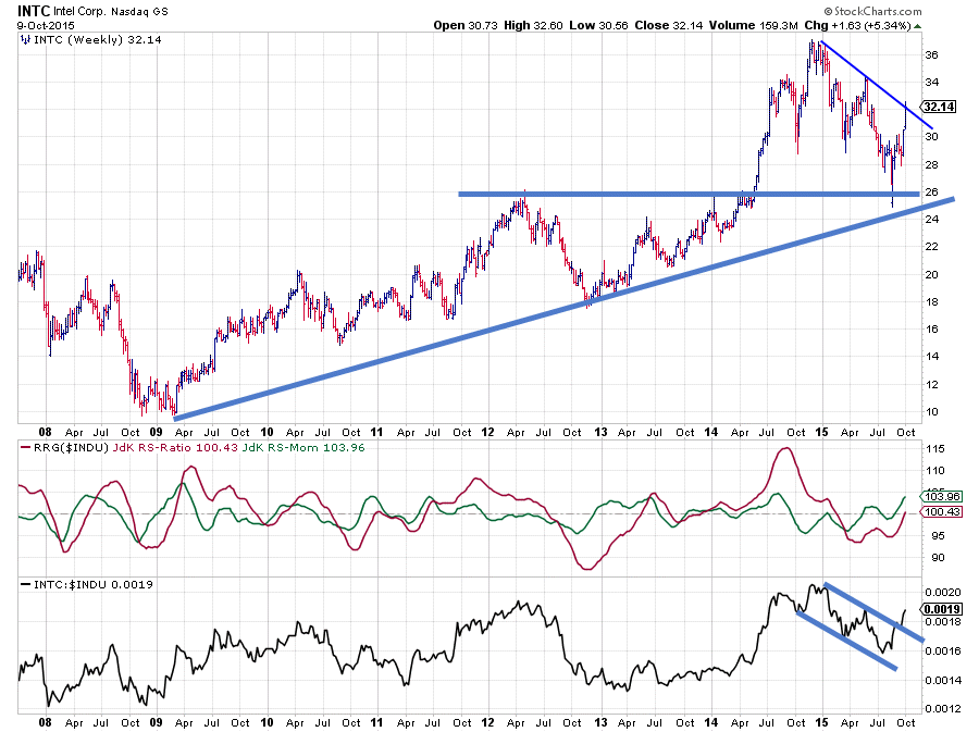
The stock that stands out the most on the Relative Rotation Graph holding the Dow industrials stocks is Intel. It is just crossing into the leading quadrant from improving and it is doing that at the highest relative momentum in this universe.
On the price chart, Intel tested its long-term support line running under the lows since 2009/2010 and more importantly it tested horizontal support coming off the 2012 and 2014 highs. The good news is that these levels held up well so far and that a rally emerged out of the latest low. However it's not a done deal yet as over the course of this year a falling resistance line started to develop and the market is challenging this level right at this moment. A break beyond this falling support would definitely help future performance. However, the relative picture is a lot better and that is way INTC jumped out on the RRG chart. As you can see the relative strength line managed to break out of a short downward pattern on the RS chart and this improvement is now confirmed with the RS-Ratio line breaking above the 100-level again. This move signals that a new relative uptrend is underway and this makes INTC an interesting candidate for new (overweight) positions in a portfolio.
It is not visible on the price chart yet, but it looks as if there is some (Intel) power hidden under the hood...
Conclusions
- DD, CVX nd UTX rallies expected to stall soon
- DIS, GS and JPM in the danger zone
- NKE, HD, MCD and AXP in relative uptrends
- AXP/GS spread offering opportunities
- INTC showing relative power
If you made it all the way down, do you want to let me know what you think in a comment? Article(s) too long, too short, need more charts and less text, suggestions on subjects, anything you'd like to share really...
Julius de Kempenaer | RRG Research
RRG, Relative Rotation Graphs, JdK RS-Ratio and JdK RS_Momentum are registered TradeMarks by RRG Research

