We live in interesting times... or maybe I should say: We live in confusing times.... Because, really, markets are throwing some serious curve balls here and there. It is time to look at some asset class rotations again.
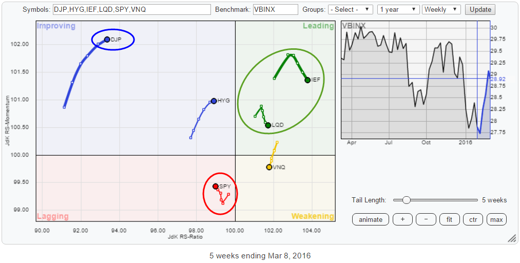 The Relative Rotation Graph shows the rotation of a number of asset classes against VBINX (Vanguard Balanced Index Fund) which is the benchmark that I use for this universe. The RRG uses weekly data which means that it is looking to detect a bit longer term trends in relative rotation, and it will take away the noise that can clutter the day-to-day movements in financial markets.
Summary
- Equities (SPY) only asset class inside lagging quadrant
- Government and Corporate bonds solidly inside leading quadrant, High Yield approaching
- Real Estate (VNQ) starting to weaken
- Something cooking in commodities (DJP)?
Quick Scan
An initial quick scan of the rotational pattern of the asset classes on the RRG above shows that, despite the recent rally, equities (SPY), is the only asset class inside the lagging quadrant. We find Government Bonds and Corporate Bonds on the opposite side in the leading quadrant, while High Yield bonds are inside improving but approaching the leading quadrant.
VNQ, the Vanguard REITs VIPERs, recently crossed over into the weakening quadrant from leading and slowly starts to lose ground on the JdK RS-Ratio axes as well. This means that the relative uptrend of VNQ is losing power but has not turned around yet.
The one asset class that stands out on this RRG is commodities! DJP (iPath Bloomberg Commodity Total Return ETN) moves in the top-left corner of the RRG at the lowest RS-Ratio level in this universe, but highest on the JdK RS-Momentum axis while slowly gaining on the RS-Ratio axes. The position on the RRG, far away from the benchmark and low on the RS-Ratio scale, make it doubtful if this rotation can take commodities straight into the leading quadrant. But in combination with the price chart, something could be cooking.
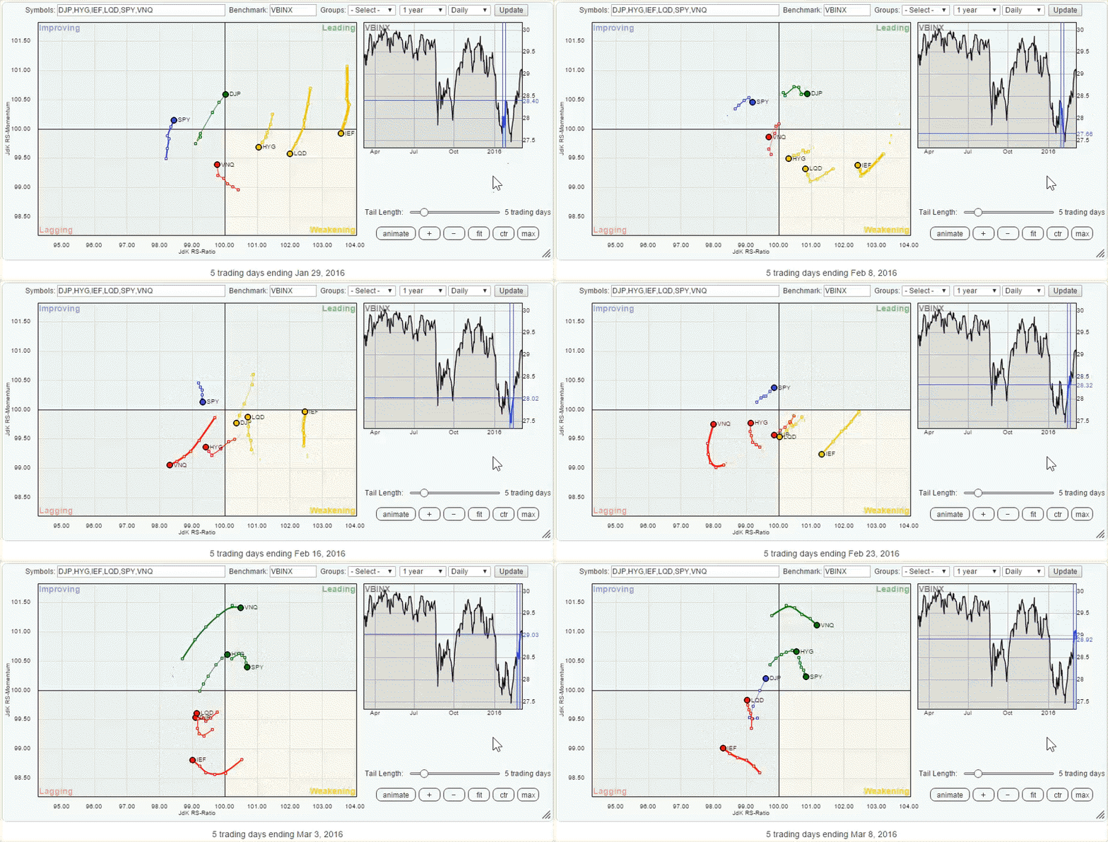
Just to illustrate the impact of the short-term swings in the various asset classes I have created an animated picture of the DAILY rotation covering the same universe and period (5 weeks) in the chart below. As you can see the five-week move on the weekly RRG includes some complete rotations on the daily version over the same period.
Assuming that the current rotation on the daily RRG will continue it will not be long before the main trends on the weekly will continue in their primary direction, i.e. underperforming equity market.
Equities
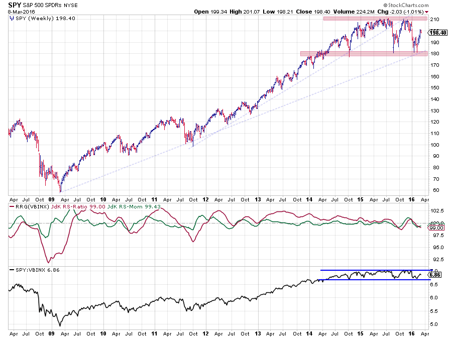 All eyes on the equities market, because that is what makes the (news) headlines! The chart above shows a bit longer-term picture for SPY in combination with the RRG-Lines and the (raw) Relative Strength line.
Looking at the price development of SPY, there are two trendlines that I keep an eye on. They are both drawn onto the chart in pale blue and dashed. The trendline emerging out of the 2011 low was clearly violated mid-2015. And after the initial decline, the recovery rally failed to take out the previous high which is a sign of weakness. The sellers who "forgot" to sell on the first occasion took their chances when SPY hit the $ 210 are for the second time. The ensuing decline once again tested the $ 180 area which makes that an important support level now.
The $ 180 area coincides with the second trendline, emerging out of the 2009 low, on the chart. Therefore, this seems to be the level to watch for the time being. All in all the S&P has transitioned from up-trend into trading range with boundaries at $ 180 and $ 210. For the time being the game will be played inside this range.
A similar picture is found in the relative strength charts which is not entirely surprising as roughly 60% of VBINX consists of equity exposure. The gradual narrowing into a range after the relative uptrend in 2015 translates into a narrowing of the swings in the RG-Lines as well.
The message here is clearly that the strong outperformance of equities as an asset class is over for the time being and that opportunities will probably arise in other parts of the financial markets.
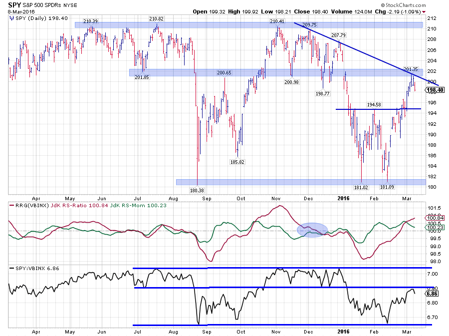 Zooming in on the recent upward price development in SPY shows that he area around $ 202 is likely to start acting as resistance within the range. It is an area where a number of peaks and troughs have been formed in the past two years and the recent high also seems to become the third touch point of a new falling resistance line.
All in all, despite the recent rally, upside potential continues to be judged as limited while risks are found on the downside.
What happened to $ 165 for SPY?
In my previous article on asset class rotation, I used reversed relative strength calculation to get a target of $ 165 for SPY. What happened to that setup?
In order to track what happened, we need to bring up the two charts on which that calculation was based. The first one is the SPY:IEF ratio below.
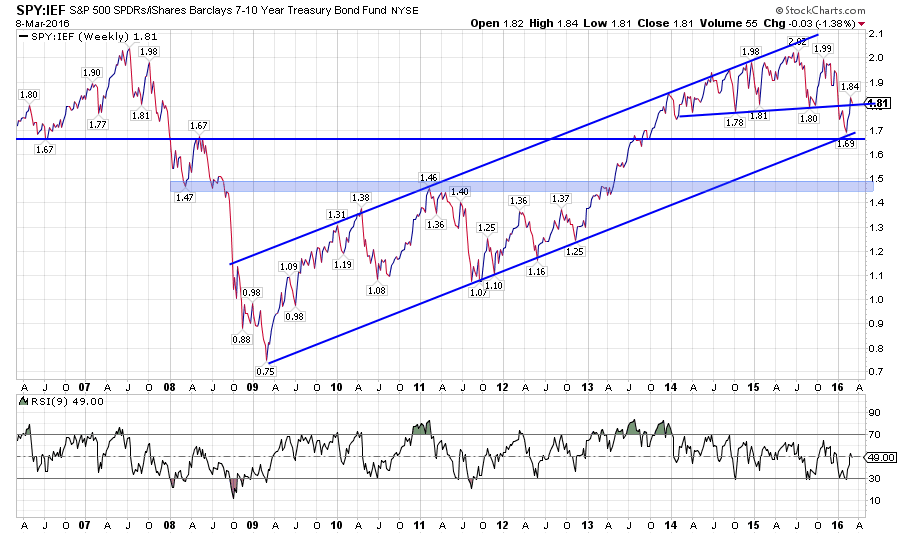 What we see here is that after breaking the almost horizontal suppoprt line this ratio tested the double support area just below 1.7 and bounced back to its former breakout level. What can we learn from this?
First of all the new low near 1.7 confirms the downtrend in SPY:IEF. The recent highs and lows are now clearly lower. This suggests more weakness ahead for SPY:IEF, hence a preference for (Government) bonds over equities. On a break below 1.7 the next target is still pegged near 1.5.
The second chart to inspect is the price chart of IEF, which was the source for the $ 110 price target for IEF.
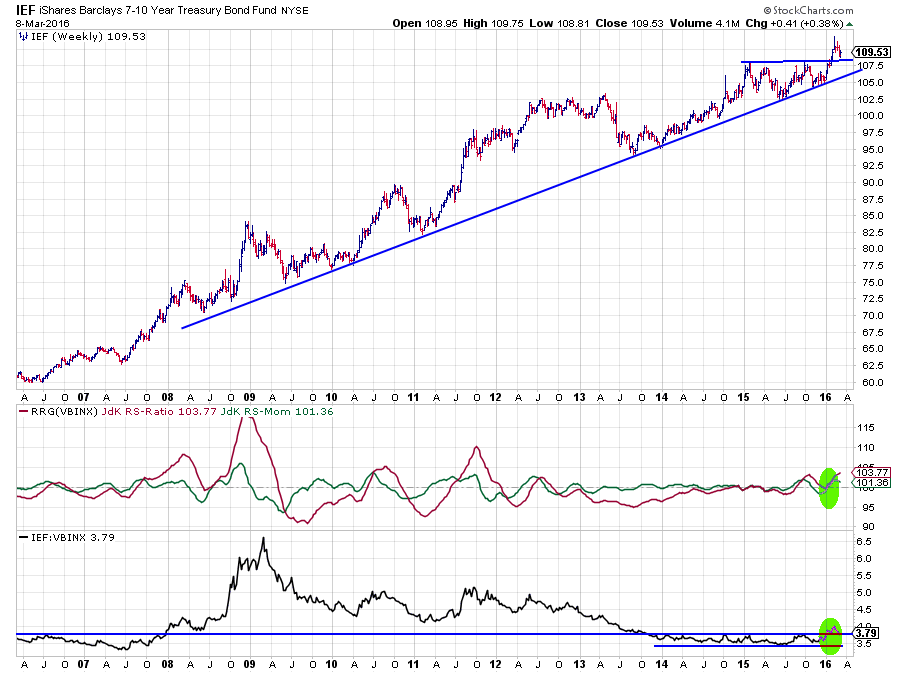 The updated chart of IEF above shows a clear break to new highs. After the break the target at $ 110 was easily reached and even surpassed. A new high was set near $ 112 and the pull-back from that level seems to be stalling at the former breakout level.
This break clearly confirms the current strength in government bonds and the relative strength charts do the same for the current relative trend of bonds in the asset classes universe. The JdK RS-ratio has picked up the relative uptrend and is well above the 100-level. The upward break of the RS-Line out of the two-year range confirms this uptrend. The recent pull-back here is also expected to land at the former breakout level before continuing higher.
With regard to the reverse relative strength calculation, the move in IEF has changed things a bit. Given the new high and pull-backs, the most likely new target is the new high at $ 112.
When we plug these new values into the reverse relative strength calculation we get:
RS = SPY / IEF
1.5 = SPY / $ 112
SPY = 1.5 * $112 = $ 168
Still pretty close to the $ 165 we found previously. The key ingredient here is obviously a break lower in the SPY:IEF ratio.
Commodities - DJP
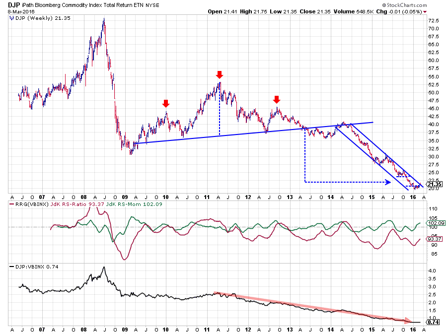 The chart of commodities as an asset class is intriguing, especially from a relative strength point of view, as it has been in a downtrend since its $ 52.50 peak back in 2011.
What often happens with markets like this is that the disappear from the investors' "radar screen" as it is "only going down" and people forget about it. Until a new trend is already well underway.
Relative Rotation Graphs are a perfect tool to spot potential (trend) changes in such "forgotten" markets.
The position of DJP on the RRG makes this clear. Vey low on the RS-Ratio axis, far away from the center and detached from the other asset classes in the universe. BUT highest on the RS-Momentum scale and gradually improving on the RS-Ratio axis. At least worth a closer look.
The weekly chart of DJP above shows the big H&S continuation pattern and the accompanying target based on that pattern which has been satisfied.
On the relative charts, the RS-Ratio line is still well below 100 which means that there is still a risk of a rotation on the left-hand side of the RRG before DJP can push into the leading quadrant but the combination with the improving price chart is what gets me interested. Especially when we zoom into the daily version.
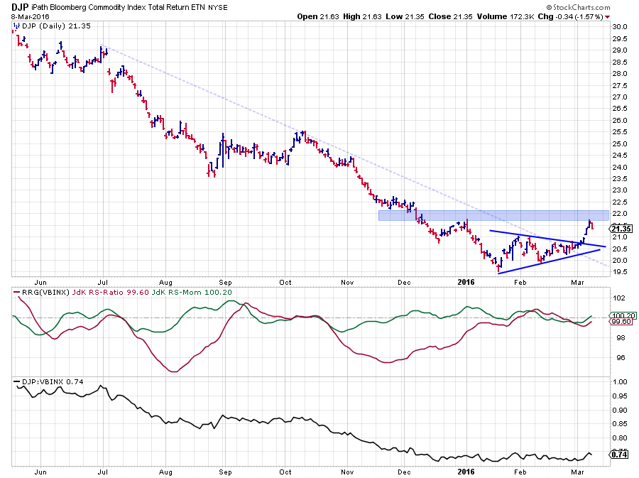 Here we see that the falling resistance line (pale blue dashed) has been taken out at the same time when DJP upwardly broke out of a symmetrical triangle formation. If it is not a trend reversal yet, it definitely looks like a trend-ending signal. After such a prolonged decline a market needs to walk before it can run.
The good news is that buyers at current levels are not entering at the high of the market :) and the risk/reward ratio could, therefore, be very promising. Something may be cooking in commodities!
Julius de Kempenaer | RRG Research
RRG, Relative Rotation Graphs, JdK RS-Ratio and JdK RS-Momentum are registered TradeMarks by RRG Research
Follow RRG Research on social media:
LinkedIn Facebook Twitter


