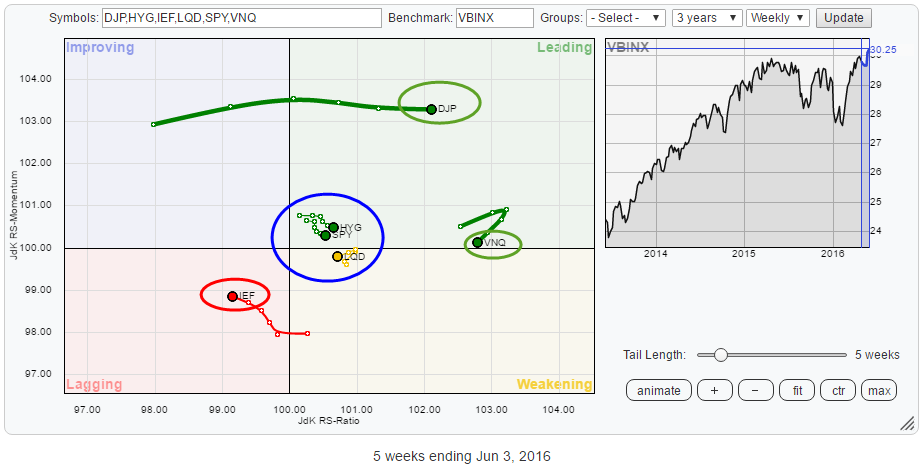
The rotational pattern of the various asset classes on a Relative Rotation Graphs is showing interesting patterns at the moment. The RRG below holds a number of ETFs that cover Equities, Government Bonds, Corporate Bonds, High Yield Bonds, Real-Estate and Commodities. The benchmark is VBINX, the Vanguard Balanced Index Fund which consists of 60% Equities and 40% Bonds.
Summary
- Commodities likely to push higher in coming weeks
- Real Estate going through (small) correction but remains strong(est) asset class
- (Government) Bonds pushing against resistance
- SPY:IEF ratio at crossroads, looking for decisive break soon
Quick scan
Upon an initial quick scan of the Relative Rotation Graph above, there are a few asset classes that stand out.
The first one is Commodities (DJP) which is showing a strong move into the leading quadrant, backed a by a long tail at solid JdK RS-Momentum values.
The second one is Real-Estate (VNQ), which is, measured on the JdK RS-Ratio scale, still the strongest asset class in this universe. VNQ is still inside the lagging quadrant but went through a setback over the past few weeks. This setback, however, is taking place at the highest RS-Ratio level on this graph and shows a modest tail length which suggests that there is not much "power" behind this move.
The third asset class that deserves a bit of our attention is Government Bonds. AT this moment that is the only asset class inside the lagging quadrant and still heading lower on the RS-Ratio axes but JdK RS-Momentum is slightly edging higher.
So where are equities? On the Relative Rotation Graph above, SPY is found inside the blue circle, close to the benchmark together with HYG and LQD, all three showing short tails, while close to the benchmark. As VBINX, which I use as the benchmark, consists of 60% (US) equities and 40% (US) bonds, the comparison SPY:IEF always makes an interesting picture to get a handle on Equity/Bon rotation.
This also means that the universe on the RRG is a, so called, open universe. I.e. the securities on the graph are not all included in the benchmark. As a result, it is possible for the securities (asset classes in this case), to move far away from the benchmark as they are not included in this benchmark. By default, in general, SPY and IEF will move closer to the benchmark.
Commodities - iPath Bloomberg Commodity Total Return IndexETN
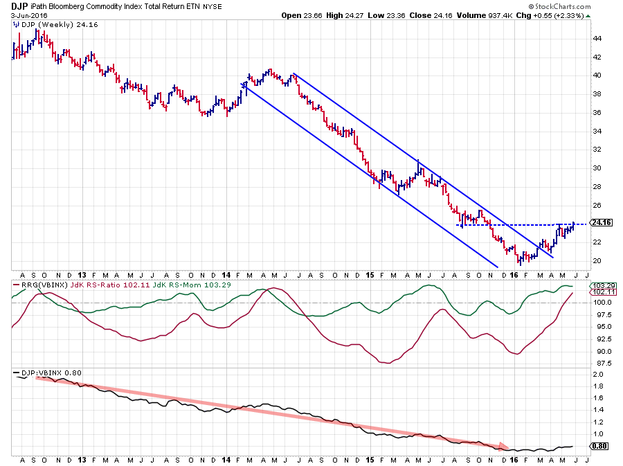 The only way is DOWN! At least that was the general feeling about commodity prices over the past few years. And it was right. Commodities took a beating since their peak near $ 52.50 in early 2011.
This picture started to change in Q1 of this year when DJP broke out of its falling channel and setting its first higher low. The first real test came when DJP tested resistance near $ 24, coming off a 2015 low. When another higher low was formed after bouncing off that $ 24 resistance level things started to look even better. At the moment, DJP is on a mission to break that $ 24 barrier.
On the weekly chart above the attempt seems to be in its early stages and we need to see a bit more confirmation.
The daily chart below gives a bit more insight and suggests that we are on track for a solid break higher in the coming week(s).
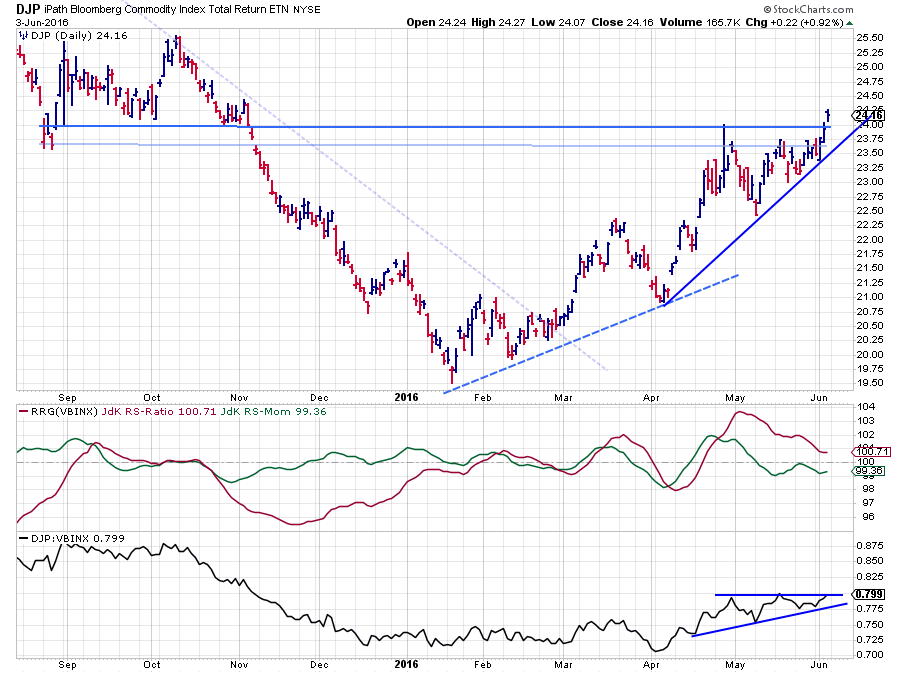 From a relative point of view (against VBINX) the weekly RS-Ratio line has settled itself comfortably above the 100-level suggesting that a relative uptrend is underway. Clearly that improvement was driven by the relative improvement that was visible on the daily chart since mid-April when the daily RS-Ratio line crossed over and put DJP inside the leading quadrant on the daily RRG.
The month of May characterized itself as a consolidation period for relative strength. On the weekly chart, RS-Ratio leveled off a bit while on the daily chart RS-Momentum dropped below 100, dragging RS-Ratio down, but not below 100. This will very likely cause DJP, to complete a rotation on the right-hand side of the graph.
A look at the raw RS-Line reveals a pattern that looks like an ascending triangle with higher lows being formed while the peaks are, roughly, at the same level.
A break beyond ~0.8 on the RS-line will very likely trigger an acceleration higher in relative strength causing DJP to push deeper into the leading quadrant on both the weekly and the daily RRG.
Real Estate - Vanguard REIT ETF
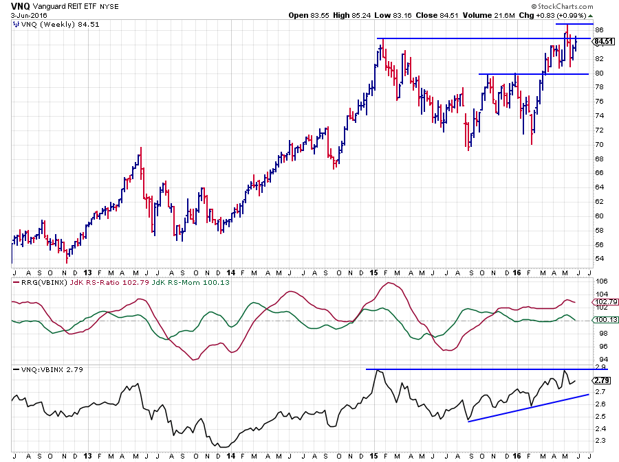 On the price chart, VNQ is attempting to break above a resistance area that roughly comes in between $ 85 - 87. In the past few weeks, we have seen one serious attempt but VNQ dropped back rapidly finding support, again, near $ 80.
The (raw) RS-Line follows a similar pattern, bouncing off its resistance near 2.9. The difference between the price and the RS-chart is that relative strength has been on the rise since mid-2015 and did not come down as much as VNQ itself and a rhythm of higher highs and higher lows can be seen in this RS-Line. This uptrend was picked up by the RS-Ratio line when it pushed above 100 in October 2015. After the initial rise, the RS-Ratio settled near 102 and RS-Momentum dropped back to 100 and showed almost no movement. This caused VNQ to remain very stable on the right-hand side of the RRG with a very short tail.
The recent rotation on the RRG looks to be a short-term correction within the longer-term uptrend. A break above 2.9 in relative strength will very likely add new fuel to the relative rally and push VNQ back up into the leading quadrant again.
This move can be seen in more detail on the daily chart below.
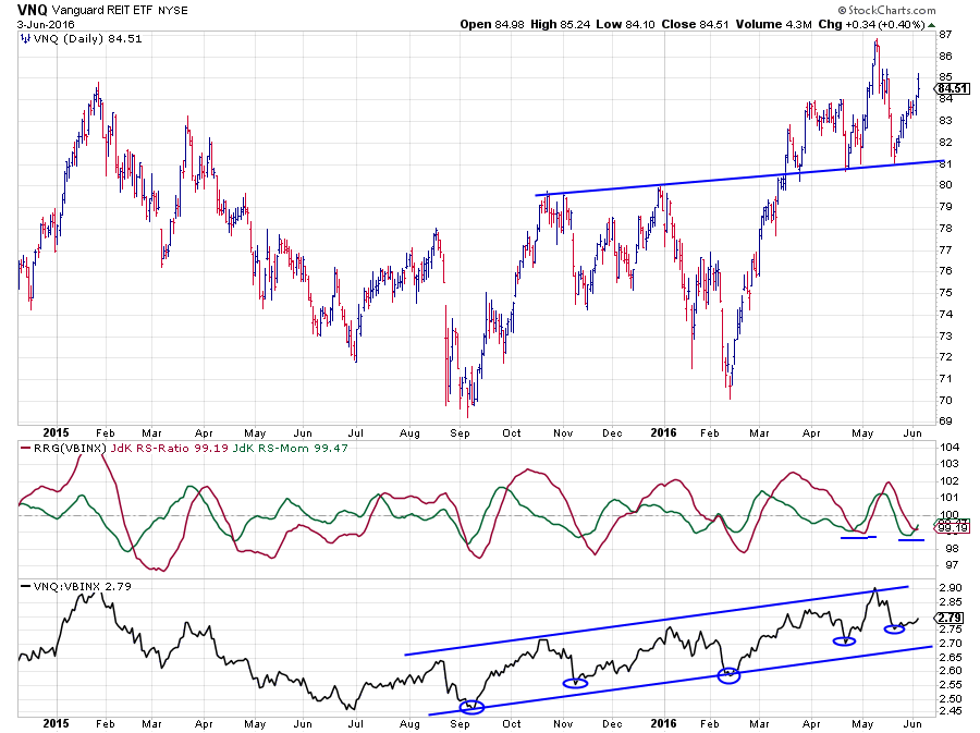 The uptrend in relative strength since September 2015 is clearly visible. The oscillation of the RRG-Lines causes VNQ to travel through the lagging quadrant on the daily Relative Rotation Graph at the moment.
Given the fact that VNQ is the strongest asset class on the weekly RRG and that the tail of VNQ on the daily RRG has already turned upward towards the improving quadrant I am looking for a continuation of this daily rotation through improving back to leading which will reinforce the current strong position of Real Estate as an asset class.
Government Bonds - iShares 7-10 year Treasury bond ETF
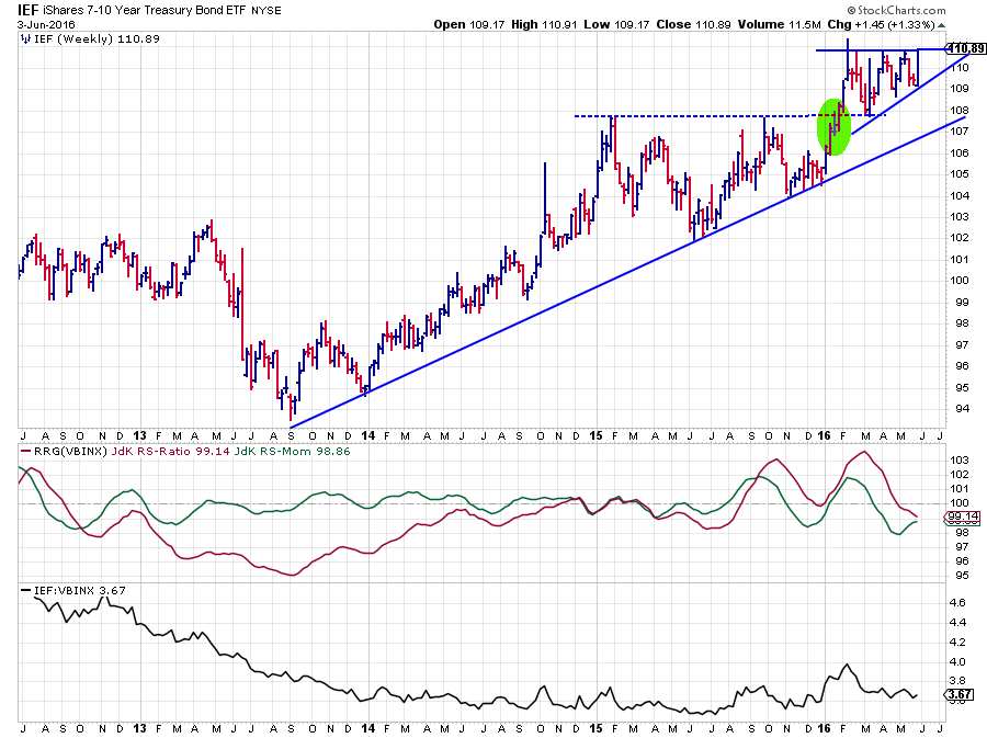 The IEF chart makes an interesting read, especially since the jump last Friday. IEF is now really pushing against its horizontal resistance area around $ 111. The price pattern since February looks like an ascending triangle which in itself is a bullish pattern. A break above the $ 111 resistance will very likely trigger another acceleration higher. Based on the height of the pattern a target can be pegged near $ 114.
The relative strength against VBINX, however, shows a not so strong picture. With both RRG Lines below 100, IEF is positioned inside the lagging quadrant on the weekly RRG while RS-Ratio is still moving lower although the rate of descent has come to a halt (RS-Momentum bottomed).
When we zoom in on a daily chart we see that the relative outlook (RRG-Lines and RS-Line) are positioned similarly to the weekly, causing IEF to show up in the lagging quadrant on the daily RRG as well.
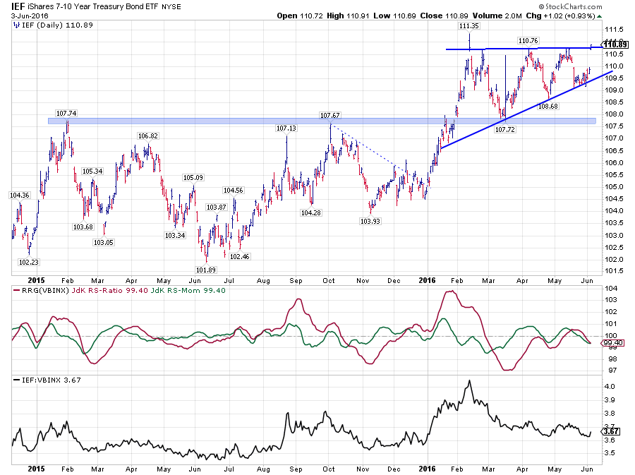
So all in all, we have a bit of a contradicting picture here for IEF with price ready to jump when it breaks the barrier of that ascending triangle and a relative strength line that is still trending lower on both time frames.
As VBINX only consists of Equities and Bonds exposure we need to look at the SPY:IEF relationship to get a better handle on the possible course of the rotation.
Equities / Bonds - SPY / IEF
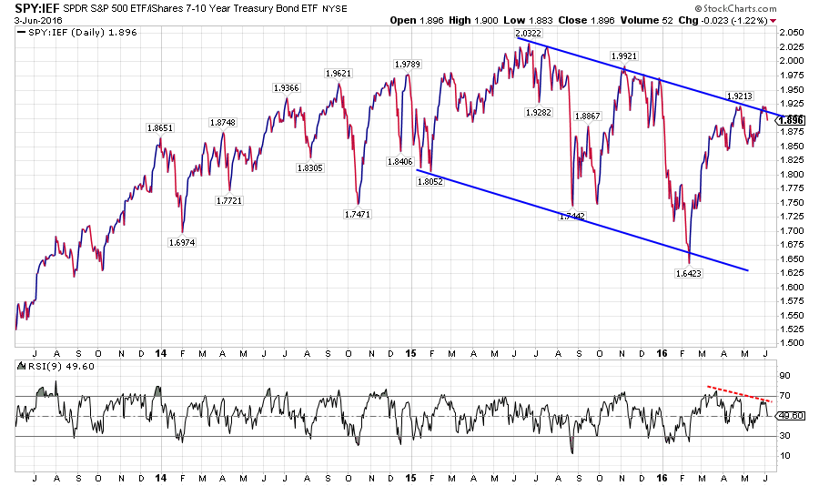 The chart above shows the relative strength of SPY vs IEF over the past three years. The falling trend since mid 2015 is still intact and it looks as is the top of that trend channel has just been tested. A turn lower from current levels would also be supported by the negative divergence that is showing up between the ratio and the RSI. The trigger will most likely be a break below 1.85 in this ratio.
When SPY:IEF moves lower, it means that Bonds are outperforming Equities. From their current positions, that means that either
- IEF breaks upward and SPY does not break higher or moves even lower
or - IEF does not break higher but SPY falls from current levels at a faster pace than IEF
The reverse will become true when SPY:IEF breaks beyond 1.9213 (its previous high) which will trigger further relative strength for equities over bonds.
As both SPY and IEF are rotating close to the center of the chart a move from leading to lagging and v.v. can occur quite rapidly.
Based on the structure in the SPY:IEF ratio chart, the fact that both SPY and IEF are close to the benchmark and the current sector rotation in equities which does not support a rise for the broader market (imho) I expect a rotation in favor of bonds over equities in coming weeks.
Separate from the Equities/Bonds rotation an outperformance for Commodities (and Real Estate) seems a safe(r) bet for now.
Julius de Kempenaer | RRG Research
RRG, Relative Rotation Graphs, JdK RS-Ratio and JdK RS-Momentum are registered TradeMarks by RRG Research
Follow RRG Research on social media:
LinkedIn Facebook Twitter


