Over the past few weeks markets, in general, experienced a lot of volatility and a lot of comments have are focussing on the general state and direction of the broader market indices around the world. In my last blog about US sector rotation, the conclusion was that the relative rotation of US sectors was not supportive for a rise in the S&P 500. Let's see if and how the rotational patterns have changed since then.
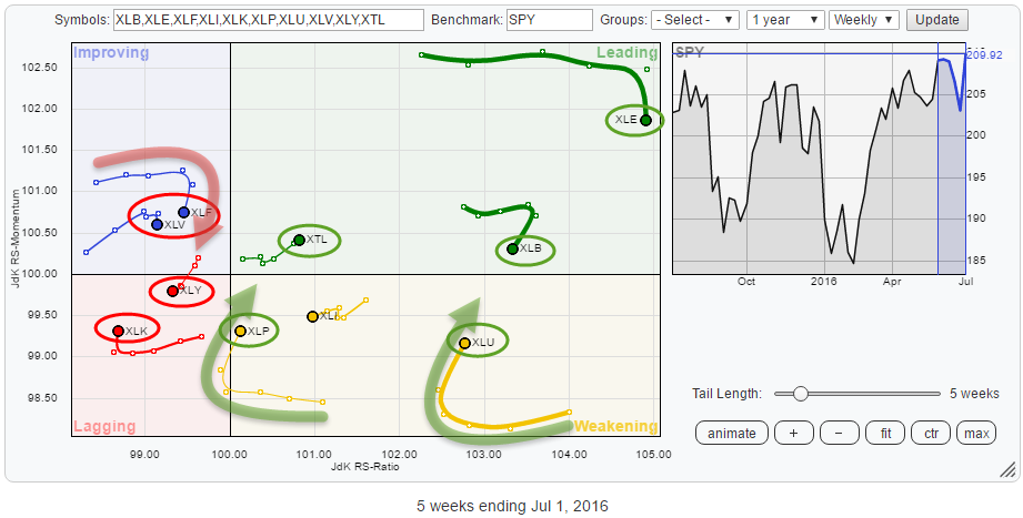
The Relative Rotation Graph below holds the 10 (9 + Telecom) sector ETFs that make up the entire S&P 500 universe and shows the sector rotation relative to the S&P 500 index (center of the chart).
Summary
- XLK hiccup inside lagging quadrant not meaningful enough (yet)
- XLY continues relative downtrend against $SPX
- XLF rotating towards lagging quadrant again
- XLE still strong but needs a break
- XTL set for further outperformance
- XLU and XLP expected to lead the market
- Current sector rotation continues to point to weaker performance for $SPX ahead
Quick scan
The first thing that strikes me in this RRG is the separated position of three sectors to the right of the graph. First, there is XLE far away in the top-right corner at the highest level on both scales but with its tail starting to turn down. Then XLB, still high on the JdK RS-Ratio scale but moving lower and closer to 100 on the JdK RS-Momentum line and finally XLU, inside the weakening quadrant but still at the third highest JdK RS-Ratio level in the universe and starting to rotate back up.
Also on the right-hand side of 100 on the JdK RS-Ratio scale with tails moving higher on both axes are XTL, inside the leading quadrant, and XLP, inside the weakening quadrant.
Moving over to the left-hand side the most striking rotation is found for XLF, the Financials sector. It is positioned in the improving quadrant, but its tail already started to lose relative momentum weeks ago when the tail flattened out and started to move horizontally round 101.25. Recently XLF started to rotate downward again without having managed to enter the leading quadrant. Usually, a sign that the existing relative downtrend is set to continue and pick up downward momentum again.
Already inside the lagging quadrant, we find XLY and XLK with XLY heading lower on both scales. XLK picked up a bit of relative momentum over the past two weeks. However, measured by RS-Ratio, it is the weakest sector in the universe at the moment.
The Lagging Quadrant
XLK - Technology Select Sector SPDR
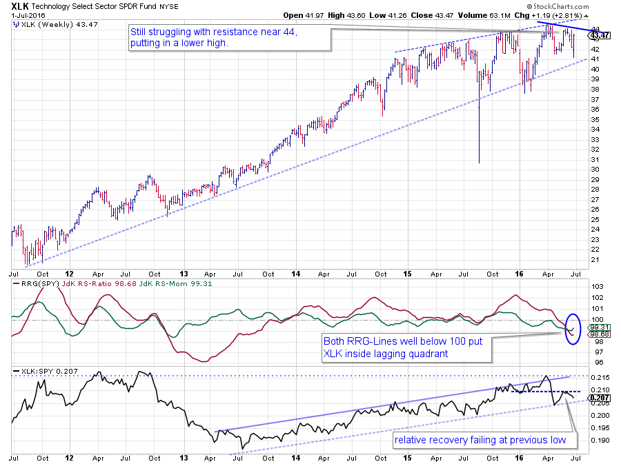 On the weekly price graph, XLK has not managed to break substantially above its previous highs since late 2014. The area around $ 44 clearly offers overhead resistance and attracts sellers. A major rising support line is currently offering support around $ 40 while the 2015 and 2016 lows near $ 38 provide horizontal support. Breaking any of those levels is expected to cause a downward acceleration.
On the relative strength chart (the black line in the third pane) a first lower high seems to have formed after the steep drop in April. After testing the rising support line, the relative recovery peaked around the level of the previous lows suggesting that more weakness lies ahead.
This pattern on the RS-Line has pushed both RRG-Lines below 100, positioning XLK well inside the lagging quadrant. The small hiccup in the (green) JdK RS-Ratio line causes the tail of XLK to move higher over the past week.
Given the fact that XLK is the weakest sector, measured by RS-Ratio, in the S&P this small rise is judged as a recovery within the relative downtrend and not meaningful enough (yet).
XLY - Consumer Discretionary Select Sector SPDR
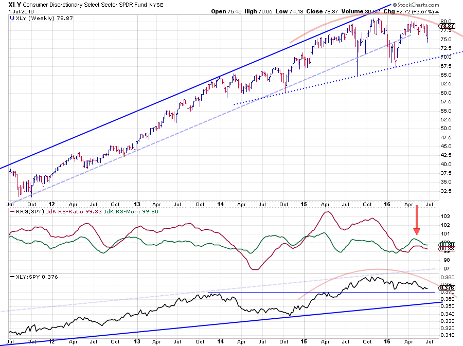 XLY broke the rising support line on the price chart at the beginning of 2016 and subsequently dropped to a low at $ 67.50. The recovery out of this low managed to push back above the former support line but did not manage to push beyond the 2015 high near $ 80. This area around $ 80 will now become an even stronger resistance level.
The pattern on the relative strength line matches the pattern on the price chart since late 2014, and a series of lower highs and lower lows is emerging since late 2015. This downtrend on the RS-graph translates into the JdK RS-Ratio line dropping below 100 following the JdK RS-Momentum line which had already moved below 100 a few months earlier.
After a short recovery of relative momentum, causing a rotation through the improving quadrant things are starting to deteriorate again and XLY crossed back into the lagging quadrant suggesting that the relative downtrend against $SPX is about to continue.
The improving quadrant
XLF - Financial Select Sector SPDR
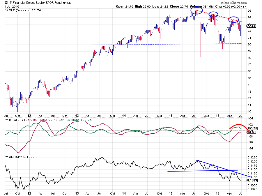 XLF, the financials sector, is probably the sector holding the key for general market direction in the next few months.
On the price chart the last three highs are clearly at lower levels each time, undeniably selling pressure at work.
The RS-Ratio for XLF is already moving below 100, indicating a relative downtrend against $SPX, since October last year. The small up move in relative strength, following the recovery in price, over the past weeks has already peaked against the falling resistance line and is now challenging the relative low that was set in early April.
The rolling over of the JdK RS-Momentum line (above 100) suggests that RS-Ratio will not make it above 100, and XLF will rotate back into the lagging quadrant, continuing its relative downtrend.
This is a weak sign for general market direction as Financials are a heavyweight sector, and they are more or less needed to push $SPX higher.
The only one caveat that I am watching is the possibility, but it is very early stages, of a large H&S continuation forming in XLF at the moment.
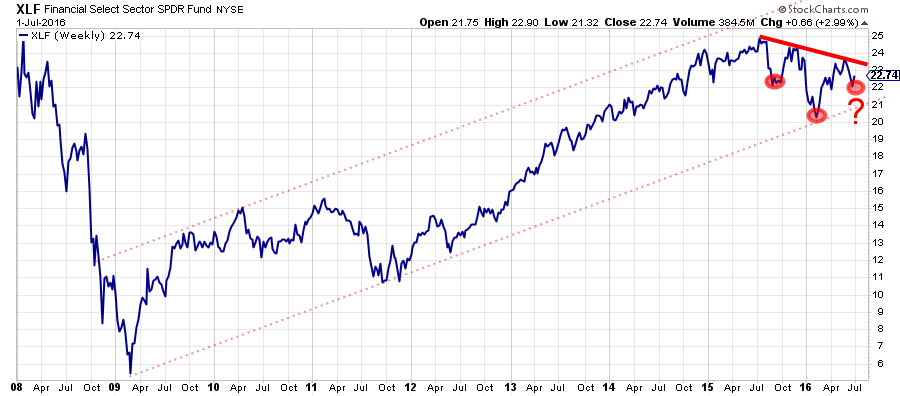 Until XLF convincingly breaks that, slightly downsloping, neckline my focus is on the further deterioration of the relative strength of XLF vs. the S&P 500 and the other sector in the universe.
The leading quadrant
XLE - Energy Select Sector SPDR
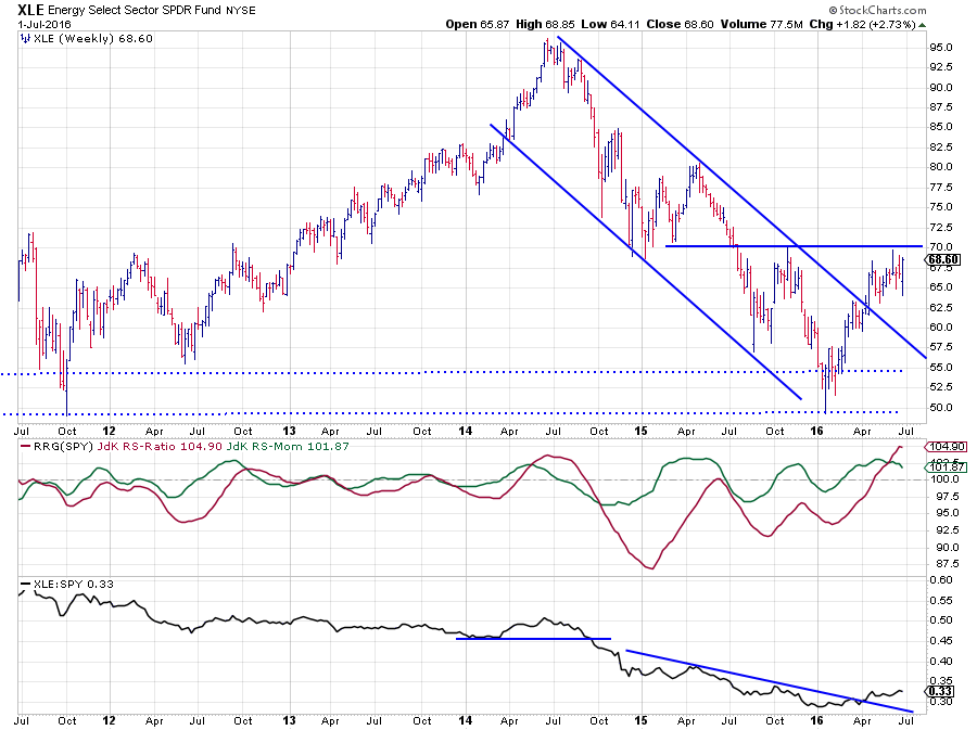 The sector showing the highest reading on both scales of the Relative Rotation Graph is Energy. This puts XLE in the far op-right corner of the leading quadrant and indicates a strong relative uptrend.
Over the past few weeks RS-Momentum has been coming off, and the tail is now heading South. Given the high reading on the RS-Ratio scale, such a downturn is not alarming (yet) as it merely indicates a pause within the longer term trend.
The pattern in the relative strength line in the lower pane supports that view. Back in September 2014 the RS line broke a horizontal support level and started accelerating lower, strongly underperforming the S&P 500. The falling resistance line broke in April, and relative strength has been on the rise since then. The current loss of relative momentum looks to be the first pause in this newly emerging uptrend in relative terms.
A look at the price chart explains where the pause is coming from. XLE just hit overhead resistance which is pretty well defined at $ 70. The market needs to digest the additional supply that apparently comes in at that level. A break beyond $ 70 will most certainly help XLE get ahead and pull relative strength even higher.
All in all the relative trend is still looking good but seems to be taking a break. I am watching for a rotation into and through the weakening quadrant and then turning back up towards leading again before reaching lagging. The typical pattern for a sector in a strong relative uptrend.
XLB, also inside the leading quadrant is showing a similar rotational pattern.
XTL - SPDR S&P Telecom
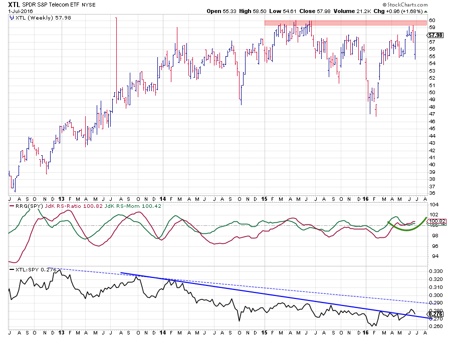 The Telecom sector (XTL) is the one that "does not really belong in this universe" but nevertheless is showing us an interesting rotational pattern because, at the moment, it is the only sector inside the leading quadrant which is gaining on both scales and heading deeper into it at an almost 45-degree angle.
On the price chart, the area between $ 59 - $ 60 is a well-defined resistance area that needs to be broken to unlock new upward potential.
From a relative point of view, the sector has been going through a relative downtrend more or less four to five years already. The resistance line marking the upper boundary of this trend is debatable (as is any trendline to be quite frank). I prefer trendlines that touch as many subsequent turning points (peaks in this case) as possible. In this case, my preferred trendline is the solid blue line. I am sure there will be people arguing that the dashed line is the preferred resistance line because the highs it connects are of a higher magnitude. I think it misses too many highs formed in 2015-2016. Maybe it will start to play a role again later on, but I will cross that bridge when relative strength comes to it.
For now, XTL has broken its relative downtrend and seems to be heading higher, a break above $ 60 in price will help the relative improvement to accelerate.
The weakening quadrant
There are two sectors in the S&P 500 that recently broke to new (all-time) highs, and they are both inside the weakening quadrant but have started to rotate back up in the past few weeks. These two sectors are Utilities (XLU) and Consumer Staples (XLP). Two sectors that have been showing strong relative trends in the first few months of this year but then started to lose relative momentum late March / beginning of April. This loss of relative momentum seems to have come to an end now, and their breakouts in price are leading relative strength higher again.
Both Utilities and Staples are the two sectors that are expected to lead the market in coming weeks months... And they are not the sectors that usually lead a general market rally.
XLU - Utilities Select Sector SPDR
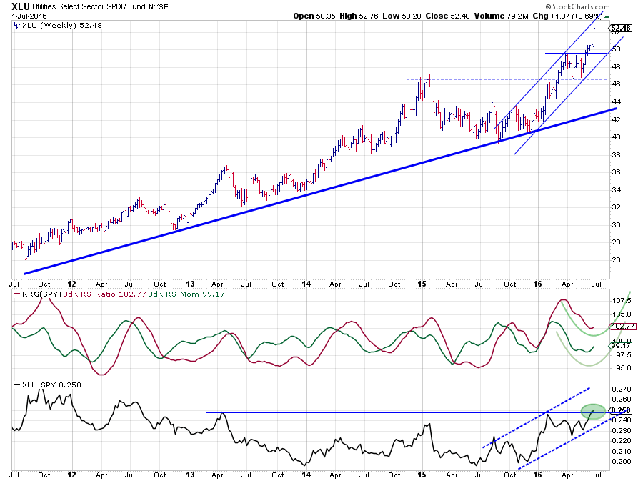 The price chart of XLU is very strong. The first important break occurred in March when the early 2015 peak was cleared. The initial rally ended just below of $ 50 after which a sideways pattern emerged. A few weeks ago this range was broken to the upside and last week the rally really accelerated.
The JdK RS-Ratio came back above 100, after a very short dip, at the beginning of 2016, signaling the resumption of the relative uptrend that started mid-2015. The short sideways pattern caused a small delay and pushed RS-Momentum below 100 and XLU into the weakening quadrant.
It is now pretty safe to assume that the acceleration of last week has ended the pause on both the price and the relative graphs.
The RS-Line is on the verge of breaking an important horizontal resistance level while RS-Momentum already started to turn up while RS-Ratio is still very comfortably above 100. It seems only a matter of time before XLU will re-enter the leading quadrant to take the lead in the S&P 500.
XLP / XLY - Consumer Staples Select Sector SPDR v.s. Consumer Discretionary Select Sector SPDR
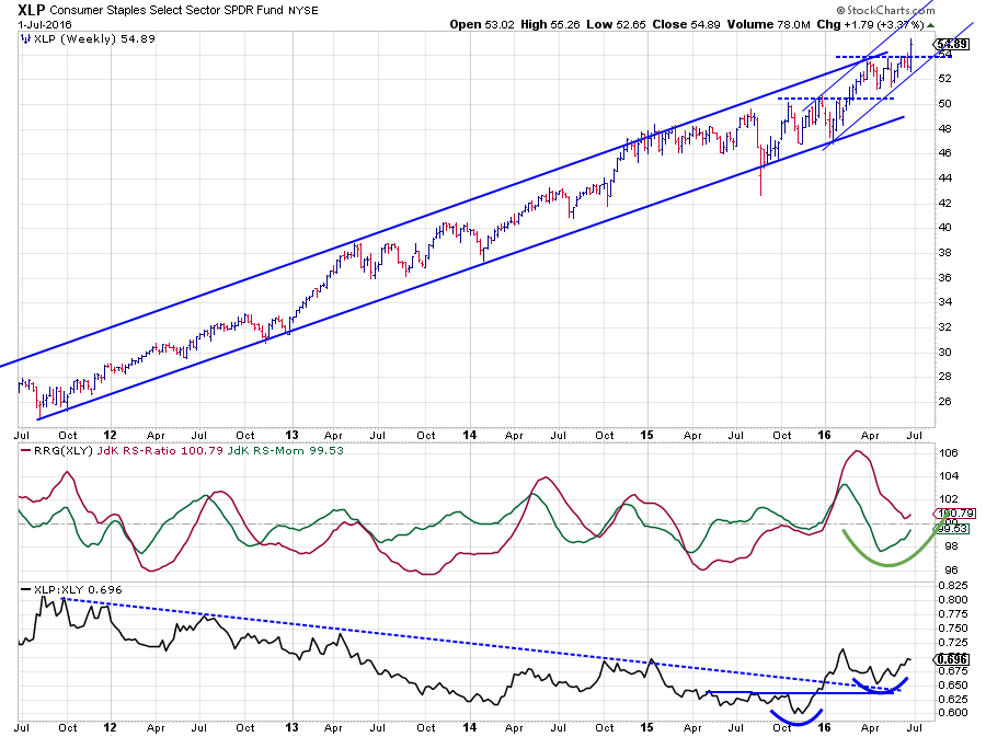 The second sector turning upward inside the weakening quadrant is Consumer Staples. This last chart shows Staples not against the S&P 500 as the other charts in this article but against Discretionary as this usually is also a pretty good gauge to get a handle on general market direction.
The price chart speaks for itself, a very strong and regular uptrend, coming out of the 2009 low, that is still very much intact and just broke to new highs. How much more confirmation do you want?
The relative strength against the Discretionary sector is always a good indicator to keep an eye on. The big downtrend that was visible over the past years was clearly broken at the beginning of this year when the falling resistance line was taken out. After the initial rally the RS-Line dropped back but found support at the level of the old resistance line were a new, first, higher low was set.
The accompanying RRG-Lines put Staples clearly in the lead, and the move of the RS-Momentum line suggests that, after the recent setback, the ratio is going to continue in favor of Staples over Discretionary.
When Utilities and Staples are breaking to new highs, Staples is leading over Discretionary and Financials are rotating back into the lagging quadrant, it will be very hard for the S&P 500 to rally strongly. With $SPX pushing against heavy overhead resistance, the risk is clearly for an acceleration to the downside.
Julius de Kempenaer | RRG Research
RRG, Relative Rotation Graphs, JdK RS-Ratio and JdK RS-Momentum are registered TradeMarks by RRG Research
Follow RRG Research on social media:
LinkedIn Facebook Twitter

