On the Relative Rotation Graph of the S&P economic sectors (GICS I), Utilities is one of the leading sectors as measured by the JdK RS-Ratio.
As described in my last RRG blog on US sectors, the fact that Utility stocks and Staples are leading the current sector rotation, tells us something about the underlying strength (or weakness) of the S&P 500 itself. The jump higher last Friday did not change the defensive rotational pattern yet, so, for now, I will stick with a scenario holding serious downside risk for the stock market (i.e. $SPX).
Generally, utility stocks are seen as "boring", that is why they always show up when markets ae getting in trouble because in those circumstances; "boring is good". But are they really that boring?
The RRG below holds the members of the XLU ETF.
Summary
- PEG's relative strength is fading and heading further down
- Pennant in EXC holds the clue for coming rotation
- D breaking above resistance is helping improvement in relative strength
- Two subsequent breaks to new highs make PNW one of the best stocks in XLU
- Short term risk in price for NI but relative trend intact
- Positive rotation expected for CNP after shrugging off current lack of relative momentum
- NRG offers opportunities
Quick scan
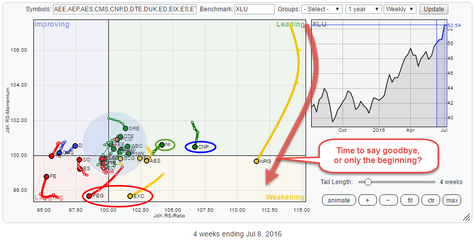
Upon the first quick scan of the Relative Rotation Graph holding the constituents of the Utilities sector (XLU), there is one stock that really stands out. NRG just crossed over from leading into lagging, far away to the right (high on the JdK RS-Ratio scale) of the plot while showing a long tail. This one deserves a bit of our analysis-love.
Without adjusting the RRG by removing NRG from the plot to make it more readable, which I will do, later on, there are a few other stocks that stand out.
PEG and EXC are traveling in a South-Western direction which suggests relative weakness against XLU.
NI and CNP are inside the leading quadrant with NI heading North-East, which is good, but on a very short tail, and CNP is losing relative momentum (moving lower on the JdK RS-Momentum axis) but still on high RS-Ratio levels.
There are some potentially interesting tails inside the shaded area around the benchmark but they are hard to see because NRG, and CNP to a lesser extent are distorting the picture.
The RRG below shows the zoomed in version of this universe excluding NRG and CNP
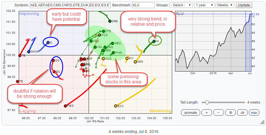 This picture shows a bit more detail. NI shows up in a positive way, and it looks as if there are some stocks inside the green shaded area which are all heading further into the leading quadrant.
In the improving Quadrant, Dominion Resources shows up as potentially interesting.
Inside the lagging quadrant, SO and ES are heading higher on the JdK RS-Momentum scale, but they are not gaining much on the RS-Ratio scale (yet).
Weak(ening) and Lagging
Keep in mind that the Utilities sector as a whole is clearly one of the stronger sectors within the S&P at the moment. As the RRGs above compare the Utility stocks to XLU as the benchmark, it is very well possible that stocks which show up as weak against XLU will show up strong(er) when compared to the S&P 500 index. This is seen very well when you change the benchmark for the RRGs above from XLU to SPY (see chart here).
Analyzing utility stocks against XLU will help you find the "Best of the best," the stocks inside, or moving towards, the leading quadrant within an already leading sector. Or if you would like to take a bit more contrarian approach you could focus on stocks that are inside the lagging or improving quadrant assuming that they will catch up and thus offer a bit more leverage. Obviously, the latter strategy will carry more risk.
PEG - Public Service Enterprise
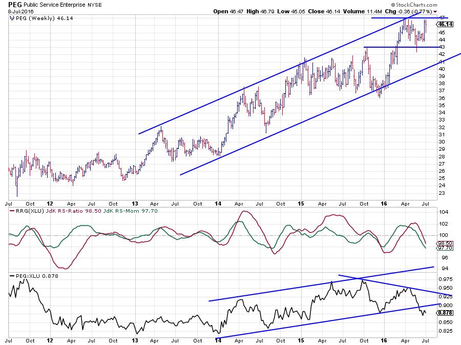 One of the stocks nosediving into the lagging quadrant is PEG. And the chart above clearly shows you why.
The price chart is not too bad at all, as a matter of fact, there still is a nice and regular uptrend at work and PEG is pushing against its latest peak near $ 47 at the moment.
The "problem" is with the relative strength. The RS-Line started to come off from its October 2015 high, then tried to rally again out of its late 2015 low (against rising trendline) but failed and put in a lower high. Just recently the up-sloping support line was broken which indicates relative weakness.
The break below its support line now limits the upside potential and points to more underperformance (against XLU) ahead. This renewed relative downtrend is picked up by the RRG-Lines which are now both heading lower below the 100 level, which puts PEG well inside the lagging quadrant and heading deeper into it.
EXC - Exelon Corp.
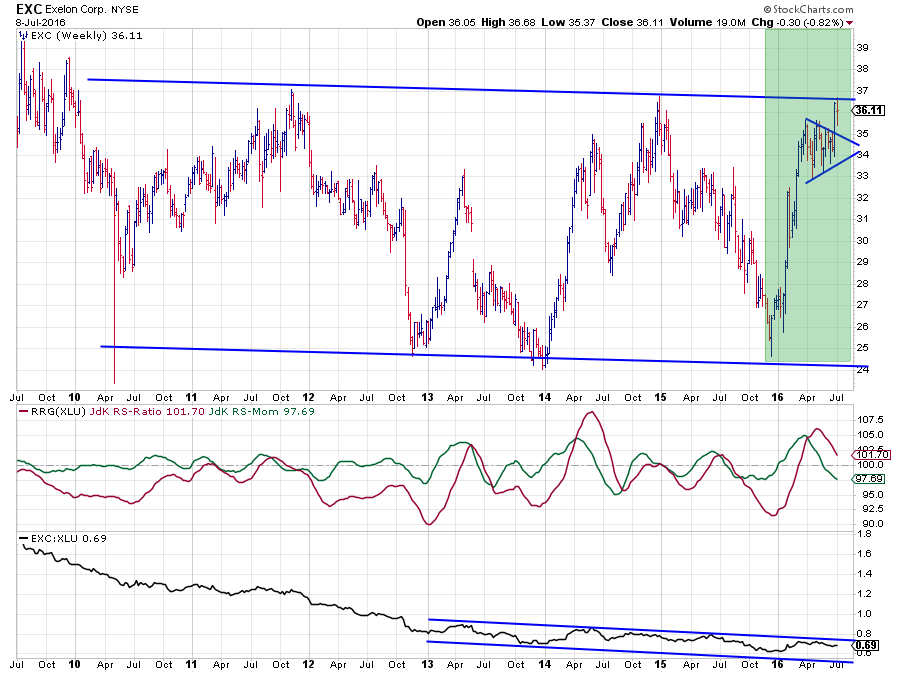 EXC is a slightly different picture. First of all, because it is still positioned inside the weakening quadrant but also because of the completely different price chart.
The RS-Line is moving inside a downsloping channel for three and a half years already coming out of an even steeper downtrend before that. The RRG-Lines oscillated around the 100-level during this period, trying to pick up on new relative trends but none of those pulled through.
The surprise in EXC could come from the price chart. For more than five years, EXC is moving in a very broad, slightly down-sloping, trading range between roughly $ 24 and $ 37 and currently testing its upper boundary just below $ 37.
However, if we isolate the price move out of the late 2015 low in the green shaded area, it can be interpreted as a very bullish pattern. The steep rally from $ 25 to $ 35 and then the small consolidation pattern can be seen as a so-called "pennant", and the fact that the formation has already been broken to the upside suggests that a further rise is likely.
For this further rally to materialize EXC will have to take out resistance around $ 37, but when it does, an aggressive further rally following the completion of the pennant is likely. Relative strength, in that case, will then very likely follow upward. If this happens within the next few weeks, the RS-Ratio line will likely bottom out above 100, and EXC will then rotate from weakening back into leading. It will be a close call from a relative perspective but worth keeping an eye on.
Lagging and Improving
Inside the lagging quadrant, Southern Co. (SO) and Eversource Energy (ES) are heading higher on the JdK RS-Momentum axis while remaining stable on the RS-Ratio axis. This lack of ability to also pick-up on the RS-Ratio scale raises doubt about the potential for a strong(er) relative rotation in the next few weeks.
Inside the improving quadrant, there is one stock that is moving higher on both axes and is worth a further study.
D - Dominion Resources Inc.
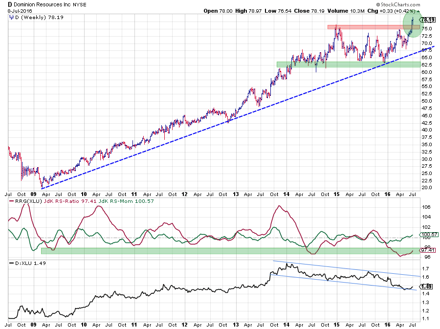 Out of the 2009 low, the trend of Dominion Resources looks strong showing a regular rhythm of higher highs followed by higher lows. This trend started to lose momentum at the beginning of 2015 causing the market to move more or less sideways, which resulted in a declining relative strength against XLU.
One attempt to turn the relative trend around in the second half of 2015 failed and towards the end of that year D was back inside the lagging quadrant with both RRG-Lines below 100.
A few months ago relative momentum started to pick up again and pushed D into the improving quadrant while the JdK RS-ratio has gradually begun to move higher. Although the turn in relative strength is still in its very early stages, it could get help from the break to new highs in price.
The jump above the horizontal resistance area around $ 75 is expected to attract some follow-up buying, pulling relative strength up further. Just like EXC, I am watching the price chart for confirmation to jump on the emerging relative trend.
Leading
Just inside the leading quadrant, there is a cluster of stocks near the benchmark (100,100) but heading deeper into positive territory. Some of those are pushing against resistance on their relative charts and need a bit more confirmation. I have picked PNW for a closer look as it is one of the more promising names.
As mentioned above NRG and CNP are far to the right but well inside the leading quadrant and NI just rotated back into the leading quadrant from weakening which suggests renewed strength.
PNW - Pinnacle West Cap Corp.
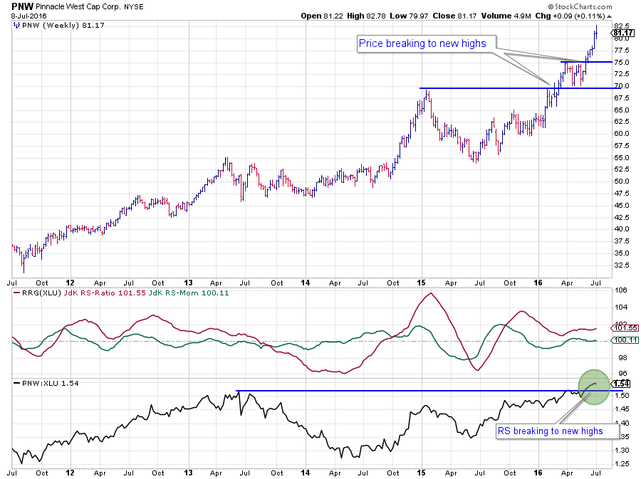 Out of the mid-2013 high, the relative strength of PNW against XLU sank rapidly to a low in 2014. During this period, the stock price moved sideways. Out of this 2014, relative low things started to improve, resulting in the JdK RS-Ratio to cross above 100 and pick up the new trend in RS.
In Q2-2015 the relative trend turned down again for a few months but never actually followed through, and the uptrend resumed again in August 2015, keeping RS-Ratio above 100. Just recently the RS-Line crossed above its previous peaks, confirming the underlying trend and opening up the way for more relative upside potential.
These relative improvements have been backed up by two breaks to new highs since the beginning of this year, which makes PNW one of the leading stocks in the Utilities universe.
NI - Nisource Inc.
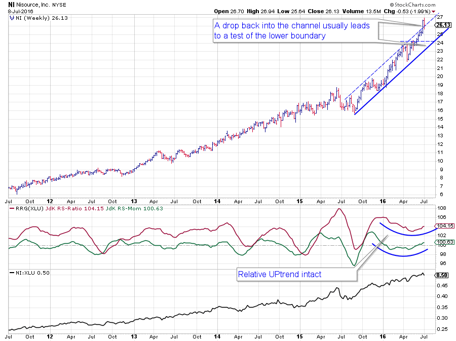 NI is one of those charts you look at and, if you are not in it yet, you know you are probably too late.... On both sides, relative and price.
The price chart is stunning, and the angle of ascent even steepened a few times in the past few years. Just recently price even broke out to the upside of the already rising channel which usually calls for another acceleration; "as long as it stays above the former rising resistance line." And that is what might become a problem as, last week, the price dropped back and is now close to falling back into the channel again, which often leads to a test of the lower boundary. Even if only a correction within the uptrend it still means some short-term risk.
The relative chart looks better, or less risky, the uptrend there is still fully intact and watching the position of the RRG-Lines, just completed a rotation through weakening and is now back inside the leading quadrant.
Although there is some short-term risk in price for NI, the relative trend against XLU remains intact.
CNP - CenterPoint Energy Inc.
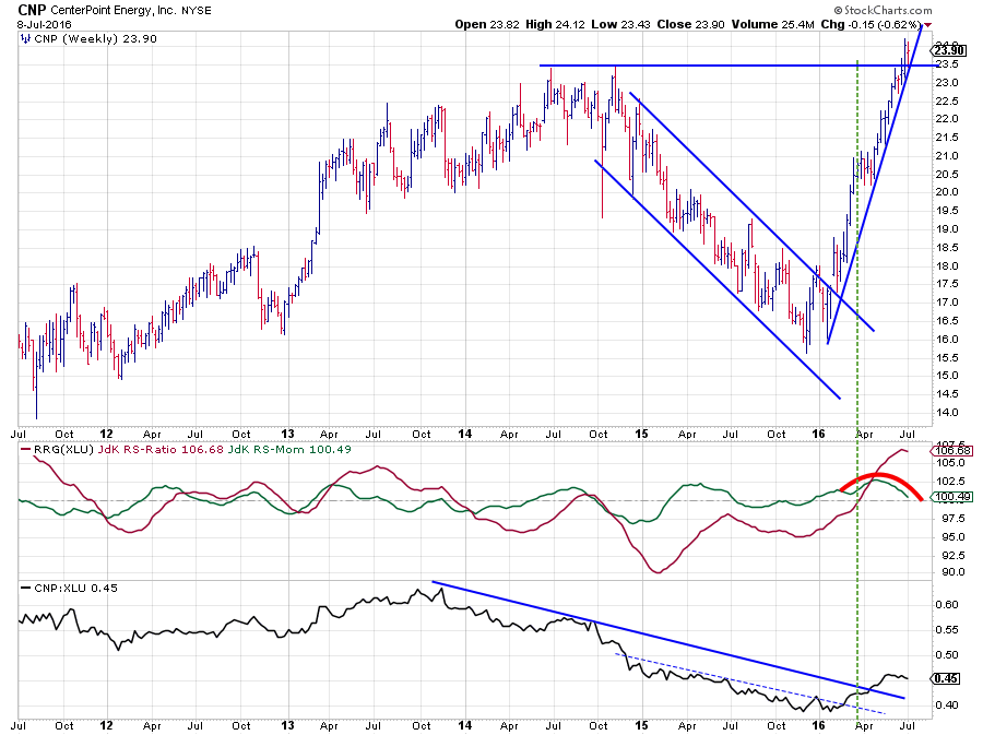 CenterPoint Energy (CNP) is showing a relative downtrend versus XLU since late 2013. In the first half of 2014 the price of CNP was still moving slowly higher despite this relative downtrend but towards the end of 2014 price also gave in and the relative trend accelerated lower backed by a declining price.
The transition from 2015 into 2016 marked the turning point for this stock. First, the price started to bottom out and improve, rapidly followed by a relative strength line, which broke above its falling resistance early in 2016. The RRG-Lines, especially JdK RS-Ratio needed a bit more time to pick up this change in trend but eventually did that in March pushing CNP into the leading quadrant.
Over the past few weeks, the initial momentum following the break of resistance in relative strength seems to be fading a bit which causes the JdK RS-Momentum line to move lower and likely drop below 100 soon. This will push the stock into the weakening quadrant while still high on the RS-Ratio scale.
The good thing is that on the price chart CNP just broke a major horizontal overhead resistance level around $ 23.50, thus opening up more upside potential, but more importantly protecting the downside near the former breakout level.
Given the strong price chart, I expect the current loss of relative momentum to be short-lived and rotation to move through the weakening quadrant back up towards leading again in the next few weeks.
NRG - NRG Energy Inc.
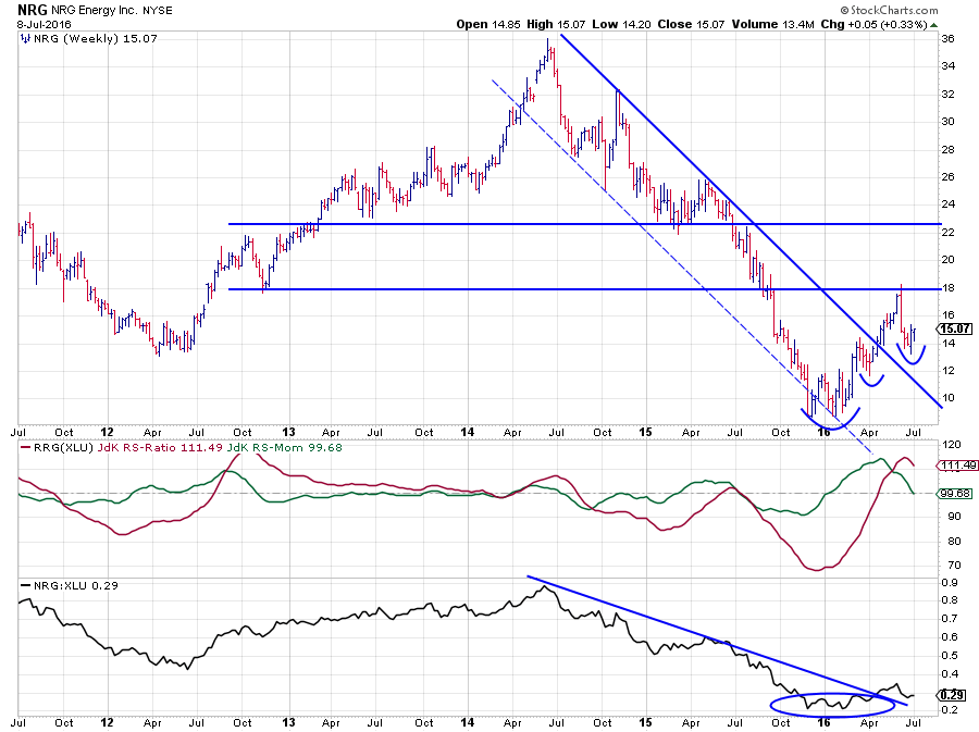 In this article so far, we have seen some stocks showing strong to very strong uptrends in both price and relative terms. And yes they are exciting, and yes one can assume that current trends will continue further.
However, the best opportunities, from an investor point of view, are found when trends are turning around as they offer Low-risk / high-reward opportunities. NRG Energy (NRG) seems to be such a stock at the moment.
On the price chart, NRG headed lower from mid-2014 to early 2016 inside a well-defined trend channel. During the transition from 2015 into 2016, a double bottom marked the end of that downtrend and the break above $ 12, followed by the pull-back that stopped at the breakout level ($ 12) were the first signs of improvement.
The break above its previous peak at $ 14, coinciding with the break of the falling resistance line confirmed that a new trend is in place in price while at the same time a similar setup occurred in the relative strength chart.
The improvement in relative strength was picked up by the RRG-Lines which pushed NRG deep into the leading quadrant and, based on the RS-Ratio reading, NRG is still the strongest stock in the XLU universe.
The current loss of relative momentum is the first setback in RS after bottoming out. The combination of a bottoming relative strength together with a bottoming price seem to offer good opportunities to embark on the next rotational move back up into the leading quadrant again.
Given the vast differences in individual charts in this sector and the big rotational patterns that they display around their common, XLU, benchmark I think Utility stocks are far from boring!
Julius de Kempenaer | RRG Research
RRG, Relative Rotation Graphs, JdK RS-Ratio and JdK RS-Momentum are registered TradeMarks by RRG Research
Follow RRG Research on social media:
LinkedIn Facebook Twitter


