My last article on asset allocation was posted just before election day (11/8), and I was not happy about the rotation for equities against bonds...
What a difference a week makes.
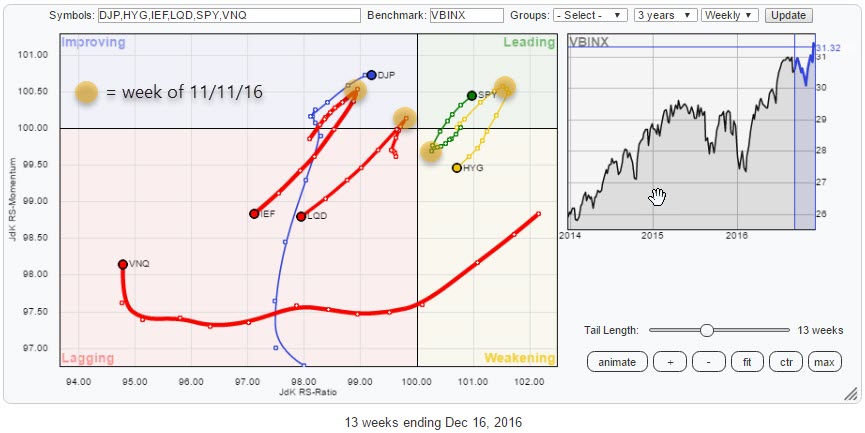 The relative rotation graph above shows the rotation of various asset classes, represented by ETFs, over the past 13 weeks. The observations highlighted in the orange circles are those of the week ending 11 November. An unusually sharp turn reversed some major relative trends that were underway until then.
Summary
- Asset class rotation turned upside down in the week ending 11/11
- IEF breaking major support line, ends long-term uptrend
- SPY tricks us with a false break and then rallies
- Equity/Bond ratio jumps to new all-time highs
Quick scan
In the run-up to election day, 8 November, there were a few, fairly well defined, trends visible on the Relative Rotation Graph of asset classes.
Bond market ETFs IEF, LQD, and HYG were all heading in a 0-90 degrees direction indicating that relative strength against the VBINX benchmark was increasing. Equities, SPY, on the other hand, were heading in the opposite direction and close to crossing over into the lagging quadrant.
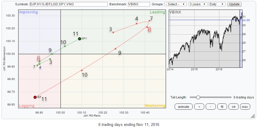
This whole picture changed almost overnight, and at the end of the week (Friday 11), those trends had reversed sharply.
This rotation becomes even better visible when I run the same RRG with daily data for that week and marking the observations with the day of the month (November).
iShares 7-10 Year Treasury Bond - IEF
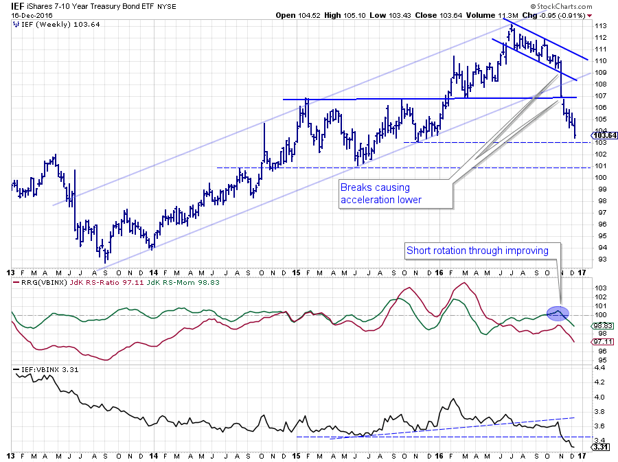 The price action is probably most pronounced on the chart of IEF. After reaching a peak around $ 113, IEF started to decline in a narrow channel. At the time it was still a corrective move within the boundaries of a longer term rising channel.
The big weekly move in the week from 7-11 November and the week after, mark a few important technical observations:
- a break below the lower boundary of the short-term declining channel
- a break below long-term rising support line that marked rising channel from 2013 lows
- a break below the horizontal support level at $ 107
All in all, a string of weak signals for the (government) bond markets.
From a relative point of view (against the balanced benchmark VBINX) things started to, carefully, improve in the run-up to 8 November. While the JdK RS-Ratio was still well below 100, indicating a relative downtrend, the JdK RS-Momentum had picked up some improvement and rallied above 100, positioning IEF inside the improving quadrant and heading towards leading.
That rotation quickly turned South again, pushing IEF back into lagging while picking up steam to the downside.
When I pull up a longer-term chart, things start to look even worse.
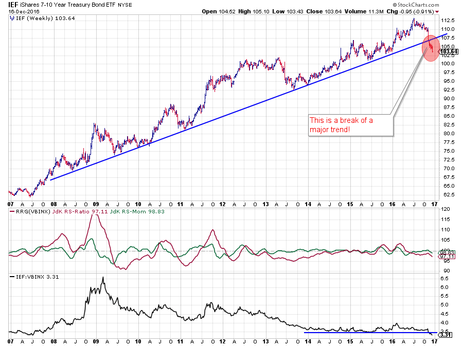 The rising trendline emerging from the late 2013 lows on the first chart, connects all the way back to the lows of 2008. The break of this trendline means that a 9- to 10-year-old trend has now been broken.
It is still the first leg down on the weekly chart which means that it is not (yet) a series of lower highs and lower lows. But looking at the chart above I think most, if not all of us, would agree that it is highly unlikely that IEF will put in a low around current levels and rally, in one big move, back above its last high at $ 112.50.
Given the importance of both the old rising support line and the former horizontal support level at $ 107 the bond market is now expected, in the case of any rally, to face major resistance in the $ 107-108 area.
This weakness in price has also taken its toll on the relative charts where the RS-Momentum line rapidly dropped back below 100, causing a fast rotation back into the lagging quadrant, backed by a lengthening of the tail. The drop of the raw RS-Line below its horizontal support is also adding to the negative as it opened up the way for a further decline in relative strength against VBINX.
SPDR S&P 500 ETF - SPY
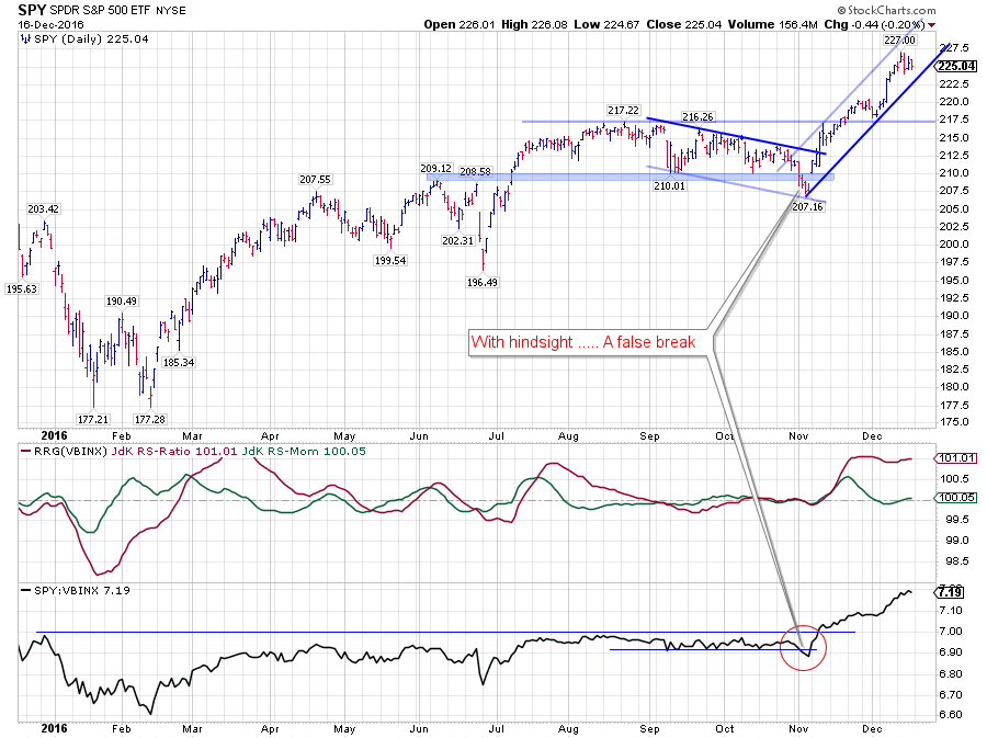 After the break above 210 in July, I doubted the potential for a further rally. In my view, there was a lack of follow through, non-confirmation by volume, and indicators like MACD and RSI started to show negative divergences as price started to move in a trading range.
When both price and relative strength broke below horizontal support in the first few days of November, everything looked like a further decline in price, followed by more relative weakness for equities, was imminent.
With hindsight, we can now see the power of a false break after both price and relative strength broke back above their support levels.
Price first took out the short-term falling resistance, then challenged the top of the trading range and after it broke that barrier tested it again as support. All in the scope of a few weeks.
The relative strength line, after breaking below its support at the beginning of November, turned around and rallied in one strong move to its current levels.
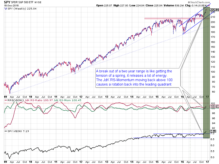 A longer-term chart of SPY puts the recent price action into a better perspective. Just like the break in government bonds looks to be marking an important turning point, the upward break of SPY out of a two-year range could very well be the trigger for more upside price action in equities as we head into the new year.
The recent move may be getting a bit over stretched at current levels. But the implications for the longer-term are looking good, and the basic market approach of risk-off (because we were just below important resistance levels and relative strength was going nowhere) has now changed into "buy-the-dips" as long as SPY remains above its recent lows/support levels.
Equities / Bonds
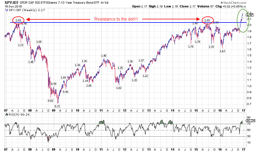 This "scissor-move" in relative strength naturally also leaves its marks on the relative strength line of Equities (SPY) versus bonds (IEF). When I pulled up this chart, the first thing that caught my eye was the horizontal resistance level that showed up connecting the 2007-high and the 2015-high which were matching to two decimals (2.03)...
Not sure about you but when I see things like this I always get this "wow, this cannot be a co-incidence" feeling. The fact that some nearby highs are at 1.98, twice, and 1.99 only adds to this feeling.
The fact that this break is taking place on a long-term chart and that it is taking this RS-Line to new all-time highs means that it has to be taken seriously.
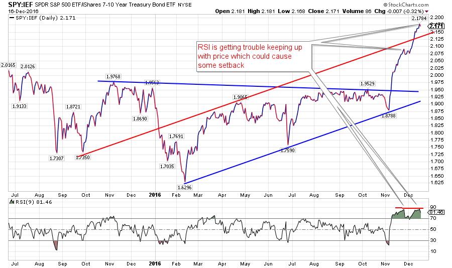 The strength of the move over the past few weeks is better seen on the daily chart of this relationship where the RSI is peaking at very high levels for the second time in a few weeks which suggests that this market is getting overbought at the moment and might need a bit of rest.
The good news is that the downside in both prices, as well as the SPY/IEF relationship, is very well protected to the downside adding to a longer-term "buy-the-dips" scenario.
Happy holidays!
I wish all of you a Merry Christmas and happy holidays from Amsterdam and would like to thank you for your support of StockCharts.com and Relative Rotation Graphs by tuning into the site and reading my articles on RRG. I love the comments and feedback as they keep me on top of the game and provide valuable insights and suggestions for new posts. So keep them coming!
Julius de Kempenaer | RRG Research
RRG, Relative Rotation Graphs, JdK RS-Ratio and JdK RS-Momentum are registered TradeMarks by RRG Research
Follow RRG Research on social media:


