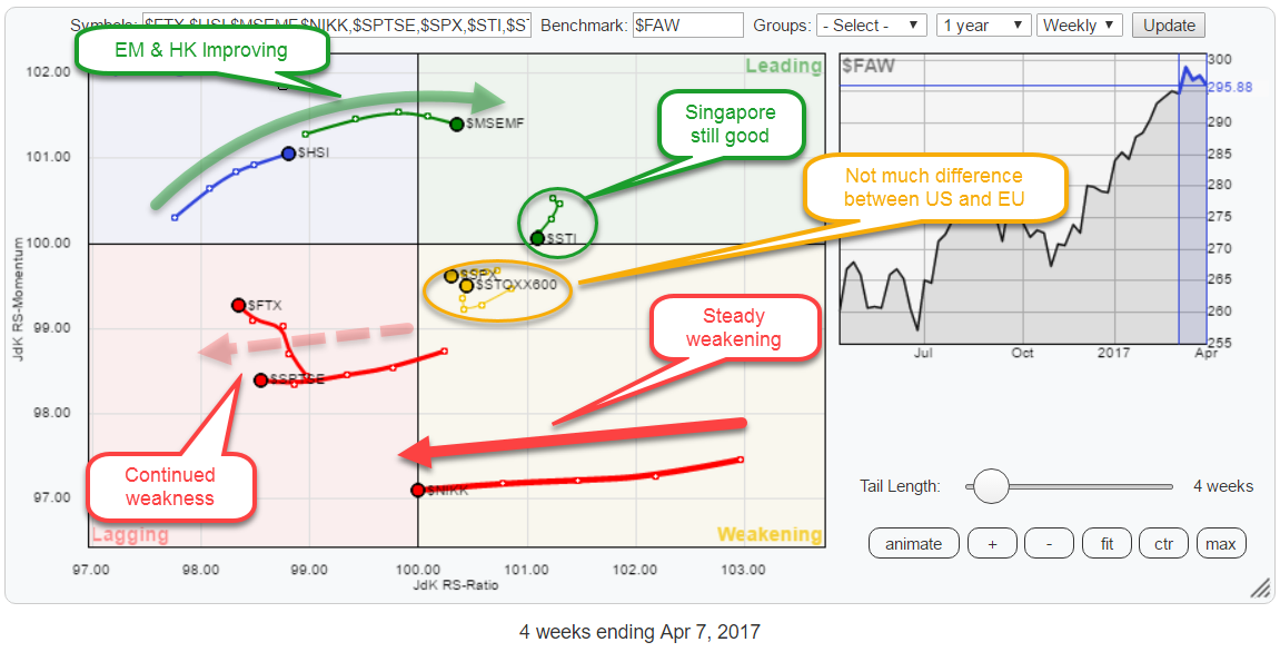
 The Relative Rotation Graph above holds some the major world market indices and compares them to the FTSE all world index ($FAW) as the benchmark.
Straight from the RRG above we can make a few interesting observations.
Starting in the lagging quadrant, we find continued weakness for China ($FTX) and Canada ($SPTSE), with China doing slightly better than Canada as it is already picking up a bit of relative momentum. Both markets are still heading lower on the JdK RS-Ratio scale.
In the weakening quadrant, the one that stands out is the Japanese NIKKEI index. The long tail over the past few weeks and the steady decline on the RS-ratio scale indicate that a strong and steady relative downtrend is underway. At the moment the Nikkei index is crossing over into the lagging quadrant. The preceding move suggests that there is more to come.
Also inside the weakening quadrant, we find the US ($SPX) and European ($STOXX) markets. What is notable in this relationship is that the are, or at least seem to be, very close together. By zooming in on the RRG, we will be able to investigate this relationship further.
The first index in the leading quadrant is the Singapore Straits Times Index ($STI). It is showing a very short tail and just above the 100-level on the JdK RS-Momentum line which suggests that the relative trend is positive by not going anywhere at the moment.
The second one is the Emerging Markets index which looks a lot more promising. It just crossed over into the leading quadrant from improving and is showing a nice long tail indicating that there is power behind the move.
The only drawback here is that the EM index has just started to roll over on the RS-Momentum scale. As far as I am concerned nothing to worry about just yet.
The only index inside the improving quadrant is the Hong Kong stock index ($HSI), but it is showing a promising tail that is gaining on both axes which gives it a positive (NE) heading.
Summary
- Continued weakness in relative strength for China and Canada
- Singapore in good shape but nothing special
- Nikkei accelerates its weakening
- Em and Hong Kong showing positive heading but preference for Hong Kong
- Hong Kong preferred over Nikkei
- Multiple angles confirm preference for European- over US equities
Stay away from Japan
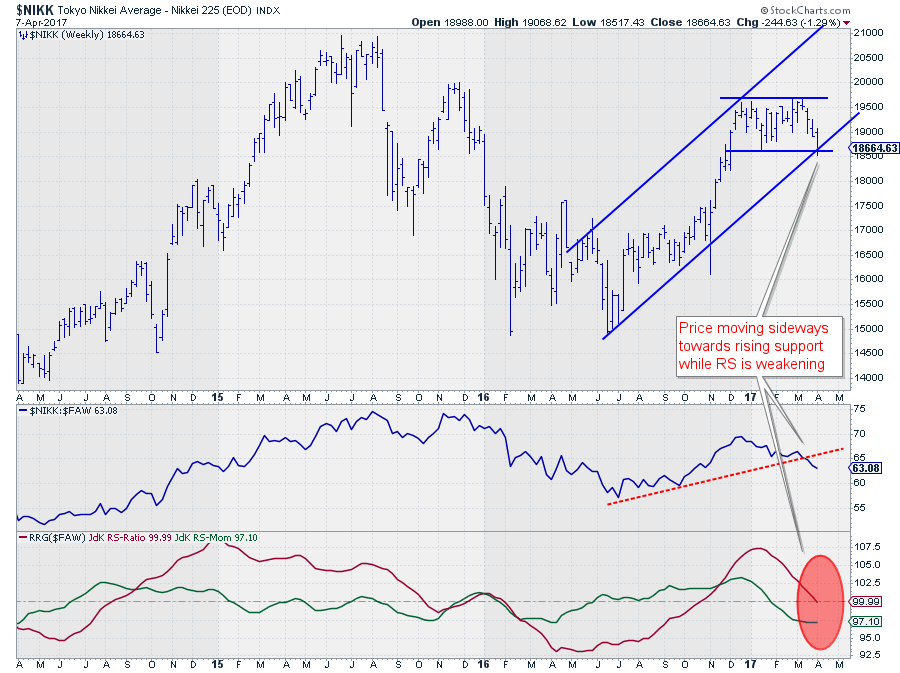 The chart above shows the Japanese Nikkei index over the past three years in combination with its relative strength against the FTSE all world index and the RRG-Lines.
Although the price is still above the rising trendline that emerges out of the mid-2016 low, it does not really "look good." Last week the Nikkei came off and is now resting at a double support level offered by the rising trendline and a horizontal support level coming off the previous low.
I am watching 18.500 for support; a break lower will complete a double top pattern and very likely trigger an acceleration in the decline.
From a relative perspective, things do no look much better. The RS-Line broke below its rising support a few weeks ago and kept heading lower.
The effect is clearly visible in the RRG-Lines which measure trend direction and strength. The JdK RS-Momentum line already dropped below the 100-level at the beginning of the year and is now followed by the RS-Ratio line that is on the verge of breaking lower.
This causes $NIKK to cross over into the lagging quadrant now, and the length of the tail (=power) suggests that there is more weakness ahead in coming weeks.
From a relative point of view, it seems best to stay away from Japanese stocks for the time being.
Hong Kong looks more promising
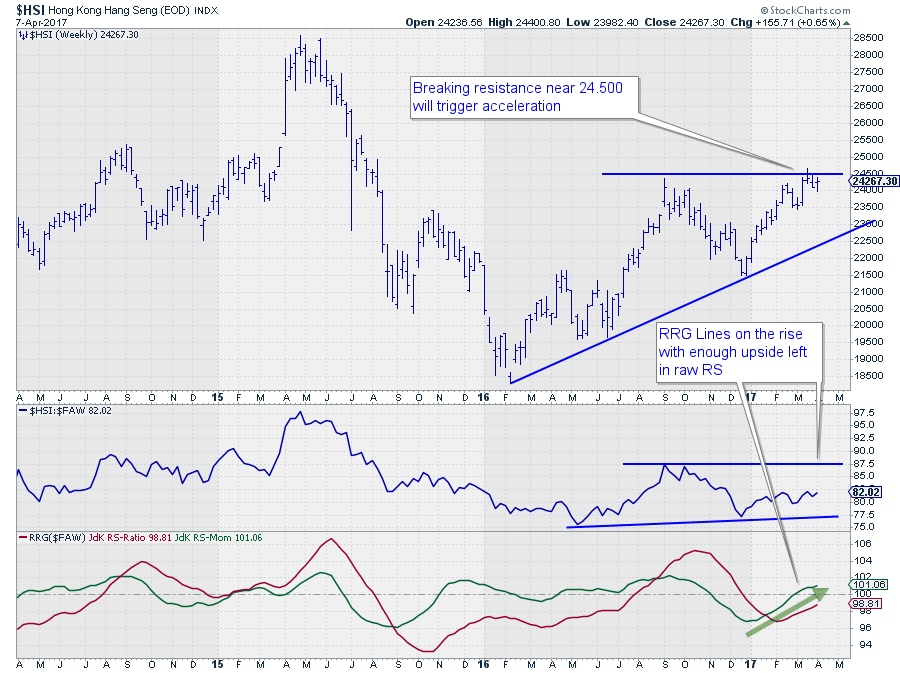 On the opposite side of the Nikkei Index, you will find both the Emerging Markets index, which has already crossed over into the leading quadrant, and the Hong Kong Stock Index ($HSI).
As the EM index is slightly ahead of HK and already started over a bit on the RS-Momentum scale, I have picked the Hong Kong market to show here judging that it has a bit more potential.
On the price chart, $HSI is pushing against a horizontal resistance level offered by the September 2016 peak and the high as recent as three weeks ago. At the moment the HK market is correcting off this resistance area while still in a pattern of higher highs and higher lows.
A break above that 24.500 area will remove the overhead resistance and free the path for a further rise.
On the relative charts, the RRG-Lines are improving with the JdK RS-Momentum line already above the 100-level for a few weeks and RS-ratio now starting to catch up. This improvement in the RRG-Lines suggests that the relative trend against $FAW is turning for the better, but it is not confirmed yet.
The good news is that the raw RS-Line is inside a broader range of which it has just tested the lower boundary and started to work its way higher. There is enough upside potential in raw RS before it hits overhead resistance. This makes it a good candidate to switch to as an alternative for any holdings in Japan.
Europe / US rotation against the world
 I am actually writing this article in a coffee bar in Brooklyn, NY after having visited the MTA (Market Technicians Association) symposium last Thursday and Friday together with fellow Stockcharts.com commentators Arthur Hill and Greg Schnell.
One of the themes that kept coming back during these two days was the relationship between European and US stocks, and there seemed to be a general view that Europe has started to take over from the US in terms of relative strength. So I wanted to review that on an RRG.
The RRG at the top of this article shows the US and European markets, $SPX and $STOXX600 very close to each other inside the weakening quadrant which makes it hard to study the relationship between the two. To be able to get a better view on the EU - US rotation, I have re-created the RRG, zooming in on $SPX and $STOXX600.
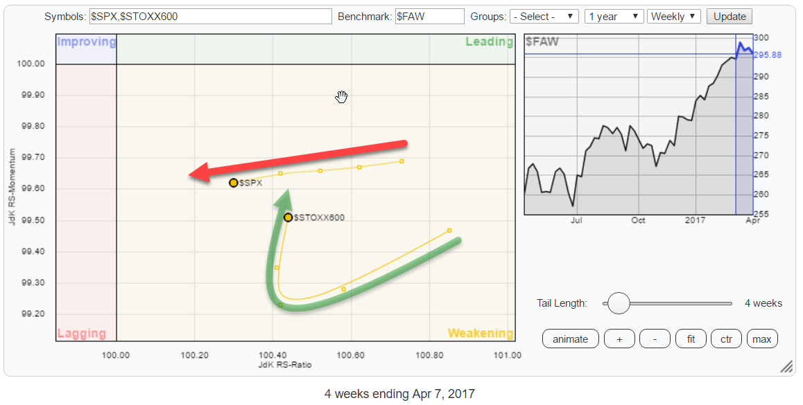 This, zoomed in, picture gives a much more detailed view of that rotation and shows pretty clearly that, over the past two weeks, Europe started to curl back up again, while the US continued heading almost straight to the left.
This rotational picture confirms the idea that Europe is starting to take the lead from the US.
S&P 500 Index - $SPX
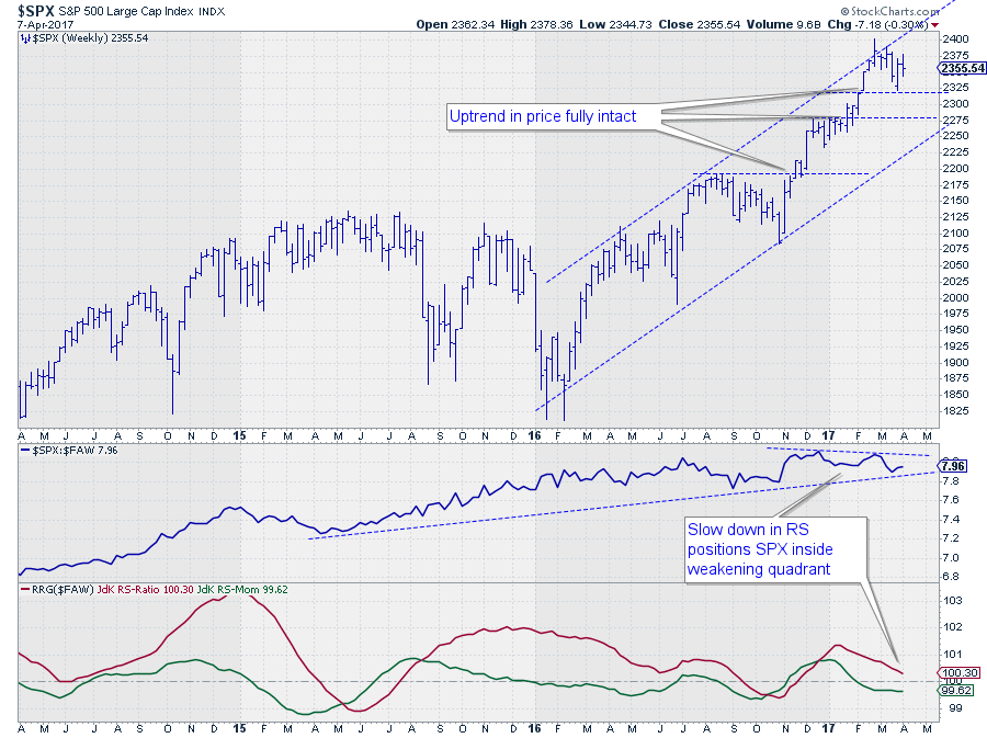 On the price chart of the S&P 500 we see that the uptrend is still fully intact, there is no doubt about that. The short-term upward potential, however, is capped by the rising resistance line that marks the boundary of the rising channel.
Relative strength against the FTSE all world index already peaked back in December 2016 and has been flat since, no outperformance anymore.
This sideways move in raw RS is starting to take its toll on the RS-Ratio line which measures the strength, of the relative trend. RS-Momentum dipped below 100 late January, pushing $SPX into the weakening quadrant.
All in all the US is starting to lose a bit of its bling and seems ready for, at least, a pause.
STOXX Europe 600 Index - $STOXX600
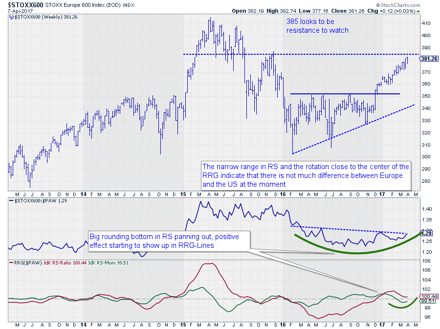 After breaking the overhead resistance level near 350 at the end of last year, the European market continued to rally strongly on the back of the US.
Regarding price, the STOXX 600 Index seems to be nearing its next resistance level around 385. A break beyond that level will definitely help the European market to push higher.
From a relative perspective, the STOXX index is working its way through a large rounding bottom formation that takes up almost a year now. The blue dotted line marks the top of that structure and a break beyond that level will complete the bottom and will very likely cause the relative strength against $FAW to continue higher.
The RRG-Lines had already picked up the improvement at the end of 2016 when both RRG-Lines crossed above 100, positioning Europe in the leading quadrant. The last dip in RS moved the RS-Momentum line slightly below 100 and therefore the index into the weakening quadrant. But as you can see, improvement is already kicking in, causing the heading of the tail to turn back up and point towards the leading quadrant.
This move sets Europe apart from the US and justifies the call for a preference for Europe over the US in the coming period.
Please be aware of the fact that this is a relative move! It is very well possible for both markets to drop in price at the same time. In that case, the expectation is for Europe to fall less than the US.
Europe vs. the USA, a direct comparison
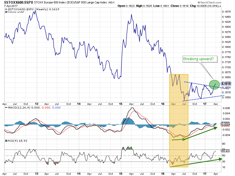 The final piece of the puzzle of this call is a direct comparison of Europe against the USA. The chart above holds the $STOXX:$SPX ratio in the main panel and shows two traditional technical indicators, MACD and RSI, below.
The downtrend from the early-2015 high to the July-2016 low is clearly visible. Also, note the positive divergence between the indicators and the ratio line that started to build up in the period just before the trough in July.
After setting the low in July, the Europe/US ratio moved sideways inside a pattern that can be qualified as a symmetrical triangle. While tracing out this triangle, both the RSI and the MACD continued to creep higher, and the MACD is almost crossing above the 0-line.
At the moment the ratio is breaking out of the triangle to the upside, calling for a reversal of the prior trend which backs up what we are seeing on the RRG and confirms the general opinion of a group of professional technical analysts ..... Maybe there is some sort of collective wisdom there. Let's wait and see. For the time being the odds based on this direct comparison also seem to be in favor of Europe over the US.
Julius de Kempenaer | RRG Research
RRG, Relative Rotation Graphs, JdK RS-Ratio, and JdK RS-Momentum are registered TradeMarks by RRG Research
Follow RRG Research on social media:


