Last week I was the guest of Tom and Erin in their Market Watchers Live show on stockcharts.tv.
In that show, I talked about the difference between open and closed universes and what it means for a Relative Rotation Graph and following that discussion we had a look at the Relative Rotation for some Asset Classes on Relative Rotation Graphs.
Summary
- Open vs Closed universes on Relative Rotation Graphs
- Real-Estate expected to rotate back down to lagging after recovery rally
- Commodities not able to turn LT trend around and now heading lower again
- Bonds expected to gain over equities in the near-term before long-term trend in favor of equities takes over again
Open vs closed universes on a Relative Rotation Graph
A universe is the selection of securities that are plotted on a Relative Rotation Graph. You may be aware that these can be pretty much any traded instrument as long as you make sure that they are comparable. This means that you should for example not mix a yield symbol with a stock index symbol as they move inversely and will not be comparable on a Relative Rotation Graph.
As you know the securities in the universe are compared to the benchmark, which marks the center of the RRG chart, and each other.
The relationship between the universe and the benchmark dictates whether it is an open or a closed universe.
Closed
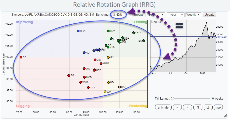
A closed universe is a universe in which the benchmark holds exactly the same securities as the universe.
Examples of closed universes are the 30 DJI stocks compared to $INDU, the 11 S&P sectors compared to the S&P 500 index, all members of a sector compared to the sector index...
Open
An open universe is a universe that holds a group of securities that is not (exactly) the same as the benchmark to which the securities are compared on the RRG.
For open universes there are three options:
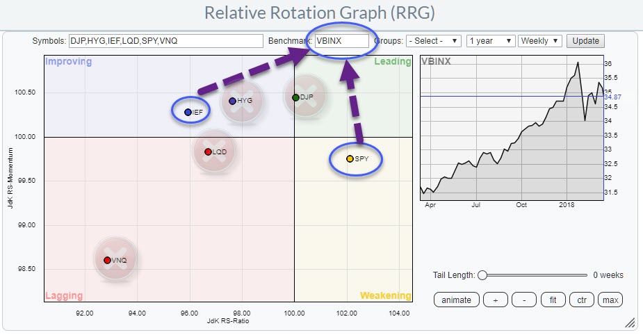
Extended. This is a universe that holds all members of the benchmark index plus some securities that are not included in that benchmark. An example of an extended universe is the universe I always use for asset allocation in my blogs. It uses the VBINX fund as the benchmark. This is a balanced index fund comprised of 60% equities and 40% bonds. But on the RRG are also commodities, corporate bonds, high yield bonds etc.
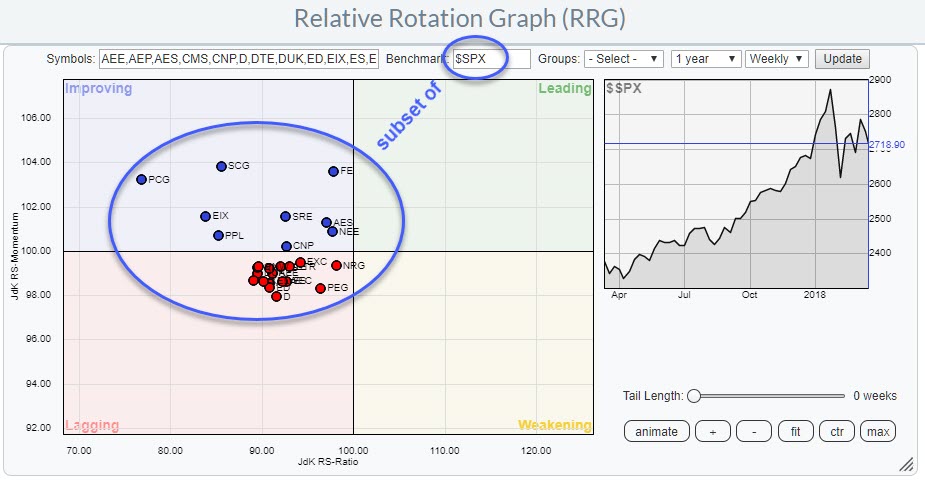
Partial. This is a universe that is a subset of the benchmark to which it is compared. For example, the members of a sector compared to an overall market index. ie all stocks in the utilities sector compared to the S&P 500
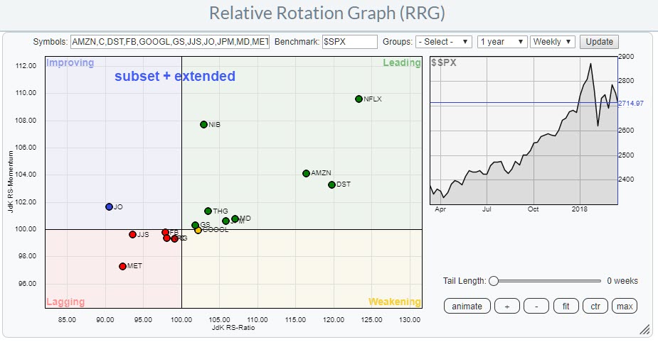
Mixed. This is a universe that holds both a subset of the benchmark index as well as securities that are not included in the benchmark. This could be, for example, a portfolio of holdings compared to a general benchmark. I.e. a portfolio of an investor who holds some individual small-cap stocks, all FANG stocks, a selection of large cap banks and three commodities-related ETFs and uses the S&P 500 index as the benchmark for that portfolio. The small cap-stocks and the commodity ETFs are not included in the benchmark and the FANG stocks together with large-cap banks are only a subset of the S&P 500.
Asset Class Rotation
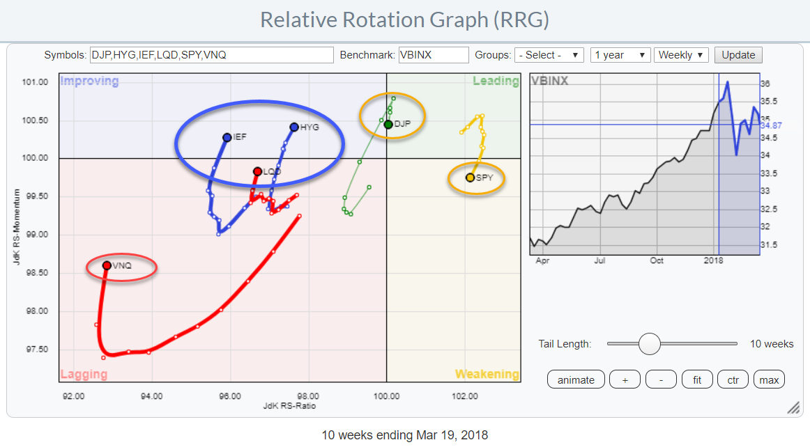
The Relative Rotation Graph above shows the rotation of various asset class ETFs against VBINX. The “extended open universe” as discussed in the first part of this post.
A quick scan learns that equities (SPY) and commodities (DJP) are the only asset classes at the right hand (positive) side of the RRG (albeit only marginally for DJP) and all others are positioned to the left-hand side of the graph. Below 100 on the JdK RS-Ratio scale.
It also shows that equities and commodities have turned around and are heading lower on both scales, causing a negative RRG-Heading while all others have turned up and are now at positive RRG-headings.
Is a rotation from equities into bonds, or other asset classes, ongoing?
In order to answer that question, I want to see the current rotation on a daily time-frame and have a look at some individual charts.
Daily Rotation
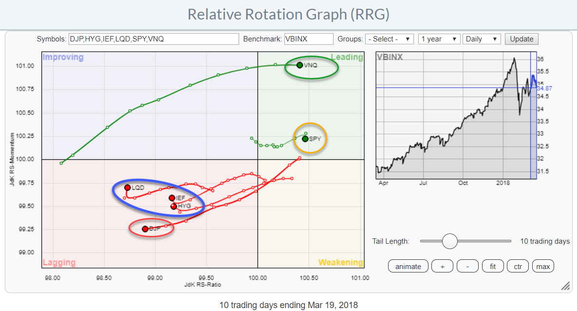
The daily version of the RRG for asset classes above is showing a different rotation for a number of the asset classes compared to what we have seen in the weekly version.
On the weekly RRG Commodities are inside the leading quadrant, albeit only just, but they have already started to roll back and seem to be returning to improving (heading for lagging) a rare and (intuitively) weak rotational pattern.
Real-estate (VNQ) is the weakest asset class on the weekly RRG. Far away to the left and deep inside lagging.
But on the daily version, VNQ has the highest RS-Momentum value and is heading further into the leading quadrant.
On the daily RRG, SPY is also in the leading quadrant, just like on the weekly while the three fixed-income related asset classes (Government, Corporate and High Yield) are inside lagging like on the weekly.
What they also have in common is that SPY and DJP are heading at a negative RRG-Heading on both time-frames while the fixed income asset classes are all heading at a positive RRG-Heading on both time frames.
Let’s have a closer look at some individual charts.
Real-Estate
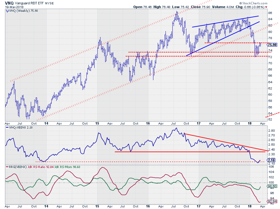
The chart above shows VNQ on a weekly basis since mid-2013. There are probably a bit more annotations on the chart than you are used to from me but I’ll try to explain how I am looking at this.
First, there is the big up-trending channel marked by the opaque red dotted lines.
Please note that drawing trend-lines is more of an art than an exact science and your lines are as good as mine. I am trying to fit mine as good as possible with as many same-level touch-points as possible.
Secondly there is a rising wedge pattern marked by the blue solid lines and finally, there are a few horizontal levels, dashed red, that I keep an eye on.
The initial sign of weakness for VNQ came when price broke out of the rising wedge pattern. After the initial break there was a little pause around the rising support line but when that level also gave way an acceleration followed and the price came to rest at the bottom of the rising wedge near $ 72.
I have support marked between $ 72 - $ 74 as you can see. After a few weeks of consolidation, we are now seeing a small uptick from that consolidation but it is already running into trouble around $ 76, which is the level of a former low.
The up-trend has definitely been broken. The initial price target coming from the wedge formation has already been met (the bottom of the formation) but as you know this is the minimum target.
Where to from here?
With the up-trend broken the upward potential for VNQ seems far less than the downward risk so it’s not an asset class which I would consider buying or overweighting in a portfolio for the time being.
In the near-term, there is the possibility of a bit more of that recovery rally, provided that it can take out resistance near $ 76. In that case, I am looking for a new lower high anywhere below the level of the old rising support line.
When support at $ 72 gives way to the downside, VNQ will very likely be in for a rough ride targeting the cluster of lows around $ 64.
How can we relate that to relative strength versus other asset classes?
The downtrend in RS against VBINX is clearly visible and that downtrend got a new boost when it broke below that horizontal support level. At the moment the old relative low from late 2013 seems to provide some support.
But just like on the price chart, here also upside potential seems capped by old support levels while downside risks are considerable.
Finally, looking at the rotational pattern we find that VNQ is inside the leading quadrant on the daily chart but RS-Momentum has been leveling off for a few weeks already, meaning that there is little fuel behind this relative movement.
With VNQ (deep) inside the lagging quadrant on the weekly RRG, inside leading on the daily but lacking momentum and at risk of rolling over it has all the characteristics of a rotation that will remain at the left (negative) side of the Relative Rotation Graph for now.
Commodities
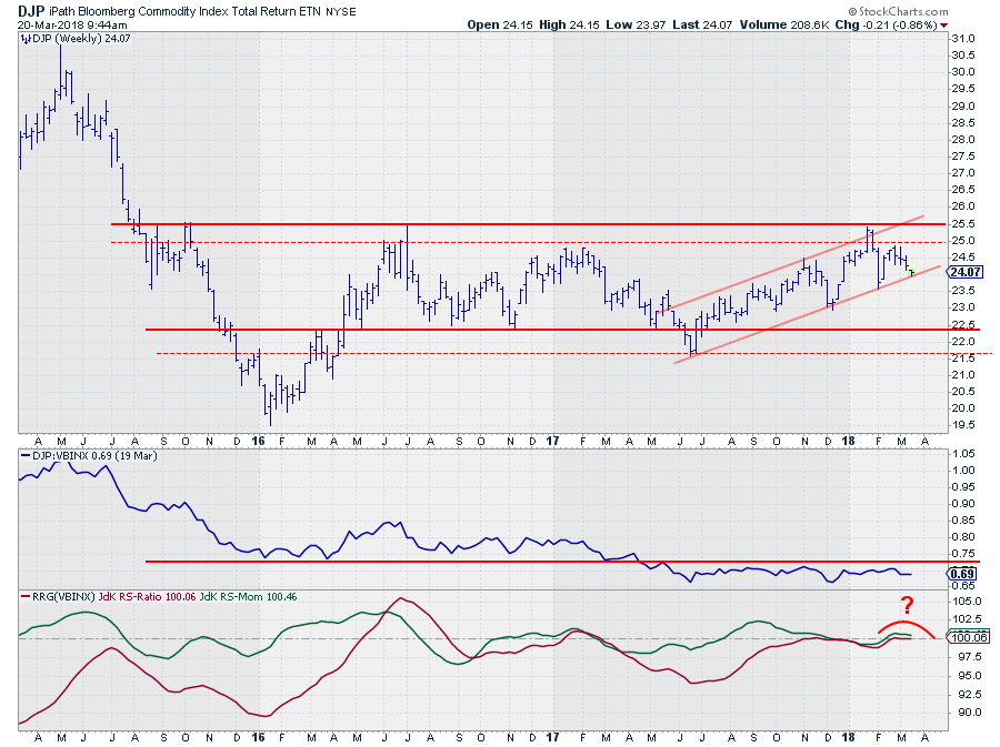
For over two years now, commodities are trying to turn around that massive downtrend (visible from early 2011 onward) and get back in favor of investors again.
There have been a few attempts, especially in the first half of 2016 and more recently during the second half of 2017 and going into 2018 but everything failed around the resistance barrier between $ 25 - $ 25.50. This area is now getting more and more important.
After having set the low around $ 20 at the start of 2016 the lower boundary of a trading range seems to have set itself between $ 21.50 - $ 22.
Looking at the move higher since mid-2017we can detect a rising channel and after the peak at $ 25.50 a first lower high inside that channel has been set at $ 25 and at the moment price is resting at support.
A break of that rising trend-line will very likely be the trigger for another test of the lower boundary of the range, I.e. somewhere between $ 21.50 - $ 22.50.
Projecting the action on the price chart onto the relative strength of commodities against VBINX shows that the RS-line dropped below horizontal support mid-2017 and has not managed to crawl back above that level since.
The sideways movements of relative strength have caused the RRG-Lines to cluster close to the 100-level on both axes without identifying a clear new rotational move.
The sudden turn of the tail on DJP to a negative RRG-Heading while only just inside the leading quadrant is a weak sign and suggests that commodities are headed back towards the lagging quadrant in coming weeks.
Equities vs Bonds
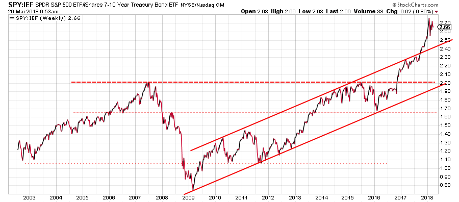
The Equity - Bonds relationship is a bit hard to read at the moment. The chart above shows the SPY:IEF ratio since 2002. The way I read this chart is that we had a very important upward break in favor of equities towards the end of 2017.
That break took place while the ratio was in the middle of the rising channel that emerged out of the early 2009 low. An equally important break took place in September 2017 when the SPY:IEF ratio broke upwardly out of the already rising channel, accelerating the move higher.
Over the past few weeks that rally has stalled and started consolidating but both breaks are still intact which means that upside potential is still there and the downside is protected by support at the level of the former rising resistance line.
From a rotational point of view, SPY is still positioned way to the right of IEF indicating a preference for SPY over IEF.
This rotation is also visible on the daily RRG (SPY to the right of IEF). However, on both the weekly and the daily RRG the RRG-Heading for SPY is negative and positive for IEF.
Given the wide separation on the JdK RS-Ratio scale and the long-term positive view from the SPY:IEF ratio chart my judgment is that the for the long-term (months) equities should be preferred over bonds.
For coming weeks I am less positive. Primarily as I see the tail (daily) on SPY rolling over and starting to head South while the tail on IEF is starting to curl upward at a more positive RRG-Heading.
This rotation seems to be backed by the price chart of SPY where the most recent high, on the daily chart, only managed to get marginally higher than its predecessor and price is dropping back between the boundaries of the long-term rising channel which often leads to a test of the lower boundary, currently around $ 255 - $ 260.
The opposite holds up for IEF where a short-term low seems to be in the making. Especially when IEF can take out resistance at $ 102.60 a bit more upside may be expected.
So resuming, the long-term trend is in favor of equities over bonds. In the near term bonds are likely to gain over equities, potentially a tradable move, off-setting some of the recent gains.
The follow through after the short-term rotation will be important to watch and judge whether the long-term trend will be able to resume.
Let me know what you think of this usage of RRG in the comments? If you want to receive a notification when a new article in the RRG blog is published? Simply "Subscribe" and leave your E-mail address.
Julius de Kempenaer | RRG Research
RRG, Relative Rotation Graphs, JdK RS-Ratio, and JdK RS-Momentum are registered TradeMarks ®; of RRG Research
Follow RRG Research on social media:
If you want to discuss RRG with me on SCAN, please use my handle Julius_RRG so that I will get a notification.