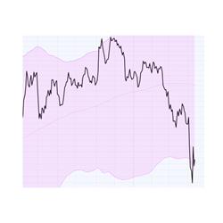
 Facebook has been making headlines recently. Not only in the newspapers and online news services but also in some of the blogs at Stockcharts.com.
With hindsight everything is easy and we can find many “signals” that “would have” given us early warning signals that we “should” have seen and the “could have” helped….
It is also very easy to find signals or methods that did not work. It happens, we all know that...
Personally, I am very reluctant to judge analytical methods that I am not, yet, too familiar with. For example, I am not an expert in Elliott Wave analysis so you will not find me writing interpretations on EW patterns and you will certainly not find me pointing out where my personal interpretation of an EW count did not work out as expected.
Having said that the recent FB price- and relative action make a nice example to use for explaining how important it is to keep things in perspective and how different time frames on Relative Rotation Graphs can (and should) work together to “paint a picture” of the universe being analyzed. But also showing how dangerous it is to look at a single stock in isolation. That is always dangerous but especially on an RRG which is a multi-securities tool.
Summary
- Situational awareness will help you win the battle
- Isolating single stocks on an RRG is a dangerous thing to do
- Always put things into their proper perspective
- Use the right tool for the right job.
Situational awareness.
Relative Rotation Graphs came to life in a professional, institutionally oriented environment.
If there is one thing I have learned from working as a professional portfolio manager, and with them when I was on the other side, it is that it is the return of the portfolio that counts and not the incidental result of an individual stock (-trade or -position).
As a matter of fact, the choice which individual stock to buy is the last one to be made.
RRGs were designed as a tool for PMs to keep an eye on the big picture and be aware of what is going on in their market, their part of the universe, as a whole.
Not too long ago someone who also comes from a military background, like me, said: “RRGs provide me with ‘situational awareness’ which is essential to survive on the battlefield”. And that is actually a spot on observation. I could not have said it better myself.
An infantry mission does not fail when one soldier does not act as expected, there can be many reasons for that one soldier to fail that day. And it certainly does not mean that the tactical plan for the mission or the equipment used for the mission was bad. If the mission fails because the whole mission relied on that single soldier or because of a bad choice of equipment then it’s not the soldier’s, nor the equipment’s fault. It was the commander’s fault.
Now swap commander for the portfolio manager, equipment for indicators or trading tools and soldiers for stocks and I think you get the picture…..
Facebook in isolation
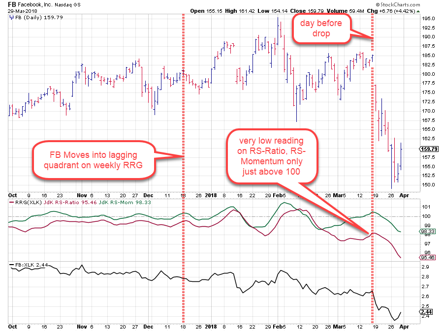
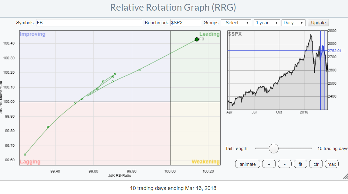 The RRG above shows FB on a daily RRG chart in isolation on March 16. Looking at this chart one may think that it is sending bullish signs for FB. However, the keen observer might see a few things that are doubtful at least.
- The benchmark is set to $SPX. This immediately puts FB against all 500 members of the S&P 500 instead of against its peers inside the technology sector. Not necessarily wrong but as the sector as a whole was doing well at the time it is not surprising to see FB doing relatively well as well as all members of XLK will be shifted somewhat to the right.
- The chart is zoomed in, to the max. This distorts the relative picture and it takes away the “big picture” effect. We all know the charts where we are presented a chart that is clearly in an up-trend but when zoomed out to a much larger time-frame it appears to be nothing more than a small upward blip within a massive downtrend. The human brain can easily be tricked into a certain thought when presented with a biased or framed picture.
If the sergeant would present this information to his commanding officer in isolation it would be very misleading and there would be a lot of explanation necessary after things went sour...
Putting things into perspective
As Facebook is a technology stock we are going to put things into perspective and position ourselves as a portfolio manager running a US Technology sector fund. This means that with 90% certainty our job is to manage the portfolio with the goal to outperform the technology sector index. Let’s assume that will be XLK but it could be any other tech-related index for that matter.
Does that mean we are interested in the direction, up or down, of the technology index (XLK)? Very likely yes, but more as a reference than something to act on or trace.
Our job is to outperform our benchmark XLK so what we need to do is put together a portfolio of technology stocks that beats XLK. Also in periods when XLK, and therefore most or all of its members, is going down.
To properly analyze FB we, therefore, need to look at the stock in relation to XLK but also in relation to all other members of XLK.
If you are not a professional portfolio manager running a huge equity fund but a private individual running your own portfolio, you can, or maybe you even should apply a similar approach adapted to your personal situation.
Take a look at the big picture, think about asset allocation, for the equity apart at least be aware of how the various sectors are doing, apply proper money management and finally come up with a reasonable, I.e. manageable number of positions for your portfolio and adjust over time while trying to stay ahead of the curve.
The picture on a daily Relative Rotation Graph
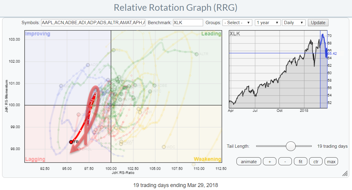 The daily RRG above again shows FB but now as a member of the technology sector and against XLK as the benchmark.
As we want to keep an eye on the big picture and see all the peers of FB on the same chart it has to be zoomed out (SC will do that automatically when you use the controls below the benchmark chart). Doing that shows that the position of FB against the benchmark (XLK instead of $SPX), or its peers, is not very strong.
Yes, it was inside the improving quadrant but as you can easily spot on this RRG, the vast majority of all other members was to the right of FB meaning that there were many other tech stocks that were in better shape than FB at the time. And this is just on the daily chart.
If we move to the weekly version of the RRG for technology stocks the picture gets even more clear.
The weekly picture
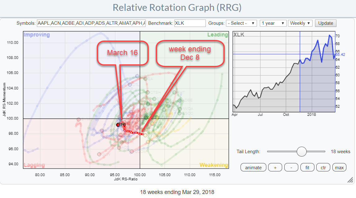 The RRG above again shows all the members of the technology sector against XLK as the benchmark. The tail of FB already crossed over to the lagging quadrant in the week of December 4 last year that was more than FOUR MONTHS ago….
Readers who follow my blog will know that securities inside the lagging quadrant that show upward momentum while they are at low RS-Ratio readings should be treated with caution as such moves are often hiccups within a longer-term downtrend. To back this up, at the time of the FB face-plant there were only four stocks inside XLK at a lower RS-Ratio reading than FB…
Wrapping up
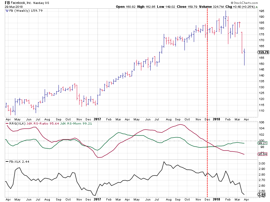
 To wrap up this analysis in hindsight. At the time of the sharp drop in price for FB, the stock was already very comfortable inside the lagging quadrant on the Relative Rotation Graph holding all members of the technology sector and showing up as one of the weakest stocks in that universe.
On the daily RRG chart, some improvement showed up, after the initial weakness, pushing FB into the improving quadrant while at low RS-Ratio readings which made the move suspect.
Very rapidly after the first sharp move down in the price of FB, the tail on the daily RRG rotated back into the lagging quadrant causing the tail on the weekly to continue lower on the RS-Ratio scale without even getting close to crossing over into improving.
I hope this backward-looking analysis made clear that it is important to:
- Keep things in their proper perspective
- Be careful with zooming or framing a chart as there is a big risk of drawing the wrong conclusion
- Be careful when looking at stocks in isolation, especially when using a multi-security tool
- Be aware of the strengths and weaknesses of the various tools in your toolbox called StockCharts.com.
You don't want to use a hammer to get a screw into a wall... And once you have figured out that you need a screwdriver, please make sure you use the right size and the right type of screwdriver before judging them as being wrong or faulty.
Using a sledgehammer to put a 0.5 inch nail into a plastered drywall does not make the sledgehammer a useless tool.
Let me know what you think of this usage of RRG in the comments? If you want to receive a notification when a new article in the RRG blog is published? Simply "Subscribe" and leave your E-mail address.
Julius de Kempenaer | RRG Research
RRG, Relative Rotation Graphs, JdK RS-Ratio, and JdK RS-Momentum are registered TradeMarks ®; of RRG Research
Follow RRG Research on social media:
If you want to discuss RRG with me on SCAN, please use my handle Julius_RRG so that I will get a notification.