 Last week Thursday (6/21) was the third Thursday (try saying that out loud ;) ) of the month. The day that I join Tom and Erin in the Market Watchers Live show to talk about Relative Rotation Graphs.
In the show, which you can play back here, I talked about different universes, open and closed, and the effect of different benchmarks.
Summary
- Open and closed universes
- Special benchmarks
- $ONE
- @FIVEPCT
Universes and benchmarks
Relative Rotation Graphs have two crucial components which determine what you will be looking at. The first of course is the universe of securities that will be displayed on the plot. As you know this can be any combination of symbols as long as they are comparable. The second element is the benchmark that will be used to compare the members of the universe against.
The combination of benchmark and universe will dictate what comes out on the RRG. And as there is an infinite number of possible combinations, there is not "one RRG". One universe can be studied against different benchmarks but also one benchmark can be used for different universes. Some universes hold only a handful of securities while others hold many, many securities.
So before you start using RRGs in your investment process, you will have to ask yourself what it is that you would like to achieve. As with all analytical work, it will pay off to have a clear understanding of what you are looking for instead of just starting to see if you find something.
Comparable
A very important prerequisite for an RRG to "make sense" is to make sure that the symols in the group are comparable. What does that mean?
It means that you need to make sure to compare apples and apples and oranges and oranges on the plot.
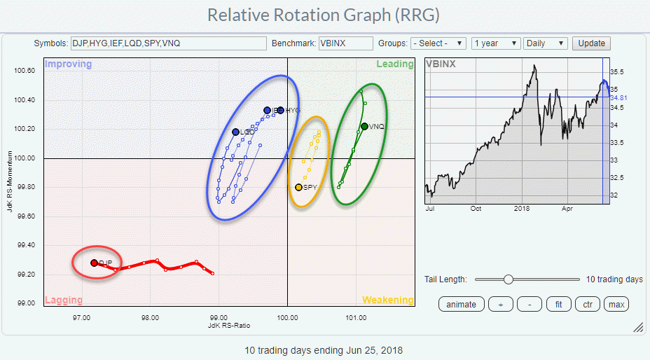
The best example I can think of is when you want to use an RRG for Asset Allocation decisions and you need to compare equities and fixed income markets as on the RRG above.
For fixed income markets we can chart yields and we can chart price or total return. The chart below shows the 10-year yield on US Treasuries (blue line) and the accompanying Total return price in the form of the iShares 7-10 year Treasury Bond ETF.
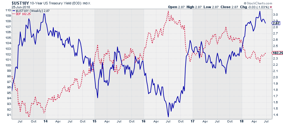 When Price goes up Yield goes down and vice versa. As a bond investor, I like falling yields as the price of my bond goes up. When I want to compare (Government) Bond investments with Equity investments I need to use the bond price or a total return bond index because equity prices are NOT COMPARABLE to bond yields. However, they are comparable to bond price series. So, on the RRG, I need to choose price series (total return as the coupon part is a big part of the bond performance) to compare them to equity price series like SPY.
If you add a yield symbol to the group the system will show you the RRG but it makes no "sense"
Another area where you will have to pay attention, is when you want to study currency rotations on a Relative Rotation Graph. As quoting conventions in the Forex markets are not always consistent (EUR/USD and USD/JPY or GBP/USD and USD/CAD) you need to make sure that all your currency pairs will have the same denominator (###/USD if you want to use USD as the benchmark or ###/EUR if you are European based investor).
Benchmarks
For Relative Rotation Graph, the original, and still most used, application is to monitor a group of securities against a common denominator. For example, the sectors (indices) in an equity universe compared to their overall index.
The best example here, clearly, is the RRG showing the S&P 500 sector indices (ETFs) against the overall S&P 500 index (SPY).
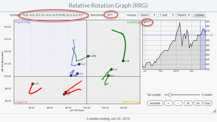 Using this setup the RRG can be used to monitor/track/analyze the "trends in relative performance" for the various sectors against the S&P 500 index but also against each other.
Open and Closed universes
Because all sectors that make up the S&P 500 are present on the RRG this setup is called a "Closed universe". Another example of a Closed universe would be all members of the Energy sector against XLE as the benchmark. Again all stocks present on the RRG make up XLE.
If we stick with the XLE example, changing the benchmark from XLE to SPY would make it an open universe.
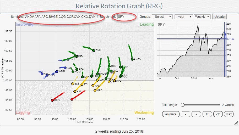 As the Energy sector is a strong sector compared to SPY at the moment you will note that the individual stocks on the RRG, with SPY as the benchmark, are somewhat shifted to the right. This is normal and expected. With closed universes, the securities are, more or less, evenly spread around the benchmark. In open universes, they can be tilted or shifted to one common direction.
Another example of an open universe is the setup that I often use to monitor asset allocation on a Relative Rotation Graph.
 In this setup the benchmark is VBINX, that is the Vanguard Balanced Index Fund. This fund tracks a balanced portfolio of 60% equities (SPY) and 40% government bonds (IEF). So an RRG with only SPY and IEF and VBINX as the benchmark would be a closed universe. By adding some other asset classes (ETFs) it became an open universe and investors can allocate and try to get alpha over their benchmark by allocating/diversifying to other asset classes.
Special benchmarks
While in most situations the benchmarks used on RRGs are benchmarks that we are used to such as the S&P 500 or any other general market index, or sector indices in case we are looking at individual stocks inside a sector etc.
If we want to get more creative with RRG we can use some special benchmarks to see a universe from another angle.
$ONE
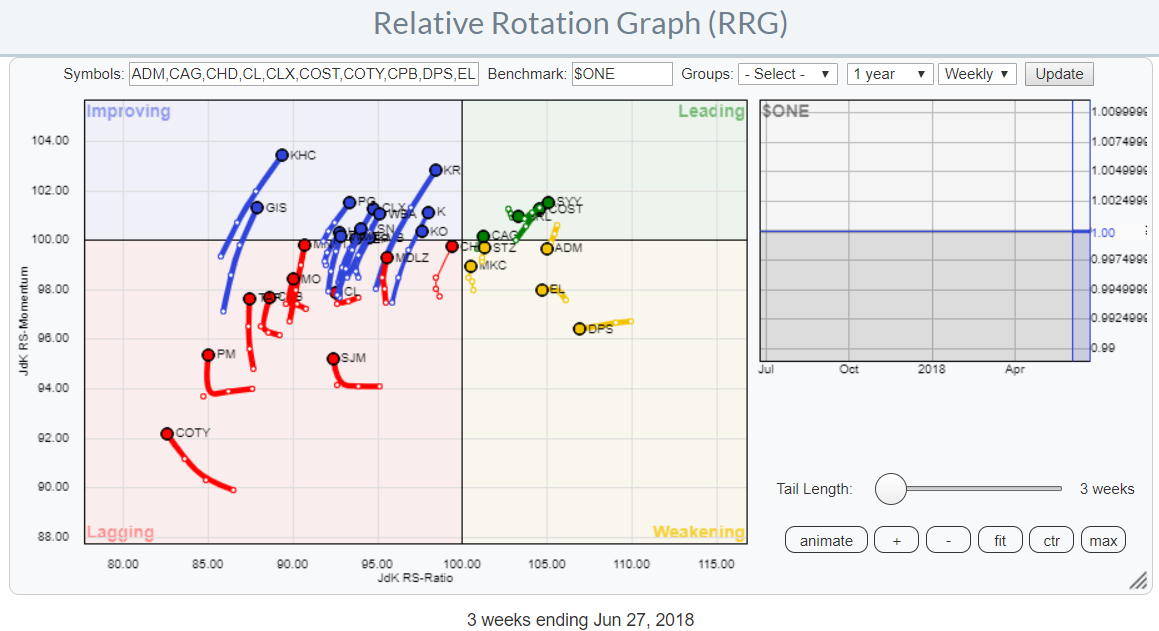
One example is the use of the benchmark $ONE. This is a benchmark that always holds the value 1. By using $ONE as the benchmark we are in essence comparing the securities on the plot with a 0% return and we are looking at absolute return instead of relative return trends through the lens of a Relative Rotation Graph.
An example of the XLP stocks against the $ONE benchmark is plotted below. As XLP is one of the weaker sectors in the S&P at the moment you can see that the universe of stocks is shifted to the left side of the graph indicating that a lot of these names are not only underperforming the S&P 500 but even showing a negative trend in absolute (price) performance.
@FIVEPCT
Last week I introduced another "trick" which involves the use of "User Defined Indices" at StockCharts.com.
The idea is that even if you are aiming for absolute return instead of relative return you may be looking for more than just beating 0% performance.
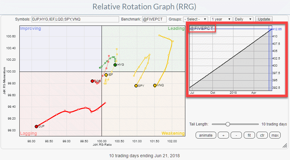
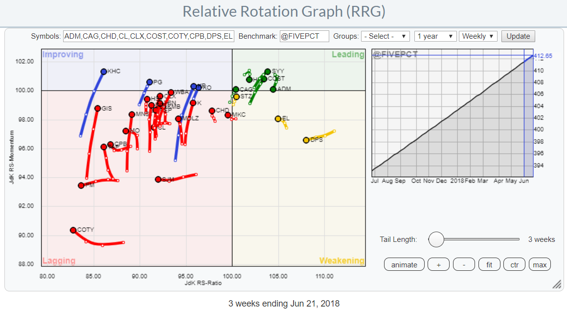
Let's say you want to beat 5% annual performance. To deploy this "benchmark" on a Relative Rotation Graph as your yardstick you need a benchmark index that goes up at a steady rate of 5% per annum.
This is where User Defined Indices come in handy.
The way to get such a time-series into a UDI is to set up a spreadsheet that creates a (daily) series that grows at a rate of 5% per annum and then use that UDI as the benchmark for an RRG.
The chart below shows the same XLP stock universe but now against @FIVEPCT as the benchmark.
 I know that during the MWL presentation some people asked how to create that series or get a hold of the sheet that I was using. I am preparing a short video showing the process and at the same time fine-tuning my sheet to make it dummy proof and a bit more flexible so it can output also 10% or 8% or whatever you want annual growth rates.
If you want to get that sheet when it is ready just ping me on one of the channels (DISQUS, mail, twitter etc.) and I will send it when it is ready.
Let me know what you think of this usage of RRG in the comments? If you want to receive a notification when a new article in the RRG blog is published? Simply "Subscribe" and leave your E-mail address.
Julius de Kempenaer | RRG Research
RRG, Relative Rotation Graphs, JdK RS-Ratio, and JdK RS-Momentum are registered TradeMarks ®; of RRG Research
Follow RRG Research on social media:
If you want to discuss RRG with me on SCAN, please use my handle Julius_RRG so that I will get a notification.


