 This is an extended version of the recent RRG article in Chartwatchers "Checking out the land down under on a Relative Rotation Graph".
Even if your investment portfolio is tied to a specific country or region it makes sense to keep an eye on developments around your geographical area of interest. Relative Rotation Graphs will help you keep an eye on the relative position and rotation of your specific area versus the rest of the world.
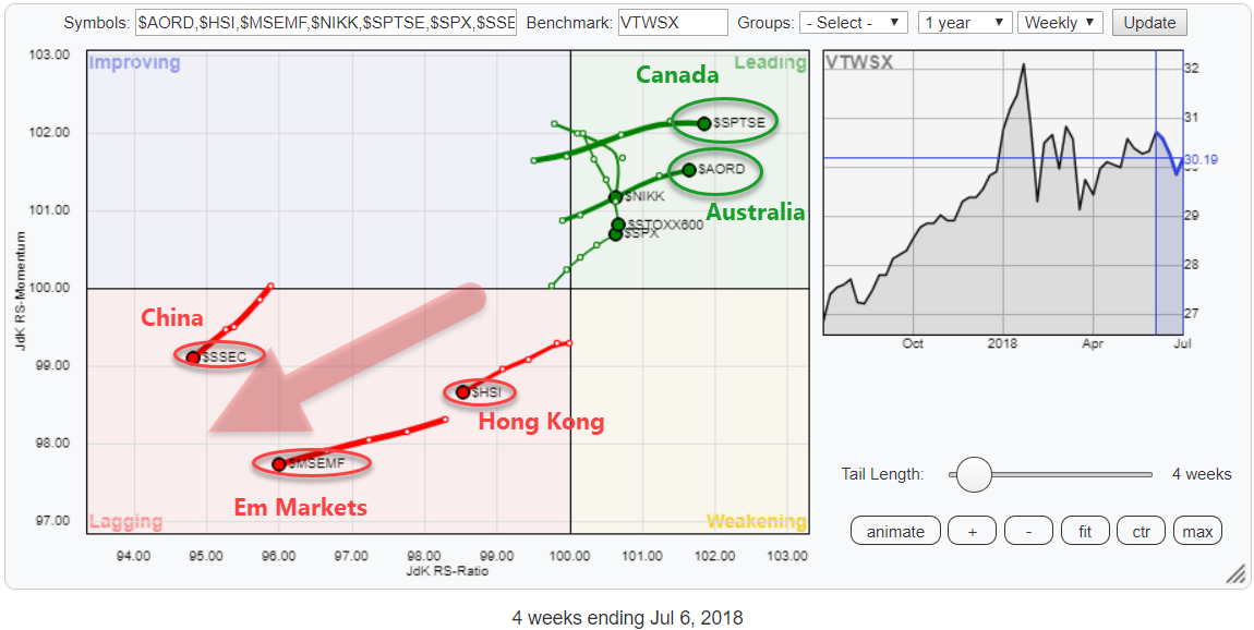
On the Relative Rotation Graph above I have grouped a selection of world equity market indices, mainly some big equity markets / -regions, and put them against the Vanguard Total World Stock Index (VTWSX) as the benchmark.
What immediately grabs our attention, or at least mine is the fact that this selection is clearly split between positive (Leading) and negative (Lagging).
Indices <> ETFs
I repeat, Indices are not ETFs!
ETFs are investment instruments that (try to) track the performance of an underlying index. When The ETF is traded in the same currency as the underlying index the ETF should be able to track the performance of the index fairly good. However, when the ETF is traded in another currency than the index that it is tracking big differences will arise because of the exchange rate effect.
For this reason, I always do my analysis, whether on an RRG or a regular chart, on the underlying index instead of the ETF. Technical analysis is about finding trends and analyzing supply and demand. If I want to study a foreign equity market, I want to analyze the supply and demand for that specific market.
These international equity markets are not traded in US dollars. Using an ETF quoted in USD to analyze supply and demand for them introduces a huge FX component into the analysis which distorts the underlying trends in the equity market.
Imho it makes no sense to look for "support and resistance" on a chart of an ETF tracking a foreign equity index quoted in USD because that chart is the result of the underlying index times the exchange rate of the local currency vs USD. The highs and lows on such a chart are not the result of people buying and selling that ETF.
In this old post, I look at this effect in more detail.
Once you have an idea on how you would position your investment portfolio and it includes an allocation to a foreign equity market you can use an ETF that tracks that market to get the desired exposure to that market. This will introduce the mentioned currency effect and therefore an additional (currency) risk to your portfolio and you will have to make up your mind about the direction of the currency vs your base currency (if you are in the US that will be the USD) and whether to hedge that risk or not. I see them as two separate risks and two separate decisions.
The universe
The universe on the RRG is found in the table below. These are the Indices and not the ETFs that track the performance of the underlying markets.
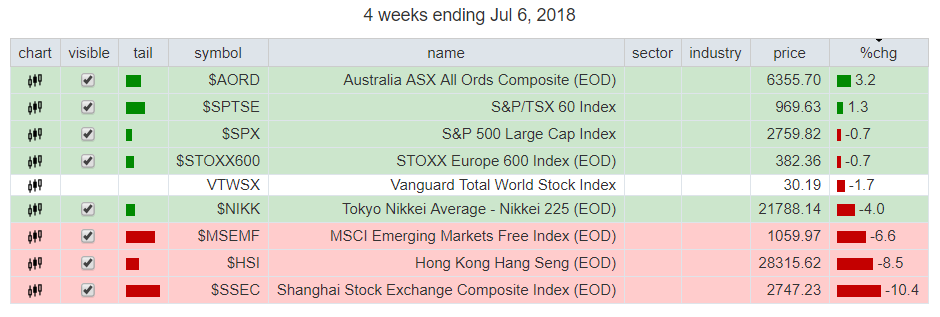 I have collected a number of ticker symbols for important international equity markets. Regional indices for Europe ($STOXX600) and Emerging Markets ($MSEMF) and some major equity markets around the world; USA ($SPX), Canada ($SPTSE), Japan ($NIKK), China ($SSEC), Hong Kong ($HSI) and Australia ($AORD).
The three markets inside the lagging quadrant are in a very clear relative downtrend. They are all at a heading between 180-270 degrees, so falling on both axes.
The difference is that $MSEMF and $HSI came into the lagging quadrant after a positive rotation through leading and improving earlier in the year while $SSEC dropped back into the lagging quadrant after a shoer stint through improving.
In the leading quadrant Japan ($NIKK) and Europe ($STOXX600) are losing relative momentum. Both markets came into the leading quadrant at relative high RS-Momentum values (> 102) but quite rapidly after crossing over to leading started to lose that momentum. This made them lose their positive RRG heading for the time being.
The other three markets, on the other hand, are all pushing deeper into the leading quadrant. The S&P 500 rotated back into leading after a short rotation close to the benchmark.
$SPTSE and $AORD came in from a bigger rotation through improving and are now leading in this universe. Especially the Australian stock market $AORD is showing an interesting chart.
Avoid China and Hong Kong
China - $SSEC
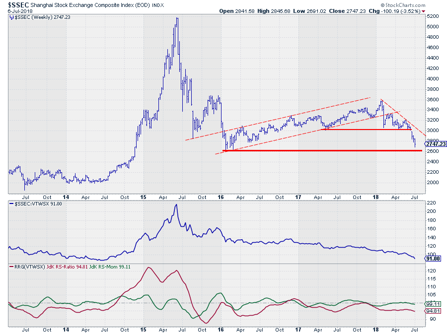 After two strong years in 2016 and 2017, the Chinese market ($SSEC) started developing a downtrend which accelerated after the index broke below the 3000 level a few weeks ago. The decline that followed the break is now nearing an important horizontal support level around 2600.
Given the steepness of the recent decline an initial bounce off that 2600 support level is possible/likely but it had to be treated as such, a recovery within a downtrend and therefore more likely an opportunity to sell at higher levels rather than a buying opportunity. It still looks like a falling knife.
The relative picture against the rest of the world does not look much better. Relative strength is in a downtrend since the peak in 2015. Only at the end of 2016, China rotated through the leading quadrant for a short period but rapidly moved back into lagging and has stayed at the left-hand side of the RRG since.
Hong Kong - $HSI
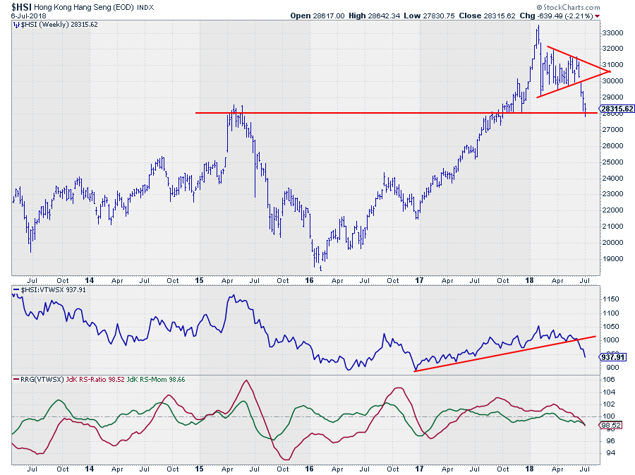 The Hang Send index that tracks the Hong Kong equity market showed a nice uptrend that started at the beginning of 2016 and lasted until the first few weeks of 2018 when a new high was set. From a relative perspective, Hong Kong outperformed VTWSX since early 2017.
After setting a new high in price $HSI started tracing out a symmetrical triangle on the weekly bar-chart. A few weeks ago the market completed that formation by gapping below the lower boundary. The decline that followed is now resting at horizontal support coming off the 2015 peak.
The rhythm of higher highs and higher lows has now been broken which suggests that rallies are (late) opportunities to still get out at a higher level.
A break below 28.000 in the $HSI will very likely cause another acceleration of the decline.
The break of rising support on the RS-chart caused the JdK RS-Ratio line to drop back below 100 after RS-Momentum already did that a few months ago. This puts $HSI well inside the lagging quadrant now while heading lower on both axes (negative RRG-Heading).
Some markets are outperforming the US
Canada - $SPTSE
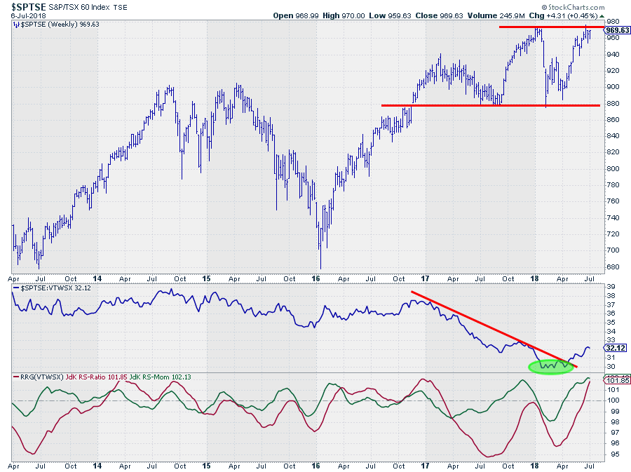 The Canadian TSX60 index completed a double bottom formation in the first half of this year and is now pushing against resistance offered by the previous peak at 970. The market will have to decide in the next few weeks if 970 is strong enough to push the market lower, temporarily, or break higher and accelerate the uptrend.
The relative downtrend that started at the start of 2017 has reversed and a first leg higher is now clearly visible. This improvement translated into a strong rotation into the leading quadrant on the Relative Rotation Graph which is still at a strong RRG-Heading.
All in all, things are looking positive for the Canadian market compared to the other world markets in this universe. Breaking resistance near 970 will be the catalyst for further outperformance.
Australia ASX All Ords Composite Index - $AORD
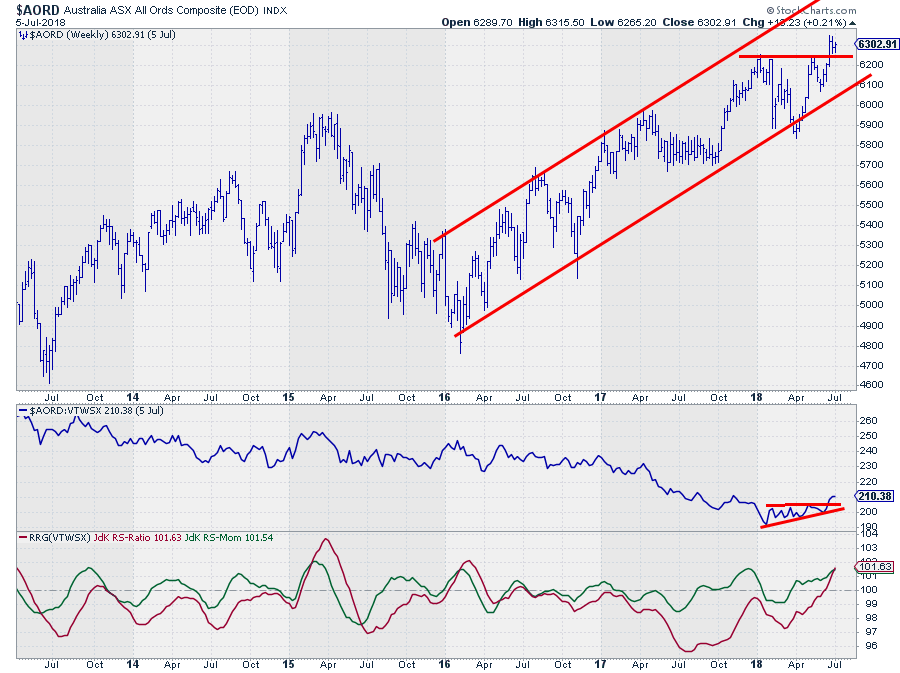 The $AORD index started a series of higher highs and higher lows out of the low that was set in early 2016. That rhythm is still intact and has just been confirmed again with the break to new highs above the resistance area around 6240.
This break confirmed the uptrend in price and opened up the way for a new leg higher targeting the upper boundary of the channel. With the former resistance around 6240 and the rising trendline coming in around 6100 as support levels, the downside is well protected.
From a relative perspective, Australia has underperformed the world index since the start of 2017 (while the price went up, so a good example of how rs can fall despite s rising price). Since the start of this year, a small ascending triangle had formed and completed last week with a break above the horizontal resistance at the top of that triangle.
This push in relative strength is now confirming the strength that is seen in the RRG-Lines for a while already.
Within this group of worldwide stock markets, Australia is showing a very attractive technical picture with the odds in favor of a further rise in both price and relative terms.
Let me know what you think of this usage of RRG in the comments? If you want to receive a notification when a new article in the RRG blog is published? Simply "Subscribe" and leave your E-mail address.
Julius de Kempenaer | RRG Research
RRG, Relative Rotation Graphs, JdK RS-Ratio, and JdK RS-Momentum are registered TradeMarks ®; of RRG Research
Follow RRG Research on social media:
If you want to discuss RRG with me on SCAN, please use my handle Julius_RRG so that I will get a notification.


