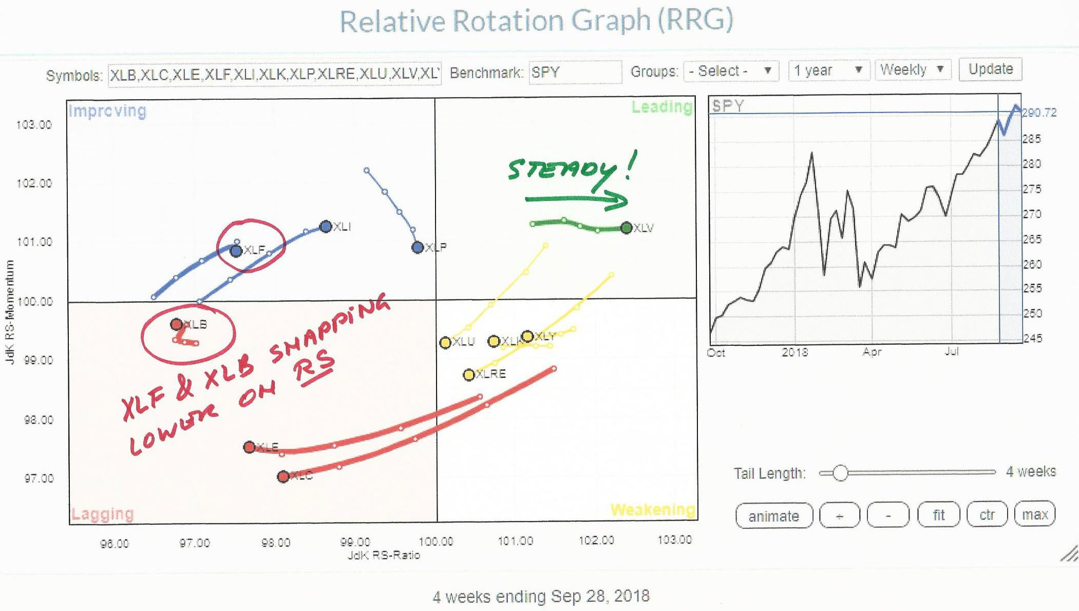
On the Relative Rotation Graph for US sectors, the Healthcare sector continues strong into the leading quadrant at a steady pace (RS Momentum). Two sectors that are showing a sudden weakness in relative strength, and therefore deserve our attention, are Materials (XLB) and Financials (XLF).
Summary
- Healthcare (XLV) moving further into leading quadrant at a steady pace
- Materials (XLB) snapping back into moving lower on JdK RS-Ratio scale
- Financials (XLF) hooking lower after a few weeks of rotation into improving
Three sectors that need attention
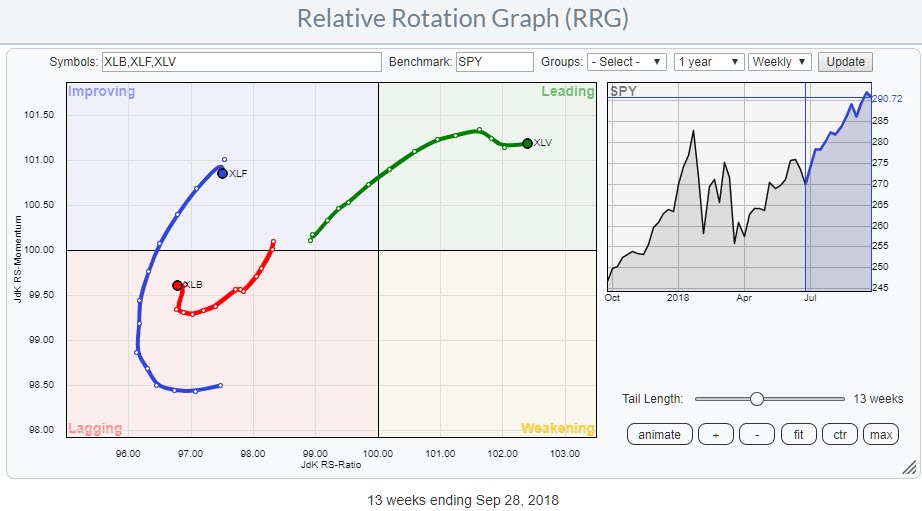
The RRG above only shows the three sectors mentioned above.
Healthcare inside the leading quadrant and pushing higher on the JdK RS-Ratio at steady Relative momentum (JdK RS-Momentum) which makes it the strongest sector in terms of relative strength and the only sector inside the leading quadrant.
The Financials sector seemed to be on track for a good rotation inside the improving quadrant but last week the tail sharply snapped lower which warrants a further investigation.
Something similar happened with the Materials (XLB) sector which completed a rotation through improving and then back to lagging already in the middle of July and just started showing a little bit of improvement in relative momentum. But last week XLB sharply snapped left again seemingly continuing its downtrend against SPY.
XLB is now the weakest sector measured on the RS-Ratio scale.
The daily view
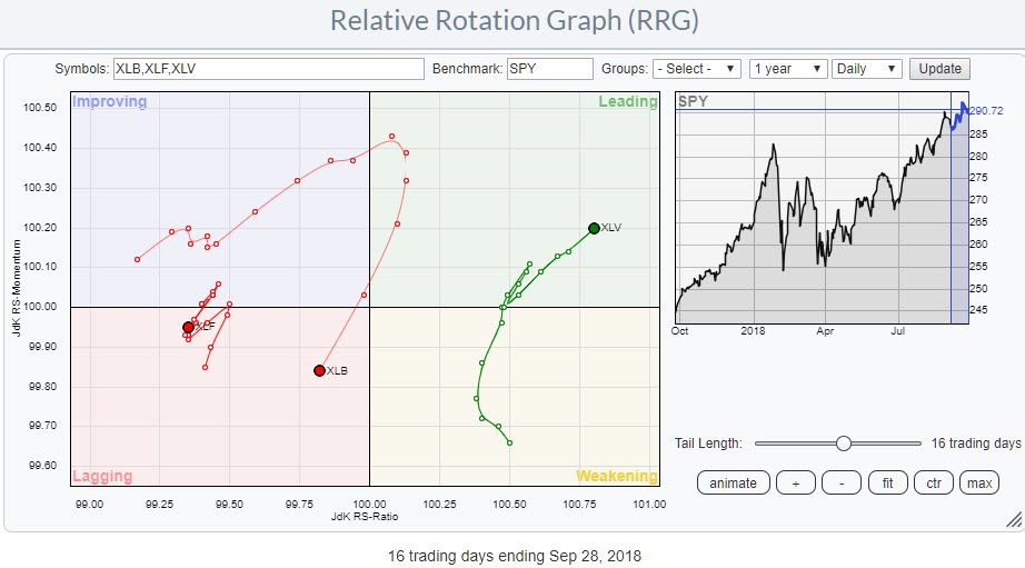
Zooming in to the daily version of the Relative Rotation Graph, while still focussing on the three sectors at hand, shows a confirmation of the rotational patterns that are seen on the weekly RRG.
The Financials sector displays some erratic movements around 100 on the Jdk RS-Momentum scale with a sharp move lower in the last week. If we would zoom in to an intraday level like hourly, these erratic movements would show up as "normal" rotations. Work is underway at Stockcharts.com to provide us with the ability to run RRGs on intraday time-frames as well (Hint: RRG-Lines will work on intraday sharpcharts!)
The rotation for the Materials sector (XLB) is clearer and shows a path from improving through leading and than straight back into lagging, without hitting the weakening quadrant (which is quite rare) thus confirming the weak position for Materials on the weekly RRG.
Materials
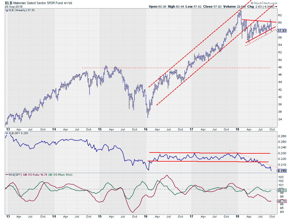 Earlier this year XLB broke its rising trend and ended up, and more or less still is, moving sideways from March-April onwards. This sideways move took the shape of a symmetrical triangle.
While still moving inside this triangle formation the relative strength line broke downward out of a narrow range that existed since the beginning of 2016 while the RRG-Lines had already comfortable dropped below the 100-level, indicating a relative downtrend vis-a-vis the market.
The push to the upper boundary of the triangle on the price chart last week, therefore, seemed out of whack. As a matter of fact, XLB even looked to be breaking out at Friday's (9/27) close but this attempt was rapidly reversed at the start of last week and at last Friday's close (9/24) we seem to have a break to the downside, albeit still fragile.
This is a good example of how subjective the drawing of trendlines can be sometimes. If I draw and look at the thick red support line, XLB is breaking lower. If I draw and look at the dotted line XLB is still above and inside the formation. Which one is right? I don't know. Personally, I like the thick line as it has a lot of touch-points in areas where the lows of various bars on the chart are clustering. I like to see these clusters as areas of support. The dotted line only connects the two extreme lows over that time period which, IMHO, makes it a less reliable line, just my two cents.
The relative downtrend on the weekly trend remains clearly visible, has just gotten a new impulse and is now confirmed by the rotation on the daily RRG. All in all, it's a sector that seems to offer a lot more downside risk than upward potential on both relative and price charts.
Financials
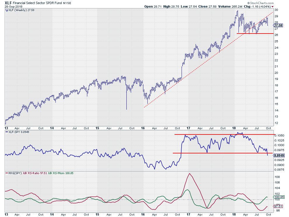 The old, dotted, support line that marked the uptrend in Financials since the start of 2016 acted as resistance a number of times since it was broken in June.
Over the past weeks, the market nudged higher a few times but each time failed at the level of that old support line making it stronger and stronger as resistance. last week the market seems to have capitulated as it sharply bounced lower off that dotted line.
The resulting move on the relative chart seems to be more important as it is showing a break below its horizontal support level which opens up the way for a further decline in relative strength towards the lows of 2016.
With the RS-Ratio below 100 and RS-Momentum, slightly, above that level and XLF rotating at a negative RRG-Heading on the daily RRG, the Financials sector seems to be getting ready to roll over and continue its relative downtrend against SPY.
Healthcare
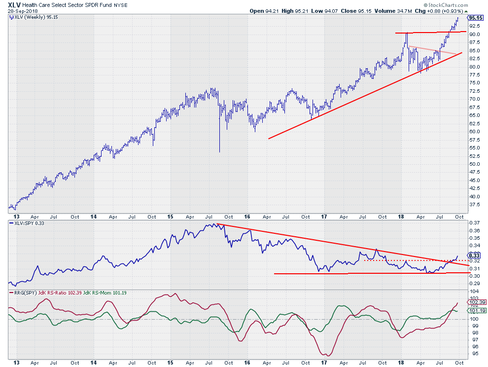
The Healthcare sector is currently the only sector inside the leading quadrant and it's traveling higher on the RS-Ratio axes while maintaining a steady relative momentum.
This tail on the RRG follows the move of the relative strength line in the middle pane above. A very steady move upward that now has clearly broken the falling resistance line as well as its previous high which opens the way for more relative strength in coming weeks.
The rotation on the daily looks a bit jagged like XLF but is taking place at the right side of the RRG, indicating a strong relative uptrend. Again, here also, an hourly version of that tail would show a clockwise rotational pattern
The break to new highs on the price chart happened as if there was no resistance at all at the level of the previous peak.
With such strong relative- and price charts we can safely say that Healthcare is the strongest sector inside the S&P 500 at the moment.
Let me know what you think of this usage of RRG in the comments below. If you would like to receive a notification when a new RRG blog article is published, simply "Subscribe" with your email address using the form below.
Julius de Kempenaer | RRG Research
RRG, Relative Rotation Graphs, JdK RS-Ratio, and JdK RS-Momentum are registered TradeMarks ®; of RRG Research
Follow RRG Research on social media:
Feedback, comments or questions are welcome at Juliusdk@stockcharts.com. I cannot promise to respond to each and every message but I will certainly read them and where reasonably possible use the feedback and comments or answer questions.
If you want to discuss RRG with me on SCAN, please use my handle Julius_RRG so that I will get a notification.

