On the first Tuesday of every month, I have a segment in Sector Spotlight in which I look at the completed monthly charts for the previous month. It forces me to sit down and look at the market from a longer-term perspective and make up my mind about trends that are in play - and that have possibly been in play for years, to the point where you would almost take it for granted. And if there is one thing certain in financial markets, it's that you CANNOT take anything for granted...
Bonds
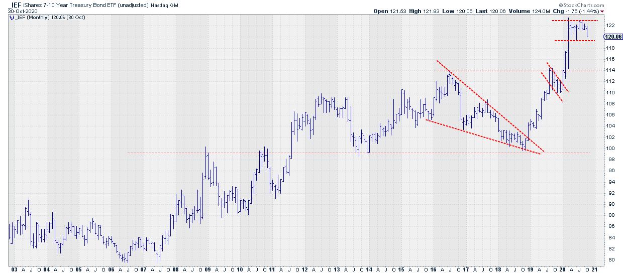
Above is the monthly bar chart for IEF, the ETF that represents 7-10 year Government bonds with a completed bar for October. The first few days of trading for November are NOT included on this chart, nor any of the other monthly charts in this article.
This IEF chart has been showing some very nice technical patterns over the last few years. First of all, there was this giant wedge-like pattern from 2016-2018, with an upward break at the end of 2018, followed by a strong rally that, as of last month, is still in play.
In the second half of 2019, IEF went through a sharp correction that comes out like a flag. If we follow the classic rules for qualifying a pattern as a flag, I don't think we can call it like that, but it has some of the characteristics and we certainly have a sharp corrective high-low move at hand inside a strong uptrend. And that was a positive thing.
After the break, IEF moved higher to eventually reach its all-time high so far at 123.40. That was in March of this year. After that, IEF started to move sideways and seems to be putting a double top formation into place.
The trigger for completion would be a break below 119.35 on a monthly closing basis. Such a break would send rates (even) higher, and we have to wait and see how that would impact stocks.
Stocks
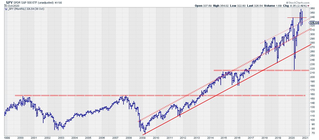
Here is the monthly chart for SPY. This one is a little more complicated to read, mainly because of the wide swings that we had at the start of 2020. Up to the start of this year, we saw a very regular moving market making nicely higher highs and lows.
This rhythm got disturbed when the world found out a pandemic was sweeping the world and everybody thought that would be very bad for business.. That was until the market figured out that it was actually very beneficial for major segments/sectors in the market, like technology, communication services and consumer discretionary, and the S&P managed to push to new all-time highs.
When I see charts like this and I feel the underlying picture gets a bit clouded by these wide or unclear swings, I have taught myself to "step back" from the noise by switching from a bar chart, which shows the entire range for the month, to a line chart, which only connects the monthly closes.
When we do that with the S&P chart, we get the image below.
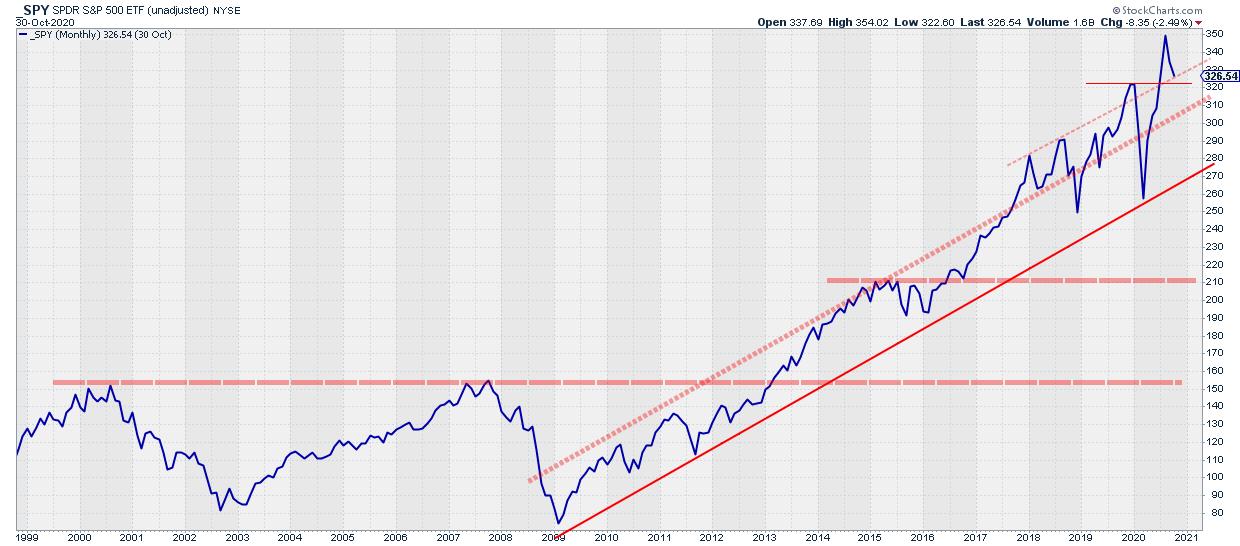
All of a sudden, the underlying trend becomes much clearer, and we can see that the big picture rhythm is still present. The market, as a matter of fact, just confirmed that trend by breaking to new highs.
Stocks vs Bonds
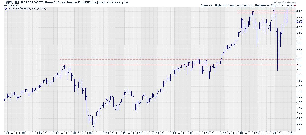
The Stock/Bond ratio has not managed to break to new highs since 2018 and is still stuck under that horizontal barrier, which is getting stronger and stronger. If and when this barrier breaks, it will most likely lead to an explosive move higher because of how long this level has already been holding the market back.
If we switch this chart to a line chart, we get this:
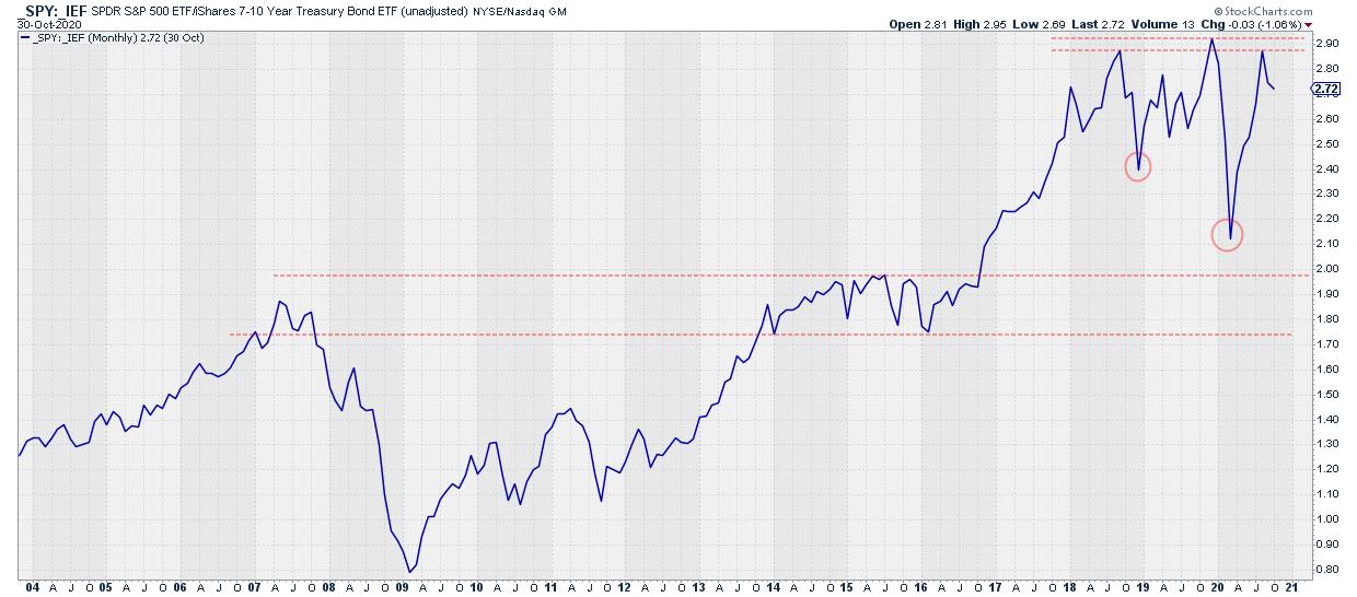
This chart also shows that horizontal boundary, but it also reveals that the last low (March) ended significantly lower than the previous low in December 2018. This makes it less of an UPtrend, but certainly also opens up the possibility for a stock/bond ratio that remains trapped in a range. A broad range, but still a range.
There are 5 ways for this ratio to break to new highs:
- Stocks rise faster than bonds (both are going up)
- Stocks rise and bonds remain sideways
- Stocks rise and bonds drop
- Stocks remain sideways and bonds drop
- Stocks fall slower than bonds (both are going down)
Given the toppish formation on the IEF chart and the uptrend still intact on the SPY chart, I am leaning towards scenarios in which bonds are dropping or, at least, move sideways.
Switching from bar to line on long term monthly charts can help you see the underlying moves/trends more clearly.
#StaySafe, --Julius
Julius de Kempenaer
Senior Technical Analyst, StockCharts.com
Creator, Relative Rotation Graphs
Founder, RRG Research
Host of: Sector Spotlight
Please find my handles for social media channels under the Bio below.
Feedback, comments or questions are welcome at Juliusdk@stockcharts.com. I cannot promise to respond to each and every message, but I will certainly read them and, where reasonably possible, use the feedback and comments or answer questions.
To discuss RRG with me on S.C.A.N., tag me using the handle Julius_RRG.
RRG, Relative Rotation Graphs, JdK RS-Ratio, and JdK RS-Momentum are registered trademarks of RRG Research.


