Sector Rotation Model Suggests There's Still Upside Available
In this week's episode of Sector Spotlight, I reviewed the current position of markets (sector rotation) in combination with the theoretical framework provided by the Sector Rotation Model (Sam Stovall). This article provides a quick write-up of that segment.
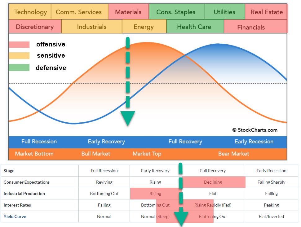
The sector rotation model shows the typical cyclical movement of an economy. We start when the economy is in a (full) recession, before moving into an early recovery phase and eventually reaching a full recovery, after which the new cycle starts with an early recession.
It is generally known that the stock market leads the economic cycle by 6-12 months on average. In the image above, the blue sine wave represents the economy and the orange sine wave represents the stock market. Across the top of the image are the sectors that are expected to do well during that time of the cycle.
Clearly, it is a very rough guide, with no specific start and end dates available for the various periods/segments. (I wish ;) ). The table below the graph is a crucial part of the sector rotation model, as it lists four macroeconomic factors that influence the economic cycle.
Consumer Expectations/Sentiment
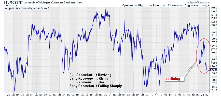
The trend for this indicator is definitely pointing lower, which puts it in alignment with "Full Recovery".
Industrial Production
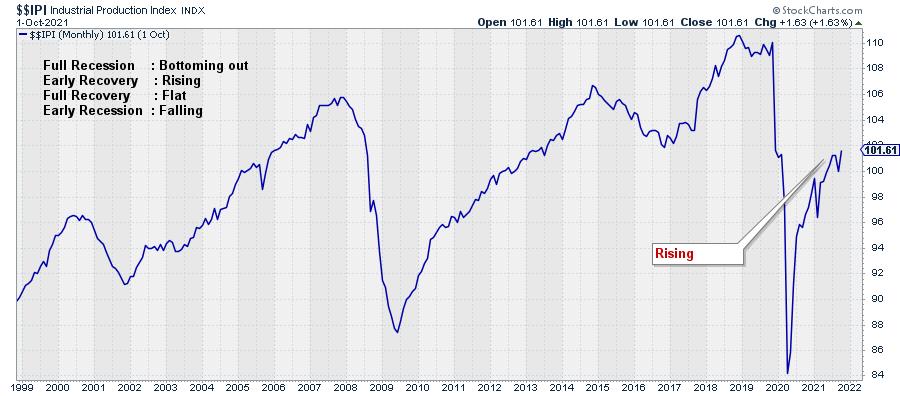
This economic indicator continues to rise and recently confirmed its trend by taking out the most recent high. This aligns with "Early Recovery" in the economic cycle.
Interest Rates
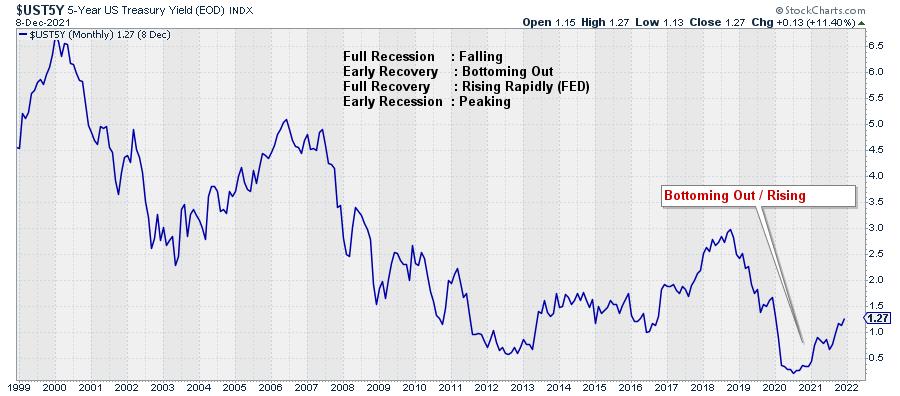
Interest rates (5-year US Treasuries) are rising after a two-year decline. Trying to position this in alignment with the expected behavior according to the economic cycle means that we have to decide whether this is still "Bottoming Out" or "Rising Rapidly". For me, it is not entirely clear; I could argue for both options, so I am going to position it between Early and Full Recovery.
Yield Curve
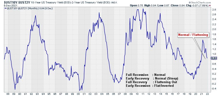
For the yield curve, we need to decide if it is "Normal" or "Flattening Out". This one is also not all that clear. The curve is above zero, which is "normal" but not by much. If you look at the history, the difference between 10-2 years yields can go as high as 2.5-2.8%. The most recent high at 1.6% looks to be somewhere in the middle of the historical range and, from there, we are coming down, which means a flattening of the curve.
I am going to judge this also as between Early and Full Recovery.
You can find a chartlist containing these four metrics here.
Sectors
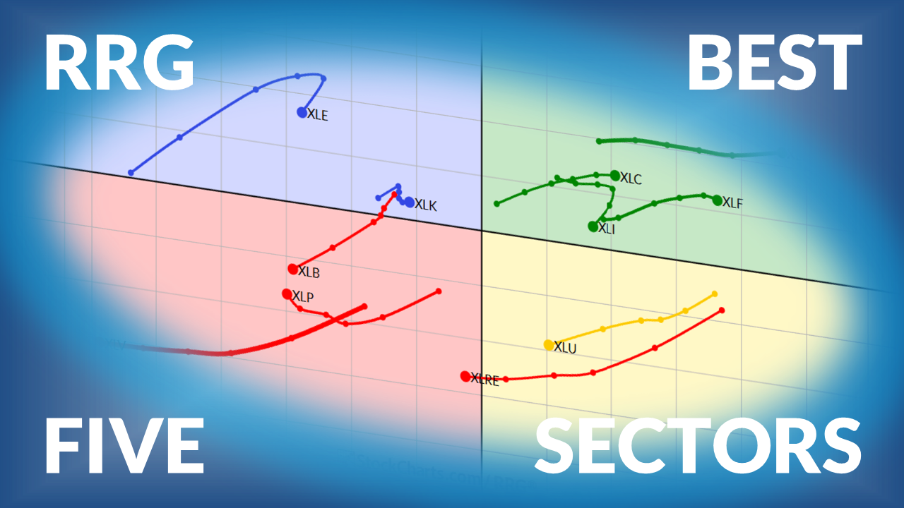
To look at the sectors and their recent rotations, I am using the Equal Weight ETFs from Invesco. This eliminates the influence of some mega-cap stocks in certain sectors, which will provide us with a more balanced picture for the sectors/stocks.
Offensive
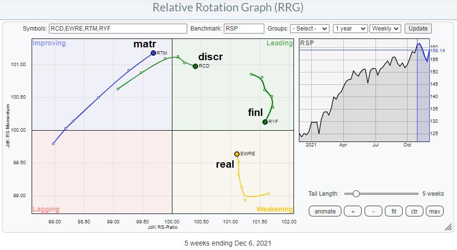
The offensive/cyclical sectors are all doing well. Discretionary and Financials are both well inside the leading quadrant, but have been losing some relative momentum lately. For the time being, this is judged to be a temporary pause. Real Estate is inside weakening and picking up momentum again, which indicates that this sector is about to start a new up-leg in an already rising relative trend.
The Materials sector finally is still inside the improving quadrant but rapidly approaching leading, with a long powerful tail at a strong RRG-Heading.
All in all, this paints a picture of outperformance for the offensive sectors. On the SRM image at the top of this article, they are shaded red.
Defensive
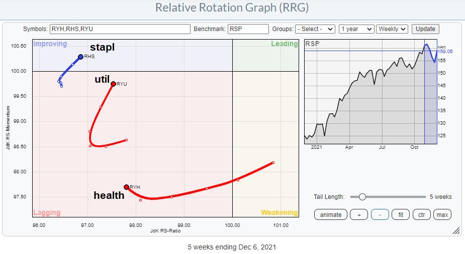
The defensive sectors are all showing up, so far, on the left-hand side of the RRG. This indicates a relative downtrend vs. the market and the other sectors in the universe. Given the low readings on the JdK RS-Ratio scale, the recent pickup in relative momentum is judged to be temporary in nature.
The overall takeaway for this group is underperformance. These sectors are shaded green in the SRM image.
Sensitive
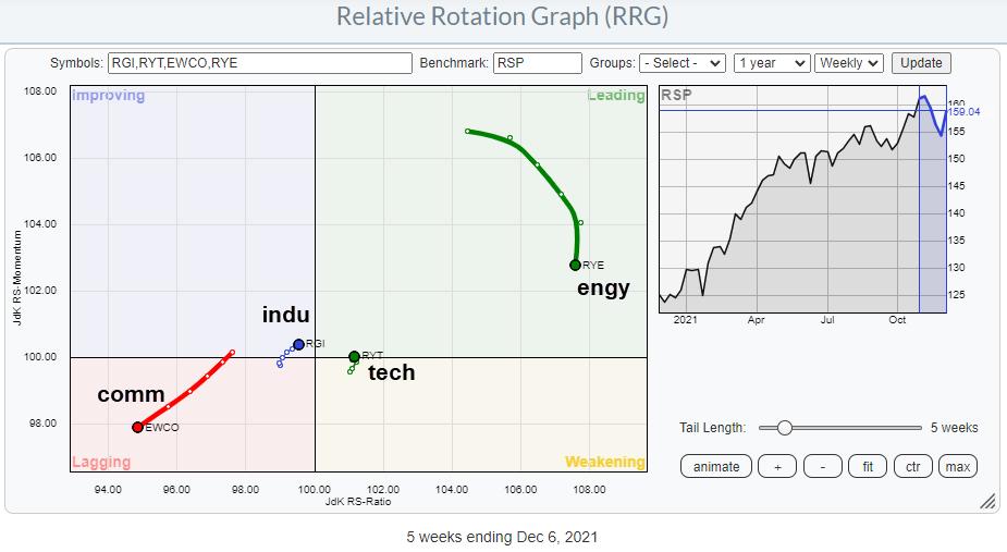
The group of sensitive sectors is more scattered. Energy is deep inside leading but losing relative momentum. The high JdK RS-Ratio reading makes a rotation leading-weakening-leading very well possible. It remains a strong sector.
Technology has just rotated back into the leading quadrant from weakening at a very short tail. This suggests that the sector is in a stable relative uptrend, which is starting a new leg higher. Industrials, like tech, is on a very short tail, but very close to crossing over into the leading quadrant. For both technology and industrials, an increasing tail length while maintaining that strong RRG-Heading would be an additional positive sign.
The only sector inside and pushing further into the lagging quadrant is Communication Services. At the moment, this is really the weakest sector.
The group of sensitive sectors is shaded orange on the SRM image.
Conclusion
With the offensive and sensitive sectors generally showing relative uptrends, except Communication Services, while defensive sectors are clearly underperforming, I think that the center of gravity based on sector rotation is also between early recovery and full recovery, but a little more shifted to early, which aligns fine with the conclusion from the economic factors. Looking at the accompanying position on the sine wave for the stock market, this suggests that there is still some room to the upside.
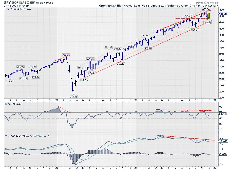
With the S&P 500 comfortably inside the boundaries of its rising channel (weekly chart), that seems to make sense.