Following my article "Which Stocks Inside The Dow Are Worth Holding?", I received a few questions on using $ONE as the benchmark for a Relative Rotation Graph and whether it would be the better benchmark to use. The honest answer to that question?
It depends.
Let Me Explain
It depends on what you are after, and that most often depends on what type of investor you are.
For professional fund managers the answer, most of the time, is straightforward. Their task is to "outperform" a benchmark. One of their "problems" is that most portfolio managers do not have the discretion to hold a lot of cash in their portfolios. They HAVE to invest, even when they think/feel/know for sure that the market is going down. Therefore, they need to find stocks or sectors that are outperforming their benchmark.
The only tool in the TA toolkit for that is relative strength. And that is where Relative Rotation Graphs come in, as they provide an all-inclusive image of the current rotations in the market and where investors should focus on picking outperformers. For them, the obvious, and pretty much the only, choice is to use the benchmark that they need to beat as the benchmark for RRGs.
Retail traders, a.k.a. most of our users here at StockCharts.com, have a lot more leeway and discretion in their approach to the market. As a matter of fact, they can pretty much do anything they like. There is no compliance officer, no Chief Investment Officer, no regulator and no board member, looking over their shoulders and monitoring their positions and portfolios to check that they are in line with the marketing brochure, the fact sheet, and the restraints that were put into place for their fund.
Price Performance vs. Relative Performance
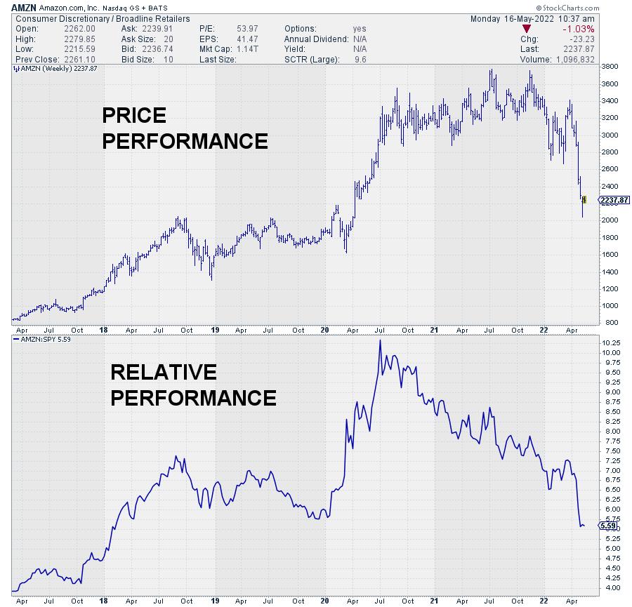
Just to be clear: a regular chart shows us price performance. If it goes up, the security gets more expensive, and vice versa. If we buy that security and it goes up in price and we sell, we have made a profit.
Relative performance is a bit more complicated, as it measures the difference between the price of a security and a benchmark, e.g. the S&P 500 index. When we buy a stock and its price rises 5% while the S&P 500 rises 1%, we have outperformed the benchmark by 4%. However, when the S&P 500 rises 10%, we have UNDERperformed the benchmark by 5%. So, despite a price gain of 5% in absolute terms, we have "lost" 5% against the benchmark.
This also goes in a declining market. Say the stock that we bought lost 5% in value but the S&P 500 lost 10% in value. In that case, despite a loss of 5% in price terms, we have OUTperformed the benchmark by 5% because our stock lost less than the benchmark.
When to Use $ONE
So, as a retail investor, your only concern is to make money from investing, and as such most are not in the relative performance game.
BUT
When the market goes up, most retail investors are still looking to OUTperform the S&P 500. And rightfully so. That means that, when the stock market is in an uptrend, it makes total sense to use the S&P 500 as the benchmark for relative strength analysis (and RRG) to look for the strongest sectors stocks and try to outperform the market.
On the other hand, when the market is in a downtrend, the main concern is to NOT LOSE money. For that purpose, $ONE is the better benchmark, as it essentially takes 0% return as the benchmark. Anything above is good, anything below is bad.
When Is The Market In An UPtrend?
In order to decide when to use which benchmark, it is necessary to determine when we think the market is in an uptrend and when it is in a downtrend. A very simple approach (but effective for this purpose) would be to use a simple moving average. When the market is above its SMA, the trend is UP, and v.v.
In the chart below I have, very arbitrarily, used a 20-week SMA to decide if the trend is UP or DOWN.
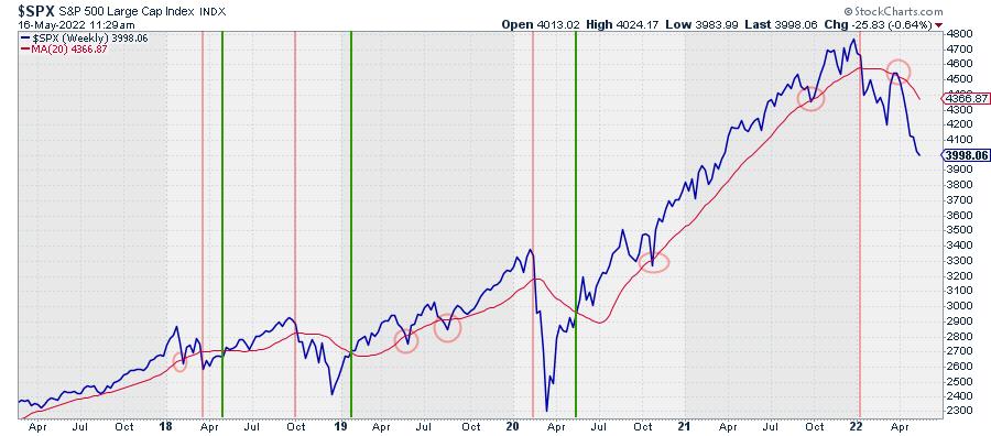
In the periods after a green vertical line, the S&P 500 can be used as the benchmark for RRGs and every other approach based on relative strength. In the periods after a red vertical line, $ONE can be used.
Clearly, everyone can adapt the period for the SMA to their own style and investment horizon.
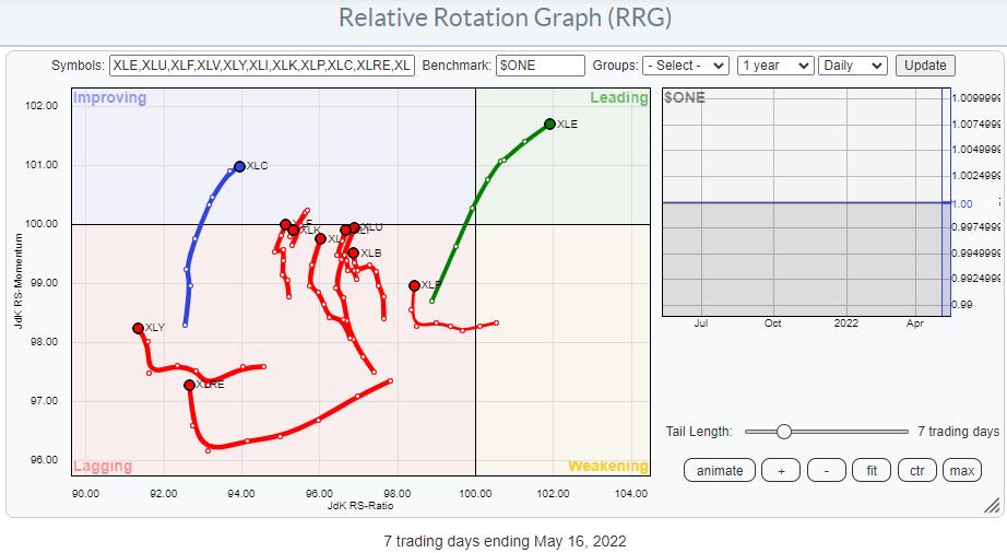
With the S&P 500 currently clearly in a downtrend, well below its 20-week SMA, it makes sense to look at a Relative Rotation Graph for sectors using $ONE as the benchmark.
That chart is printed above and it is easily visible that only the Energy sector qualifies as an uptrend (in price terms) while all others, on the left-hand side of the plot, are in downtrends. The recent move higher on the JdK RS-Momentum scale suggests that they are currently going through a pause, or a recovery, within the prevailing downtrend.
#StaySafe, --Julius
Julius de Kempenaer
Senior Technical Analyst, StockCharts.com
Creator, Relative Rotation Graphs
Founder, RRG Research
Host of: Sector Spotlight
Please find my handles for social media channels under the Bio below.
Feedback, comments or questions are welcome at Juliusdk@stockcharts.com. I cannot promise to respond to each and every message, but I will certainly read them and, where reasonably possible, use the feedback and comments or answer questions.
To discuss RRG with me on S.C.A.N., tag me using the handle Julius_RRG.
RRG, Relative Rotation Graphs, JdK RS-Ratio, and JdK RS-Momentum are registered trademarks of RRG Research.


