
Greetings from Geneva Switzerland! “Buy the dips”, they say, and watch the market take off like a hot air balloon. SPY is back above its second week of October breaking points, AAPL is making new all time highs and last months record levels on US Blue Chip Indexes have never felt so close. On other international markets, the snapback does give some breathing space. This year’s Bull market tops (for some indexes, all time highs), however, are still quite a ways away. Many of them are still well within the scope of a Daily secondary correction down (please note that as for now, none of our longer term Weekly charts have reversed down yet).
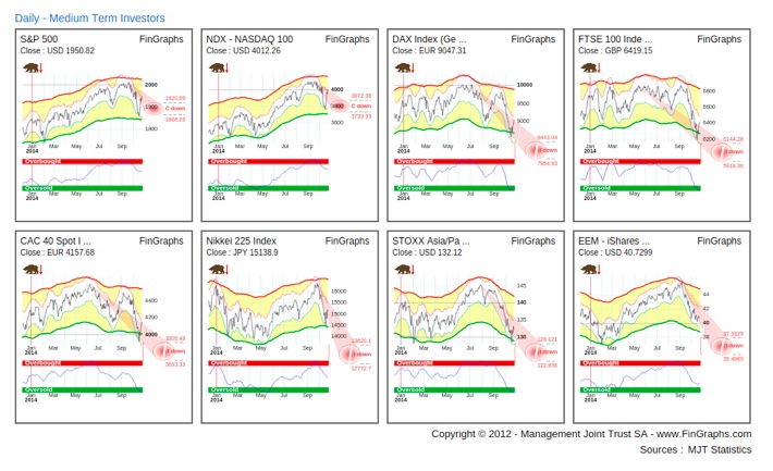
The following FinGraphs Daily Mosaic View reviews a selection of worldwide markets and indices. Although, US Blue Chip indexes (here S&P500 and NDX100) are back in what can be labelled as a mere correction down (and they are most often the leaders), other markets (here the DAX30, the FTSE100, the CAC40, the Nikkei225, the STOXX Asia Pacific and iShares EEM) still show impulsive potential down. Yes, Europe was oversold last week, our shorter term envelopes (the thinner white band) was hitting against the boundaries of our longer term envelopes (the wider yellow band) – we call this Market Stress. Our risk indexes were also well in the Oversold territory. Now, it takes more than an exaggeration to reverse a trend, an Oversold situation on a momentum oscillator is often only the beginning of the end and our bearish trend indications are still in place. We will hence remain on the cautious side over the next weeks as international market breadth prevents us from calling the “all clear” message.
Talk about market timing and consider FED’s James Bullard intervention on Bloomberg TV last Thursday close to the bottom of the dip. He mentioned that the FED might consider taking a pause on taper and delay the end to quantitative easing in response to tumbling inflation expectations. It was also interesting to hear FED’s Richard Fisher response on Monday, who reaffirmed on CBNC that recent stock market volatility has not changed his outlook for ending the central bank’s bond-buying program “one iota” (i.e. the committee is expected to end QE at their meeting next week if the economy continues to improve). Call it tactics or dissonance? Let’s look at the Government Bond markets.
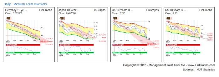
The Daily Mosaic below shows German, Japanese, British and US 10 Government Bond yields. They seem heavily oversold having reached our Impulsive targets down and for some nearing their Impulsive 2 targets. A reversal at this stage would work perfectly with the end of QE3 and improving growth and inflation expectations.
However, looking at the same Mosaic on our longer term Weekly charts may hint to another story.
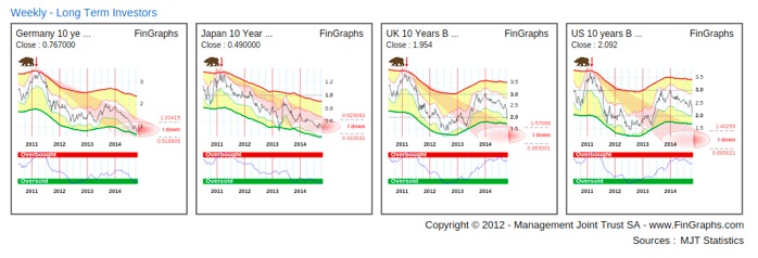
German and Japanese yields, although still in a downtrend, may be approaching Oversold conditions (see our Oversold Risk Index, Market Stress in our envelopes and our impulsive targets down close to completion). The trend for UK and US Government yields, however, seems to be playing catch up. They have recently reversed down from an Overbought risk index position and are showing significant downside potential over the next few quarters. Some investors out there do seem to be weary of the growth prospects.
Our last chart today is a relative 3D Investor’s View of the SPY (the SPDR S&P500 Tracker) vs TLT (the iShares 20 Year Treasury Bond ETF). An Investor’s View is a combination of a Weekly, Daily and Hourly chart. It may raise more questions that it answers, but it is certainly worth a post.
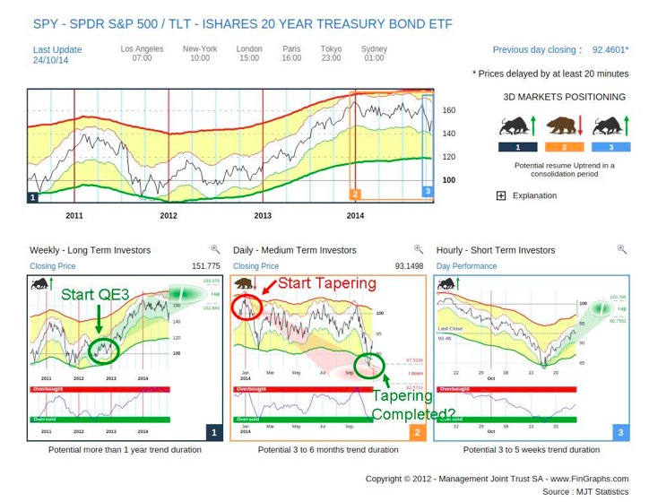
The Weekly chart is still in an uptrend although approaching FinGraphs usual measures of exhaustion (close to impulsive targets, with Market Stress and an Overbought and reversing Risk Index). Please note that QE3 started in September 2012, right before the upside breakout of the trend. Now consider the Daily chart, it has been consolidating down all year in what may seem like a classic corrective pattern. Amazingly, its December 2013 top and recent low almost perfectly match the timing of tapering process. The Hourly chart is moving up rapidly escaping the dip. It may represent the new normal with increased growth and inflation prospects and no QE. It all looks a bit perfect, extremely fortunate in timing, even deterministic. Talk about a successful transition from easing to normality.
I’ll be watching this relative chart very closely over the next few weeks and months as it seems to determine if more QE will be needed or not. What seems clear is that we sure wouldn’t want to break the recent dip and start a longer term downtrend on the relative chart above (“a la” 2007-2009). I’ll follow the long bond yields very closely (as that’s where very often the smart money is) and remain concerned that this secondary correction is not over yet (Daily charts). But don’t worry, if the party seems to end, there will be some large interests out there screaming for a new punch bowl to extend the party in the early hours of the morning.
For more information on our methodology click here and then visit "About Us/Press Release" and "User Guide" sections of our website. Clicking that link also qualifies you for a 7 day demo and a 10% discount on our services if you choose to subscribe.
Have a great weekend,
J-F Owczarczak
@fingraphs