
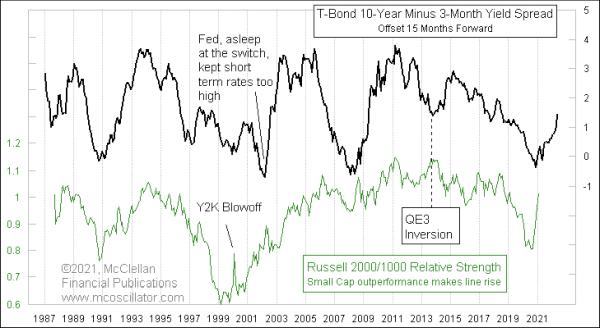
Liquidity is bullish for the stock market. It is even more bullish for small-cap stocks and other types of issues which are more sensitive to liquidity. That is why indicators like the A-D Line are so useful for gauging the health of the liquidity pool. There are more small-cap stocks than large ones, so they have a bigger voice in the A-D Line. When the A-D Line and small cap stocks are doing well, the overall market tends to be very healthy, because liquidity is plentiful.
The Fed has a big effect on liquidity, and thus on small caps, through its interest rate policy. But there is a lag, which is the topic of this week's chart.
The steepness of the yield curve is a decent indicator of future financial market liquidity. It is tough to depict all of the different bond yields along the entire maturity spectrum, so I am simulating that yield curve steepness by looking at the spread between 10-year T-Note yields and 3-month T-Bill yields. And the key insight is that the movements of this yield spread tend to get echoed approximately 15 months later in the relative strength ratio of the Russell 2000 vs. Russell 1000.
In other words, yield curve steepening shows up 15 months later as small-cap outperformance. That is a fun thing to know. And a hard thing to wait for, sometimes.
Right now, longer-term rates are rising, while the Fed is keeping the short-term rates low. That means the yield curve is steepening at a rapid rate, which should mean a continuation of small cap outperformance over at least the next 15 months. If the Fed dithers in allowing short term rates to keep pace with the rise in long term rates, then the message is that small caps should continue to outperform for a longer time, due to all of that excess liquidity.
This same 15-month lag time also makes an appearance in another set of data. It turns out that the yield curve also matters for corporate profits.
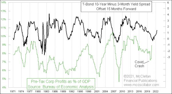
For this chart, I am using data from the Bureau of Economic Analysis (BEA) on all U.S. corporations, not just NYSE-listed companies. It is not easy data to find. You first have to go here, then scroll down to select Table 1.10 Gross Domestic Income by Type of Income, then finally read the data in Line 15. And then, once you have those data on corporate profits, just divide by nominal GDP (not real GDP). It is all simple math, but there is a whole lot of it.
The COVID Crash in 2020 bent things a little bit for this relationship, along with the Fed's response to the crash. The message of this relationship is that corporate profits should continue to improve throughout 2021 and into 2022. Having the economy open back up again after COVID starts to abate should no doubt help to fuel this recovery.
If and when the Fed starts to wake up to the inflation monster that it has fueled, and starts to increase short-term rates in response, then that de-steepening of the yield curve is going to matter for small caps and for the larger economy. But the 15-month lag time will be a factor, so don't expect an immediate effect. All of the excess stimulus that the Fed is still pumping is going to have a lasting effect, no matter what changes they make now. And the longer they wait to take action, the longer the effect's duration will be.