
The text of this article originally appeared in our July 13 Daily Edition issue, and I thought that readers of the Chart In Focus series would appreciate knowing about this relationship as well. The charts presented here have been brought up to date as of July 14.
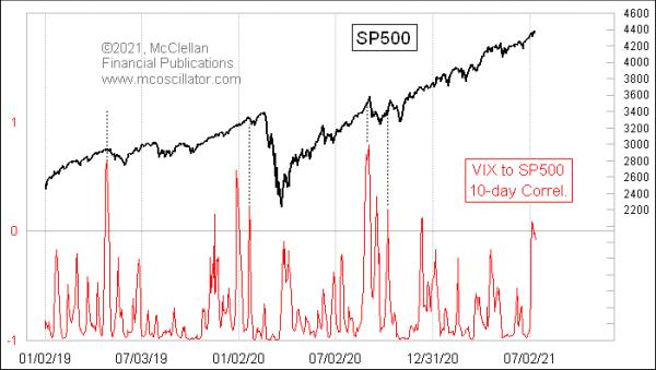
The VIX Index is making higher lows, which is not in keeping with the higher price highs of the S&P 500. Normally, the two move in opposition, and it is a warning of trouble when higher price highs are accompanied by higher VIX readings.
Analyst Jesse Felder came up with an elegant way to help spot these unusual times, which is shown in this week's chart. It shows a rolling 10-day correlation coefficient comparing the VIX to the S&P 500. Normally, it is at a deeply negative reading, meaning that the VIX and S&P 500 move in opposition. But, every so often, it shows a high reading, like we are seeing now.
The Pearson's Correlation Coefficient is normally a bad tool to use for time series data. It can get badly fooled by trending periods (see here). A lot of analysts still use it, though, because it is easy to calculate. Easy is not always good, though. With just a 10-day lookback, that flaw about getting fooled by trends becomes a feature. High readings like this show instances when the VIX and the S&P 500 are strangely doing the same thing. They can be pretty good markers of a topping condition, although there are some instances in recent years when the market just ignored them.
What the correlation coefficient is showing us numerically is the divergence that can be seen in the chart of the VIX compared to the S&P 500.
Higher prices with a higher VIX is not how things normally work and, when it happens, it is a warning of trouble. The market can sometimes take a while before such warnings come around to finally matter, but they are worth paying attention to anyway.