On Wednesday, I began a series of blog articles that is designed to evaluate the health of the stock market. In other words, what should we be looking for in determining whether we should leave our retirement and taxable accounts at risk? Wednesday's blog was the first, and very obvious, sign of a bear market - poor price action. You simply cannot have a bear market if prices keep moving higher. Hopefully, that makes sense. But price action is the CONFIRMING sign. By the time we see our major indices, sectors and industry groups breaking down, much damage has already been inflicted. So the next question becomes what "under the surface" messages can we be looking for that might clue us in of an impending correction or (gulp!) bear market?
2. KEEP AN EYE ON SECTOR PERFORMANCE
We go through different cycles within our economy. Throughout much of a bull market, you'll see companies that grow their earnings faster during an economic boom leading the advance. These companies generally fall into four sectors (ETFs that track these sectors are in parenthesis: Technology (XLK), Industrials (XLI), Cyclicals or Consumer Discretionary (XLY), and Financials (XLF). Traders and investors look AHEAD at expected GDP growth, anticipated earnings growth and the like in pricing equities. Fundamentalists buy because of anticipated growth of companies. Technicians buy because of expected continued price appreciation. Generally speaking, the stock market is an excellent leading economic indicator. If you study the history of price action and the relationship of sectors vs. the benchmark S&P 500, you'll find that during bull markets the four aggressive sectors mentioned above tend to perform better than average while the defensive sectors - Healthcare (XLV), Consumer Staples (XLP) and Utilities (XLU) - normally under perform. Let me illustrate this by taking a look at two different time periods - first, the bull market from late 2002 through 2007 and second, the one we're currently in that's been in play now for more than six years:
Here's a look at the 2002-2007 bull market:
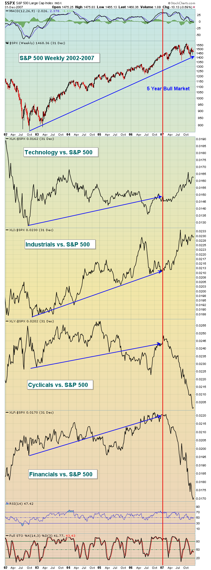
Rotation of money from sector to sector during a bull market is quite normal so we'll see periods where one sector is out of favor while others lead. That's not so alarming, but the severity of sector under performance and the number of aggressive sectors under performing should be monitored closely. The 2000-2002 bear market ended in October 2002 and a five year bull market was born. Relative performance of each of these four aggressive sectors was strong during the bull market. I've shown a blue line for each sector from October 2002 through the beginning of 2007 to illustrate that each of these sectors showed relative strength over this 4+ year period. Technology was bruised a bit in 2004 and 2005 while cyclicals struggled in 2005 and 2006 on a relative basis. But overall, these groups rose faster than the S&P 500 during this advance. More significant issues began developing in 2007, however, as relative performance deteriorated in a big, big way in both cyclicals and financials. Personally, I look at the relative performance of financials as one of the most important and influential signs in evaluating the likely sustainability of a bull market. I'll talk more about this during a future article within this series, but the health of banks is important. Financials don't need to lead the parade, but they should have a float and go along for the ride.
Now let's fast forward to this current six year bull market and look at the relative performance of each of these sectors now:
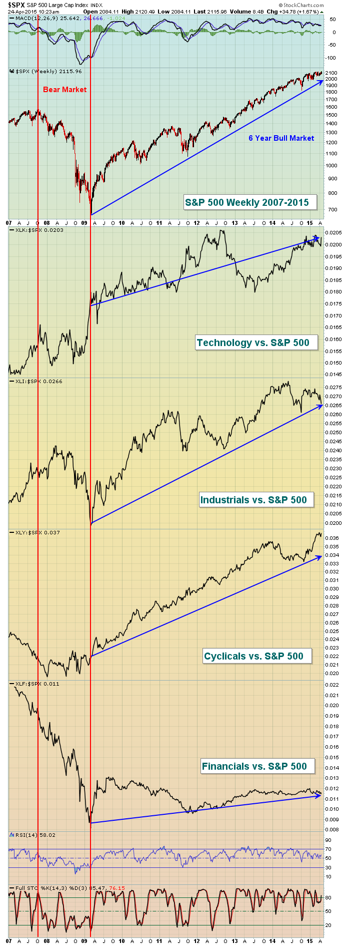
Keep in mind that the relative performance of sectors is just that - relative to the S&P 500. For instance, the last two years you'll see that the XLF vs. the S&P 500 is flat. That doesn't mean that the financial ETF hasn't gone higher. It simply means that financials have performed equally as well as the S&P 500 (ie, gone along for the ride). The interesting part of this chart is that, unlike 2007, each of these four sectors continues to perform well on a relative basis. There is no sign of deterioration "under the surface" in terms of sector performance. Therefore, I'd conclude from this chart alone that the structure of this bull market remains sound and we should expect a further rise in equities. Money has not turned defensive yet, suggesting that investors and traders continue to put their money to work in areas that will benefit from an improving economy. That's bullish.
Now let's turn our attention to the defensive sectors that I mentioned before. Healthcare (XLV), consumer staples (XLP) and utilities (XLU). Healthcare is a bit of a mix as biotechnology stocks should be viewed as an aggressive area of the market, but many other areas of healthcare perform well on a relative basis when the stock market declines. Can money rotating into these groups provide us much-needed clues? Well, I've expanded the S&P 500 chart from 1999 through 2007 and will now show you the relative performance of the defensive sectors. Take a look:
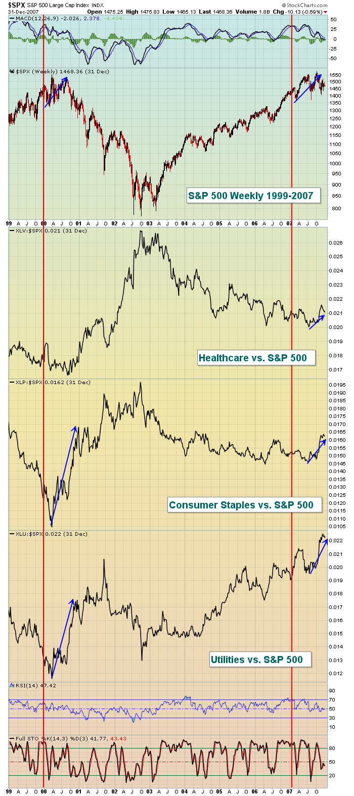
For the most part, the defensive groups performed worse on a relative basis when the S&P 500 was moving higher. Why? Well, investors were expecting an improving economy and when that's the case, money tends to flow into aggressive areas that will benefit the most from those improving economic conditions. Defensive groups bear the brunt of the selling during such rotation. But I want you to focus on the first nine months of 2000 and the first nine months of 2007 as two separate bull markets were nearing their ends. Check out those blue arrows highlighting the relative strength of defensive sectors in the latter stages of both bull markets. Do you notice the relative strength of these defensive sectors BEFORE the S&P 500 topped? This is a warning sign that we should not ignore.
Evaluating the health of the stock market is like trying to solve a crime. One piece of evidence doesn't necessarily mean you're going to convict. But when you begin to see piece after piece of incriminating evidence, the decision to convict becomes easy. That's the way to approach the stock market. Don't necessarily jump to conclusions because we see one big down day in terms of price action or because we see a bit of market rotation into defensive sectors. It's the combination of these signs, including the signals I'll discuss in this series of blog articles, that should help you determine whether you're taking unnecessary risks.
In my next article, I'll specifically look at the relationship of consumer stocks - cyclicals (discretionary) vs. staples - and the clues that this relative performance provides us. If you find these articles helpful, please let me know in the comment section below. I love to hear from everyone, both the good and the bad. :-)
Happy trading and please enjoy your weekend with family and friends, if you get the chance!
Tom
