The volatility index ($VIX) charts the implied volatility of S&P 500 index options. It's a sentiment indicator that measures the stock market's expectation of volatility over the next 30 day period. I could spend time talking about square roots, variance swaps and standard deviations, but it's a lot easier to understand that expected volatility generally rises when the S&P 500 declines. The VIX is often referred to as the fear gauge. To illustrate how the VIX and the S&P 500 trend in opposite directions, let's take a look at the two during 2010 and 2011:
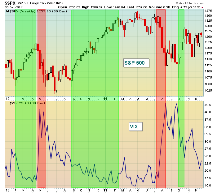
If you've ever looked at a chart of the S&P 500 during an uptrend, it normally turns quite boring with little volatility (green zones above). Many of the candles grow much shorter, indicating little in the way of fluctuations on an intraday basis. But selloffs are completely the opposite. They tend to occur over much shorter time frames with losses mounting quickly (red zones above). Option traders pay close attention to the premiums they must pay on various options. Premiums rise because of higher volatility and higher "expected" volatility. Since volatility is generally associated with selling, premiums rise as markets decline. That's the reason we see the VIX soaring during periods of stock market weakness. Once the bout of selling ends, volatility begins to decline as the stock market resumes its climb.
On the next chart, take a look at how the VIX performed relative to the S&P 500 throughout the bull market from 2002 to 2007:
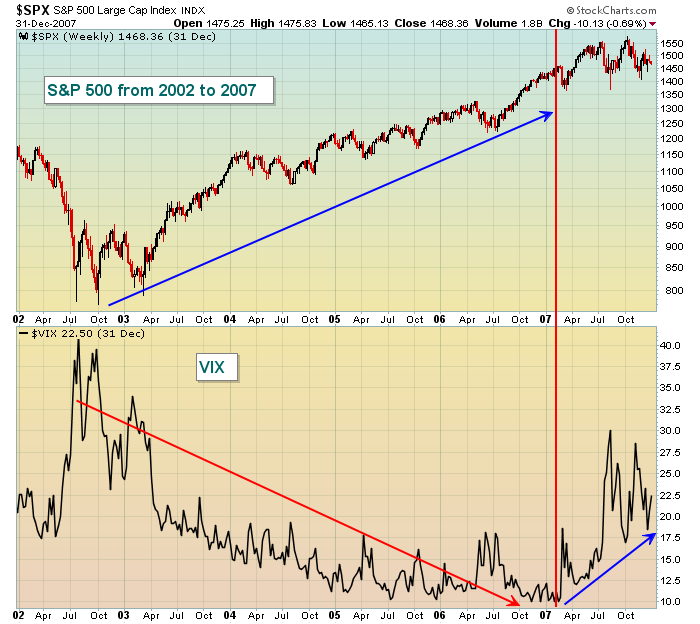
Volatility declined throughout the bull market - until early 2007. Despite an ongoing bull market that lasted into the 4th quarter of 2007, the VIX started ramping up and moving against the grain. Put another way, the stock market was getting nervous BEFORE the stock market topped. That's a warning sign. From a common sense perspective, if fear is increasing and nothing bad has happened technically, what might happen once an actual technical breakdown occurs? Well, we know what happened and it wasn't pretty.
Now let's fast forward to the six year bull market that we're currently enjoying. We'll look at the same chart:
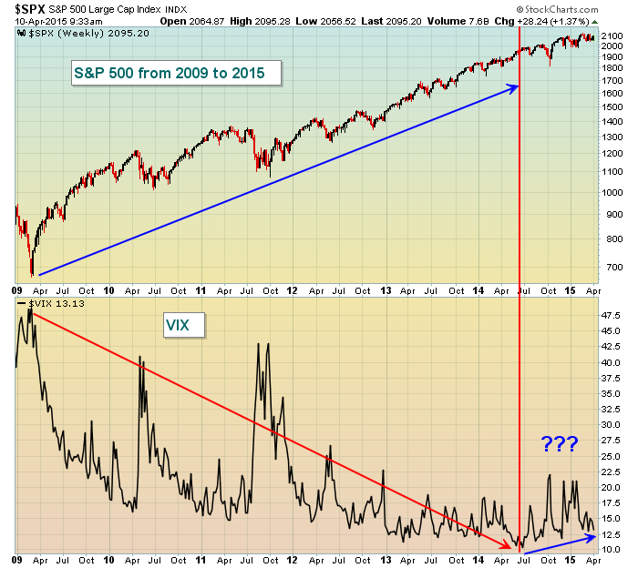
I'll be honest. I remain on the bullish side of the market for now. But this is one chart that I'm keeping an eye on. Recent S&P 500 highs have been accompanied by slightly higher lows on the VIX. It's pretty obvious on the chart that this normally doesn't occur. Also, bear markets don't begin when volatility is high, they begin when the stock market is complacent and the VIX is low.
In 2007, there were a TON of warning signs that the market was topping and central bankers around the globe weren't supporting that bull market the way they've been supporting this one. And the rise in the VIX was much more pronounced in 2007 despite the S&P 500 attempts at setting further all-time highs. Clearly, we have a completely different set of circumstances in 2015 and the rise in the VIX is much more subtle. Nonetheless, sentiment is an important secondary indicator when evaluating the health of a stock market advance. If nothing else, keep this chart on your radar and if volatility continues rising on further rises in the S&P 500, you may want to grow much more cautious.
Happy trading!
Tom


