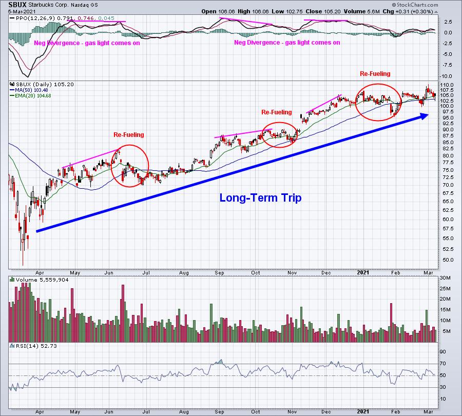
In last weekend's Part 1 of 2, I discussed what divergences are and provided an analogy. Divergences can flash a refueling warning light during a long-term journey higher. If you recall, I illustrated it by using Starbucks (SBUX) as an example:
Divergences can mark long-term tops, but I'd be careful trying to identify long-term tops in the midst of a secular bull market. If prices continue rising over time, most stocks will gravitate higher, not lower.
While divergences can be extremely useful to a shorter-term trader, they should NEVER be viewed as guarantees. Here are several things I consider when I view divergences.
Divergences Work Says The Monday Morning QB
We all do it. We look back at history and show how beautifully divergences worked at prior tops and prior bottoms. I've done it and continue to do it. But it's also very important to point out the times that divergences don't work. If you suggest that divergences correctly predict every upcoming rise and fall, then you're not telling the whole story. Let's look at Tesla (TSLA) an example:
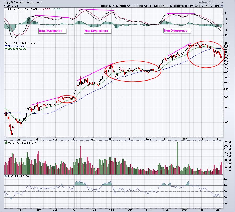
Looks like 3 negative divergences and 3 successful "refueling" pauses, right? Well, let's dig a little deeper into that 2nd negative divergence and zero in on that August breakout:
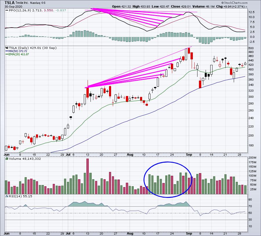
After the fact, it was easy to say that negative divergence occurred at the top and provided a great warning. But the truth of the matter is that TSLA printed a negative divergence on 5 previous highs and the stock kept climbing higher. The August 17th close (initial negative divergence) was at 367. So was that negative divergence a great signal of an impending selloff? TSLA continued soaring to just over 500 two weeks later. While the Monday Morning QB may have seemed to nail this top with ease, had the call actually been made at the time the negative divergence first printed, it would have been disastrous. And that takes me to the next point.
Divergences Need Corroborating Evidence
Take another look at that second TSLA chart. Check out the volume. I've seen plenty of technicians say "buy a stock when this line does this" or "buy a stock when this line crosses over that line". That's not a very good way to trade. Common sense should always be considered. Again, look at that volume. On August 17th, TSLA broke out to close at an all-time high on much-heavier-than-normal volume. So does the argument of slowing momentum, which is what a negative divergence is supposed to tell us, make sense when a stock is breaking to an all-time high on confirming volume? No way. That's why I always say that the PPO (or any other momentum indicator) is a secondary indicator for me. Nothing tops the combination of price and volume.
In a perfect scenario, I'd want to see the following:
- a negative divergence (higher price and lower PPO)
- failure at price resistance
- a reversing candle
- lighter than normal volume on attempted breakout
Hey, I said in the "perfect" scenario. But any of those other technical issues, combined with a negative divergence, would make that slowing momentum argument much more plausible. Here's a picture perfect negative divergence where I'd be a seller every time - not necessarily a short seller, but rather a seller of a stock I owned:
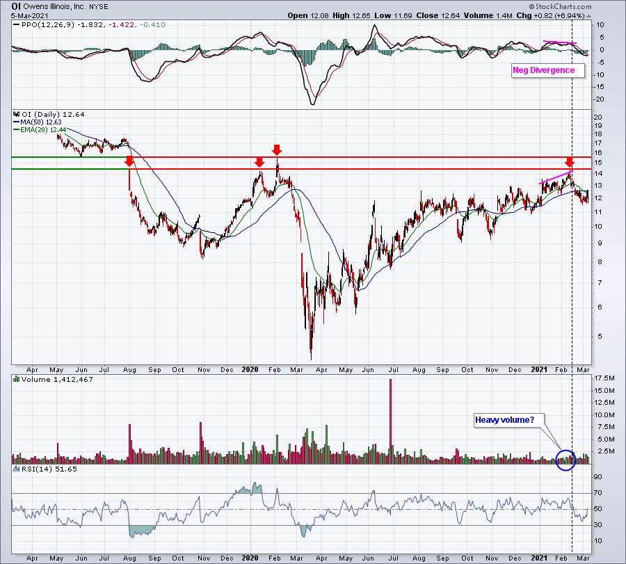
Do you see the difference here? Negative divergence? Check. Failure at price resistance? Check. Lighter-than-normal volume? Check. Reversing candle? Well, we can't really tell because the above is a two-year chart, but let's magnify this 2021 action:
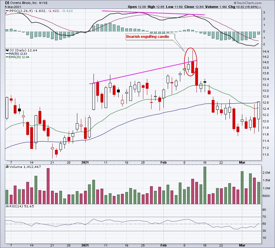
After trading as high as 14.45 intraday, OI reversed and closed at 13.63, printing a very bearish engulfing candle on increasing volume. When looking for a significant momentum warning signal, this is the combination that I'd be looking for.
Beware The Stealth Move Higher
Another problem with divergences is that you need to understand some basic math concepts. The PPO is looking at the percentage difference between a 12-period EMA and a 26-period EMA (default setting). When a stock explodes to the upside, that 12-period EMA will rise much, much faster than the smoothed-out, 26-period EMA. So big gaps or lengthy trends to the upside will many times result in a very quick spike in the PPO that - mathematically-speaking - will be difficult, if not impossible, to exceed. When a stock goes through a period like this and later pushes to another high, it's a near-guarantee that a negative divergence will print. Does a mathematical guarantee qualify as slowing momentum? I don't think so. Let me give a radical example first, using a 25-year weekly chart of the NASDAQ:
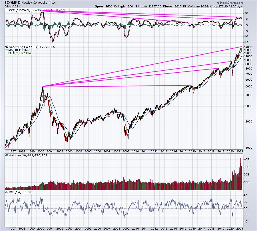
When there's a huge run higher in price, the PPO surges. While the subsequent lower PPOs do, in fact, indicate a lower level of momentum, I wouldn't sell because of a negative divergence. Now you might say, "well, those 3 prior negative divergences all worked because the NASDAQ sold off afterward. If you're thinking that, then I will remind you to go look at that 3-month TSLA chart that I showed earlier. Every new high on the NASDAQ was accompanied by a negative divergence. I only pointed out the tops (Monday Morning Quarterbacking).
To give you a better and more recent example of a surging PPO, let's look at Etsy, Inc. (ETSY). I want you to focus on the breakout as of June 19, 2020 and what the PPO looked like:
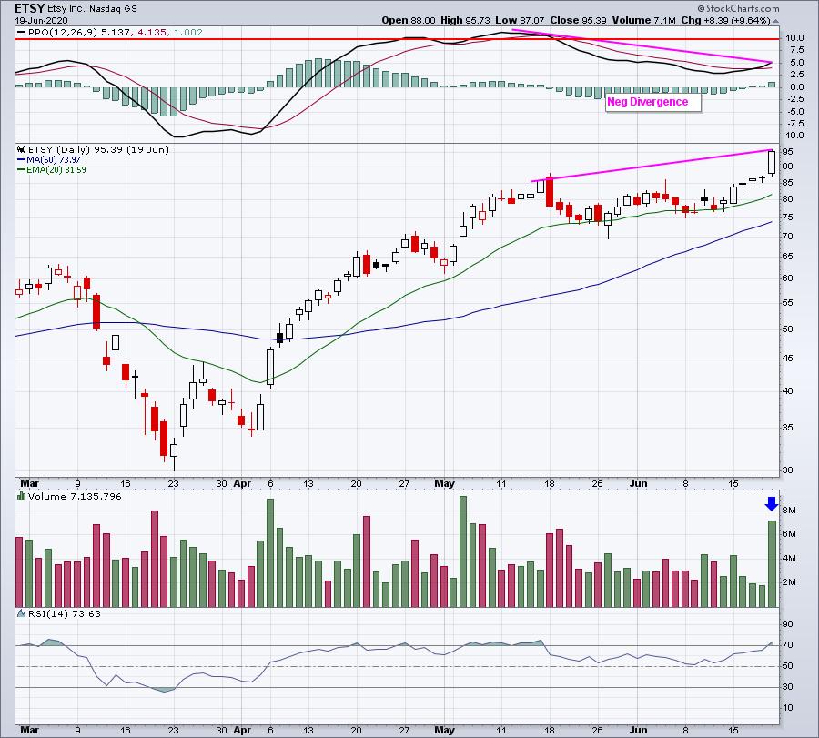
We have the benefit of hindsight now, but at the time, this appears to be slowing momentum. We have higher price action and a much lower PPO. Personally, I'd take one look at that high volume breakout and I'd completely ignore the negative divergence. Keep in mind that the PPO only takes into consideration price action. Volume is not any part of this technical indicator. Now for those who want to ignore the volume part of technical analysis, be my guest. But I cannot argue slowing momentum on a stock that just gained nearly 10% to an all-time high, while volume surges to a way-above-average level. It simply makes no common sense to conclude that ETSY was losing momentum. You have to think BEYOND the lines on a chart. If you look at that PPO from the second week of May, you'll see that it moved above 10. That's a tremendous amount of upside momentum! It's very difficult to continue rising at that pace. Check out the next 2-3 weeks AFTER that initial negative divergence printed:
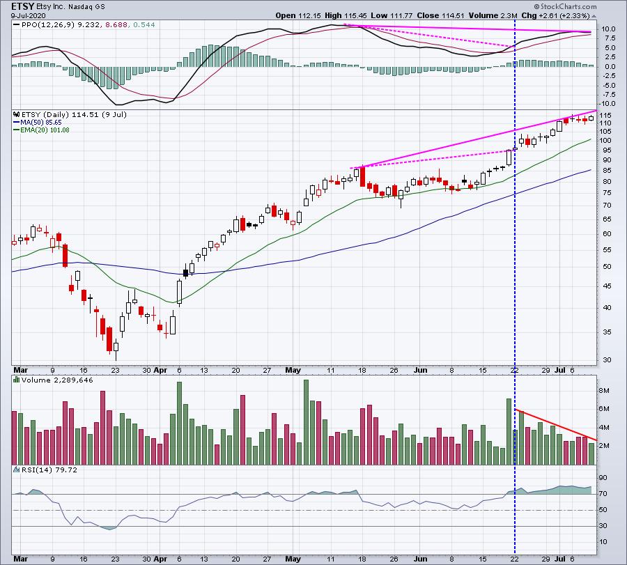
The "slowing momentum" warning first flashed on June 19th when ETSY closed at 95.39. When ETSY's short-term uptrend finally ended on July 9th at 114.51, that "sell signal" would have cost a long 20% if ETSY was sold too soon. You've got to be very careful calling tops on stocks with strong momentum and solid volume. While the PPO clearly was lower, do you really want to argue that a stock that just ran from 95 to 114 in 3 weeks has lost momentum? I will say that the argument began to make more sense as the volume drifted lower and lower. By the time that final high printed, you can see that volume had retreated back to low levels. At that point, the negative divergence began sending a bit more of a warning sign.
Now let's look at the rest of ETSY's chart. It turns out that every price high after May 15th coincided with a lower PPO reading (from the May reading). Were all of these black arrows sell signals?
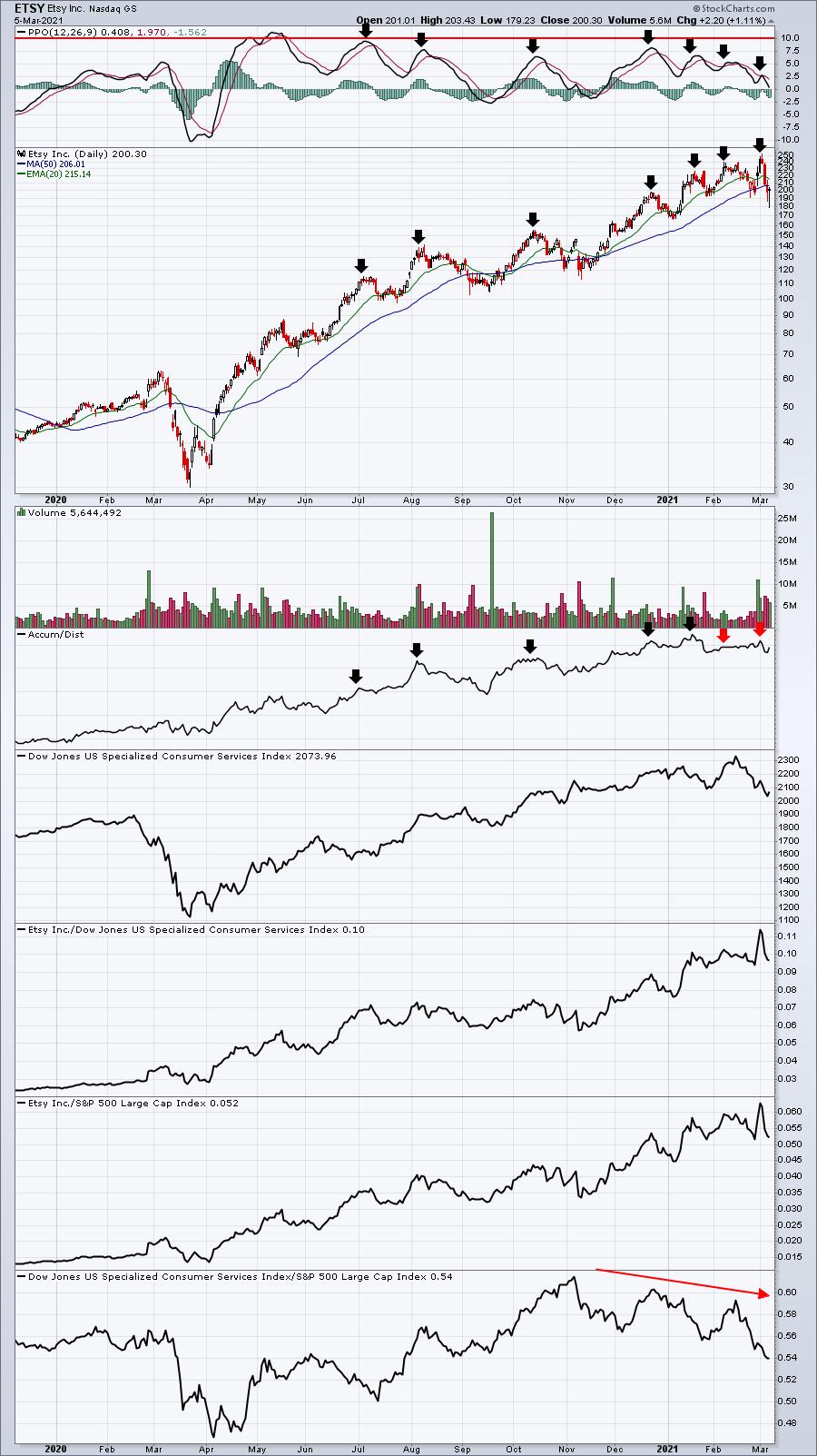
I'm also doing a little Monday Morning Quarterbacking of my own right now, but I don't see enough corroboration of slowing momentum until the high in February. At that point, I'm seeing the AD line print a lower high for the first time. All the other PPO and price highs were accompanied by higher AD lines as well. Also, in that bottom panel, notice that ETSY's peer group, specialized consumer services ($DJUSCS) begins to lose relative strength vs. the S&P 500. We had ETSY in one of our portfolios until February 2021 for this reason. I don't know if the run is over, but there were plenty of question marks.
But does it truly make sense to keep comparing the PPO on the NASDAQ from 1999 to the PPO on the NASDAQ in 2021? Does it make sense to compare the PPO on ETSY from May to the PPO on ETSY in March of the next year?
Introducing The Centerline "Reset"
In explaining how momentum and divergences work, I typically use the analogy of a 3-game baseball series. Game 1 has lots of ebbs and flows, but when it ends, you start Game 2 tied 0-0 again. The score is "reset" back to 0-0. You don't consider anything from Game 1 when you start Game 2. I believe the PPO has a centerline "reset". If you think about it, at what point does the PPO (or any momentum oscillator, for that matter) show zero momentum? At what point is bullish momentum and bearish momentum tied 0-0? It's the centerline. That's when the 12-period EMA and the 26-period EMA are exactly the same and tied at 0-0. It's anyone's ballgame at that point. Neither side has an advantage. What does this look like on a chart?
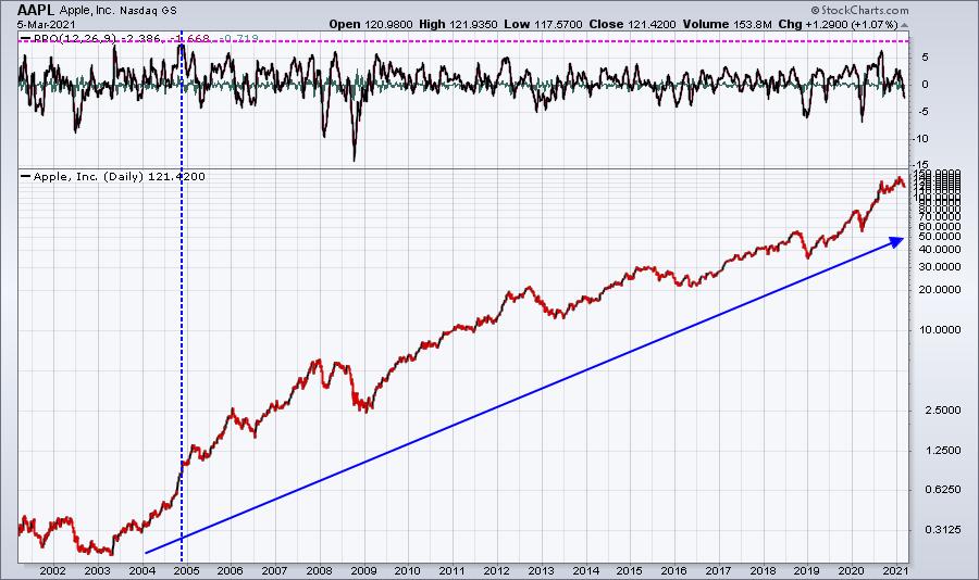
There are two takeaways here. First, Apple (AAPL) has arguably been the best investment of our lifetime, or at least one of the best. The price chart has been in a very lengthy uptrend - for years and years. Yet, note that the PPO frequently moves above and below the centerline. The PPO does not trend higher indefinitely. It periodically returns to the centerline, even moves below it, on the best of the best stocks. Every stock will return to a point where the bulls and bears are tied 0-0. That's the reset. The game starts over.
The second takeaway here is that AAPL's highest PPO reading was in 2004. Does that mean that we've been in a negative divergence for 17 years? Of course not. Momentum is "reset" every time the centerline is reached. The momentum game starts all over again.
Let me illustrate one last chart, which reflects a much better way to view momentum and divergences, in my view:
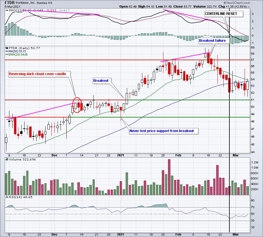
There are two negative divergences reviewed above. If I had sold based on a negative divergence, it would have been on December 11th, which would've turned out to be a so-so signal. Price action, for the most part, went sideways for a couple weeks before breaking out again. A third negative divergence actually printed when FTDR broke out in early January. But notice the volume accelerated with the breakout. I'd have ignored that negative divergence. However, the slowing momentum warning signal from February 12th was a solid one. FTDR needed some time to refuel and the breakout failure on February 16th started the "refueling" period. About 10 days later, the PPO returned back to centerline support for a "reset". Since then, we're seeing price action move sideways again, but above key price support near 51.00.
Summary
Divergences can provide us excellent clues from time to time. But they're not the end-all-be-all of technical indications. They have their flaws, just like everything else. No signal is infallible. Use technical analysis to identify and manage risks, not to provide guarantees. And above all, remember to put all the jigsaw puzzle pieces together - or at least as many as you can find. Momentum oscillators are simply one small piece of the puzzle.
If you enjoy the educational aspect of investing, I'm sure you'll love my EB Digest, a free newsletter that I publish 3x a week. It's free, no credit card required, and you may unsubscribe at any time. CLICK HERE to sign up.
Finally, we've just released a Testimonials page from satisfied subscribers. You can find those HERE.
Happy trading!
Tom


