|
|
||||
 |
||||
Expert Technical Commentary Delivered Straight To Your Inbox |
||||
| November 5, 2016 | ||||
Hello Fellow ChartWatchers!Welcome to the latest edition of ChartWatchers, the newsletter for technical analysts, online investors, StockCharts users and more. As always, this week's edition features some fantastic commentary from John Murphy, Arthur Hill, Greg Schnell and more. Also, don't forget to check out the Site News section towards the bottom of this week's newsletter. ChartWatchers is the best way to stay informed on all the latest news, events, updates and additions here at StockCharts, so whether it's a new feature or a new blog, an upcoming conference or a special sale, you'll hear about it first in the Site News section! For this week's newsletter, we are introducing an updated look and feel to ChartWatchers! We've made some fantastic improvements to the newsletter format, most notably making it fully scalable across all your devices. Checking your email on your desktop computer? The newsletter should look great. Reading this week's edition on-the-go from your phone or tablet? Not a problem! The email should scale to fit your device and be easy to read no matter what screen size you're on. This being our first official newsletter with the new design, we're excited to hear your thoughts! Be sure to let us know what you think. |
||||
|
Rising Bond Yields Boost Insurers, Have Negative Impact on Stock Indexes |
||||
|
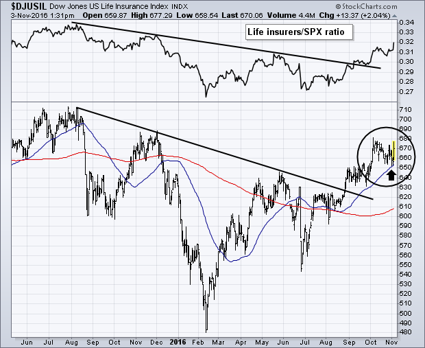
LIFE INSURERS LEAD FINANCIALS HIGHER ... Rising bond yields continue to give a boost to financial stocks like life insurers. Bear in mind that premium income in insurance stocks is invested mostly in fixed income markets. Higher bond yields mean higher income. Life insurers are leading the financial sector higher today. Several of the big life insurers are seeing nice gains after beating earnings estimates. Chart 1 shows the Dow Jones US Life Insurance Index ($DJUSIL) climbing more than 2% today and nearing a new 2016 high. The index is in a clear uptrend, as is its relative strength ratio (top of chart). Several individual stocks are already hitting new highs.
|
||||
|
||||
|
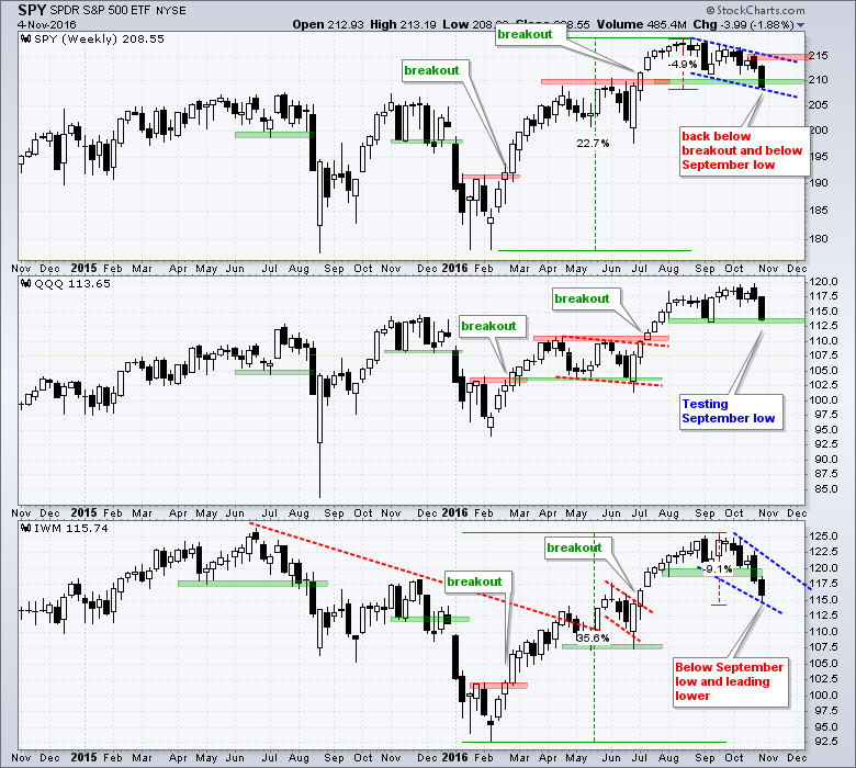
The S&P 500 SPDR (SPY) and the Russell 2000 iShares (IWM) both broke below their September lows with IWM leading the way lower. QQQ is still holding up the best because it hit a 52-week high the week before and remains above the September low. Looking at SPY first, the ETF fell around 5% from high to low over the last eleven weeks. This modest decline comes after a 22% advance from the February lows and a 10% advance from the late June low. Even though the inability to hold the breakout is negative, I still view this as a correction within a bigger uptrend. The blue trend lines mark a possible falling channel to define this correction and I am marking resistance at 215.50. The bottom window shows IWM advancing around 35% from the February low and 17% from the June low. The ETF then fell around 9% over the last six weeks. IWM is down the most of the big three, but it was also up the most from its February low. The bigger they surge, the harder they correct. It is possible that a falling wedge is taking shape on the price chart. Chartists can watch the upper trend line for the first sign that this correction is ending. A weekly close above 122 would break this trend line. **************************************** Plan your Trade and Trade your Plan |
||||
|
||||
|
The Monthly Close For October Couldn't Have Been Closer To A Sell Signal |
||||
|
While the technicians usually write about the short tem, I want to zoom out a little and use a monthly chart of the New York Composite ($NYA). For those who follow my webinars, we are following the charts very closely as the market conditions are frail in my opinion. We could rally from here, but the long term charts continue to disappoint in my work. This New York Composite chart ($NYA) shows the close Friday, November 4th, 2016. While the October 31st close did not close below the 10-month Moving average or give a MACD sell signal, it only took a pullback of one more day (November 1) to generate a sell signal on both the MACD and the 10 month moving average. That is a fine detail on a monthly chart. These can be seen looking at the Zoombox on the far right. By the Friday close shown below, the picture was getting a little more difficult. Martin Pring's Monthly KST is below zero as well. The note I wrote on this chart above back in August 2016 as the $SPX made it's high is extremely important now. We actually did cross above the signal line but so far this month we are below. We will need to wait for the November close and the level of 10414, but it is very important to realize how frail the market setup is. There were only 3 times on this chart that a monthly sell signal reversed higher. One was the coordinated central bank move in September 2012. The other was the brief rally in 1999 before the tech top. The current one is in play. If we close below 10414, we have an important signal. Why is this so important? The real problem is understanding what has happened through the passage of time from the high on the MACD in 2014. As oil plummeted from June 2014 and the energy sector was decimated, it slowly affected other industries and sectors. By the spring of 2015, the $NYA chart above made marginal new highs over the 2014 level. As the industry dominoes started to fall, the market pulled back most of 2015 with a final low in January/February 2016 coinciding with Crude Oil's final low. As oil rallied, GDP numbers started to improve and recently we just had a GDP print of 2.9%. My position is if energy (Oil, Natural Gas, Wind, Solar, Coal, Nuclear, Ethanol) fails to hold up, we could see more pressure on the economy. Since the market top of May 22,2015, three groups have gained meaningfully from that day, three are close to flat and three declined heavily.
Lastly, some of the webinars over the last two weeks have set the stage for how close this market is to a major reversal. If you are not aware of how fine that picture is, I would encourage you to watch Commodities Countdown 2016-10-27 and then the Commodities Countdown 2016-11-03. I have been bullish until late September so I am not quick to jump on the bear bandwagon. But when the time comes, keeping your capital becomes more important than making money. I will be hosting Martin Pring with a Webinar on Tuesday. Martin Pring 2016-11-08. I will also be hosting a Commodities Countdown Webinar on Thursday November 10th. If you miss any of our webinars be sure to check the Webinar Archives for watching them when its convenient for you. Good trading, |
||||
|
||||
 |
||||
|
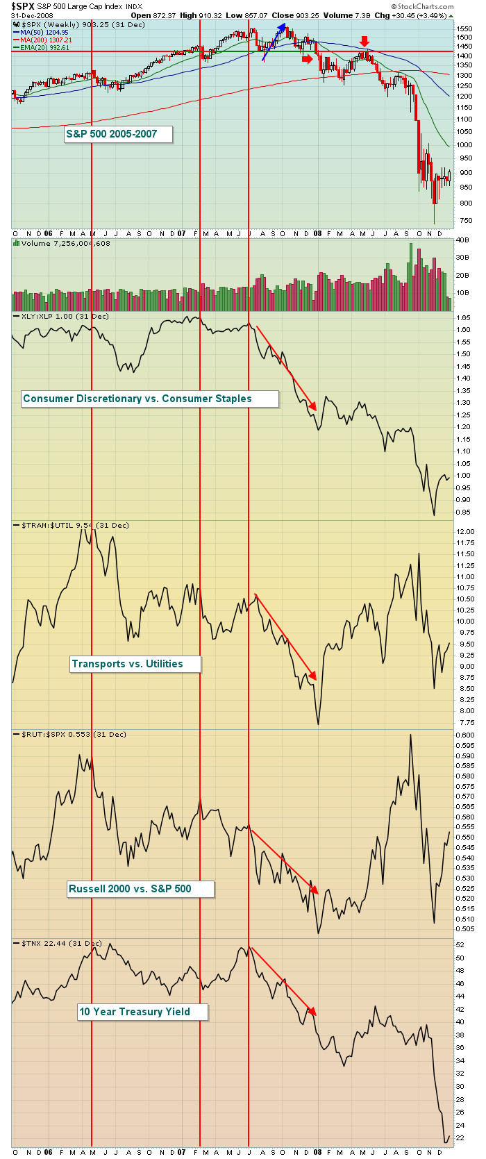
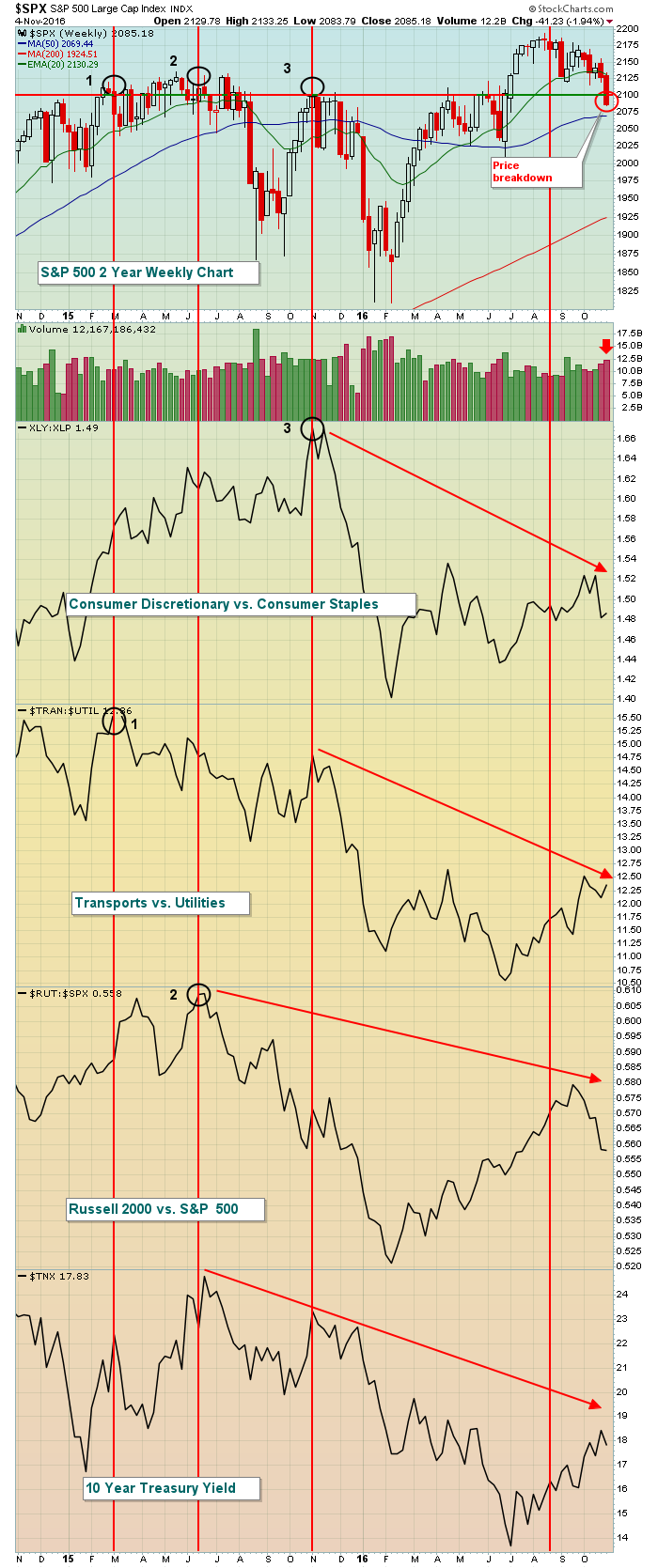
The "under the surface" signals have been quite bearish for the past 1-2 years. Money has rotated away from aggressive areas and I've discussed it here and my Trading Places blog quite often. But it was very difficult to think bearish thoughts as long as the combination of price and volume remained bullish. So I've been waiting to get the bearish price breakdown before re-evaluating the market. That breakdown came last week during one of the most historically bullish periods of the year - strange indeed. Let's look first at the warning signs and price breakdowns prior to both the 2000-2002 and 2007-2009 bear markets: 2000-2002:
November 2016:
Finally, for those who are very aggressive and are interested in shorting, I'd use a short-term bounce on the S&P 500 to the 2100-2120 area as an opportunity to begin building short positions. Happy trading! Tom |
||||
|
||||
 |
||||
|
When the market is under fire like it has been for the past few weeks it becomes harder to trade successfully. This is particularly true if your focus is on the long side. One way we've tried to combat a difficult trading environment at EarningsBeats is to focus specifically on those companies that beat earnings expectations with the theory being they will hold up the best, no matter market conditions. But that strategy can prove to be tricky when the market moves into a "shoot first and ask questions later" mode. As an example, we issued a long alert on ETFC on October 24 after it posted strong earnings. It had gapped up on strong earnings and looked like a good reward to risk trading candidate on a pullback. But right out of the chute the stock continued to move lower, resulting in a failed trade.
This doesn't mean there aren't stocks that hold up better than other ones when the market is unraveling. Traders DO have a tendency to flock to those stocks with strong fundamentals and strong charts when things are rocky. So it makes sense that your odds of experiencing a successful trade increase if the market cooperates as well I will be conducting a webinar on Thursday, November 10 at 4:30 pm eastern where I will be showing examples of stocks that reported strong earnings and how they performed during the recent pullback. This will include some that held up well and some that fell apart. Then we'll have a discussion to see if there were tell tale signs that might have predicted which ones were more likely to succeed, or fail. If you want to join me for this FREE webinar just click here. At your service, John Hopkins |
||||
|
||||
|
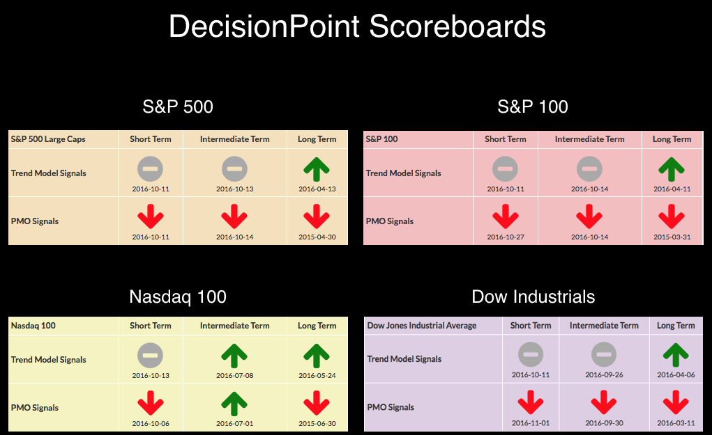
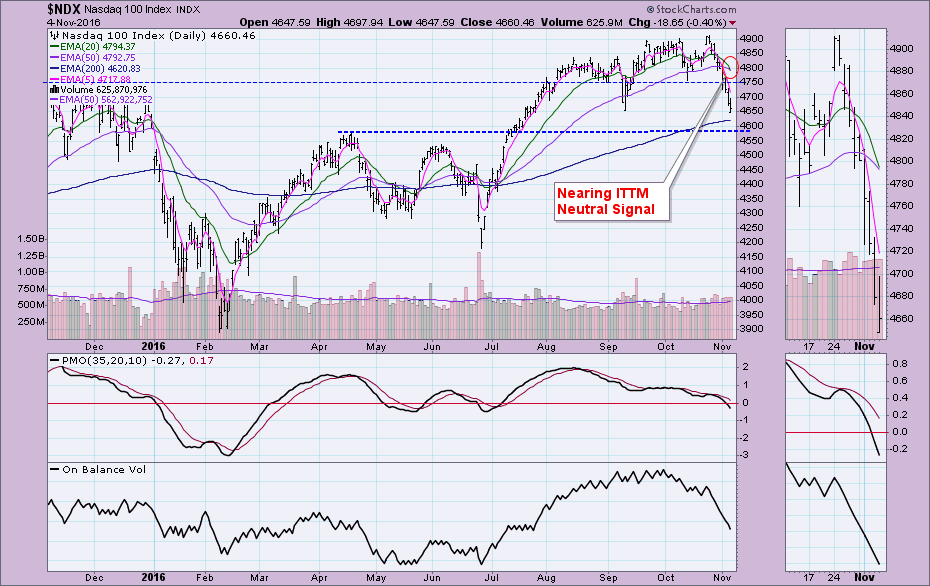
If you look at the DP Scoreboards by themselves, you would note that the NDX appears to have internal strength given that two July BUY signals are still intact in the intermediate term. However, a look at the charts reveals those signals are about to break.
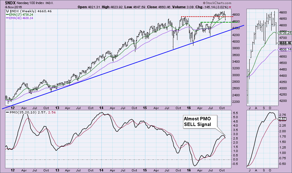
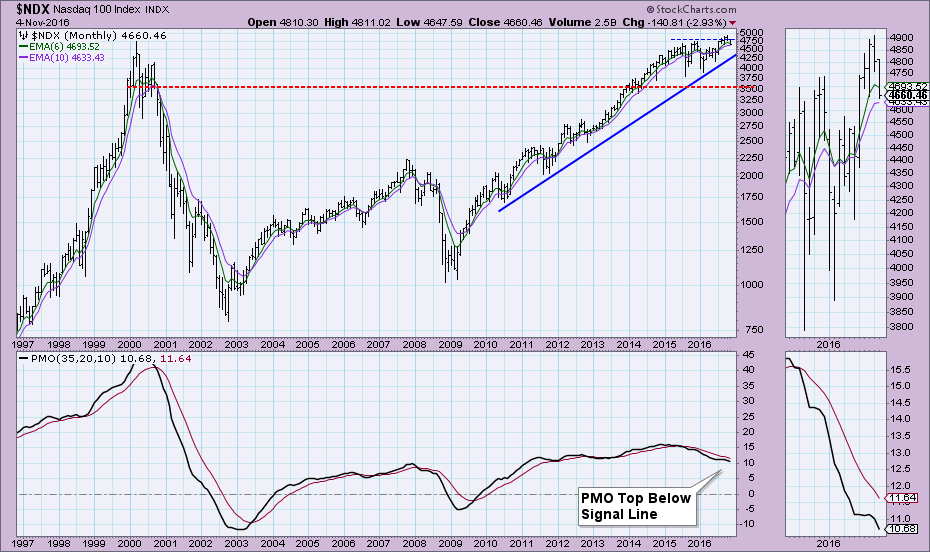
The Intermediate-Term Trend Model signals are on the daily chart. They are determined by 20/50-EMA crossovers in relation to the 200-EMA. In the case of the NDX below, you can see that an ITTM Neutral signal is likely to trigger next week. The weekly chart went final today and the NDX narrowly avoided an IT Price Momentum Oscillator (PMO) SELL signal by .01. A SELL signal will likely appear on next Friday's chart. The monthly chart which the LT PMO signals are generated from shows not only a current LT PMO SELL signal but a new top below the signal line which is also quite bearish. Conclusion: Although the DecisionPoint Scoreboard for the NDX appears bullish in the intermediate term, the weakness of the charts shows that all BUY signals in the intermediate term will be extinguished next week. Come check out the DecisionPoint Report with Erin Heim on Wednesdays and Fridays at 7:00p EST, a fast-paced 30-minute review of the current markets mid-week and week-end. The archives and registration links are on the Homepage under “Webinars”. Technical Analysis is a windsock, not a crystal ball. Happy Charting! |
||||
|
||||
|
||||
|
||||
|
||||
|
||||
|
||||
|
||||
|
|
||||
| © StockCharts.com, Inc. | ||||
| This email was sent to [email] |
||||
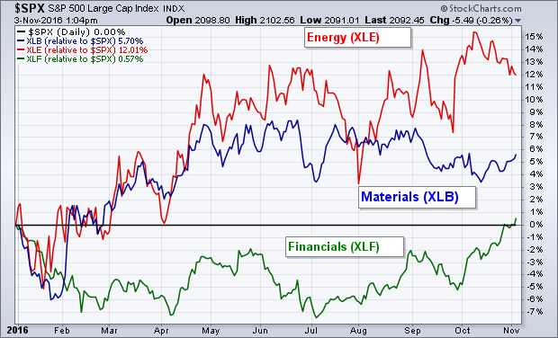
 RISING RATES ARE WEIGHING ON STOCKS IN GENERAL ... There's good and bad news in the prospect for higher bond yields. The good news is that it favors financial stocks. To the extent that rising rates are also hinting at higher inflation, it may also be good for commodity related stocks like energy and materials. The bad news is that rising rates are bad for dividend payers, and possibly even consumer discretionary stocks that are hurt by rising consumer prices. Which helps explain why stocks have been basically flat since midyear. More groups have been falling than rising. Since midyear, only three sectors are in the black: technology (+8%), financials (+6%), and industrials (+2%). Energy and materials are basically flat. All the rest are in the red. That's three up, two unchanged, and seven down (counting telecom). Combined losses in the four dividend paying groups (and healthcare) are bigger than gains in financials and technology (with tech turning down this month). That makes for a flat market with a downside bias. For the market to make any upward progress, either the more economically stocks need to strengthen and/or the dividend payers need to stop falling. That leads to a couple of possible conclusions. First, the net effect of rising bond yields has been negative for major stock indexes. That calls for a more cautious stance. Beneath the surface, however, money is rotating into stocks that should benefit from rising yields and higher inflation. That may offer a way to take advantage of the current situation. Chart 2 shows rising relative strength lines for stock ETFs tied to energy (red) materials (blue), and financials (green). Traders are also buying put insurance (volatility) to hedge against possible stock losses.


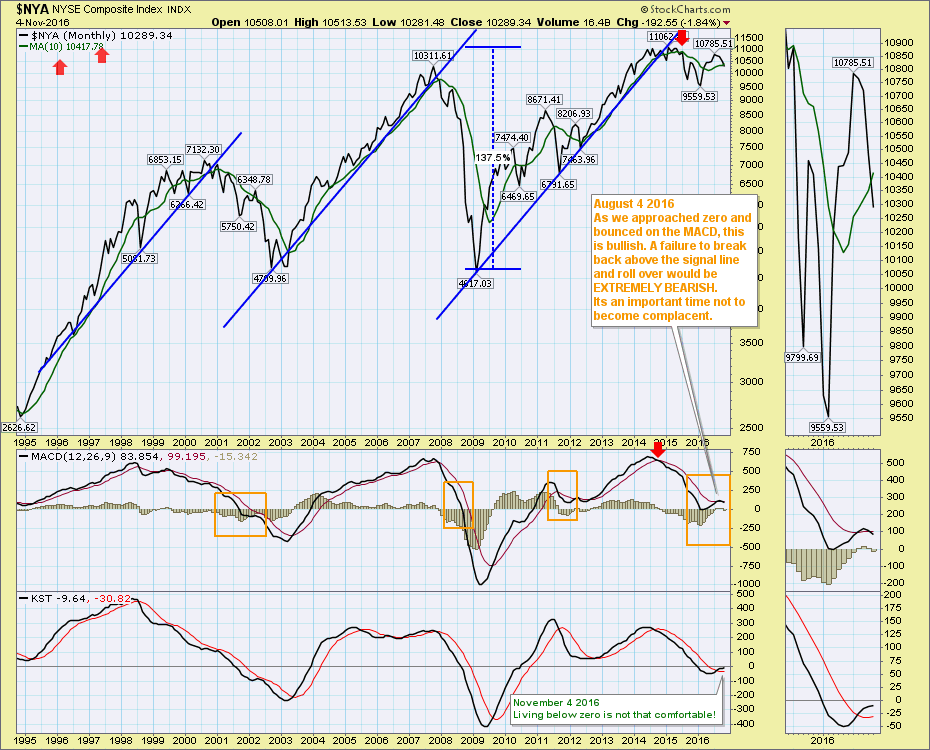
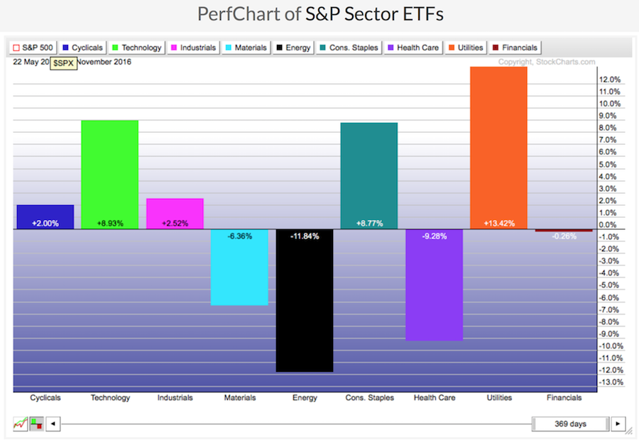 However, zooming in on the markets for the last 3 months after the initial rally off the floor in February 2016, we have a different picture. While energy and financials are marginally positive, big sectors like consumer discretionary, industrials and materials are down. As well, Biotech within Healthcare has been crushed. Technology has been relatively flat, even with Apple, Google, Amazon, Facebook and Netflix.
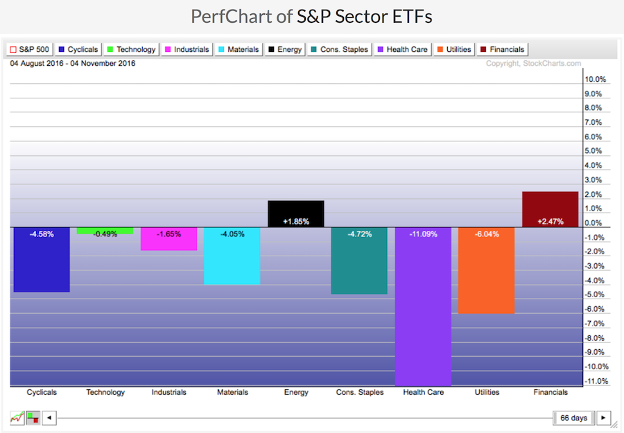 In a nutshell, for my way of thinking, we need Energy to continue to rebound. If that doesn't happen, it is a global sector that slowed the MACD from the highs of 2014 to the very low levels we saw in the first chart. If Energy rolls over again, which it appears to be doing now, this could be the major derailment that gives our global markets negative momentum. The other sectors don't look strong enough to carry the economy forward in my mind. The monthly charts are warning us. It could break out to the upside, but I think it is important to understand what a sell signal in November and confirmation in December could mean for the longer term. We don't usually get two whipsaws on monthly charts.

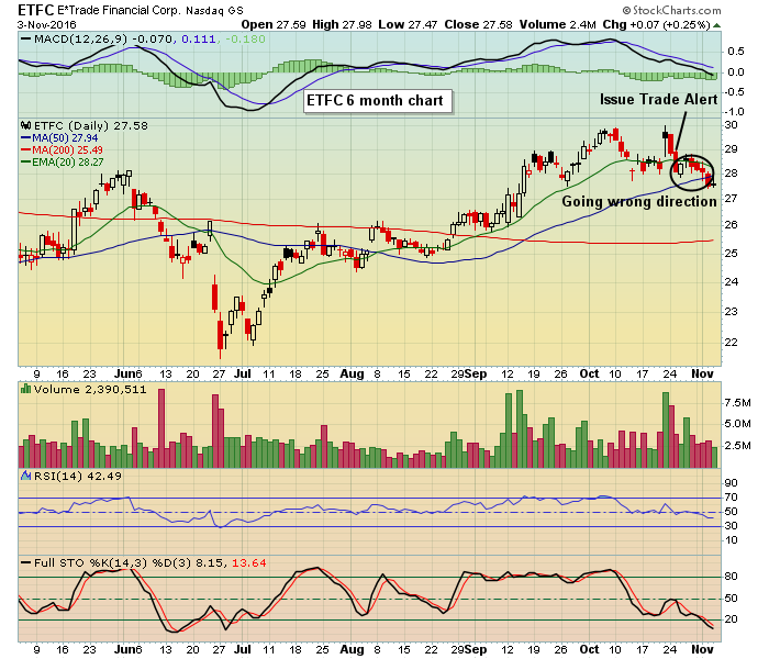 It turns out that the most recent leg down in the market started on October 24, the same day of the ETFC alert. In fact, the NASDAQ was down 8 straight days in a row. So the timing of the alert was unfortunate; the strength of ETFC's earnings was not enough to avoid getting sucked down with the rest of the NASDAQ.