| THIS WEEK'S ARTICLES |
| Market Roundup |
| Prices May Be Falling, But Bond Spreads (Confidence) are Holding in There |
| by Martin Pring |
Editor's Note: This article was originally published in Martin Pring's Market Roundup on Wednesday, May 8th at 6:37pm ET.
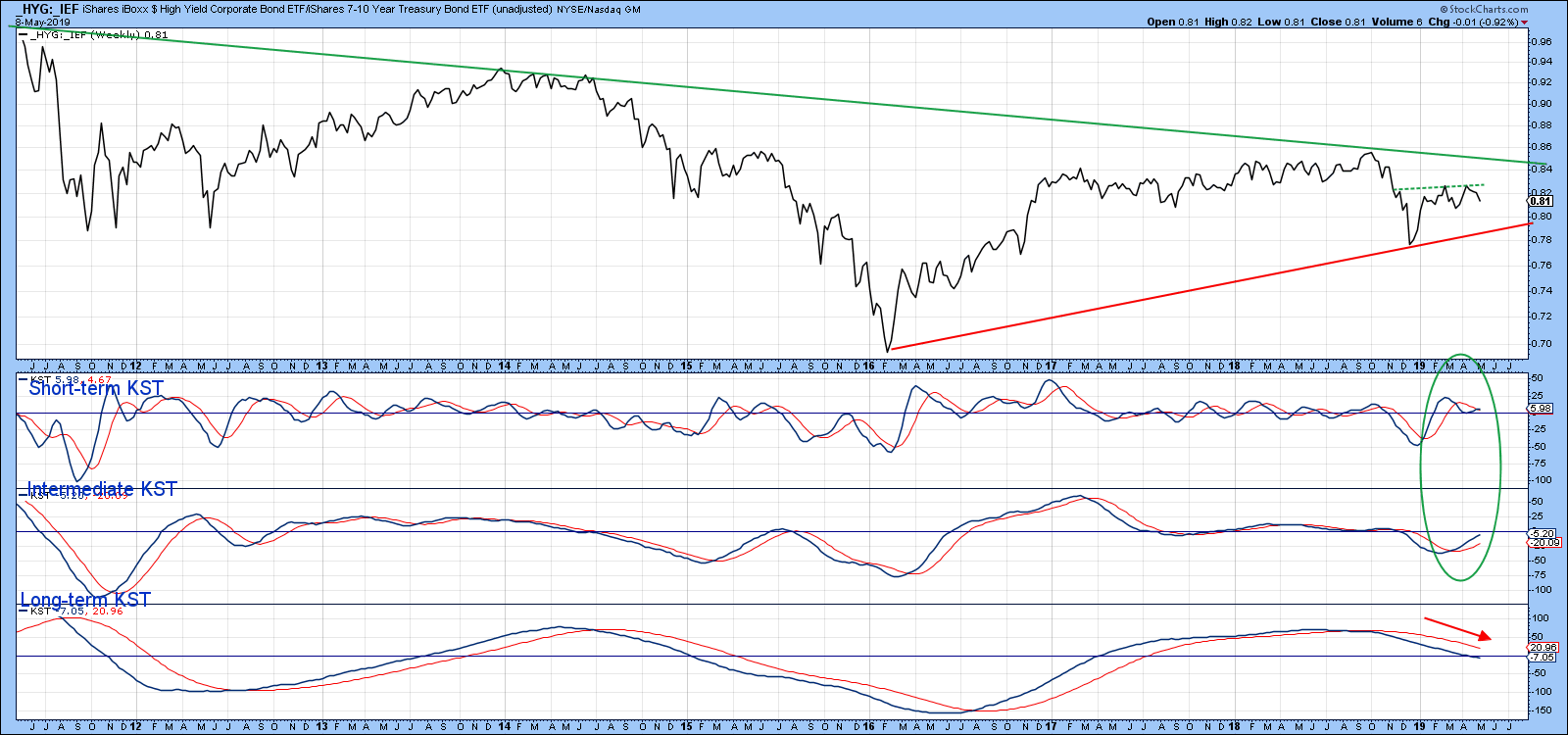
One area I monitor daily is the technical picture of bond spreads and other market relationships that reflect confidence. That’s because changes in their direction often lead or confirm what is actually happening to equity prices in general. One of my favorites is the ratio between the iShares High Yield and iShares 7-10-year treasury ETFs (_HYG/_IEF). When it is rising, it indicates investors and traders are growing in confidence concerning the level of business activity, as they are willing to bid up the HYG in order to receive its generous yield. When they are worried about the economy, there is a rush to the quality offered by treasuries and the ratio falls. Chart 8 shows that this relationship clearly does not move tick for tick with the NYA. However, we do find that, if trouble is brewing we normally get an advance warning from the ratio itself or a reversal in its momentum. Right now, it is caught between the two converging trend lines. Whichever way it breaks is likely to signal the direction of the next important move for both confidence and the equity market.
What is surprising is the fact that this relationship has held up very well, despite the recent selling squall. Moreover, the two momentum series, which you can read about here, are both in a bullish mode. If investors are in any way worried by a failure in the trade talks, I would expect it to show up here. So far it hasn’t, which could mean that the current decline will be limited in scope.

Chart 8
Good luck and good charting,
Martin J. Pring
The views expressed in this article are those of the author and do not necessarily reflect the position or opinion of Pring Turner Capital Group of Walnut Creek or its affiliates.
|
| READ ONLINE → |
|
|
|
| The Mindful Investor |
| Three Bright Spots Outside the United States |
| by David Keller |
“The world is a book, and those who do not travel read only a page.” - Saint Augustine
I recently returned home after a 10-day trip to Scotland with my family for Spring Break. We rented a car in Glasgow, made our way up into the Highlands and took a ferry over the Isle of Lewis, where we rented a house for the week.
We enjoyed meeting new people and learning about Scottish Gaelic, we loved the challenge of driving a manual transmission on the left side of the road and we treasured finding cute little places to grab fresh seafood during our excursions. Most of all, we appreciated getting exposed to people and cultures and stories outside of our comfort zone.

As investors, we are often affected by so-called home bias, which suggests that, generally speaking, we tend to own stocks and companies and markets based geographically closer to our home base. To put it simply, we tend to own what’s close to home.
Now this makes sense in some ways, as we’re much more likely to be familiar with companies we do business with, which means (especially for consumer goods) they are often located near to where we live. The problem occurs when that prevents us from looking for potentially better investment opportunities that may be located elsewhere.
Over the years, investors have tended to think more globally in their investments due to the internet, the interconnection of the global economy and the prevalence of investment vehicles such as ETFs. So, given this week’s correction in the US equity markets, where should American investors be looking for potential opportunities a little further away from home?
1. Brazil

There’s no surprise that the first two markets we’ll discuss have a commodity-oriented theme to them. As the US and many developed markets have thrived due to strength in technology and consumer-oriented spaces, commodity-based markets have struggled with weaker commodity prices.
However, this also means that, if and when developed markets start to struggle (a process which arguably began this week), commodity-oriented markets like Brazil may present an opportunity for an uncorrelated return profile.
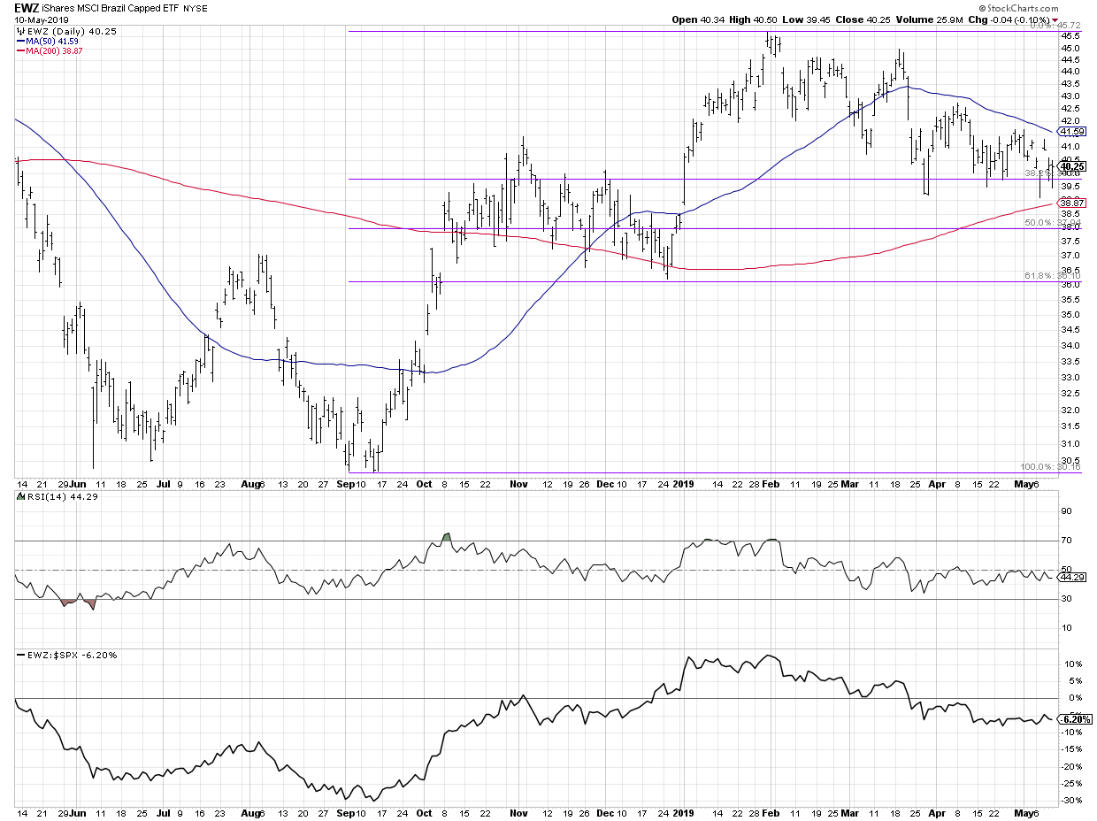
After rallying from the low 30s last fall to a peak in the mid-40s earlier this year, the EWZ reached the 38.2% retracement level in late March. That level was tested again twice in the month of April, then again in the first two weeks in May. The 200-day moving average could serve as further support, currently lying just below 39.
2. Australia

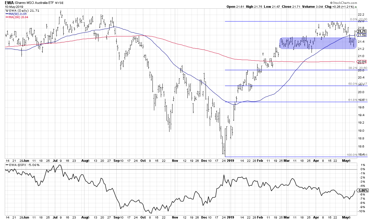
EWA, the Australian ETF, rallied back above its 50-day moving average this week after finding support in the 21.20-21.50 range. This is one of the few markets that closed up on the week while many other global markets suffered. This resulted in a nice uptick in relative strength going into the weekend.
3. Frontier Markets

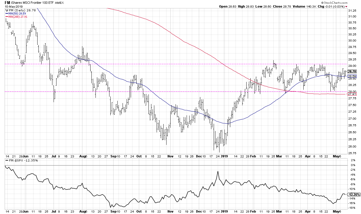
Frontier markets on their own don’t look incredibly rewarding here. The FM has essentially been range-bound for the last three months, often finding support at the 28 level. So we have a chart going not up, not down, but decidedly sideways.
However, when you compare frontier markets to other global regions, you can see why a sideways trend isn’t all that bad.

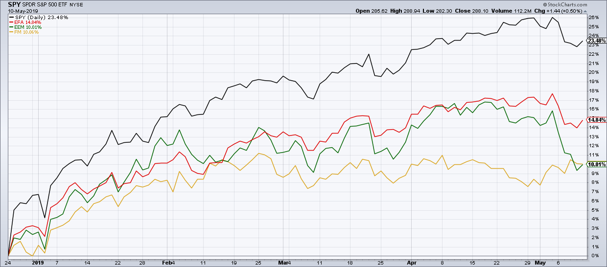
Year-to-date, the S&P 500 has far outpaced EAFE, EM and FM. But if you look at the last two weeks, you’ll see that, while all other major global ETFs have pulled back, FM has actually increased on an absolute and relative basis. In short, it’s working while other markets have not.
When looking for investment ideas, we often look close to home because that’s where we’re comfortable. A savvy investor knows that the best opportunities can come from many places, even ones where we have much less familiarity!
RR#6,
Dave
David Keller, CMT
President, Sierra Alpha Research LLC
www.marketmisbehavior.com
Disclaimer: This blog is for educational purposes only and should not be construed as financial advice. The ideas and strategies should never be used without first assessing your own personal and financial situation or without consulting a financial professional.
The author does not have a position in mentioned securities at the time of publication. Any opinions expressed herein are solely those of the author and do not in any way represent the views or opinions of any other person or entity.
|
| READ ONLINE → |
|
|
|
|
|
| Trading Places |
| S&P 500 Reverses Off Key Support, New Leadership Emerging |
| by Tom Bowley |
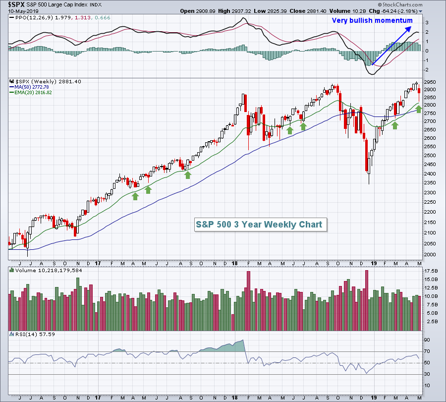
It was a brutal week, especially given the surging U.S. equity prices throughout 2019 thus far. The benchmark S&P 500 fell 2.18%, but intraweek losses were far steeper. There was a significant reversal on Friday as the Volatility Index ($VIX) appeared to confirm a near-term top - a bullish development indeed. The first chart illustrates the technical strength and reversal of the S&P 500 on its weekly chart:

Any time I see the PPO rising like this, I expect a 20 period EMA test to provide support. The green arrows show several kick saves at 20 week EMA support the past three weeks.
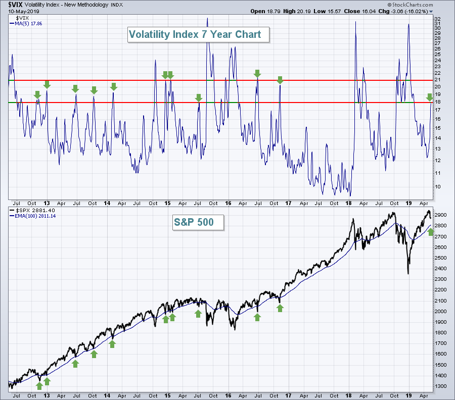
The VIX also suggested we likely set a short- to intermediate-term bottom:

The top part of the above chart is a 5 day moving average of the VIX. In a bull market, when this 5 day moving average moves into the 18-21 range, short-term bottoms generally print. The green arrows above illustrate that point. While we didn't close at the 20 week EMA on Friday, we did approach that moving average on an intraweek basis.
So....assuming we've bottomed, where should we be turning our attention? I'll give you two industry groups, the first seems to be regaining its prior relative strength, while the second has been a serious underperformer for years and might just be starting its relative uptrend.
1. Defense ($DJUSDN)
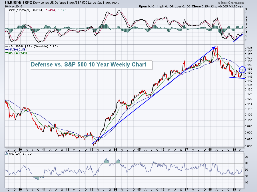
Defense stocks had been a relative leader from 2013 into early 2018, but paused and took a year off. The group appears to be rebounding nicely now and I'd look for further relative strength:

One positive here is that the relative strength ratio has just cleared its 50 day SMA. Relative momentum had already suggested an impending turn back to the upside. Unless the market proves me wrong, I believe this is an area to overweight during the balance of 2019.
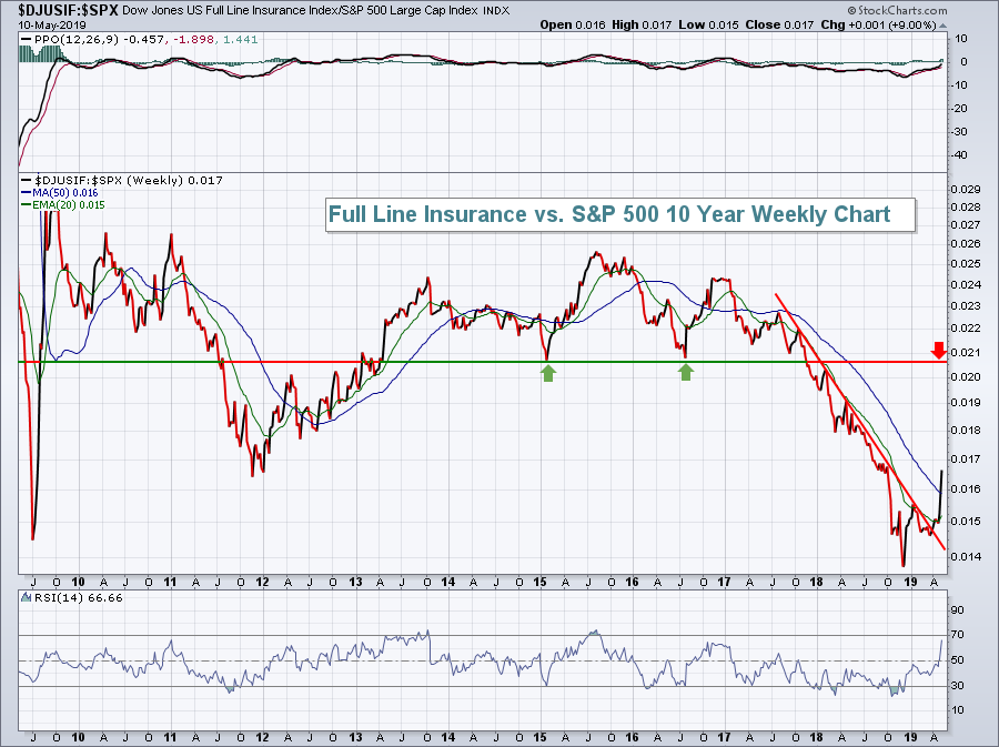
2. Full Line Insurance ($DJUSIF)
A relative downtrend has been broken and I'd expect to see further relative strength in the weeks and months ahead. The DJUSIF has gained more than 12% in the past month and that's likely just the beginning. The DJUSIF underperformed for several years and has plenty of catching up to do:

Because there's been so much relative weakness since the 2015 top, we do want to make sure the relative strength continues. Failure to hold its relative 50 week SMA would be an initial warning sign to heed.
I post a daily blog article every day the stock market is open. If you'd like to receive my article each day, go to my latest article, "Here's A Defensive Health Care Stock That Loves The Next 3 Months". Scroll down to the bottom of the article, type in your email address in the area provided, and click the "Subscribe" button. It's FREE and it's easy!
Happy trading!
Tom
|
| READ ONLINE → |
|
|
|
| The MEM Edge |
| How To Play The Hot IPO Market - One Sound Approach Can Help You Navigate These Fast Movers |
| by Mary Ellen McGonagle |
The number of IPOs listed in the U.S. has picked up this year. While some high-profile companies have already come public, there are more highly anticipated companies that are due to list shortly, such as the ride-share company Uber and workplace messaging app Slack.
Some of these recently public companies have performed well, making it worth your while to check out these stocks. After all, the powerhouse FAANG stocks of today all started out as new issues at some point.
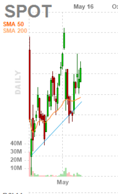
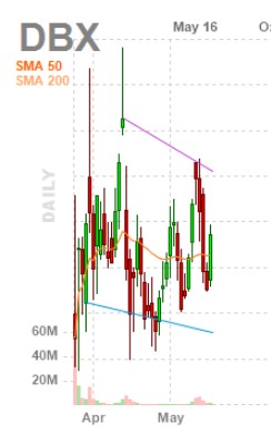
That said, investing in new issues is not for the faint of heart, as these generally smaller companies can be quite volatile. Most new IPOs can bounce around for quite some time while growing. Just look at the charts for recent new issues Spotify (SPOT) and Dropbox (DBX) , both of which went public last year.
 
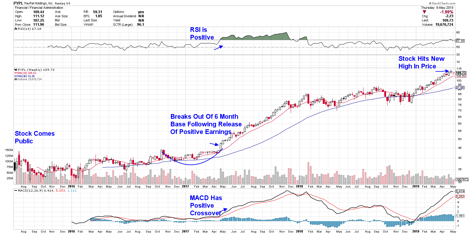
But… once investors see a promising trajectory of solid earnings and sales, stocks can soar. Take payment processing firm PayPal (PYPL), which traded in a lackluster fashion for over 18 months following its IPO (see below) in spite of posting decent earnings and sales.

Above: Strong earnings finally spur takeoff in PayPal.
It wasn’t until the company produced strong earnings, despite a small drop in sales the 1st quarter of 2017, that investors took notice, seeing it as a sign that existing clients were using the service more frequently. Even more encouraging was the pick-up in the number of users; the company added 6 million new users that quarter, up 11% over the prior year. Management also announced initiatives aimed at deepening their reach with merchants while simplifying user experiences among their growing client base.
All of this has pointed to continued growth. The company has since gone on to hit a new high in price this week.
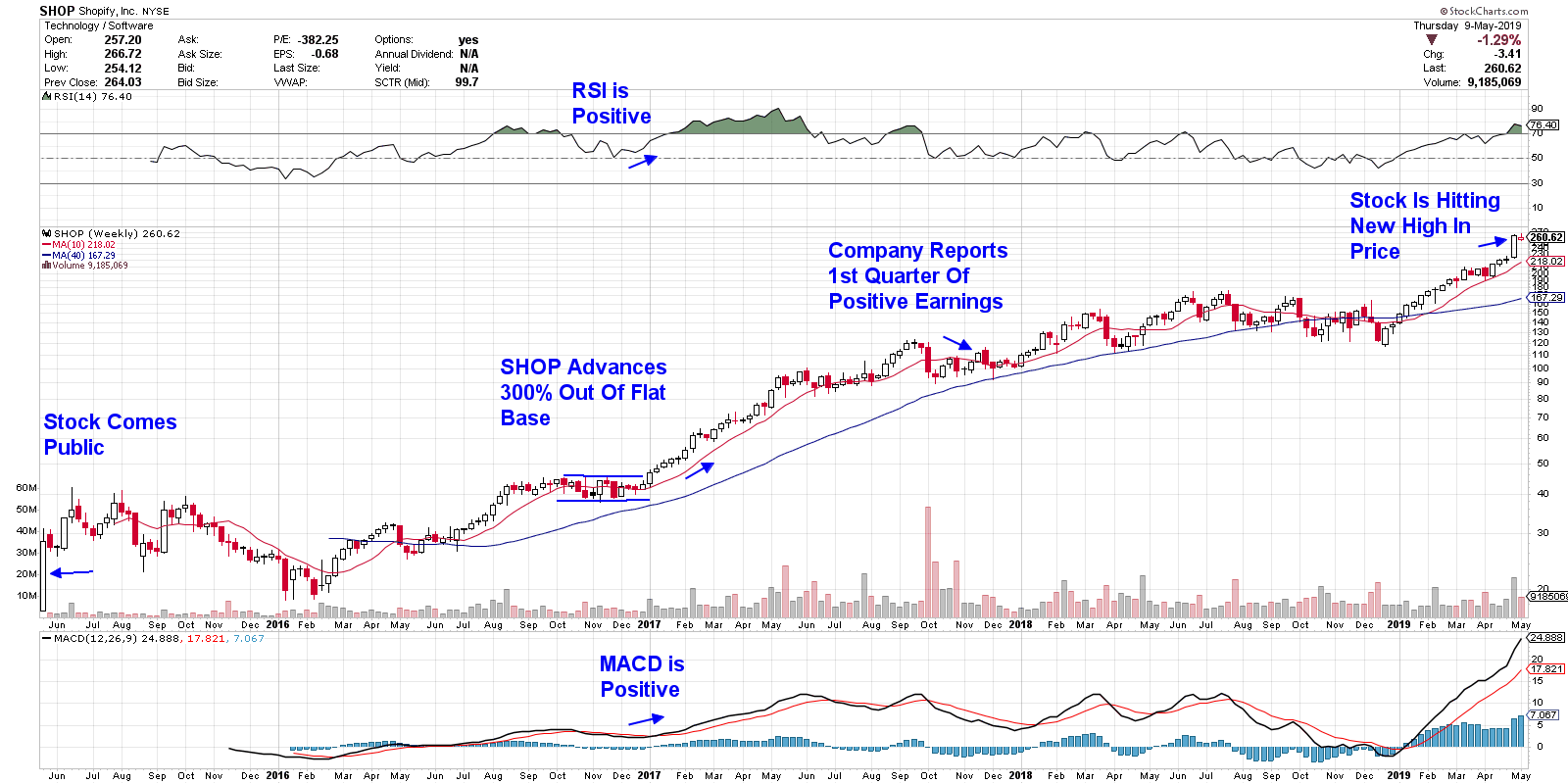
Other IPOs will have meteoric rises despite a lack of earnings. This is because investors are looking at other metrics to gauge growth. Shopify (SHOP) is a good example of this; shares of this stock appreciated over 500% before the company reported a positive quarter (see below). Investors instead paid attention to other metrics, such as revenues and gross profits. Exceedingly strong customer base growth was also viewed as a positive.

In yet other cases, new issues will skyrocket with no sign of earnings or sales, such as some of the winning Medical Products companies that came public this year. (Think SWAV or SOLY.) These companies are pouring capital into research and development and are oftentimes years away from producing a device. Investors are instead sold on the possibilities and excitedly buy up shares.
While it may be difficult to determine what benchmarks investors will find compelling enough to drive an IPO up, there is one sound way to get you in front of winning new issues and, just as importantly, get you out of the duds: knowing how to interpret the chart of the company’s stock.
Chart interpretation will always be the best guide for formulating your entry and exit points. Looking for sound breakouts on volume is one great tool. The volume in these breakouts tells you that institutions are bidding up shares; this support is usually a good sign.
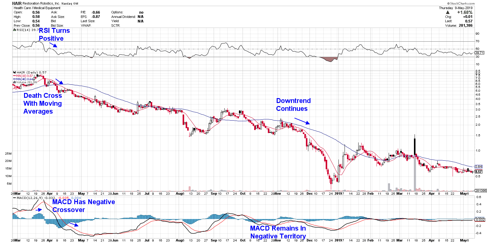
Other key indicators include the RSI and MACD, as shown above. Lastly, pay attention to the price of stocks vs their moving averages. In addition to wanting those MAVs in an uptrend, you want the current price above them for the least possibility of upside resistance.
Using these same indicators to spot signs of a breakdown is going to be equally important, as some of these IPOs can drop dramatically. Take a look at Restoration Robotics (HAIR), which is now down 95% from its peak in price 18 months ago.

Once-hot Cannabis stocks are also seeing sharp declines from their peaks in price. Many of these companies are years away from reporting the types of numbers that would justify their valuations.
As you can see, putting your own technical analysis skills to work will be the best way for not only identifying potential big winners, but also getting you out of the way of the losers.
Mary Ellen McGonagle
President, MEM Investment Research
www.MEMinvestmentResearch.com
|
| READ ONLINE → |
|
|
|
|
|
| RRG Charts |
| Building A Case For SYY In The Staples Sector Using Three Relative Rotation Graphs |
| by Julius de Kempenaer |

Relative Rotation Graphs can be a great asset in getting a high-level overview of what is going on in the markets and keeping an eye on the big picture. Beyond that, though, they can also help you to drill down to find new individual investment possibilities and trading ideas.
For this week's ChartWatchers newsletter, I will use three Relative Rotation Graphs to make a case for a single stock trade idea.
Starting At The Top

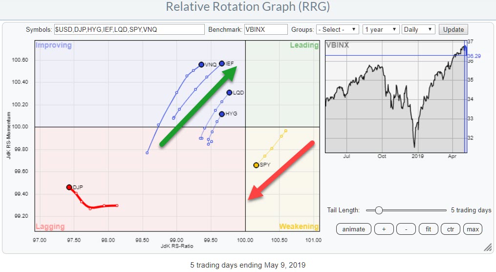
The daily RRG for Asset Classes above shows the rotation of various asset classes against the Vanguard Balanced Index, which replicates a balanced portfolio holding 60% in stocks and 40% in bonds. Over the past few weeks, the rotation has started to shift in favor of fixed income asset classes and real estate. Commodities is still very detached from the other components on the RRG, but Stocks (SPY) has started to move inside the weakening quadrant and is now headed for lagging. This indicates that a more risk-OFF-based approach by market participants is taking shape.
Then Sectors

This risk-off mood is being translated into a sector rotation, which favors the more defensive parts of the market.
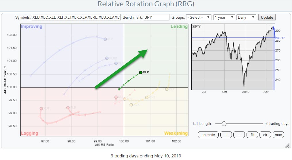
The daily RRG above shows the recent move of the Consumer Staples Sector into the leading quadrant. A salient detail is that XLP is now the only sector inside the leading quadrant.
Other defensive sectors like Health Care, Utilities, and Real-Estate are in the improving quadrant and moving towards leading. Utilities and Real-Estate are at a strong RRG-Heading, while Health Care has already started to roll over, making that move a bit questionable for now.
And Finally, Stocks

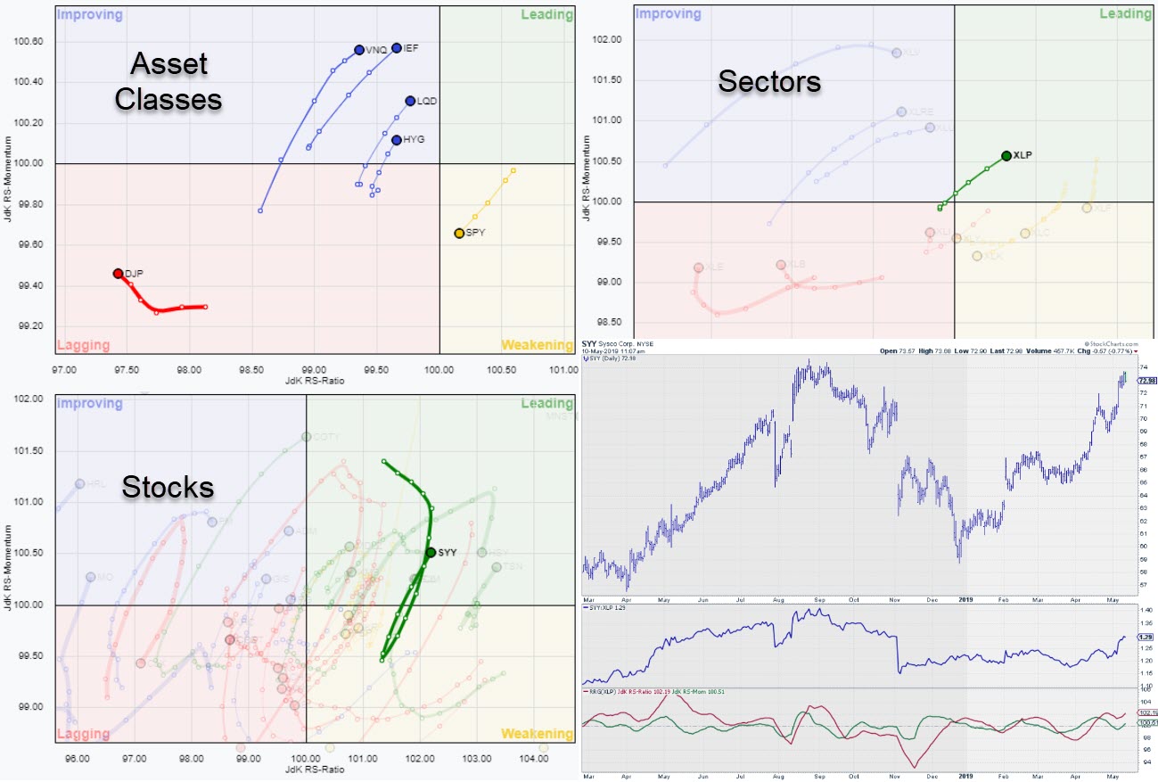
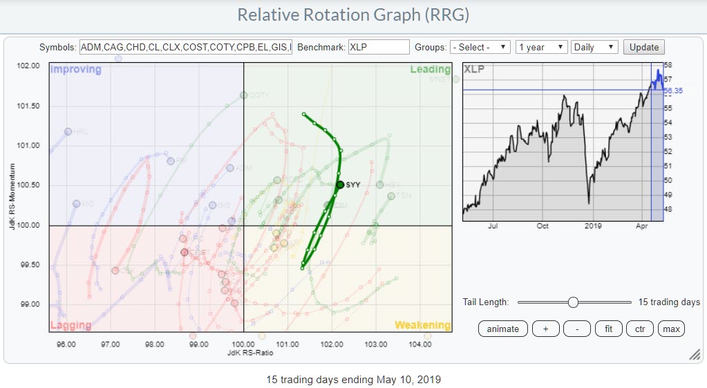
From the sector RRG, let's drill down into the individual stocks that make up the Consumer Staples (XLP) sector. The stock, or rather one of the stocks, that sparked my interest is SYY.
Sysco Corp. moved from lagging into improving at the beginning of April and pushed into leading halfway through the month. From late April into the first week of May, SYY rolled over and rotated through the weakening quadrant, but ultimately managed to rotate back into the leading quadrant this week and now seems set for another rotation through the leading quadrant. This makes it one of the leading stocks within the Staples sector.
Sysco Corp. - SYY

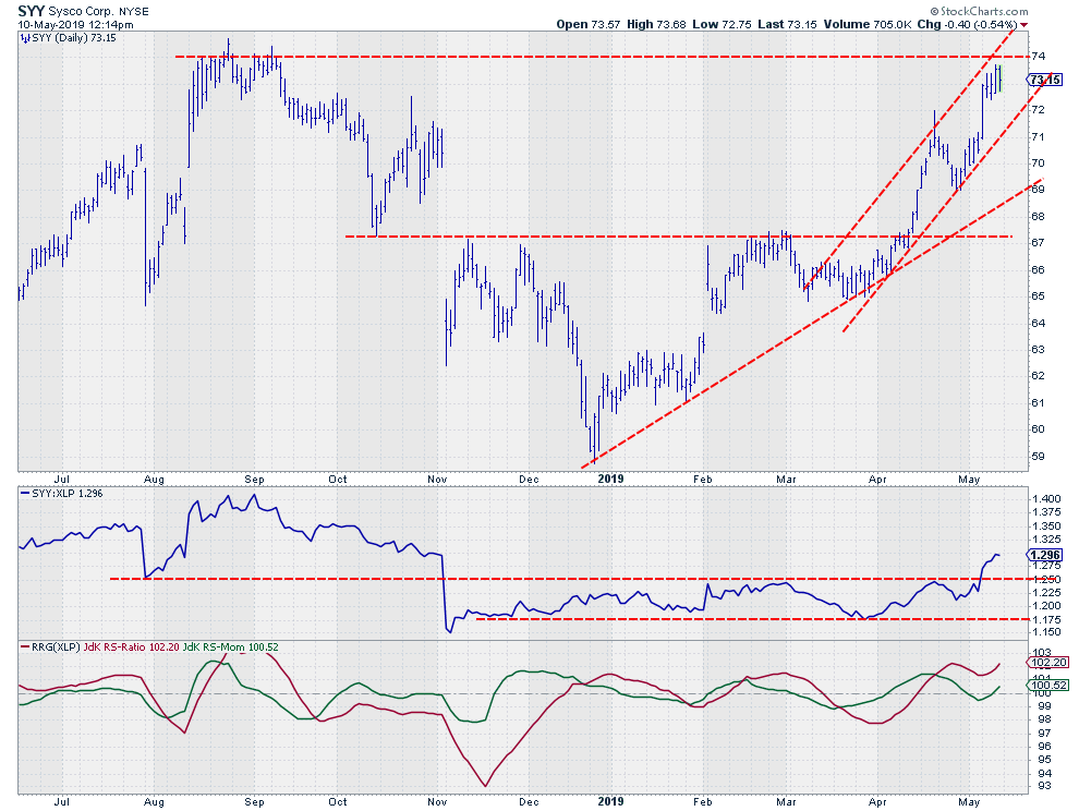
A study of the price chart in combination with relative strength shows that SYY broke beyond an important horizontal resistance level near $67 mid-April, which sparked an acceleration of the rally.
Following that break, a nice series of higher highs and higher lows has been established and the stock is still trading inside that channel. At the moment, overhead resistance is looming around $74. A break beyond that level will very likely ignite even more upside movement.
The good news is that there is enough room within the rising channel for SYY to take a break if that barrier cannot be taken out immediately.
Perhaps the strongest signs are coming from a relative strength perspective.
The raw RS-Line recently broke out of a long sideways range and started to rally. The RRG-Lines already pushed above 100 in the middle of April, putting SYY inside the leading quadrant on the RRG. The small dip of the JdK RS-Momentum line below 100 caused the rotation through weakening, but, with both lines now back above 100 and the tail on the RRG moving at a heading between 0-90 degrees, things currently look good for SYY.
Even if resistance near $74 cannot be taken out right away because of general market weakness, we are still looking at a risk-off market. SYY is expected to stay ahead of the XLP sector performance, while that sector is expected to stay ahead of the S&P 500 index for the time being.
My regular blog is the RRG Charts blog. If you would like to receive a notification when a new article is published, simply Subscribe using your email address.
Julius de Kempenaer
Senior Technical Analyst, StockCharts.com
Creator, Relative Rotation Graphs
Founder, RRG Research
Want to stay up to date with the latest market insights from Julius?
– Follow @RRGResearch on Twitter
– Like RRG Research on Facebook
– Follow RRG Research on LinkedIn
– Subscribe to the RRG Charts blog on StockCharts
Feedback, comments or questions are welcome at Juliusdk@stockcharts.com. I cannot promise to respond to each and every message, but I will certainly read them and, where reasonably possible, use the feedback and comments or answer questions.
To discuss RRG with me on S.C.A.N., tag me using the handle Julius_RRG.
RRG, Relative Rotation Graphs, JdK RS-Ratio, and JdK RS-Momentum are registered trademarks of RRG Research.
|
| READ ONLINE → |
|
|
|
| MORE ARTICLES → |
|
