| THIS WEEK'S ARTICLES |
| Market Roundup |
| Current Trend of Declining Rates Seen as Part of a Large Base |
| by Martin Pring |
Editor's Note: This article was originally published in Martin Pring's Market Roundup on Friday, May 24th at 4:42pm ET.
This week has seen many interest rate series, both in the US and around the world, breaking down from important trading ranges or reaffirming previous breaks. It seems that the bond market is responding to the recent trend of lower commodity prices. In retrospect, that rangebound action, along with any further drop in yields in the period ahead, is likely to turn out to be part of a larger trading range, the upside resolution of which will ultimately signal the next secular uptrend. In short, I am expecting any downside action to be of limited scope and not to register new secular lows.
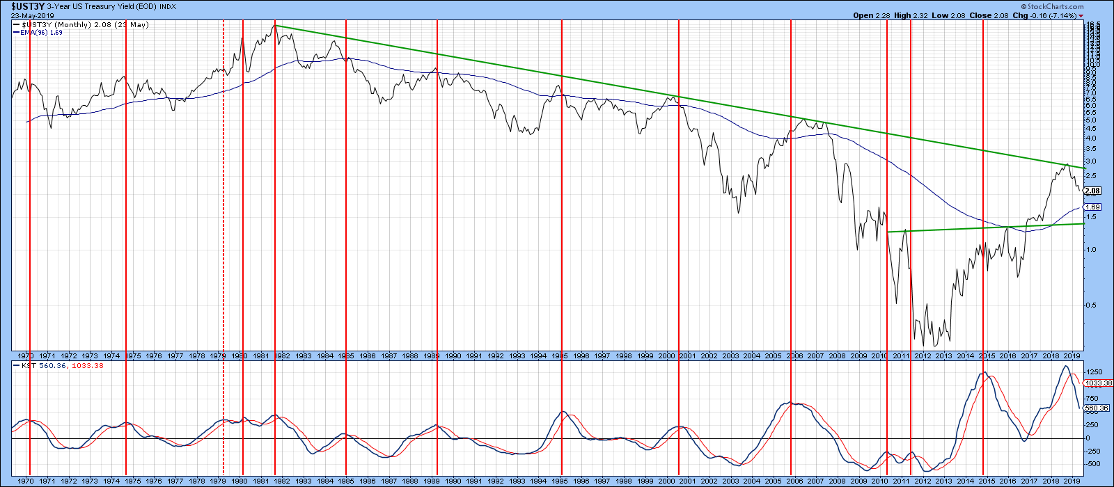
This possibility is captured by the 3-year yield, featured in Chart 1 below. Here, we can see the secular downtrend that took place between 1981 and 2012. Note that, last year, the yield once again found resistance at its secular downtrend line. Downside reversals in the KST have historically been followed by a primary trend decline; last year’s signal was no exception. In the case of the 3-year maturity, it looks as though the yield completed and broke out from a base pattern in late 2016. That means that any decline in its yield from here on out is likely to represent a retracement to the top of the 2010-2017 pattern.

Chart 1
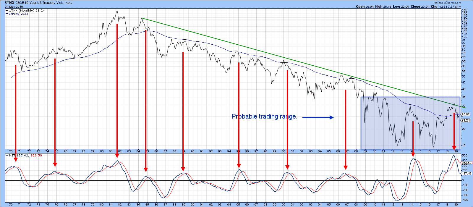
Chart 2 moves further down the yield curve to more realistically feature an unresolved trading range, which has been highlighted in blue. Note that the KST is still declining and still at a moderately overbought reading. As this momentum indicator works its way lower, I am expecting rates to do the same. When an upside KST reversal does materialize, it is likely to signal another assault on the secular downtrend line for both this and the 3-year maturity in Chart 1.

Chart 2
Good luck and good charting,
Martin J. Pring
The views expressed in this article are those of the author and do not necessarily reflect the position or opinion of Pring Turner Capital Group of Walnut Creek or its affiliates.
|
| READ ONLINE → |
|
|
|
| SPECIAL EVENT ANNOUNCEMENT |
| For those of you in or near the Pacific Northwest – or anyone up for a trip to Seattle – we have an important announcement for you. The MoneyShow will be returning to Seattle next month, June 15th and 16th. In addition to a long list of incredible presenters, our own Gatis Roze will be a featured speaker at the event. Many of the StockCharts team members will be there as well, and we encourage you to join us. With so many experts sharing their investing wisdom and unique energy that accompanies this exciting event, we know it will be a can't-miss for 2019. Click the banner below to learn more and pre-register for next month's MoneyShow here in Seattle! |
 |
| LEARN MORE → |
|
| The Mindful Investor |
| Five Trendlines Revisited |
| by David Keller |
About a month ago, I wrote an article for ChartWatchers titled “Five Trendlines You Should Be Watching.” The general idea was that, as long as those five trend lines held, then the market was still most likely in a very constructive phase.
Revisiting those trend lines here will show that the picture has changed dramatically in just four weeks, presenting a more bearish outlook for the equity markets.
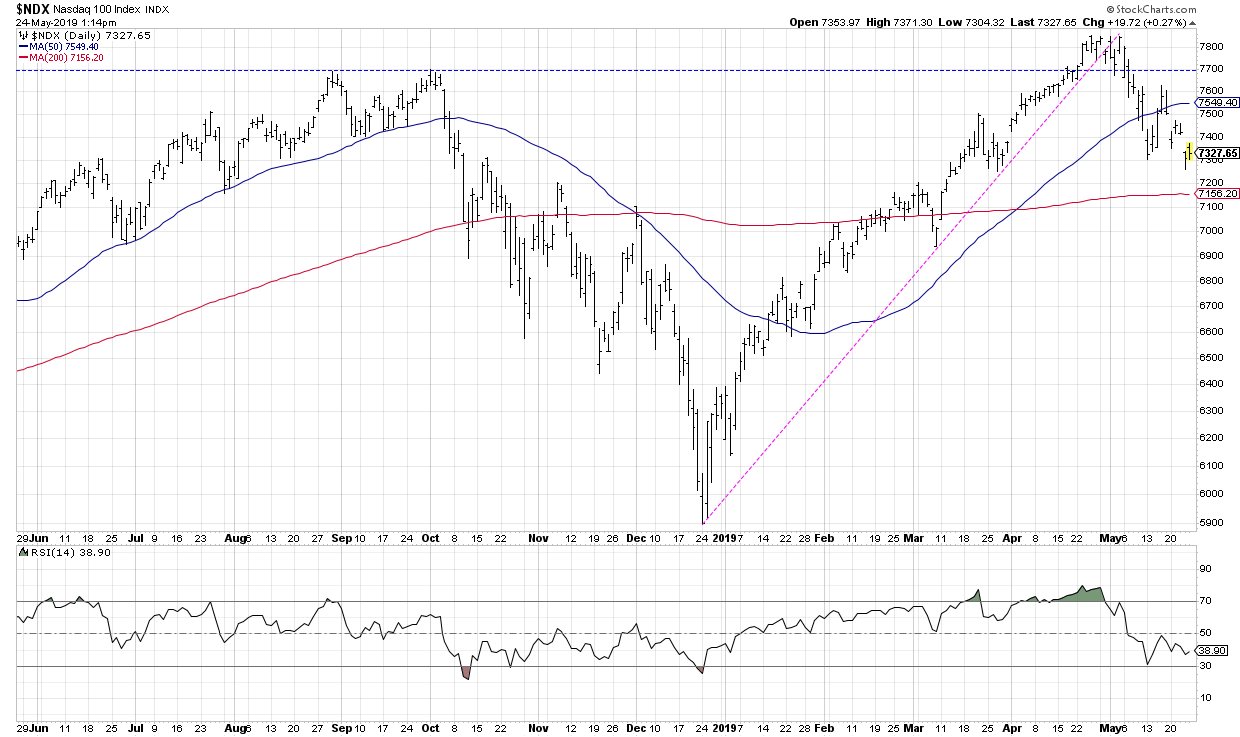
1) Nasdaq 100 Index

This was a key chart for me, as it represented the mega cap technology leadership that drove the market higher in the first four months of 2019. This trend line break was the most important in terms of acknowledging a potential sea change within equities.
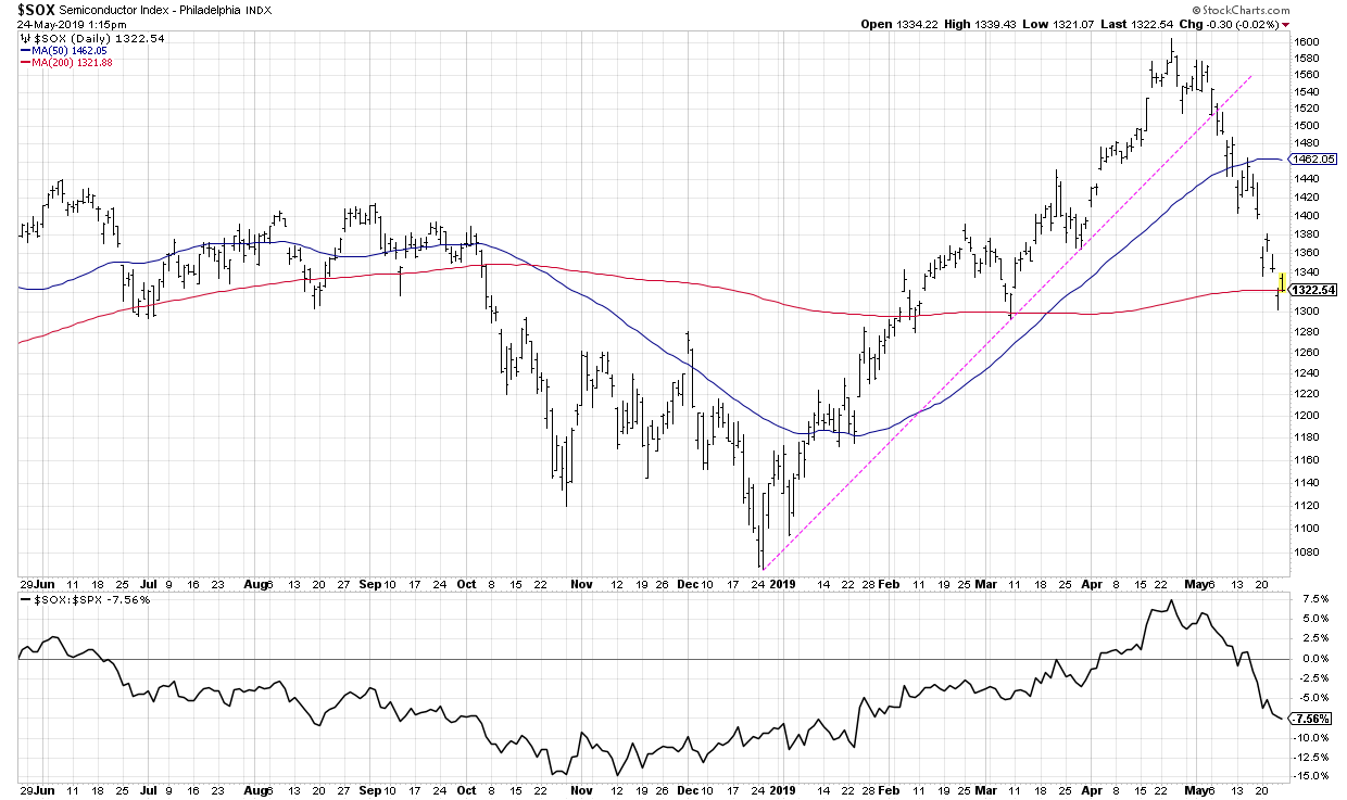
2) Semiconductors

The market has rarely gone meaningfully higher without semiconductors participating in the upswings. The SOX has broken trend line support and is now testing the 200-day moving average around 1320. A confirmed break below 1300 would suggest further lows and underperformance.
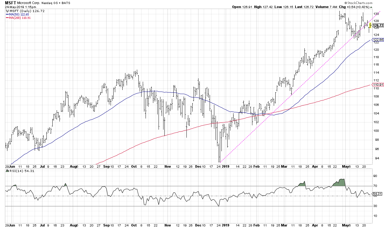
3) Microsoft

Microsoft is perhaps the least painful of the bunch, as it has broken the trend line a number of times but hasn’t really confirmed the break yet.
To confirm a trend line break, I usually look for a close through the trend line, followed by confirmation when the price moves even further in the direction of the breakout. This suggests that any resistance to the move has been overwhelmed and the price is likely to continue in the direction of the breakout.
It’s also worth noting that Microsoft remains the largest company in the world by market cap. The fact that MSFT has not confirmed a downside breakout is one of the reasons why charts like the SPX don’t look nearly as bad as they could.
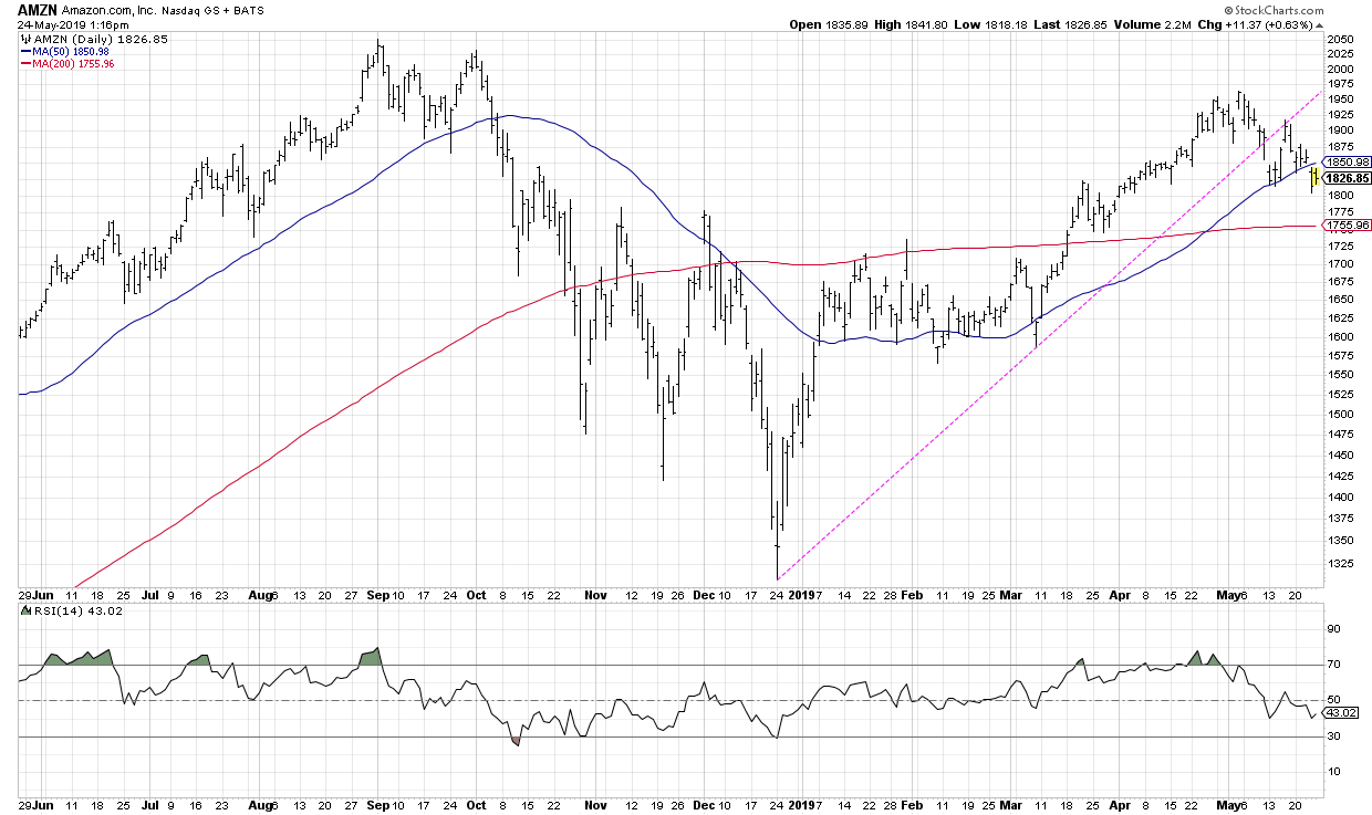
4) Amazon

Amazon has now confirmed a downside break of trend line support and is in the process of violating the 50-day moving average as well. The 200-day moving average looms large at around 1750.
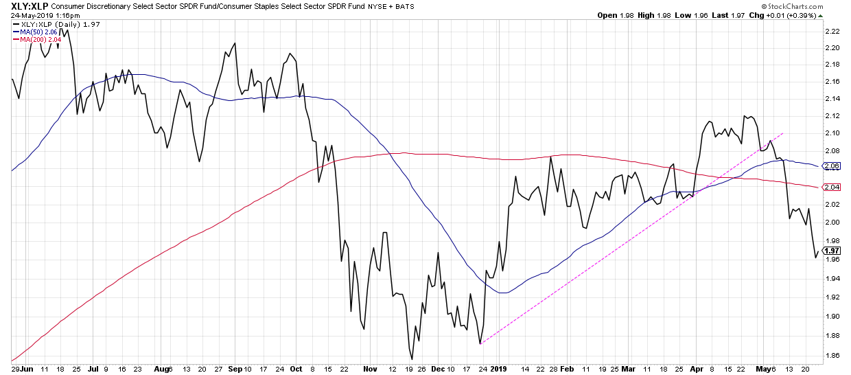
5) Offense vs. Defense

I love to use this ratio as a barometer of risk on vs. risk off within the consumer space. The ratio has confirmed a breakdown of the trend line and is now in an established downtrend. This suggests a rotation more toward the defensive side of the consumer sectors.
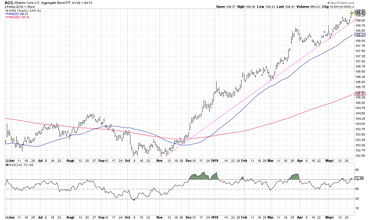
It’s worth noting that I actually included a sixth trend line in the original article, using a chart of bond prices in the form of the AGG ETF.

I added this chart to the article in a later version because, although it represented a very different market than the other five charts, it was still a chart in a consistent uptrend that deserved attention.
Not surprisingly, this is the one trend line that has actually remained unbroken during the recent market turmoil. Bonds remain in a cyclical bull market and continue to run higher unabated. Charts like AGG have become overbought numerous times over the last six months, but, in each instance, the chart has continued higher.
At some point, that pattern of higher highs and higher lows will break. A violation of trend line support is what may finally signify that the cyclical bull market in bonds is over. Until then, the trend is up!
RR#6,
Dave
David Keller, CMT
President, Sierra Alpha Research LLC
Disclaimer: This blog is for educational purposes only and should not be construed as financial advice. The ideas and strategies should never be used without first assessing your own personal and financial situation or without consulting a financial professional.
The author does not have a position in mentioned securities at the time of publication. Any opinions expressed herein are solely those of the author and do not in any way represent the views or opinions of any other person or entity.
|
| READ ONLINE → |
|
|
|
| Trading Places |
| Calling Market Tops Is Easier Than You Think |
| by Tom Bowley |
There are no perfect signals that scream "GET OUT" of equities, but there are warning signs.....so long as you know where to find them. Most market participants believe in the random walk theory, which suggests that changes in stock prices have the same distribution and are independent of each other. Therefore, the assumption is that past stock market movements or trends cannot be used to predict its future movement.
I beg to differ.
Sentiment swings back and forth. I think if we're all honest with ourselves, we know that we generally grow overly bullish and overly bearish the stock market at just the wrong times. It's human nature. Don't beat yourself up, it happens to us all. But what if there was a mechanism to signal when sentiment was heading too far in one direction or the other?
There is and it's called the Volatility Index ($VIX). Here's the CBOE's explanation of the VIX and how it's calculated:
"The VIX Index is a financial benchmark designed to be an up-to-the-minute market estimate of expected volatility of the S&P 500 index, and is calculated by using the midpoint of real-time S&P 500 index option bid/ask quotes. More specifically, the VIX Index is intended to provide an instantaneous measure of how much the market thinks the S&P 500 Index will fluctuate in the 30 days from the time of each tick of the VIX Index."
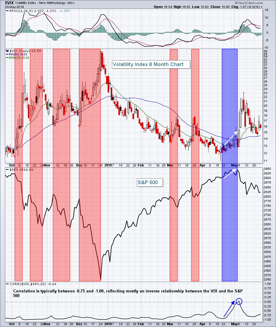
On the charts, the VIX rises as the S&P 500 declines. That's the normal relationship and it's illustrated here:

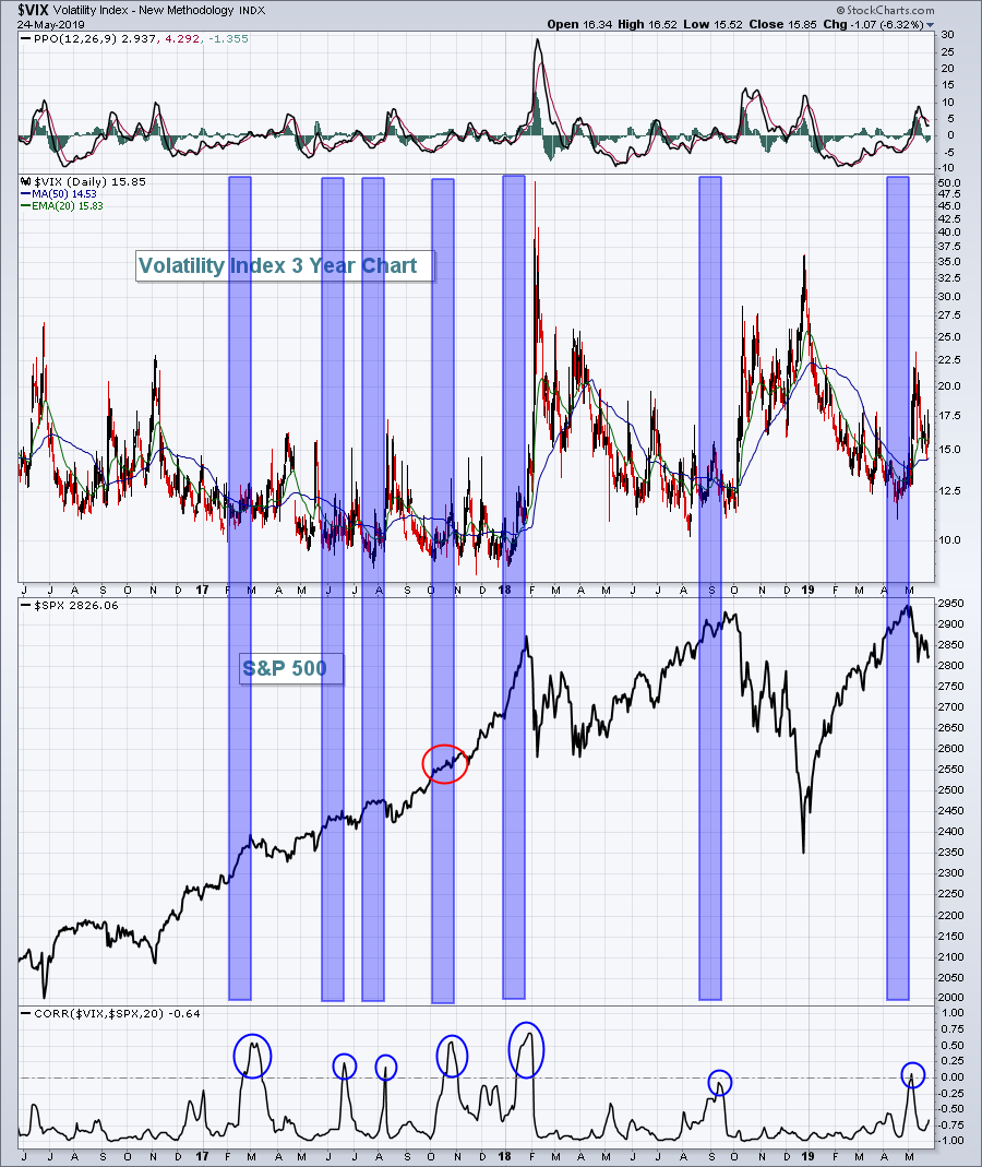
The red-shaded areas highlight the fact that the VIX rises significantly when the S&P 500 declines. When the S&P 500 rises, volatility diminishes. Hence, the correlation readings that are at or near -1.00 throughout much of the period above. The part that was interesting, however, was the blue-shaded area. At the last high on the S&P 500 in early May, the VIX was already on the rise! Correlation was already turning positive. Should we consider this as a potential warning sign of a top? Let's go back in time and see how often this signal is triggered and what the after-effect was:

What do you think? I think this signal is a keeper! When the stock market is rising and the VIX is rising simultaneously, it's telling us the market is getting nervous. And when the market is nervous, we should be nervous! Of those seven signals, six gave us very solid warnings that we were going to see a drop. Keep in mind, these signals don't suggest we're entering a bear market. They simply tell us that the market is getting nervous and that we should consider moving some or all of our portfolio to cash or perhaps move to defensive sectors from aggressive sectors.
I've discussed market bottoms on many occasions and I'm planning to do so again on Tuesday at 4:30pm EST in a FREE joint webinar with John Hopkins, President of EarningsBeats.com. Spotting market bottoms is based on two different sentiment indicators that are remarkably accurate. Join us on Tuesday and I'll show you how I do it. CLICK HERE to register.
Happy trading!
Tom
|
| READ ONLINE → |
|
|
|
|
|
| The Traders Journal |
| Celebrating An Investor's Obituary |
| by Gatis Roze |

I've begun writing my own obituary. No worries. I don’t have any incurable health issues to be concerned about. It's simply an exercise that I believe will have value and will be beneficial to my investment efforts. The catalyst for this rather unusual undertaking was James Hagerty's piece in the Wall Street Journal on April 22, 2019. Hagerty's professional job is to write obituaries about others for the newspaper, and on a lark he decided to write his own.
As I read his article, I began to ask myself the question, "what has motivated me to live the life I am living?" Hagerty writes that the obituaries he writes always attempt to answer three basic questions. What was that person trying to do? Why? And how did it work out?
I think asking these same questions while wearing your investor hat can produce a number of profound insights. We investors all have different motivations because we're all different unique souls. But I've always maintained that if money is your primary motivational driver, your investing efforts will underperform your potential.
In resolving to compose my own obituary I've pledged to set aside fifteen minutes a week to delve into myself and revisit my thinking. Yes, I'm exploring my own motivations, but I guess I'm writing my own story as well and not leaving it entirely to my family to figure out when I'm gone. I've made choices. I continue to make choices and I am trying to catalogue precisely those choices to better understand my motivations both in life and investing.
This is not too dissimilar to prize fighters. They are judged by the fights they select almost as much as by those they choose to avoid. We investors must choose wisely in making investments, but we should understand the reasons for doing so — why we chose what we did. An unwillingness to do so would be like living in a house without windows.
Not to sound morbid, but I invite you to join me in writing your own investing obituary as you consider the choices you've made and the choices still to make. Sure, you can include some personal tributes, but don't make it all about your victories, triumphs and conquests. Make it something that reveals your motivations. Be humble and include your bungles, botches and blunders as well. Be brave. Step forward and look in those tough places — your life will get bigger.
Living and investing with purpose yields the fruits of labor to be proud of. Think of your written obituary as a sort of life recipe. What you do here and now will determine what you leave behind and how you are remembered. It's not good when life ends, but here you get to write the ending!
Seattle-area investors!
Come join me at next month's MoneyShow here in downtown Seattle, where I'll be speaking.

Trade well; trade with discipline!
- Gatis Roze, MBA, CMT
StockMarketMastery.com
|
| READ ONLINE → |
|
|
|
| DecisionPoint |
| My New Favorite Scan - Excellent Results Using SCTR and Rising PMO |
| by Erin Swenlin |
If you watch MarketWatchers LIVE regularly, you've probably heard about my new scan. I've found, especially when the market has a bearish bias, that my original Price Momentum Oscillator (PMO) scan wasn't producing any results. I consider this a caution flag before I get too involved with the results of my new scan.
The original scan is below. Its requirements are quite high, so I won't get results in a bearish market; not only do I need a PMO on a rising trend, but the EMAs need to be configured bullishly. After the market takes a serious hit, there aren't that many stocks that will work with the scan. It is great for intermediate-term trades, though, as resulting stocks are on already on the right track.
// Narrows down the universe to stocks with decent volume and from the US
[type = stock] AND [Daily SMA(20,Daily Volume) > 100000]
AND [country is US]
// Keeps the penny stocks and high volatility stocks out of your results
AND [Close > 10]
// This identifies a PMO that hasn't yet had a positive crossover its signal line
AND[today's PMO Line(35,20,10) < today's PMO Signal(35,20,10)]
// This identifies a PMO rising for three days
AND [today's PMO Line(35,20,10) > yesterday's PMO Line(35,20,10)]
AND [yesterday's PMO Line(35,20,10) > 2 days ago PMO Line(35,20,10)]
AND [2 days ago PMO Line(35,20,10) > 3 days ago PMO Line(35,20,10)]
//This ensures we get a positive IT and LT Trend Model configuration
AND [today's ema(20,close) > today's ema(50,close)]
AND [today's ema(50,close) > today's ema(200,close)]
//This identifies stocks with SCTRs greater than 75 or in the "hot zone"
AND [SCTR > 75]
MarketWatchers LIVE is centered mainly on the short term. I need a scan that would give me good results for short-term investments; I think this scan serves that purpose pretty well.
[type = stock] AND [Daily SMA(20,Daily Volume) > 100000]
AND [country is US]
// Keeps the penny stocks and high volatility stocks out of your results
AND [Close > 10]
AND [today's PMO Line(35,20,10) > yesterday's PMO Line(35,20,10)]
AND [yesterday's PMO Line(35,20,10) > 2 days ago PMO Line(35,20,10)]
AND [2 days ago PMO Line(35,20,10) > 3 days ago PMO Line(35,20,10)]
AND [today's ema(20,close) > today's ema(50,close)]
AND [today's ema(50,close) > today's ema(200,close)]
AND [SCTR < 80]
AND [SCTR > 70]
The scan above doesn't require the PMO to be beneath its signal line. Additionally, it allows the SCTR to be potentially as low as 70, rather than 75. I really have been surprised by the results that return with just that little amount of tweaking. If this still isn't opening you up to enough results, I recommend that you go ahead and "comment out" some of the criteria. For example, I will sometimes let the PMO rise for 2 days (or even just for the day). Unfortunately, the hard work comes afterwards when it's time to analyze the results.
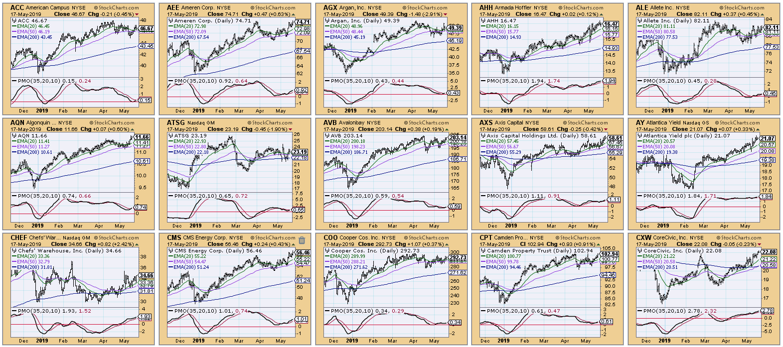
Here is part of a CandleGlance containing some of today's results.

To start with, I look for breakouts from resistance or declining trends accompanied by a good-looking PMO (one that is moving upward, not sideways or twitching). I then follow that with looking at any chart patterns that reveal themselves.
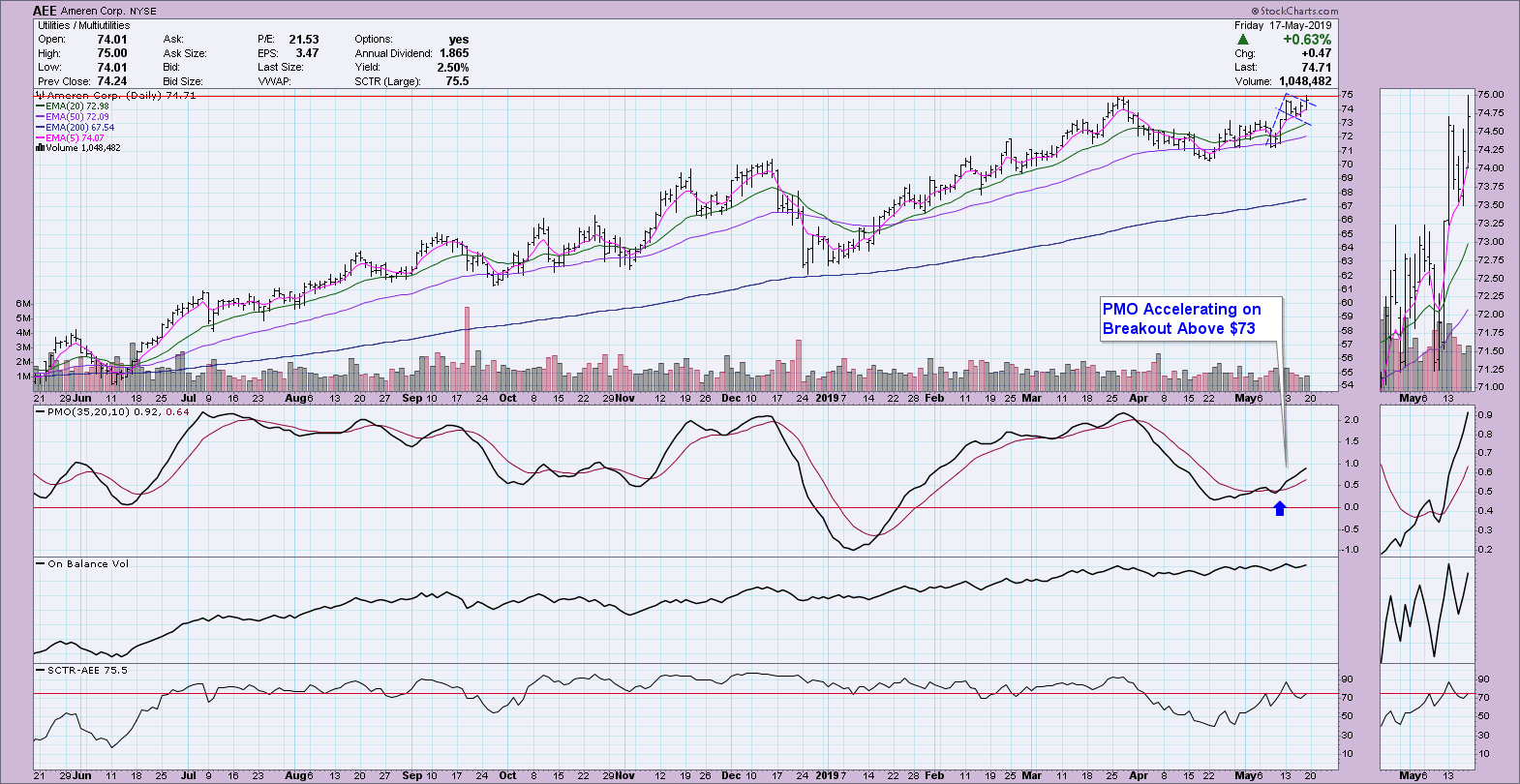
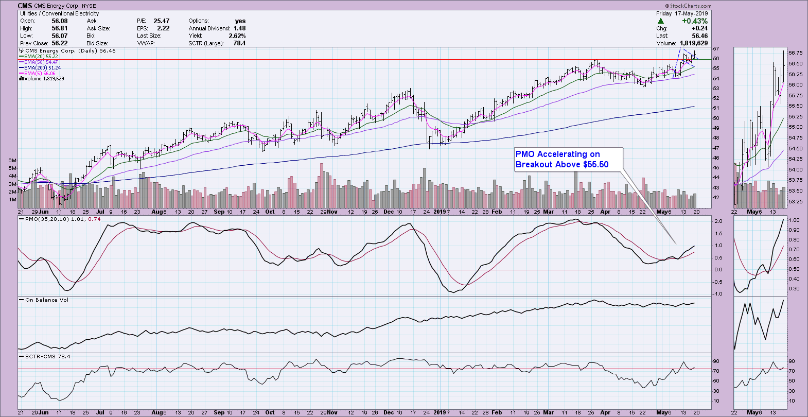
Looking at the results above, my interest lies with AEE and CMS (a breakout from a possible flag and challenging highs). It's just a small thumbnail, though, so I have to look at the charts. I've annotated both below. Of the two, CMS is more promising, despite a very similar price chart. My reasoning is that CMS has already broken above its March top while AEE hasn't.

Hopefully you found this exercise helpful. I hope you find my new scan to your liking. Enjoy!
Watch the latest episode of DecisionPoint with Carl & Erin Swenlin LIVE on Fridays 4:30p EST or on the StockCharts TV YouTube channel here!
Technical Analysis is a windsock, not a crystal ball.
Happy Charting!
- Erin
erinh@stockcharts.com
Helpful DecisionPoint Links:
Erin's PMO Scan
DecisionPoint Chart Gallery
Trend Models
Price Momentum Oscillator (PMO)
On Balance Volume
Swenlin Trading Oscillators (STO-B and STO-V)
ITBM and ITVM
SCTR Ranking
**Don't miss DecisionPoint Commentary! Add your email below to be notified of new updates"**
|
| READ ONLINE → |
|
|
|
| The MEM Edge |
| The Relative Safety Of High-Yielding Stocks - 4 Names To Ponder As Interest Rates Plummet and Markets Waffle |
| by Mary Ellen McGonagle |
We’re in a difficult period with the markets at the moment, as uncertainty surrounding U.S.- China trade talks is weighing heavily on stocks. With both sides throwing barbs and a resumption of talks not due until later this month, the pressure on the markets may very likely continue.
With daily reactions to the latest trade-related headlines, there’s been an increased risk in equities, which, in turn, is pushing Interest rates down as investors seek the relative safety of U.S. Treasuries. In fact, yields are now down to levels not seen in over a year.
Income investors, as well as those looking to buffer their portfolios from any sharp gyrations in the U.S. Equity markets, may want to consider these four technically sound stocks, which can act to buffer you against continued volatility while providing growth prospects that should keep them attractive in the long run.
The first stock is in the Utility sector, which is hitting a new high in price. In addition to offering an attractive yield, Utility stocks don’t have exposure to China, which is another reason we’re seeing money flows into these defensive stocks.
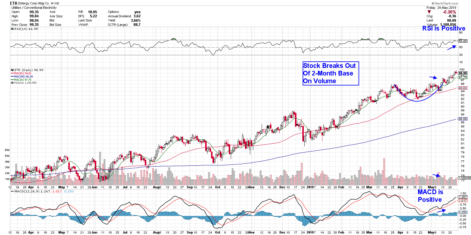
Entergy (ETR) is a utility that delivers electricity to almost 3 million customers in the Louisiana/Texas area. The company made a strategic shift 5 years ago to enter the more regulated area of its industry; that move is now paying off with a bounce back to profitability in 2017, which has continued to expand since then. Given its growth prospects, this 3.7% yielder was touted as one of the few relative bargains among Electric Utilities by a major forecaster at this month’s Money Show.
As you can see in the chart below, the stock is in a confirmed uptrend, finding support at its upward-trending 10-day simple moving average following a breakout on a 2-month base. A quick look at the money flow characteristics tells us that this stock is poised for further outperformance.
DAILY CHART OF ENTERGY CORP. (ETR)

Our next stock is in the Consumer Staples. In addition to being in a defensive sector, this high yielder bought out a company that’s in an explosive growth area of the food industry, which should continue to help them grow.
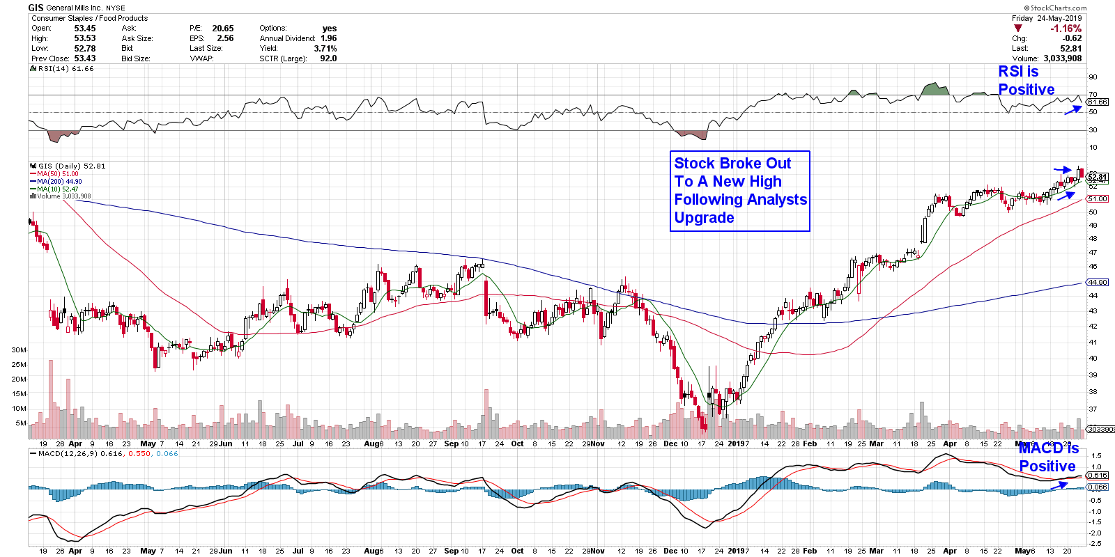
That stock is General Mills (GIS). Although most investors may think that this 100-year old company is washed up, you may want to look closer. The company has been selling off some of their older, non-performing brands while simultaneously acquiring companies with new brands that appeal to evolving consumer tastes. One such company is Blue Buffalo, which produces and distributes premium food for dogs. The pet product industry is a $30 billion per year space and GIS is expected to participate heavily.
As you can see in the chart below, the stock hit a new high in price this week following positive remarks from a Wall Street analyst. This bullish move followed last week’s break out of a 1-month base. In addition, this 3.8% yielder remains in an uptrend as the stock continues to find support at its upward-trending 10-day moving average.
DAILY CHART OF GENERAL MILLS INC. (GIS)

Next, we’ll turn our focus on a Real Estate related play, which is benefitting from an expanding economy as well as lower interest rates. The company we’re highlighting is one of the few truly diversified REIT (Real Estate Investment Trust) stocks, with properties spread across office, retail and industrial segments, as well as overseas properties.
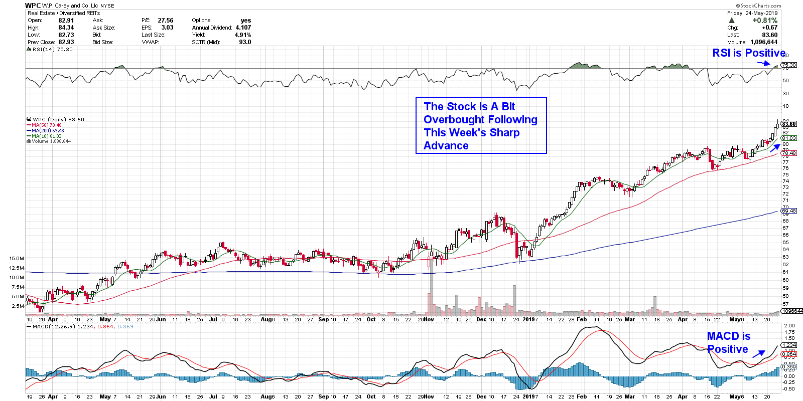
The company is W.P. Carey (WPC) and this fast grower has managed to increase their annual dividend every year for 22 years running. Additionally, the company’s 5.2% yield is higher than most of its peers.
Currently, the stock is a bit extended following last week’s explosive move to a new high in price. As you can see on the chart below, a pullback to the 10- or 50-day moving average has historically presented itself as an ideal buying opportunity.
DAILY CHART OF WP CAREY INC. (WPC)

Lastly, I’ve highlighted an asset management firm that is reversing their recent downtrend with positive performance results, coupled with recent announcements that has analysts raising their guidance.
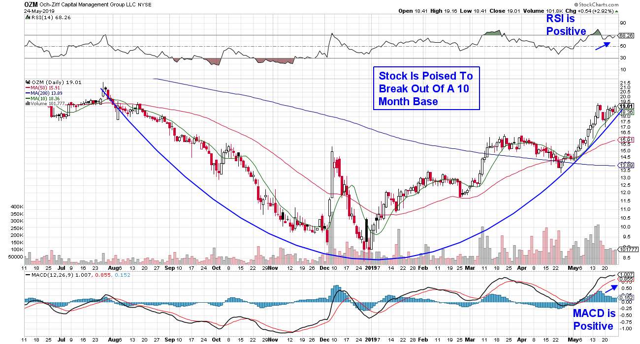
Ozh-Ziff Capital Management (OZM) is one of the largest alternative asset managers in the world, with over $32 Billion under management. Their main fund is consistently cited for outperformance relative to its peers, as it seeks investment opportunities in all asset classes and throughout the world. Of note is the company's late-December release of strategic policies that will restructure the company to create more visibility for shareholders.
The stock is currently in the throes of reversing a 5-year downtrend, as their new initiatives as well as favorable global market conditions begin to positively impact the company.
The daily chart below shows that the stock is in a clear uptrend as it continues to find support at its upward-trending 10-day simple moving average. In addition, both the RSI and MACD are positive. While the stock currently looks attractive, it’s important to note that it’s had an explosive run-up in May and, with a 29% gain for the month, we'd wait for a pullback before entering the stock. I would suggest buying on a pullback, as this 7.9% yielder appears poised for further outperformance.
DAILY CHART OF OCH-ZIFF CAPITAL MANAGEMENT (OZM)

While my first three picks highlighted stocks that are in defensive areas of the market, which may outperform more during uncertain periods of the market, each of these companies has a growth prospect that should keep them attractive even after the market pressures lift.
Subscribers to my bi-weekly MEM Edge Report were alerted to these stocks a while ago. If you'd like a trial of this report, email me using the link below.
Warmly,
Mary Ellen McGonagle
MEM Investment Research
|
| READ ONLINE → |
|
|
|
| RRG Charts |
| Communication Services Shows a Strong Rotation, But GOOG Is Not Participating |
| by Julius de Kempenaer |

Relative Rotation Graphs can help to identify threats and opportunities within groups of securities. In this article, I will be looking at the position and rotation of the Communication Services Sector against the S&P 500 and other sectors, followed by a closer look at the rotation of various stocks inside that sector, especially Google.
From a Sector Perspective

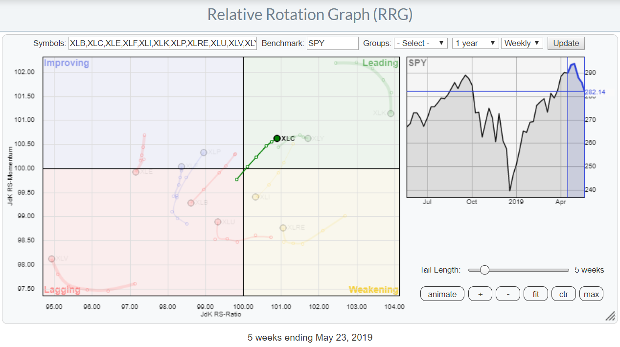
The RRG above shows the rotations for the 11 sectors in the S&P 500 index with Communication Services (XLC) highlighted.
The rotation into the leading quadrant at a strong RRG-Heading (0-90 degrees) indicates that this sector is in a relative uptrend against $SPX. Assuming a normal clockwise rotation, a continuation of that trend may be expected in the weeks to come.

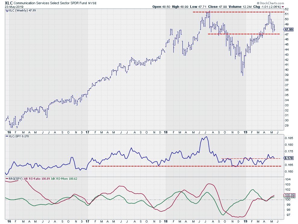
In line with the market, the Communication Services Sector failed to break above its prior high, which was set almost a year ago near $51. From a price perspective, that means that upside potential is capped around $51 for the time being.
On the downside, I am watching support in the area around $47, as supply and demand shifted around this level a few times in the last 12 months. With the sector ETF (XLC) trading around $48, that is a very limited downside risk for the time being.
A more positive message is coming from the relative strength line and the RRG-Lines comparing XLC with SPY.
After a strong decline in relative strength from July 2018 into November of that year, the RS-Line started to move in a range. The resulting RRG lines, especially the Jdk RS-Ratio, landed near the 100-level and remained close to these levels for a few months, meaning that this sector was moving in line with the S&P 500.
That situation recently came to an end when the RS-Line broke above its previous highs. It currently seems to be completing a bottoming process. The RRG-Lines picked up the improvement in April when they both bounced off the 100-level and started to rise together. This move is positioning the Communication Services sector well inside the leading quadrant, while still traveling at an RRG-Heading between 0-90 degrees.
A Look Inside

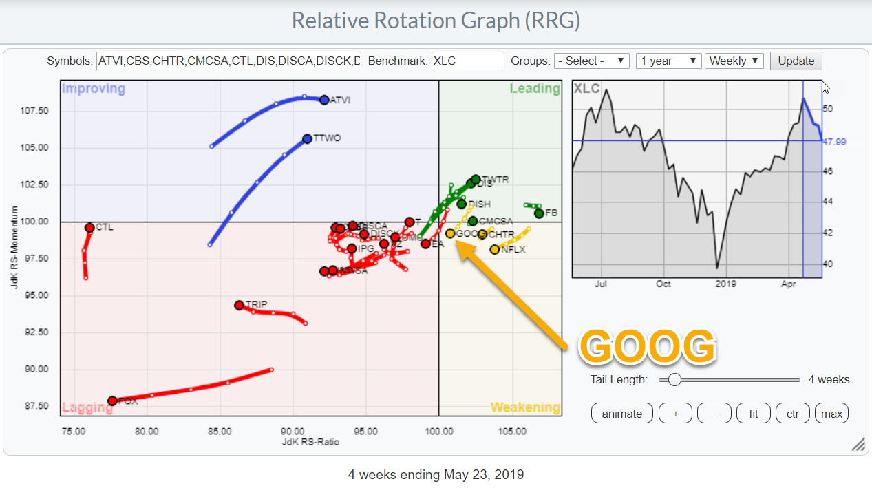
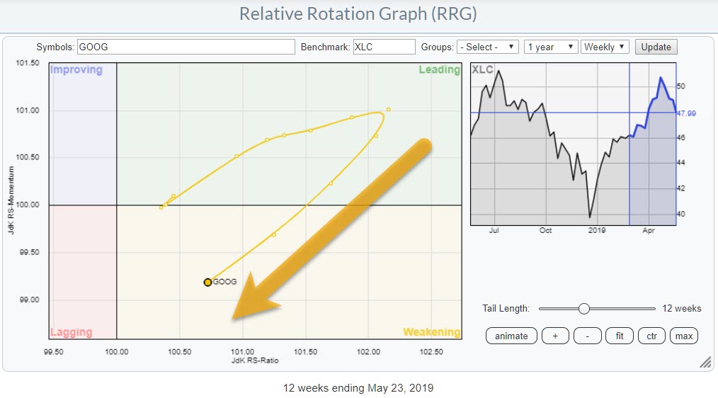
The RRG at the top of this article shows the complete population of the Communication Services sector against XLC (the benchmark). On that graph, GOOG is somewhat buried between other stocks and is not very visible. In order to zoom in on this particular stock and better see the recent rotation, I have printed the same RRG, but now only showing GOOG vs XLC.
The recent rotation clearly shows the weakness that Google is going through versus XLC. With a little over 11% weight for GOOG and GOOGL each, this totals around 22% total weight for Google within the sector. The good news is that this weakness is largely offset by Facebook. FB also accounts for 20% of the sector and is much further to the right in the RRG, at a high reading on the JdK RS-Ratio scale. That said, Disney, which is the fourth largest stock, is worth approaching from the long side.
Alphabet Inc - GOOG

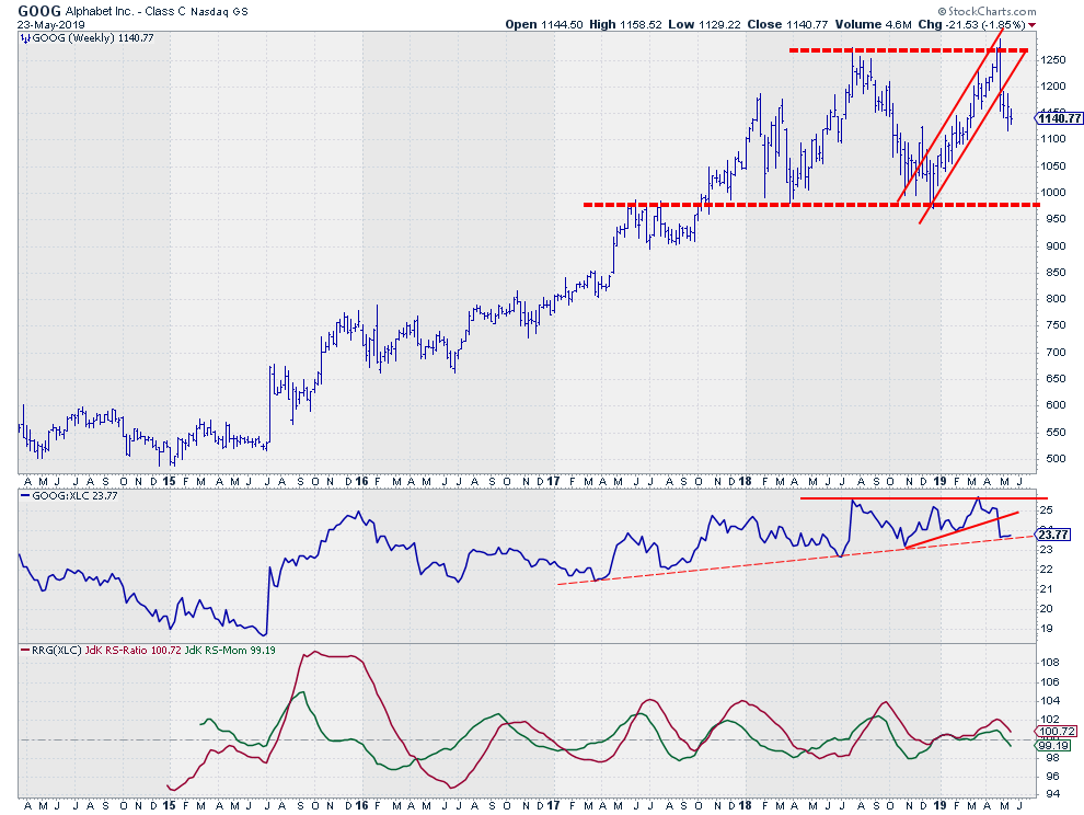
On the price chart, GOOG bounced off its former highs and left the rising channel that came into play at the end of 2018. The lower boundary of this range lies around $975, which is roughly 15% below current levels.
The RS-Line recently broke a short-term support line (solid) and is now resting at a longer version (dashed), while the RS-Momentum line has crossed below 100 and RS-Ratio is heading towards that level as well. A rotation into lagging seems to be around the corner.
All in all, the Communications Services sector is doing well compared to the S&P 500. Within the sector, however, it seems better to avoid Google for now.
My regular blog is the RRG Charts blog. If you would like to receive a notification when a new article is published, simply Subscribe using your email address.
Julius de Kempenaer
Senior Technical Analyst, StockCharts.com
Creator, Relative Rotation Graphs
Founder, RRG Research
Want to stay up to date with the latest market insights from Julius?
– Follow @RRGResearch on Twitter
– Like RRG Research on Facebook
– Follow RRG Research on LinkedIn
– Subscribe to the RRG Charts blog on StockCharts
Feedback, comments or questions are welcome at Juliusdk@stockcharts.com. I cannot promise to respond to each and every message, but I will certainly read them and, where reasonably possible, use the feedback and comments or answer questions.
To discuss RRG with me on S.C.A.N., tag me using the handle Julius_RRG.
RRG, Relative Rotation Graphs, JdK RS-Ratio, and JdK RS-Momentum are registered trademarks of RRG Research.
|
| READ ONLINE → |
|
|
|
| MORE ARTICLES → |
|
