| THIS WEEK'S ARTICLES |
| The Market Message |
| Defensive Sectors Fall Behind While Technology, Cyclicals, and Industrials Take the Lead |
| by John Murphy |
Editor's Note: This article was originally published in John Murphy's Market Message on Thursday, June 27th at 3:49pm ET.
Previous messages have pointed out that defensive stock sectors were top performers since the market hit a peak at the end of April when trade tensions started to resurface. Stocks, however, have recovered most of their May losses during the month of June. And sector leadership during June reflects that more opimistic alignment. Chart 1 shows sector performance for the past month. And it shows defensive groups like utilities, real estate, and consumer staples lagging behind. June leadership has come from materials, technology, consumer discretionary and industrials which usually do better when investors are willing to assume more risk. In the case of materials, the biggest gains came from gold miners which are generally considered to be more defensive. But more economically-sensitive copper and steel stocks also saw a June rebound. It's also revealing to dig down into the other three leading sectors to see where their leadership came from.
Chart 1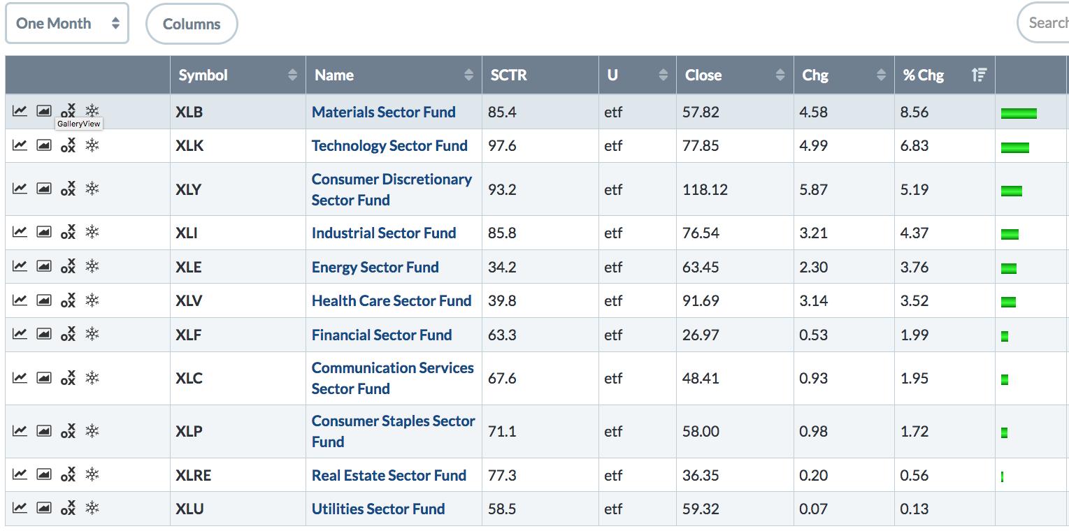
|
| READ ONLINE → |
|
|
|
| Art's Charts |
| How to Spot Reversal Alert Zones and Get the Jump on a Breakout |
| by Arthur Hill |
 Breakouts are bullish and often look great, but they do not always offer the best reward-to-risk ratio when taking a trade. As with so many aspects of technical analysis and trading, we must often walk the fine line between anticipating and confirming. The first step to anticipating a breakout is spotting a reversal alert zone before the breakout occurs. Going on alert before the breakout can improve the entry price and the reward-to-risk ratio. Breakouts are bullish and often look great, but they do not always offer the best reward-to-risk ratio when taking a trade. As with so many aspects of technical analysis and trading, we must often walk the fine line between anticipating and confirming. The first step to anticipating a breakout is spotting a reversal alert zone before the breakout occurs. Going on alert before the breakout can improve the entry price and the reward-to-risk ratio.
There are three parts to a reversal alert zone. First, the decline leading to the reversal zone should be considered a correction after some sort of impulse move. An impulse move is deemed part of the primary uptrend and subsequent declines are viewed as corrective or secondary price movements. In other words, I am interested in a reversal that will signal a continuation of the bigger uptrend.
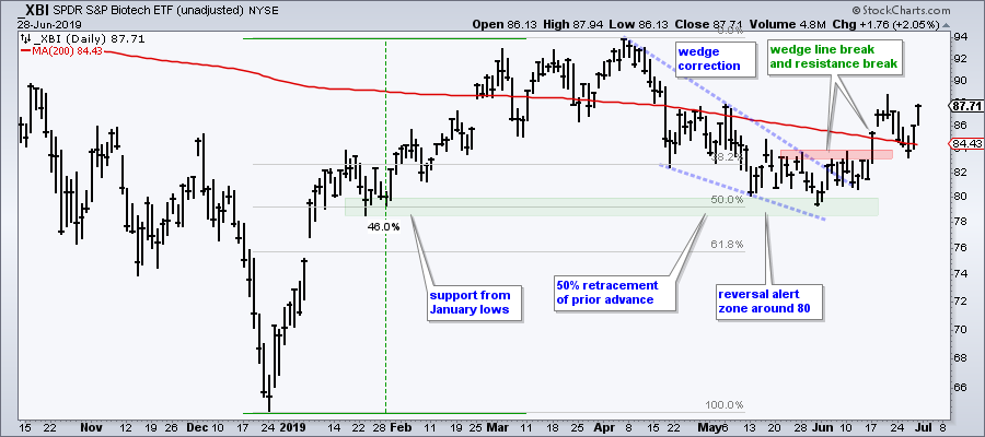
Second, the decline should retrace one third to two thirds of the prior advance. Charles Dow used 33.3% and 66.7% as retracement estimates with 50% as the based case. Elliott wavers use 38.2% and 61.8%. Personally, I raise the alert level when a decline retraces around 50% of the prior advance, which is akin to two steps forward (up) and one step back (down). The chart below shows XBI retracing around 50% of its prior advance, which was a whopping 46%. Note that this reversal alert zone was visible in mid June (Art's Charts article)
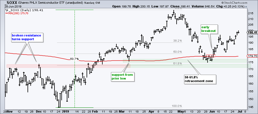
Third, the retracement zone should be confirmed by a support area. This could be broken resistance turning into support, a prior consolidation or even prior lows that marked support. The chart below shows SOXX finding support near the early March low and just above support from broken resistance (green zones). In addition, the decline into late May retraced 50-61.8% of the prior advance. This reversal zone was visible in late May (Art's Chart Article)
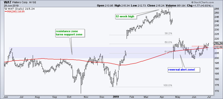
Reversal alert zones are certainly not fool proof, but they offer a great reward-to-risk ratio when they do work. Chartists watching these reversal alert zones for SOXX and XBI could have nibbled in the support zones or jumped on the first sign of a breakout. As far as current reversal alert zones, Waters Corp (WAT) caught my eye as it returned to a breakout zone and retraced around two thirds of the prior advance. The stock firmed in the 200-205 area from April to mid June and turned up the last two weeks.
On Trend on YouTube (Thursday, June 27th)
- Setups versus Breakouts (IBB, ASHR, SOXX)
- Spotting a Reversal Alert Zone
- A Video Game Stock Sets Up Bullish
- A Defense Stock Bouncing off Support
- Click here to Watch
Arthur Hill, CMT
Senior Technical Analyst, StockCharts.com
Author, Define the Trend and Trade the Trend
Want to stay up to date with the latest market insights from Arthur?
– Follow @ArthurHill on Twitter
– Subscribe to Art's Charts
– Watch On Trend on StockCharts TV (Tuesdays / Thursdays at 10:30am ET)
|
| READ ONLINE → |
|
|
|
| The Canadian Technician |
| These Stocks Can Pick You Up |
| by Greg Schnell |
The IPO frenzy has been well-documented this year, with CrowdStrike, Beyond Meat, Slack, Pinterest, Uber and Lyft all garnering media attention. One thing that can happen with IPOs is a sudden surge in either direction. However, for chartists, with no chart history, these IPO's are hard to buy. What works better for me is when the stock pauses and builds a base.
Two stocks line up nicely this week for that concept.
First of all, UBER does not make any money, so until the stock forms a price range to trade around, we have no relative value of what investors are willing to pay. By waiting for the hype to die down, we can get a better idea of price. I like the chart of UBER; I will show it here on a 60 minute chart.
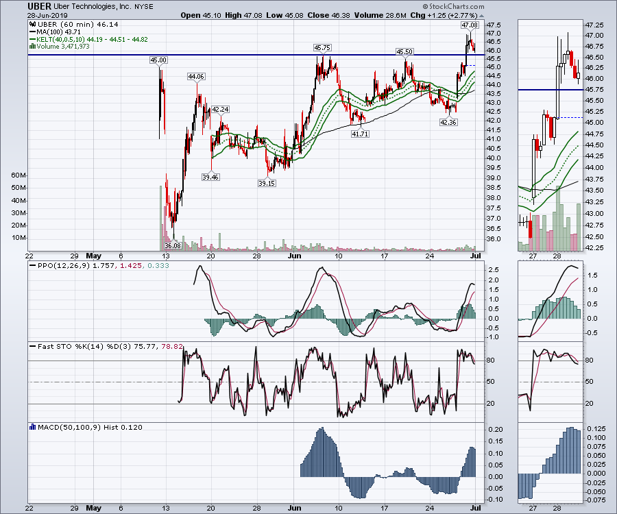 Uber has pushed to a new high, which means anyone who bought the stock is in a profitable position. The little pullback on Friday gives us an opportunity to buy it near the breakout level and control risk. The institutional investors like to jump on these breakouts and push them back down, forcing swing traders out with a loss, but it looks like any pullback in here would give the trader the opportunity to control downside risk while looking for a move higher. I have put a narrow Keltner channel on the chart; perhaps a pullback into that range would be helpful for an entry. All the momentum indicators are at near-term extremes, so watch these for a pullback to gain a nicer entry. Uber has pushed to a new high, which means anyone who bought the stock is in a profitable position. The little pullback on Friday gives us an opportunity to buy it near the breakout level and control risk. The institutional investors like to jump on these breakouts and push them back down, forcing swing traders out with a loss, but it looks like any pullback in here would give the trader the opportunity to control downside risk while looking for a move higher. I have put a narrow Keltner channel on the chart; perhaps a pullback into that range would be helpful for an entry. All the momentum indicators are at near-term extremes, so watch these for a pullback to gain a nicer entry.
LYFT is also setting up a base and is now riding along the Keltner channel, which can be used as support. There was a late Friday pullback, but, now that the base is built, we might have trouble getting an entry near the breakout level at $63. I would look to find an entry around the top of the Keltner channel.
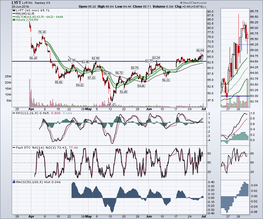 With both of these stocks setting up, this can be a nice pairing as they enter the second half. Remember to keep stops in place, as we have all the backdrops for a volatile summer given the declining economic data, but a flexible Fed trying to ease the dips should have us working. The earnings season of July gets underway in a few weeks to add more swings. With both of these stocks setting up, this can be a nice pairing as they enter the second half. Remember to keep stops in place, as we have all the backdrops for a volatile summer given the declining economic data, but a flexible Fed trying to ease the dips should have us working. The earnings season of July gets underway in a few weeks to add more swings.
I focused on some long-term quarterly charts in a fast moving Market Buzz on Friday. Click this link to see.

With the second half setting up, it should be an eventful trading environment. If you would like to follow along on other trade ideas through the second half, feel free to follow me at my blogs or Twitter feed links below.
Good trading,
Greg Schnell, CMT, MFTA
Senior Technical Analyst, StockCharts.com
Author, Stock Charts For Dummies
Want to stay on top of the market's latest intermarket signals?
– Follow @SchnellInvestor on Twitter
– Connect with Greg on LinkedIn
– Subscribe to The Canadian Technician
|
| READ ONLINE → |
|
|
|
| SPECIAL EVENT ANNOUNCEMENT |
| Calling all Chicago-area investors and traders! Our very own Greg Schnell will be speaking at the upcoming TradersEXPO in Chicago next month, July 21st - 23rd. Not only is this one of the summer's premier financial events, but it's also free to register and attend. In addition to a long list of incredible speakers, you can hear Greg share his latest market analysis, see the charts he's watching most closely and meet the man himself in person. Click the banner below to learn more and register. |
 |
| LEARN MORE → |
|
|
|
| Earnings Beats |
| Building Portfolio Power: Start With Stocks Like These! |
| by John Hopkins |
Let me start by saying that we track a "Best of the Best" list at EarningsBeats.com. Technically, it's actually 3 "Best of the Best" lists - a Model Portfolio, an Aggressive Portfolio and an Income Portfolio. They each include 10 stocks that are weighted equally in the portfolio and held for three months. After the next earnings season is over, we cash in the 10 stocks in each portfolio and replace them with our next "Best of the Best" list. Here is the actual return of our Model Portfolio since its inception and the corresponding return of the benchmark S&P 500 over the same time period:
- Model Portfolio (since its inception November 19, 2018): +37.16%
- S&P 500 (since November 19, 2018): +9.33%
The concept is really simple and very easy to understand: buy the stocks that Wall Street currently loves, then ride them while they have strong momentum and show excellent relative strength among their peers. Rinse and repeat each quarter. Since the Model Portfolio began in November, the best three-month performer in the portfolio for any quarter has been eHealth, Inc. (EHTH). Check out the chart:
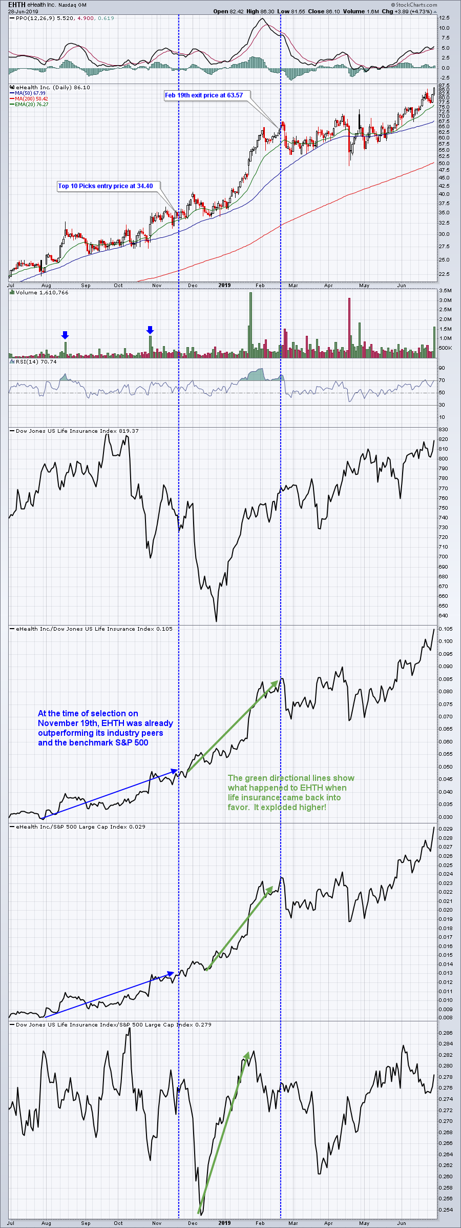 When you have a stock that rises 85% in 90 days, that tends to help boost overall returns. But it's not just one leading stock per quarter that determines the Model Portfolio's success. Each quarter, the majority of Model Portfolio stocks outperforms the benchmark S&P 500. It's the cumulative effect that has led the Model Portfolio to outperform the S&P 500 by 4 to 1. When you have a stock that rises 85% in 90 days, that tends to help boost overall returns. But it's not just one leading stock per quarter that determines the Model Portfolio's success. Each quarter, the majority of Model Portfolio stocks outperforms the benchmark S&P 500. It's the cumulative effect that has led the Model Portfolio to outperform the S&P 500 by 4 to 1.
Due to the overwhelming popularity of focusing on relative strength, not to mention the outstanding results above, our EarningsBeats.com community members wanted more. We delivered. We've since added an Aggressive Portfolio, designed to be riskier but with higher potential returns, and an Income Portfolio for those that want to invest in less risky, dividend-paying stocks. Each of them sticks with the relative strength philosophy, however. These other two portfolios began on May 19th. Here are the current returns for each portfolio, with the benchmark S&P 500's return as well.
- Model Portfolio (since the last 10 equal-weighted stocks were announced on May 19, 2019): +5.40%
- Aggressive Portfolio (since inception on May 19, 2019): +8.29%
- Income Portfolio (since inception on May 19, 2019): +2.65%
- S&P 500 (since May 19, 2019): +2.88%
Just one month into the current quarter, the Aggressive Portfolio and Model Portfolio have outperformed the benchmark S&P 500 by 5.41% and 2.52%, respectively. That's very significant outperformance at a time when 80% of mutual funds underperform the S&P 500. The Aggressive Portfolio is being led by Enphase Energy (ENPH), which has climbed a very impressive 24.44% since the May 19th unveiling. Here's the chart:
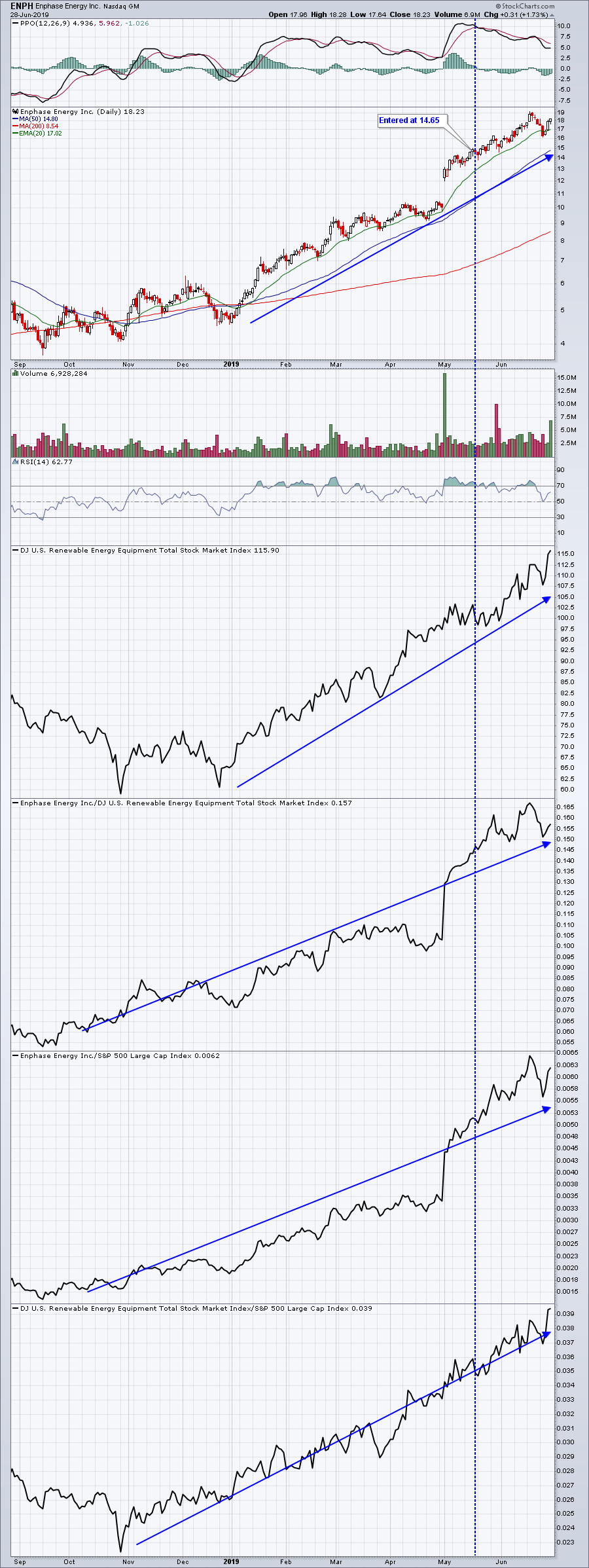 Putting together a portfolio of stocks that are relative leaders increases our chances of success in the stock market. To increase our odds even more, we don't consider a stock unless it's already beaten Wall Street consensus estimates as to both quarterly revenues and quarterly EPS. In other words, we marry strong fundamentals with strong technicals. We currently have a ChartList of 280 such companies and every company in our portfolios must be on this ChartList. If you'd like a link to review this entire ChartList, simply CLICK HERE to sign up for our FREE newsletter, which is delivered to the email address you provide three times a week. You will then be directed to a page that includes a link to these 280 charts. Putting together a portfolio of stocks that are relative leaders increases our chances of success in the stock market. To increase our odds even more, we don't consider a stock unless it's already beaten Wall Street consensus estimates as to both quarterly revenues and quarterly EPS. In other words, we marry strong fundamentals with strong technicals. We currently have a ChartList of 280 such companies and every company in our portfolios must be on this ChartList. If you'd like a link to review this entire ChartList, simply CLICK HERE to sign up for our FREE newsletter, which is delivered to the email address you provide three times a week. You will then be directed to a page that includes a link to these 280 charts.
Seriously, change the way you view the market and your trading/investing strategy now.
At your service,
John S. Hopkins, President
EarningsBeats.com
|
| READ ONLINE → |
|
|
|
| DecisionPoint |
| S&P 600 Under the Indicator Microscope - Bouncing Off Relative Lows |
| by Erin Swenlin |
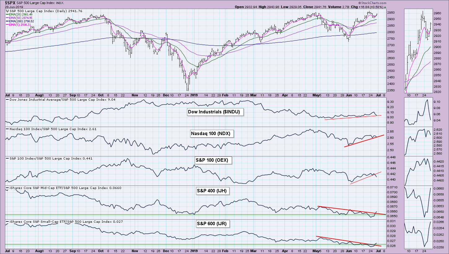
Be prepared! I have a plethora of charts this week to share that focus only on the S&P 600. If you look closely, you can see that, even before the last two days of an impressive rally, the indicators were already suggesting a renewed interest in small-cap stocks. Below is the relative chart of the major indexes to the SPX. Note that we are seeing an increase in relative strength for the S&P 400 and S&P 600 after logging relative lows that we hadn't seen all year.

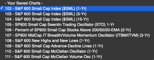
I'm going to introduce you to all of the charts that are in our free ChartPack called "Straight Shots." I'll be using the DPSS-1300 ChartList, which provides you with all of the indicators below that are specifically calculated for the S&P 600. Here is the listing:

We have these same indicator sets for the other major indexes, including the S&P 400, Dow, etc.
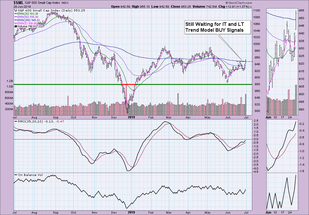
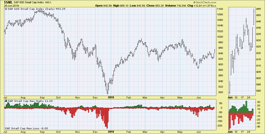
As you can see, there was a nice breakout today for the small-caps. Additionally, price broke above the 200-EMA. We are still waiting for the 20-EMA to cross above the 50-EMA for an IT Trend Model BUY signal, as well as for the 50-EMA to cross above the 200-EMA for a LT Trend Model BUY signal. Don't get too excited by today's volume - it was quarterly options expiration day. I do note that, even if we get a decline on Monday, the OBV top will be above the previous top, which is confirming.

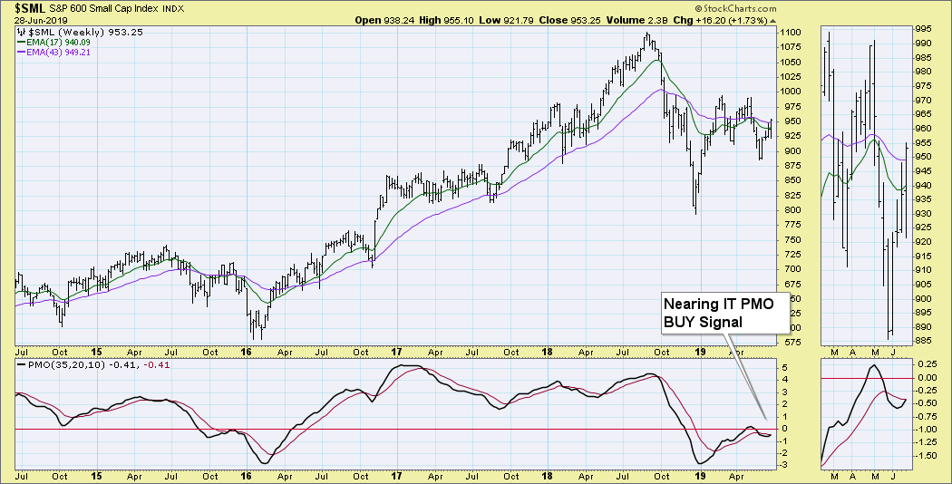
We nearly saw an IT Price Momentum Oscillator (PMO) BUY signal this week. It should come in next week, barring a correction.

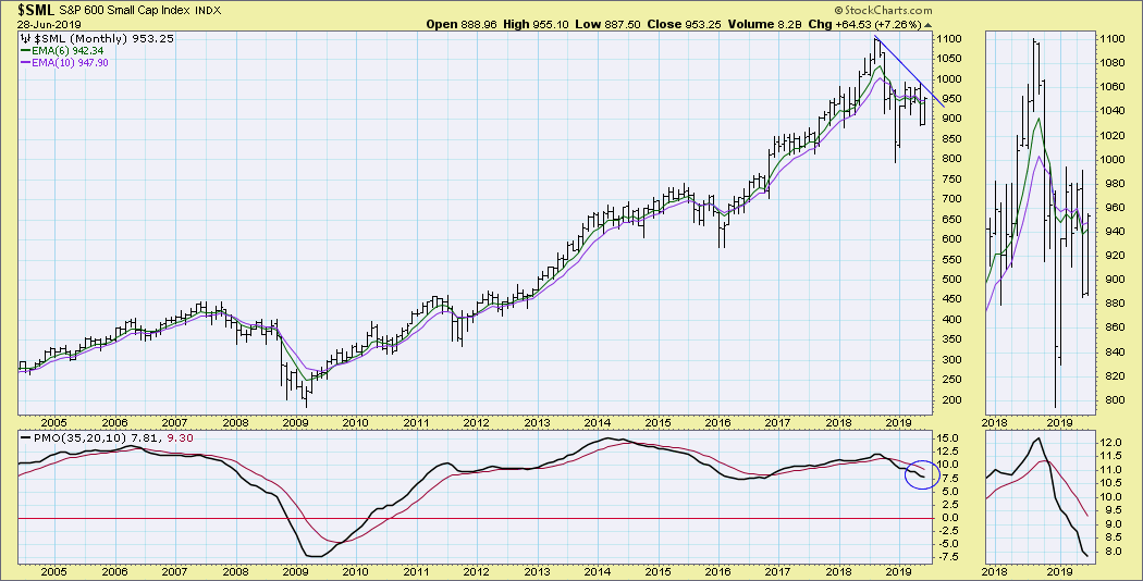
We are still seeing a declining PMO on the monthly chart and a long-term declining tops line that still hasn't been broken.

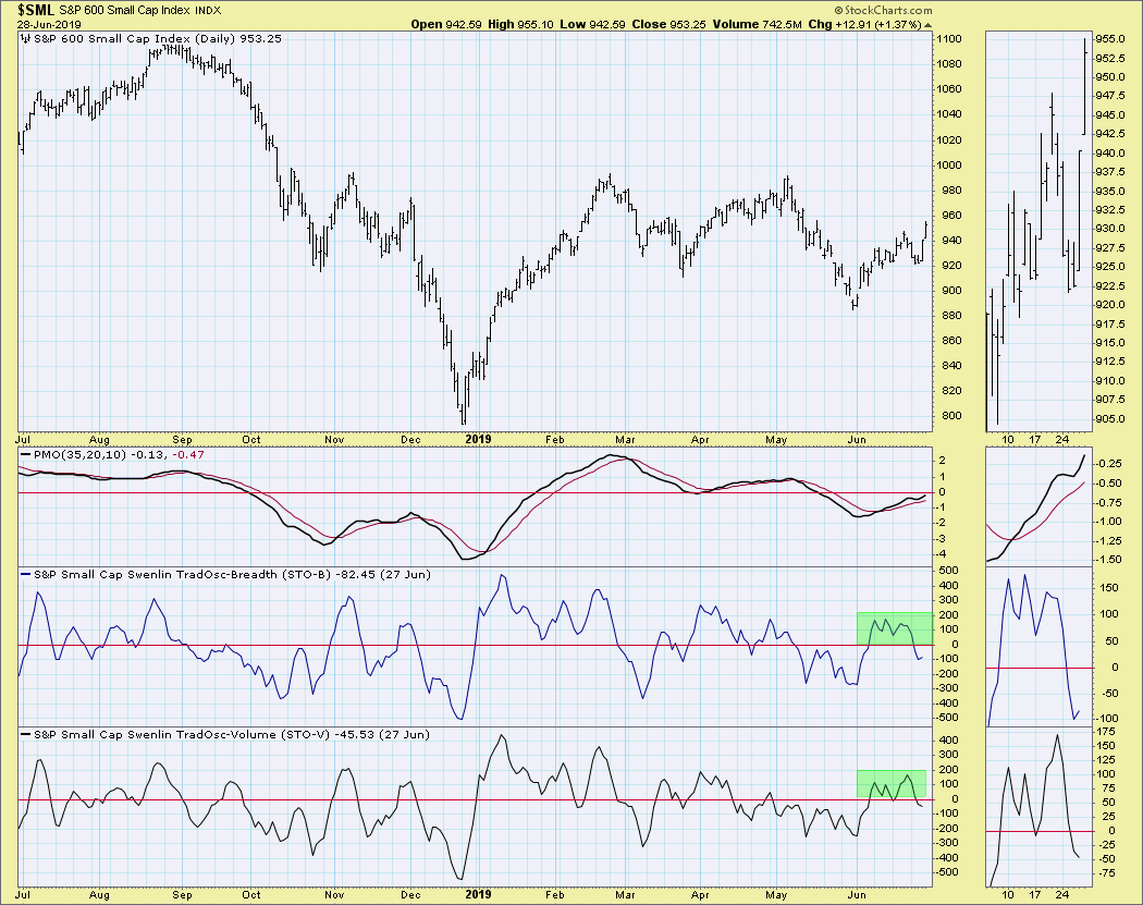
I like that the Swenlin Trading Oscillators (STOs) have ticked up after moving just below the zero line. They are currently in neutral territory and can definitely accommodate higher prices before becoming overbought.

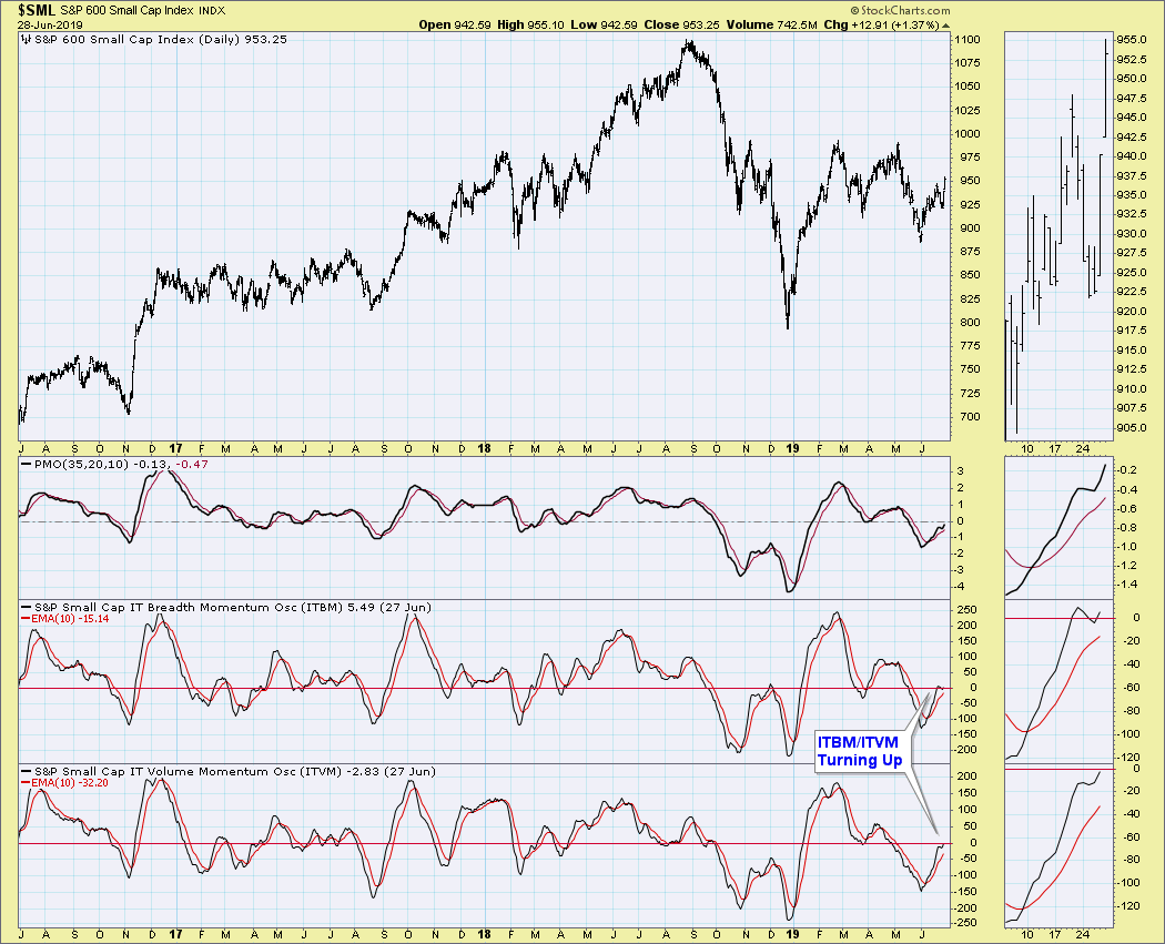
Like the SPX, ITBM and ITVM for the S&P 600 had previously topped, but they turned up yesterday. They are also in neutral territory.

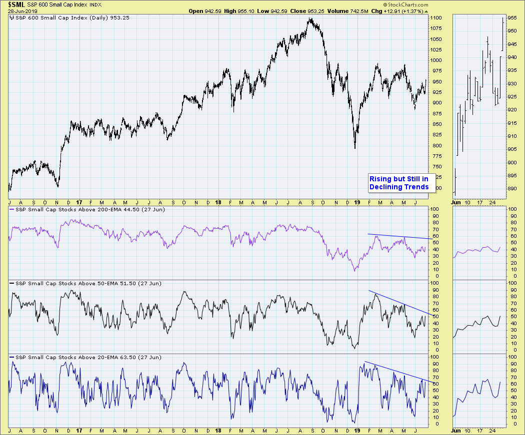
Stocks above their various moving averages for the $SML are improving, but are still within a declining trend. They have plenty of room for improvement.

We didn't see any climactic activity this week on the New Highs/New Lows chart.

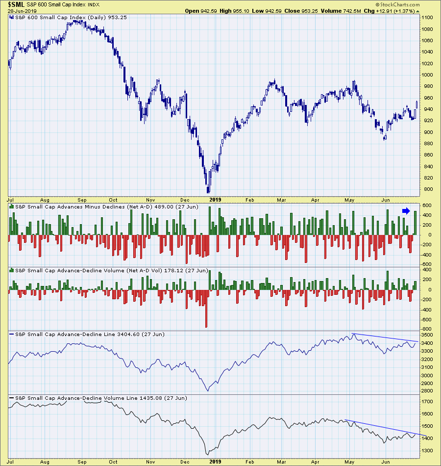
However, we did see extremely climactic readings on the Net Advances - Declines. The volume indicator didn't participate climactically, which I don't like. Also, we can see that the AD Lines are still in a declining trend, but are now vulnerable to a breakout.

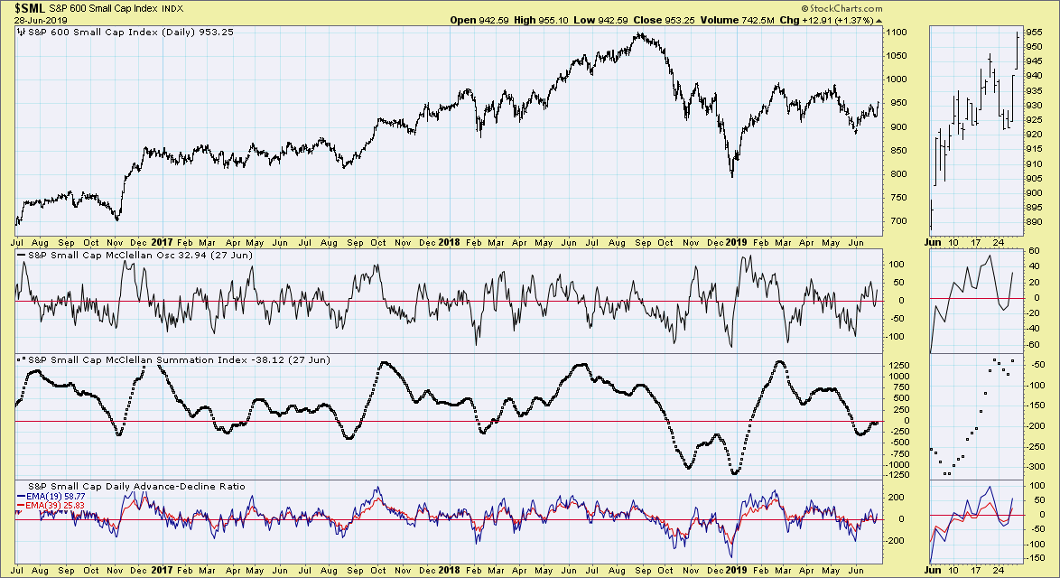
Finally, looking at the McClellan Oscillator chart for the $SML, we saw a move back above the zero line for the oscillator. However, the Summation Index is stuck below the zero line.

Conclusion: By reviewing all of the indicators in the DPSS - 1300 ChartList from the DP Straight Shots free ChartPack, we can see that indicators were already hinting at a recovery for the small-caps and we are beginning to see that recovery in action. I'm very encouraged, given a multi-year relative low and the bounce that is now occurring. I recommend that you click on the charts above for "live" versions. I suspect the new readings that will come in this weekend will bolster my case that the small-caps are now waking and should continue to outperform. Consider downloading the DP Straight Shots ChartPack if you'd like to focus in on the other major indexes.
Watch the latest episode of DecisionPoint with Carl & Erin Swenlin LIVE on Fridays 4:30p EST or on the StockCharts TV YouTube channel here!
Technical Analysis is a windsock, not a crystal ball.
Happy Charting!
- Erin
erinh@stockcharts.com
Helpful DecisionPoint Links:
Erin's PMO Scan
DecisionPoint Chart Gallery
Trend Models
Price Momentum Oscillator (PMO)
On Balance Volume
Swenlin Trading Oscillators (STO-B and STO-V)
ITBM and ITVM
SCTR Ranking
**Don't miss DecisionPoint Commentary! Add your email below to be notified of new updates"**
|
| READ ONLINE → |
|
|
|
|
|
| MORE ARTICLES → |
|


 Breakouts are bullish and often look great, but they do not always offer the best reward-to-risk ratio when taking a trade. As with so many aspects of technical analysis and trading, we must often walk the fine line between anticipating and confirming. The first step to anticipating a breakout is spotting a reversal alert zone before the breakout occurs. Going on alert before the breakout can improve the entry price and the reward-to-risk ratio.


 When you have a stock that rises 85% in 90 days, that tends to help boost overall returns. But it's not just one leading stock per quarter that determines the Model Portfolio's success. Each quarter, the majority of Model Portfolio stocks outperforms the benchmark S&P 500. It's the cumulative effect that has led the Model Portfolio to outperform the S&P 500 by 4 to 1.
 Putting together a portfolio of stocks that are relative leaders increases our chances of success in the stock market. To increase our odds even more, we don't consider a stock unless it's already beaten Wall Street consensus estimates as to both quarterly revenues and quarterly EPS. In other words, we marry strong fundamentals with strong technicals. We currently have a ChartList of 280 such companies and every company in our portfolios must be on this ChartList. If you'd like a link to review this entire ChartList, simply