| THIS WEEK'S ARTICLES |
| Market Roundup |
| CRB Still Caught in a Trading Range |
| by Martin Pring |
Editor's Note: This article was originally published in Martin Pring's Market Roundup on Tuesday, July 2nd at 12:36pm ET.
Back in May, I wrote an article entitled “Commodities: Down Now, Up Later?" in which I pointed out some of the long-term technical bullish potential for the commodity markets, as well as some of the near-term vulnerabilities. The thought was that prices would experience some near-term weakness, after which some of these bullish factors could come into play. As it turned out, the CRB Composite dropped about 10 points and subsequently regained 8 of them. As Chart 1 shows, all that has happened in the meantime is an extension of the 2016-19 trading range.
If the Index drops below its late 2018 monthly closing low of 170, that will complete a consolidation bearish head and shoulders. On the other hand, a close greater than 189 will place it above its 12- and 24-month MAs, as well as the 2008-19 secular downtrend line. Such action would likely push that 18-month ROC above its secular downtrend line as well. In many cases when an oscillator, such as this, cracks a very long-term momentum indicator, it flags a major trend reversal. That secular line also joins the head with the right shoulder of that potential head and shoulders. Since the top of that shoulder is below 189, that would be additional evidence pointing to its bearish demise. I must stress that none of this bullish action has yet taken place and price is still locked in that trading range, so let’s not jump the gun in either direction.
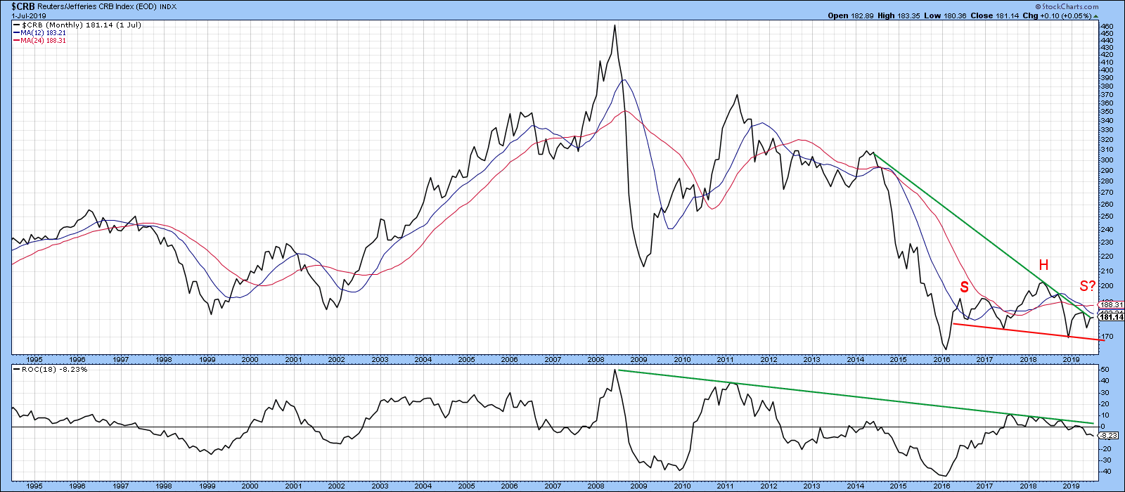 Chart 1 Chart 1
Indeed, Chart 2 indicates that the 50-day net new high commodity oscillator has started to decline from an overbought condition. The red arrows point up similar situations and, in most instances, we saw a 1-to-2-week decline. Since the Index is also running into its green resistance trend line and the 200-day MA, a test of the all-important 2016-19 uptrend line cannot be ruled out.
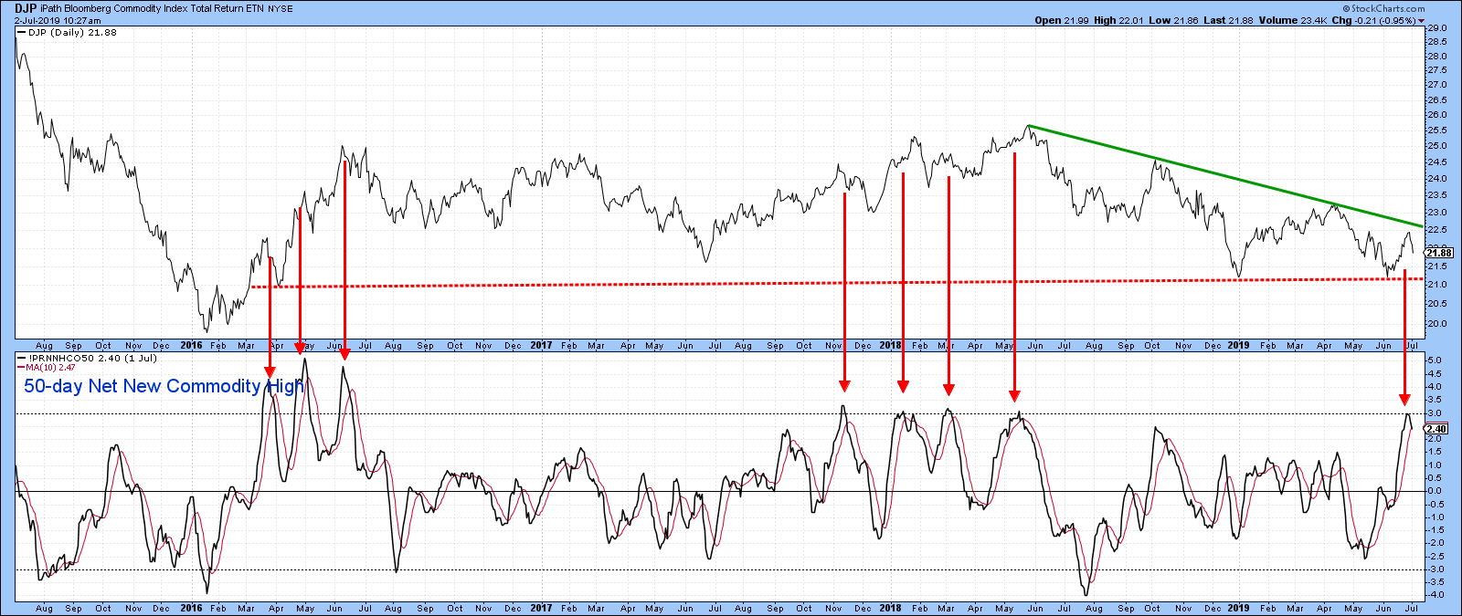 Chart 2 Chart 2
Good luck and good charting,
Martin J. Pring
The views expressed in this article are those of the author and do not necessarily reflect the position or opinion of Pring Turner Capital Group of Walnut Creek or its affiliates.
|
| READ ONLINE → |
|
|
|
| The Mindful Investor |
| Mindful Investors Minimize Distractions |
| by David Keller |
 When you're a student pilot, your first couple of solo flights remain very close to your home airport. Basically, you get up in the air and do a couple laps around the landing pattern. This is meant to get you comfortable being in the plane by yourself, as well as help you gain confidence for the long solo flights. When you're a student pilot, your first couple of solo flights remain very close to your home airport. Basically, you get up in the air and do a couple laps around the landing pattern. This is meant to get you comfortable being in the plane by yourself, as well as help you gain confidence for the long solo flights.
The long solo is where you actually travel away from your airport and go somewhere else. This involves navigation, communication with air traffic control and many other moving parts. Honestly, it ends up being fairly overwhelming.
For my first long solo, I took off from Norwood, which is a great airport to the southwest of Boston. I was then set to fly due east over to Marshfield, right on the ocean, then take a right turn to head southeast, ultimately landing at Hyannis.
The takeoff went well, after which I turned due east to Marshfield, then southeast to Hyannis. That leg of the journey took me right over the water. I remember being absolutely captivated by the moment. I could see all of Cape Cod, the ocean and even Rhode Island off my right wing. Beautiful clear sky.
All of a sudden, I looked back and noticed the Hyannis airport off in the distance, getting larger and larger in front of me. I realized I had neglected to radio Hyannis Tower to let them know I was en route. Even worse, I completely forgot the radio frequency that I was given from the previous controller.
The good news is that I was taught to write all frequencies down on my kneeboard, so I glanced down at my notes, switched to the correct frequency and announced my intentions. Crisis averted.
One of the worst things you can do as a pilot is become distracted. When that happens, you lose your situational awareness, the recognition of what’s happening all around you. A distracted pilot is an ineffective and arguably dangerous pilot.
As investors, we need to maintain a good situational awareness of what’s happening around us and our portfolio. I often call this “market awareness” and it’s about having a good sense of what’s moving and why. It’s so easy to put on the blinders and forget that there’s a whole market moving around your positions!
So, how do you minimize distractions as an investor?
First, give yourself a focused time to get your priorities in line. Think through the things that you need to accomplish in a given week. Write them down and review them regularly.
I look at a lot of charts, hundreds if not thousands every day. It’s very easy to get caught in “stream of consciousness” mode, jumping mentally from one thing to the next with no real purpose in mind.
I developed a morning coffee routine with a set of charts that I review, in order, every day. I’ve learned that if I start every day with this process, I can more easily track trends and identify inflection points.
Every once in a while, I review all the charts in my daily list and look for ways that I can improve my process. Sometimes I’ll add a chart or two, and sometimes I’ll remove one that no longer speaks to me. More often than not, I don’t change anything and simply confirm that I’m looking at the right content every morning.
Second, have a solid plan for each day. Set it ahead of time and write it down.
I like to break down my daily schedule like a football game, with specific tasks laid out for pregame, each of the four quarters and a postgame period. This helps me to focus on my key priorities and keep coming back to the things that I know will be most valuable to my work.
Finally, don’t forget to take a step back once in a while. Don’t get so focused on your investment process, your trading plan and the flickering ticks of the markets that you forget why you put in all of that effort.
For me, I focus on things like music, mindfulness, my family, my faith. I never want to become so engrossed in my investment strategy that I neglect the things that are truly the most important in my life.
Distractions happen, for pilots as well as investors. Mindful investors minimize distractions by setting their priorities, developing a good daily plan and taking time to reflect on what’s most important.
RR#6,
Dave
David Keller, CMT
President, Sierra Alpha Research LLC
Disclaimer: This blog is for educational purposes only and should not be construed as financial advice. The ideas and strategies should never be used without first assessing your own personal and financial situation or without consulting a financial professional.
The author does not have a position in mentioned securities at the time of publication. Any opinions expressed herein are solely those of the author and do not in any way represent the views or opinions of any other person or entity.
|
| READ ONLINE → |
|
|
|
| Trading Places |
| Why U.S. Equities Are Poised For Another 40-50% Surge |
| by Tom Bowley |
I want to discuss two charts that really need to be monitored closely as we enter the second half of 2019. A rise in these charts is synonymous with massive bull market rallies. They both make great common sense, so let's discuss them before visualizing the charts.
1. 10 Year Treasury Yield ($TNX)
One very important lesson to understand about the stock market is that money comes from two places. One rather obvious source is new money entering the stock market. A simple example is deciding to use cash to buy a stock. The stock market goes higher based on more demand than supply. It goes down because of the opposite. Any signs of economic improvement will typically see money rotate from defensive investments to more aggressive investments.
Big investment firms use asset allocation strategies. When they believe our economy is strengthening, they will look to change their allocation model, normally raising the percentage allocated to stocks and lowering the percentage allocated to fixed income like the TNX. Here's a chart to illustrate the power of asset class rotation:
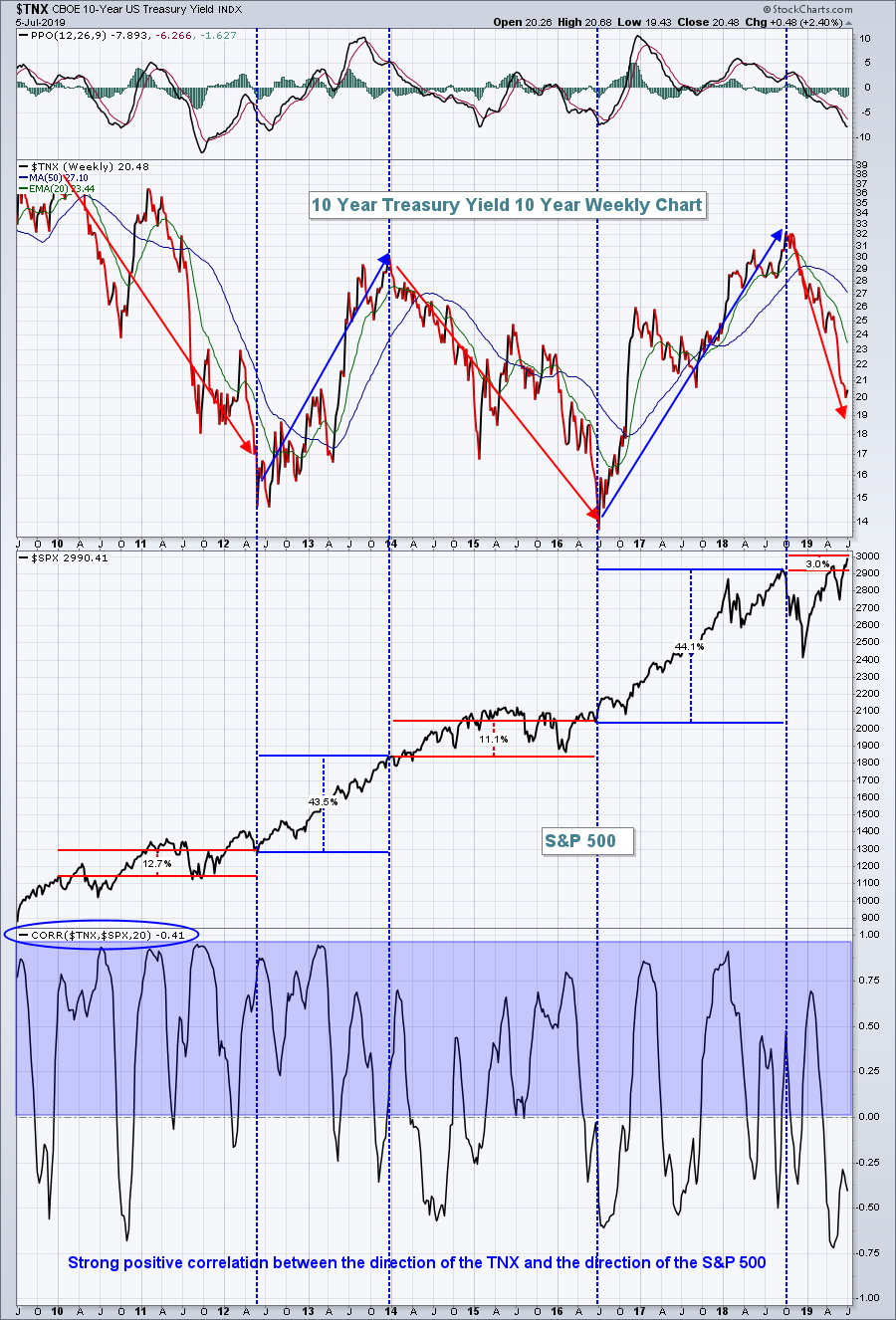 When the TNX is falling, money is rotating into treasuries, and you can see the resulting struggle in the S&P 500. But, when the TNX is rising, money is rotating away from treasuries, and that money typically drives the S&P 500 much, much higher. The last two times the TNX trended higher for extended periods of time, the S&P 500 posted its most impressive uptrends during the current bull market. When the TNX is falling, money is rotating into treasuries, and you can see the resulting struggle in the S&P 500. But, when the TNX is rising, money is rotating away from treasuries, and that money typically drives the S&P 500 much, much higher. The last two times the TNX trended higher for extended periods of time, the S&P 500 posted its most impressive uptrends during the current bull market.
2. Transports ($TRAN) vs. Utilities ($UTIL)
The Dow Jones Transportation Average ($TRAN) should perform well in an improving economic environment, as more goods would be expected to be shipped. Those improving economic conditions generally hurt the Dow Jones Utilities Average ($UTIL) as money rotates away from safety into riskier assets. In addition to money rotating from treasuries to equities, there's also a strong tendency to see money rotate from defensive equity stocks to aggressive equity stocks. When that occurs, the S&P 500 normally gets a sizable boost:
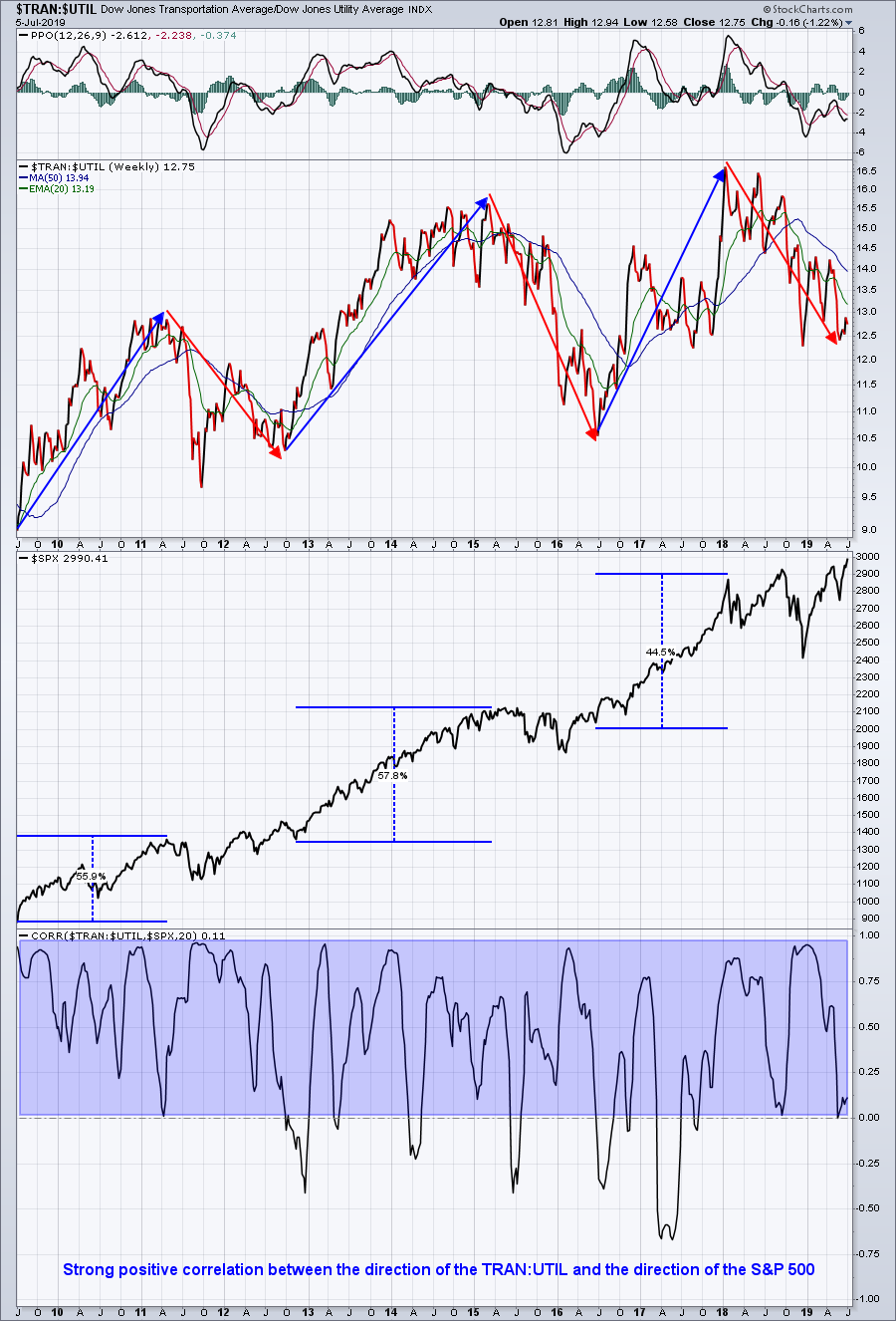 As you know if you've followed my ChartWatchers articles and my daily Trading Places articles, I remain very bullish on U.S. equities. Central bankers around the globe continue to support equity prices and that should not be overlooked. Global stock markets, with few exceptions and despite negative media attention, remain in multi-year bull markets. These uptrends have occurred despite record amounts of money flowing into global treasuries. Imagine the possibilities of global equities when rotation begins to take place. The above charts demonstrate that, when the TNX chart and TRAN:UTIL ratio chart both move higher, the S&P 500 explodes..... and it explodes for very good reason. As you know if you've followed my ChartWatchers articles and my daily Trading Places articles, I remain very bullish on U.S. equities. Central bankers around the globe continue to support equity prices and that should not be overlooked. Global stock markets, with few exceptions and despite negative media attention, remain in multi-year bull markets. These uptrends have occurred despite record amounts of money flowing into global treasuries. Imagine the possibilities of global equities when rotation begins to take place. The above charts demonstrate that, when the TNX chart and TRAN:UTIL ratio chart both move higher, the S&P 500 explodes..... and it explodes for very good reason.
Make sure you follow these two charts. If they fail to move higher, then I suspect the S&P 500's attempt to set new all-time record highs will be challenging. However, if we see bottoms form in these two charts, then we could see an S&P 500 high in the next 1-2 years that approaches 4000 or more.
On Monday, July 8th at 4:30pm EDT, I'll join John Hopkins at EarningsBeats.com for a special "2019 2nd Half Market Outlook" webinar. There are areas where you definitely will want to have exposure and other areas that you'll want to avoid. I'll explain my reasons and discuss how you can not only participate in the upcoming equity surge, but also how you can outperform the benchmark S&P 500 by a wide margin. CLICK HERE to register and for more information.
Happy trading!
Tom
|
| READ ONLINE → |
|
|
|
|
|
| DecisionPoint |
| EARNINGS: 2019 Q1 Finalized; S&P 500 Still Overvalued |
| by Carl Swenlin |
The S&P 500 earnings for 2019 Q1 have been finalized. The following chart shows us the normal value range of the S&P 500 Index, as well as where the S&P 500 would have to be in order to have an overvalued P/E of 20 (red line), a fairly valued P/E of 15 (blue line) or an undervalued P/E of 10 (green line). There are three hash marks on the right side of the chart, which show where the range markers are projected be at the end of 2020 Q1. Since 2016, price has been well above the traditional value range, with the exception of the late 2018 price decline (which lowered the P/E to 19). Based upon the future earnings hash marks on the right, the S&P 500 is within the normal range, but is still overvalued.
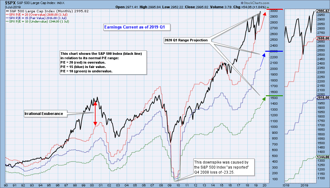
Historically, price has usually stayed below the top of the value range (red line); however, since about 1998, it has not been uncommon for price to exceed normal overvalue levels. The market hasn't been undervalued since 1984.
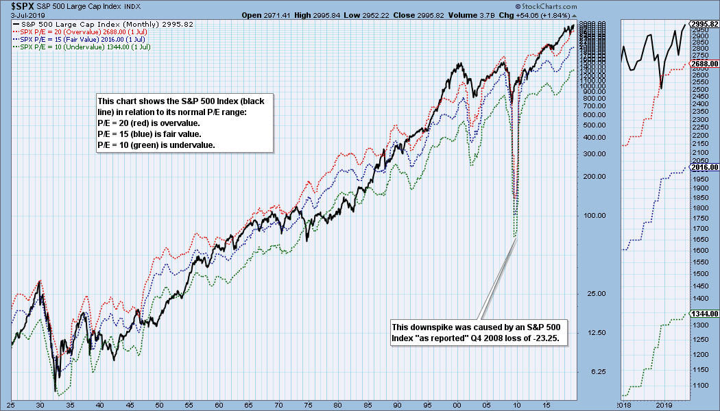
I use GAAP earnings (Generally Accepted Accounting Principals) as the reference for this article. Operating Earnings is the favorite of most of Wall Street, as it omits essential elements of real accounting to make the numbers look better. For me, a former accountant, using operating earnings is too horrifying to contemplate!
The table below shows how earnings are expected to improve going forward, but the drop in P/E shown is only possible if price doesn't rise significantly. In the best case shown (2020 Q1), the market will be slightly lower than the top of the value range, but this depends upon price being about the same level as it is now. Not likely.
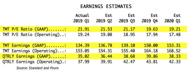
The following table shows where the colored bands will be using forward earnings.

CONCLUSION: Historically, overvalued conditions leave the market vulnerable for a large correction or bear market, but P/E ratios are not a precise timing tool, just a way to see if fundamentals are favorable or not. These earnings charts are intended to provide a historical context for current earnings and to demonstrate that overvaluation is not your friend.
Technical Analysis is a windsock, not a crystal ball.
Happy Charting!
- Carl
Helpful DecisionPoint Links:
DecisionPoint Chart Gallery
Trend Models
Price Momentum Oscillator (PMO)
On Balance Volume
Swenlin Trading Oscillators (STO-B and STO-V)
ITBM and ITVM
SCTR Ranking
|
| READ ONLINE → |
|
|
|
| The MEM Edge |
| Alert Yourself To Pullback Opportunities In Fast-Moving Stocks |
| by Mary Ellen McGonagle |
It’s been quite a star-spangled week for the markets, with the S&P 500 and Nasdaq hitting a new high 3 out of their 4 sessions. One sector showing particular strength has been Technology, which also reached a new high as many underlying stocks are posting significant returns. While this bullish action may have you eager to jump into some of these fast Tech movers, chasing stocks hitting a new high in price can be the surest way to frustration, as the inevitable pullback will have you wishing you waited.
By contrast, waiting for these pullbacks presents a much better opportunity. Today, I'll reveal not only how to uncover top stock candidates, but also precise entry points that you can be alerted to upon their pullback - all with StockCharts.com.
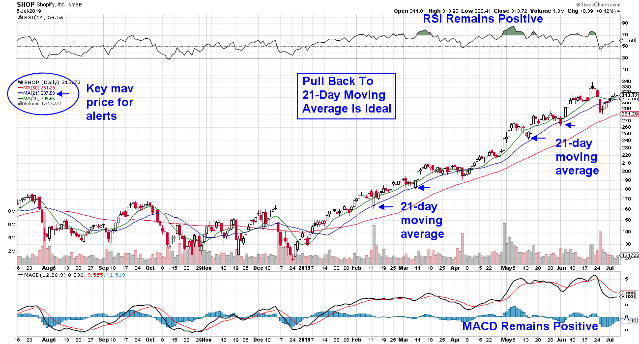
To begin, when a stock pulls back, you’ll want to pay attention to its simple moving average. While you can use either the shorter-term 10-day or the longer-term 21-day moving average, you’ll want to check the stock’s chart to uncover which one is the better indicator. This is because, as you’ll see, each stock has its own “personality” that determines which moving average it tends to obey. In the example below, we reviewed top performer Shopify (SHOP) and found that a pullback to its 21-day moving average has been the best entry point.
DAILY CHART OF SHOPIFY , INC.
Now let's move on to uncovering top stock candidates. The best way to do this is by using StockCharts's SCTR rankings. This technical ranking system is very powerful, as it identifies the most technically sound and, in most cases, faster moving stocks in a given area of the markets.
We'll begin by using the Sector Summary on the first page of StockCharts.com. From there, you can access the stocks in the sub-Industry groups. For instance, try accessing the Technology sector and clicking on an industry group. Then, sort those stocks by their SCTR ranking – highest to lowest.
Once you’ve uncovered several candidates and identified the key moving average that works best for a pullback, you’ll be ready to set up an alert. StockCharts's alert tool will notify you (via email) that your stock has hit your entry point. You can access the setup information for your alerts here.
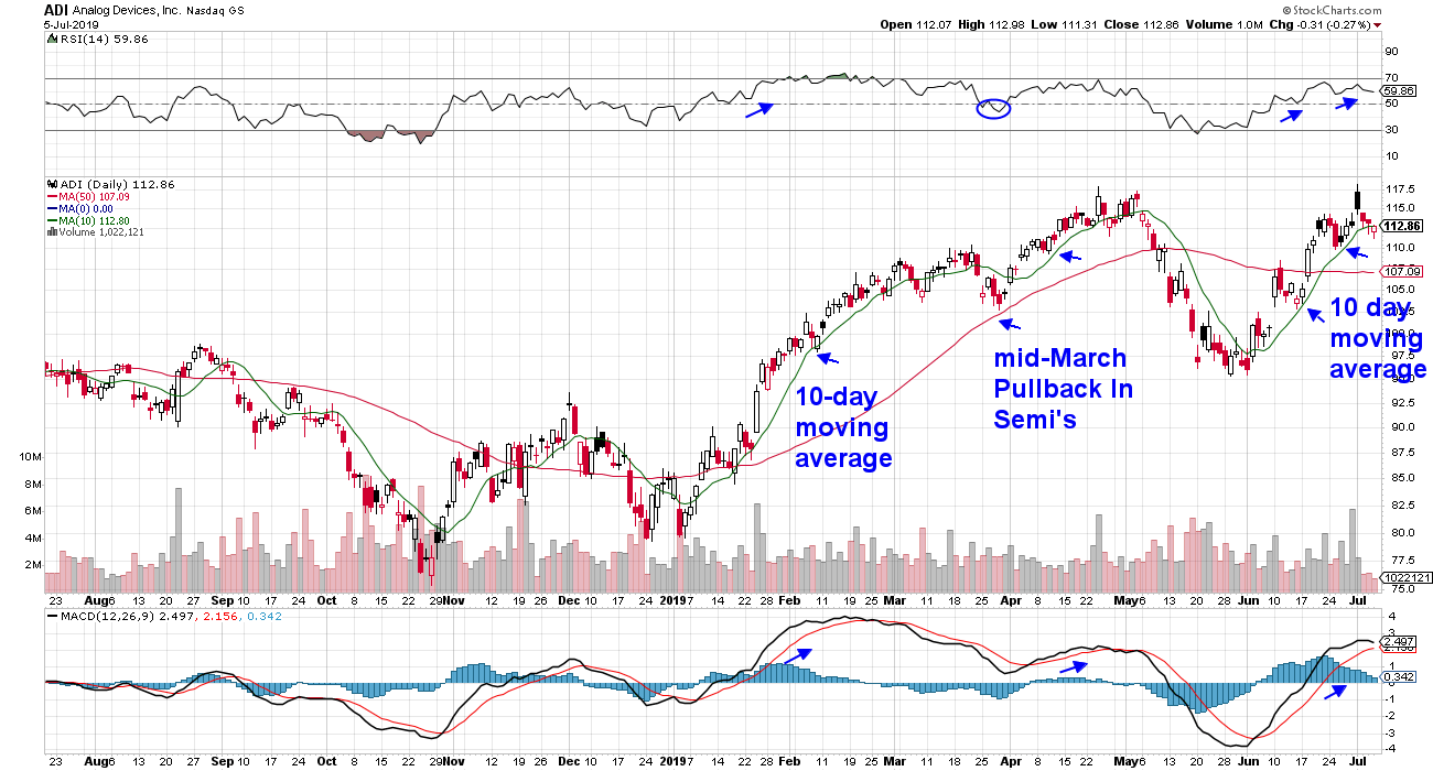
As with all trading, you’ll want to use additional indicators to make sure that your stock is only pulling back, not entering a downtrend. The two indicators I’ve found very helpful are the relative strength indicator (RSI) and the Moving Average Convergence/Divergence (MACD).
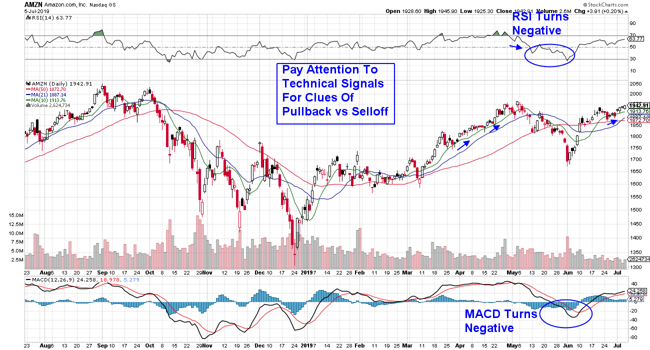
As you can see below, Amazon (AMZN) can normally be bought on a pullback to its 10-day simple moving average. However, in May, the dynamics shifted and the stock fell below both its 21- and 50-day moving averages, with both the RSI and the MACD turning negative at the same time. This was your signal that the near-term uptrend had reversed.
DAILY CHART OF AMAZON.COM, INC.
 There are other example of top-performing stocks that are at ideal buy points upon a pullback. Below is Semiconductor stock Analog Devices (ADI), which can be bought on a pullback to its 10-day simple moving average. By uncovering top candidates and saving them to your alerts, you can not only improve your returns, but you can also lower your frustration level. There are other example of top-performing stocks that are at ideal buy points upon a pullback. Below is Semiconductor stock Analog Devices (ADI), which can be bought on a pullback to its 10-day simple moving average. By uncovering top candidates and saving them to your alerts, you can not only improve your returns, but you can also lower your frustration level.
DAILY CHART OF ANALOG DEVICES (ADI)
Warmly,
Mary Ellen McGonagle,
MEM Investment Research
|
| READ ONLINE → |
|
|
|
| SPECIAL EVENT ANNOUNCEMENT |
| Calling all Chicago-area investors and traders! Our very own Greg Schnell will be speaking at the upcoming TradersEXPO in Chicago next month, July 21st - 23rd. Not only is this one of the summer's premier financial events, but it's also free to register and attend. In addition to a long list of incredible speakers, you can hear Greg share his latest market analysis, see the charts he's watching most closely and meet the man himself in person. Click the banner below to learn more and register. |
 |
| LEARN MORE → |
|
| RRG Charts |
| The S&P Just Broke Out of a Two-Year Consolidation, But There are Still Some Pockets of Concern |
| by Julius de Kempenaer |
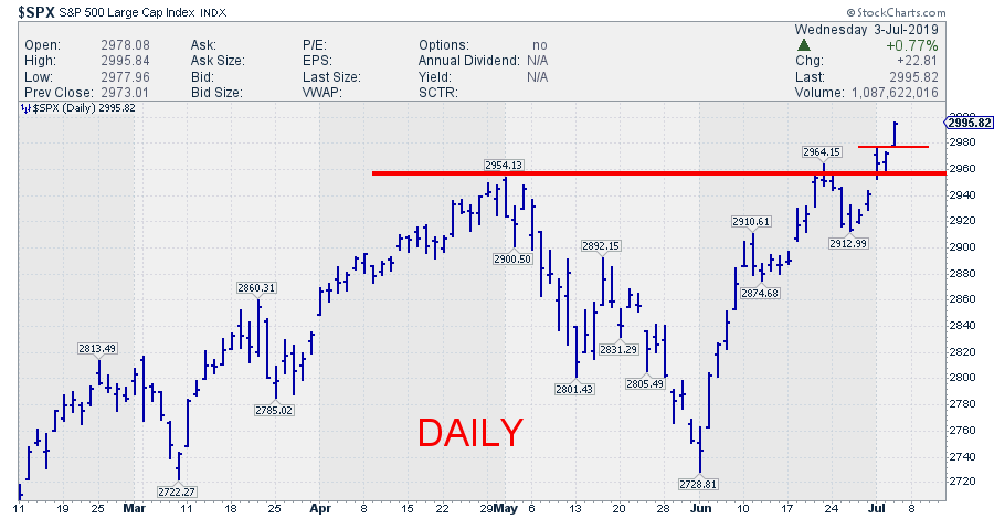
 A short, but strong, trading session just before the Fourth of July holiday pushed the S&P, along with the Nasdaq 100 and the DJ Industrials indexes, to new highs. A short, but strong, trading session just before the Fourth of July holiday pushed the S&P, along with the Nasdaq 100 and the DJ Industrials indexes, to new highs.
Breaks to new highs are pretty strong signs and should not be ignored. At the end of the day, it's hard to be bearish when a market makes new highs.
As I write this, daytime in Amsterdam on Friday, 5 July, the weekly close for these indexes in the US is not yet available. European markets are unchanged and probably waiting for guidance from the US.
On the daily chart below, the break is clearly visible.
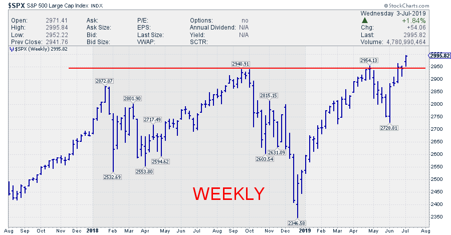
 If we manage to hold above 2955 at Friday's close, that break will also be confirmed on the weekly chart, making it even more important. However, that's not a done deal yet; today is an important day, with payrolls and unemployment data still to be released. If we manage to hold above 2955 at Friday's close, that break will also be confirmed on the weekly chart, making it even more important. However, that's not a done deal yet; today is an important day, with payrolls and unemployment data still to be released.

That weekly chart also reveals that this break, in essence, means a break from an 18-month consolidation, which is all-in-all pretty bullish.
Pockets Of Concern
Does all this mean that all stars are aligned for another continuation of the blistering bull-market? I am not sure. But I do still see some pockets of concern.
1. Asset Class Rotation Starting To Favor Bonds (And Real Estate)
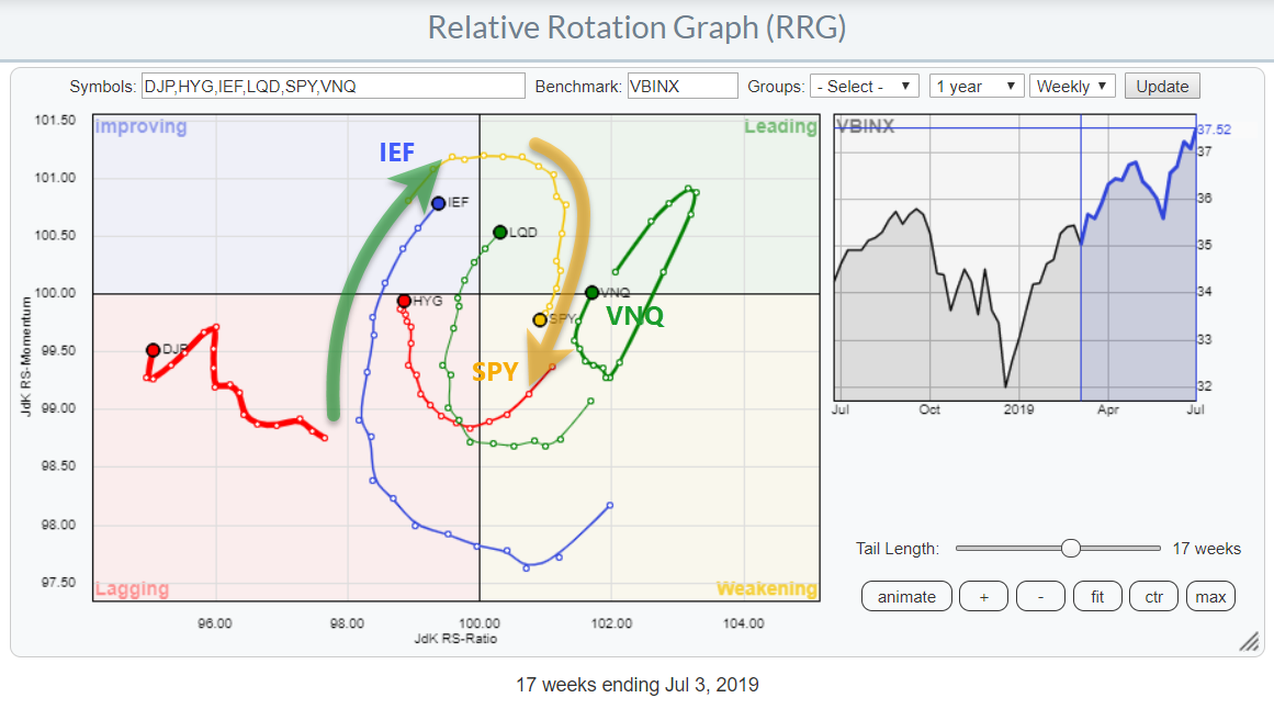
 My first observation comes from the above Relative Rotation Graph, which tracks the rotation for various asset classes. The recent rotation is clearly in favor of bonds over stocks, with the tail for IEF traveling through the improving quadrant at a strong RRG-Heading and close to crossing over to leading. SPY, meanwhile just moved inside the weakening quadrant and is at a negative RRG-Heading. My first observation comes from the above Relative Rotation Graph, which tracks the rotation for various asset classes. The recent rotation is clearly in favor of bonds over stocks, with the tail for IEF traveling through the improving quadrant at a strong RRG-Heading and close to crossing over to leading. SPY, meanwhile just moved inside the weakening quadrant and is at a negative RRG-Heading.
A rotation favoring SPY would be much more supportive for a broad-based (continuation of the) stock market rally. We'll have to see if the strength in stocks will be enough to drag the tail on SPY back up towards (and into) leading.
2. Stocks Rotate To Defensive Sectors
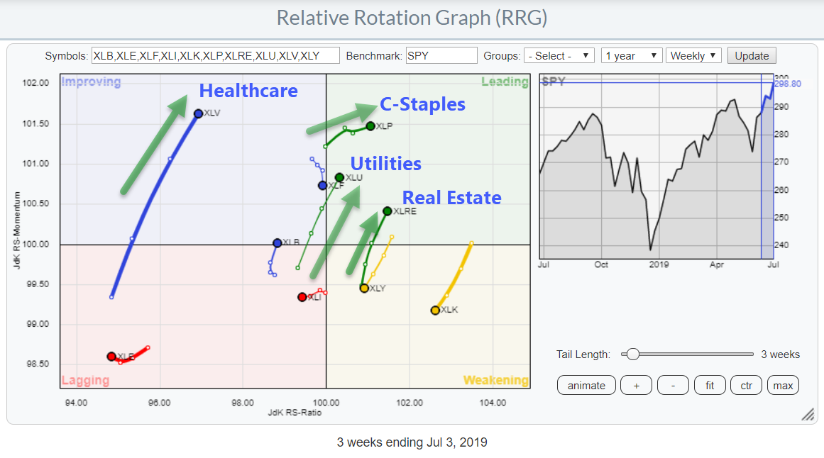
 The second pocket of concern is the very clear rotation to sectors that are generally considered to be "defensive." The second pocket of concern is the very clear rotation to sectors that are generally considered to be "defensive."
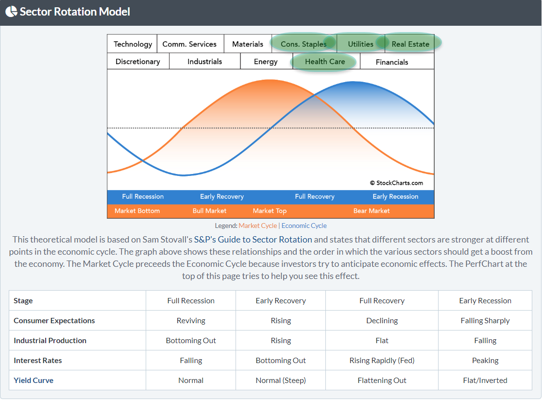
The ultimate defensive sectors, Consumer Staples and Utilities, are already well inside the leading quadrant and pushing further into it, together with the Real Estate sector that just returned into the leading quadrant following a corrective rotation through weakening.
Inside the improving quadrant, the Healthcare sector definitely stands out, with a long tail at a strong RRG-Heading.
When I map these relative trends onto the sector rotation model, they line up with a market that is at a market top (end of expansion cycle).

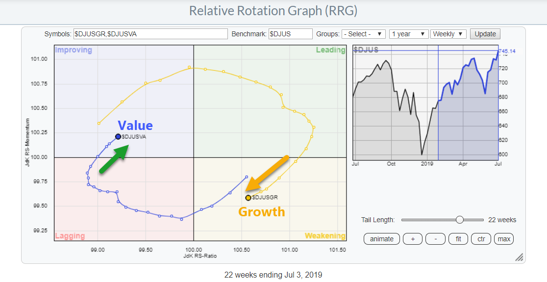
3. Value Starting To Pick-Up vs. Growth

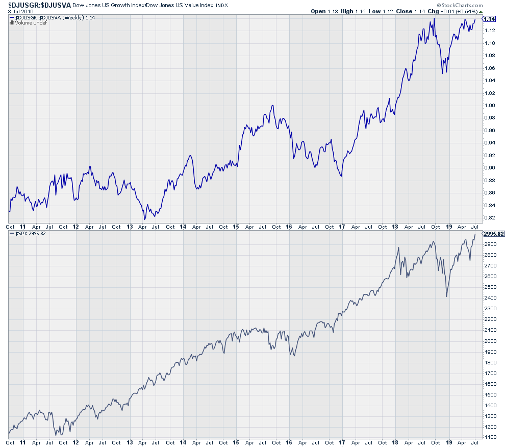
In general, this relationship is in favor of Growth stocks when markets go up (strongly) and in favor of Value when markets flatten out or go down. In other words, Value is the defensive play while Growth is the offensive play.
The third pocket of concern is the observation on the rotational picture that the tails on the RRG above have recently started to move in favor of Value over Growth, albeit with Value inside the improving quadrant and Growth inside weakening.
The accompanying line-chart of this relationship shows that $DJUSGR:$DJUSVA is pushing against resistance.
 As long as this ratio remains below overhead resistance, that pocket of concern remains intact. Once this hurdle is taken out, especially if this happens soon (i.e. in the coming weeks), the rotations for Value and Growth may complete at their current sides of the RRG, lifting this potential drag for the market. As long as this ratio remains below overhead resistance, that pocket of concern remains intact. Once this hurdle is taken out, especially if this happens soon (i.e. in the coming weeks), the rotations for Value and Growth may complete at their current sides of the RRG, lifting this potential drag for the market.
Price Is Leading
As always, price is leading and the $SPX broke higher. That's a given, and it is good. However, despite this positive development, there are enough weak spots in the overall picture to warrant a bit of extra caution and maybe some close(r) monitoring of positions than normal for a blistering bull-market.
My regular blog is the RRG Charts blog. If you would like to receive a notification when a new article is published, simply Subscribe using your email address.
Julius de Kempenaer
Senior Technical Analyst, StockCharts.com
Creator, Relative Rotation Graphs
Founder, RRG Research
Want to stay up to date with the latest market insights from Julius?
– Follow @RRGResearch on Twitter
– Like RRG Research on Facebook
– Follow RRG Research on LinkedIn
– Subscribe to the RRG Charts blog on StockCharts
Feedback, comments or questions are welcome at Juliusdk@stockcharts.com. I cannot promise to respond to each and every message, but I will certainly read them and, where reasonably possible, use the feedback and comments or answer questions.
To discuss RRG with me on S.C.A.N., tag me using the handle Julius_RRG.
RRG, Relative Rotation Graphs, JdK RS-Ratio, and JdK RS-Momentum are registered trademarks of RRG Research.
|
| READ ONLINE → |
|
|
|
| MORE ARTICLES → |
|
 Chart 1
 Chart 2
 When you're a student pilot, your first couple of solo flights remain very close to your home airport. Basically, you get up in the air and do a couple laps around the landing pattern. This is meant to get you comfortable being in the plane by yourself, as well as help you gain confidence for the long solo flights.


 There are other example of top-performing stocks that are at ideal buy points upon a pullback. Below is Semiconductor stock Analog Devices (ADI), which can be bought on a pullback to its 10-day simple moving average. By uncovering top candidates and saving them to your alerts, you can not only improve your returns, but you can also lower your frustration level.

 A short, but strong, trading session just before the Fourth of July holiday pushed the S&P, along with the Nasdaq 100 and the DJ Industrials indexes, to new highs.