| CHARTWATCHERS |
| Crypto Data Is Here! 24/7 Real-Time Coverage And Advanced Charting For Bitcoin, Ethereum, Litecoin And Many More |
| by Grayson Roze |
|

This week, we rolled out new data coverage for the crypto market, with real-time prices updated 24/7 and full integration into all of the tools and features you know and love on StockCharts. You can now create advanced technical charts for Bitcoin, Ethereum, Litecoin, XRP, Monero and many more. Plus, run custom technical scans across all cryptos and set automatic alerts for the coins you're following most closely.
As you can imagine, data coverage is an ever-expanding puzzle. Adding crypto data is the newest piece, and we're thrilled to bring it to the site. The market for digital assets has continued to grow steadily over the past few years and is becoming an increasingly important piece of the global financial machine. We've been keeping a close eye on it, and it's clear that the time is right to add this thriving new asset class to StockCharts.
So, where you can you find, track, chart and analyze all of this new crypto data? Let's take a look!

Your Members Dashboard
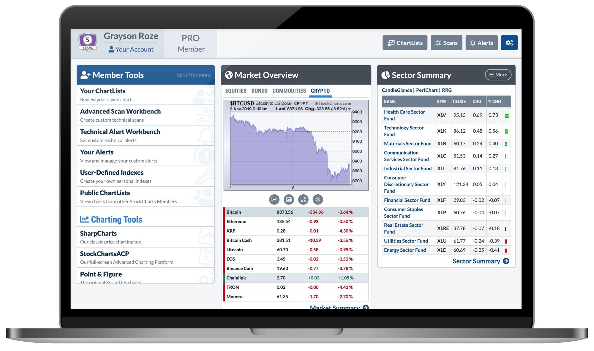
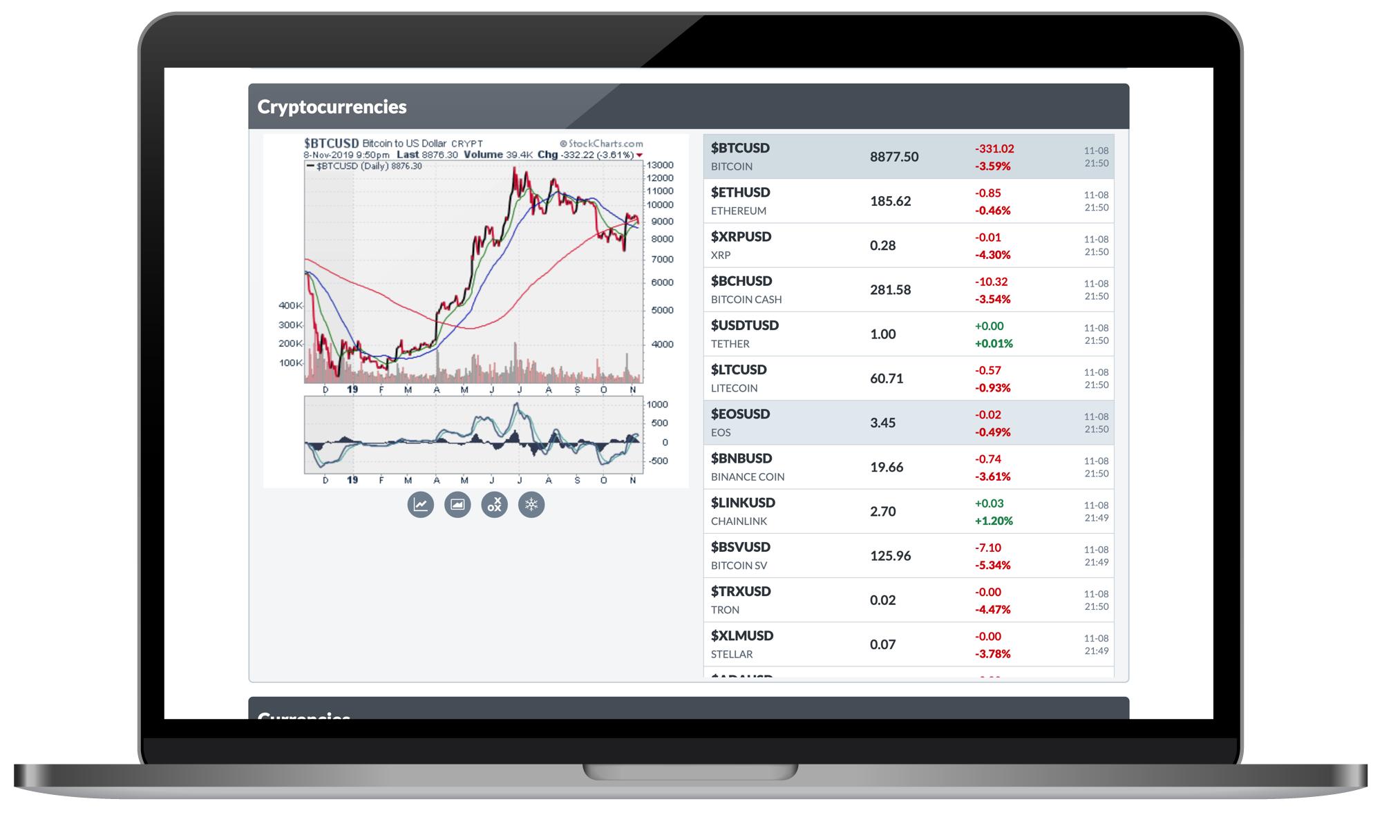
We'll start with my personal favorite. We've updated the "Market Overview" panel of Your Dashboard with three new tabs. In addition to Equities, you now have a Bonds tab, a Commodities tab and an all-new Crypto tab, which features 10 of the largest cryptos in circulation. With a single click over to this tab, you can follow which of the big coins are moving the market, with the latest performance data and charts for each one.
The Dashboard has received quite a few updates and improvements lately, and the new Crypto tab is the latest example. If you missed our announcement from a few weeks ago about the latest Dashboard changes, Click Here to take a look.

The Market Summary Page
On our Market Summary page, we've now added a Cryptocurrencies section to match the other important groups and asset classes. You'll find the new group listed below the "US Commodities" summary about half way down the page.
As a reminder, you can access the Market Summary page from the Member Tools panel of Your Dashboard, or from the Charts & Tools page if you're not a StockCharts Member.
QUICK TIP: As a StockCharts Member, you can customize the charts you see on the Market Summary page with the indicators, overlays and settings you prefer. For detailed instructions, Click Here.

Our NEW "Crypto Summary" Page
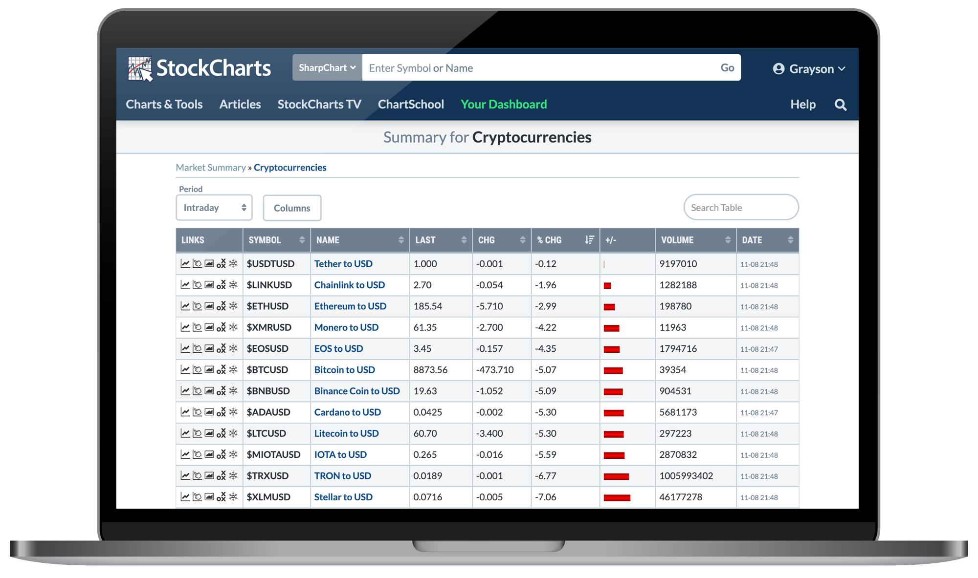
For those of you looking for a more focused summary of what's happening in the crypto space, we've also created a dedicated Crypto Summary page just for this group. In addition to the latest performance data for each coin we cover, the summary page includes quick links to all of our most powerful charting tools, allowing you to pull up charts for each crypto with ease.
You can quickly access our new Crypto Summary page from the Member Tools panel of Your Dashboard, from the Charts & Tools page if you're not a StockCharts Member, or simply by visiting StockCharts.com/crypto.

StockChartsACP – Our Advanced Charting Platform
You've probably heard the buzz surrounding our new full-screen, interactive Advanced Charting Platform – StockChartsACP. With an ultra-dynamic, highly-flexible charting experience, it's designed to totally transform the way you analyze the financial markets. Most importantly, it's the next generation of StockCharts technology and represents multiple years of hard work by our incredible development team.
We're so excited about this new tool that we simply couldn't wait to share it with all of you. That's why earlier this year we decided to release an early-stage alpha version of the new ACP tool. Rather than keep everything under wraps, we wanted to give our loyal users the opportunity to see and explore the upcoming product. We've continued to update that preview version every Friday with updates, improvements, new features and more. It's all leading up to the big official release of the full-featured Advanced Charting Platform in early 2020.
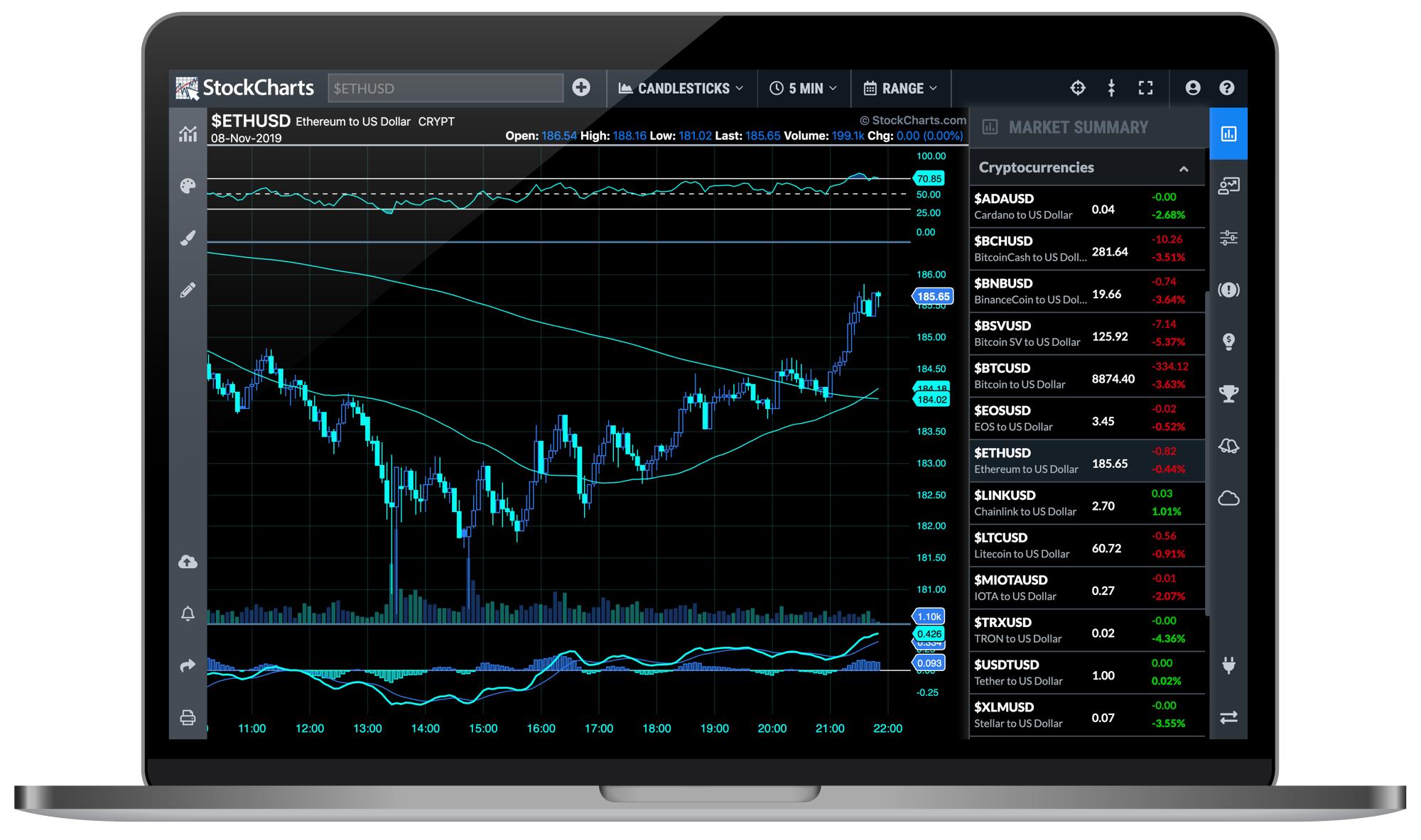
So, with the addition of crypto coverage this week, we've started incorporating the new data into ACP. If you open the Market Summary menu in the righthand sidebar of ACP, you'll see the Cryptocurrencies group listed there. Click on any of the cryptos in that list to see an ACP chart for that coin.
Personally, I'm thrilled about the addition of crypto data on its own, but in concert with the ongoing rollout of our new Advanced Charting Platform, the excitement has only just begun. We have big, big things in store for these two together, and I simply can't wait to share it with you all.

Scans And Alerts
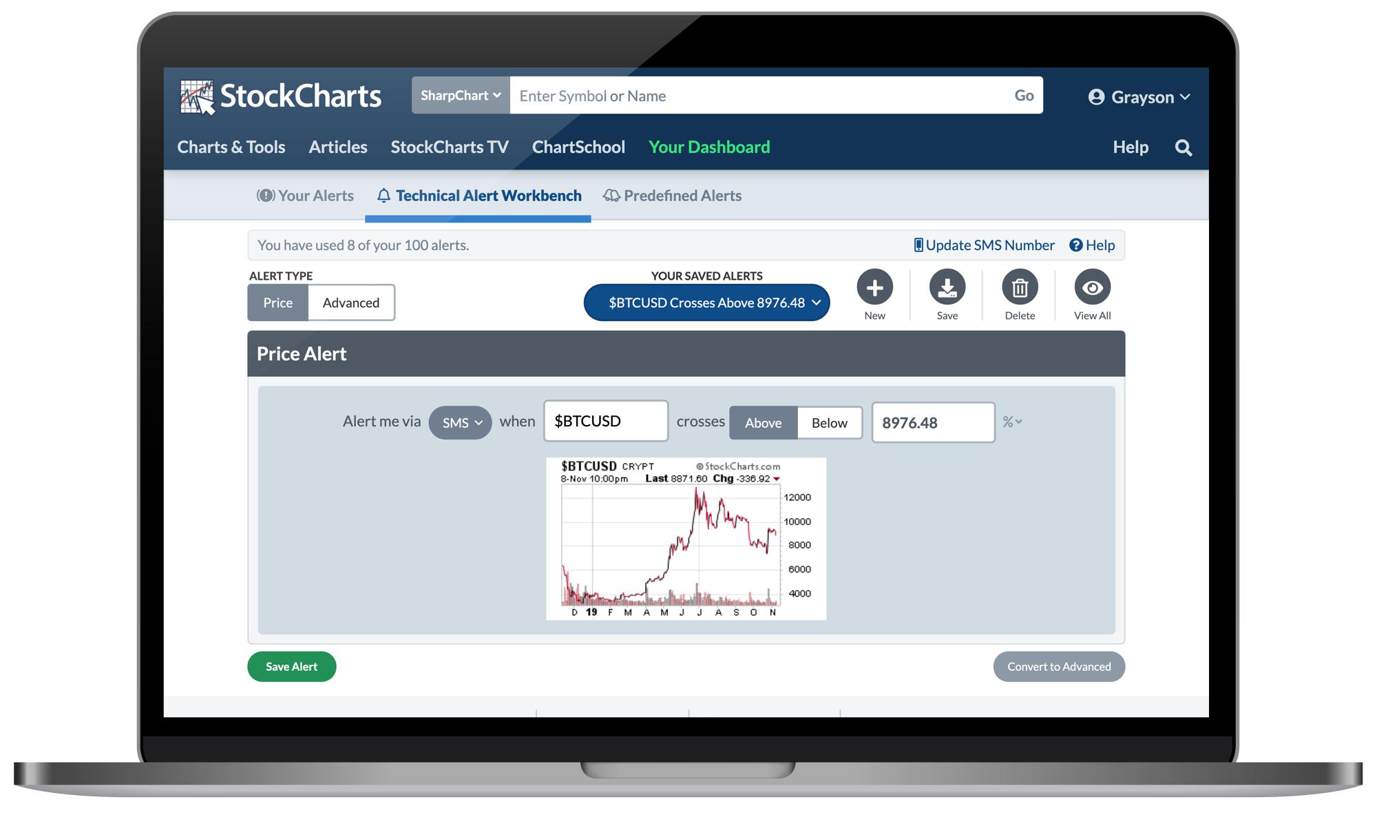
We've wired the new cryptos into both the Advanced Scan Engine and our Technical Alerts tools. You can run scans for your own technical criteria across all of the cryptos we cover, and set custom alerts for the coins you're following most closely. For a market that trades 24 hours a day, 7 days a week, these scanning and alerts capabilities should be a crucial part of any crypto investor's workflow.

Predefined Groups for CandleGlance, PerfCharts and MarketCarpets
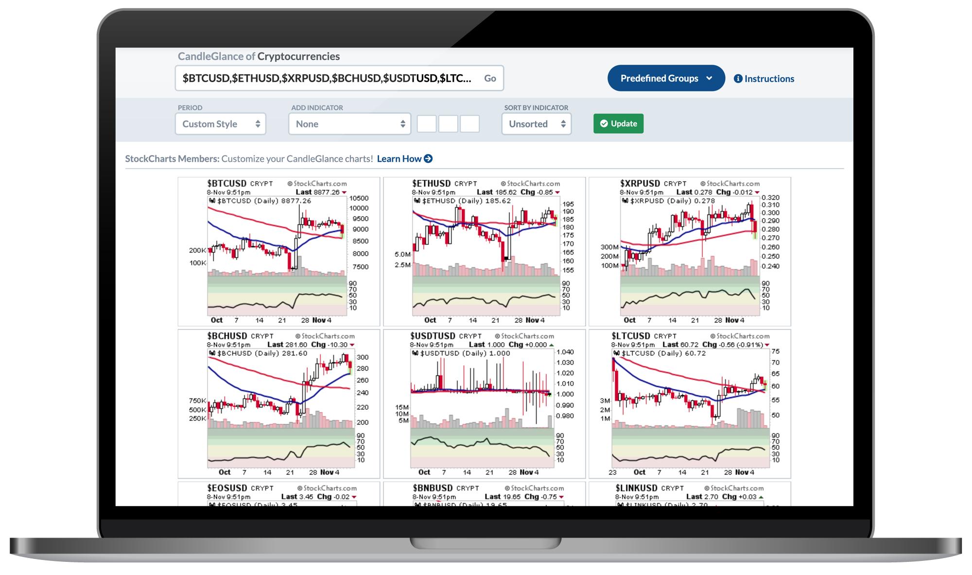
Within our CandleGlance, PerfCharts and MarketCarpets tools, you'll now find a predefined "Cryptocurrencies" group that includes the largest coins we cover. No need to type in all of the ticker symbols by hand. Simply look for the blue "Predefined Groups" dropdown menu and select the Cryptocurrencies option. Quick 'n easy!

And Of Course...SharpCharts!
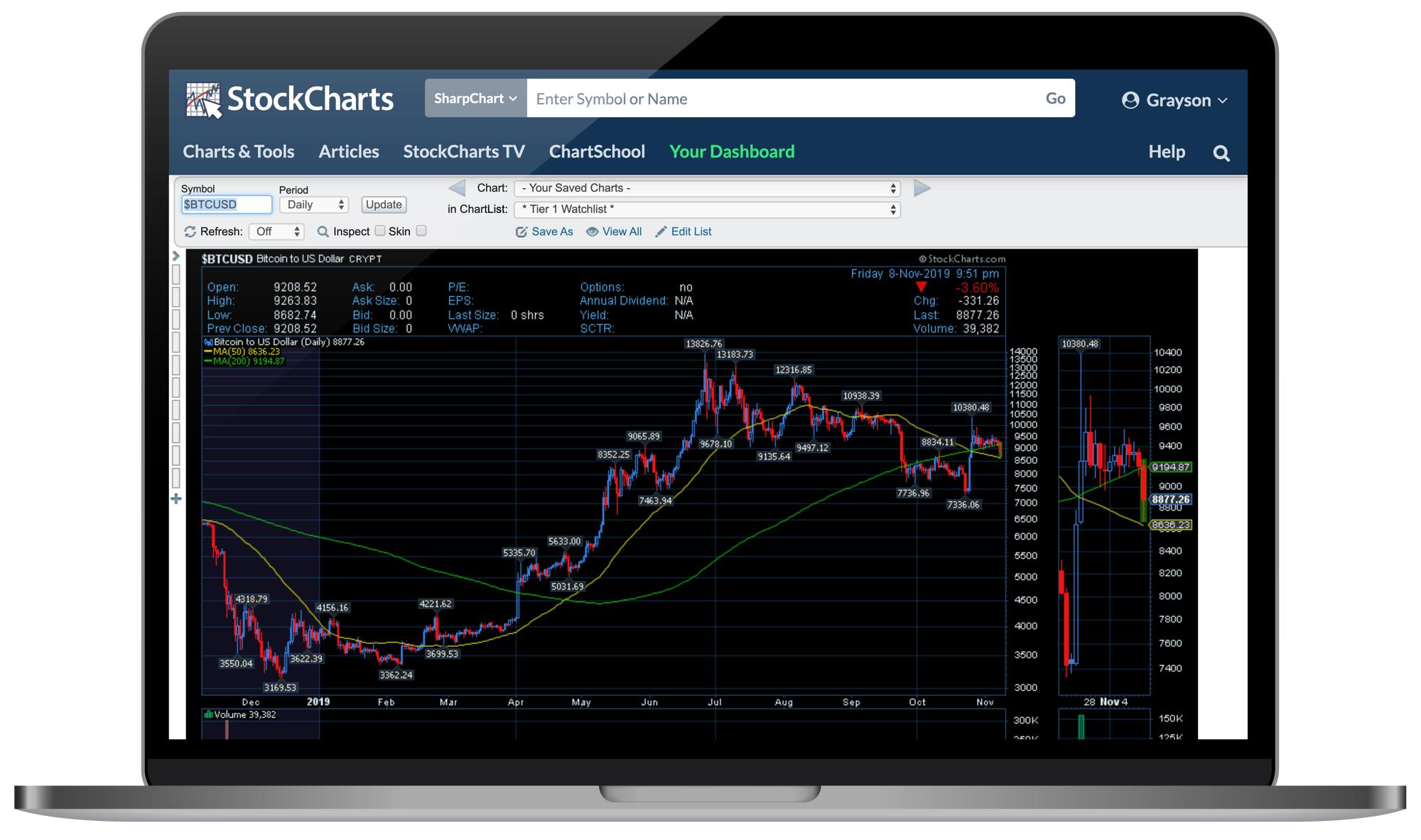
Just like any stock, ETF, Mutual Fund or index we cover, all of our new cryptocurrencies can be charted on the SharpCharts workbench. Using the same technical indicators, overlays, chart settings and annotation tools you're already familiar with, you can analyze the crypto market like never before with the addition of this new data across the site. Plus, just like any other symbol, you can save your charts for these cryptos into your ChartLists, view them with CandleGlance and GalleryView, run scans on them, set alerts for them...the list goes on and on. When I said cryptos are here, I really meant it – cryptos are here!
As with any new feature or addition, we'd love to hear from you. Let us know what you think about the addition of crypto data and share how you're using these new symbols around the site! We appreciate your feedback and input and always love learning more about your experience using StockCharts.
Chart On, My Friends.
Grayson Roze
VP of Operations, StockCharts.com
|
| READ ONLINE → |
|
|
|
| Market Roundup |
| Recent Breakouts Say Equities are Headed Significantly Higher in the Next Six Months |
| by Martin Pring |
Editor's Note: This article was originally published in Martin Pring's Market Roundup on Thursday, November 7th at 1:28pm ET.
Back in mid-September, I wrote an article on US equities that pointed out how several short-term indicators had reached extreme overbought levels, a sign of strong underlying momentum that historically had been followed by higher prices. However, since overbought conditions are typically followed by short-term corrections even during the strongest bull markets, I stated that I was looking for confirmation from three key indicators. If they went bullish, my thought was that this would signal a meaningful extension to the rally. We finally got that confirmation for two of those charts last week and the third is right at its breakout point. Even though we do not have a “full house,” so to speak, there is enough other evidence that suggests that both US and global equities are set to move significantly higher.
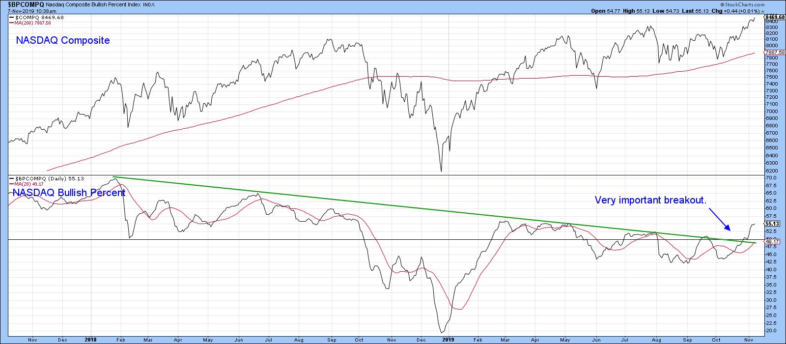
Our first chart features the NASDAQ bullish percentage. You can see how it gradually worked its way lower from a heady reading of 70% in 2018 to a more modest 40% earlier this year. The barrier I was really interested in was that green downtrend line, which is quite lengthy and had been touched on numerous occasions. Its penetration, I felt, would represent a powerful signal of market strength. Such a break would suggest two things: first, that the number of stocks in a positive trend would expand, and second, that this broadening in participation would also translate into a higher NASDAQ. That break has now materialized. In addition, the indicator has begun a series of rising peaks and troughs. Finally, even after the sharp recent rally, it remains at a relatively modest 55%, which leaves plenty of upside before it becomes overbought.

Chart 1
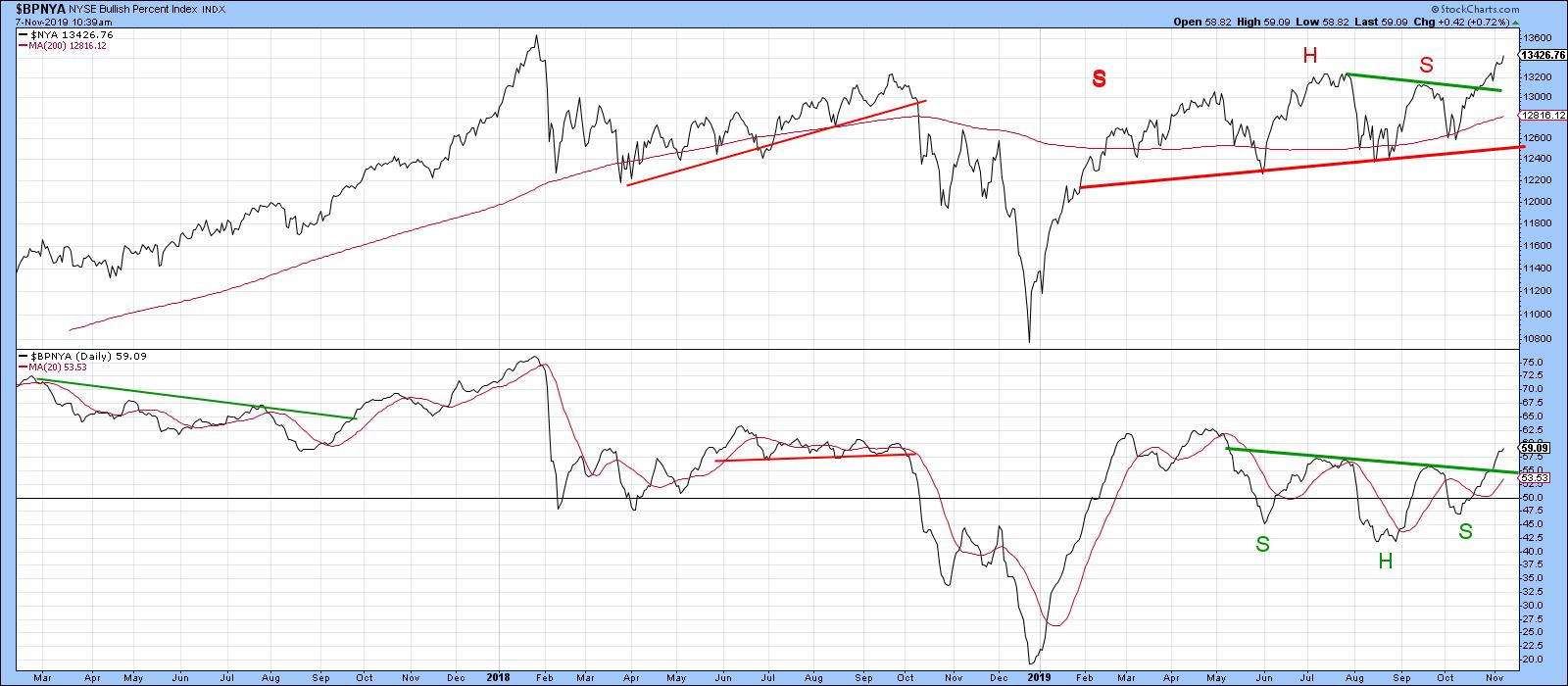
Chart 2 shows that a similar measure for the NYSE has completed a reverse head-and-shoulders. Also, note that the NYSE failed to complete a head-and-shoulders top, an event that is often followed by an above-average move, as those believing that prices were headed lower scramble to get on the right side of the market.

Chart 2
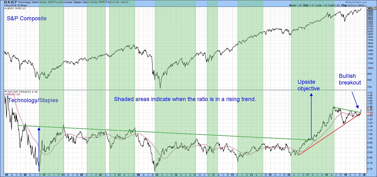
The second chart we were monitoring is the ratio between the SPDR Technology and Consumer Staples (XLK/XLP). It’s essentially a proxy for identifying swings in investor sentiment. A rising indicator tells us that traders are becoming more confident, bidding up the more speculative technology stocks against their defensive consumer staple counterparts.
When this relationship is rising, the overall market is usually stronger as well. Using the benefit of hindsight, the green-shaded areas represent the major rallies in the ratio. You can see that such periods were generally pretty positive for the S&P Composite. Note also that it broke out of a huge base some time ago and has yet to achieve the upside objective called for by that pattern. More recently, this relationship has been moving in a narrowing trading range, bounded by the two converging trend lines. It has now broken out. The unrealized upside objective from the giant base suggests that the recent break will be valid.

Chart 3
Click here to read the full article in Martin Pring's Market Roundup.
Good luck and good charting,
Martin J. Pring
The views expressed in this article are those of the author and do not necessarily reflect the position or opinion of Pring Turner Capital Group of Walnut Creek or its affiliates.
|
| READ ONLINE → |
|
|
|
| The Mindful Investor |
| Three Tips to Upgrade Your Chart Routine |
| by David Keller |
As of this article's writing, I have just passed the two-month mark after joining StockCharts.com as Chief Market Strategist. Let me tell you, it’s been an absolute pleasure getting to know all of the developers that are building and maintaining the powerful set of features that StockCharts users enjoy.
Selfishly, I’m also thankful that I’ve gotten to spend way more of my time upgrading my own use of the platform. As investors, we tend to get stuck in our ways; once we design a routine that works, we tend to stick with it. I’m so thankful that the move to Seattle provided a natural opportunity to take a step back and see how I could be getting more out of the platform.
I have always been impressed by Greg Schnell’s mastery of the ChartList feature. When he spoke at the TSAA annual conference in San Francisco, he ripped around sectors and industries in a way that made a ton of sense to me. Inspired by Greg’s presentation, I returned to Redmond ready to update my ChartLists to allow me to systematically review my most important charts.
Here are three tips I learned from elevating my use of the ChartList feature:
1) Organize your ChartLists effectively.
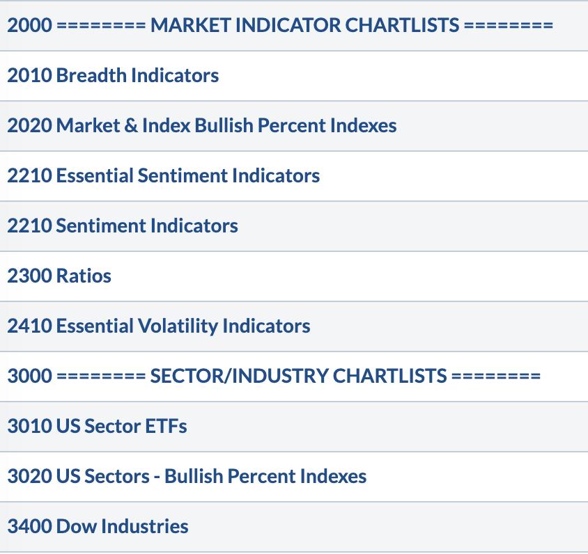
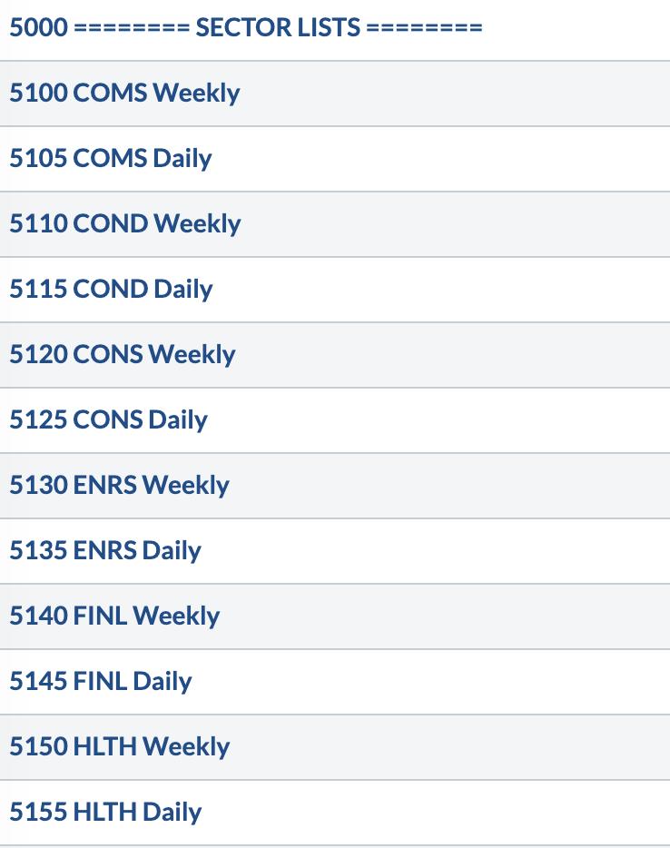
Arthur Hill first suggested that I start all ChartList titles with a number. Fantastic advice. Ordering your lists comes down to your numbering system and, if you do it right, it becomes very easy to insert lists anywhere you want down the road.

The really important lists start with a symbol like “!!!”, which elevates them to the very top of your list. I’m often saving charts to the Mindful Investor LIVE ChartList, so it has a place of honor at the top.
2) Set a regular time to review key ChartLists.
I have a set of charts that I like to review first thing in the morning. I also have a second set of charts that I review every afternoon while preparing for The Final Bar on StockCharts TV. Finally, I have a third set of charts that I review every week, in particular the entire S&P 500 index members grouped by sector.

Setting up your lists is the easy part. Creating a routine of systematically reviewing those charts - and sticking to it over time - is the real tricky part.
3) Use ChartLists as a workbook.
I always coach beginner technical analysts to treat your charts not as a painting, but as a workbook. Keeping a list of ideas on paper on an Excel spreadsheet is straightforward, but it’s one step removed from your decision-making process.

I like to keep notes directly on my charts so I know what I was thinking on a certain date based on a certain chart configuration. Then, when I go back as part of my regular review process, I can understand what motivated a decision on a certain chart at a certain point in time.
ChartLists are one of my favorite parts of the StockCharts platform because they allow me to design a system of charts that aligns with my investment process. The easier and more accessible you make these lists, the more likely you are to stick to a good routine of charting to fuel good investment decisions.
RR#6,
Dave
David Keller, CMT
Chief Market Strategist
StockCharts.com
David Keller, CMT is Chief Market Strategist at StockCharts.com, where he helps investors minimize behavioral biases through technical analysis. He is also President and Chief Strategist at Sierra Alpha Research LLC, a boutique investment research firm focused on managing risk through market awareness. He is a Past President of the Chartered Market Technician (CMT) Association and most recently served as a Subject Matter Expert for Behavioral Finance. David was formerly a Managing Director of Research at Fidelity Investments in Boston as well as a technical analysis specialist for Bloomberg in New York. You can follow his thinking at MarketMisbehavior.com, where he explores the relationship between behavioral psychology and the financial markets.
Disclaimer: This blog is for educational purposes only and should not be construed as financial advice. The ideas and strategies should never be used without first assessing your own personal and financial situation or without consulting a financial professional.
The author does not have a position in mentioned securities at the time of publication. Any opinions expressed herein are solely those of the author and do not in any way represent the views or opinions of any other person or entity.
|
| READ ONLINE → |
|
|
|
|
|
| Trading Places |
| Biotechs Have Finally Caught Fire; Trading Candidates To Consider |
| by Tom Bowley |
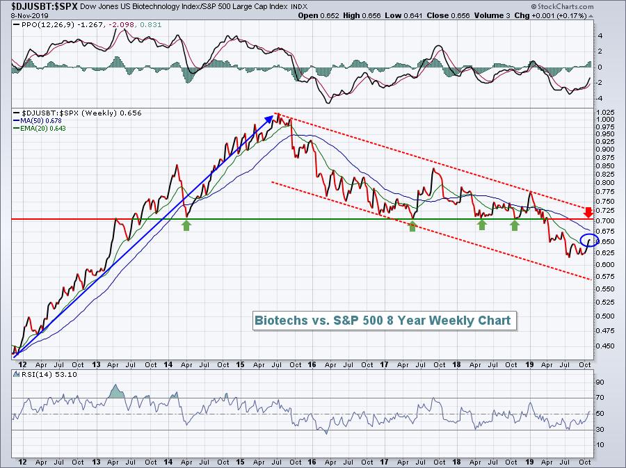
When the biotechs ($DJUSBT) get rolling, make sure to jump on board for the ride! The DJUSBT broke out above 600 at the beginning of 2012; by the time the run was over 3 1/2 years later, it had gained 167%! Since the middle of 2015, this same group of stocks has lost 8%. That's not good, especially when we consider that the S&P 500 has risen more than 40% over that same period. You should be able to imagine what that relative strength chart looks like for biotechs, but if you can't picture it, here you go:

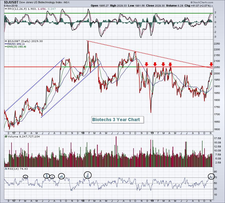
So the obvious bad news for the group is that the weekly relative downtrend remains firmly in play. However, there is a glimmer of short-term hope, in that the relative strength line has cleared the 20-week EMA for the first time in 10 months. Furthermore, if we shift to a price chart of the DJUSBT, you'll see a few positive developments:

On this price chart, note that the RSI has moved above 70. That generally only happens during uptrends. If you look back over the last three years, you'll notice that when the RSI moves above 70, we tend to see more bullish action. During the current downtrend, we've not once seen the RSI move above 70 - not until now, that is. Also, the daily PPO has reached +2, which has been the top since early 2018. A PPO that rises above +2 would be a very bullish development, so watch for it. Next, look at where price and trend line resistance meet - at or near the 2050 level. If you see a price breakout above 2050, that, in my opinion, would be a confirming signal of a fresh uptrend.
Given this renewed strength (and assuming we see the breakout above), where should we consider trading in biotechs? Well, there are two ETFs that I'd consider, if ETFs are your thing: the SPDR S&P Biotech ETF (XBI) and the iShares NASDAQ Biotechnology ETF (IBB). The XBI is much more diversified, with the top holding (Seattle Genetics - SGEN) just 2.47% of the ETF value. The top 10 holdings represent 19.34% of the ETF value. The IBB, on the other hand, has been the much better performer, but its holding are much more concentrated; the top 10 holdings, for instance, represent 54.15% of the ETF value. IBB's top 3 holdings are Celgene Corp (CELG, 8.56%), Amgen Inc (AMGN, 7.84%) and Gilead Sciences (GILD, 7.69%), which comprise roughly 25% of the entire ETF. So you need to know what you're buying.
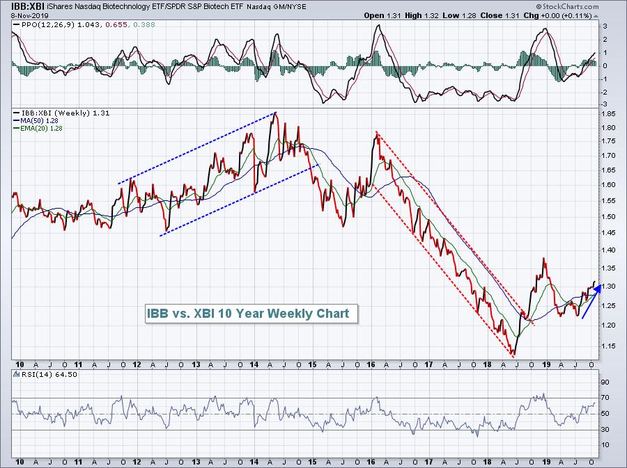
My preference between these two ETFs would be the IBB. I love the CELG and AMGN charts, and the fourth largest holding, Vertex Pharmaceuticals (VRTX), just broke out to an all-time high here in the past 1-2 weeks. To compare their performances, let's look at IBB:XBI on a relative chart:

One thing that's very clear to me is that owning the IBB vs. the XBI is a big deal. They go through periods of outperformance and underperformance, and I'd tend to stick with the one that's leading... until it isn't. So I prefer the IBB at this point.
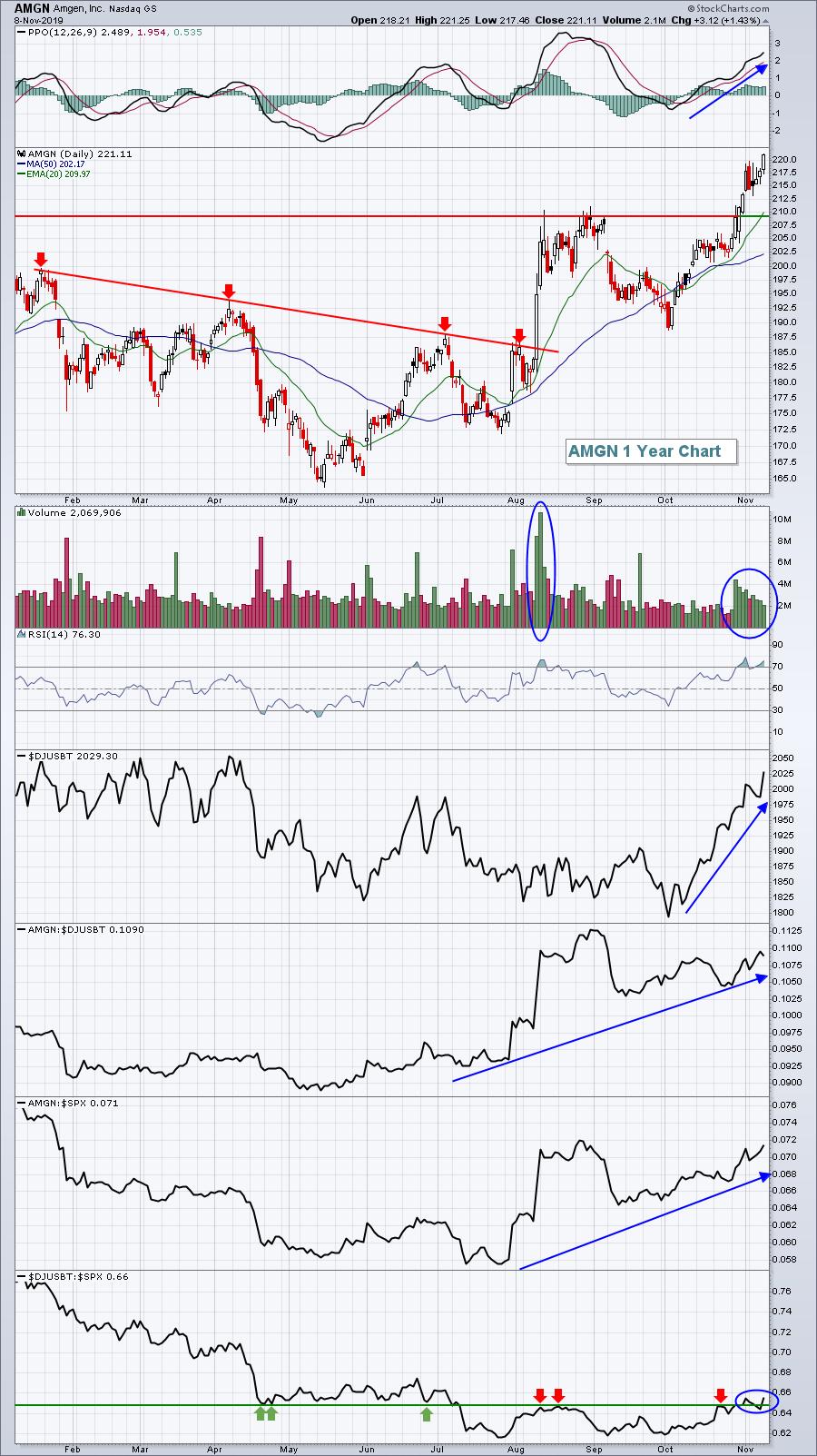
From an individual stock standpoint, there are two large cap biotech names that I like right now. The first is Amgen (AMGN):

AMGN is a leader and thus isn't subject to the massive selloffs when a drug trial fails. I see higher prices ahead for AMGN.
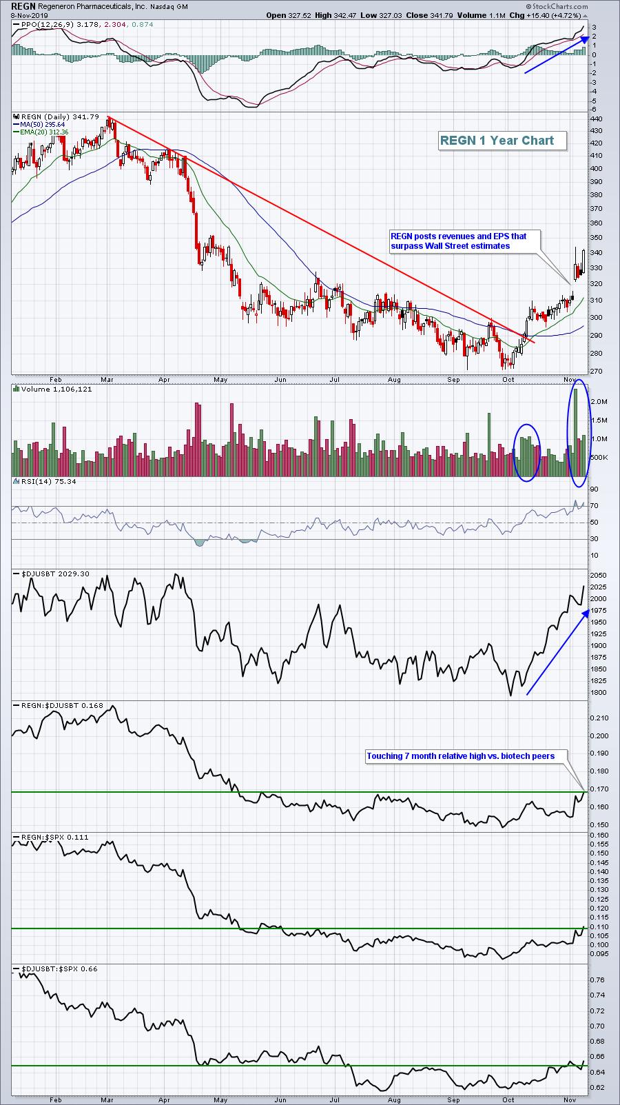
The second stock I'd like to discuss is Regeneron Pharmaceuticals (REGN). On Wednesday, in my Trading Places LIVE show, I covered REGN as my #1 stock in the "3 You Must See" segment that I end each show with. The stock has been consolidating for the past four years following a dizzying rally from 20 bucks in 2010 to 600 in 2015!!! That was a 30-bagger! It's taken a while for the stock to break back to the upside, but I think it's happening right before our eyes. Look at the recent transition from downtrend to uptrend:

I expect to see higher prices from REGN in the balance of 2019 and into 2020. Volume trends are much more bullish now and, unlike AMGN, REGN seems to just be starting its uptrend. It's also just moved up to test its 7-month relative high (vs. the DJUSBT). On Friday, REGN was the top-performing stock in the S&P 500.
On Monday, November 11th at 4:30pm, I'll be hosting a "Top 10 Stocks Sneak Preview" webinar, where I release my Top 10 stocks for each of my Model, Aggressive and Income portfolios on Tuesday, November 19th. Here are how my portfolios have performed vs. the benchmark S&P 500:
Model Portfolio (since inception on 11/19/18 and through 11/8/19): +39.66%
S&P 500 since 11/19/18: +14.95%
Aggressive Portfolio (since inception on 5/19/19 and through 11/8/19): +9.28%
Income Portfolio (since inception on 5/19/19 and through 11/8/19): +9.95%
S&P 500 since 5/19/19: +8.17%
All 3 portfolios, despite a difficult past 10 weeks during the market's rotation from growth stocks to value stocks, have outperformed the benchmark S&P 500 since their respective inceptions. At Monday's webinar, I'll be discussing my methodology for selecting stocks for each portfolio and will even share a few excellent recent earnings reports of companies that might just find themselves in one of my portfolios come November 19th.
This Monday event is free to everyone and I encourage you to attend. I'll be discussing recent rotation to areas like biotechs and transports ($TRAN), providing potential trading opportunities there and in other areas of the market. All I ask is that you sign up for our free EB Digest newsletter and become a part of our rapidly growing EarningsBeats.com community. Furthermore, my Monday EB Digest article will feature my favorite mid-cap biotech stock, one that could be poised to explode if money continues rotating into the group.
CLICK HERE to sign up for the free EB Digest newsletter, receive the mid-cap biotech stock Monday morning, and reserve your seat for our very popular Monday event!
Happy trading!
Tom
|
| READ ONLINE → |
|
|
|
| RRG Charts |
| The Yield Curve, What is it? Why is it important? |
| by Julius de Kempenaer |

A yield curve is a graphical representation of yields on bonds with different maturities. The most common example is the government bond yield curve, but it is very well possible to render a yield curve for other types of bonds, such as corporate bonds, high yield bonds, etc.
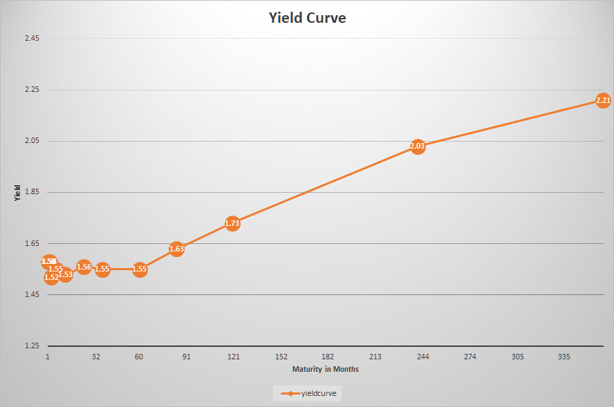
The government bond yield curve is often referred to as the benchmark yield curve; the image above shows this curve for US government bonds on 1 November 2019. Data to draw a yield curve (for US gov bonds) are readily available from various sources. A good source to check yields for various maturities of government bonds is the website of the US Department of the treasury (www.treasury.gov). The image above is rendered using data from that source.

Each day, the yields are reported for the various maturities, ranging from 1 month up to 30 years. Please note that all these yields are annualized; for a bond with a one-month maturity, you will receive 1.58% : 12 = 0.13%
On the horizontal axis the maturity of the bonds is translated to no of months in order to get a proper scaling on the chart. On the vertical axis the yield is shown.
In a normal situation, one would expect to receive a higher compensation (yield) for longer maturities. When you lend money to the government for 20 or 30 years, it intuitively makes sense to receive a higher compensation than when you lend it only for a year or a few months.
As these yields change every day, the shape of the curve will change accordingly. Because financial markets have a tendency of throwing curve balls from time to time, unusual/unintuitive situations can and will happen.
Three Shapes
Essentially, there are three possible shapes that we can see in the yield curve.
Normal
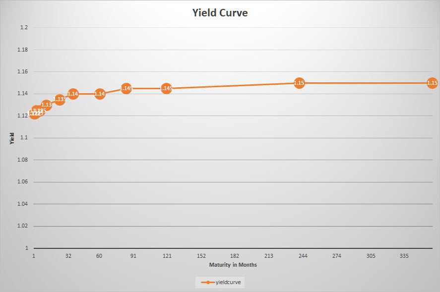
This is the situation described above, in which the yield on shorter maturities is lower than on higher maturities. The yield curve curves gradually upward, with the increase of yield decreasing towards longer-dated bonds.

Flat
When the yield curve is "flat," the yields are (more or less) the same across all maturities. This means that you will receive roughly the same compensation for lending your money out for 2 years or 30 years. You are not compensated for the longer-lending (and therefore more risky) period.

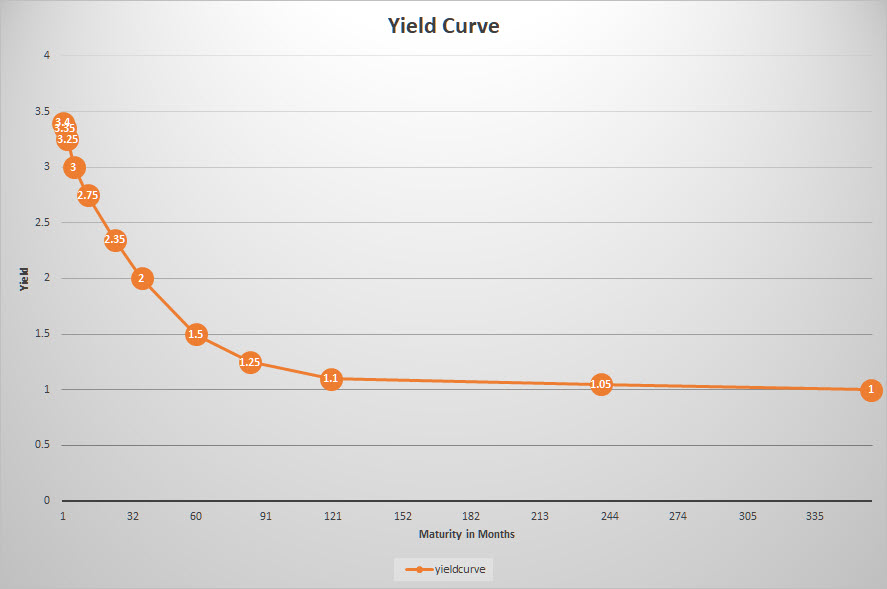
Inverted
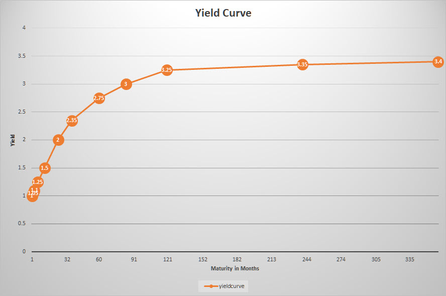
An inverted yield curve refers to a situation where the shorter-dated bonds offer a higher yield than the longer ones. Clearly an unusual situation, but it happens. When it does, it is a situation that draws a lot of attention.

What can we learn from (changes in) the yield curve?
The image(s) above are obviously "styled" and will usually differ quite significantly from reality. An inverted yield curve does not have to be "completely" inverted as in the image. Sometimes only part(s) of the curve are inverted; this can cause humps or dents in the curve as we would expect it to be shaped.
In general, the yield curve reflects the way investors think about risk. In a normal yield curve situation, the thinking is that the shorter the maturity, the less risk for the investor and, therefore, a lower yield (compensation) than for longer-dated bonds.
A normal-shaped yield curve is usually seen in an economic environment that shows normal growth and little-to-no changes in inflation or available credit.
Changes in the shape of the curve over time can help investors to signal changes in the economic climate. This changing of the curve is often referred to as "steepening" or "flattening." These movements are measured by the slope of the yield curve. When there is a big difference between the short and the long end of the curve, it is called steep. When this difference decreases, long yields come down while short yields go up, which is called a flattening of the curve (the slope is getting less steep).
The opposite situation, when the difference between the two ends of the curves is small but is starting to increase, is called the steepening of the curve. Steep curves are generally seen at the beginning of a growth or expansion period.
An inverted curve is usually seen as a signal that economic growth will soon stabilize or reverse, maybe even signaling the start of a recession. This is caused by investors thinking that the period of economic growth is or will soon be over, making them more likely to accept lower rates before they fall even further. This process can cause (partial) yield curve inversions.
As the economy expands and contracts and the yield curve moves from normal/steep to flat/inverted, the curve has to pass the flat shape in both directions. A flat curve can therefore be seen as a transition period in the economy from one phase to another.
Which tools to use?
It is not so much the current shape of the curve that can help us to solve the financial puzzle, but more the transition and the changing of the shape of the curve that will provide us with clues for the potential future direction of the economy.
As with many graphs/tools/relationships/etc. that we use in our analysis, the yield curve will not provide us with the definitive answer. Like all other tools that we have at our disposal, it is just a piece of the puzzle that we are trying to solve every day.
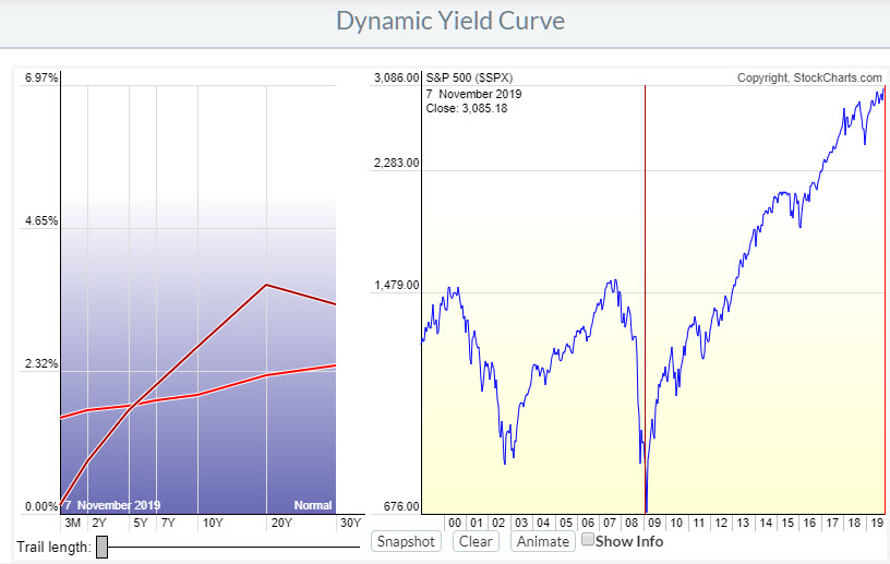
On StockCharts.com, we have the dynamic yield curve tool to help you analyze the yield curve as it changes over time.

In the image above, you can see the changes the curve has experienced from the low in the S&P 500 in 2009 to today.
In early 2009, the shape of the curve was normal with a small bump on 20y. Today, the curve is much flatter, with short yields much higher than in 2009 and long yields much lower than in 2009. We can therefore see a serious flattening of the curve over this period.
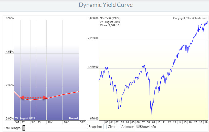
During that period, there have been a few days where the curve was minimally inverted at the end of August.

When people talk about "the yield curve inversion," they usually refer to the 10y-2y segment.
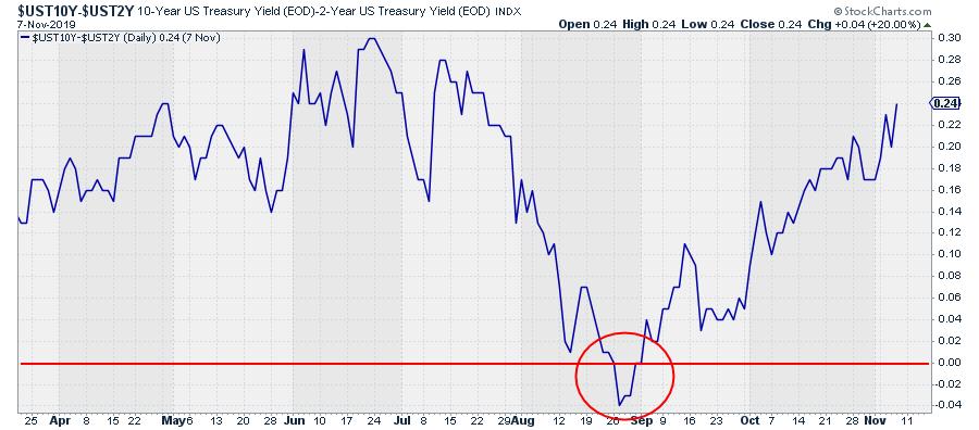
Another way of showing that relationship is by drawing a chart of the difference between these two yields ($UST10y-$UST2y), as shown in the chart below.

When this relationship dips below 0, the 10-2 curve is inverted.
(In a previous post, I wrote about how you can combine the yield curve with the business cycle to get a handle on economic conditions and also throw in some Relative Rotation Graphs for analysis purposes.)
-Julius
My regular blog is the RRG Charts blog. If you would like to receive a notification when a new article is published there, simply "Subscribe" with your email address.
Julius de Kempenaer
Senior Technical Analyst, StockCharts.com
Creator, Relative Rotation Graphs
Founder, RRG Research
Want to stay up to date with the latest market insights from Julius?
– Follow @RRGResearch on Twitter
– Like RRG Research on Facebook
– Follow RRG Research on LinkedIn
– Subscribe to the RRG Charts blog on StockCharts
Feedback, comments or questions are welcome at Juliusdk@stockcharts.com. I cannot promise to respond to each and every message, but I will certainly read them and, where reasonably possible, use the feedback and comments or answer questions.
To discuss RRG with me on S.C.A.N., tag me using the handle Julius_RRG.
RRG, Relative Rotation Graphs, JdK RS-Ratio, and JdK RS-Momentum are registered trademarks of RRG Research.
|
| READ ONLINE → |
|
|
|
| The MEM Edge |
| Deep Value Stocks Come Into Favor As Investors Seek Higher Yields - 2 Turnaround Candidates And An ETF For Your Review |
| by Mary Ellen McGonagle |
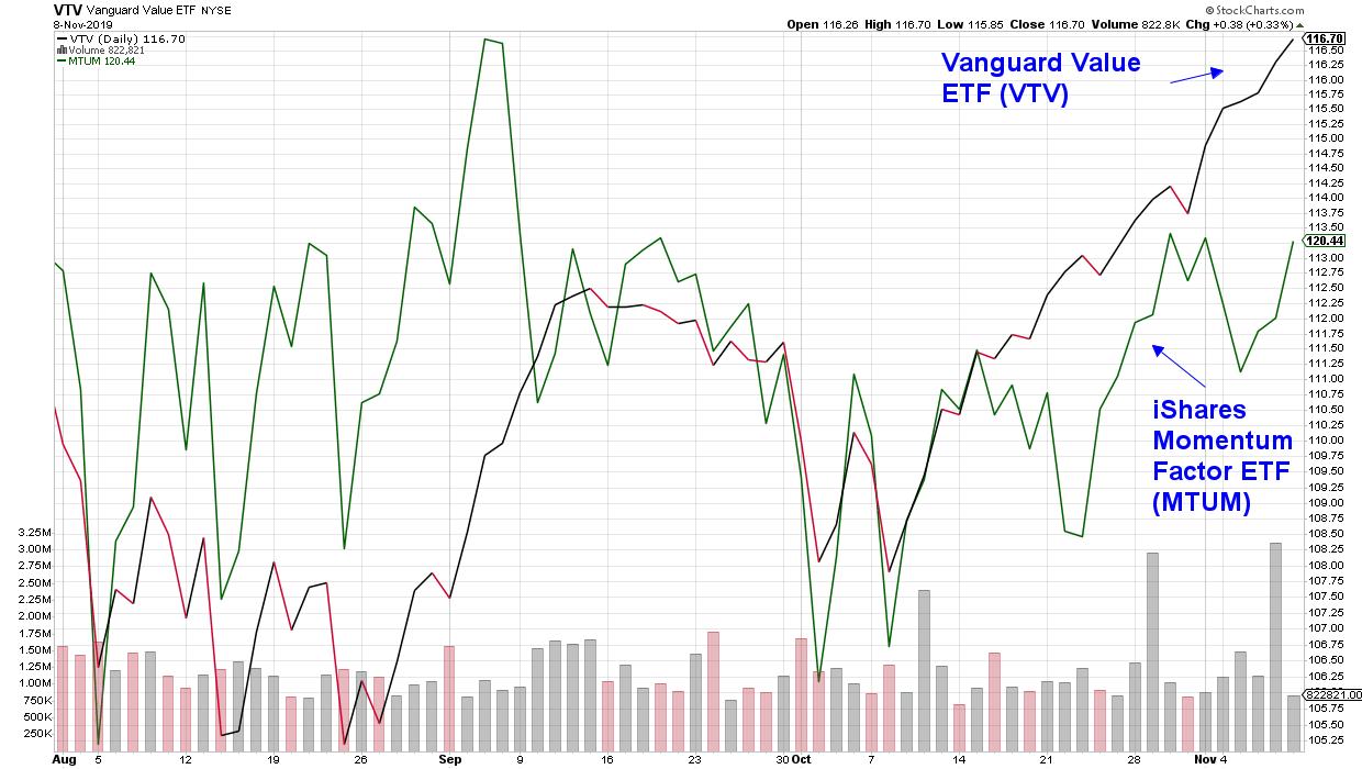
There’s been a rotation in the U.S. markets recently as faster moving, high growth stocks have given way to value within the U.S. As you can see in the chart below, the Vanguard Value ETF has been outpacing the S&P 500 Index for about a month now.
Vanguard Value ETF (VTV) versus the S&P 500 Index (SPX)

A closer look at the underlying stocks within these outperforming Value funds and the top 10 holdings each have a yield that’s higher than the S&P 500 Index. This search for yield is a common theme of late; particularly following the Federal Reserve’s 3rd rate cut in a matter of months.
Today, I’m going to share 2 value stocks that are in the beginning stages of reversing long term downtrends while offering exceptional dividends as well as an ETF that provides its high yield by investing in International companies.
WEEKLY CHART OF CARDINAL HEALTH INC. (CAH)
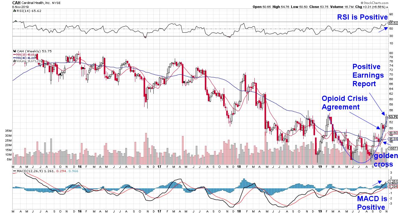
First up is Cardinal Health (CAH) which provides services and products to hospitals and pharmacies throughout the world. Despite the company’s ability to beat earnings and sales estimates handily over at least the past 4 quarters, the stock has been in a prolonged downtrend due to its involvement in the opioid crisis lawsuit.
As you can see in the chart above, the stock has had several other downtrend-reversal attempts that did not take hold however, there are dynamics now that make this attempt more likely to succeed. To begin, the stock is very close to breaking out to a 1-year high in price. This event would remove any overhead supply that would have recent purchasers selling as it hits their buy point.
A second and even more important element is the fact that the uncertainty surrounding the opioid litigation has been mostly removed following news that a tentative agreement was reached with 4 states attorneys late last month.
More recently, CAH reported earnings and sales that were ahead of estimates for every segment of their company and despite the recent rally in the stock, this 3.6% yielder is trading at a mere 10 times next years earnings estimates while analysts are raising their estimates.
DAILY CHART OF CENTURYLINK INC. (CTL)
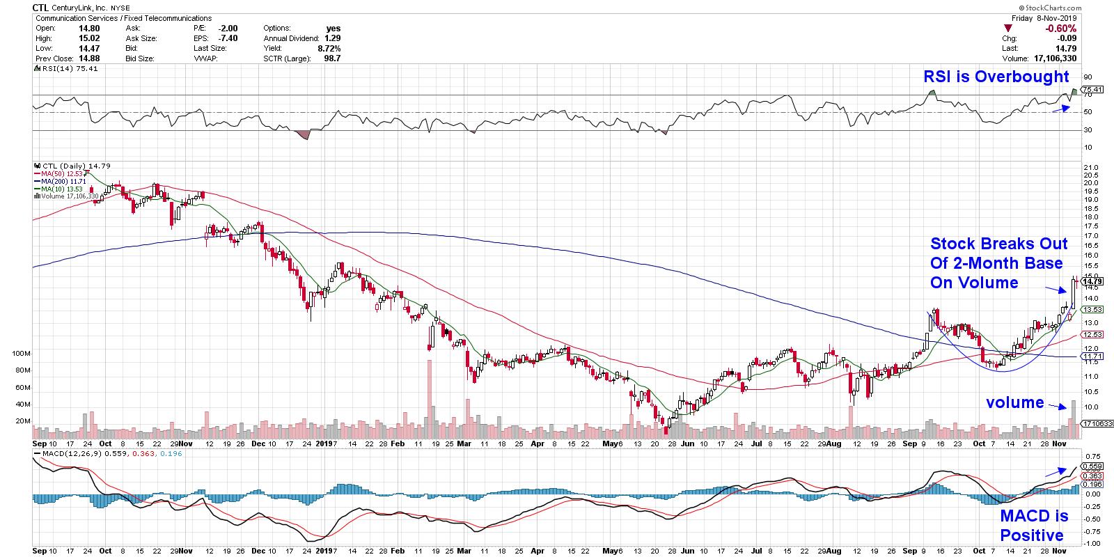
Next up is CenturyLink (CTL) which is another underperformer until more recently. The stock’s steep decline began after the company announced in mid-February that they’d be cutting their dividend in half. The company was also suffering from slower sales due to legacy services such as landline phones and slow internet connections.
The company has since focused on more profitable lines of business such as building out their fiber optic network as well as building on their cloud computing solutions. The efforts seem to be paying off as CTL reported numbers yesterday that showed a pickup in revenues. The markets responded by pushing the stock out of a 2-month base following an 11% rally.
The move was on volume which is bullish and it puts the 6.8% yielder on track for more upside.
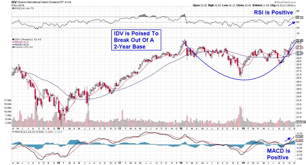
WEEKLY CHART OF iSHARES INTERNATIONAL SELECT DIVIDEND ETF (IDV)
Last up is iShares International Dividend (IDV) which is an ETF that's comprised of high dividend paying equities in non-U.S. developed markets such as Europe, Asia and Canada. The ETF has a 5.6% yield and a quick look at the top holdings reveals several top performing Bank stocks from Italy, Australia, Sweden and Germany as well as Consumer related stocks from the UK.
As you can see, IDV is poised to break out of a 2 year base which would be very bullish.
Each of the stocks and the ETF that I've highlighted appear poised for more upside and while high-dividend Utility and REIT stocks were hit hard this week, these names have characteristics beyond their high yields that should sustain a continued uptrend.
Over the next month, I'll be introducing a High Growth Dividend newsletter with fellow Stockcharts.com author Bruce Fraser. I'm very excited about this endeavor and for those of you who'd like to be alerted to it's launch, you can get on the waiting list here.
And for those who'd like to be receive a trial of my MEM Edge Report, you can access this link here. This bi-weekly report provides sector insights as well as individual stocks that are poised to outperform within those stronger sectors.
Warmly,
Mary Ellen McGonagle, President MEM Investment Research
|
| READ ONLINE → |
|
|
|
| MORE ARTICLES → |
|
