| THIS WEEK'S ARTICLES |
| Market Roundup |
| Three Good-Looking Sectors for the Ongoing Bull Market |
| by Martin Pring |
Editor's Note: This article was originally published in Martin Pring's Market Roundup on Thursday, November 28th at 4:08pm ET.
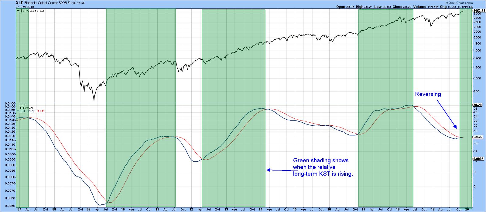
Chart 3 shows a long-term indicator that just went bullish for the market. It also points us in the direction of one of the sectors referred to in the title of this article, namely financials. The indicator in question is the long-term KST for the relative action of the SPDR Financials (XLF). The green-shaded areas begin when it crosses above its 26-week EMA and end when it moves back below it. If you look at the progress of the SPY in the upper window, you will see that it is typically in a bullish mode when in the “green.” On the other hand, practically all of the declines developed in the unshaded areas, where financials were underperforming. Since the KST has just crossed above its EMA, it has just flashed another buy signal. That makes financials one of our choices as a potential market leader.

Chart 3
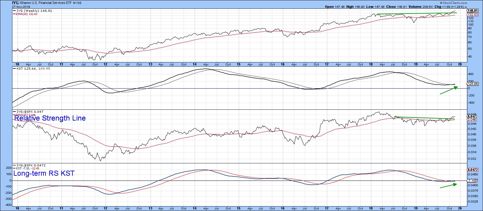
Chart 4 features the iShares Dow Jones Financial Services ETF (IYG). It, like the S&P itself, has emerged from a two-year consolidation, but we also see that the RS line has as well.

Chart 4
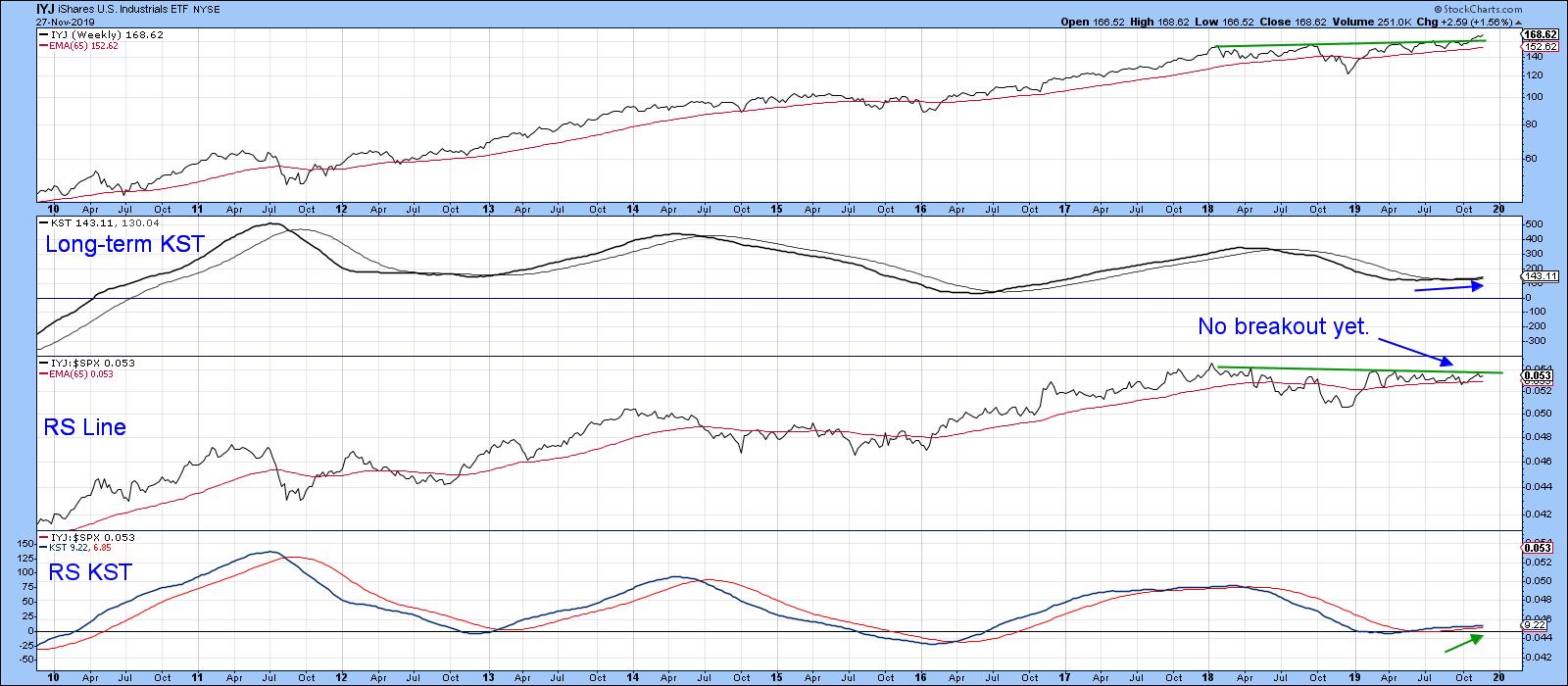
Industrials also look promising. Here, we have two principal contenders, the iShares Dow Jones Industrials (IYJ) and the SPDR Industrials (XLI). I prefer the IYJ, as it’s a purer play on industrials. That compares to the XLI, which also includes transports, which tend to be early cycle leaders. Pure industrials are not.
Chart 5 shows that the IYJ has broken to the upside, while its RS line, though close, is contained in a trading range. However, the bullish KST for relative action suggests that it soon will.

Chart 5
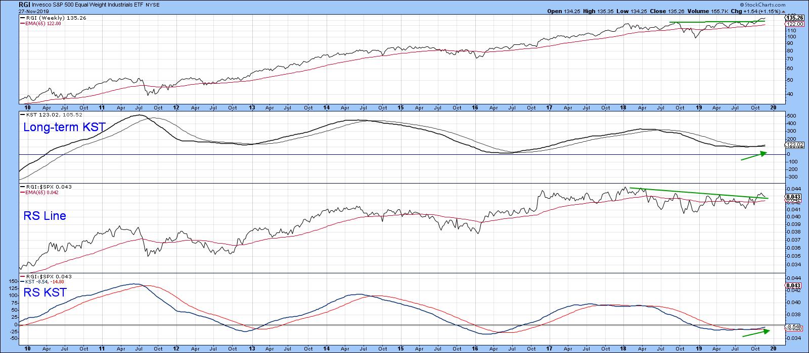
One industrial ETF that has broken out on both an absolute and relative basis is the Invesco Equal Weight Industrials (RGI). It looks to be the most promising of all, as shown in Chart 6.

Chart 6
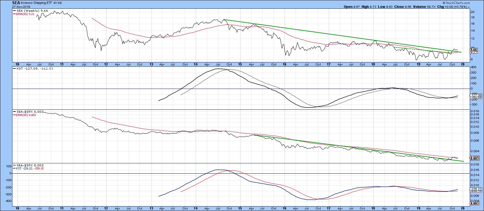
An industry (as opposed to sector) ETF that has recently got my attention is the Invesco Shipping ETF (SEA). Both the price and the RS line have been in a long-term downtrend, which may be coming to an end. That view is based on the fact that the price has broken out from a small base, i.e. above the dashed trend line, and its 2014-19 downtrend line. Relative action has already violated its equivalent trend line, but has not quite cleared its 65-week EMA. Since both long-term KSTs are positive, it seems a likely bet that it soon will.

Chart 7
Click here to read the full article in Martin Pring's Market Roundup.
Good luck and good charting,
Martin J. Pring
The views expressed in this article are those of the author and do not necessarily reflect the position or opinion of Pring Turner Capital Group of Walnut Creek or its affiliates.
|
| READ ONLINE → |
|
|
|
| Art's Charts |
| 'Tis the Season for Mobile Payments |
| by Arthur Hill |

Black Friday weekend is here and the holiday shopping season is just getting started. While I have no clue which retailers will be the big winners or losers this season, the mobile payments industry is likely to be a big winner. Mobile payments are expected to exceed $300 billion this year and $400 billion next year (Source: BI Intelligence).
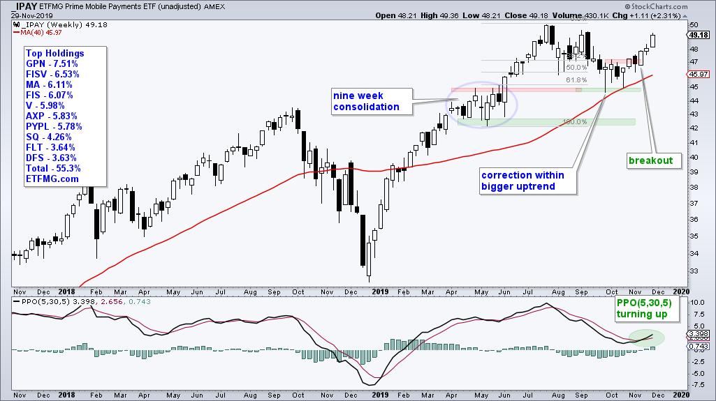
Sounds like a high-growth industry that could use an ETF. And there just happens to be one: the Mobile Payments ETF (IPAY). IPAY debuted in July 2015 at 24.95, dipped below 20 in February 2017 and then went on a tear. The ETF exceeded 40 in September 2018 and touched 50 in July 2019. IPAY is currently trading around 49 and has pretty much double since its debut.
Now let's put industry fundamentals, or biases, aside and look at the price chart. IPAY looks bullish because it just ended a corrective phase and broke out to signal a resumption of its bigger uptrend. The chart below shows the ETF hitting new highs in July and then correcting back to the rising 40-week SMA in September-October. Notice that this decline retraced around two thirds (66.67%) of the prior move and returned to broken resistance, which turned support. This looks like a classic two steps forward and one step backward sequence with another step forward beginning.

IPAY firmed above the rising 40-week SMA for four weeks and then broke out in mid November (3 weeks ago). The breakout signals an end to the correction and a resumption of the bigger uptrend. As such, I would expect a move above the July high in the coming weeks. The indicator window confirms the upturn as the PPO(5,30,5) turned up and moved above its signal line the last two weeks. 'Tis the season for momentum in mobile payments!
Special Offer for StockCharts members!
Subscribe to TrendInvestorPro.com with the email you used to sign-up or log-in at StockCharts and receive two ETF lists in one ChartList: our core list of 60 ETFs and our master list of 200 ETFs. These carefully chosen ETFs are organized with numerical prefixes that make it easy to follow a top-down analysis process with just one ChartList.
The master list includes: 8 Broad Index ETFs, 6 Factor ETFs, 8 Style ETFs, 31 Sector ETFs, 51 Industry Group ETFs, 17 Fixed Income ETFs, 6 Commodity ETFs, 54 International ETFs, 11 Currency ETFs and a few others. The core list refines this master list by filtering out ETFs with low volume and reducing redundancy.
Note that you must be an Extra or Pro member of StockCharts to have more than one ChartList. Sign up with the email you used to sign-up or login to StockCharts and I will share the ChartList to that email. Those who are not StockCharts members can receive a CSV file and upload the list to their preferred charting platform.
Click here to take your analysis to the next level!
-----------------------------------------------------------------------------------------------------------
|
| READ ONLINE → |
|
|
|
| The Traders Journal |
| Market Correction Coming: Here's Your Action Plan |
| by Gatis Roze |

If you don’t really know yourself, the market is an expensive place to learn about your "Investor Self". This axiom is most essential and relevant during a market correction. This blog is an exercise to help us all understand our own nature — ideally during the calm before the storm.
Successful individual investors tend to be an optimistic bunch because, over the long term, the market rewards us optimists far more frequently than pessimists. The flip side is that as time passes, our memories color the past corrections with a brighter, lighter brush. This exercise is meant to have you revisit history and revisit your own "uncle point" or exit strategies well before the next correction.
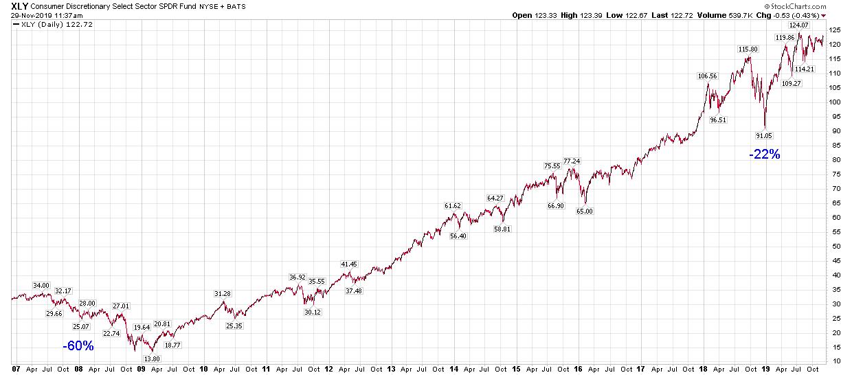
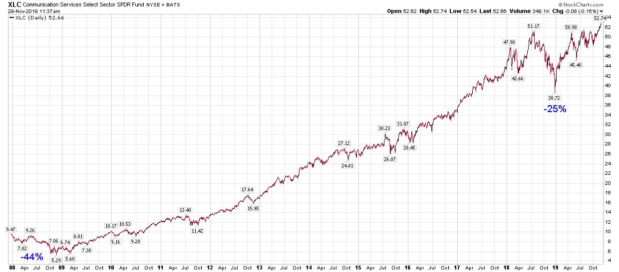
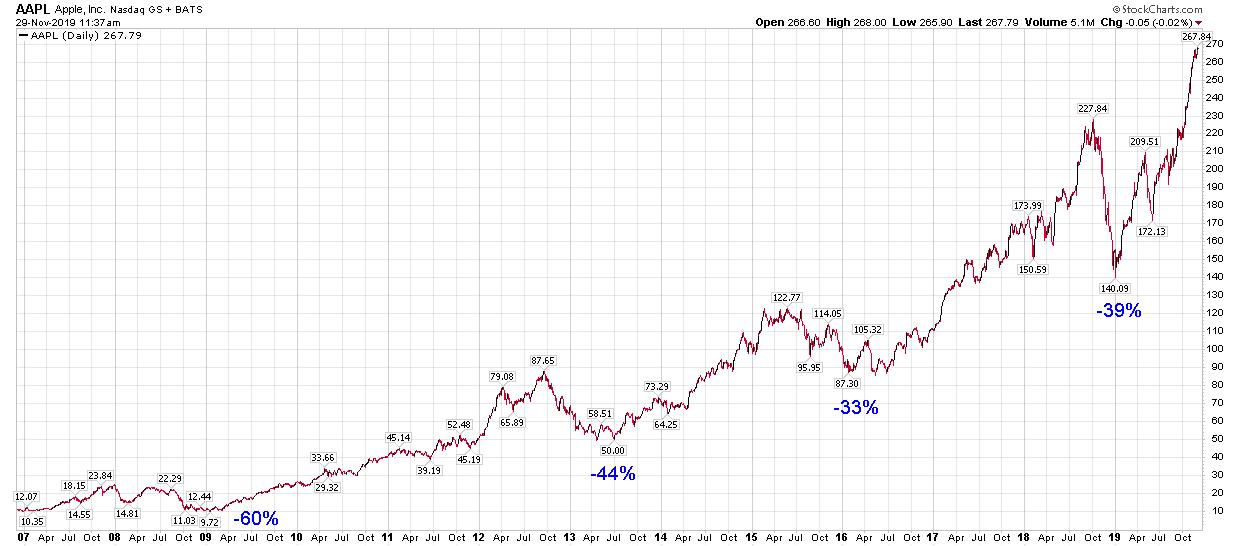
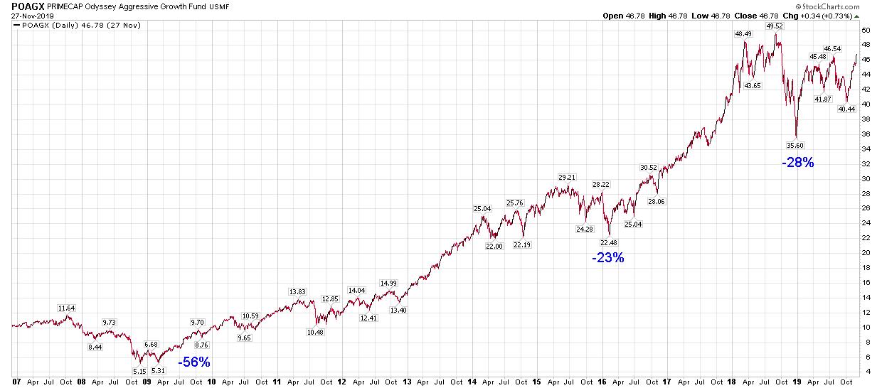
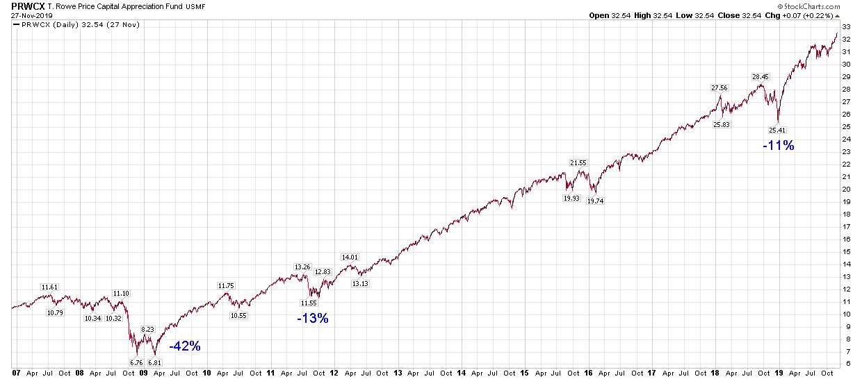
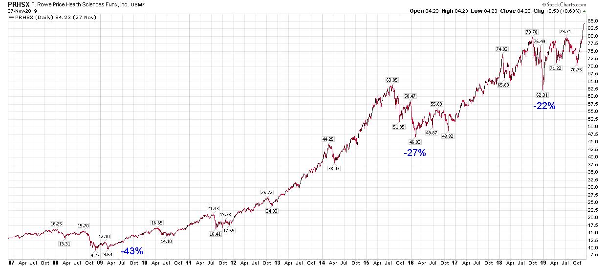
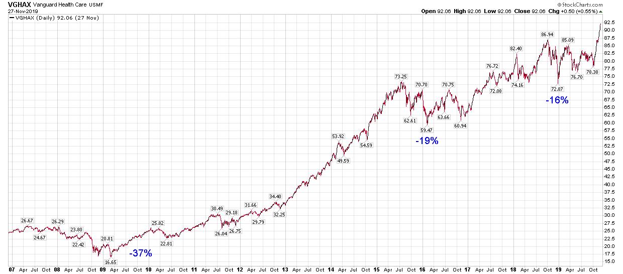
I’ll make a few personal observations, but the main focus here is for you to review these 10 charts yourself. They are comprised of stocks, indexes, sector ETFs, healthcare mutual funds, and global growth mutual funds. I’m reviewing each along with you since these are all part of my own portfolio.
Observations
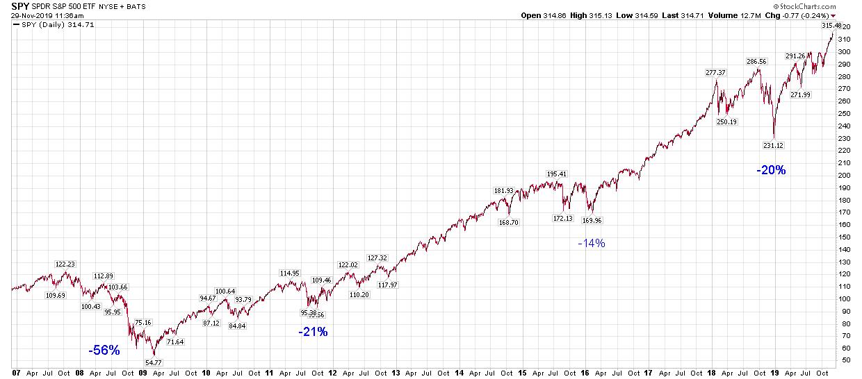
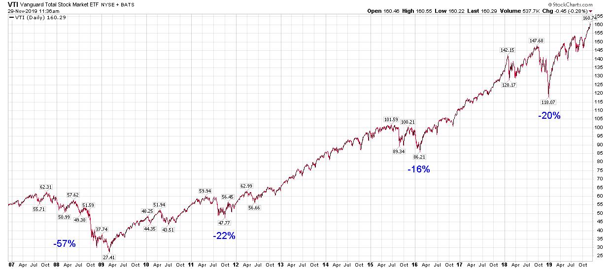
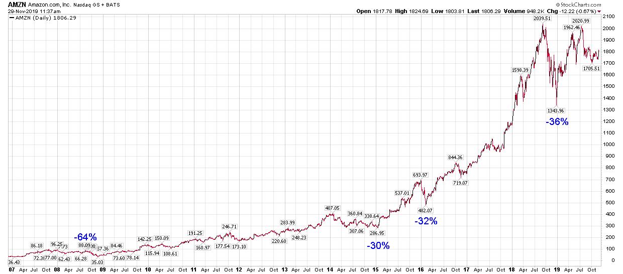
- The past 12 years have seen four corrections, reactions, pullbacks, or whatever you'd like to call them (2008, 2011, 2016 and 2018). As we all know, the most painful was 2008, so let's zero in on this correction.
- In 2008, Amazon pulled back 64%. This is the question you should ask yourself: if I owned it at $87, could I hold it through this 64% reaction all the way down to $34? Note: In 2008, it was $34.68. Today it’s at $1,773.94.
- The market indexes pulled back less than Amazon, Apple and the Consumer Discretionary Sector (XLY). The S&P 500 was down 56%, and VTI was down 57%. Note: Vanguard Total Market (VTI) has since risen from $27.05 to $159.64. That’s nearly +600% in under 11 years.
- Even five-star, gold-rated diversified mutual funds — such as Primecap (POAGX) pulled back 56%. On recovery, however, it’s up nearly 900% since the 2008 correction.
- Although five-star balanced funds which hold both stocks and bonds (such as PRWCX) are expected to be less volatile, they nevertheless lost 42% in the 2008 correction. Once again, the good news is that it’s up nearly 500% since that downdraft.
- Finally, it’s interesting that Healthcare funds (PRHSX and VGHAX) are up 900% and 550% respectively from the 2008 correction where they lost 38% and 37% respectively — much less than the market.
Conclusion
The exercise here is to review all your positions and revisit the four corrections I’ve mentioned. Ask yourself what percentage pullback you could tolerate for each and every type of equity you own. A correction is inevitable. Are you emotionally prepared for it? Panic is not a profitable investment methodology.
The bottomline is that you need to know your personal "uncle point" (i.e. exit strategy) for all your asset classes and all your individual equities. When the inevitable storm hits, your portfolio will be weatherized and waterproofed because you will have already embraced and acknowledged the emotional side of your "Investor Self".


Trade well; trade with discipline!
- Gatis Roze, MBA, CMT
StockMarketMastery.com
|
| READ ONLINE → |
|
|
|
| DecisionPoint |
| NEW! DecisionPoint Indicators: Golden Cross/Silver Cross Indexes |
| by Erin Swenlin |
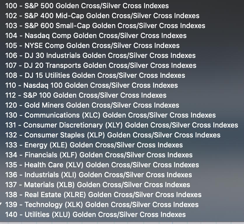
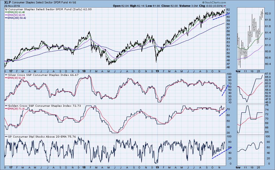
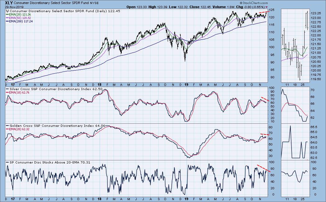
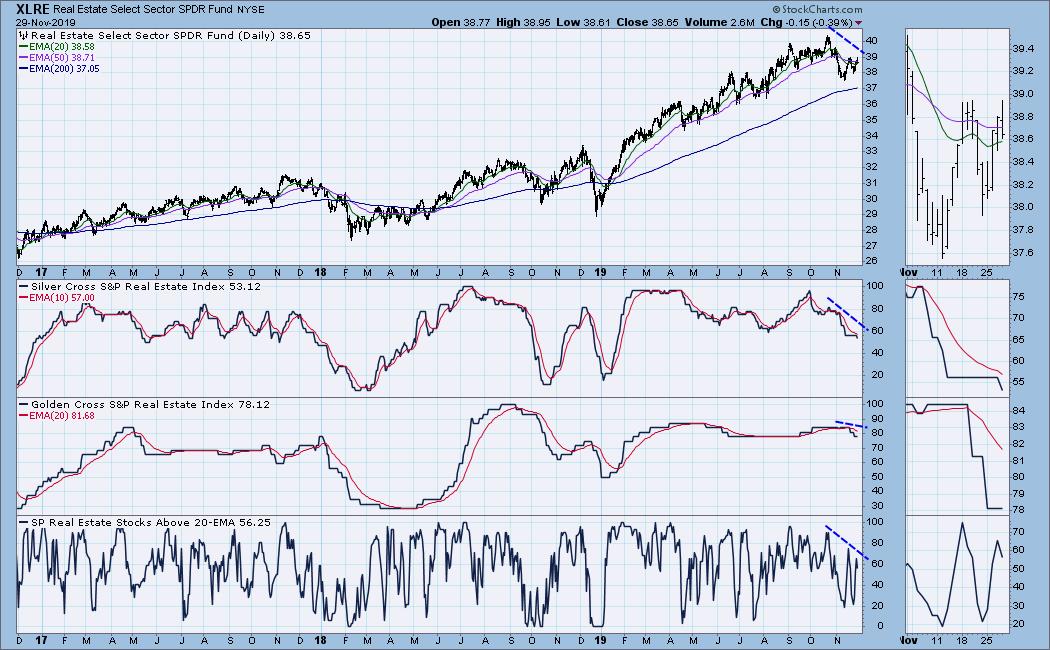
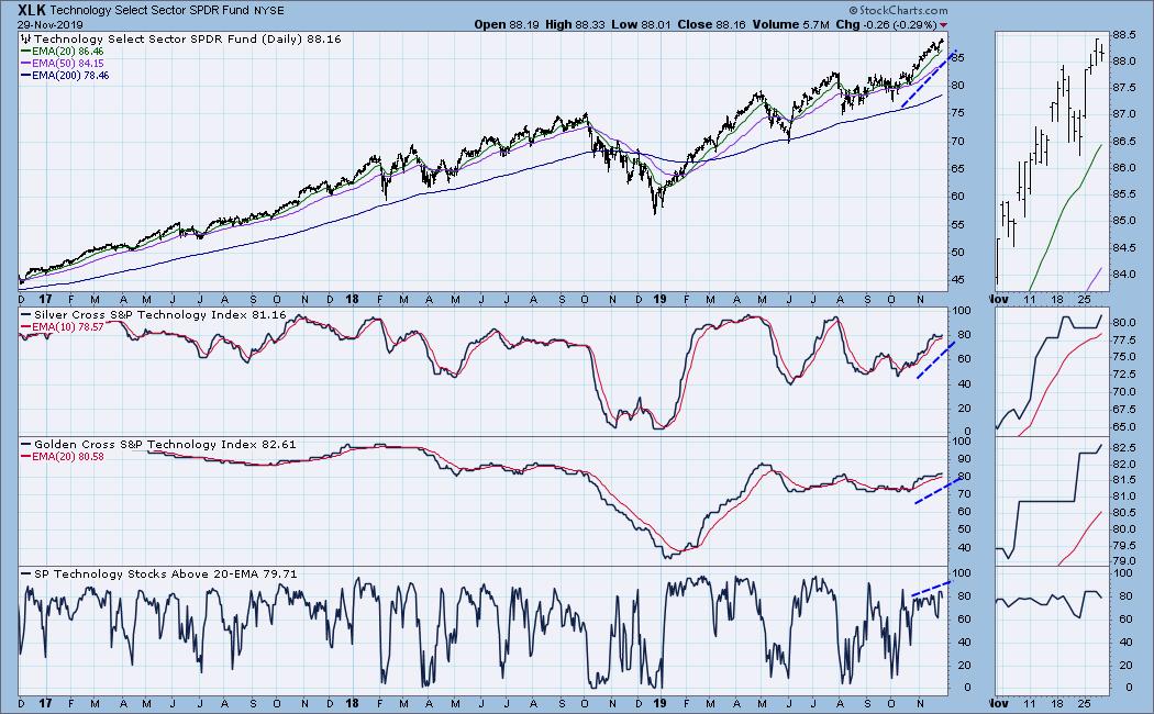
On our November 20, 2019 DecisionPoint show on StockCharts TV, Carl and I introduced the new Golden Cross and Silver Cross Indexes. The Golden Cross Index measures the percentage of components in an index or sector that are on LT Trend Model BUY signals (50-EMA > 200-EMA). The Silver Cross Index, meanwhile, measures the percentage of components that are on IT Trend Model BUY signals (20-EMA > 50-EMA). By tracking these readings with a signal line, we can see a clear picture of participation within an index or sector.
Below is the list of Indexes and Sectors we track the GCI/SCI for.

If you would like to add this list to your ChartLists, go to "My Account" and click "Manage ChartPacks". You'll want to download the free "DecisionPoint Market Indicators (DPMI)" ChartPack.
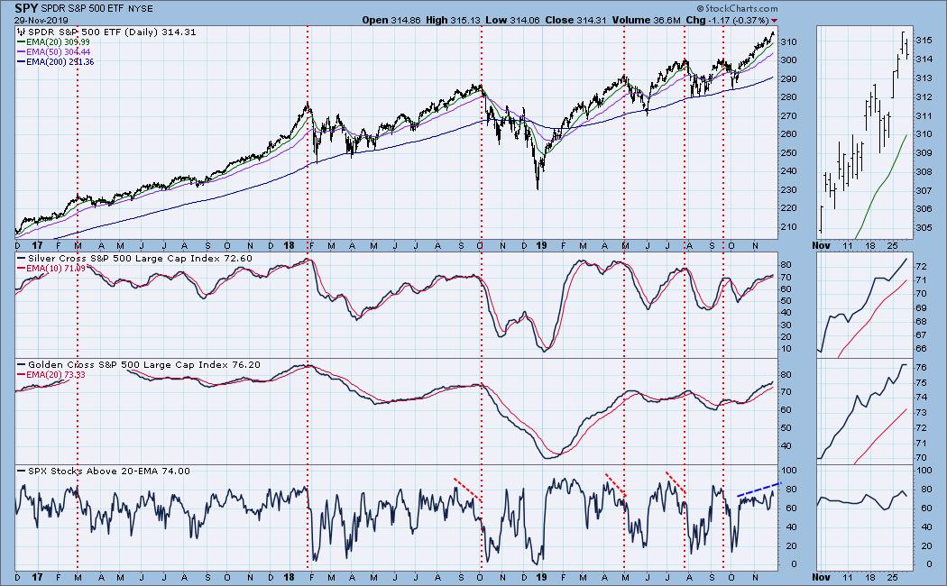
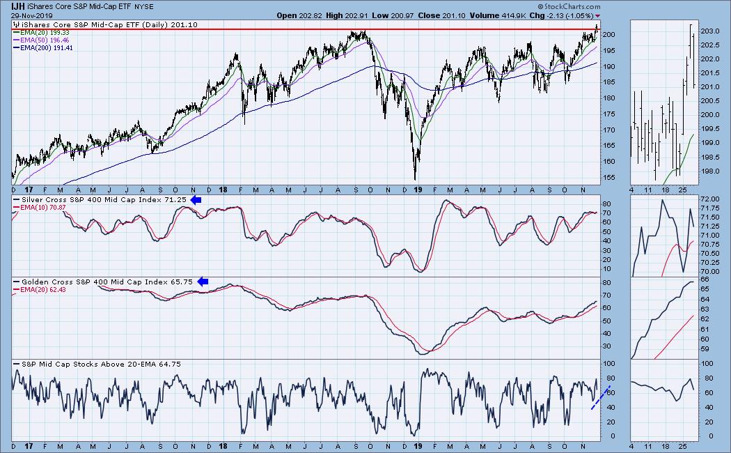
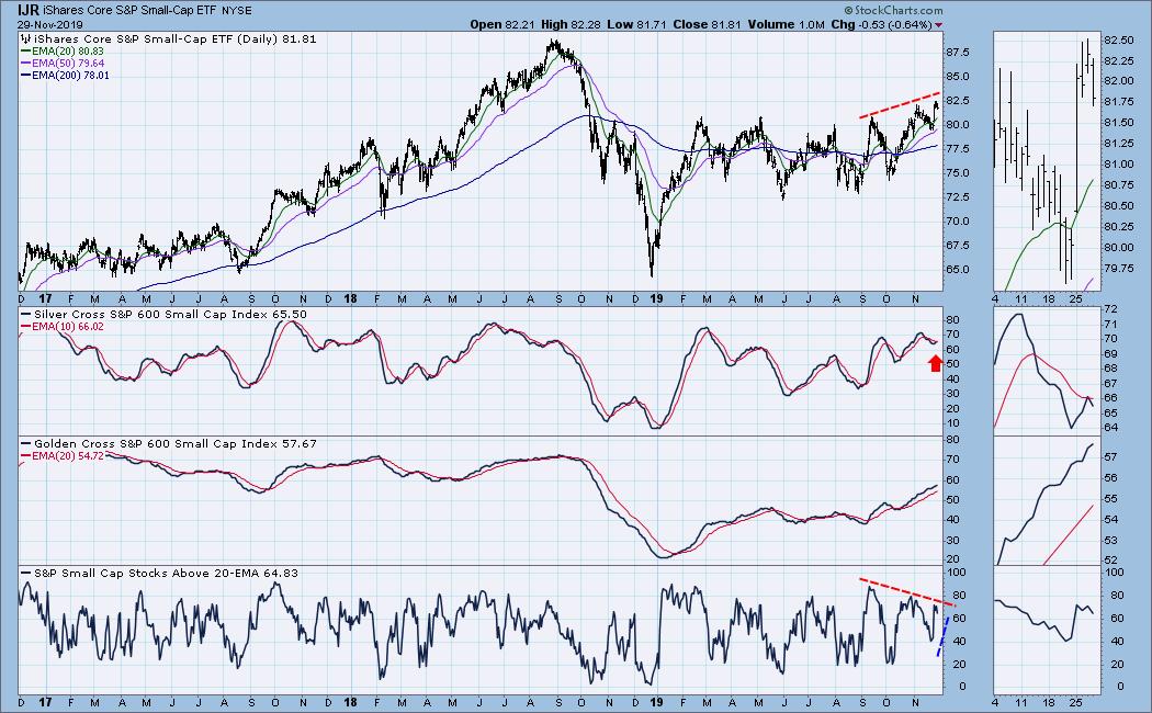
Below are a few indexes I've selected to talk about. You'll see that these, along with the % of stocks above their 20-EMA, can confirm a price move or give you warning that participation isn't what it should be. Below are the indicators for the SPX, S&P 400 (IJH) and S&P 600 (IJR).
We are now seeing confirmation by both GCI/SCI and % above 20-EMA is catching up. We can see nearly 3/4 of the components are participating in the IT and LT rally.

Both the GCI and SCI confirmed the breakout to new all-time highs as both reached readings higher than the previous top in September.

The struggle continues for the small-caps. While the situation is improving, participation is particularly low in comparison to the mid- and large-caps. I don't like the hesitation in SCI, nor the negative divergence with % of stocks above their 20-EMAs.

Below are a few of the sector charts. Note the annotations show you confirmations (blue) and negative divergences (red).


I hope you're as excited about the unveiling of these new indicators as we are!
Watch the latest episode of DecisionPoint with Carl & Erin Swenlin LIVE on Mondays at 5:00pm ET or on the StockCharts TV YouTube channel here!
Happy Charting! - Erin
Email: erinh@stockcharts.com
Do Not Miss Market Vision 2020 Online Conference!
I will be presenting at the "Market Vision 2020" online conference on January 4th! It is sponsored by EarningsBeats.com and promises to be "THE" event to start the new year. We will have many of the commentators that you love presenting their "market view" for 2020, with John Murphy as the keynote speaker! For information on the event, sign up for the free emails that will give you all the details as we get closer!

Erin Swenlin will be presenting at the The MoneyShow Las Vegas May 11-13, 2020! You'll have an opportunity to meet Erin and discuss the latest DecisionPoint news and Diamond Scans. The conference is free to attend or view online!
**Don't miss any of the DecisionPoint commentaries! Go to the "Notify Me" box toward the end of this blog page to be notified as soon as they are published.**
NOTE: The signal status reported herein is based upon mechanical trading model signals, specifically the DecisionPoint Trend Model. These define the implied bias of the price index based upon moving average relationships, but they do not necessarily call for a specific action. They are information flags that should prompt chart review. Further, they do not call for continuous buying or selling during the life of the signal. For example, a BUY signal will probably (but not necessarily) return the best results if action is taken soon after the signal is generated. Additional opportunities for buying may be found as price zigzags higher, but the trader must look for optimum entry points. Conversely, exit points to preserve gains (or minimize losses) may be evident before the model mechanically closes the signal.
Helpful DecisionPoint Links:
Erin's PMO Scan
DecisionPoint Shared ChartList and DecisionPoint Chart Gallery
Trend Models
Price Momentum Oscillator (PMO)
On Balance Volume
Swenlin Trading Oscillators (STO-B and STO-V)
ITBM and ITVM
SCTR Ranking
|
| READ ONLINE → |
|
|
|
| ChartWatchers |
| This Impressive Market Could Require Patience |
| by John Hopkins |
The market has mostly been straight up since the October 3 bottom, when the S&P touched 2855 before heading north. Since then, the S&P has climbed more than 10%, with buyers ready and willing to buy on any dips.
If you are a bull, and especially if you have ridden the market higher the past few months, you should be very pleased. However, the market has risen - and so have many individual stocks - to levels that could start requiring some patience; essentially, the "easy money" for the year may have already been made.
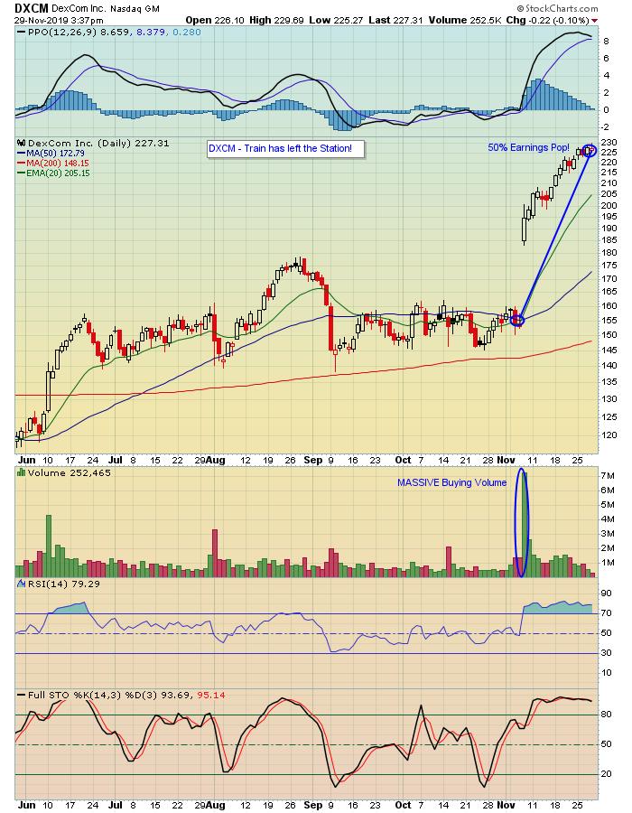
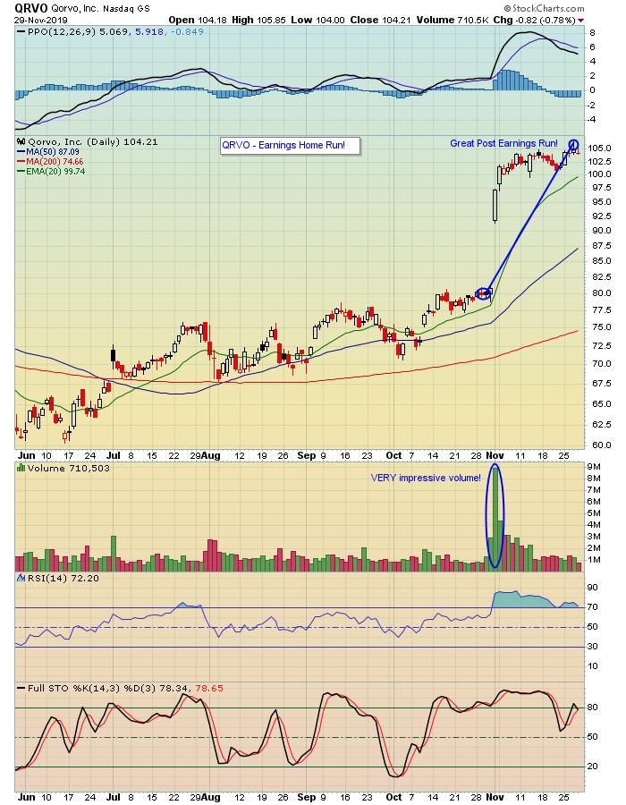
As an example, take a look at the two charts below on DXCM and QRVO. Both companies smashed earnings expectations, with the market rewarding both of them for their stellar results.


In the case of DXCM, the market was so impressed with their numbers that the stock climbed almost 50% during the month of November. Now, the stock is extremely stretched and it makes no sense to chase it here. Instead, this is where patience could pay off, because when it does finally pull back, you can bet those who missed out the first time around will be licking their chops to get involved in the stock.
In the case of QRVO, the stock has "only" risen 33% during the month of November. Kidding aside, it's similar to DXCM, so you'll need to be patient before putting any serious money to work on the stock.
These two stocks are great examples of why it gets harder to make big scores when the market is scorching hot - and stretched. And they're both examples of why you need to think twice before chasing stocks that have risen so substantially in such a short period of time.
This has been quite an impressive rally, as we've seen, and it's going to be interesting to see if the market holds up into year-end. For example, many traders might recall the wicked finish to last year, when the S&P fell 15% in just over 3 weeks between November 30 and December 27 before starting its torrid move to record highs just last week. It doesn't mean we'll see the same thing again this year, but it does serve as an example of why you need to be prepared for any sudden outcome.
One thing I did want to mention that we are extremely excited about is our upcoming "Market Vision 2020" online financial conference, where some of the best minds in the industry will share their views on where the market could be headed during 2020. This includes our recently announced Keynote speaker, John Murphy, Chief Technical Analyst at StockCharts.com. We also announced our "Black Friday Special" today, which we want to extend to all of you! Just click on this link to see the fabulous speaker lineup and save a seat for what is certain to be a highly educational event. Hope you can all join us!
At your service,
John Hopkins
EarningsBeats.com
|
| READ ONLINE → |
|
|
|
|
|
| MORE ARTICLES → |
|
