| Hello Fellow ChartWatchers |
"This new Symbol Summary is a game changer!"
"Holy smokes! The new Symbol Summary page is amazing. Like WOW. StockCharts is now truly my one-stop shop for everything stock related."
"I just wanted to tell you how much I am enjoying the new Symbol Summary feature. It is the first place I go when viewing my charts, and I have found it very helpful when deciding whether to buy, sell, or hold."
You all said it best, so I guess my job's done. I mean, I was planning to write about how great our new Symbol Summary page is. But in the past few days, we've seen an outpouring of positive feedback, excited reviews and thankful comments from hundreds and hundreds of users. There's nothing more powerful than what you all tell us, so I wanted to share and also give a very big "thank you" to everyone for the warm words about our newest tool.
If you're wondering what this is all about, let me fill you in. Last week, we released our new Symbol Summary page, an extensive research tool featuring full quote information for stocks, ETFs, mutual funds, indexes, and cryptocurrencies. From a single page, you can view technical stats, fundamentals, earnings, dividends, corporate info and much more.
Pull up a ticker on the Symbol Summary and you'll be able to see the latest price info, view a chart in multiple timeframes, browse high-level summary stats, fundamentals and popular technicals, get earnings dates and dividend info, visualize the symbol's latest SCTR info, read full company or fund descriptions, and much more. Alongside SharpCharts, the Symbol Summary is your go-to resource for analyzing any stock, ETF, index or other security covered on StockCharts.
On top of that, this is only the start of a significant data expansion here at StockCharts. Very soon we'll be introducing even more fundamental data, complete earnings history, after-hours prices, analyst ratings, and much more. On the Symbol Summary AND our charting tools like SharpCharts and ACP (yep, charting fundamentals is coming!), we have many other major additions already in the works.
If you didn't catch the newsletter last weekend, be sure to click here and read my announcement article about the Symbol Summary, which describes all of the new data we've added and covers the many unique features of this tool.
Lastly, don't stay quiet! We love hearing from all of you about what's working, what's not, what you enjoy, what you need – all of it. We do have lots more coming to StockCharts as we continue to roll out coverage for the new fundamental data, earnings info, analyst ratings and more, but keep the feedback coming. Our mission is to help you get the most value out of our tools and features, and your input only helps make that happen. |
| Chart on, my friends. |
|
|
|
| THIS WEEK'S ARTICLES |
| The Market Message |
| Travel Stocks Under Pressure Again |
| by John Murphy |
My Tuesday message showed a number of travel and tourism stock groups with heavy exposure to China finding support near moving average lines; or regaining them. Today's message shows those same groups under pressure again today. Let's start with airlines. Chart 1 shows the Dow Jones Airlines Index retesting its 200-day moving average today. Chart 2 shows United Airlines (UAL) still remaining well below that red line. UAL has heavier exposure to China than other U.S. airlines. Chart 3 shows American Airlines (AAL) backing off from its 200-day line. Delta (DAL), however, remains above its red support line.
Judging from this week's strong rebound in global stock markets, it seemed like concerns about the coronavirus had receded into the background. Today's selling in travel and tourism stocks, however, suggests that may not be the case. How those stocks with the heaviest exposure to the Chinese virus end the week may help determine whether the market is out of danger. Investors are turning a bit more defensive just in case.
Chart 1
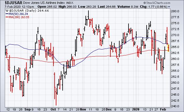
Chart 2
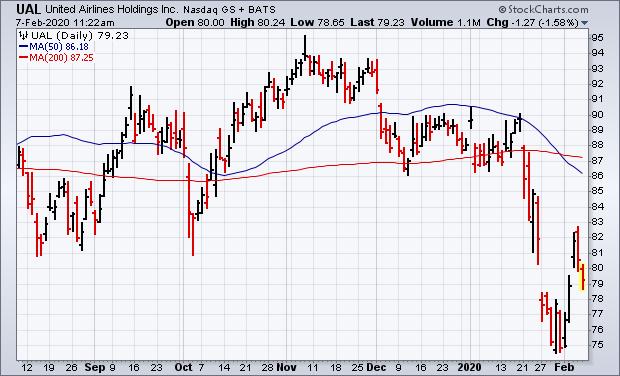
Chart 3

Editor's Note: This is an excerpt of an article that was originally published in John Murphy's Market Message on Friday, February 7th at 12:14pm ET. Click here to read the full article, which includes Charts 4-6.
|
| READ ONLINE → |
|
|
|
|
|
| Art's Charts |
| A Bullish Hat-Trick for the Aerospace & Defense ETFs - But One is Seriously Lagging |
| by Arthur Hill |
 There are three ETFs covering the defense and aerospace group and all three recorded new highs. Even though these ETFs cover the same industry group and have similar price charts, they are quite different when we look under the hood and one is seriously underperforming the other two. There are three ETFs covering the defense and aerospace group and all three recorded new highs. Even though these ETFs cover the same industry group and have similar price charts, they are quite different when we look under the hood and one is seriously underperforming the other two.
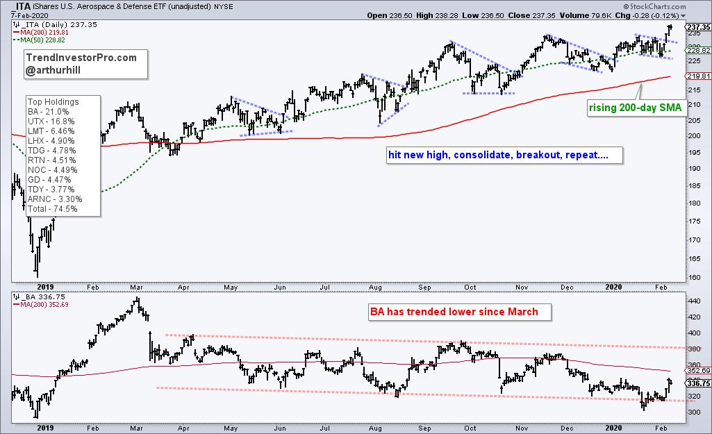
The Aerospace & Defense (ITA) from iShares has just 34 stocks and is quite top heavy with the top ten stocks accounting for around 75%. Boeing (BA) is the top component with a 21% weighting. Even though BA hit a 52-week low in mid January and remains below its falling 200-day SMA, ITA is holding its own with a 52-week high on Friday.

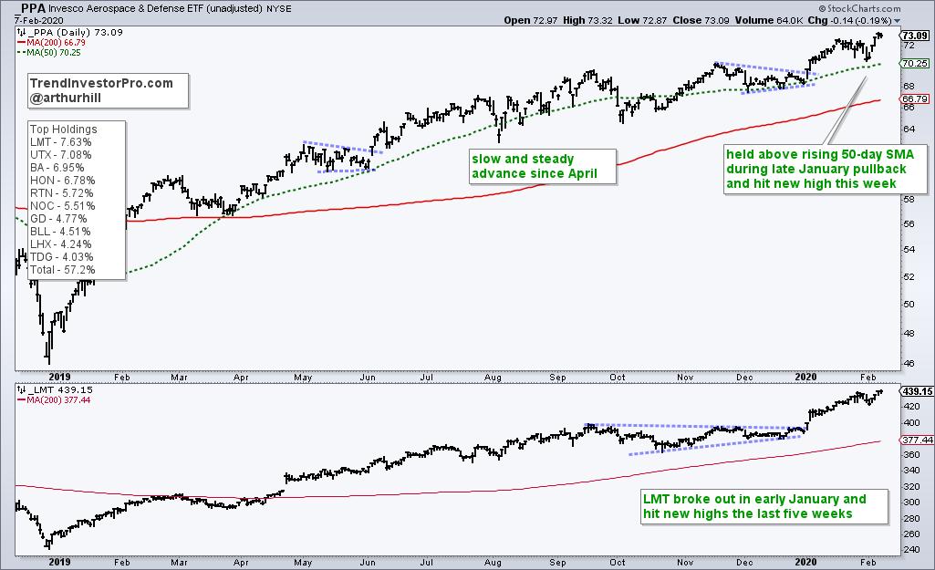
The Aerospace & Defense ETF (PPA) from Invesco is a little more balanced because the top ten holdings account for around 57% and it has 51 stocks, 18 more than ITA. Boeing still features in the top three, but its weighting is much less. The other big stocks, Lockheed Martin (7.63%) and United Technologies (7.08%) recorded new highs this week to power the ITA to a new high.

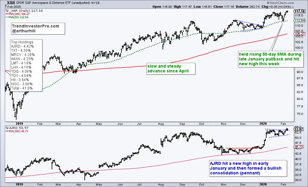
The Aerospace & Defense ETF (XAR) has the fewest holdings (33), but the stocks are equally weighted, more or less. The top ten stocks account for 41.6%, which is the lowest of the three. Aerojet Rocketdyne (AJRD), a name that reeks of defense, broke out in December and hit a new high in early January. The stock stalled with a pennant and this is a bullish continuation pattern.

All three ETFs are in strong uptrends, but Boeing is dragging on ITA. Even though ITA is hitting new highs, note that the ETF is up around 20% over the past twelve months. In contrast, PPA and XAR are up around 29% and seriously outperforming ITA. Chartists looking for more exposure to Boeing, and betting on a turnaround, should opt for ITA. Chartists looking for concentration in large-cap names should opt for PPA and chartists looking for broad exposure to the group should opt for XAR.
This weekend at TrendInvestorPro.com, I will highlight five stocks with bullish setups from the defense & aerospace group. XAR is also part of our core ETF list and followed on a regular basis. Subscribe today for immediate access to the weekly ETF report, ETF ranking tables, market timing models, ETF ChartBook, weekend video, Saturday stock setups and more.
Click here to take your analysis to the next level!
-------------------
|
| READ ONLINE → |
|
|
|
| The Canadian Technician |
| Stocks Start To Diverge |
| by Greg Schnell |
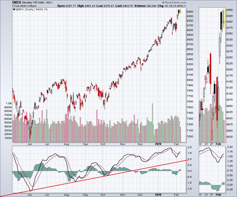
While it is only a week, it was a crackin' bounce in the high-flyers club. The bulls trotted a trail of optimism that the drive-by-shooting caused by the coronavirus was a big buying opportunity on the back of more Fed and Chinese liquidity injections. That liquidity seems to be flowing into the large caps, as the world migrates into a smaller collection of names to trust in weak times. It also seems to be replay of the Nifty 50 in India back in the day. But the Nasdaq 100 chart ($NDX) soared on Monday, Tuesday and the Wednesday morning open. On Thursday, it worked all day to keep climbing while Friday ended up being a bit of exhaustion.

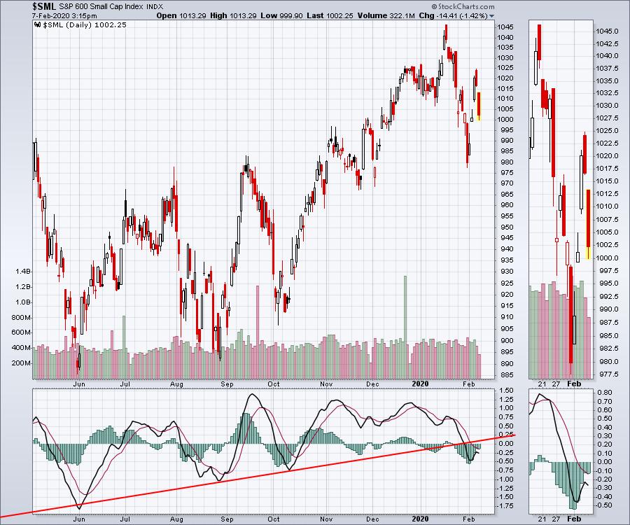
Small caps tried to follow the indexes to higher ground, but so far they have failed to reclaim the old highs. The momentum trend line on the PPO has also been broken. What we're seeing is the market bifurcating into large-cap huddles and small-cap dispersion.

This is also being shown on the VEU and EEM charts for Friday. The EEM had two black candle days where it opened higher and closed lower than the open, but closed above the previous day.
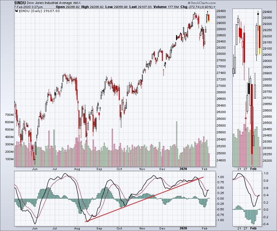
With the investors narrowing their focus, it is more important than ever to keep gains on a tight leash. While caution is always prudent, my indicators haven't flipped back to bullish after last week's drop. Tesla (TSLA) share buyers buying in at over $900/share masked some weakness underneath other names. Now that the euphoria has dissipated for a few days, the market weakness in some large caps started to show on Friday in the Dow Jones Industrials ($INDU) with a 300-point drop. Those are large caps letting go after creating a short term double-top. This seems to be the median between the Nasdaq 100 and the small caps.

Stay flexible, as the big jobs number was not enough to float the boat Friday. That seems cautionary in itself. But if large caps start to follow the rest of world down, don't be surprised if we start making faster, aggressive moves lower rather than a slow descent.
|
| READ ONLINE → |
|
|
|
| The Traders Journal |
| Preparation Pays Profits, Randomness Ruins Riches - Deal With Both! |
| by Gatis Roze |
Does your investing ecosystem look like meteorological chaos? Remember the three R's — Randomness Ruins Riches. You may recall Warren Buffett saying that he doesn't invest in anything he can't explain to a 10 year old. So here's my Buffett 3-R Challenge to you.
Explain your investing strategy, methodology and plan to a fellow investor you respect. If they can make sense of it and not get lost in the details, chances are you won't either. If it's too complex for others to understand, chances are high that you, too, will get lost in your own financial maze.
The metaphor I'll use for this challenge is airports where we all have experienced frustrating times. When traveling, have you ever wondered why every airport is so dissimilar to every other airport? Why haven't airport architects finally hit upon the ideal design? The best layout that will optimize all aspects of flying for both airlines and passengers?
Here's why:
Consider Washington Dulles. Basically, two very long parallel corridors. Then there's San Francisco International which is completely different with it's rounded hub and numerous legged spokes. And can someone please explain to me who ever designed the seemingly arbitrary hologram that's Chicago O'Hare?
My point is that most airports configurations work well enough. In reality, most investment methodologies work well enough with the caveat that if you have the discipline to remain loyal to the design and not let your corrosive emotions overwhelm your methodology, you'll likely make money. As an individual investor, you are literally permitted to design the airport of your dreams — your personal framework of corridors, hubs and spokes that will all work as one because you know it intimately.
Good luck if you should meander into someone else's airport. The result is increased stress, missed flights and lost luggage. Similar to those detailed airport maps we all search out, I challenge you as an investor to draw and sketch out a similar map of your investing airport.
Now remember those three Ps? Preparation Pays Profits. I'll share with you my airport map in a bit, but please consider that I've spent decades studying, teaching, trading and laboring to assemble an investment roadmap that has worked nicely for me. Not to sound glib, but making profits quickly takes time.
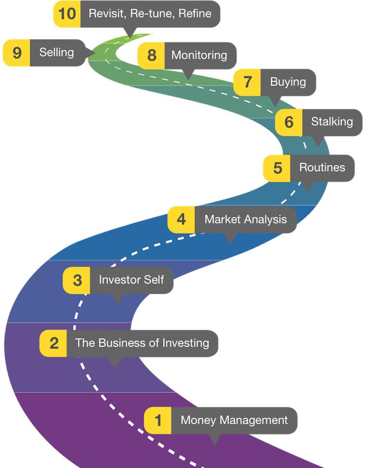
Bear in mind that successful portfolio management is always evolving. Investing needs to be a 360-degree activity. What's in front and in back and all around you matters. It's like real life — it's never simply black and white. In reality, investing is very personal. There is not just one best way to design a portfolio and investment plan — much like airport design. So back to basics. Here is the roadmap I designed and we presented in our book, Tensile Trading: The 10 Essential Stages of Stock Market Mastery. How does your plan compare?

One Last Note...
In closing, I should let you know that the detailed presentation of these ten stages is now available for a 50% off discount in a two-disc Blu-ray format. Click Here to check it out and pick up a copy in The StockCharts Store. Alongside the Tensile Trading book itself, the two pack a pretty serious punch and give you a complete understanding of how Grayson and I invest and trade the markets successfully.
March 21: "Mastering The Stock Market At All Ages"
Next month, Grayson and I will be presenting in Los Angeles to the AAII about "Mastering The Stock Market At All Ages". In this special event, we're taking over for a full morning (9:00am - noon) with three mini presentations designed to bring young and older investors together into the same room. We'll share how we manage our money, how we invest both separately and together, and discuss the most important lessons that we've learned as a father-son investing team with over 45 years of combined experience.
For more information about the event or to register, CLICK HERE.
|
| READ ONLINE → |
|
|
|
| DecisionPoint |
| DecisionPoint Sentiment Update |
| by Erin Swenlin |
It's been some time since I revisited my sentiment charts. I used to do a weekly sentiment update on MarketWatchers, but since then I haven't written or talked about sentiment much, so it is long overdue.
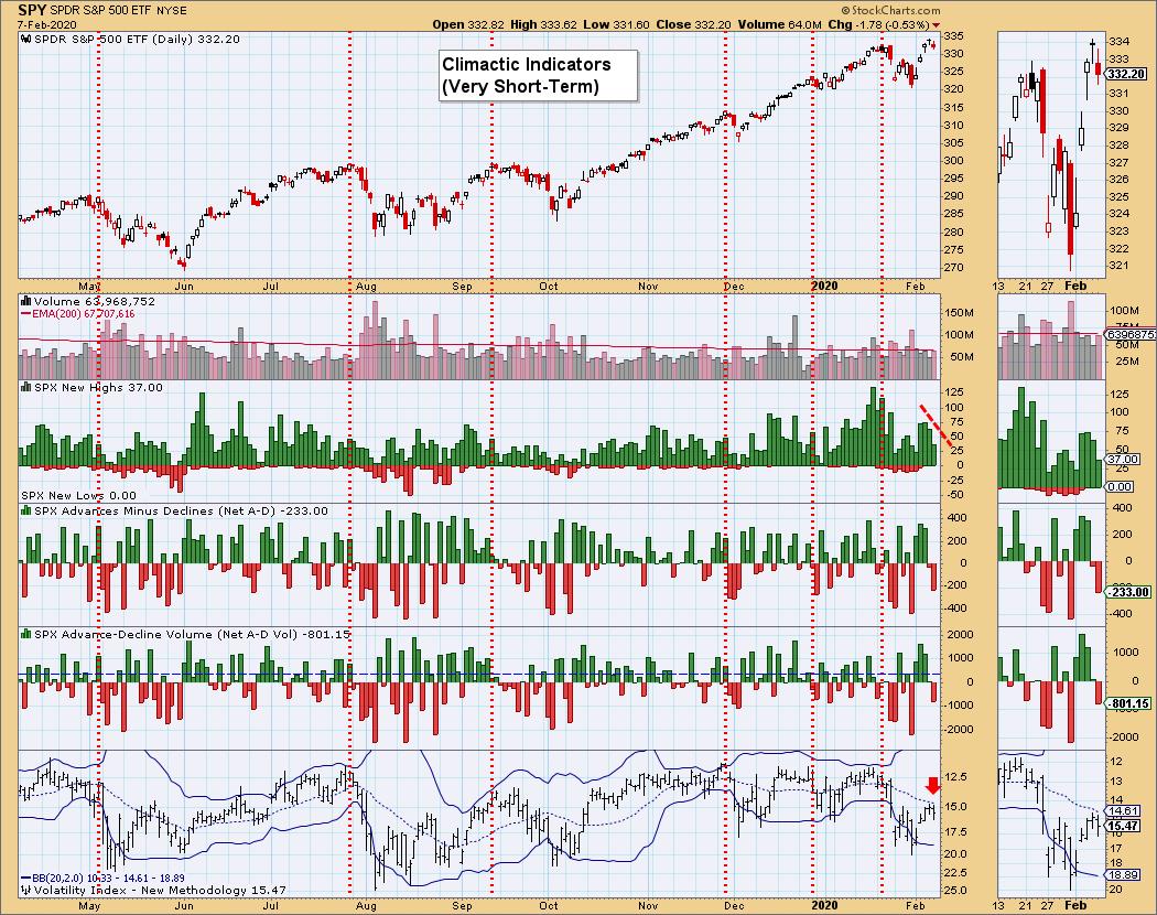
Sentiment is a measure of how bullish and bearish participants are regarding the market, where we look for extreme readings in one direction or the other. Sentiment is contrarian, meaning that, when everyone is bullish, it is usually a signal of a nearing decline. On the other side, when everyone is very bearish, that is the time to look for a market bottom. Many of us typically use the VIX as a sentiment gauge all the time whether we know it or not. When the VIX hits high readings, the "fear factor" is high, so you should look for a price rise when that happens. Below is the VIX chart. I update, annotate and analyze this chart daily for DecisionPoint Alert subscribers, for whom I give my analysis of market conditions based on this chart and (of course) many others.
I've marked cardinal tops over the past year and you can see that they typically occur when the VIX is at overbought extremes (very low readings), many times puncturing the upper Bollinger Band first. Very low VIX readings are telling us that participants are bullish or even complacent. Seeing a market top when this condition occurs is a great example of highly bullish sentiment resulting in a bearish decline. Remember, I use an inverted VIX to accentuate overbought and oversold conditions. Looking at the current readings on the VIX, I am bothered that it is turning back down below its 20-MA. This suggests internal weakness in the SPY. So, while neither Bollinger Band has been pierced, watching how the VIX reacts to its average is also important.


As investors, we want to accomplish two basic things: (1) determine the trend and condition of the market, and (2) select stocks that will ride that tide. The DecisionPoint Alert helps with the first step, while DecisionPoint Diamonds helps with the second. Go to DecisionPoint.com and SUBSCRIBE TODAY! (Charter Subscriber Discounts Still Available!)
Let's look at some of the other sentiment indicators that DecisionPoint updates. You can find these charts in the DecisionPoint.com "DP Alert ChartList," annotated and curated by Carl and I exclusively for our subscribers. To simply get the charts themselves, you can download the "DP Market Indicators" ChartPack on StockCharts.com (free to Extra members and above).
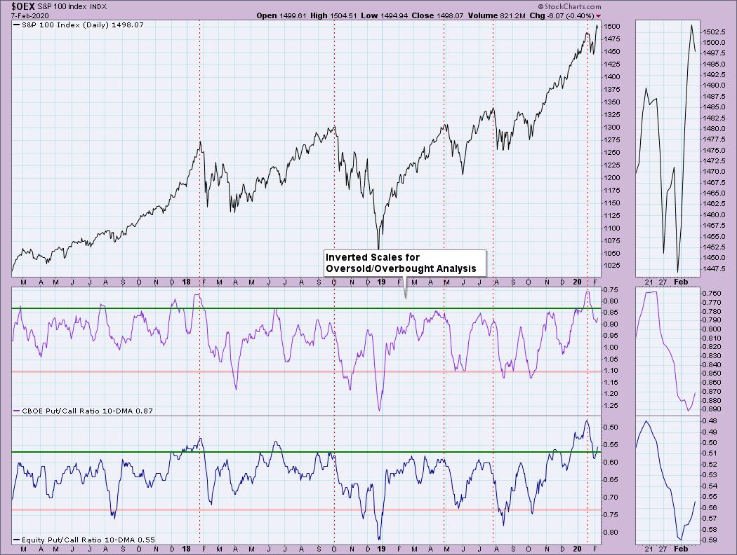
First up is the 10-DMA of the Put/Call Ratios. You'll note that when the ratios get overbought (again using inverted scale to make clear the "overbought" vs. "oversold" readings), it typically precedes market declines. I've again annotated cardinal tops so you can see the behavior of the indicator going into the declines. The ratios topped in very overbought territory before last month's pullback. Today's readings aren't climactic, but, until we get a solid bottom on these indicators, the market is vulnerable.

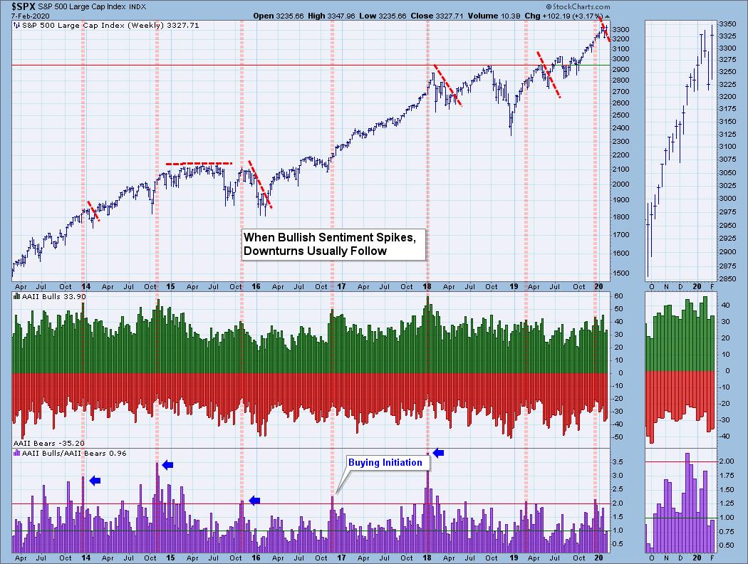
Next up is the American Association of Individual Investors (AAII) poll results. Every week, anyone can go to their site (aaii.com) and take the simple "I'm bullish, I'm bearish" survey/poll. We track the results weekly with fresh readings coming in on Thursday afternoon. Again, note that when we get climactic readings on the bull/bear ratio, the market usually tops or consolidates. It's not an "every time" indicator, but sentiment sets the stage and lighting for the show. Though unusual, sometimes these readings can mark the beginning of a buying initiation, I usually look for buying exhaustions when we get high-ratio readings. Currently, we're in neutral, with a near equal amount of bulls to bears.

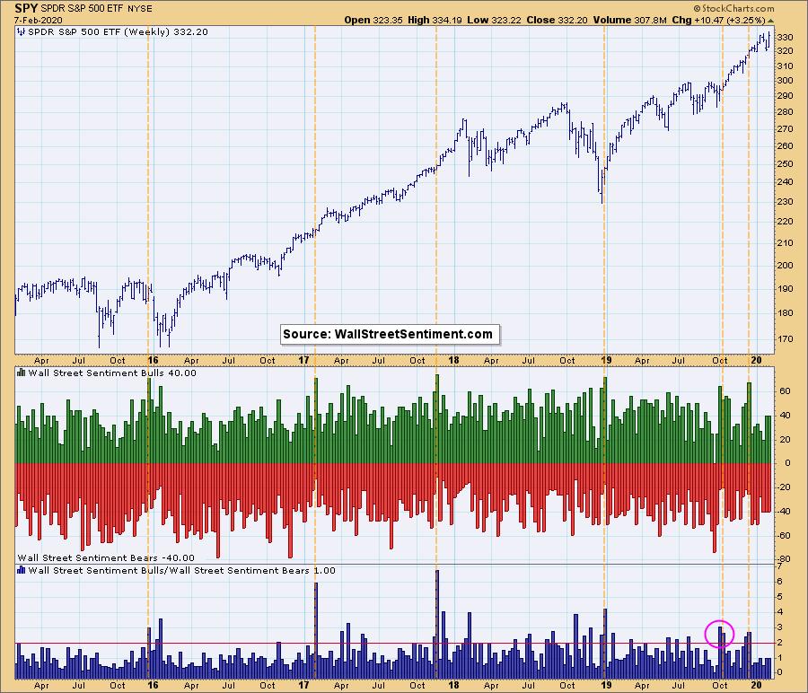
My friend Mark Young at WallStreetSentiment.com gives us the data for this chart. Mark sends out a survey on Friday afternoon asking a group of near-static market timers whether they think the market will go up or down the following week. Carl and I are among the survey participants, so it does make me proud to say that my market timer brethren tend to be right when the ratio hits bullish extremes. Currently, the reading is 1.00, which isn't helpful because it means there are an even number of bulls and bears. No sentiment extremes this week. This chart updates on Mondays.

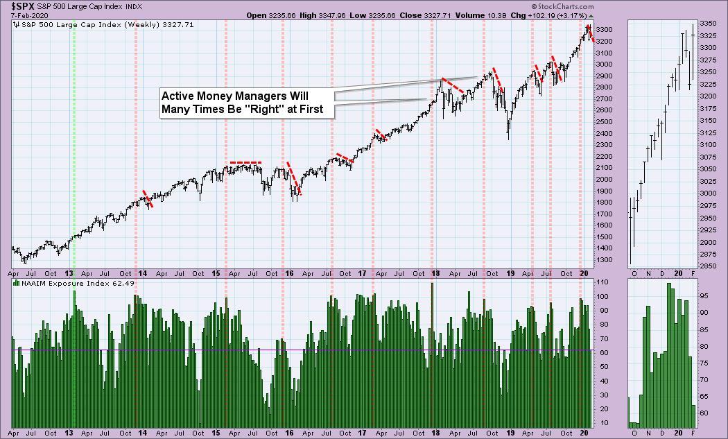
The National Association of Active Investment Managers (NAAIM) surveys big money managers and asks how "exposed" they are to the market. Notice that extremes tend to come before consolidation or decline. At first, they will tend to be right, but, shortly thereafter, a decline or consolidation usually occurs. The green line in 2013 was the mark of a buying initiation. Currently, we are seeing low levels but no extremes, which tells me managers are cautious right now (as am I!).

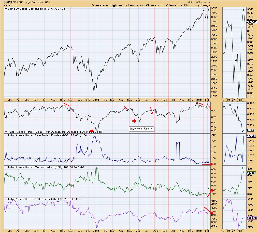
The final chart I consider one of DecisionPoint's hidden gems. Carl came up with this indicator many years ago when Rydex used to manage a group of funds that are divided into bull funds, cash (money markets) and bear funds. Guggenheim manages them now, but we have kept the "Rydex" name since the indicator has always been known as the "Rydex Ratio." It's really ingenious, if you ask me. We monitor the number of assets each night within the bull funds, money markets and bear funds, then track the ratio between bull/equity funds and bear/money market funds. This is why this chart isn't showing readings for today - they won't be in until tonight.
Right now, bear funds are holding even. Money market assets are increasing significantly, suggesting money is moving out of the market. Bull and equity funds are declining. So, interestingly, even as prices began to rally, money was moving to the sidelines. Rather than a finger in the wind survey, this is based on actual money. I've marked cardinal tops and notice the warning we get when the ratio turns down. Currently, the ratio is moving lower and there is some distance to oversold territory, which suggests caution.

I hope you enjoyed the sentiment update! I'll be posting another one soon for our DecisionPoint.com subscribers. Many of you have written to Carl and I over the years telling us how helpful and lucrative our reports have been for you. If you used to regularly read the DP Alert Mid-Week and Carl's Weekly Wrap, we now have those in even more detail (and daily!) on our website. Additionally, I moved the DecisionPoint Diamonds Report to our website.
As one subscriber told us, "You do all the work for me!" as we provide overall market analysis daily and 15 stock suggestions a week. Read the DecisionPoint blog archives for sample reports. You can also sign up for our free email list to be notified regularly of free content when it is published. Just go to our homepage DecisionPoint.com.
Happy Charting! - Erin
Technical Analysis is a windsock, not a crystal ball.
Helpful DecisionPoint Links:
DecisionPoint Alert Chart List
DecisionPoint Golden Cross/Silver Cross Index Chart List
DecisionPoint Sector Chart List
DecisionPoint Chart Gallery
Trend Models
Price Momentum Oscillator (PMO)
On Balance Volume
Swenlin Trading Oscillators (STO-B and STO-V)
ITBM and ITVM
SCTR Ranking
|
| READ ONLINE → |
|
|
|
| ChartWatchers |
| Earnings Shine, Helping to Power Market Higher |
| by John Hopkins |
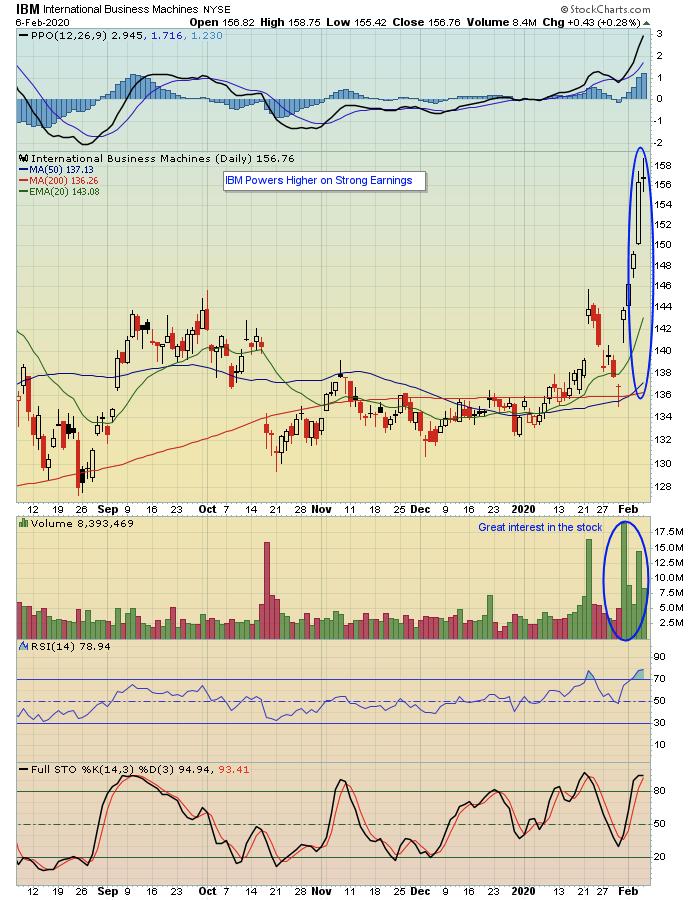
The market has shown incredible resiliency lately, shaking off the coronavirus epidemic, any negative economic reports, an impeachment trial and other developments that one would think could derail stocks. Yet here we are, with the market near record highs with traders seeming to "care less" about anything but the one thing that matters the most: corporate earnings.
In some ways, the overall market attitude seems somewhat cavalier. But the fact is that, above all else, it's the bottom line that determines whether or not traders become attracted to a stock.
As an example, look at the chart below on IBM, which powered higher on strong earnings.

That powerhouse move higher came as a result of IBM exceeding expectations, fueled by a heavy increase in volume on the buy side. In other words, everyone wanted a piece of a stock that produced strong earnings.
If you asked me if I would chase IBM after that move higher, I would say absolutely not. It was a terrific response, but the stock has become overbought and it now makes sense to wait for the excitement to settle down. But you can bet that traders will be looking to get involved in the stock when it pulls back to a more reasonable level, as everyone likes to be involved in stocks that are winners.
In fact, we'll be conducting a webinar this Monday, February 10, at 4:30pm ET. That webinar will be a sneak preview for our upcoming "Top 10 Stock Picks" webinar that will take place on Wednesday, February 19, where EarningsBeats.com Chief Market Strategist Tom Bowley will release his Top 10 Stock Picks in four different portfolios: Model, Aggressive, Income and Character Change. Monday's FREE webinar is open to all members of the EarningsBeats.com community, including those who currently get our free EarningsBeats Digest that focuses on earnings related information. If you are NOT currently a subscriber, just click here to sign up and we'll send you room instructions and a reminder prior to the start of the webinar. You can also use this link to join us on Monday and the room will open at 4pm ET. Hope to see all of you there!
At your service,
John Hopkins
EarningsBeats.com
|
| READ ONLINE → |
|
|
|
| MORE ARTICLES → |
|


 There are three ETFs covering the defense and aerospace group and all three recorded new highs. Even though these ETFs cover the same industry group and have similar price charts, they are quite different when we look under the hood and one is seriously underperforming the other two.