| THIS WEEK'S ARTICLES |
| Market Roundup |
| Lots of Short-Term Indicators Reversing from Bearish Extremes - What Does It Mean? |
| by Martin Pring |
I wrote earlier in the week that, whenever the market rallies by 8-9%, it's obvious that some form of bottom has taken place (however fleeting), so I don't want to state the obvious. It is apparent, though, that some of the short-term indicators have finally begun reversing to the upside, which suggests that, for all intents and purposes, this week's low will hold for a while. Let's consider some of them.
Indicators Start to Flash Buy Signals
Chart 1 features a 10-and 20-day MA of the McClellan Volume Oscillator. Rallies typically develop following periods where the 10-day series reverses to the upside from the oversold dashed green horizontal line. However, when it falls even lower below the solid thick green line and then reverses, a more durable bottom tends to form. Note that the indicator re-crossed back above that line today and actually reached a lower level than it did in December 2018.
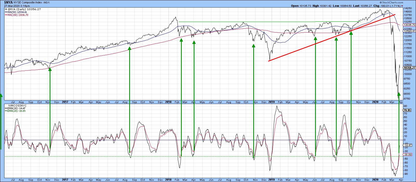
Chart 1
Chart 2 features the NYSE Bullish Percent, which almost took out its 2008 record low, but, at a reading close to 5, certainly reached a crisis extreme. Apart from that October 2008 low (B), it only got really close to the solid line at the bear market bottom in 2009 (C). It also dropped below the dashed line again at A, right at the beginning of the bear market. The fact that this occurred at the start of the bear market gives me pause to think; although a nice rally, taking the Index back to its 200-day MA, followed, it developed close to the peak, which cannot be ruled out in the current situation. It's also interesting that, by Friday, this series had rallied back to the 50 level. That's a bit too fast for my liking.
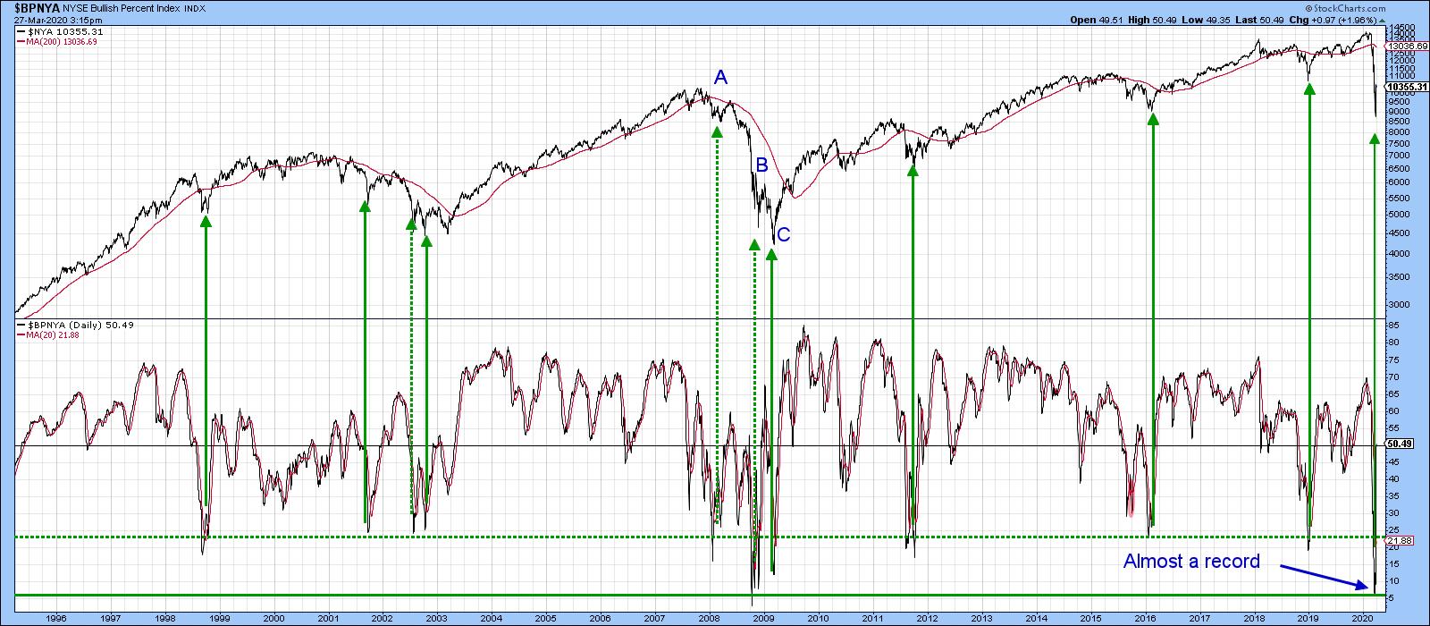
Chart 2
Chart 3 compares the SPDR Dow Jones ETF, the DIA, to my Dow Diffusion indicator. It's a series which monitors the percentage of Dow stocks in a positive trend and triggers buy signals when it reverses direction from an oversold reading. The arrows demonstrate signals that were triggered from an even lower level at the green dashed line. The two dashed arrows reflect weak rallies that developed under the context of the 2007-09 bear market. Even then, the reversals did flag a respite of several weeks from the strong down draft. The indicator's recent level was pretty close to a record, so it's certainly reflecting a deeply oversold market. It's still declining, but has started to flatten. I am expecting a reversal any day now.
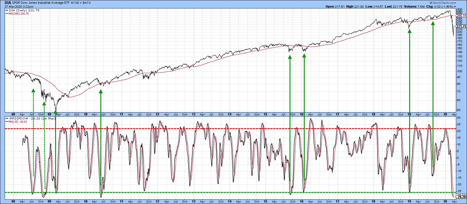
Chart 3
One sign of an improving technical position comes when the Index being monitored falls to a new low for the move, but the number of stocks does not. That's the sort of thing that developed at the 2009 bottom and appears to be materializing today. In Chart 4, it is evident the net number of new lows was far less on Monday's closing than it was on March 12. The NYA closed around 1000 on March 12, yet on Monday it was around 8750.
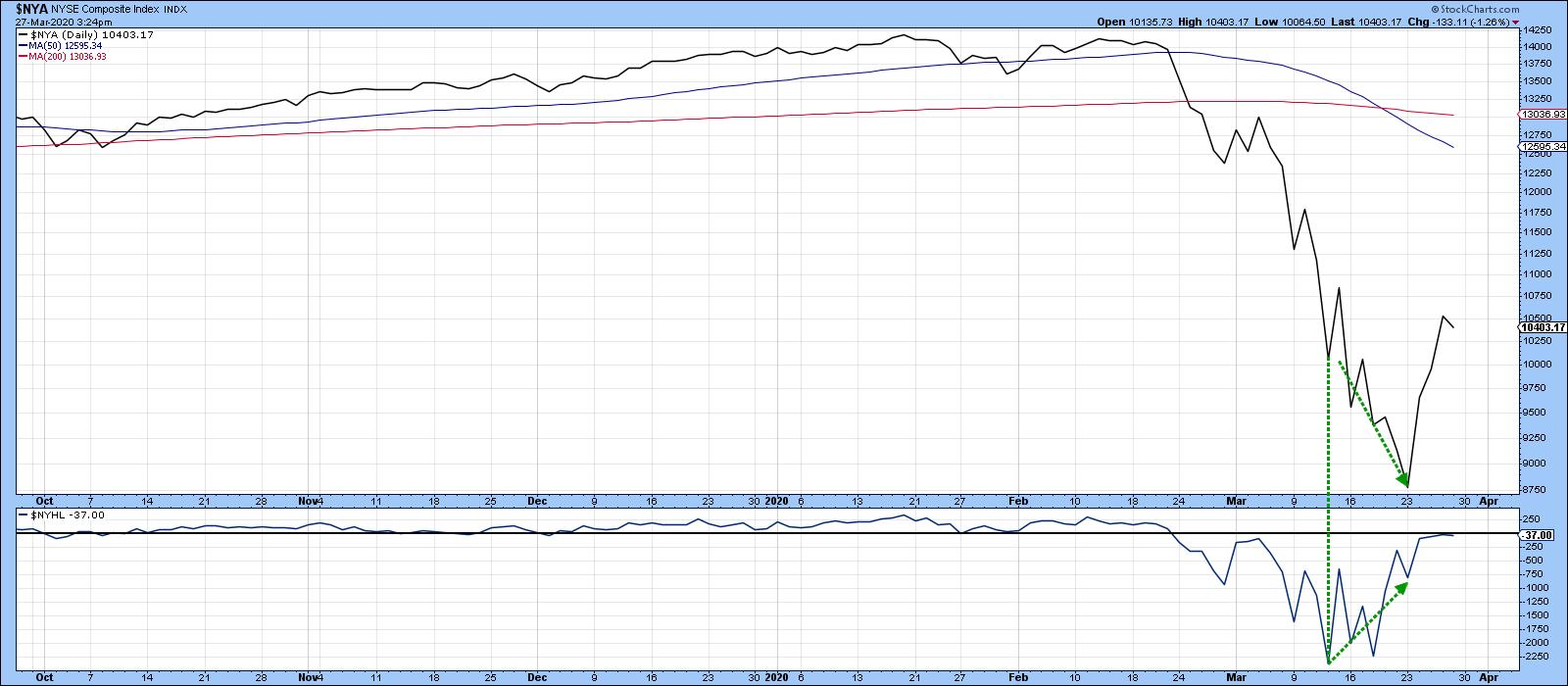
Chart 4
Finally, my Bottom Fisher (!PRBFISH) has actually fallen below its previous record low, set during the 2007-09 bear market. Historical bottoms that have developed at an extreme reading have been flagged by the vertical lines. Seven of them were followed by excellent rallies. Two of them, indicated by the dashed lines, were not so prescient, as they developed during a vicious bear market. Thursday's action resulted in a reversal, but not a MA crossover. Since it was right at the MA, a crossover is likely at any time.
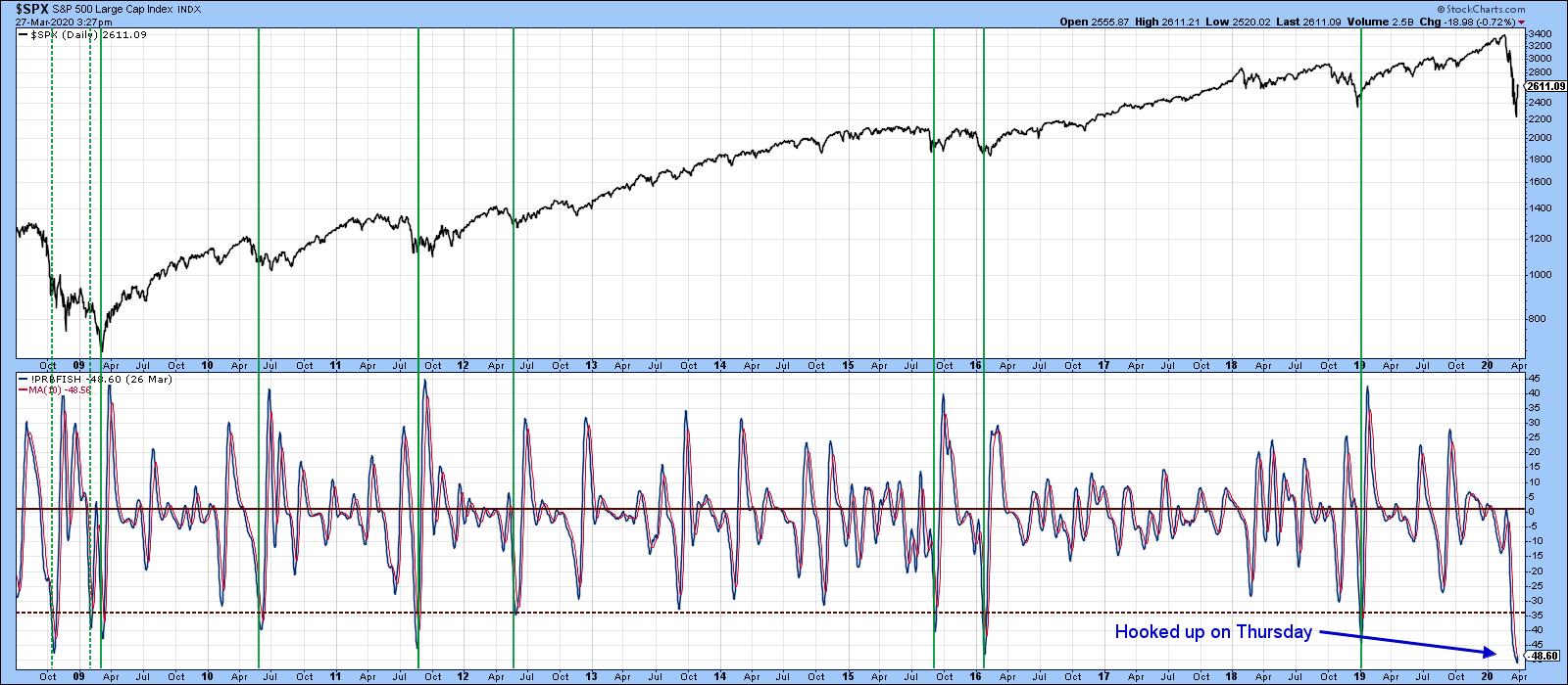
Chart 5
Editor's Note: This is an excerpt of an article that was originally published in Martin Pring's Market Roundup on Tuesday, March 24th at 7:55pm ET, and was later updated and expanded on Friday, March 27th. Click here to read the full article, which includes Charts 6-8 and a discussion of the Great Depression and long-term perspectives.
Good luck and good charting,
Martin J. Pring
The views expressed in this article are those of the author and do not necessarily reflect the position or opinion of Pring Turner Capital Group of Walnut Creek or its affiliates.
|
| READ ONLINE → |
|
|
|
| The Mindful Investor |
| The Charts That Speak to Further Downside |
| by David Keller |

I very much enjoyed participating in our StockCharts TV special event "Navigating a Bear Market" along with many of my fellow StockCharts contributors. In this article, I'll provide my comments and charts from that special, along with some brief updates on what has changed in the last couple days.
Let's explore the bear market through an asset allocation lens. We tend to think a lot about stocks and their current sell-off, but how does this sell-off relate to other asset classes? We're going to go through what I would consider the asset allocation decision - that is, looking at stocks vs. bonds vs. commodities vs. currencies. Next, we'll briefly examine each one individually for some key themes of note.
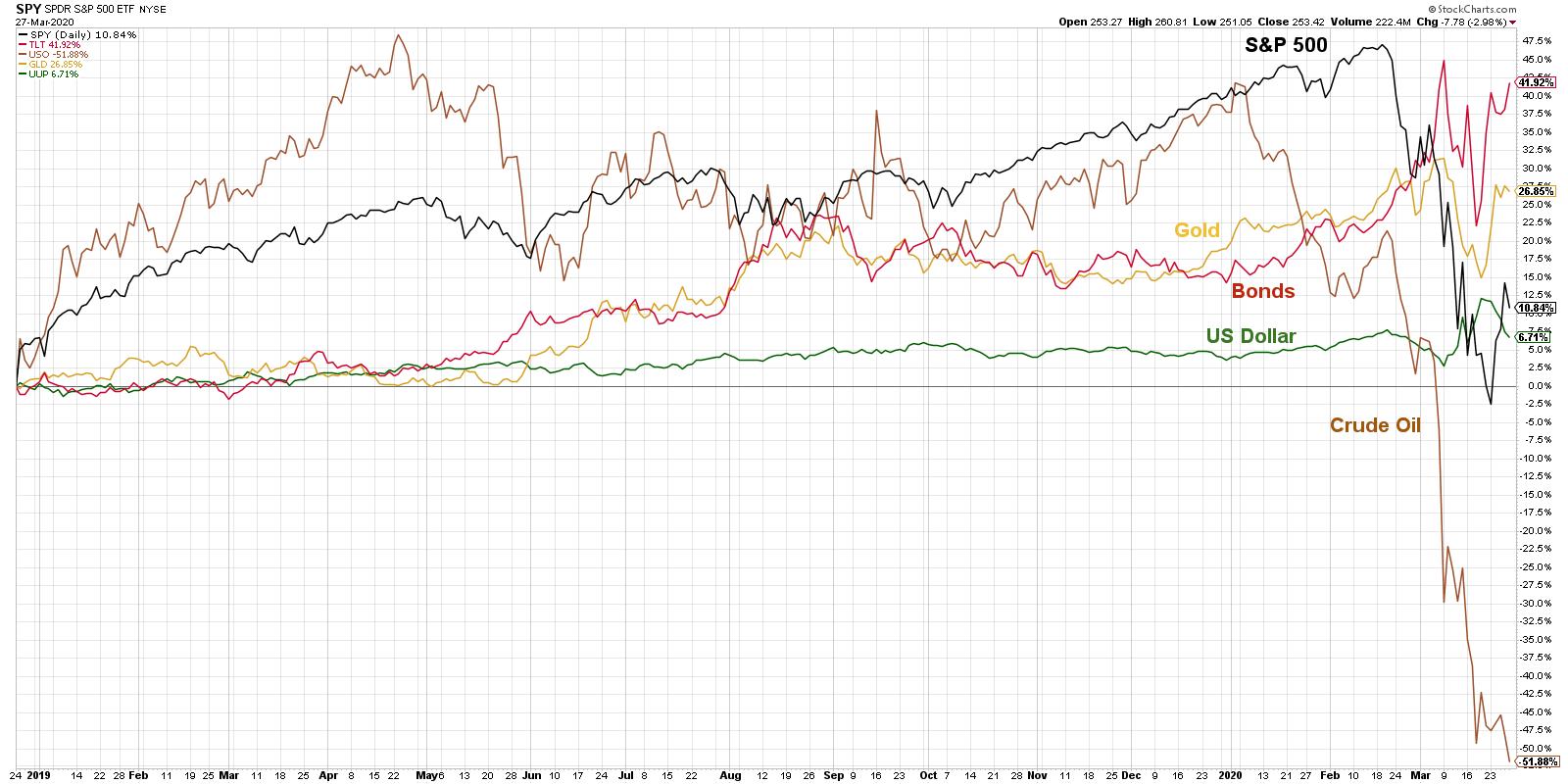
When I gave a presentation here in Seattle in mid-February, I noticed all of these asset classes were going up at the same time. That 2nd week in February, it seemed everything was in a bull market, and I made the comment that this is certainly unsustainable. There was no way that pattern could continue - something had to give.
That "give" happened in the 2nd half of February when stocks sold off very quickly, crude oil sold off aggressively, the dollar started to weaken and even gold pulled back. Bonds were the only thing that rallied, and they rallied hard into the first week in March.
Since that time, things have stabilized just a bit. However, it's undeniable that crude oil continues to be in a significant downtrend, while stocks, even with a bounce here early in the week, continue to be in the downtrend of lower highs and lower lows. The question, then, is how does this relate to other asset classes?
A crucial point to note - don't get too caught up in what "should" happen. People tend to think "Stocks are selling off, so a safe haven like gold should do well." There are plenty of times when this is the case, but in the last couple weeks stocks and gold have actually been moving together and selling off in tandem. So don't think as much about what should happen - look at what is happening.
Let's look at each asset class individually and notice some of the patterns.
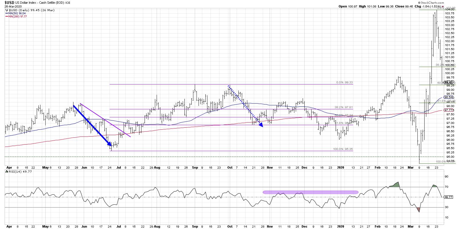
When looking at the US dollar index, it has overall been in a slow and steady uptrend before really coming off in mid-February to mid-March. Afterwards, it moved into full rally mode. Even with days where the dollar weakened, the trend has remained significantly strong overall, which tends to favor US stocks over non-US stocks.
In general, this would also be more supportive of small-cap stocks, but with the coronavirus pandemic and how the economy is adjusting, I don't think this is as much of a theme. Nevertheless, it certainly speaks to the strength of US versus non-US stocks.
It's worth noting that going into the end of this week, the Dollar pulled back aggressively, retracing 50% of its gains from the two previous weeks. Overall, this puts the US Dollar chart on my short list of "reversal watch" charts, as it may be nearing a key inflection point here.
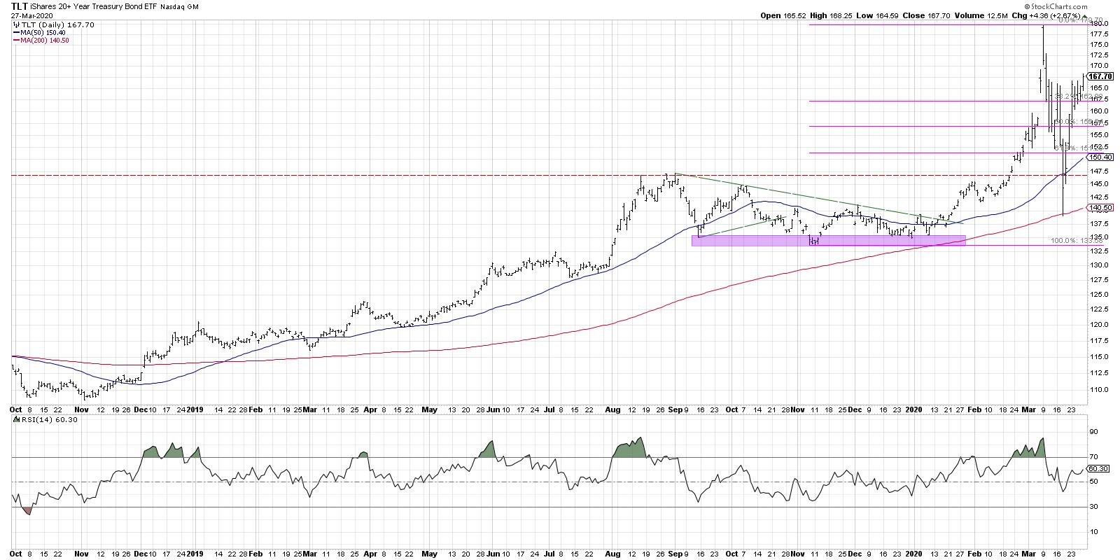
I usually look at bonds with the TLT. Bonds had rallied strongly into the 2nd week of March, and since then they have pulled back aggressively to the 200-day moving average. What's interesting with the chart of the TLT is it found support right at the 200-day, traded below that support intraday a couple days ago, then rallied to close back above the 50-day for the next couple of days.
It's important to note that it also came right back down to that region of stability from the 4th quarter of last year, which is certainly becoming a key support level for bonds. Since then, even with increased volatility in most asset classes, bond prices seem to be going higher.
A word of caution - people are seeing interest rates near all-time lows and starting to ask, "How much higher can bonds actually go?". The answer is that they can go much further than you think, while interest rates can keep going lower... much more than you probably think is reasonable.
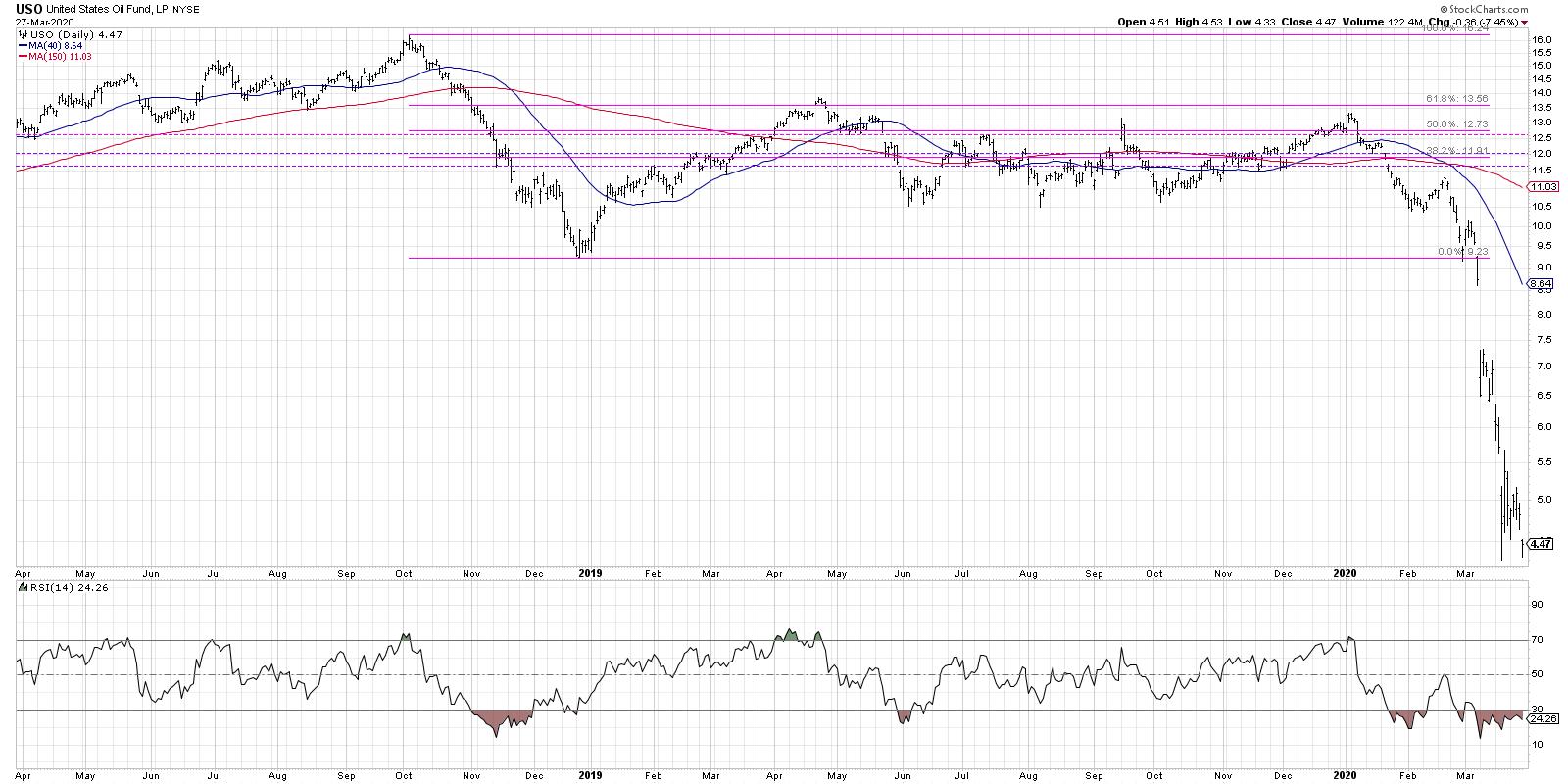
Oil seems to be in a falling knife scenario. In this scenario, you will notice huge percentage swings because the price is so low. Remember to take a step back, look at the peaks and the valleys and examine the trend.
I'm seeing oil in a downtrend - and not seeing the stability I would expect if we were going to get some sort of lasting rally. Consequently, oil seems relatively muted for the near future. Friday's selloff pushed crude oil to a new closing low, confirming severe price weakness leading into next week.
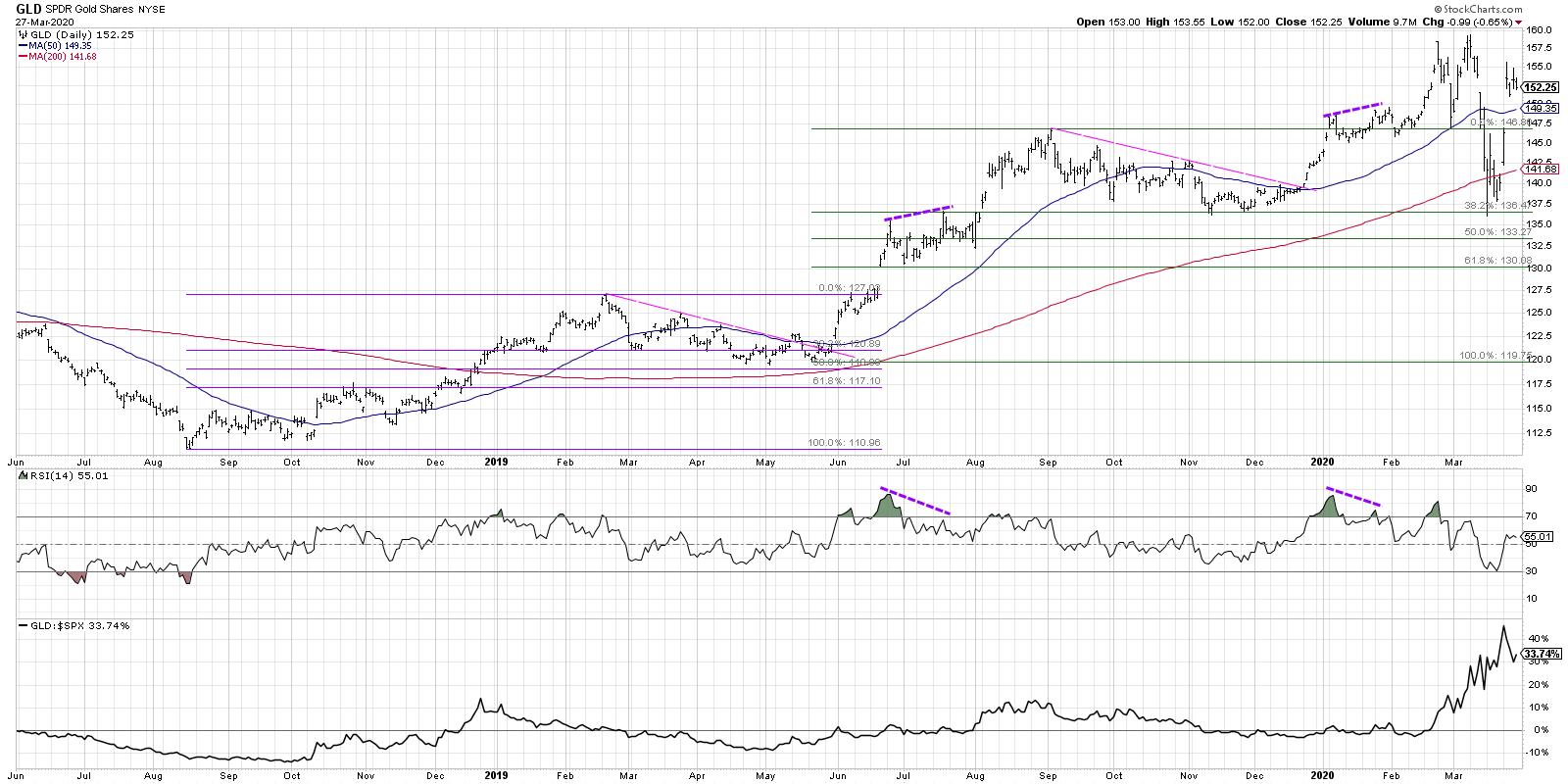
Of all the assets we've discussed so far, perhaps with the exception of the US Dollar, Gold appears to be set up most keenly to grow from here. The USD gapped up pretty well in the last couple days as a reaction to further sell-off in stocks, but overall it is setting up beautifully to appreciate. It pulled back to the same support level it found from last November and December when it broke below the 200-day, but that was a false breakdown. It rallied back above and is now once again approaching previous highs.
All of that is compelling, but relative strength is what tells the real story. If you want to outperform the S&P 500, you need to own assets that are improving in relative strength. Gold is certainly one of those assets.
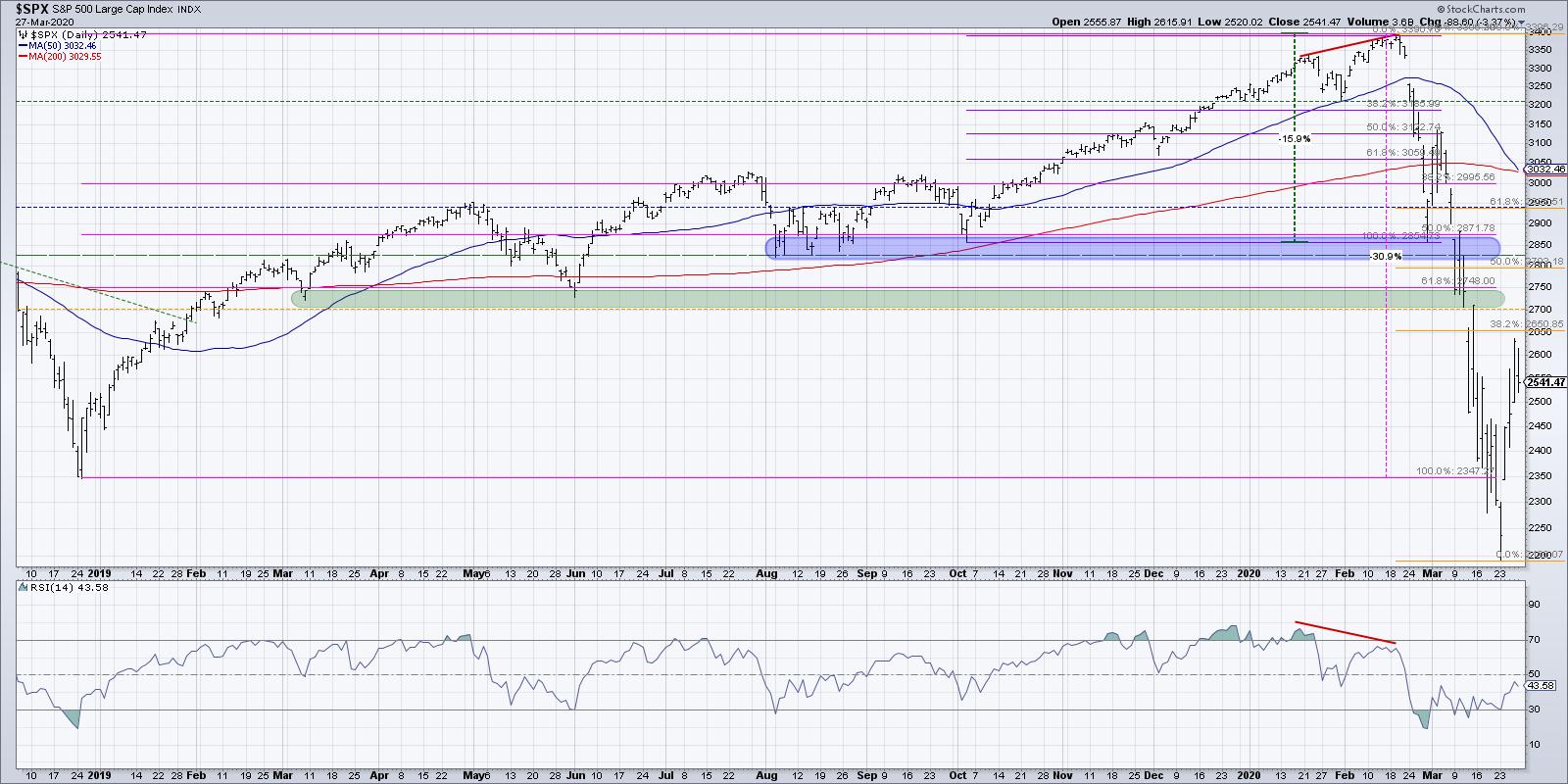
Finally, in looking at the chart of the S&P 500, what concerns me overall about stocks is that the breadth characteristics are now more similar to the 4th quarter of 2008 as opposed to the 1st quarter of 2009. I think this means further weakness for stocks and further increases in some of these other asset classes.
This week saw the S&P improve dramatically, yet the distribution leading into Friday's session made it feel as if there is plenty of selling pressure out there for equities.
Combine this with the fact that Friday's close to Monday's close has usually been a down move, and next week may be setting up for further price weakness and uncertainty.
RR#6,
Dave
David Keller, CMT
Chief Market Strategist
StockCharts.com
Disclaimer: This blog is for educational purposes only and should not be construed as financial advice. The ideas and strategies should never be used without first assessing your own personal and financial situation or without consulting a financial professional.
The author holds positions in TLT and GLD at the time of publication. Any opinions expressed herein are solely those of the author and do not in any way represent the views or opinions of any other person or entity.
|
| READ ONLINE → |
|
|
|
| Trading Places |
| Are You Prepared For Another Selling Episode? |
| by Tom Bowley |
During tumultuous times like these, I pay particular attention to sentiment levels. Extreme fear tends to mark market bottoms, just as the recent Volatility Index ($VIX) reading above 80 coincided with this week's stock market bottom. It's simply the way bottoms form.
However, last week we saw a major rebound in U.S. stocks. It was the "rubber band" effect. Losing one third of the entire market capitalization has generally resulted in a typical Fibonacci rally, which is exactly what we saw last week. The Dow Jones climbed 20% over just three trading days - its biggest advance since the 1930s. While that may sound absolutely incredible, it needs to be viewed with perspective - it came on the heels of the biggest 5-6 week stock market decline in my lifetime.
Now let's focus on reality. The Dow Jones closed at 29551.42 on February 12th. Six weeks later (!!!), the Dow Jones closed at 18,591.93, a jaw-dropping decline of 11,000 points. That's a loss of 37% of the market capitalization of 30 U.S. conglomerates........ in 6 weeks!!!
Is it too much? OF COURSE IT IS!!! More than one-third of the value of all U.S. stocks in 6 weeks? That's C-R-A-Z-Y! But, unfortunately, it's the way the stock market works. When uncertainty is in the air, Wall Street takes a "sell first, ask questions later" mentality. It always overshoots to the downside, which is why extreme fear marks bottoms.
So should we rush in and buy stocks now on sale? Well, it depends. In my opinion, those with a long-term mentality should be absolutely jumping at this opportunity. After all, isn't this what everyone wanted when the Dow Jones was knocking on the door at 30,000? But now that it's here, it's difficult to pull the trigger. Welcome to this emotional roller coaster!
A long-term investor should be buying this weakness without a doubt. Prices are historically cheap when massive fear hits the market. But what should traders do? Will we get an opportunity to get in at lower levels?
I say yes.
Rarely do we see equities print "V-bottoms." Q4 2018 was an example of a V-bottom, but they are very rare. I believe we'll see a minimum of a double bottom, testing the earlier price low on our key indices. I won't say with certainty that the short-term top is in, but we definitely approached a key Fibonacci level on the S&P 500:
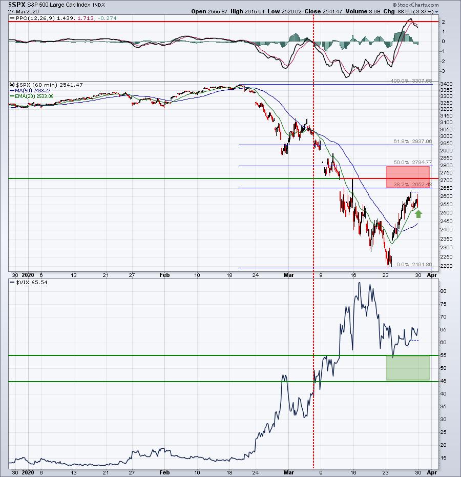
The red-shaded area marks very important Fibonacci retracement levels at 38.2% and 50.0% retracement of the recent decline. We never quite made it that high on the rebound - at least not yet. I think it's possible that we could still enter that "red zone," but Friday's late-day selling resulted in the hourly PPO rolling over from a key level at 2. If we take a trip down memory lane, the following hourly chart from 2008 shows that an hourly PPO reading in the 1-2 range can be difficult to negotiate on rebound attempts:
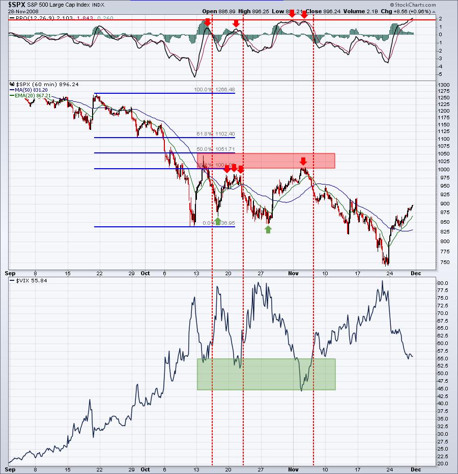
Those four red arrows highlight the failure of the rally when the hourly PPO hit 1 or 2. The combination of hourly PPOs in the 1-2 range, along with key price resistance, ended the initial price rebound in 2008. My guess is that the same area will be difficult to negotiate in 2020.
Pay close attention to key sentiment readings. The VIX will drop below 45 when the insane fear levels finally start to roll over; that will begin to provide us confirming clues of a bottom. Until then, I'd suggest you remain on guard for another possible impulsive bout of selling.
To be clear, I remain bullish longer-term. But I recognize how the stock market works when uncertainty fills the air. I'd be looking to take advantage of additional selling in the weeks ahead.
If you'd like to join our free 3x per week newsletter, CLICK HERE!
Happy trading!
Tom
|
| READ ONLINE → |
|
|
|
| RRG Charts |
| And the Worst Section of the US Stock Market Is....... |
| by Julius de Kempenaer |
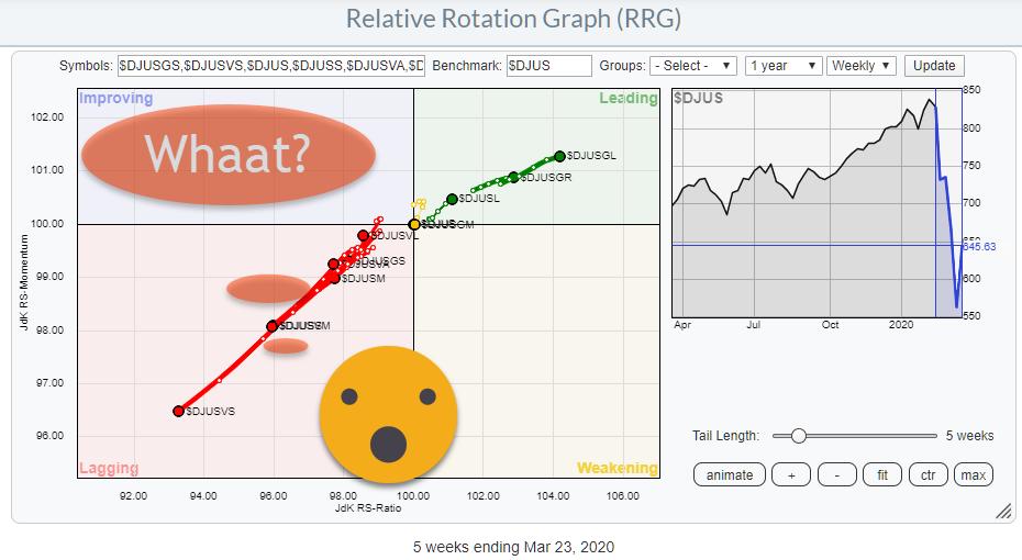
Instead of simply looking at sectors, it also makes sense to keep an eye on segments of the stock market based on different criteria.
The Size Factor
One example is to group stocks based on Market Capitalization, i.e. Large-, Mid- and Small-Cap stocks.
A Relative Rotation Graph of that breakdown is available as a predefined universe in the dropdown on the RRG page, using the Dow Jones US index family - $DJUSL, $DJUSM, $DJUSL - with $DJUS (total market) as the benchmark.
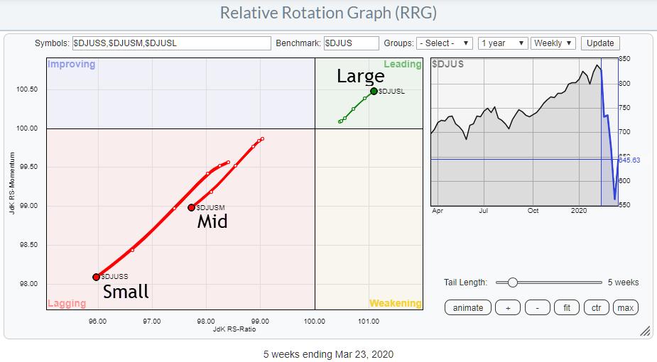
The RRG for this breakdown is sending a very clear message that large-cap stocks are outperforming mid-caps and small-caps. Or, in the light of the recent decline, it is probably better to say that large-cap stocks are holding up better than mid- and small-caps, with small-caps being hardest hit.
The Style Factor
A second breakdown that is often used is to qualify stocks as Growth or Value stocks. A good explanation of the difference between these qualifications can be found in this article from Fidelity: "2 schools of investing: Growth vs Value".
The RRG below shows the DJ US Growth Index ($DJUSGR) and the DJ US Value Index ($DJUSVA), again using the DJ US index as the benchmark.
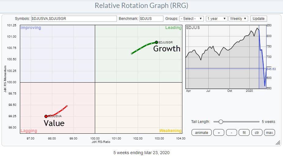
This image also is sending a very clear message: Growth beats Value. Or, perhaps more accurately: Growth is holding up better than Value.
Combining "Style" and "Size"
Combining these two "factors" can give a more granular insight in those breakdowns.
The DJ US Index family also provides indexes for breaking down the size segments into growth and value. If we include the original factor indexes, that gives us a universe of 11 indexes:

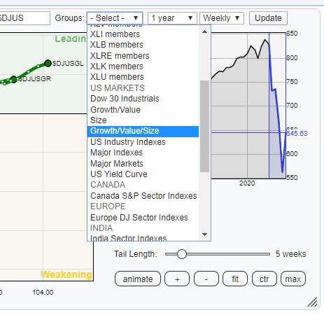 This universe of symbols is also grouped as a pre-defined universe on the RRG page. You can find it under the "Groups" Drop-down under the US Markets section. This universe of symbols is also grouped as a pre-defined universe on the RRG page. You can find it under the "Groups" Drop-down under the US Markets section.
Selecting that group will bring up the universe as shown in the table above, breaking down the US stock market into its growth, value and size segments.
When I opened up that group today, the image at the top of this article popped up.
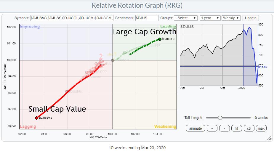
As you know, I am always interested when specific tails are moving rotating in opposite directions, especially as these tails are at strong (0-90 degrees) or weak (180-270 degrees) headings. And the rotation, as it is currently visible for this universe, could not be more clear.
Here is the RRG again. but now highlighting the tails for US Large Cap Growth and US Small Cap Value.

The absolute worst segment of the market to be in at the moment is US Small-Cap Value stocks, while the segment that is holding up best is US Large Cap Value.
The direction of these two tails is almost exactly opposite, but also note the length of the tail and the increased RRG-Velocity (distance between week-week observations) on Small Cap Value versus Large Cap Growth. It's telling us that there is a lot of power behind this push into lagging.
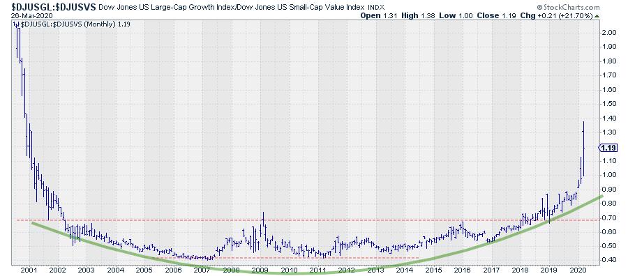
The straightforward comparison between these two areas of the market also shows an interesting long-term picture.

Already back in 2018, this ratio broke out of a very long-term base and crawled steadily higher. Literally at the start of 2020, this relationship started to accelerate higher in favor of Large Cap Growth and it really jumped higher in February and March.
How much more upside is left in this spread is difficult to say. The earliest observations (when the indexes were introduced) shows levels around 2 while we are now around 1.2. That's a lot of upside left. Or, in other words:
There's a lot of risk left in small-cap value stocks.
Please #StaySafe and enjoy your weekend!
--Julius
My regular blog is the RRG Charts blog. If you would like to receive a notification when a new article is published there, simply "Subscribe" with your email address.
Julius de Kempenaer
Senior Technical Analyst, StockCharts.com
Creator, Relative Rotation Graphs
Founder, RRG Research
Want to stay up to date with the latest market insights from Julius?
– Follow @RRGResearch on Twitter
– Like RRG Research on Facebook
– Follow RRG Research on LinkedIn
– Subscribe to the RRG Charts blog on StockCharts
– Watch Sector Spotlight on Youtube
Feedback, comments or questions are welcome at Juliusdk@stockcharts.com. I cannot promise to respond to each and every message, but I will certainly read them and, where reasonably possible, use the feedback and comments or answer questions.
To discuss RRG with me on S.C.A.N., tag me using the handle Julius_RRG.
RRG, Relative Rotation Graphs, JdK RS-Ratio, and JdK RS-Momentum are registered trademarks of RRG Research.
|
| READ ONLINE → |
|
|
|
| The MEM Edge |
| $2 Trillion Coronavirus Relief Bill Makes Bullish Case for Certain Industries |
| by Mary Ellen McGonagle |
The U.S. government passed a coronavirus relief bill today that's thought to be the largest of its kind in history as Washington tries to dampen the sharp economic decline that's expected from the spreading pandemic.
While the plan will provide one-time payments to individuals as well as tax-breaks to small businesses, select industries will benefit as well by way of substantial capital infusions. This would include struggling airlines as well as overstretched hospitals and, while these much-needed funds will help these industries, the negative impact of the coronavirus may well outstrip the relief bill's efforts to buffer them from financial losses.
Of more interest is the $2.5 billion allocated to the defense industry, which will help prop it up after the government invoked the Defense Production Act, forcing companies to provide goods and services in response to COVID-19 upon request.
DAILY CHART OF LOCKHEED MARTIN (LMT)
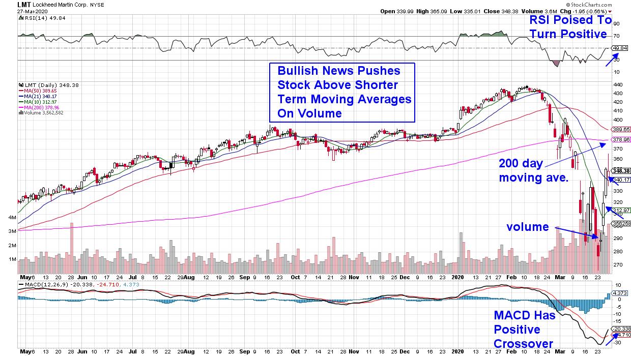
This would include companies such as defense contractor Lockheed Martin (LMT), which has kept its plants running as the company plays an essential role in national security. The stock is currently emerging from a deeply oversold position following its 37% plunge from a February high in price.
LMT began this week's rally ahead of the Relief Bill signing, as news of being awarded two missile contracts worth over $1.5 billion had analysts raising earnings estimates. The stock has bullishly broken back above both its 10- and 21-day moving averages, with the next area of possible upside resistance being its 200-day moving average, which is 9% away.
A quick look at the 2008 bear market shows that top-performing defense-related stocks held in relatively well while being big winners when the new bull cycle resumed in early 2009.
While being provided a much smaller allocation, telemedicine companies made the cut as the government is aiming to reach rural residents that may not otherwise have access to medical professionals.
DAILY CHART OF TELEDOC HEALTH INC. (TDOC)
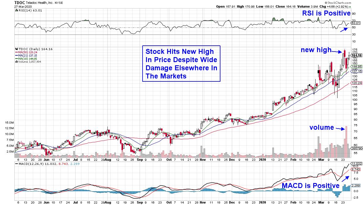
Telemedicine has been around for years; however, these companies now have genuine potential, with demand for their video consultations rising dramatically as quarantined populations are seeking medical advice. Teledoc Health (TDOC) is one of the more established virtual healthcare providers, as they've secured contracts with most major hospitals and insurance health plan providers since their inception almost 20 years ago.
The stock has held in remarkably well during a punishing environment for most listed companies, with TDOC hitting a new high in price earlier this week. While the stock is bullishly positioned above each of its key simple moving averages with a positive RSI and MACD, investors should be aware that it has been experiencing daily volatility that includes price swings as high as 10% on a given day.
While both stocks highlighted above have attractive charts, broader market dynamics may well dampen their potential progress over the near-term. While we've experienced a substantial rally this week, volatility levels remain high and certain longer-term bullish signals have not yet emerged.
If you'd like to be alerted to when it's safe to get back into the markets for a longer period, I urge you to take a 4-week trial of my bi-weekly MEM Edge Report for a nominal fee. My work uses a proven system that has identified every bear market reversal - and you'll be immediately alerted once we get there.
In addition, I'll be starting a daily live trading room next week. Access will be at no cost and it will last for one hour. For those interested in more information, you can go to the Contact Us tab on my website and provide your email address.
I hope you'll join with like-minded investors as we navigate these tricky markets!
Warmly,
Mary Ellen McGonagle,
MEM Investment Research
|
| READ ONLINE → |
|
|
|
|
|
| MORE ARTICLES → |
|


 This universe of symbols is also grouped as a pre-defined universe on the RRG page. You can find it under the "Groups" Drop-down under the US Markets section.