| THIS WEEK'S ARTICLES |
| ChartWatchers |
| Key Charts From Our Top Contributors, Straight To Your Account: Our "Navigating a Bear Market" ChartPack Is Now Available |
| by Grayson Roze |
|

This week was a first for us, but it marks the start of something big – a unique integration between the content you follow from our team of market experts and the charts that you use in your own StockCharts account. Allow me to explain.
Late last month, we released a new special on StockCharts TV called "Navigating a Bear Market". In this 1-hour presentation, we took ten of our most dynamic contributors and brought them together to share the strategies, routines and processes they use to navigate deteriorating conditions and analyze the markets in times of stress.
We've seen wild swings these past few weeks as the historic bull run came to an end and a new bear market took hold. With conditions changing so rapidly, there's a good chance you're wondering what the experts are watching.
How are they managing risk?
Where are they finding opportunity in the face of high volatility?
How do they handle weakening prices and choppy charts?
Well, that's exactly what we had them sit down and answer in "Navigating a Bear Market". Packed with powerful insights and unique ideas from a world-class team of chartists, this special will help you better understand how some of the industry's sharpest technicians are navigating today's chaotic market. Check it out here.
But now here's the best part...
We Took It A Step Further For Our StockCharts Members
As a members-only exclusive, we've collected all of the charts you see in our "Navigating a Bear Market" special and organized them in a new ChartPack that you can install straight into your own StockCharts account (plus three bonus lists for good measure!)
Totally free for our Extra and PRO members, our "Navigating a Bear Market" ChartPack will give you 13 ChartLists from 13 different analysts, each full of charts created and used by these experts themselves. That includes charts from John Murphy, Martin Pring, David Keller, Arthur Hill, Dan Russo, Greg Schnell, Erin Swenlin, Tom Bowley and many others.
Right from their screens to yours, you can add these experts' favorite charts to your account, follow along with the presentations and bring their analysis into your own workflow. Plus, they're real live charts, just like any you'd create yourself on StockCharts. Use them as is, the way our contributors designed, or let them be a starting place, something to modify and customize and make your own.
Extra & PRO Members: Here's What To Do
If you're a StockCharts Member with an Extra or PRO account, getting the new ChartPack couldn't be easier. Simply CLICK HERE to visit the ChartPack page, then look for the big green "Install ChartPack" button at the bottom of the page. Give it a click and the 13 new ChartLists will appear in your account alongside all of your other lists. Each one will begin with "SC - Navigating a Bear Market" to indicate that it's part of the ChartPack.
Basic Members: Here's What To Do
If you're a StockCharts Member with a Basic account, you'll first need to upgrade to Extra or PRO in order to get the ChartPack.
Our Basic service level gives you one ChartList, but when you upgrade to Extra or PRO, you'll unlock up to 350 ChartLists for your account. In addition to installing ChartPacks, you'll gain tons of storage space to organize and analyze your charts like never before. Second only to your charts themselves, I'd argue that ChartLists are the next most important feature on StockCharts and will definitely enhance what you are able to do with the platform.
To upgrade your Basic account now and unlock premium features like ChartPacks and more saved chart storage, click here.
Not a Member? Here's What To Do
If you're not a StockCharts Member, the time to sign up is now. Our free 1-month trial will give you a brand new Extra account, and you can install the new "Navigating a Bear Market" ChartPack at that point.
ChartPacks are just the tip of the iceberg though. You'll be able to create bigger, better, more advanced charts that you can save to your account. You can use ChartLists to track your portfolio or create watchlists, run custom technical scans for the criteria you look for in new trades or investments, and set custom alerts to help keep yourself one step ahead of the markets.
Our most powerful tools and features are always reserved for members, so check out our free trial today and see how a StockCharts membership can help you get more from your charting experience.
I hope you'll take advantage of this special "Navigating a Bear Market" ChartPack and the chance to bring the work of these incredible experts straight into your own StockCharts account. It's a unique way to make their processes your own and model your investing routines after some of the industry's best. Enjoy!
Chart on, my friends.
- Grayson Roze
VP of Operations, StockCharts.com
Author, Trading For Dummies (Wiley, 2017)
Author, Tensile Trading (Wiley, 2016)
|
| READ ONLINE → |
|
|
|
| The Market Message |
| Weekly and Monthly Charts Show Improvement |
| by John Murphy |
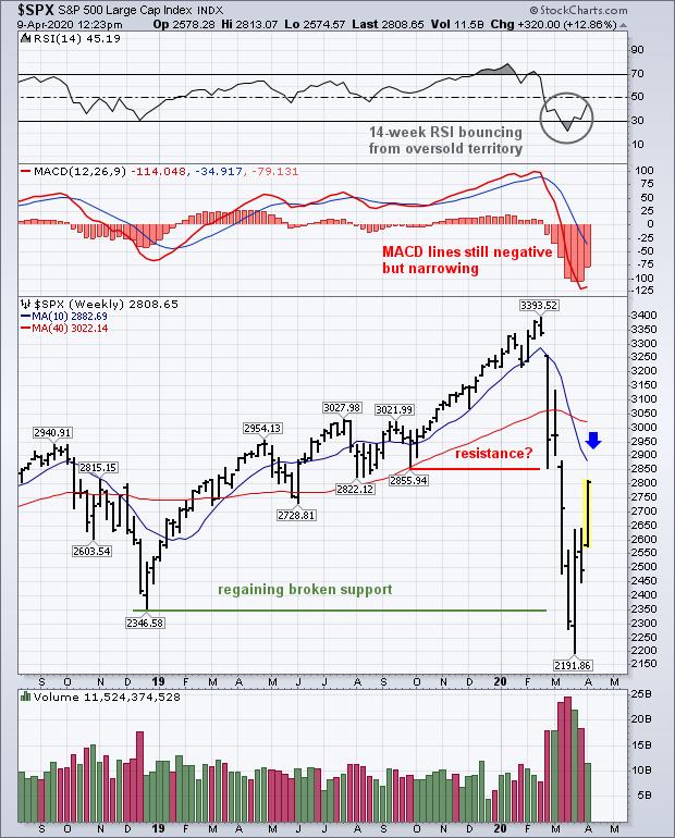
Stock prices are trading higher again today following a Fed injection of $2.3 trillion dollars into the economy. The question is how far can the rally carry, and are there still risks on the downside. For that, we're going to look at weekly and monthly charts to try to put things into better perspective. Chart 1 plots weekly S&P 500 bars for last couple of years. It shows the SPX trading back above its late 2018 low which is an encouraging sign. So is the fact that its 14-week RSI line in the upper box is bouncing from oversold territory below 30. The weekly MACD lines in the middle box, however, remain very negative. But the red histogram bars have rebounded this week (meaning that the negative spread between the two lines is narrowing) which is an improvement. The chart, however, shows the SPX nearing potential overhead resistance along previous broken support levels ranging from 2822 to 2885. It's also nearing a possible test of its 10-week (or 50-day average) at 2882 (blue circle). In addition, the SPX has already retraced 50% of its first quarter loss.
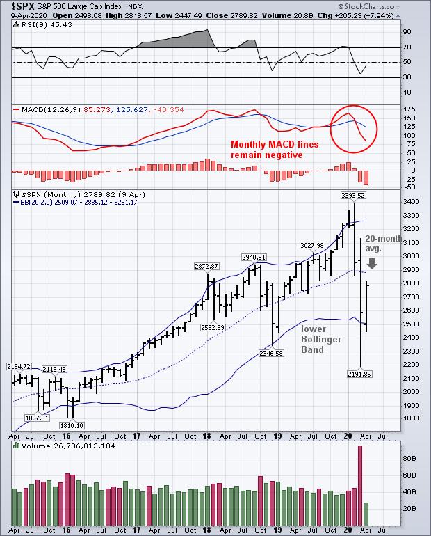
Chart 2 shows a monthly chart of the S&P 500 for the past five years. The chart shows the SPX trading back above its late 2019 low as in Chart 1. It also shows the SPX bouncing off its lower 20-month Bollinger Band which is encouraging. But it also shows the SPX approaching a test of the middle 20-month moving average at 2886 which could provide some overhead resistance (down arrow). The two top boxes show its 14-month RSI line starting to recover near oversold territory. Monthly MACD lines in the middle box, however, remain in their most negative alignment in years. Those negative MACD monthly readings are usually a warning that market risks still remain. So does the history of previous bull markets.
Stocks fell more than 20% during the first quarter which signaled the start of a bear market. Using that same criteria, the 20% gain in the S&P 500 over the last month puts it back in bull market territory. While that's an encouraging sign, it's also highly usual. Historically, bear markets last an average of eleven months. If this week's rebound is signaling a new bull market, that would make the first quarter bear market the shortest in history. So far, the stock market has regained 50% of its first quarter decline which is a pretty normal counter-trend rally. And stock prices are approaching some potential overhead resistance levels which could stall the current rebound. In addition, the current pandemic adds a huge element of uncertainty both for stocks and the economy.
Chart 1

Chart 2

Editor's Note: This is an excerpt of an article that was originally published in John Murphy's Market Message on Thursday, April 9th at 12:28pm ET. Click here to read the full article, which includes further discussion of the economic impact of the COVID-19 pandemic.
|
| READ ONLINE → |
|
|
|
|
|
| The Mindful Investor |
| Seven Bear Market Mistakes and How to Avoid Them |
| by David Keller |
As a technical analyst who started my career just after the market top in March 2000, I've had the pleasure (I guess?) of living through a number of previous bear market cycles.
I first learned about and started to apply technical analysis during the 2001-2002 bear market, so I've often found that my technical approach tends to focus more on the risk side than the reward side. Consider that one of the side effects of learning charts when I did; it's usually served me pretty well.
As much as bull markets are interesting and exciting and rewarding, I feel that I've learned much more from bear market cycles than bull market cycles. "Everyone's a genius in a bull market," but when the charts start to turn lower, that's when you uncover all the problems with your process that weren't as easy to identify.
I've summarized my experiences into these seven common mistakes I see people make in bear markets, and I'll finish with my Bear Market Playbook on how you should be approaching this period.
Mistake #1: Not Validating the Anecdotal with the Evidential
I was once told that the markets are driven by fear and greed, but I think at this point that is no longer true. Markets are driven 100% by fear. On the way down, it's the fear losing everything, while on the way up, it's the fear of missing out, or "FOMO".
Fear is what drives us to hear a harrowing projection of the future direction of the economy, a specific sector or a particular theme, and then make investment decisions based on that anecdotal evidence.
A mindful investor focuses on the hard evidence, which to a technician means price. Instead of focusing on what should happen based the anecdotes, focus on what is happening based on the price.
Anecdotal evidence is still a good thing, don't get me wrong. But anecdotes should drive you to dig deeper into the evidence to validate what you're seeing and hearing, as opposed to driving your investment process on its own.

This is why I have long-term trend-following models that I've been running for years. I'm always interested in ideas about where things may be headed, but these long-term models are what ground me in the evidence. This is what has happened and these are the long-term trends.
Mistake #2: Embracing the Endowment Effect
We tend to attribute greater value to things we own. That is, if I have a special coffee mug that has sentimental meaning for me, I will see the mug as quite valuable even though for you it may just be a convenient way to hold your coffee.
This is the endowment effect, and it's what leads us to hold on to stocks way too long. When the chart starts to turn negative, instead of exiting a losing position and moving on to other things, we tend to hold on for way too long because of an emotional connection to the stock.
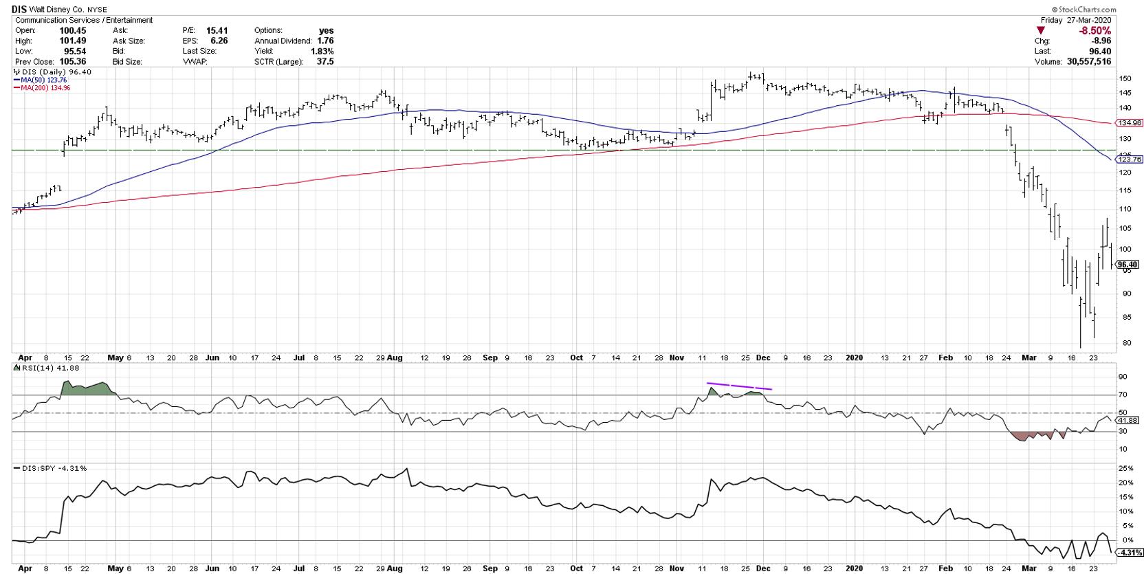
Let's use Walt Disney Co. as a recent example.

For the first six to eight weeks of 2020, there were a number of warning signs that could have compelled you to reconsider a long position. The price broke below two moving averages. The price broke below long-term support around $126. The stock was underperforming its peers. The price was making a lower high while the broader market was making a higher high in February.
The endowment effect causes us to basically ignore these clear warning signs and instead feel good continuing to hold the stock due to our emotional attachment to the name.
Mistake #3: Over-reliance on Analogues
Analysts love to compare the current market to previous cycles. How does this correction compare to previous market corrections? Fair question, and I truly love this sort of debate.
The problem occurs when we assume that the current movements will closely mirror those in the past. If you told a statistician that you were comparing one observation to a second observation, and making assumptions that they would be identical, they would most likely laugh you out of the conversation.
As with mistake #1, I feel you have to consider this sort of comparison anecdotal evidence at best. There is absolutely no guarantee that tomorrow will mirror any previous market movement. The best we can do is bet on probabilities and try to understand the conditions that may cause two different periods to play out in similar ways.
So analogues are good if they spur discussion and help you question how conditions may be the same as or different than before. They are not good when you make bets based purely on the idea that this time will be the same as another time!
Mistake #4: Being Sucked In by Bear Market Rallies
Rallies in bear markets are brutal. They are quick, they are sudden, they bring huge percent moves that make you feel like you've already missed out on the entire move.
Bear markets are a process, not a moment. They take time. And most bear markets have involved crazy bounces that suck in lots of investors before the next down leg evolves.
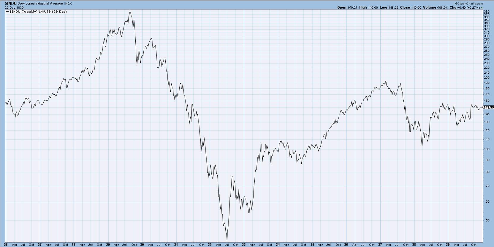
Look at the chart of the Dow from 1929-1932:

Notice how many times during that brutal down market that the price had a countertrend move, often retracing 20, 30 or even 40% of the previous down leg. These can happen, and they will tempt you, but chances are they will be temporary.
Focus on the long-term trends.
Mistake #5: Forgetting Your Timeframe
As part of hosting The Final Bar, our daily closing bell show on StockCharts TV, I often review the short-term market movements. What happened today? What worked and what didn't? What broke out and what broke down?
But my main goal with the show is to connect those short-term signals with the long-term trends. How did today's price action relate the overarching trends and themes we've been discussing in recent weeks? That's the game for long-term investors.
However, I've seen too many long-term investors make long-term decisions based on short-term price movements. Only look at intraday charts if you've already looked at the long-term charts that will put those short-term movements into proper context.
Mistake #6: Getting Married to a Narrative
We love narratives. As humans, we relate to the world around us in narratives. This is why, when you're buying a car, the salesperson is not selling you on the specifics of the engine or why a specific feature is designed a certain way, but rather they're selling you on the narrative. They put you in the car so you can see it as your own.
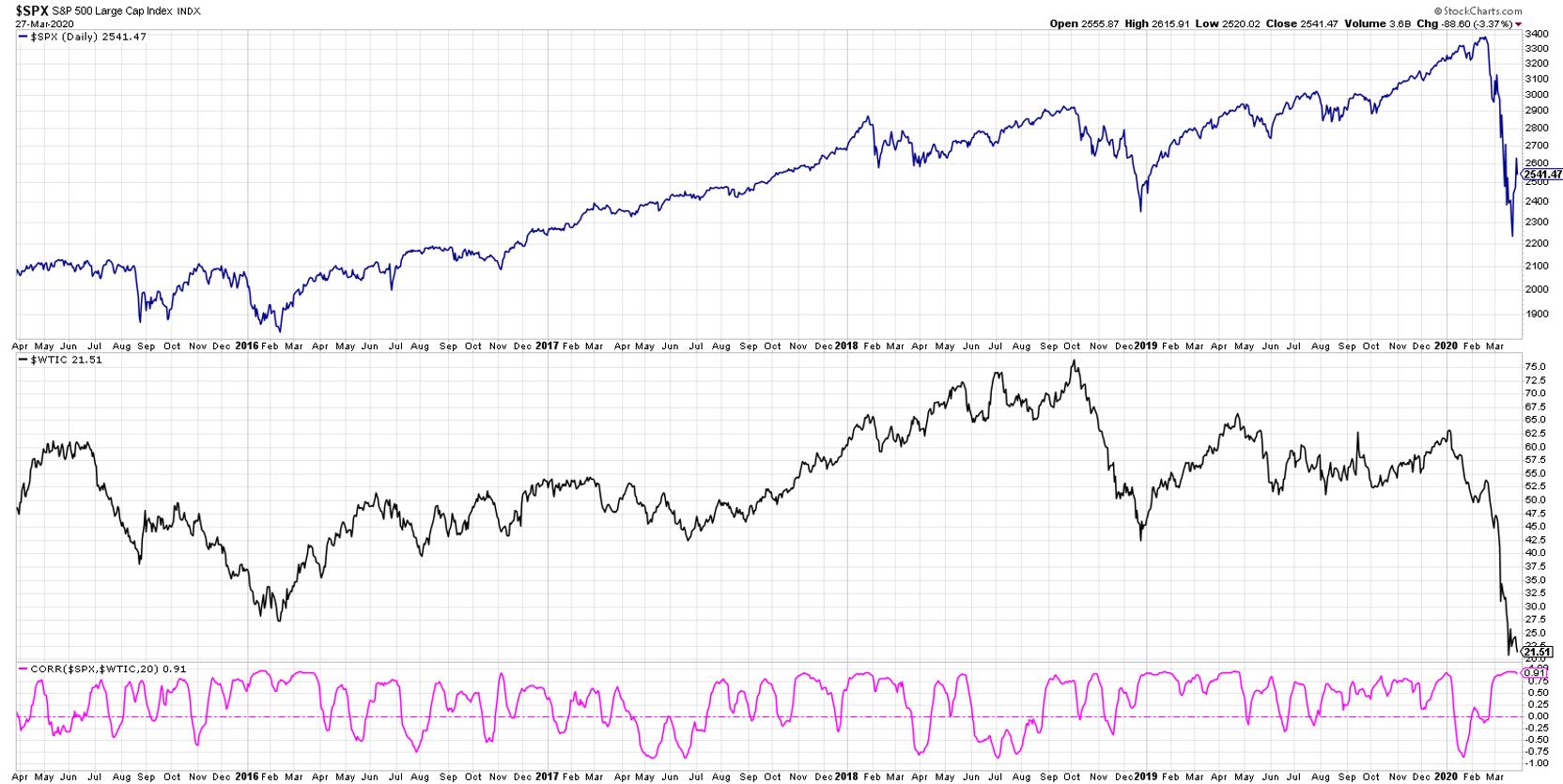
Narrative bias is where we hear or develop a particular narrative, for example, that stocks and crude oil are positively correlated, and we then start to think of the world in the context of that narrative.

In reality, stocks and crude oil are two variables among many out there. The markets are not a simple system with a small number of variables. They are a complex system combining thousands of variables that can cause asset prices to evolve in infinitely complex ways.
So saying Price A should do a specific thing because of Price B is an overly simplistic way of addressing intermarket analysis. As in mistake #3 above, you should treat narratives as you treat analogues. They can be helpful only if they encourage you to dig deeper.
Mistake #7: Overestimating Your Performance and Process
Hindsight bias speaks to how impressed we tend to be with our own performance. Our historical performance actually seems to improve in our minds the further that events appear in our rearview mirror.
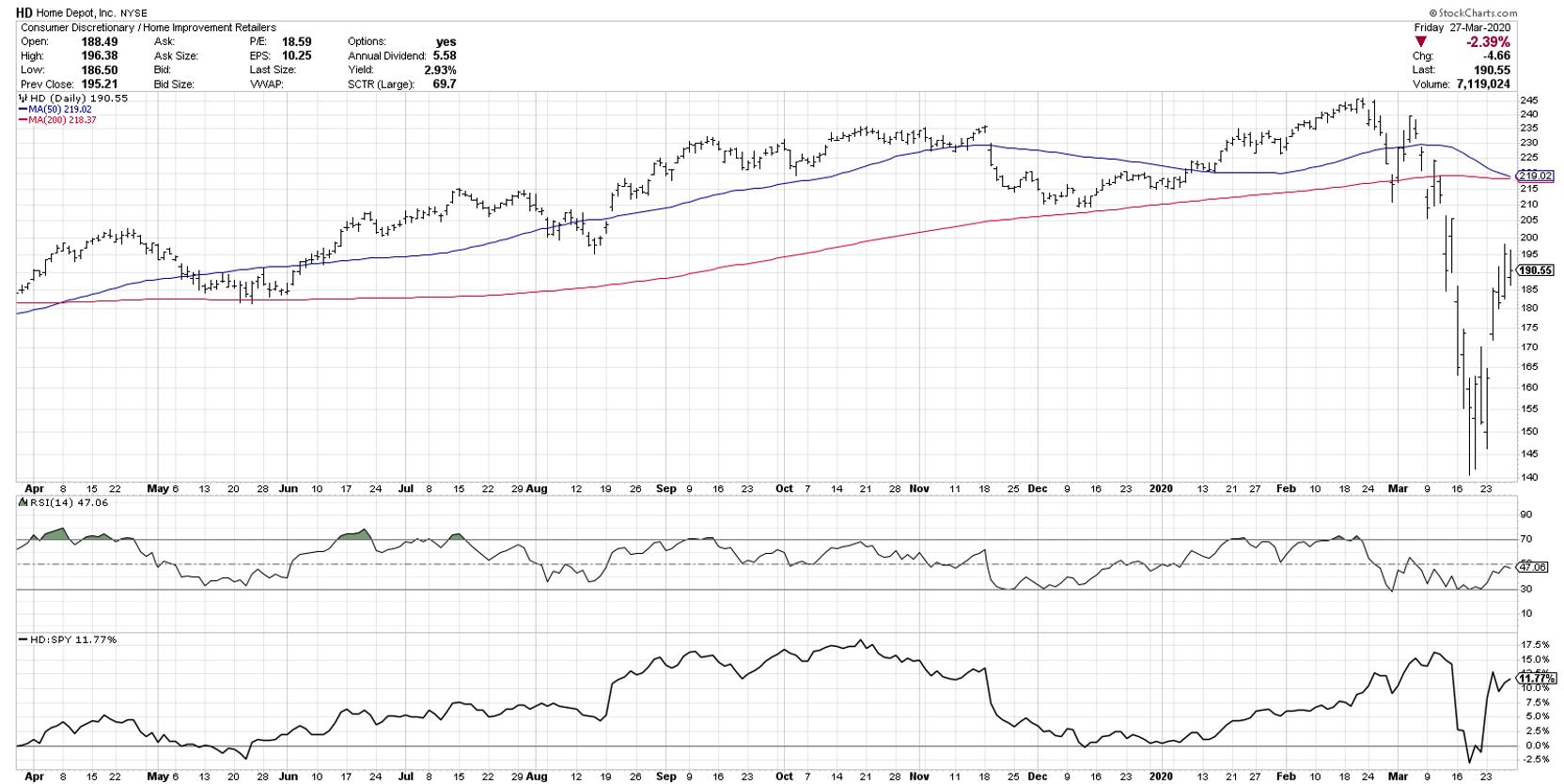
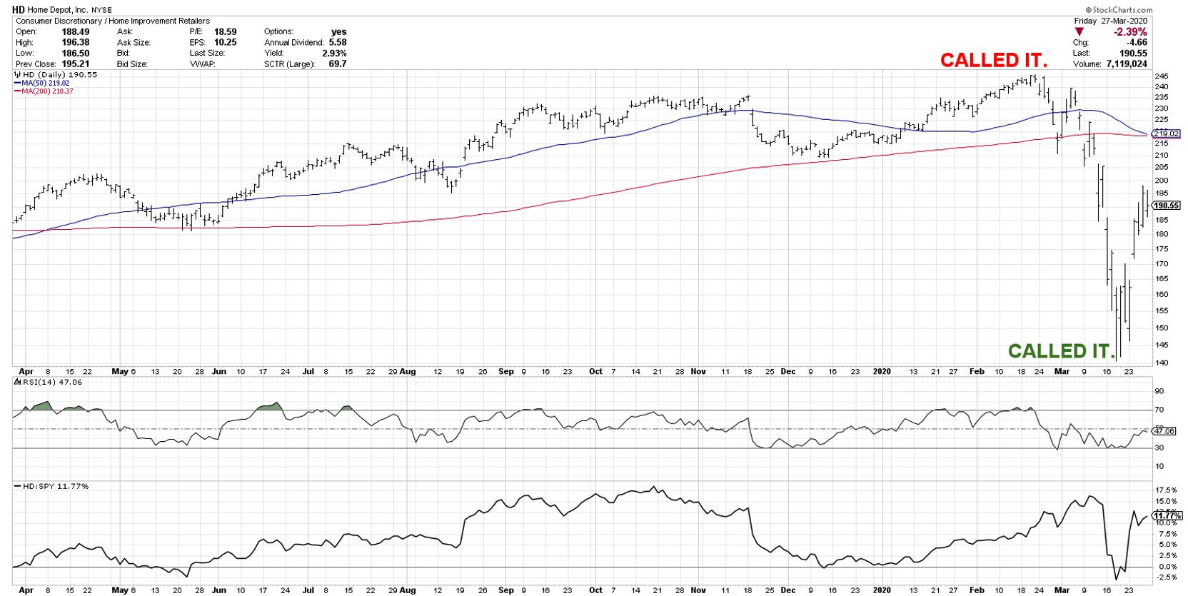
Let's say Home Depot (HD) is a stock you've been trading recently.

Perhaps you noticed the lower high the first week in March and started to question your long position. Or maybe when it broke down through moving averages or when it traded below a previous support level. As the stock bombed out two weeks later along with most equities, you maybe struggled a bit to figure out exactly if and when to get back into the stock.
This next chart, however, is more how you will remember this period years from now.

With perfect foresight, you called the top and soon after managed to get in right at the lows. Social media tends and YouTube ads tend to be filled with this sort of thing and, while some are disingenuous, I would guess some people actually remember their performance as being as solid as they are describing.
There's a humility that comes with investing, and bear markets tend to be humbling experiences. A process that seems solid during the bull phase may seem much weaker when the going gets tough.
Now that we have reflected on these seven common bear market mistakes, how should we approach things to minimize these mistakes in our own experience?
I now present Dave's Bear Market Playbook, turning each of those seven mistakes into positive practices that all investors should consider.
- Validate the Anecdotal with the Evidential. Use events that you see and hear as inspiration to dig deeper.
- Set Stops and Sell. Resist the Endowment Effect. When you enter a position, have an exit strategy clearly laid out.
- View Analogues as Descriptive, Not Prescriptive. Comparing this market to previous markets is great, as long as you use it inform your investment process, not be an investment process on its own.
- Avoid the Temptation of Bear Market Rallies. I would argue we are in the late stages of a bear market rally. Bottoms are a process, not an event. There will likely be further downside and more tempting rallies along the say.
- Remember Your Timeframe. If you're a long-term investor, stay focused on the long-term.
- Focus on the Charts, Not the Narrative. Narratives are interesting and engaging and fun to debate, but build your strategy not on the narrative, but on the evidence.
- Use a Journal and Learn from Wins and Losses. Keep track of your thinking during this bear market period and, once we're through it, dig out the journal and review how you handled things. What can you do better next time around?
Bear markets can be frustrating and challenging and stressful, but they can also be fantastic learning experiences. Hopefully these common mistakes and playbook will help you to survive and thrive in the coming months, helping you come out the other side as a better, more mindful investor.
RR#6,
Dave
David Keller, CMT
Chief Market Strategist
StockCharts.com
Disclaimer: This blog is for educational purposes only and should not be construed as financial advice. The ideas and strategies should never be used without first assessing your own personal and financial situation, or without consulting a financial professional.
The author does not have a position in mentioned securities at the time of publication. Any opinions expressed herein are solely those of the author and do not in any way represent the views or opinions of any other person or entity.
|
| READ ONLINE → |
|
|
|
| The Canadian Technician |
| Bubblin' Crude |
| by Greg Schnell |
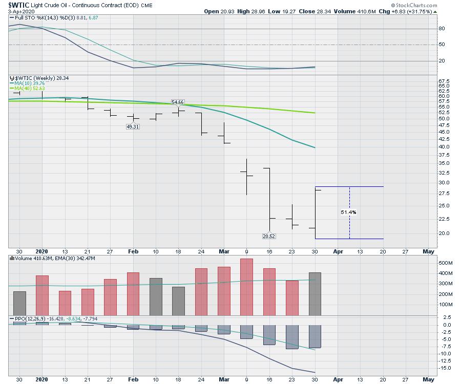
It has been a wild ride for those on the crude oil train this week. It's never good when your stocks are riding pandemic viruses, tweet storms, kingdoms, autocratic leaders and democracies trying to impose volume limits. While crude oil closed up 50% off the lows within a week, it was hardly one for the people of free markets.

With the pandemic wiping out demand, we are in a new world. If oil consumption is going to be restrained due to people staying home and planes not flying, the world will quickly run out of storage.
Under this new reality, the principles of free markets are under pressure. Even with new production limits, it will take a long time to not only reduce production, but to reduce the number of barrels in storage worldwide. So, on a day with crude oil up big, many oil names fell. While the global production agreement may be coming soon, we still will need to curtail the volumes.
The biggest thing is that the downturn is global. This oil issue has to be managed from Nigeria, Iran, Iraq, Kuwait, Australia, Scotland, Norway, Canada, USA, Russia, Saudi Arabia and many other countries.
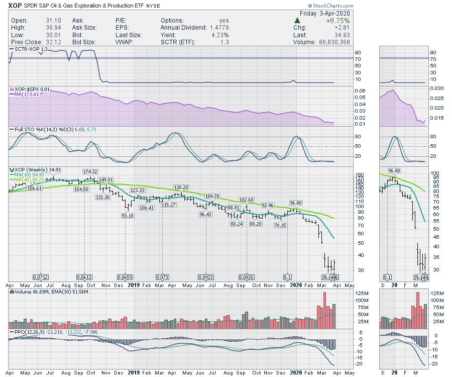
While crude oil was up 50% on the week, the exploration and production ETF was only up 8.8%.

The price of oil, the volume of oil and who cuts is going to take a little time. After that, low prices stop wells from pumping. Another piece will be bankruptcies in non-state owned companies globally. The last thing is the ongoing decline rates of the reservoir. If no new wells are drilled for a significant period of time, this too shall pass.
I don't know if the lows for the price of oil are in, but there are a lot of reasons to expect the advance a little farther off in the distance. Again, one problem is the overproduction. The second problem is reflating the demand. Care will be required to build some normalcy into the industry. Lastly, oil is a significant source of revenue for many third-world countries. If this does not get repaired sooner than later, this can also cause social unrest, which would be an unwelcome and unhelpful side effect of the COVID-19 pandemic.
Watch oil and oil companies closely. We'll need to get things repaired quickly to restart the global economy.
|
| READ ONLINE → |
|
|
|
| Trading Places |
| This Is How I Created My All-Star Trading ChartList |
| by Tom Bowley |
Let me give you an update as to how the SPY (ETF that tracks the S&P 500) and QQQ (ETF that tracks the NASDAQ 100) have performed since the top on February 19th, broken down by opening gaps (net) and intraday price action:
SPY:
- Closing price, 2/19/20: 336.36
- Opening gaps, net: -71.16
- Intraday price action, net: +13.00
- Closing price, 4/9/20: 278.20
QQQ:
- Closing price, 2/19/20: 236.45
- Opening gaps, net: -41.01
- Intraday price action, net: +5.42
- Closing price, 4/9/20: 200.86
Since February 19th, the SPY and QQQ are down 17.29% and 15.05%, respectively. However, it's been the fear at the opening bell that's driven U.S. equities lower. If we viewed only the price action from the opening to closing bells, we wouldn't even know there was a crisis. Put another way, if you had invested $100,000 at the opening bell and sold at the closing bell every day since February 19th, the balance in your portfolio investing in the SPY and QQQ would be as follows:
SPY: $105,748.59
QQQ: $103,457.89
So, while everyone has made a habit of panicking given the mostly weak futures over the past 7 weeks, willing buyers have emerged throughout most trading days. This SCREAMS accumulation to me. In that regard, the 2020 COVID-19 crisis has been completely different from the 2008 financial meltdown. In 2008, there was mass distribution throughout trading days and we moved lower. We really haven't seen that this time around and the apparent accumulation would suggest the likelihood of a much quicker recovery, in my opinion.
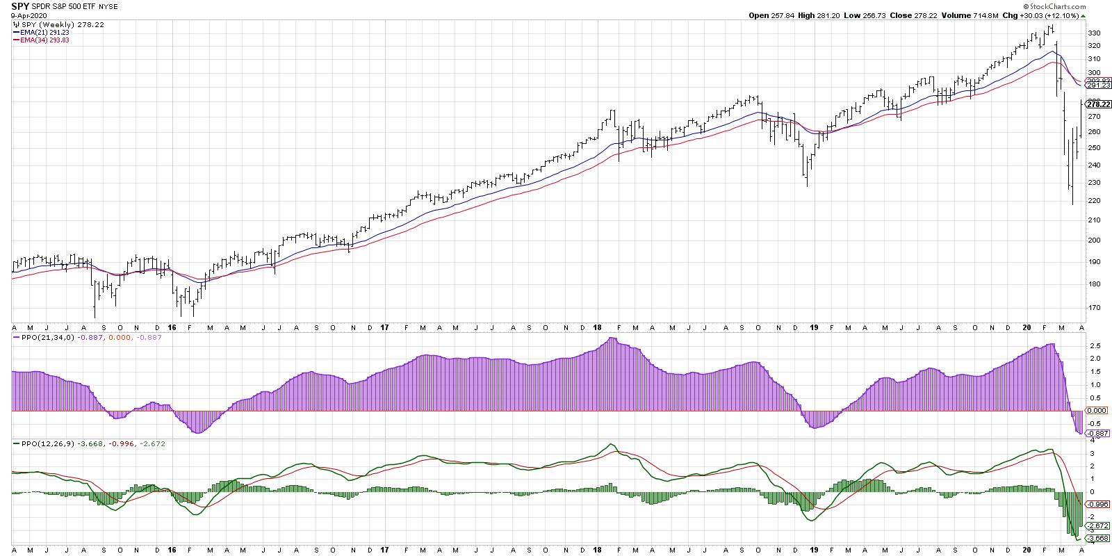
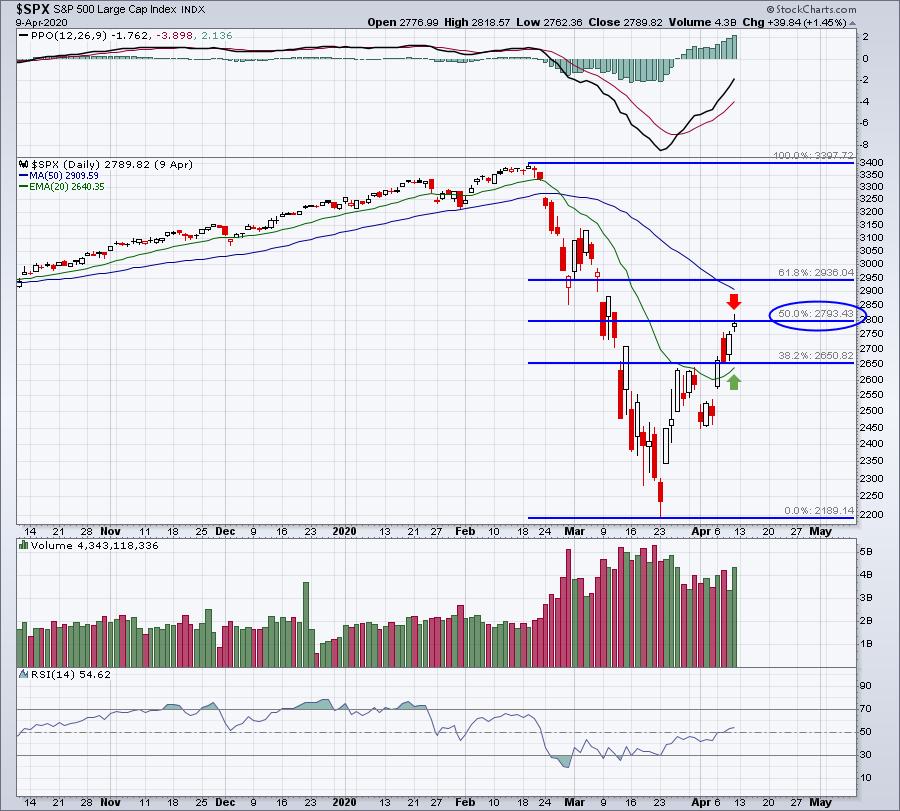
Will we see a double bottom? That's a great question and one that will likely be answered this week. Our key indices have seen prices rebound and test critical Fibonacci retracement levels at both 38.2% and 50.0%. Our initial rebounds in 1987 and 2008 never closed above the 50.0% Fibonacci retracement level. Here's where we stand now on the $SPX:

I'd like to be able to pull out the "Pandemic Playbook," but I don't own one. This is new territory for me and for everyone else who wasn't investing in 1918 during the Spanish Flu pandemic. But I do know that the March 23rd low was accompanied by a VIX reading in the 80s. That's a "throw the kitchen sink in" type of sentiment reading. Extreme bearish sentiment marks MAJOR stock market bottoms and I'd be willing to bet at this point that the bottom is in.
But what if we start to go back down?
Well, I'm prepared either way. I've used the last several weeks to do a lot of thinking and analyzing. Wall Street sends us signals all the time if we would only pay attention. High volatility has resulted in a massive decline followed by an impressive rally, while much rotation has taken place in the stock market. I mentioned above that the S&P 500 and NASDAQ 100 are down roughly 17% and 15%, respectively. Many sectors and industry groups, however, are showing relative strength and it's our job to seek out those winners. From a sector perspective, healthcare (XLV) is down just 8.41% since February 19th, easily the best-performing sector. Two of its five industry groups have lost just 5% and 6%, respectively. Wall Street is placing its bets and we need to know the stocks that are (1) performing well on a relative basis and (2) being accumulated.
I've put together a ChartList of 354 companies that show confirming signs of both. Let me explain how I constructed this list.
First, I ran a scan of stocks in every individual sector that has SCTR scores > 80. Here's a sample of the utilities scan:

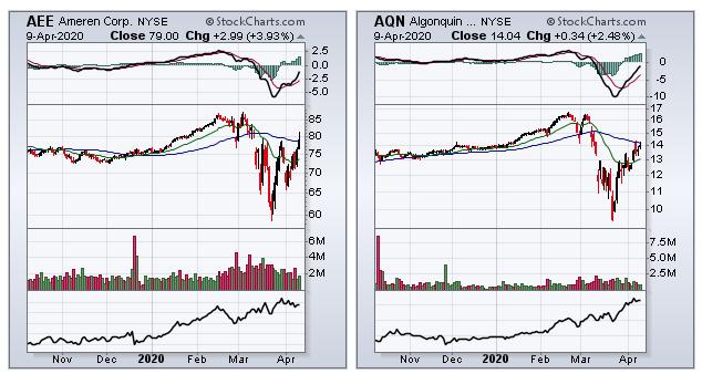
I also included a minimum average volume of 200,000 to make sure the stocks were liquid. After running the scan, I pulled up all the stocks in "CandleGlance" form so that I could quickly go through and eliminate the stocks that had poor accumulation/distribution lines (AD lines). Here were two that showed strong AD lines and are on my final list:

Rising accumulation/distribution lines, together with excellent relative strength, really provides us a big advantage in trading right now; I'll show you how tomorrow.
On Saturday, April 11th, at 10:00am EST, I'm hosting a webinar, "Changing Conditions Require a Changing Game Plan". Conditions have changed with COVID-19 - I think most everyone can agree with that. Wall Street is telling us which industry groups and stocks we should consider as we look ahead. I will share my just-developed AD ChartList (with 354 charts) with those who are EarningsBeats.com members and also at least Extra members at StockCharts.com. (You'll need to be an Extra member in order to download this ChartList.) I'll show you in tomorrow's webinar how you can click a link on our website, enter a password and download this ChartList into your StockCharts account. It'll take you 10-15 seconds. It's simple.
Tomorrow's webinar will likely last 60 to 90 minutes and I'll be discussing the winning sectors, industry groups and stocks that you need to be aware of given the changing stock market conditions. It's an opportunity to bring our EarningsBeats.com community together during this period of social distancing. Now is the time to gain additional insight and education. Tomorrow's agenda, along with a link to sign up for your fully refundable $7 30-day trial, can be found HERE.
Happy trading!
Tom
|
| READ ONLINE → |
|
|
|
| RRG Charts |
| Using Relative Rotation Graphs as a Selection or Evaluation Tool for Mutual Funds |
| by Julius de Kempenaer |

Last week on Wednesday (4/8) I wrote an article in the RRG blog on how you can use ChartLists, in combination with Relative Rotation Graphs to monitor your mutual fund portfolio. The article was inspired by a question which I received in the mailbag of my weekly show Sector Spotlight, which airs every Tuesday from 10:30am to 11:00am ET.
Just as a reminder, when you have any questions related to Relative Rotation Graphs, relative strength in general or anything you think I could help you with, please get in touch. My email address is below every article, as well as my handles for social media.
Re-capping
As a short recap of the previous article in case you missed it, I explained how you can set up and maintain a chartlist that contains all the holdings in your portfolio and, using the "view as" option in your chartlist, display your portfolio as an RRG.
The example I used in the article was using Mutual Funds, following the question that was specifically geared to that segment of the market, but obviously you can use the same routine on ETFs, individual stocks or any other investment instrument you are holding (and that StockCharts has the data for).
For this week's ChartWatchers newsletter, I want to expand on this concept using mutual funds, but approach it from another angle. This time, I'll be using RRG as a selection/evaluation tool for Mutual Funds.
Use Scan Engine to Find Funds
Let's assume you are looking for a mutual fund that invests in US Large Cap Growth stocks. An easy - in fact the easiest - way to select funds that are active in this space is by using the Scan Engine tool on StockCharts.com.
The first property that we want to set for this scan is that the security needs to be a 'fund'.
[type is fund]
When you run this scan, you will get ALL securities of type 'fund' in the database, so we need to tighten the search.
Initially I thought to set up a universe of 'Growth' funds by adding this:
[and name contains 'growth']
However, that still returned 950 results... way too much. Hence I decided to narrow it down to large-cap funds by changing my code to:
[and name contains 'large cap growth']
This scan returned 45 funds.
Perfect, the limit for the number of symbols on an RRG is 50!!
So the full code for this scan is now:
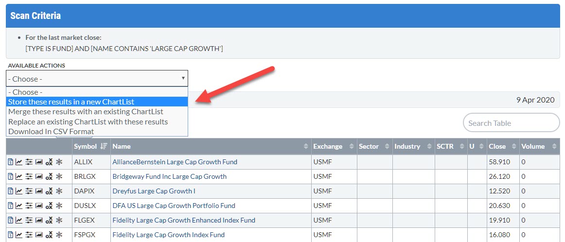
[type is fund] and [name contains 'large cap growth']
Save Results To a New ChartList and Remove Duplicates
The next step is to save the scan result into a new chartlist, which you can do under the "Available Actions" dropdown menu.

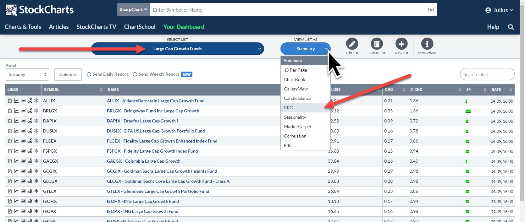
I have titled my list "Large Cap Growth Funds", seen below:

The list is now available for selection in my chartlists. When I loaded the list, I noticed that there were quite a few duplicates on the list. These are almost always different share classes of the same underlying fund. By eliminating these duplicates, I got the number of funds down to 24.
"View As" RRG
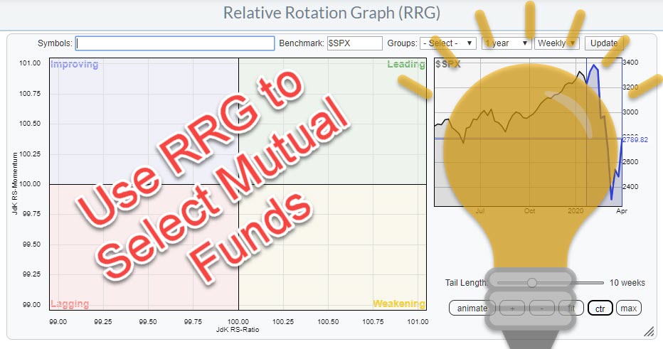
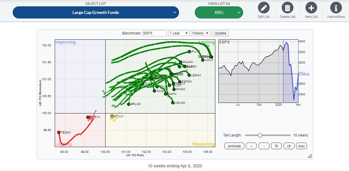
After selecting this chartlist, the next step is to select "RRG" from the "View List As" options. This gives the RRG below:

You may notice that the field to enter, edit or delete symbols for inclusion or deletion from the RRG has disappeared. That is because this RRG is now linked to the chartlist. When the components on the chartlist change, these changes will be reflected the next time you load the RRG for the list.
At first, this looks pretty promising. Most of the funds are inside the leading quadrant. But hang on..... The benchmark on this RRG is $SPX. These are all funds that invest in large-cap growth stocks.
A few weeks ago, in the ChartWatchers newsletter of 27 March, I wrote an article titled "And the Worst Section of the US Stock Market Is.....". The RRG that I used for this article not only showed that "Small Cap Value" stocks were the worst section of the US stock market, but it also showed that "Large Cap Growth" was the best/strongest segment of the US market.
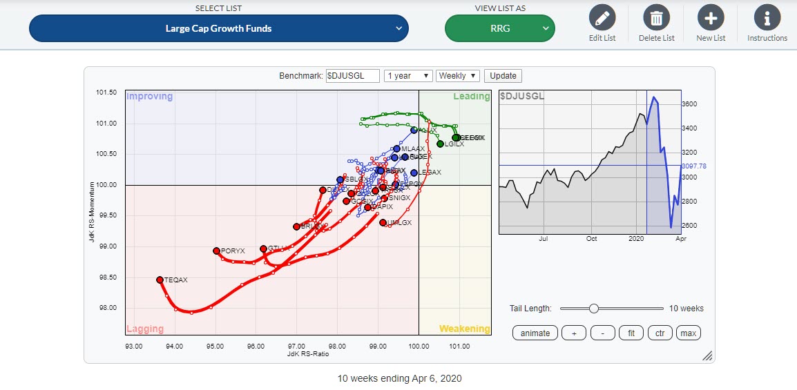
So, in order to get a fair comparison, we need to change the benchmark from $SPX to $DJUSGL. That changes the RRG to this.

Clearly, the comparison on the first RRG was biased because of the general strength of Large Cap Growth vs. $SPX. When these funds are compared to a benchmark which reflects the space in which they are operating, things change pretty dramatically. We can now start to evaluate the performance of the various funds and see if we can find a fund that deserves a spot in our portfolio.
The easiest way to do that, imho, is to check the individual tails on the funds. Select one line in the table below the chart, toggle through the list by keeping the CTRL/CMD key pressed and then "walk" through the list with the up/down arrow keys.
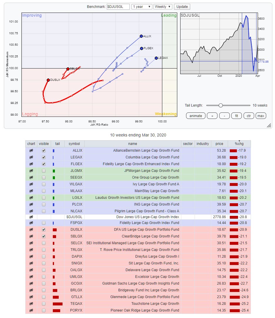
I look for tails that are traveling at an RRG-heading between 0-90 degrees. For easier reference, I have isolated these funds in the RRG below. This can easily be done by ticking the check box in front of the symbol on or off.

What is left are three funds inside the improving quadrant that are moving, rapidly, towards leading. These are the funds from Alliance Bernstein and Colombia and the Fidelity Large Cap Growth Enhanced fund (there is also another Fidelity fund on the list; Fidelity Large Cap Growth Fund).
Inside the lagging quadrant, I found two funds, DFA and Clearbridge, that recently turned into a positive heading but still need to catch up.
Based on the speed of the rotation, the direction of travel and the position on the RRG, the three funds inside the improving quadrant are most likely to continue their outperformance of the DJ US Large Cap Growth Index in the coming weeks.
Please be aware of (= look at) the fact that all these funds have dropped significantly in price over the last few weeks (see % in the table below the graph), but they have beaten the index and are likely to do so in coming weeks. This does not necessarily mean a rise in absolute prices.
Find Consistent Performing Fund Managers
When you invest in mutual funds on a regular basis, I encourage you to use this approach to filter the funds that you are interested in into a chartlist. Take a look at the rotations over a longer period of time, say 5-10 years, and see if you can find funds that are consistently, or predominantly, rotating at the right hand side of the RRG, as these are funds managed by the best (teams of) fund managers.
Happy Easter and #StaySafe
--Julius
My regular blog is the RRG Charts blog. If you would like to receive a notification when a new article is published there, simply "Subscribe" with your email address.
|
| READ ONLINE → |
|
|
|
| The MEM Edge |
| Tesla's On The Move Again – Along With 2 Other Automakers Poised To Race Off |
| by Mary Ellen McGonagle |
The COVID-19 pandemic has hurt the auto industry tremendously as consumer demand for vehicles has collapsed in the face of enforced lockdowns in China, Europe and now the United States. The industry is fighting back with efforts to jump-start production and sales globally, as countries such as China have begun opening factories.
Tesla (TSLA) is at the forefront after shipping a record 10,160 Model 3 sedans from its Shanghai plant in March. The company also announced plans today to offer their higher-end Model 3 autos in China for only 13% above the cost of their basic version. All this news has analysts raising their price targets for TSLA to as high as $684, which is 19% above Thursday's close in price.
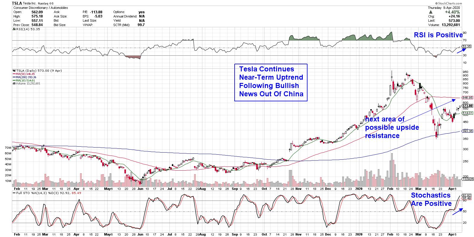
Tesla has been a clear outperformer during the markets' sharp drop into bear market territory, as the stock was one of only 5% of companies that found support at their 200-day moving average. This bullish action has been followed up by a break back above its 10-day moving average, while the RSI and Stochastics are in positive territory. The next area of possible upside resistance is its 50-day moving average, which is 13% away.
DAILY CHART OF TESLA, INC. (TSLA)

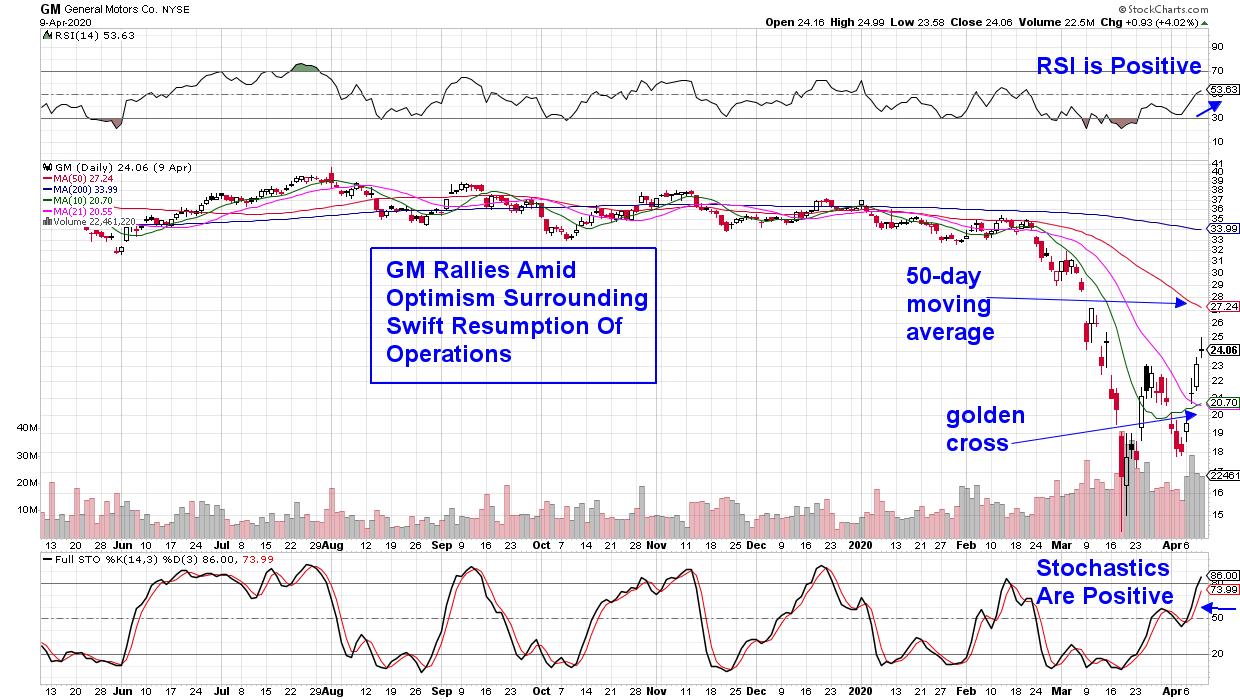
For the Detroit automakers and their suppliers, the shutdown of profitable truck and sport utility vehicle plants in North America has choked off cash flow. This has companies such as General Motors (GM) pushing to reopen U.S. production as early as the first week in May.
General Motors (GM), along with other auto manufacturers, has launched the production of ventilators in their U.S. plants, which has allowed them to fine-tune health safety measures in anticipation of re-opening on a wider scale that will include auto production.
As you can see in the chart below, GM was already in a declining mode prior to experiencing losses of 40% over the last 2 months. The sharp drop positioned the stock to rally along with other beaten-down areas, and its 50-day moving average is the next area of possible upside resistance.
DAILY CHART OF GENERAL MOTORS, CO. (GM)

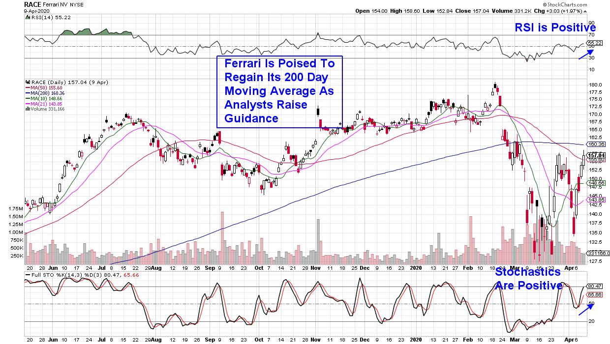
Unlike other car makers, Ferrari (RACE) has been relatively unscathed financially by the coronavirus downturn, as the company's significant earnings growth over the past several years has kept them well-positioned.
More importantly, the company has confirmed that demand remains solid, with no pandemic-related order cancelations for their luxury vehicles that command prices ranging from $200k to $300k. The fact that they receive payments in advance of delivery has allowed the company to continue to book sales.
Ferrari is now poised to break back above its 200-day moving average, which is 2% away; that would put the stock in a bullish position to trade back to its pre-bear market highs. While a weekly chart of the stock looks more constructive, as it smooths out the daily volatility, it's important to be aware of the high price swings possible with RACE.
DAILY CHART OF FERRARI NV (RACE)

While the stocks mentioned above are in constructive positions from which to trade higher, based on my work, caution is still warranted particularly as we head into the beginning of earnings season next week. And, although the markets appear to be firming up, high daily price swings, such as last Monday's 7% rally as well as headline sensitivity, imply an uncertainty among investors that may well take more time to resolve.
For those who'd like to be alerted to near-term opportunities in top growth stocks, as well as guidance on when the markets have signaled a new - much longer - bull uptrend, I urge you to take a 4-week trial of my bi-weekly MEM Edge Report at a nominal fee. In addition to stock ideas, you'll receive insights into the broader markets and select sectors that are not found elsewhere.
I hope you'll take advantage of this offer and, more importantly, that you are staying healthy and safe.
In addition, Erin Swenlin from DecionPoint.com and I will be hosting a Live Trading Room next Tuesday morning. This free event is open to all as we'll be highlighting trading opportunities in this highly volatile period. You can register by clicking this link here!
Warmly,
Mary Ellen McGonagle
MEM Investment Research
|
| READ ONLINE → |
|
|
|
| MORE ARTICLES → |
|
