Last week on Wednesday (4/8) I wrote an article in the RRG blog on how you can use ChartLists, in combination with Relative Rotation Graphs to monitor your mutual fund portfolio. The article was inspired by a question which I received in the mailbag of my weekly show Sector Spotlight, which airs every Tuesday from 10:30am to 11:00am ET.
Just as a reminder, when you have any questions related to Relative Rotation Graphs, relative strength in general or anything you think I could help you with, please get in touch. My email address is below every article, as well as my handles for social media.
Re-capping
As a short recap of the previous article in case you missed it, I explained how you can set up and maintain a chartlist that contains all the holdings in your portfolio and, using the "view as" option in your chartlist, display your portfolio as an RRG.
The example I used in the article was using Mutual Funds, following the question that was specifically geared to that segment of the market, but obviously you can use the same routine on ETFs, individual stocks or any other investment instrument you are holding (and that StockCharts has the data for).
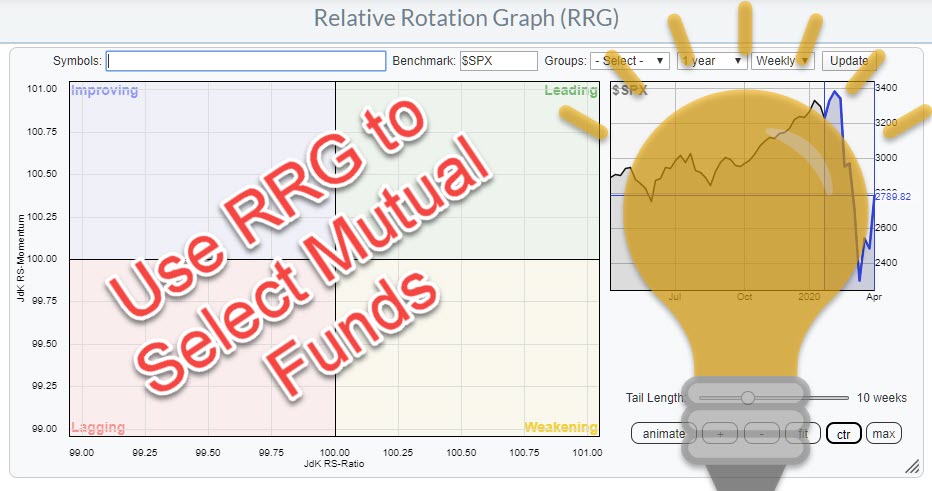
For this week's ChartWatchers newsletter, I want to expand on this concept using mutual funds, but approach it from another angle. This time, I'll be using RRG as a selection/evaluation tool for Mutual Funds.
Use Scan Engine to Find Funds
Let's assume you are looking for a mutual fund that invests in US Large Cap Growth stocks. An easy - in fact the easiest - way to select funds that are active in this space is by using the Scan Engine tool on StockCharts.com.
The first property that we want to set for this scan is that the security needs to be a 'fund'.
[type is fund]
When you run this scan, you will get ALL securities of type 'fund' in the database, so we need to tighten the search.
Initially I thought to set up a universe of 'Growth' funds by adding this:
[and name contains 'growth']
However, that still returned 950 results... way too much. Hence I decided to narrow it down to large-cap funds by changing my code to:
[and name contains 'large cap growth']
This scan returned 45 funds.
Perfect, the limit for the number of symbols on an RRG is 50!!
So the full code for this scan is now:
[type is fund] and [name contains 'large cap growth']
Save Results To a New ChartList and Remove Duplicates
The next step is to save the scan result into a new chartlist, which you can do under the "Available Actions" dropdown menu.
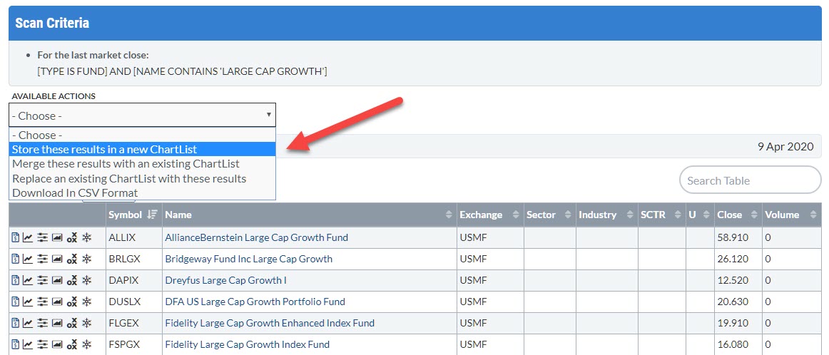
I have titled my list "Large Cap Growth Funds", seen below:
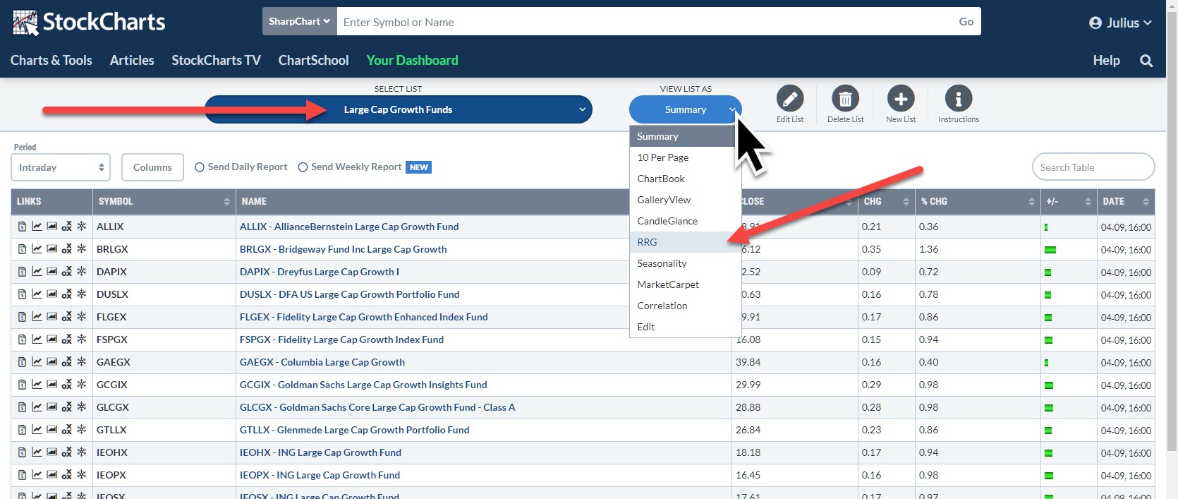
The list is now available for selection in my chartlists. When I loaded the list, I noticed that there were quite a few duplicates on the list. These are almost always different share classes of the same underlying fund. By eliminating these duplicates, I got the number of funds down to 24.
"View As" RRG
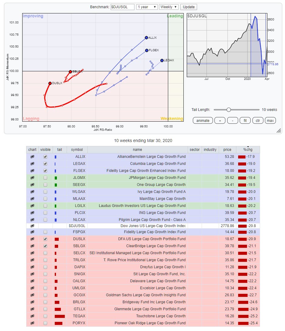
After selecting this chartlist, the next step is to select "RRG" from the "View List As" options. This gives the RRG below:
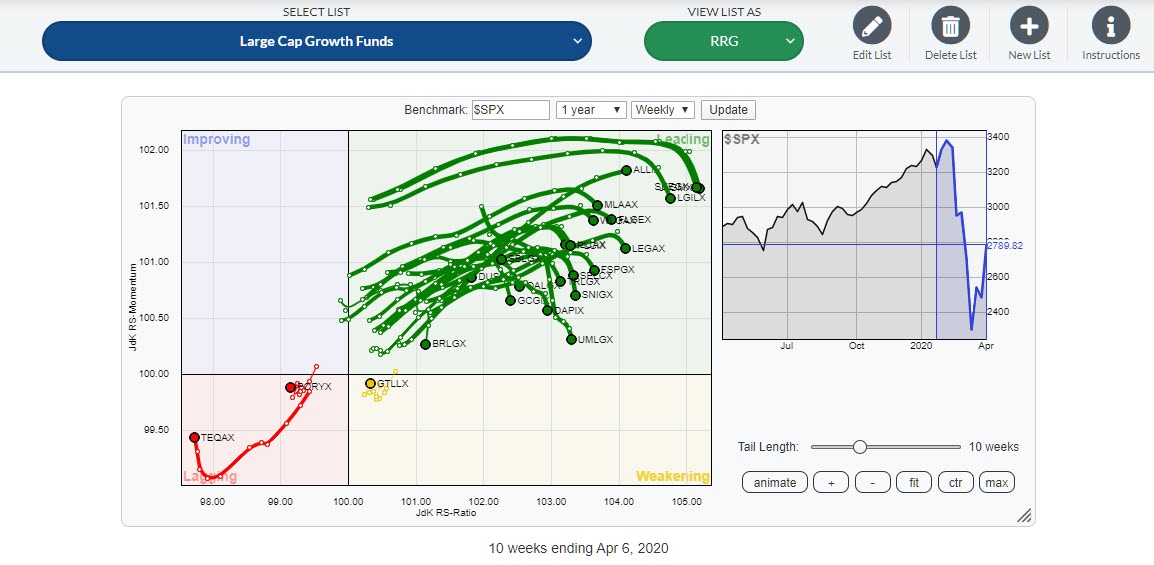
You may notice that the field to enter, edit or delete symbols for inclusion or deletion from the RRG has disappeared. That is because this RRG is now linked to the chartlist. When the components on the chartlist change, these changes will be reflected the next time you load the RRG for the list.
At first, this looks pretty promising. Most of the funds are inside the leading quadrant. But hang on..... The benchmark on this RRG is $SPX. These are all funds that invest in large-cap growth stocks.
A few weeks ago, in the ChartWatchers newsletter of 27 March, I wrote an article titled "And the Worst Section of the US Stock Market Is.....". The RRG that I used for this article not only showed that "Small Cap Value" stocks were the worst section of the US stock market, but it also showed that "Large Cap Growth" was the best/strongest segment of the US market.
So, in order to get a fair comparison, we need to change the benchmark from $SPX to $DJUSGL. That changes the RRG to this.
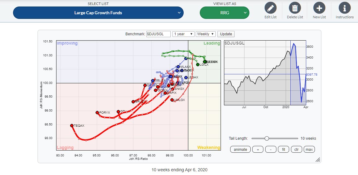
Clearly, the comparison on the first RRG was biased because of the general strength of Large Cap Growth vs. $SPX. When these funds are compared to a benchmark which reflects the space in which they are operating, things change pretty dramatically. We can now start to evaluate the performance of the various funds and see if we can find a fund that deserves a spot in our portfolio.
The easiest way to do that, imho, is to check the individual tails on the funds. Select one line in the table below the chart, toggle through the list by keeping the CTRL/CMD key pressed and then "walk" through the list with the up/down arrow keys.
I look for tails that are traveling at an RRG-heading between 0-90 degrees. For easier reference, I have isolated these funds in the RRG below. This can easily be done by ticking the check box in front of the symbol on or off.
What is left are three funds inside the improving quadrant that are moving, rapidly, towards leading. These are the funds from Alliance Bernstein and Colombia and the Fidelity Large Cap Growth Enhanced fund (there is also another Fidelity fund on the list; Fidelity Large Cap Growth Fund).
Inside the lagging quadrant, I found two funds, DFA and Clearbridge, that recently turned into a positive heading but still need to catch up.
Based on the speed of the rotation, the direction of travel and the position on the RRG, the three funds inside the improving quadrant are most likely to continue their outperformance of the DJ US Large Cap Growth Index in the coming weeks.
Please be aware of (= look at) the fact that all these funds have dropped significantly in price over the last few weeks (see % in the table below the graph), but they have beaten the index and are likely to do so in coming weeks. This does not necessarily mean a rise in absolute prices.
Find Consistent Performing Fund Managers
When you invest in mutual funds on a regular basis, I encourage you to use this approach to filter the funds that you are interested in into a chartlist. Take a look at the rotations over a longer period of time, say 5-10 years, and see if you can find funds that are consistently, or predominantly, rotating at the right hand side of the RRG, as these are funds managed by the best (teams of) fund managers.
Happy Easter and #StaySafe
--Julius
My regular blog is the RRG Charts blog. If you would like to receive a notification when a new article is published there, simply "Subscribe" with your email address.
Julius de Kempenaer
Senior Technical Analyst, StockCharts.com
Creator, Relative Rotation Graphs
Founder, RRG Research
Host of: Sector Spotlight
Please find my handles for social media channels under the Bio below.
Feedback, comments or questions are welcome at Juliusdk@stockcharts.com. I cannot promise to respond to each and every message, but I will certainly read them and, where reasonably possible, use the feedback and comments or answer questions.
To discuss RRG with me on S.C.A.N., tag me using the handle Julius_RRG.
RRG, Relative Rotation Graphs, JdK RS-Ratio, and JdK RS-Momentum are registered trademarks of RRG Research.


